I have been thinking a lot about character of lenses and cameras lately.
The reality is, perfection is easy, character hard. Yannick Khong, on his blog has been (in his words) recently obsessed with the 3D vs flattening effect of some lenses and more recently the fickle dynamic of “work capable” or fully corrected lenses and character filled or “X” factor lenses. Many lenses are “perfect”, but lack that dark side where beauty hides, while the more exciting lenses can often lack “safe” or predictable enough characteristics to be trusted for pro work.
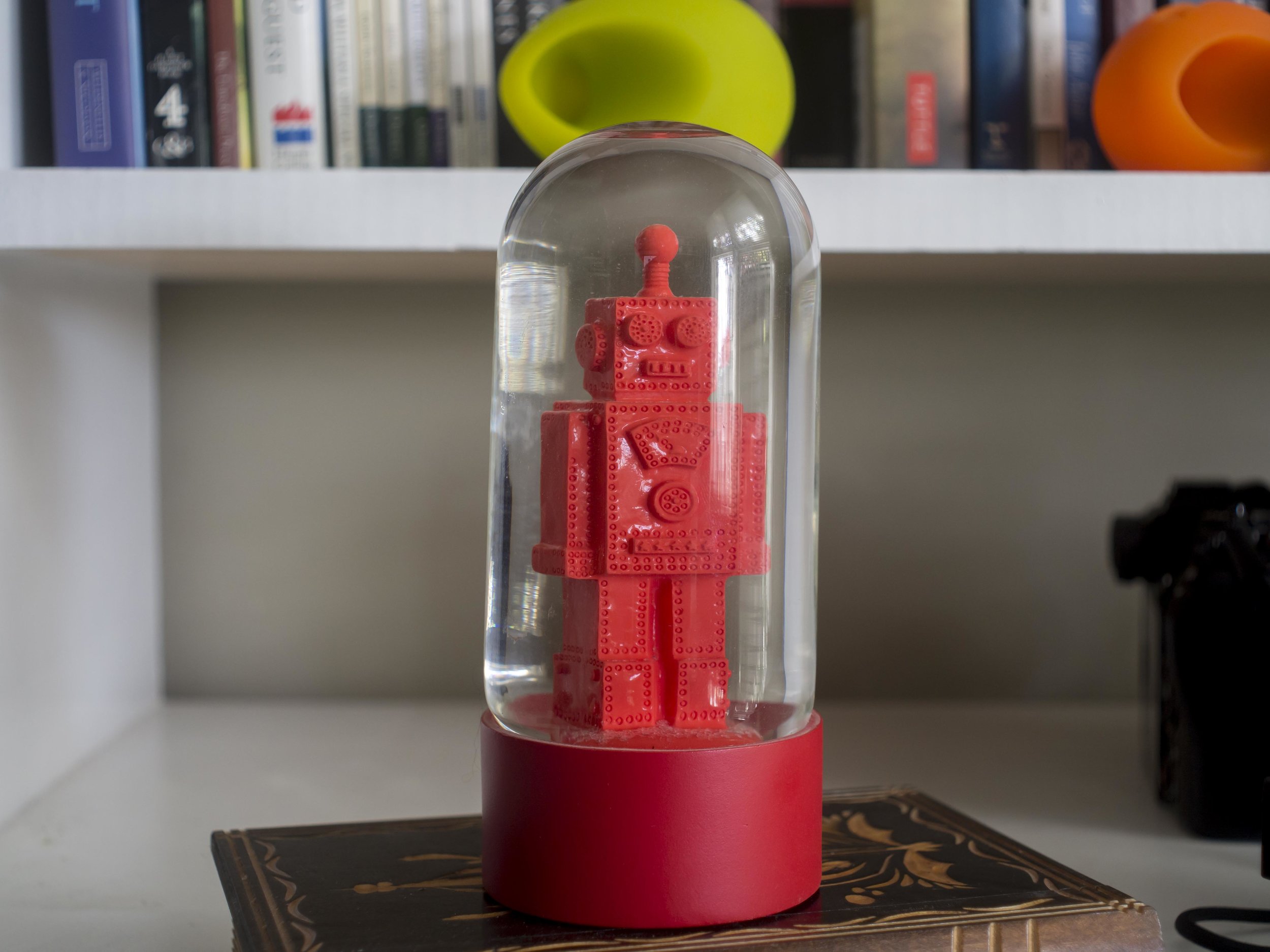
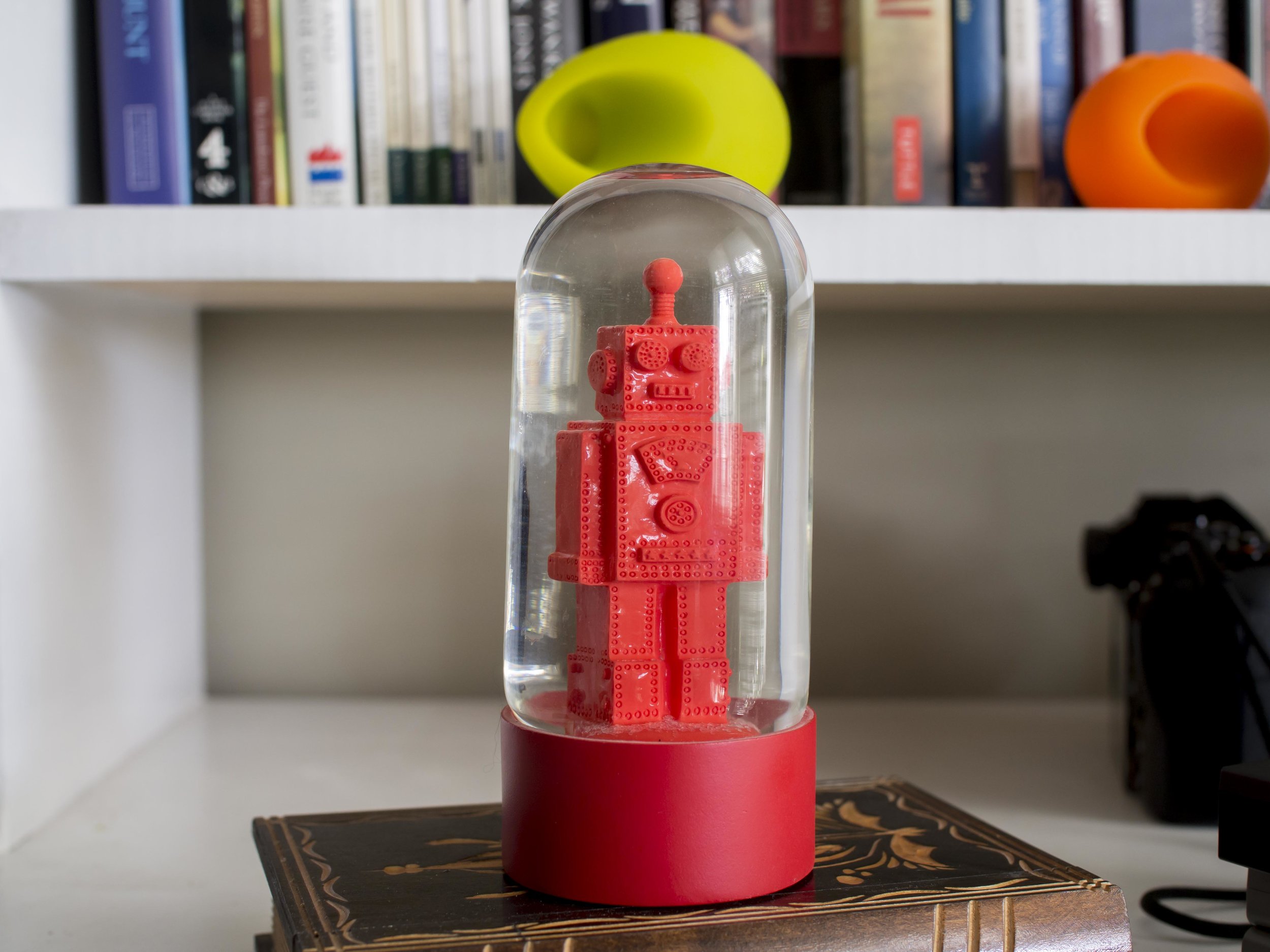
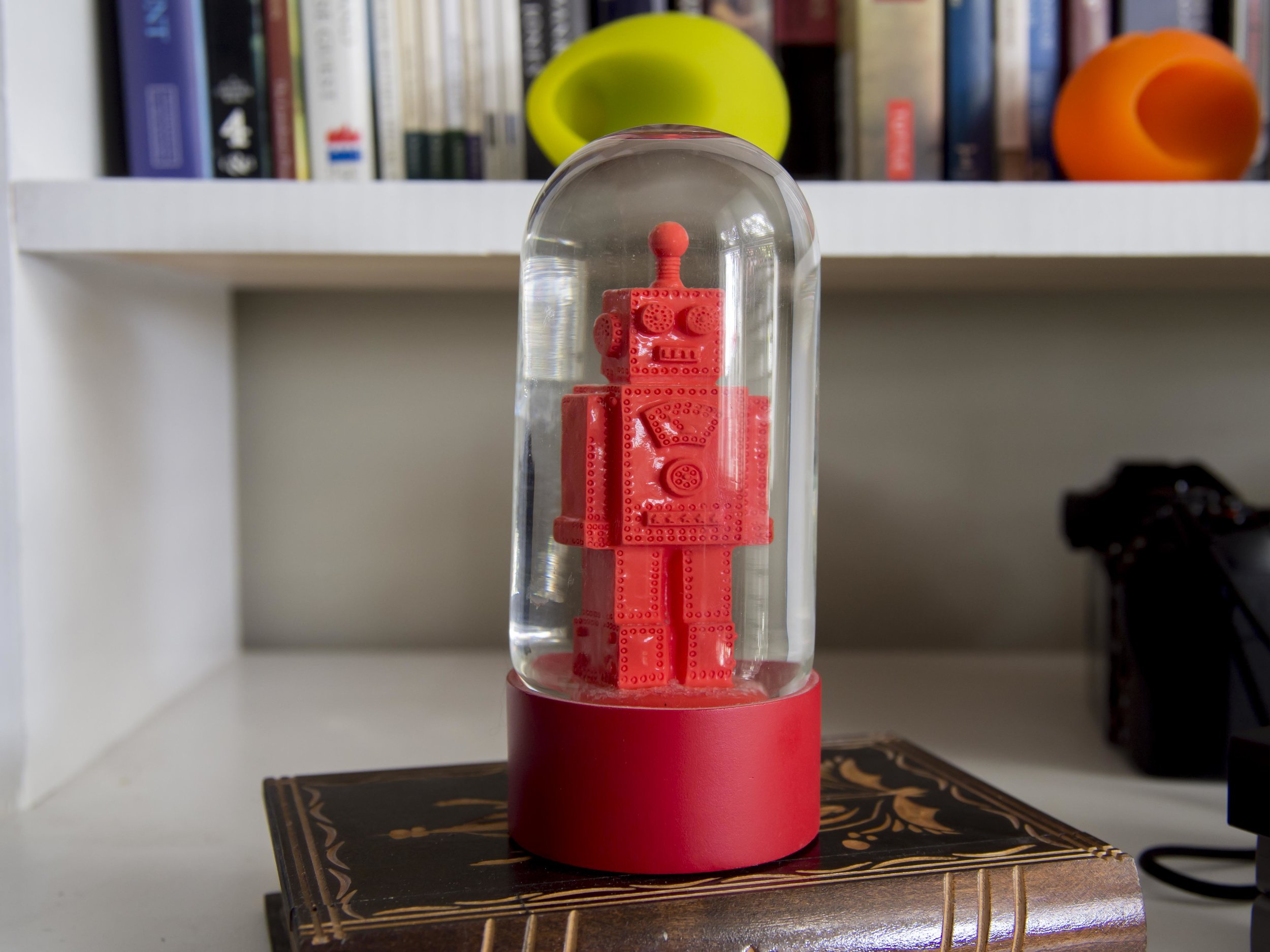
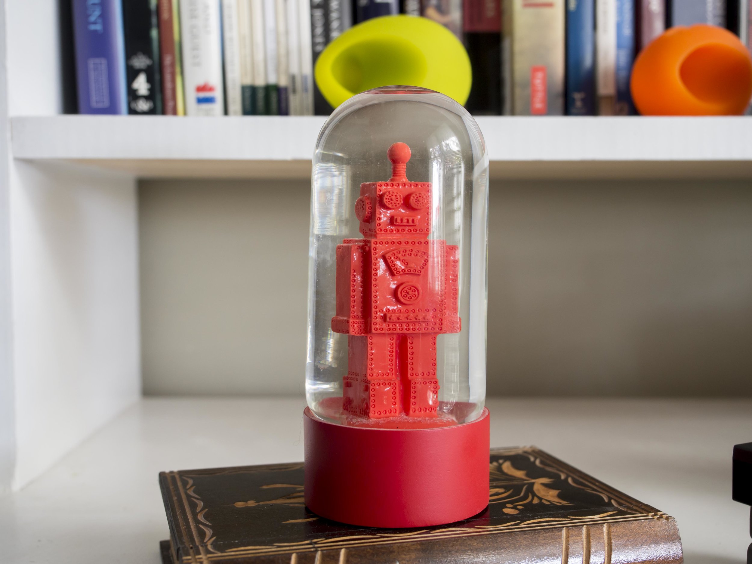
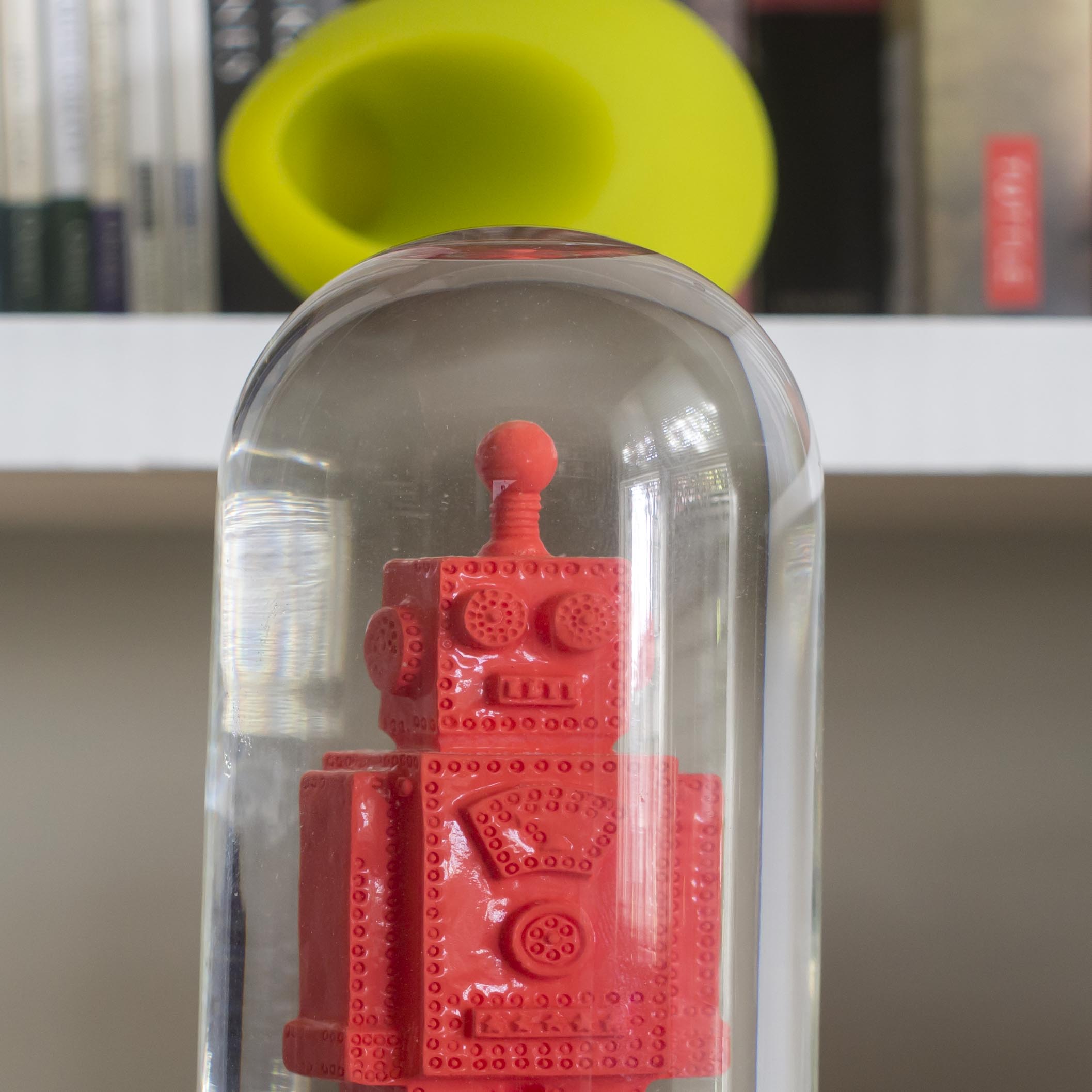
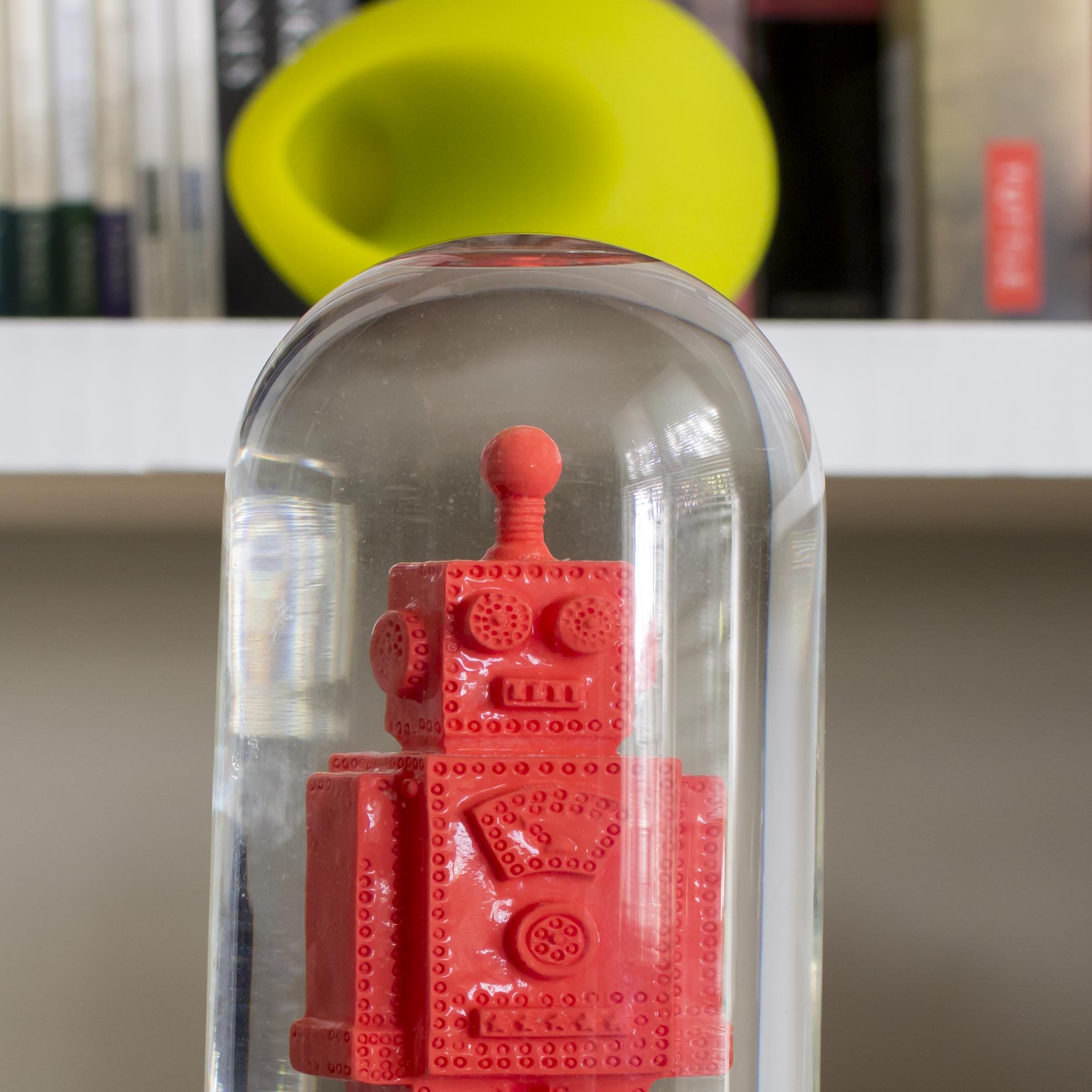
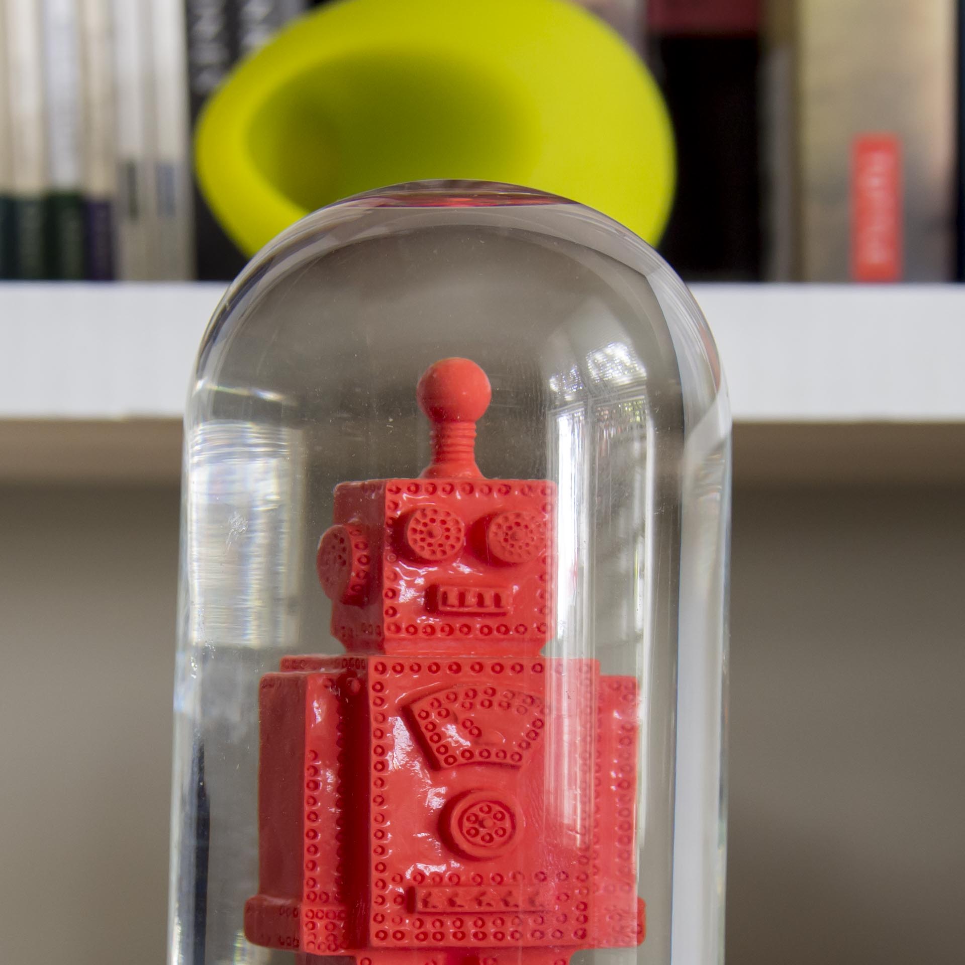
I thought, as a little exercise to try out 4 lenses in the same (!?) focal length*, settings (all f4) and light. All lenses were focussed manually with magnification on the robot’s body as the glass might fool the AF.
First lens, 25mm G. Zuiko for the 1960-70’s Pen cameras on a Fotodiox adapter.
Second lens, 25mm M Zuiko f1.8
Third lens, M Zuiko 12-100 Pro
Fourth Lens, M Zuiko 12-40 Pro
There is a subtle difference in rendering
Same order left to right as above.
Not much of a difference in the real world, but maybe plays out to my instinctive reaction to the lenses.
The old 25 exposes about a half stop darker, so I lightened it up for better comparison, then it showed lower contrast and less vibrant colour. It is also hazy (though sharp) at f2.8. At f4 it is almost in the same sharpness class as these lenses. It possibly (as Yannick’s blog theorises) has more 3D snap, but this is (as he also often found) at the expense of less smooth Bokeh and other optical compromises.
It is also obvious to me that the two 25’s are for different reasons the slightly flatter and less exciting images of the four. The 12-40 looks nicest to my eye.
The newer 25 (21!) and the 12-40 are similar in rendering and contrast, which fits with the less micro contrasty, modern portrait Bokeh “feel” I get from them. The green ipad speaker blobs are a little less coherent in the new 25/12-40 images, but the book text is slightly smoother also. This makes them ideal for portraiture.
The old 25 and 12-100 seem to have more in common here. Their rendering of the blob is slightly more coherent**, but equally the text edges are a little less smooth. It is hair splitting between the two zooms, but the two primes are quite different in character.
Just for fun, a little more post to the old 25’s image. Not bad for a lens older than most of us and this was not one of the stand out lenses of the range! That Bokeh is a little nervous looking, but the subtly 3D and old school look of the lens adds another arrow to my quiver.
What have I learned?
The lenses as assigned in my head are best suited to their purposes or it makes little real difference in practice.
This micro analysis only proves out known facts and in this case they are minor considerations (the lenses are more alike than they are different).
Olympus has made three premium lenses with very similar performance (at these focussing distances anyway), but could manage a good lens over 50 years ago, so that should come as no surprise.
I have a secret 20mm, or at least a wider than 50mm equivalent.
The old lens may have a use in the future.
I need to be a little more careful when doing these tests (see * and **).
I really need to compare the two zooms at longer distances, to make sure i am on the right track for landscapes. When I tested the 12-100 at about 50m, it left all challengers in it’s dust, but there was not a 12-40 available at the time to compare.
*OK I messed up the focal lengths. It turns out that the two 25’s are not in agreement. I was a bit sloppy with matching the first and second images, but I adjusted the third image to match (roughly) the coverage of the second one and the lens showed 21mm in Lightroom (no way to tell on the barrel except to say it was backwards of 25mm). I then adjusted the fourth shot to match these as close as I could be bothered and again got 21mm! It looks like I have a 20mm after all.
**It appears I made a slight focussing error with the 12-100. The finger prints on the front of the glass are sharp (not on the others), where the robot is a little less so. This makes the slightly more coherent background blob even a more interesting.
