So, looking at the my ramblings on black and white, what can be said to solidify my feelings on colour one way or the other (keep in mind I do love colour and consider myself a colour image maker, but that is the problem).
Some of below touches on the last post’s thoughts, but needs to be covered for completeness and again, I am not promising to write anything other than a ramble-fest of disjointed thoughts, but this is my thought process.
Colour can confuse. Colour can take a simple message and dilute it’s power. Sure it can and often is the power of the image, but sometimes all it does is sap the power from an image. Poor light, uncomplimentary tones, blandness, can all reduce the clarity or strength of an image’s message. Sometimes, even a small spot of colour can distract the viewer from the true intent of the photo. Imaging an image of despair or poverty in one of the worlds less lucky countries, powerful in content and composition, with a back lit flash of yellow, contrasting despair with joy. Maybe that is the intent of the photographer, or more likely, that colour would be removed. Mono would simply turn it into a tone that could also be reduced, but only on brilliance if needed. The point is, the colour evokes a mood, which switches the emphasis from central subject and message to a peripheral impulse.


In the image above, your eye is drawn to the yellow and red parts of the image and away from the faces. In the mono image, the main subjects become the central focus again.
Colour can dominate. As above, colour is usually the visual bedrock of a colour image. This is at the core of the difference between colour and mono, “seeing”. Most, if not all colour images are colour first, other compositional factors second. Many of my personal favourite images (taken by other photographers) are based on the power of colour, but many of these can be converted to mono and be equally powerful. It is telling, that many of the worlds best photographers split their images between colour and mono, simply because their intent can sometimes be diluted by poor colour, but it can also be perfectly grounded by strong colour (Peter Turnley is a good example of this).
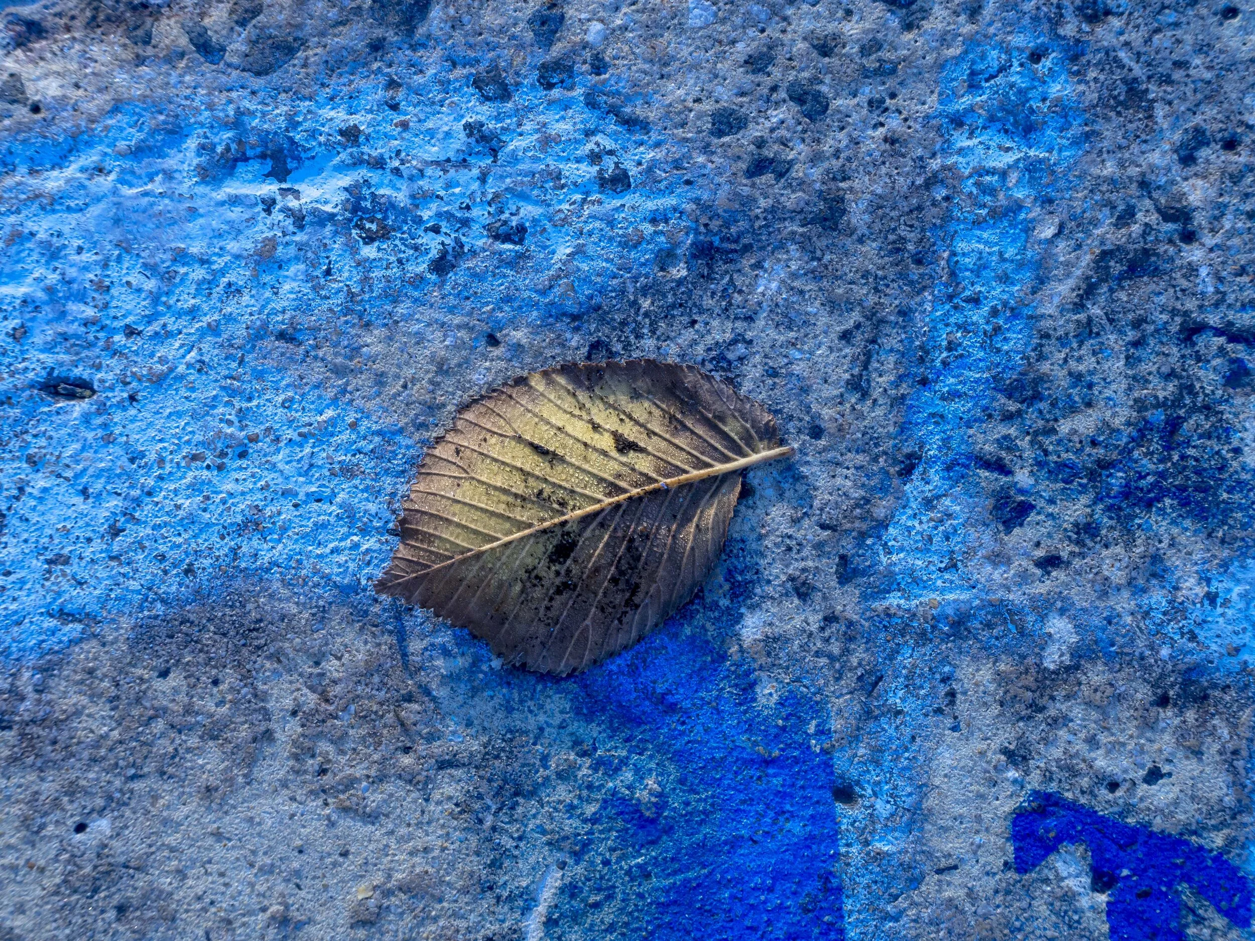
Without colour, what is this image? It is eye caching and it actually works ok in mono, but it’s suddenly just one of many texture based images.
Colour lacks latent artistic compulsion. Colour is an interpretation of the mundane in an easily understood form. We see in colour, so we see colour images naturally. To be artistic or even iconic, a colour image needs to be transcendent, often manipulated or simply unusual. The subject needs to dominate the colour and the colour just get out of it’s way. Colour is obviously the main part of colour image composition and can be strikingly powerful because of that, but always on it’s own terms. I feel a mono image always asks for interpretation by the viewer, where a colour image can just “be” unless it elevates the viewer’s interest.
Black and white has the ability to transform my thinking, which I need to do to make the most of it. The deliberate reduction of options black and white forces, helps us focus our attention more sharply, because of reduced options (i.e. distractions).
In colour this image lacks a sense of scale, impact or abstraction. It is essentially just sand on a cool winters day.
Colour is always fake. As much as we might like to think otherwise, no colour image is literal to it’s subject. This has always been the case. Your choice of film, camera sensor, software, paper and even your viewing screen will have some effect of the accuracy of your colours. Mono is always consistent to the image makers intent (toning not withstanding). Colour’s variation leaves it open to fashion and evolving interpretation, which in turn creates time stamped periods of this-or-that look. Mono tends to be timeless, leaving few cues to the viewer. It also tends to withstand short term trends. Take a walk on the forums discussing the various brand’s colour interpretation and you will soon see that no one brand or process is really right over all others and nothing is consistent. Conversely, the mono forums are mostly concerned with film/film like or digital processing.
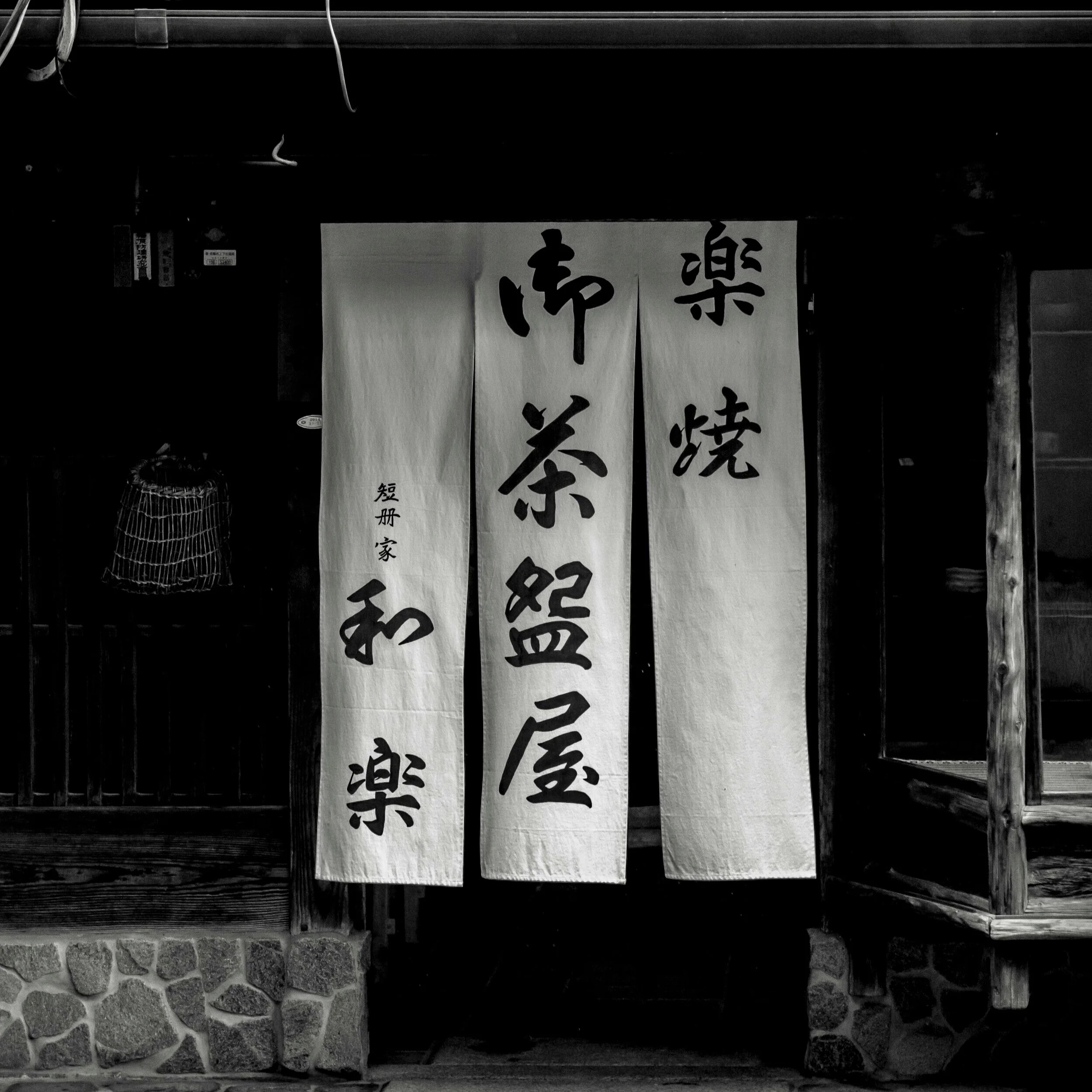
Kyoto back street restaurant 1973, Hasselblad medium format with Tri-X film, or 2017 EM5 mk1?
Colour is hard. Balance, interpretation, accuracy, or the manipulation of, processing fashions, technical constraints and limits are all part of colour image making. Talk to your present self about your current technical capabilities and preferences, then time trip back and chat to your 10 or 20 year younger self and you will have two very different conversations. This is not always a one way street either. My Canon using, 10 year self would be colour and processing obsessed. My 8 year younger self would be struggling with the colour from my OMD EM5’s which would evolve into a more enthusiastic advocacy of the “film like” look that I will now miss when I am forced to move on. Most of my own issues with bonding with the Olympus system, came from an allergic reaction to their colour after coming from Canon and Fuji.
Colour is easy. When the quick fix of colour is present, the image comes easily and naturally (or not at all). This makes me (YMMV) lazy and easily satisfied, but the resulting images are rarely outstanding. If the image also contains the elements that make it work in black and white, then the colour image is also stronger for it. If not, then the colour is all that is holding it together. Very few of my own favourite images cannot work in black and white and those that cannot are the weaker for it. I think, for me, the instant grab of colour can sometimes short circuit or even limit further thought processes.
A quick hit of colour. Red, orange and contrasting blue work on a base level with other, but In mono this image offers little, revealing it’s the overall weakness.
It feels less like film. Feeling like I am still shooting film feels like my early excitement with photography has returned. Something has been lacking over the last few years. Digital colour is easily satisfying, but ultimately lacking depth of satisfaction for me. I blamed zooms over primes (still do), digital over film (still do), but shooting black and white has the strongest bridging effect to film like work habits.
The images do not get hung on the wall. I have a few of my prints hanging around the place (a series in the foyer of a school, several in family and friends houses etc) and they are all, except for one, black and white. The only colour one, hanging in our hall way needs subtle colour to work (revisit?), but my wife has recently expressed dissatisfaction with it in that space. She says it is too big for the space, or maybe it’s the frame? I think it is that colour has worn off. Have you ever noticed that most artistic photographs hanging in peoples houses are mono, but most family snaps are in more relevant colour?
In a nutshell, I can go on and on (and on…) about the benefits of one form over the other, but for now I need to face the reality that until I commit fully to the black and white process, I will never truly know the benefits on offer. Like any mild addiction, colour is the easy road, the well trod pathway that gives easily, but at what cost?


