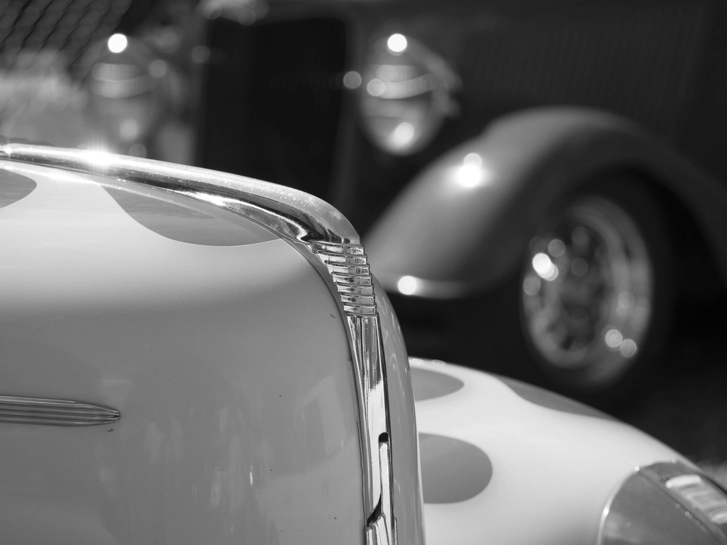
My mono re-birth has started slowly, but relentlessly.
This has started a few conversations both with others and in m own head.
One such conversation about the processing of colour vs mono bought to light the reality of the two mediums and it goes something like this;
With colour imaging, accuracy of the colour is vitally important unless it is being deliberately, creatively modified to control mood or deliberately buck reality.
Mono imaging needs to be tackled with maximum creative effort to be valid always. Unlike colour, it requires pushing, not accuracy (which is basically irrelevant).
Bold statements?
Totally off pace even?
Look at it this way and see if you agree.
A colour image has a point that is crossed only if the intention is to bend or deny reality. This would be done with mood in mind as the main trigger, because colour controls mood, but not much else. Colour can be stunning, bland, low or high impact, cool, warm or neither and is almost always the pivotal value to be controlled. In other words, when working with colour you have to choose to be either accurate or creative, but seldom both and often that choice is out if your hands.
This makes working with colour highly particular, but also very powerful. Get accuracy wrong when it is needed and you have a technically poor image. Creatively you can engender a variety of responses from emotionally compelling to outright revulsion. This is a sharp sword with two sharp edges.
Neither of the images above are close to accurate, but both elicit an immediate mood response.
To be honest, working professionally, colour is the bane of my life. Almost always shooting in mixed indoor light, I have to process for beauty and accuracy more often than any other consideration. Some of the rooms I shoot in (when flash is out of the question), are bland, dull, poorly lit and “beige” in the extreme, with messy backgrounds and usually a limited working area and time frame. Whole concerts have been shot under lighting that is less than pleasant. Nothing that cannot be fixed, but the fixing tends to be all consuming.
Black and White or Mono imaging has a totally different set of processing needs.
Mono removes the dual elements of emotion impact and depth perception provided by colour alone. Colour images automatically trigger emotional responses by their very nature (show someone the same image with warm and cool white balance set and see what I mean). The same can be said for mono images with tones applied.
In the set above, the first image has no immediate emotional impact due to having no inherent colour, only subject, composition and the viewers own take on mono images in general will have an effect. Much could be done to the image, but without a colour bias, it lacks an immediate statement, standing on it’s own two legs. The other two do make an up-front statement (a heavy handed one), setting their mood as the first thing perceived, subject and composition coming after.
Rule one; Only pure mono has no colour “opinion”.
Colour also helps us perceive depth, by “placing” colours more powerfully than tones alone can do.
This image to me is simply a yellow foreground contrasting with a harmonious, supporting red background, all other compositional elements are largely irrelevant.
In mono, the tones, textures and sharp-soft transitions are all important, but these do less to impart a feeling of depth and mood. They effectively flatten the image. The out of focus rio wire fence has become as strong a compositional element as the rear car, something largely ignored in the colour shot. The shot also looks flat, which brings us to the next bit.
Mono needs to be treated differently.
Something I find I do every time I purposefully re-enter the world of mono (deliberately, not when inspired by a specific image), is to treat it like colour. This is the first barrier to good mono imaging.
Just like in the film era, converting a colour image to mono rarely produces a good file. Why? It is because the world tends to be just shades of grey when the colour is removed. An image made up of mostly grey tones is dull and muddy. Green, red, blue, grey, orange, dark yellow are all basically a similar shade of grey when straight converted from colour. Mono film was designed to be sensitive to different colours differently, so that it would separate tones and coloured filters can also be employed for more control/power.
Grey tones are needed in a mono image, but they are weak on their own, they tend to need contrast, both micro (mid tone) and more globally (the extremes). If you do not do some serious prodding, straight conversions are as a rule pretty poor. Think of taking a Bell curve and turning it upside down. You want less convergence in the middle, more on the extremes and a steeper, sharper curve towards them.
First rule; make the changes your gut tells you to, don’t settle for the computers version, ever.
With a little tweaking, the flat jpeg file from above has come to life. The key word here is separation. You need to increase separation of the tonal elements in a mono image. It is not strictly necessary to always have a paper white or ink black in an image, but they are a good place to start. More importantly, the mid tones need to be separated well. In the above file, the yellow channel was lightened, the red one darkened and overall contrast slightly increased.
Tones, texture and brilliance.
After separation has been successfully applied, the three elements above are your next tools to apply.
Tones are part in parcel of the separation issue above, but they are also important to the greater image. Texture and tone share much the same space, allowing good contrast control


