Shooting sport without tracking AF

While looking at my future needs for possible sports photography, I analysed the actual needs of each type of sport and the techniques required.

Field sports.

Longer lenses allow for better focus as the subject moves less in relation to you. If shooting length ways down the ground, with decent depth of field, the single shot or continuous AF of even the EM5 mk1 will get the job done. If trying to follow action from the side, manual zone focus and timing will get good results.

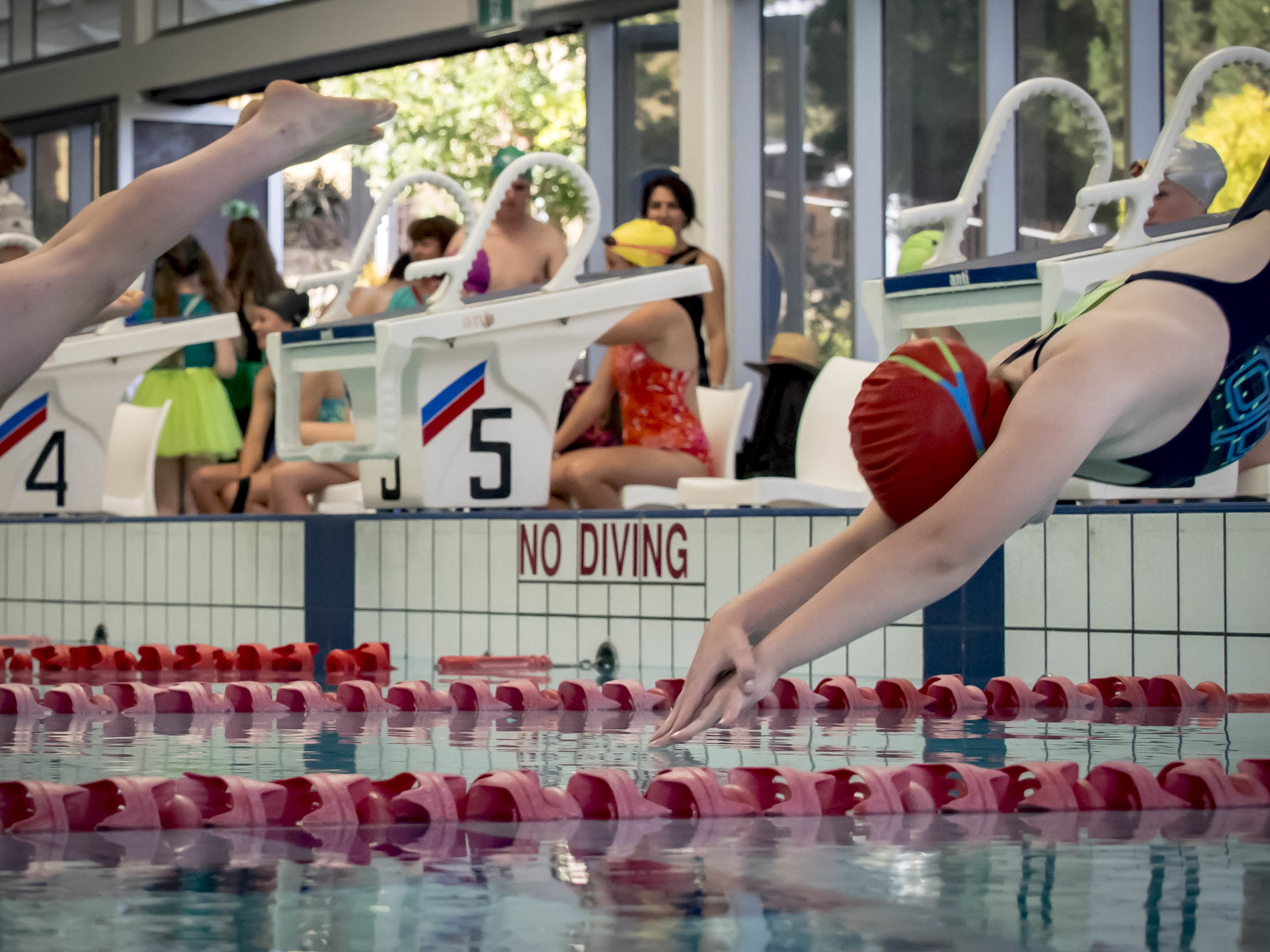
Swimming and distant athletics.

This is the one I did recently that started the madness. Manual zone focus will get diving in, the lanes guarantee the same plane of focus from the side and focussing on the "bow wave" of the subject will work for single or continuous AF for converging targets.

OMD 40-150 pro at about 100mm f2.8

OMD 40-150 pro at about 100mm f2.8

Short distance sprinting.

This is the tough one. How I used to do it was to focus on the runner about to leave the blocks (from the finishing end), shift focus once or twice down the track getting the subject with a short burst as they pass through the focus point and then settle focus on the finish line, usually zoomed right back (this can be achieved by memorising finger placement at each of the focus points). Using the most depth of field possible and with a bit of practice, a set of 10 or so good images out of 15-20 is the norm, including zooming. If shooting from the side, practice panning with good depth and a slowish shutter speed, the longer the lens, the longer the focus sweet spot holds. The long lens trick I learned photographing dragonflies in flight (remember to keep one eye on the action and the other on the eye piece).

IDs mk2 and 400 f5.6L. With the long lens, the 2-3 meter "hops" the dragonfly made were relatively small adjustments. Closer would have meant greater shifts.

IDs mk2 and 400 f5.6L. With the long lens, the 2-3 meter "hops" the dragonfly made were relatively small adjustments. Closer would have meant greater shifts.

Tennis and Netball.

I used to shoot a lot of Netball and found that the field sport techniques worked (shooting long down the length or zone focus from the side), but you also have the opportunity to do some high or low wide angle and short lens work around the goals or base line in tennis.

The trick is to be smooth and gentle with focus, no jerky movements and trust to depth of field if available. Single shot AF is ok as long as the total process of focus and fire is not slower than the subjects movement. Practice on moving cars is good to. Shoot wider than needed as 16-20mp has plenty of cropping power for web work.


This an example of a 2-3mp crop of a failed "trap focus" composition. One of the reasons good corner sharpness is handy.

This an example of a 2-3mp crop of a failed "trap focus" composition. One of the reasons good corner sharpness is handy.

Fighting G.A.S.

I have a slight case of GAS (gear acquisition syndrome).

I decided I should look at the merits of tracking autofocus in the M43 world as I shot some sport and may have some more on the horizon. 

Even though I have rationalised the benefits away for the level I will be working at (high school), the lure of the new will not go. Even old new, the EM1 mk1 is calling to me. I am fighting false promises, shunning the reliable and well known for the new and exciting. I need to count my blessings, take stock of what is good, what is working and move on.

One of the best things to do is get my gear out, clean and check it as I find the intangible tends to over shadow the real when my imagination takes hold. I learned this trick with Canon gear. I had more of a problem settling on it, even stressing over the physical look of some of my lenses.

Yep, take a breath.

Yep, take a breath.

remembering old tools

I often wonder (don't regret really, just ponder) what it would be like to have just the best custom kit for each job*. A specialised landscape, sport and street/travel kit.

One lens/camera combo that I would have kept for that thinking, if that was how I chose to go would have been the Canon 1Ds mk2 and the 400 f5.6L. The lens, like my other favourites from Canon, the 70-200 F4L and 135L, was not stabilised, but it hand held well, easily lower than it's reciprocal focal length/shutter speed equation.

1Ds mk2 with 400 f5.6L with 1.4 teleconverter wide open at 1/125th, cropped to 1400x1700 from the image below.

1Ds mk2 with 400 f5.6L with 1.4 teleconverter wide open at 1/125th, cropped to 1400x1700 from the image below.

The OMD sensor has similar properties and the same pixel count, but the quality out of those old Canons was way better than anything I had seen before and the colour more natural than the lush colour of the current crop (much like the Olympus look). I remember showing a friend, a 5d mk2 user, an 8x10 of the above and telling him the long list of compromises made to get it. I don't think he believed me until I showed him the "full monkey".

The full file.

The full file.

Ahwww, cute. 5d Mk2 and the same lens.

The lens was a giver. I remember trying to convince a customer to buy it over the 100-400L, but he went with the versatility. He later regretted the decision after we compared identical images from similar cameras. To top it off, after selling it and the 135L to a shop in a neighbouring city, I found out from my wife, that a friend from her work bought them both and has them back here. Haunted still.

The Olympus glass is the equal of the Canon I had (the 45 is nearly identical to the 85 f1.8 in look and performance, but less than half the size, the 75 matches or beats the 135L, 40-150 is better/faster/longer than the 70-200 f4L and the 75-300 surprisingly close in end result to and easier to use than the 400 and a little longer), but if I had held onto those lenses they would have been (were) the nucleus of a good SLR sports kit.

*Fuji for landscape (14, 18-55, 60 and 90 macro), Olympus for street and portrait (17, 25, 45, 75) and Canon for sport (24, 40, 135, 400). Selling and buying gear for me has been a bit of a merry-go-round and I don't regret most transactions, but some clear thinking in hind sight would have spared me from selling off a couple of camera and lens combo's that just worked.

The ideal is one kit that works (that I have), but it is sometimes fun to remember past successes, just not dwell too much on the ones that got away.

Art for art

I did a little shoot today, launching a school production season with local talent done well, Matthew Garwood as the speaker. 

EM5 mk1 ISO 3200 40-150 at 150 f2.8. Not bad for a "tiny" and "old" sensor.

EM5 mk1 ISO 3200 40-150 at 150 f2.8. Not bad for a "tiny" and "old" sensor.

Amazing ink. Very Asian inspired and very well done.

Glad I bought the big lens. It allows close shots, with very a good success rate.

Hope there are more of these types of shoot.

Big Weather and free food

Thunder storm brewing, we can hear it rolling in. Pizza guy just tried to deliver a paid for Pizza to us (right address, wrong name), but too honest. Madness abounds.

OMD 40-150 at 40mm. Editing consisted of darkening the "black's" slider, reducing noise for smoothness, adding clarity to separate the cloud details and a bit of contrast added.

Early images rediscovered.

I just found a bunch of images from my first trip away to Melbourne with the new EM5. They are processed (as possible) jpeg's as RAW was not available at the time. 

The first five are with the older 20mm Panasonic, the next two are the 45mm Olympus and the last one was with the 14mm Panasonic. When I worked in the shop we used some of these to sell a lot of OMD/Pen cameras. I was blown away with the ease that images were achieved at night (exposure peeking, stabiliser, lens sharpness wide open etc.) and that enthusiasm rubbed off. My comparison was to Canon "L" glass and crop frame SLR's used in Italy the year before. 

Colour vs Mono #4

Another pairing off. This one comes and goes with me. The mono image is cleaner and better balanced, but the cool colours show the late time of day and inclement weather better. 

The mans shoulder is balanced well with the umbrella and the background lights are effectively invisible in the mono image. In the colour one, the umbrella colour, the pink lights and the mans neck and collar become much stronger. The colour image shows a strong contrast between the cold light of the time of day and the artificially lit elements.

OMD 17mm f1.8

OMD 17mm f1.8

Colour vs Mono #3 No winner

Another look at the contrast between mono and colour processing. No superior choice here to my mind. I honestly cannot choose a "winner". The vibrant colour vs the restful tones. Both work but differently.

Pen F 75mm f2

Pen F 75mm f2

A trait of some converted images is they can look "dirtier". The mono image needed a lot of spotting out of a dozen or so tiny, but noticeable black spots on the front column. They are in the colour image, but the strength of colour hides them. When reduced to tones and textures only (with an increase of contrast to make the mono image stronger), they stand out a lot more.

Two conversations

Both taken from the same spot, with different subjects and different treatment.

The first image screams opulence, youth, maybe arrogance, but definitely status or the attempt to display it.

The mono version of this looses the critical gold of the phone and the complimenting background colours, but the Apple logo stands out more.

Pen F 75mm f2

Pen F 75mm f2

The second image has a much more humble feel. Someone, not necessarily worried, but with something on their mind, distracting them from presentation as they fall into habit.

The colour version of this image has a mish-mash of badly coordinated hues, cold and drab, but the mono version strips them away. 

Pen F 75mm f2

Pen F 75mm f2

Two days, two lenses

Two days spent in Melbourne last year doing street photography and some shopping. Day 1, finding my rhythm, using a wide angle, pre focussed and shooting at waist level. The images have that tell tale "up from under" look (that I like) as it makes the subject look bigger, more interesting and with that lens, it adds a sense of drama. EPM-2 and 17mm

The next day, a little later in the morning, I went with the 45mm on my OMD as the corner I had found myself was bigger and the light more dramatic.

Odd thing. Both sets were processed using my mono preset with a little exposure balancing, but have a quite different look (granted the light was also a little different). The colour and contrast of the two lenses is different, so maybe the mono pre set affects their images differently. I love the "organic" nature of the 17mm images, but prefer the clean brilliance of the 45mm images. The 75mm and 17mm look to have a similar colour palette, the 45mm is deeper/darker and richer, a bit like the 75-300 and the two f2.8 zooms are a close match to each other also.

Just love watching people being people. Images turning the constant flow, the organised chaos into frozen moments to be savoured, giving more each viewing. Each face has the thoughts of the day ahead or of things left behind. Reminds me that we are all the same in the end.


bathroom cyanotype

I don't usually muck around with my images with overt colour filtering, but on this occasion, a Cyanotype look fit better than a straight mono image.

OMD 25mm

OMD 25mm

My wife has collected some cool things over the years.

shadows of 1948

Heard of Ansel Adams? If you have an interest in photography and are over 30 you most likely have and if not, but still aware of photographic history, then you probably have as well.

Every one who knows of Adams has a favourite image that comes to mind when his name is mentioned. It's part of our photo memory bank, from which inspiration is drawn. Mine is less usual than most. 4 of my top 6 Adams faves including the top one, are colour.

Not everyone is aware he shot colour and Adams himself was no great fan, but Kodak insisted and he obliged. A portfolio of his images was launched in book form in 1993. An interesting time as the digital colour flood was still a long way off and landscape was equally strong in both mono and colour large format (or smaller) film. 

Not Adams. 1Ds mk2 100mm macro

Not Adams. 1Ds mk2 100mm macro

The thing that hit me was the subtlety of the colour. I was using Fuji Velvia at the time, as were most and the gentleness of the early Kodachrome images came as a pleasant surprise. Several images (Caladium Leaves, Honolulu 1948, Tree, Barn, Hills Livermore 1950, Green Hills, Gilmore 1945 and Aspens, North Rim 1947) are still what I aim for in quality (and "quality") when shooting landscape. These are 60+ years old and still cutting edge! The lime greens, soft pinks and openness of the lighting and colour are natural and realistic, transporting you there timelessly. They are a testament to the power of subtlety and Adams' skill with a medium he actively disliked.

Recently I discovered a smaller reprinting of the book (A4 with A5 prints, the first had A4 prints with large page borders) and grabbed it, intending to add it to the collection as a "reader" with the older tome safely shelved. Then I opened it.

Who ever decided that the images needed to be Photoshopped to within an inch of their life has obviously never seen the originals or has little idea about photography. My poor attempt above is gaudy and crude when compared to the Adams images, but is weakly postulated when compared to the over saturation, over sharpening and sometimes added graduated neutral density filtering, not present in the originals. They may as well have hand coloured his mono work. It was also a reminder that high end book printing in the late 20th century looses nothing to more recent reproductions.

If anyone was unsure of Adam's health, this book would have been proof enough of his passing. 

I should have purchased it as an example of what not to do, but unfortunately there are plenty of examples of blatantly manipulated or just poorly reproduced classic work on the web. If you google any of the above images, you will find huge variation in rendering. How can this be so blatant when the originals are in a form that inherently denies change or misinterpretation. The problem is getting so bad that it is hard sometimes to be sure you are looking at the "real" version. Adams, Sam Abell, Willian Allard, Alex Webb, McCurry (with his blessing?), the list goes on and on of photographers past and present who are represented by both the true, original reproduction, that may well change slightly over time as technology changes and their Frankensteins' monsters of poorly conceived "modernised" copies. The problem with messing with colour film images is, they were shot with the film chosen to give the desired result, or the choice was limited, marking a point in time when all images of their type looked the same way. Bringing them into the now with heavy handed techniques, often only based on trends, nullifies their value.


Not very japanese

Things you do not see much in Japanese cities, that are quite common in other parts of the world are graffiti and the homeless. Not sure the guy in the background is homeless or just travelling, but the graffiti is real.

Pen F 17mm

Pen F 17mm

This exposure was taken close to dark, processed lighter to reveal the interplay between the characters.

Colour vs Mono #2

Another example of the colour, mono shape change. First the colour image.

Pen F 45mm f5.6

Pen F 45mm f5.6

The colour image has only two strong colour elements. The mans warm skin tone, matching in with the woods and rusty metal and  the contrasting blue in the tub and his overalls. In this case I really like the play of the two complimenting colour groups.

The mono image arguably has more texture/character, but the impact is lessened in direct comparison to the colour version. I also think the man blends into the background too much, but a bit more processing could help that.

Again, you may disagree. I find when I am in a strongly colour or black and white only mood, I tend to be intolerant of the other.

Mono-colour showdown #1

I just came across another good example of an image changing "shape" when turned to mono.

Pen F 45mm f4

Pen F 45mm f4

In the image above, the two men are simply and clearly placed in the centre of the frame, their expressions and poses are the photo. Black and white can get a message across very clearly, but the down side is the relative two dimensionality of the image.

The second image shows the effect colour can have. Even though the two men are the main subject still, their message is diluted by, or inclusive of, the colour elements of the image. The red letter box (slightly darkened in post), the rusty sign, the red gum boots, blue shorts and the yellow of the cart and crate all stake their place in the image. Even the relatively insignificant logo on the chest of the man on the left jumps out more in red rather than grey. If these things were important to the story being told or they created a sense of depth, then they would be useful. In this case, they are, I feel, simply distractions to the central message, although the red and yellow elements do balance themselves out well enough.

Which do you prefer? It matters not. We are all entitled to like either, both or neither. My favourite (against the norm) is the mono one. Well at the moment anyway.

Fleeting moments and tough editing

This image is a good example of "almost".

The man in the background and some technical issues (motion blur) are going to relegate this one to the not quite folder. Shame as I like it.

Pen F 17mm 

Pen F 17mm 

The Quiet ones

Usually after a trip, I start the editing and processing work immediately. Too many files, too fast tends to lessen the impact and quiet beauty of many images. One of my favourite times is months after the initial editing, revisiting those gentle little images lost in the whirlwind. 

Pen F 45mm. somewhere in Kyoto.

Pen F 45mm. somewhere in Kyoto.

perfectly imperfect

Like people, I think that plants can be interesting when they are not "perfect". growth and life are a cycle. there may be a definable pinnacle, but what about the rest of the time? When faced with perfection we often fail to see details (maybe the magic of perfection is that we don't dwell on detail), but imperfection allows us to look for both the remaining good and the true nature of the lost and decayed.

OMD 12-40 40mm f4

OMD 12-40 40mm f4

Processing this image was more about less, not more. The colour was desaturated and the red of the fallen petals reduced in impact to help settle the composition.

shadows of the past

My early influences were, for the most part American fine art photographers working in the 1970-90's. Many, but not all, used large or medium format cameras and came from the "beauty found from seemingly nothing" school. I have decided to open my own heart back up to these image maker's style, rather than try to move away from them as I have been since digital came along. This year (for me) is the year of retrospection. Always growing is the right path, but growth comes from a beginning and I have been ignoring my beginning's for too long. The images I still respond to are the ones I have always responded to. No gimmicks, no tricks, no short term fads, just honest (as photography allows) image making of real things to the highest degree possible.

OMD 12-40 at 40mm f5.6

OMD 12-40 at 40mm f5.6

You have to be true to yourself.