Looking at some images that the Pen f produced, I made a discovery that set me back a bit.
Some of the best images I have produced from the Pen F with 12-40mm f2.8 (some of the best 12-40 images I have) were jpegs.
I don't use jpeg files. I have tried a couple of times, especially when I used Fuji cameras, but kept coming back to the safety and flexibility of RAW. I must have decided one day to find out if the jpeg corrections in the Pen are as good as they boast. I guess my answer is in the fact did not notice them afterwards as anything less than excellent.

Smooth and luscious.

Not much artificial haloing or "crunchiness".

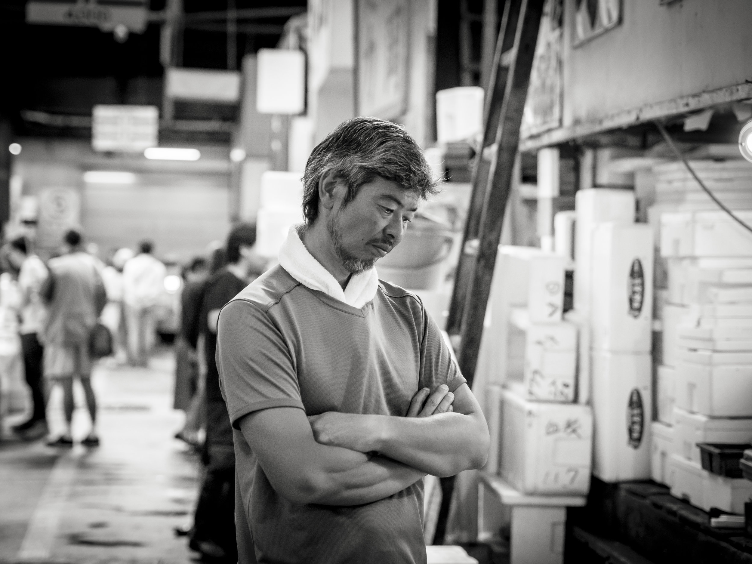
Again smooth and vibrant.

And on closer inspection, nothing to complain about.
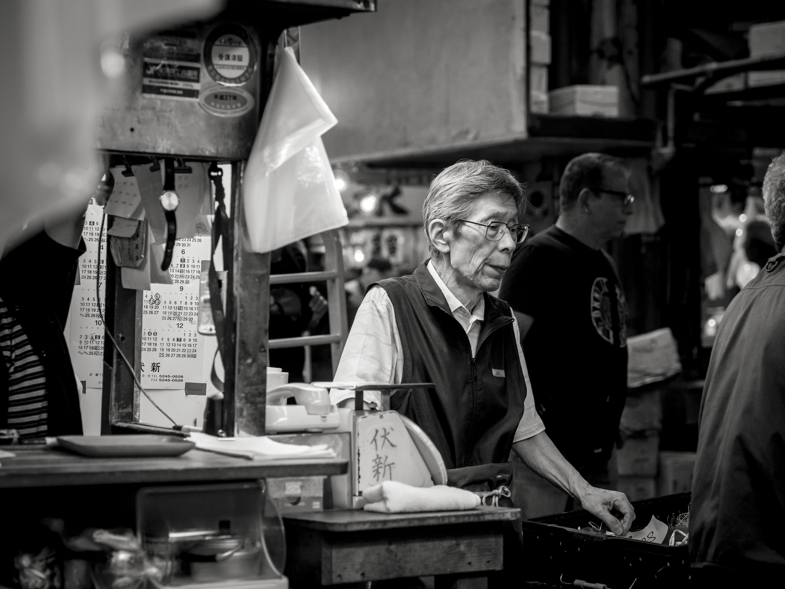
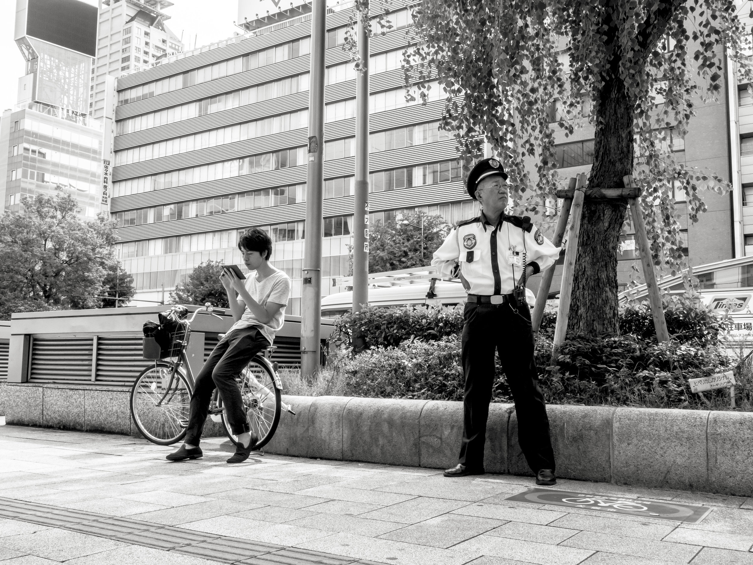
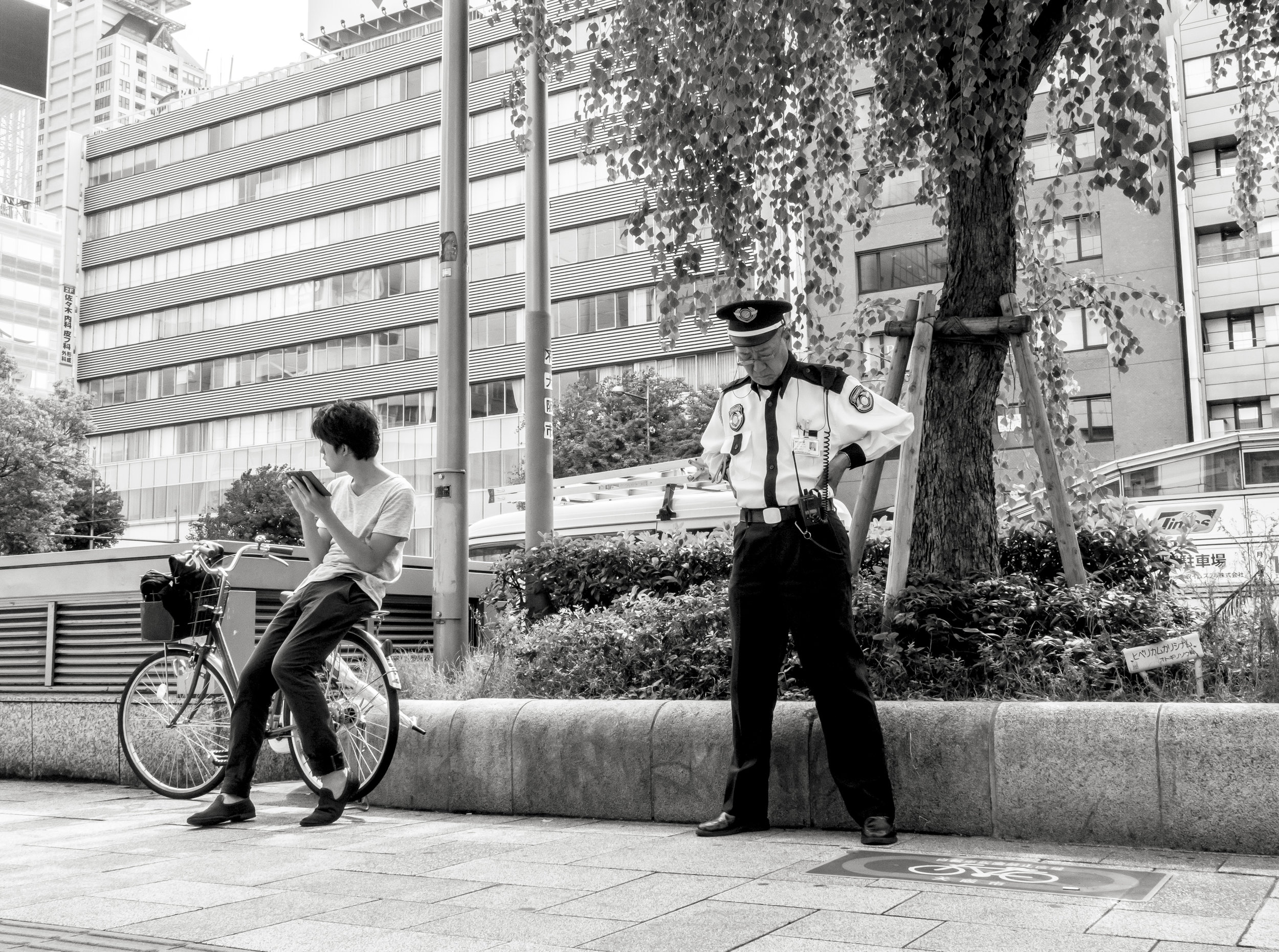
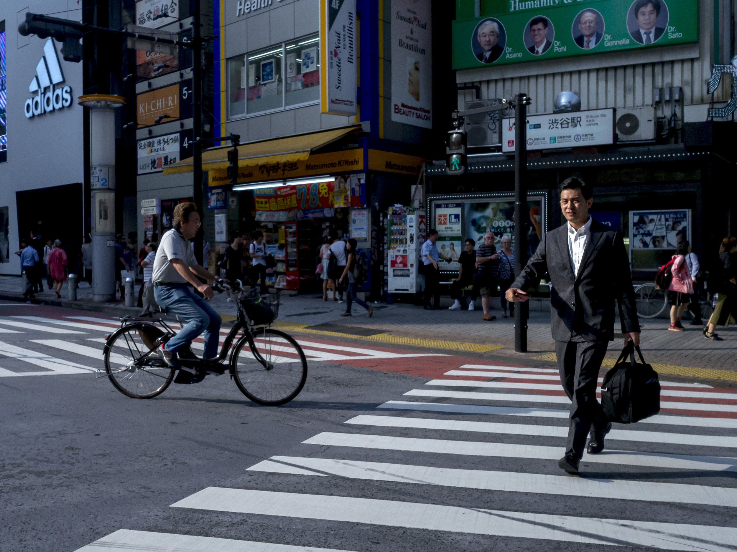
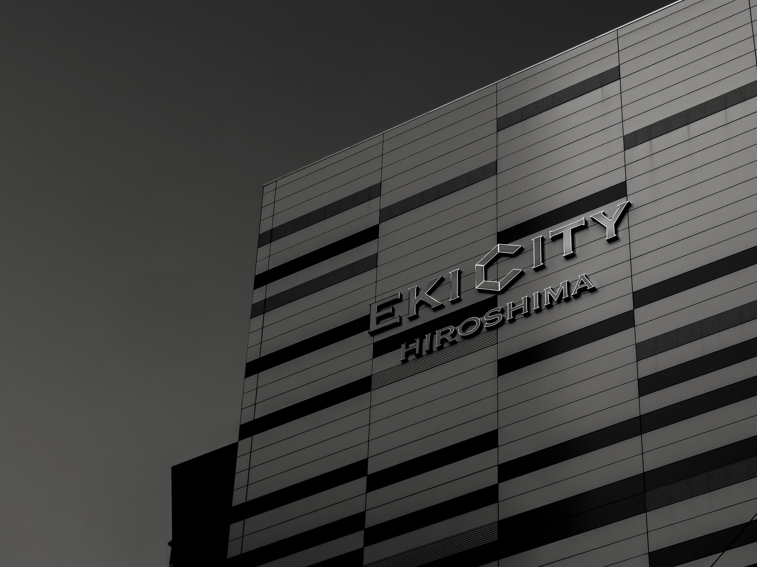
Shot with electronic shutter at 1/12800th sec and f3.2

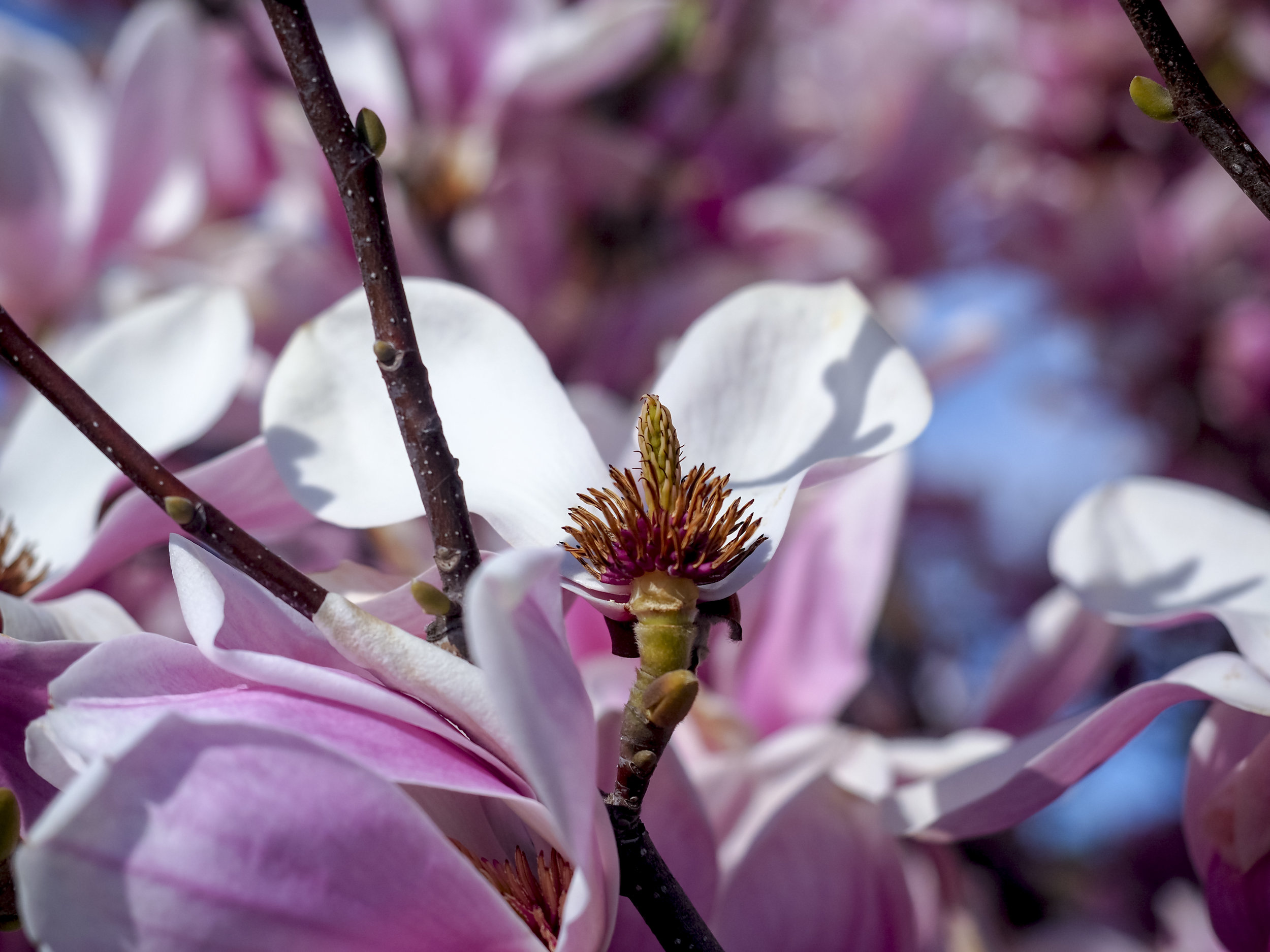
This one looks a little unnatural (slightly too perfect) around the fine details, but this would smooth out in a big print.

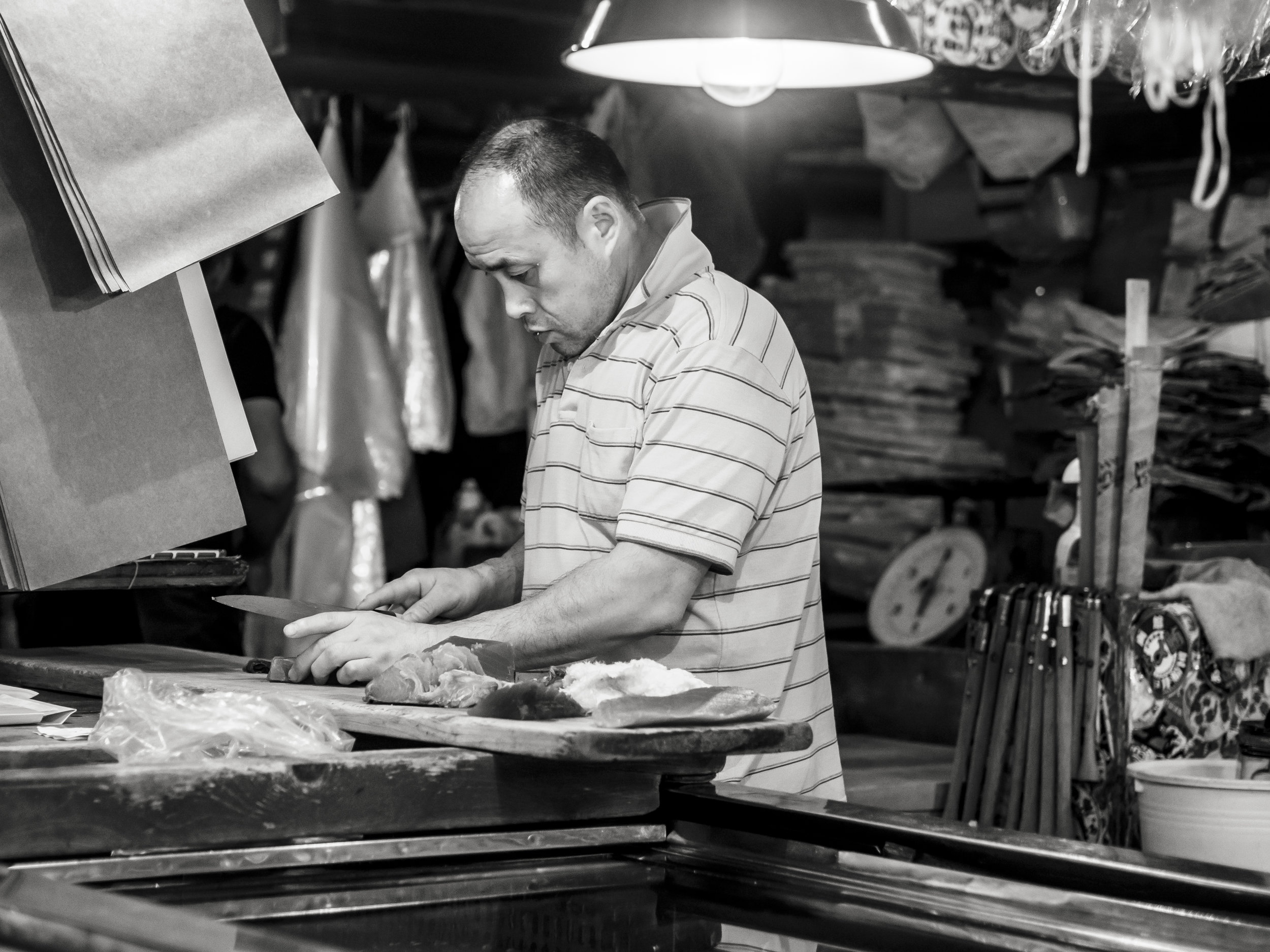
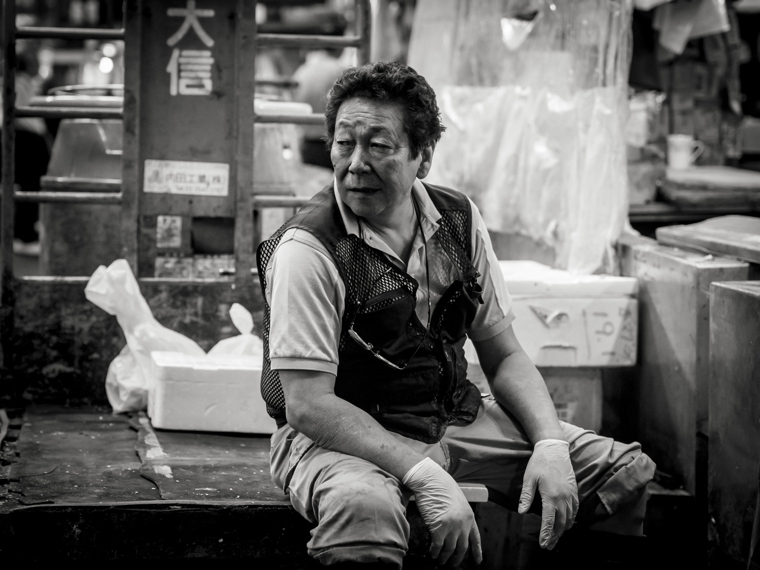
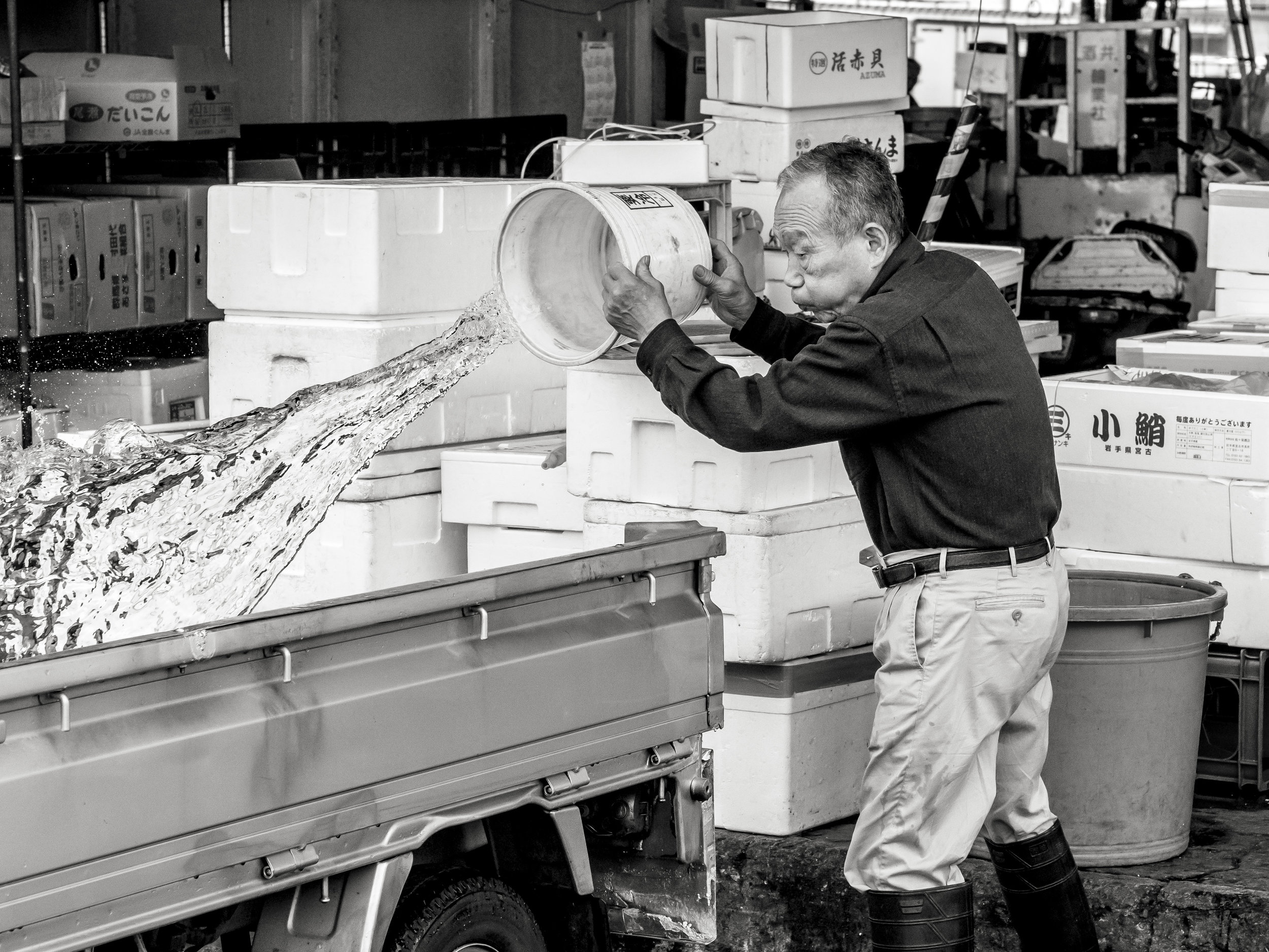
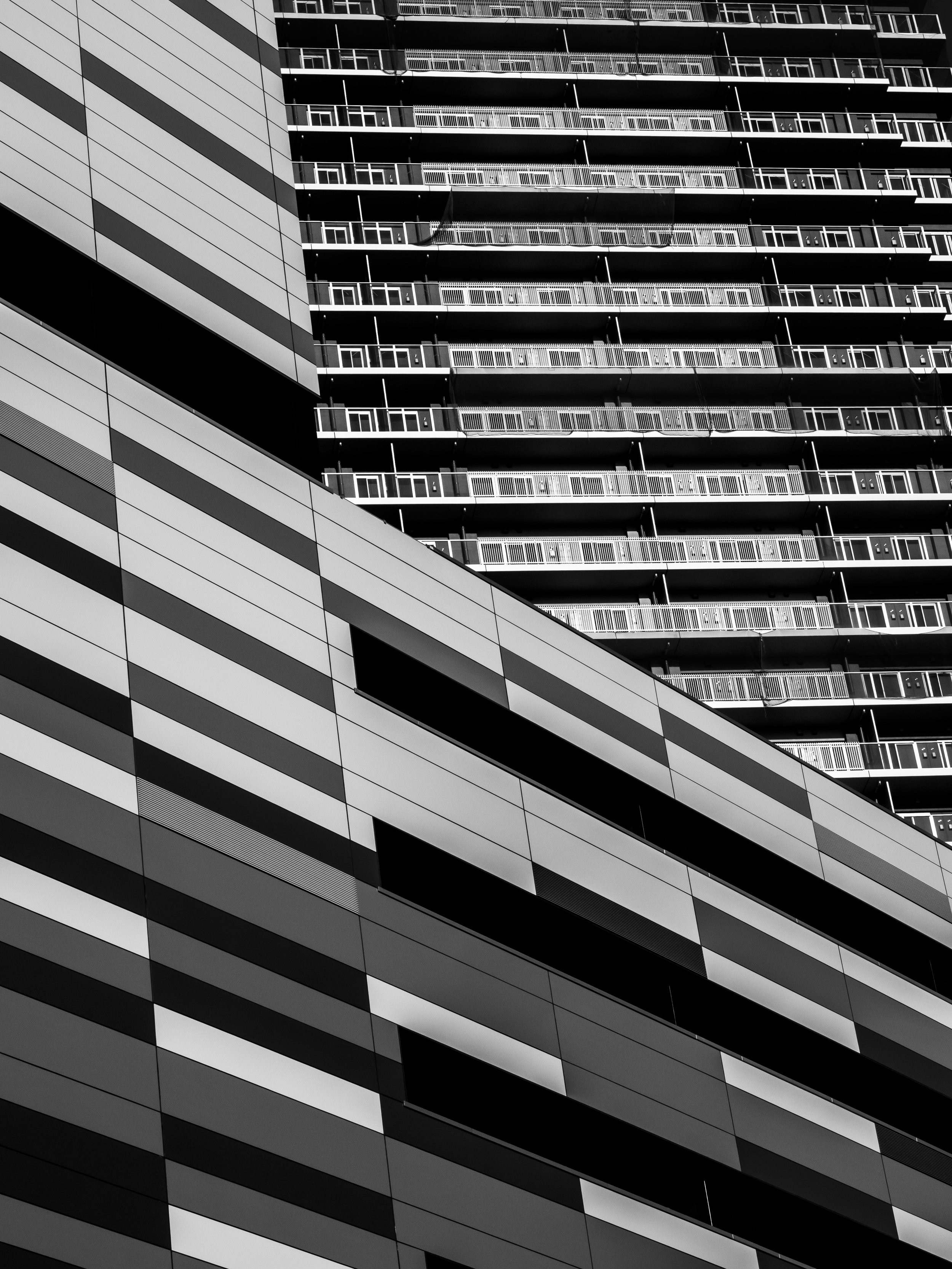
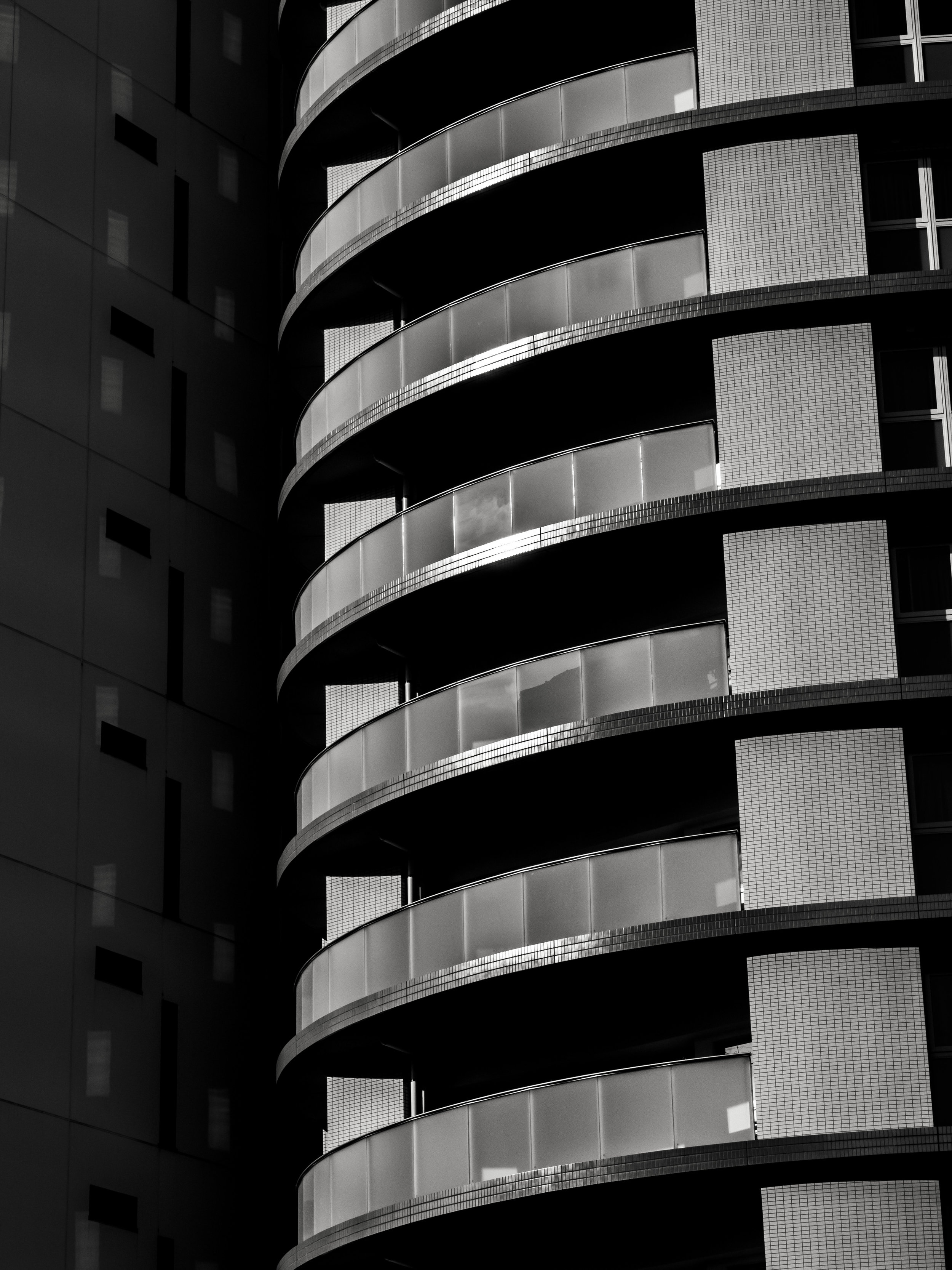
The bulk of these images were shot with the electronic shutter at the longer (supposedly weaker) end of the lens.
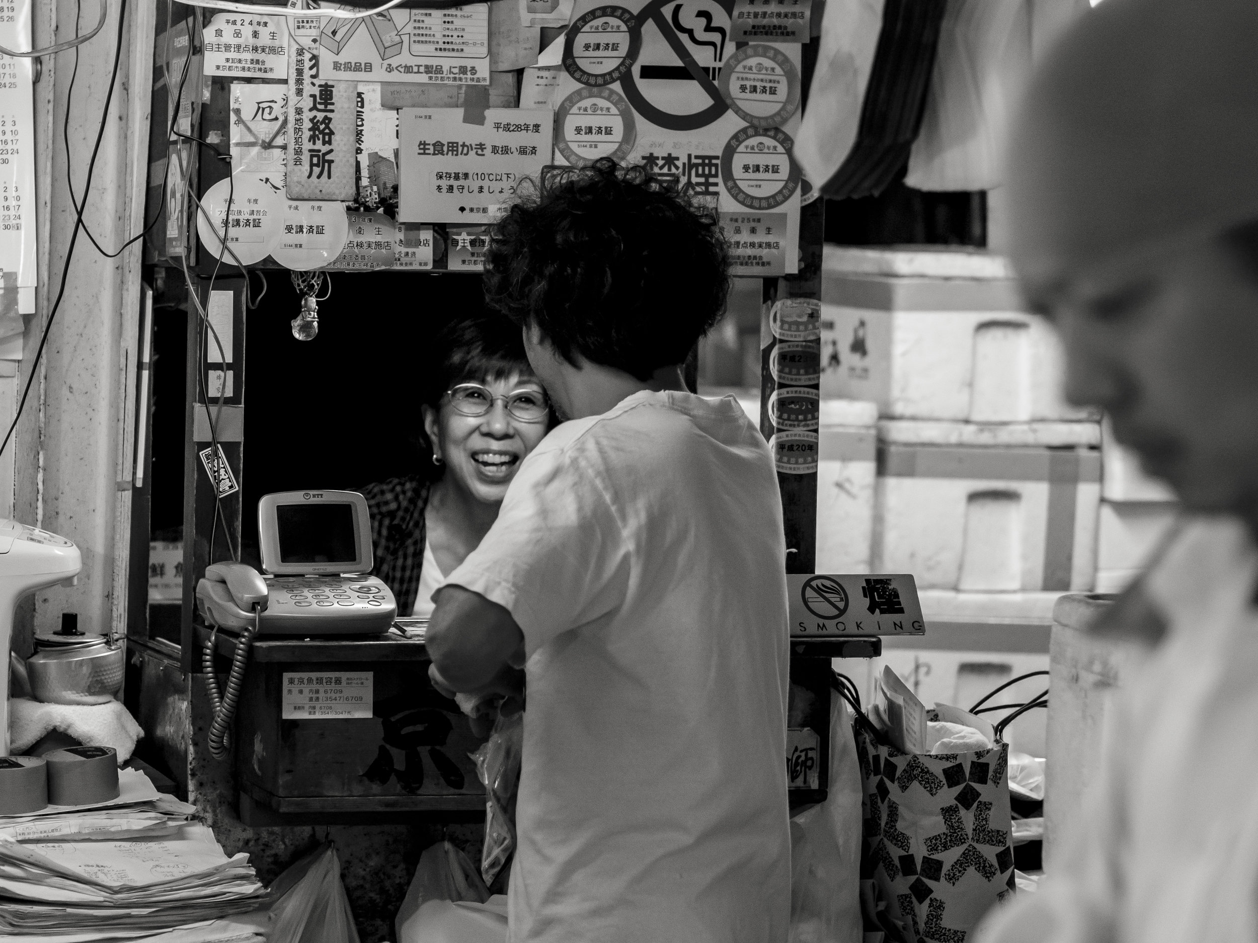
What I have come to realise is my opinion of the zoom is based on this set of images, on this day with this camera, in this mode. Other times I have used the lens, I have not been as impressed. I honestly did not realise they were all jpegs until today when I looked closely at the flower image and it gave a hint of "over processing". I have played with these files a bit and they have been excellent and flexible, granted the exposures were all pretty spot on.
So a wholesale change to jpeg files? No, not yet (I wish!). Colour and Mono choices alone will restrict that until I have done some more testing. What I will do however is use the Pen F on jpeg and RAW from now on, especially with the zooms, just in case the jpeg gets me to where I want to be quicker, cutting down on a lot of processing and storage space if the RAW can be dumped. Another option is to shoot RAW and process the images in camera, allowing the Olympus fixes to be added before down loading (using Olympus's own RAW processing programme is not an option due to poor work flow).
The logic is if the good work can be done by the camera, then the negative adjustments (exposure, deliberate vignetting, selective colour reductions and brush work etc.) can be completed without further harm. It is generally only additive editing that jpeg files limit as they have already dropped so much unused information leaving little room to add more.