Revelations

I have been thinking and writing a lot recently about my take on the differences between colour and black and white image making. This has touched on several different influences and avoided a few others, but today I stumbled across the one truly important matter or segregation between the two forms.

Emotional response.

Our response to an image is often formed quickly and draws on innate pre-conceptions and feelings we use every day to make decisions. Within seconds we decide on the emotional “flavour” of an image when forming the basis of our response to it. We can (and ideally should) find something deeper in the image, but often our first impulses form our lasting opinion of the work.

The effect of colour is immediate, but sometimes shallow. It is often the foundation stone of an image, setting the scene before any other elements are recognised and can often be the only element of measure.

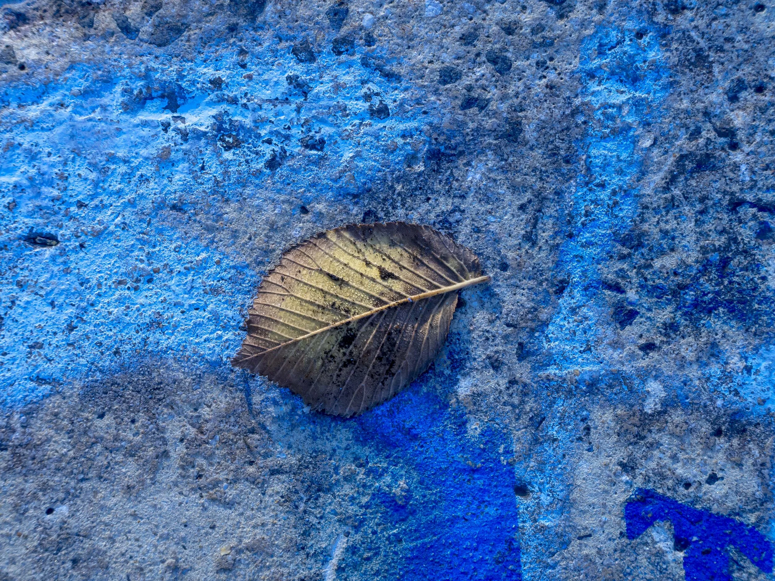
Effectively a mono tonal image, blue instantly conjures up thoughts or early mornings, deep shade and cold. In actual fact this was a warm morning, but it was early and in the shade.

Effectively a mono tonal image, blue instantly conjures up thoughts or early mornings, deep shade and cold. In actual fact this was a warm morning, but it was early and in the shade.

Take colour out and you have a more “bare bones”, modest and plain image, relying on the next level in of information to help you form an opinion. It is of course possible to tone a mono image or even to create a mono tonal colour image, but without strong application of colour, the image is forced to open up. To bear all.

Colour has it’s place in our work, especially if strong and immediate emotional responses are needed, but it may also disguise a deeper message, or even the lack of one.

Colour can be used for a cheap shot, often unintentionally, as we have evolved to respond to it, so we take a shot, but our mistake was to follow through with an otherwise weak image, taken based on this response. This surface trigger is one I am slave of and (I think) this is where my problem lays.

Each of the images below works for me on some level in black and white and colour.

The sets as I see/feel them;

1) Warm summer evening vs brilliant winter day.

2) Deep shade in warm weather and the glasses dominate vs anytime, anywhere, but the face dominates.

3) Late afternoon light, yellow and orange objects dominate (and hold it together) vs anytime, wall textures and contrast dominate.

Which ones push my buttons? Unfortunately for me I cannot easily choose. Part of this may be a natural tendency to shoot for colour, weakening my mono conversions, or most likely, an in ability to break from that very knee-jerk response I am discovering in myself. For my wife, it was much the same colour/mono/colour, but she did say that generally she would prefer a mono image hanging on the wall.

Both of the wall studies have a pleasing gentleness due to their colour, but glow more and display stronger graphic elements in mono. The portrait is a little mysterious in colour, but adopts better balance in mono.

Conversely, the basic blandness of a world without colour can be emotionally draining. You must switch your way of seeing to an unnatural method, ignoring colour and looking only for form and content. We evolved responding to colour, but we also evolved to be better than just our surface instincts.

To combat this, somewhat ironically, we can add back some colour as a mood trigger. Does this add to a stronger image or revert it to a cheap trick, colour hit?

Below are 4 different takes on the mono image in the set above.

  1. The first has darkroom style manipulations (the darkened glasses, added grain and vignetting).

  2. The second is tones for warmth. The toning was applied with the shadows slider in Lightroom, which is similar to toning paper.

  3. The third image is tones with a colder blue tone, again to the shadows mostly.

  4. The last is “split” toned, which is where Selenium and Sepia were used, one effecting the highlights with a warm tone and one the shadows with a cool, reddish-purple tone. A hazardous and time consuming technique, but uniquely powerful when perfected.

So. Is the path to use black and white and all the tricks traditionally (and in mimicry of tradition) used to enhance it?

My Lens Options For Black And White (Zooms)

The previous post touched on a subject dear to my heart, analysing the character or actual photographic application of my arsenal of modest lenses.

The primes were easy, as they are consistent and relatively well known to me. Zooms on the other hand are difficult to pin down. By their very nature they will change as zoomed, both in technical performance and in visual characteristics.

Lets give it a try though.

The 12-40 f2.8

Fast becoming a favourite again after selling my first, this lens has a similar feel to the 25mm f1.8. It also has in common with the 25mm a good close focus range and a rich, glowing personality. This is an XP2 film like lens, able to be a little adaptable, never harsh, even if pushed, and reliable. Bokeh is generally “new school” again matching the 25mm. It blurs out so smoothly, it has been blamed for some softness, when poor attention to depth of field and/or focus was the actual culprit. Originally only purchased to give me a wide angle for work, I have become a convert to it’s charming ways. It just makes this “primes only” guy, feel all warm inside. The lens also balances perfectly on my EM1 and covers a good range up to the surprising kit 40-150.

Just nice, as usual. Good black and white candidate? Will I be able to avoid the call of colour?

Just nice, as usual. Good black and white candidate? Will I be able to avoid the call of colour?

The 12-100 f4

This one has pretty much the opposite character to the 12-40. The Bokeh can be a mixed bag, the sharpness is hard, even harsh and the micro contrast is through the roof. I once tested it against the 75-300 and although similar in edge sharpness at 100mm, the 12-100 showed a whole world of fine detail the 75-300 ignored. Insanely versatile and good at what it does for me (landscapes), I much prefer almost any other of lens for people and shallow depth work. This is like medium format Tri-X film, gritty tonally, but otherwise high quality. It also has very good close focus and stabiliser/AF performance.

Prone to slightly nervous Bokeh, this lens is superb if used within it’s strength envelope. Urgh, more freakin’ colour.

Prone to slightly nervous Bokeh, this lens is superb if used within it’s strength envelope. Urgh, more freakin’ colour.

The 40-150 (kit not Pro)

Bought in a cheap set with a second 45mm and new standard kit lens for my wife, I soon found myself treating it like one of the big guys. On my last two trips to Japan it became the invisible lens. Weightless and oh so handy, it went everywhere and was used indiscriminately. Strong micro contrast similar to the 12-100, lends it a feel of more than decent optical quality and other than it’s flimsy build quality, it offers good performance at a piffling price and weight. This lens has actually made me think of it as a “colour Tri-X” lens even before this process started. I feel what black and white will do for it is actually make it better. Without the limitations of slightly flat colour and middle of the road bokeh, it will shine as a tone and detail lens.

With stunning light and ample subject matter I asked myself “what more do you really need” shooting a long series with the one”el-cheap-o” lens. The some of the light in this image was almost unbearable bright to the eye. The little lens controlled …

With stunning light and ample subject matter I asked myself “what more do you really need” shooting a long series with the one”el-cheap-o” lens. The some of the light in this image was almost unbearable bright to the eye. The little lens controlled it well, saving me from myself.

The 75-300

What more can I say that has not already be said of this lens on these pages. I love it, I respect it’s giant killing capabilities and I am grateful that Olympus supplied a more than decent “filler” lens in this space. Better optically than the kit 40-150, mainly due to superior colour and slightly nicer Bokeh, this lens surprises again and again. It falls very much in the same camp as the 12-40 and 25mm lenses and is my go-to for shiny cars and brilliant light detail. It has little micro contrast, which has the benefit of letting it make nice images, without too much micro contrast baggage. It hides polishing scratches and skin blemishes that lenses like the 12-100, 40-150 (pro or kit) and 17mm would reveal.

Glowashious! This lens does this time and again. I can honestly say, processing the files from this combination of lens and subject matter is a total no brainer.

Glowashious! This lens does this time and again. I can honestly say, processing the files from this combination of lens and subject matter is a total no brainer.

Scientific analysis? No. This is more of a mojo type of thing. It felt good to revisit the kit after a break and to re-align my thinking for mono work. Lets see if it comes to anything.

My Lens Options For Black and White (Primes)

Black and white imaging brings to light different lens characteristics. These are not wholly different to colour lens characteristics, but sometimes the emphasis of these characteristics changes.

Since leaving the camera industry, I have been able to shrink my world down from shelves of expensive lenses, back to just what I know and trust. My humble 25 and 45mm lenses, which were assuming near cheap give-away status are again precious and appreciated friends. Already the self inflicted therapy is showing benefits.

The primary characteristics that mono will effect are contrast, micro contrast, brilliance and Bokeh*. Each of my lenses are pretty well known to me now, but not in a black and white context, where I suspect the subtle differences will out, but maybe not as I expect.

The 17mm f1.8

This lens has always exhibited high micro contrast and gentle colour, that I suspect will manifest as nice, film like roll off of tones and pleasant highlights. This will likely match a Tri-X** film feel, which I have heard referred to as a “cold” or fast roll-off film . This type of film rarely showed much “glow” or brilliance, but rather emphasised deep and gritty textures and expanded mid tones. This characteristic suits the lenses expanded, slow transition Bokeh, which also emphasises texture.

Not strong on shiny, but good on tone.

Not strong on shiny, but good on tone.

The 25mm F1.8

This has always shown the opposite characteristics to the 17mm. This one may be the Ilford FP 4*** film look alike, as it tends towards brilliant and generally more contrasty. Fantastic for reflected light, metallic and water subjects it should produce strong, deep blacks, glowing whites and compressed mid tones. FP style films was not a favourite back in the day, but I used it when it’s unique characteristics were ideal. Bokeh with this one is pleasant in the modern sense, but a little over the top for my tastes, going to smooth mush very quickly (I know I am off trend here, but trends are just that).

Lots of abstract miss-cues work with lenses like this as they render out of focus areas smoothly and add brilliance to blurred colours.

Lots of abstract miss-cues work with lenses like this as they render out of focus areas smoothly and add brilliance to blurred colours.

The 45mm f1.8

This one falls somewhere in between the 17 and 25. It shows brilliance when needed, but also offers haunting subtlety in mid tones especially and when light is difficult. Like the 25, it has forgiving, beautiful Bokeh, but more highlight control and like the 17mm it has tons of character. The slight flattening effect is natural, that is to say not too flattening (see below), which adds to the very natural feel the lens offers. I think this one will perform like XP2 film, which is the C41 colour process mono film, that has the unique ability to change character as needed.

These harmonious characteristics I hope will make the 45mm the work horse of the pack.

These harmonious characteristics I hope will make the 45mm the work horse of the pack.

The 75mm f1.8

Rounding out the 1.8’s is the powerful 75mm. It is by far the most opinionated of all of my lenses, flattening and separating subjects with little doubt to it’s intent. This is a lens with a task to perform and that it does with aplomb. It can be a bit of a one trick pony, so should be used sparingly or the near perfect look it has can become boringly predictable, like perfect days in the tropics. If I think of the beautiful tonality of Pan F 50, as a versatile ISO 400 film, I have maybe got a handle on this one.

This lens is so consistently good it has defied categorisation since I have tried. It shares both strong micro detail and tons of rich glow. It is sharp wide open and the colour is beautiful. The only issue it has, and the main reason I have avoided the f1.2 lenses, is it is a little too perfect, lacking character and a little unpredictability, that makes life fun. It is, and will always be, my “big look” lens.

Even though it provides a decent candid working distance, you still need to be a little careful.

Even though it provides a decent candid working distance, you still need to be a little careful.

*Bokeh, meaning the in to out of focus transitions of the entire image at all focussing distances and with any aperture, not just wide open and in your face.

**Tri X or the “cold” S-Curve films included (from memory), Agfa APX, Ilford Pan F, Delta and HP5 films. These films “round off” blacks and whites, strengthening mid tones. These films were often referred to as “gritty”.

***The “Hot” or steep S-Curve films included (again from memory) Ilford FP 4, XP2, Kodak T Max and Fuji Neopan films. These films tend to go into deep black and brilliant whites very quickly at the expense of mid tone range. Some even had limiters built in so they would not blow out completely. They tended to have a smooth tonal look.

Why Not Colour?

So, looking at the my ramblings on black and white, what can be said to solidify my feelings on colour one way or the other (keep in mind I do love colour and consider myself a colour image maker, but that is the problem).

Some of below touches on the last post’s thoughts, but needs to be covered for completeness and again, I am not promising to write anything other than a ramble-fest of disjointed thoughts, but this is my thought process.

Colour can confuse. Colour can take a simple message and dilute it’s power. Sure it can and often is the power of the image, but sometimes all it does is sap the power from an image. Poor light, uncomplimentary tones, blandness, can all reduce the clarity or strength of an image’s message. Sometimes, even a small spot of colour can distract the viewer from the true intent of the photo. Imaging an image of despair or poverty in one of the worlds less lucky countries, powerful in content and composition, with a back lit flash of yellow, contrasting despair with joy. Maybe that is the intent of the photographer, or more likely, that colour would be removed. Mono would simply turn it into a tone that could also be reduced, but only on brilliance if needed. The point is, the colour evokes a mood, which switches the emphasis from central subject and message to a peripheral impulse.

In the image above, your eye is drawn to the yellow and red parts of the image and away from the faces. In the mono image, the main subjects become the central focus again.

Colour can dominate. As above, colour is usually the visual bedrock of a colour image. This is at the core of the difference between colour and mono, “seeing”. Most, if not all colour images are colour first, other compositional factors second. Many of my personal favourite images (taken by other photographers) are based on the power of colour, but many of these can be converted to mono and be equally powerful. It is telling, that many of the worlds best photographers split their images between colour and mono, simply because their intent can sometimes be diluted by poor colour, but it can also be perfectly grounded by strong colour (Peter Turnley is a good example of this).

Without colour, what is this image? It is eye caching and it actually works ok in mono, but it’s suddenly just one of many texture based images.

Without colour, what is this image? It is eye caching and it actually works ok in mono, but it’s suddenly just one of many texture based images.

Colour lacks latent artistic compulsion. Colour is an interpretation of the mundane in an easily understood form. We see in colour, so we see colour images naturally. To be artistic or even iconic, a colour image needs to be transcendent, often manipulated or simply unusual. The subject needs to dominate the colour and the colour just get out of it’s way. Colour is obviously the main part of colour image composition and can be strikingly powerful because of that, but always on it’s own terms. I feel a mono image always asks for interpretation by the viewer, where a colour image can just “be” unless it elevates the viewer’s interest.

Black and white has the ability to transform my thinking, which I need to do to make the most of it. The deliberate reduction of options black and white forces, helps us focus our attention more sharply, because of reduced options (i.e. distractions).

In colour this image lacks a sense of scale, impact or abstraction. It is essentially just sand on a cool winters day.

In colour this image lacks a sense of scale, impact or abstraction. It is essentially just sand on a cool winters day.

Colour is always fake. As much as we might like to think otherwise, no colour image is literal to it’s subject. This has always been the case. Your choice of film, camera sensor, software, paper and even your viewing screen will have some effect of the accuracy of your colours. Mono is always consistent to the image makers intent (toning not withstanding). Colour’s variation leaves it open to fashion and evolving interpretation, which in turn creates time stamped periods of this-or-that look. Mono tends to be timeless, leaving few cues to the viewer. It also tends to withstand short term trends. Take a walk on the forums discussing the various brand’s colour interpretation and you will soon see that no one brand or process is really right over all others and nothing is consistent. Conversely, the mono forums are mostly concerned with film/film like or digital processing.

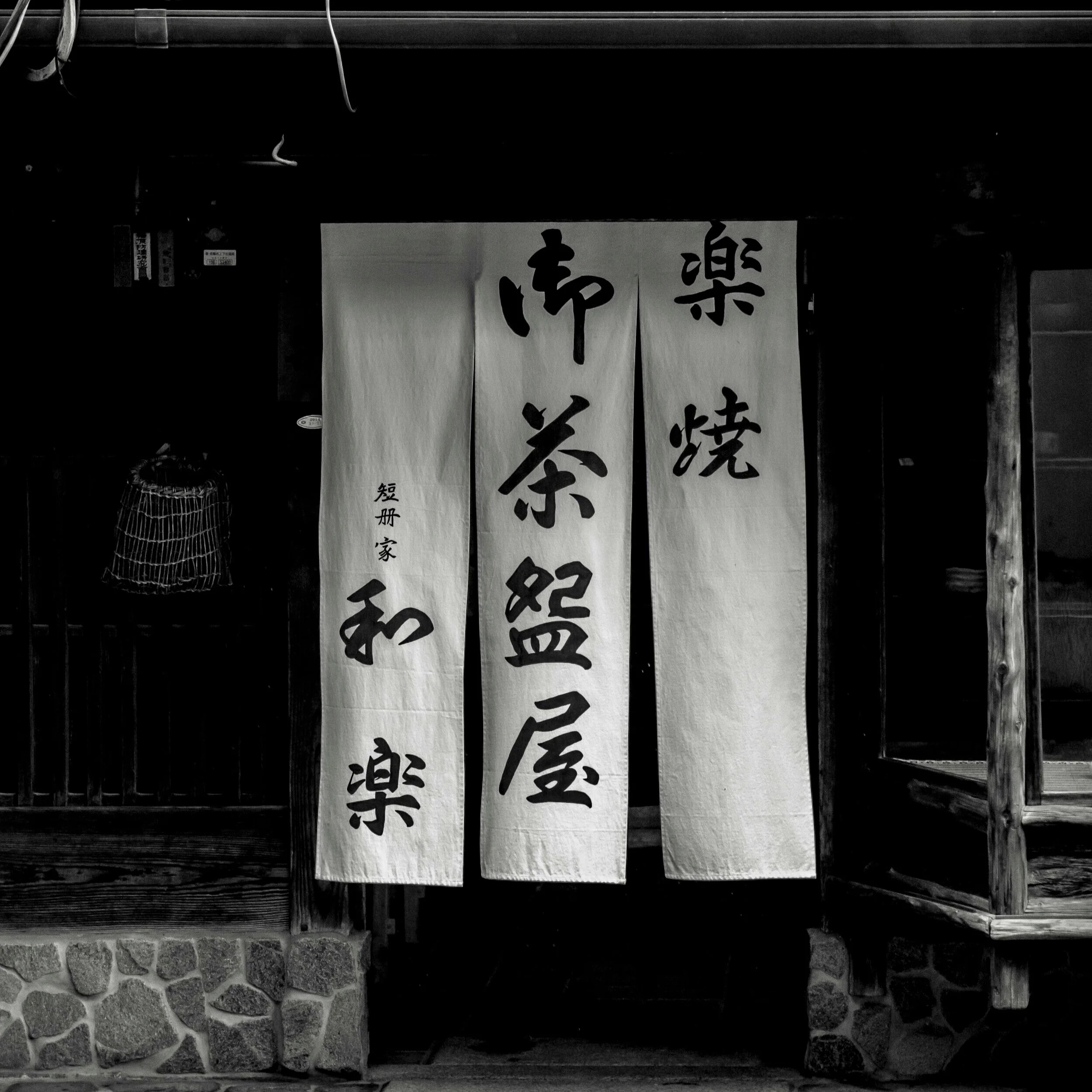
Kyoto back street restaurant 1973, Hasselblad medium format with Tri-X film, or 2017 EM5 mk1?

Kyoto back street restaurant 1973, Hasselblad medium format with Tri-X film, or 2017 EM5 mk1?

Colour is hard. Balance, interpretation, accuracy, or the manipulation of, processing fashions, technical constraints and limits are all part of colour image making. Talk to your present self about your current technical capabilities and preferences, then time trip back and chat to your 10 or 20 year younger self and you will have two very different conversations. This is not always a one way street either. My Canon using, 10 year self would be colour and processing obsessed. My 8 year younger self would be struggling with the colour from my OMD EM5’s which would evolve into a more enthusiastic advocacy of the “film like” look that I will now miss when I am forced to move on. Most of my own issues with bonding with the Olympus system, came from an allergic reaction to their colour after coming from Canon and Fuji.

Colour is easy. When the quick fix of colour is present, the image comes easily and naturally (or not at all). This makes me (YMMV) lazy and easily satisfied, but the resulting images are rarely outstanding. If the image also contains the elements that make it work in black and white, then the colour image is also stronger for it. If not, then the colour is all that is holding it together. Very few of my own favourite images cannot work in black and white and those that cannot are the weaker for it. I think, for me, the instant grab of colour can sometimes short circuit or even limit further thought processes.

A quick hit of colour. Red, orange and contrasting blue work on a base level with other, but In mono this image offers little, revealing it’s the overall weakness.

A quick hit of colour. Red, orange and contrasting blue work on a base level with other, but In mono this image offers little, revealing it’s the overall weakness.

It feels less like film. Feeling like I am still shooting film feels like my early excitement with photography has returned. Something has been lacking over the last few years. Digital colour is easily satisfying, but ultimately lacking depth of satisfaction for me. I blamed zooms over primes (still do), digital over film (still do), but shooting black and white has the strongest bridging effect to film like work habits.

The images do not get hung on the wall. I have a few of my prints hanging around the place (a series in the foyer of a school, several in family and friends houses etc) and they are all, except for one, black and white. The only colour one, hanging in our hall way needs subtle colour to work (revisit?), but my wife has recently expressed dissatisfaction with it in that space. She says it is too big for the space, or maybe it’s the frame? I think it is that colour has worn off. Have you ever noticed that most artistic photographs hanging in peoples houses are mono, but most family snaps are in more relevant colour?

In a nutshell, I can go on and on (and on…) about the benefits of one form over the other, but for now I need to face the reality that until I commit fully to the black and white process, I will never truly know the benefits on offer. Like any mild addiction, colour is the easy road, the well trod pathway that gives easily, but at what cost?

Why Black and White?

When I decided to embrace my new found freedom (short term and mostly illusionary it may be), my mind went instantly to black and white.

Why?

Not sure, but rather than fight the feeling, I have been trying to explore it without any pressure from my current, sparse, work practices, or any long practiced pre-conceptions. My usual process with black and white is to declare my desire, start the process and then come crawling back to colour like a sugar addict to candy.

I (we all) see in colour naturally, but some of us can also “see” in black and white. I am not sure I am one of these gifted few, but I have desire. Lots of desire. Ironically the enemy of film (digital) offers us the brilliant tool of seeing in mono jpeg through the view finder, while shooting on colour with RAW.

Now all I have to do is turn this desire into some discipline and turn out some work.

Here are a few things I have (re)discovered while pondering this newish direction (many trains of thought will overlap, but these are not the thoughts of a fully coherent mind, just the ramblings of someone trying to get a handle on their art).

Black and white offers no safety net. Stripping away the very thing that often attracts us, colour, requires the artist to respond with tones textures and contrast only. Black and white offers no “quick fix”. No eye catching, or mood forming foundation. It works on one level or it does not.

It is obvious what element makes this image. Would it be as relevant in black and white? Maybe, but it immediately looses the one thing that caught my eye in the first place, so it will have to work in another way. This whole series was shot with co…

It is obvious what element makes this image. Would it be as relevant in black and white? Maybe, but it immediately looses the one thing that caught my eye in the first place, so it will have to work in another way. This whole series was shot with colour in mind. I wonder if any of the images taken would have been taken for a similar series of mono images.

It is more artistically compelling. Mono image making is artistic by nature and realistically it is not much good for record keeping (your mind has to fill in too many blanks). It compels you to be an artist, because it is not particularly useful for anything else. It has always been a post-process based medium, which has much in common I guess with digital work flow. No black and white image maker now or in the past should feel constrained to try to create a purely literal representation of the world. It is not possible nor desirable. Ansel Adams is a fine example of an artist who developed deep and lengthy controls over his black and white image making, but was forced occasionally to shoot colour basically “straight” which he struggled with. In recent years I have been unfortunate enough to see what modern photoshop meddling can do to those colour images, but for 60 years of their lives, the images were left essentially untouched. His black and white work on the other hand seems reasonably impervious to tampering.

The colour image was similar as the visual elements are basic, but even the smallest amount of colour forced a mood response. In colour, the image was colder, in mono it has been toned warmer.

The colour image was similar as the visual elements are basic, but even the smallest amount of colour forced a mood response. In colour, the image was colder, in mono it has been toned warmer.

It is less driven by fashion. Mono is mono with small sub-sets of harsher, grainier and colour toned. Colour is much more a slave to what ever is “in” right now or is even limited by choices such of film stock or digital camera sensors/settings and will always show this out over time. Most colour images can be time stamped to their era as a visual record of slowly evolving technology or tastes. Black and white images are much harder to categorise. I have seen many subtle and not so subtle shifts in colour perception over the years, but black and white has the ability to withstand time, simply due to a lack of pesky colour. It must also be remembered that even though colour image making is often limited by the perception of it needing to be accurate to life, it rarely is anyway. For many years the world thought of exotic places, far away in a National Geographic, Kodachrome palette, then Fuji took ascendency, changing that, then digital. Ever changing, colour is a poor time-neutral observer, but it is excellent for recalling a feeling of time and place because of this.

It is easier. No colour balancing and fewer limitations forced on you by poor light or limited time. Tones, textures and contrast are all easily attained with even the most mundane subject in almost any light. Mono has many moods and can adjust as needed, but it can also shine just as well as colour when the stars align. It even simplifies the basic requirements of printing. This is of course a bit of a tempting trap. Seemingly simple, it requires a lot more than it would seem to work.

This girl’s red hair caught my eye, but the colour files never looked settled. Mono allows me better placement of the high and low tones and emphasises the shapes and textures, rather than being dominated by the colour of her hair (incidentally the …

This girl’s red hair caught my eye, but the colour files never looked settled. Mono allows me better placement of the high and low tones and emphasises the shapes and textures, rather than being dominated by the colour of her hair (incidentally the wall behind her was red also, creating a harsh balance).

It is harder. It forces me to push for more honest visual strength without falling back on any habits of lazy gimmickry, which colour can do. If you see an eye catching red leaf on a green mossy rock? Don’t get too excited, because all you will have to use are tones, textures and contrast, which may not translate well as the colours do, not to mention the inevitable deflation taking the colour away can inflict. Mono makes me (us) work harder and look for excuse free visual impact through strength, or subtlety. Nothing comes for free. Basically, mono has little tolerance for weak crap, held together by simple colour tricks. It challenges us to see differently from the conventions and triggers evolution has made us respond to.

Editing is fun and freeing. Editing in colour forces rigid decisions on the photographer. Push too hard and the image shows it, push too little and the natively unprocessed image looks flat and uninviting. This is exactly the same dynamic as colour film. You are forced to use what you are offered, limiting your controls to basic film/digital file choices (which ironically forced a specific palette on you), then you pushed and pulled within those constraints. Exceed this and your image falls under the umbrella of over Photoshop art. Black and white invites you to experiment. It almost demands it.

Mixed and difficult light, compounded by poor exposure, dominated this colour image. Much of it was nullified by switching to mono. This also highlights the flattening effect mono has, making the Bokeh vitally important as out of focus areas move to…

Mixed and difficult light, compounded by poor exposure, dominated this colour image. Much of it was nullified by switching to mono. This also highlights the flattening effect mono has, making the Bokeh vitally important as out of focus areas move to the same visual plane as the foreground elements of the image (in the colour image, the girl on the far left was a cool pink-blue, contrasting with the warmer natural light in the foreground, making her feel further away).

Editing needs constant review and realignment (and courage). Editing black and white images well is a difficult art. Basically, the biggest problem for me is remembering what is important and staying true to the path. Just going out and shooting some colour images and converting them in Lightroom is not going to do the job. You need to shoot for black and white from the get-go. Editing a good black and white image is often a fine line between too much and too little. True some of my favourite mono images have been salvage jobs from poorly realised colour files, but you put enough monkeys up trees with type writers….

The colour file was washed out, milky and flat. The images problems translated into character in mono, complimenting the subject.

The colour file was washed out, milky and flat. The images problems translated into character in mono, complimenting the subject.

Black and white changes the shape of the world. Mono images change our perceptions of depth, mood and relevance. The single red leaf in a sea of green, the yellow taxi in the distance that creates a feeling here-to-there. These are all gone. the world often seems to flatten out, often brighten and visually equalise in black and white.

Technical concerns become less limiting, maybe even more creative. Technical constraints in colour often come down to noise degradation at higher ISO settings, sharpness and colour quality. With some (though ever fewer) cameras, these can be severely limiting. Colour noise is not nice, just as colour film grain was less than ideal, but mono grain in either medium adds texture, which is just as valid as any other contrast controlling tool. Sharpness also has few useful tools to apply in colour and these are easy to over use. In black and white, natural contrast abounds as part of the process, offering strong clarity tools without making an image look too harsh or manipulated. This gives you more options and flexibility as the limits of naturalness forced on you with colour, are far less defined. The Lion image above was a good example of a bad colour digital file. The texture added by refining the noise into film like grain does nothing to diminish the image’s power and even helps to fix other issues it had.

It is abstract. This is a little difficult to sell as I find colour is also good for abstraction, but mono generally suits abstraction well simply because the things that make it work are a combination of abstractions wedded together the make a coherent whole. Abstraction is just the removal of more or less of the key indictors or form and shape.

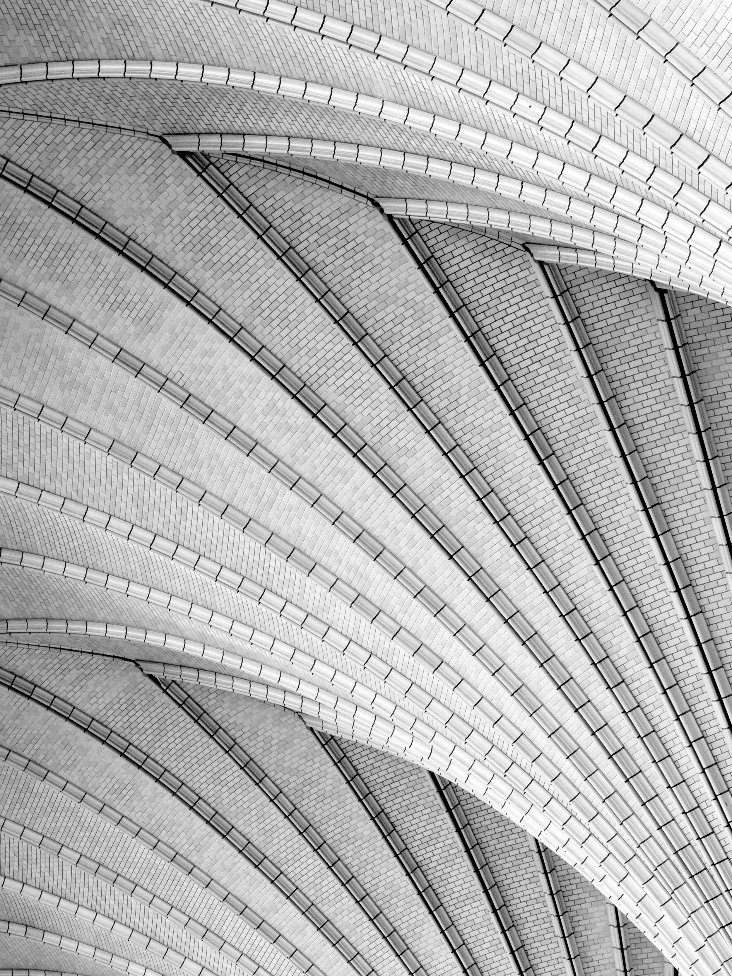
These tiles were basically mono anyway, but switching to true mono enhanced their clean strength, removing any hint of colour induced, mood bias.

These tiles were basically mono anyway, but switching to true mono enhanced their clean strength, removing any hint of colour induced, mood bias.

It is accepted. Black and white has spent many years on the fringes of the art world, working often fruitlessly for acceptance, never fully competing on an equal footing until relatively recently. We forget though that for most of it’s life black and white was the grown up or “real” photographic art form and colour was lucky to ride on it’s coat tails, desperately trying to cash in on the left overs. Black and white images as old as 150 years are highly sought after, but colour has had a much patchier journey. Sadly, when colour was finally finding it’s feet, digital saturation has diluted it’s power. Strangely, mono has retained it’s integrity.

It is different. The more pictures that are taken, the more marginal variation becomes. The simplest way to be different is to do something off the main stream and do it better than the average. Mono has been a little lost over the last decade or so, so it is ripe for a few dedicated souls to get back on the train and ride it for all it is worth. The best advice I can give is pick up a few books of film shooters work, like Michael Kenna, Salgado, Nick Brandt etc and give yourself a visual refresher of what mono is capable of. Even Adam’s relatively ancient The Camera, The Negative and The Print trio of books are still relevant.

It makes me work differently. This one is a given. I use different lenses, see things differently and work towards different goals when shooting in mono. This goes back to my film days, but with jpeg mono previews it is even easier (which is good because I am out of practice). I have no doubt that my photographic brain changes shape when I consciously shoot for mono.

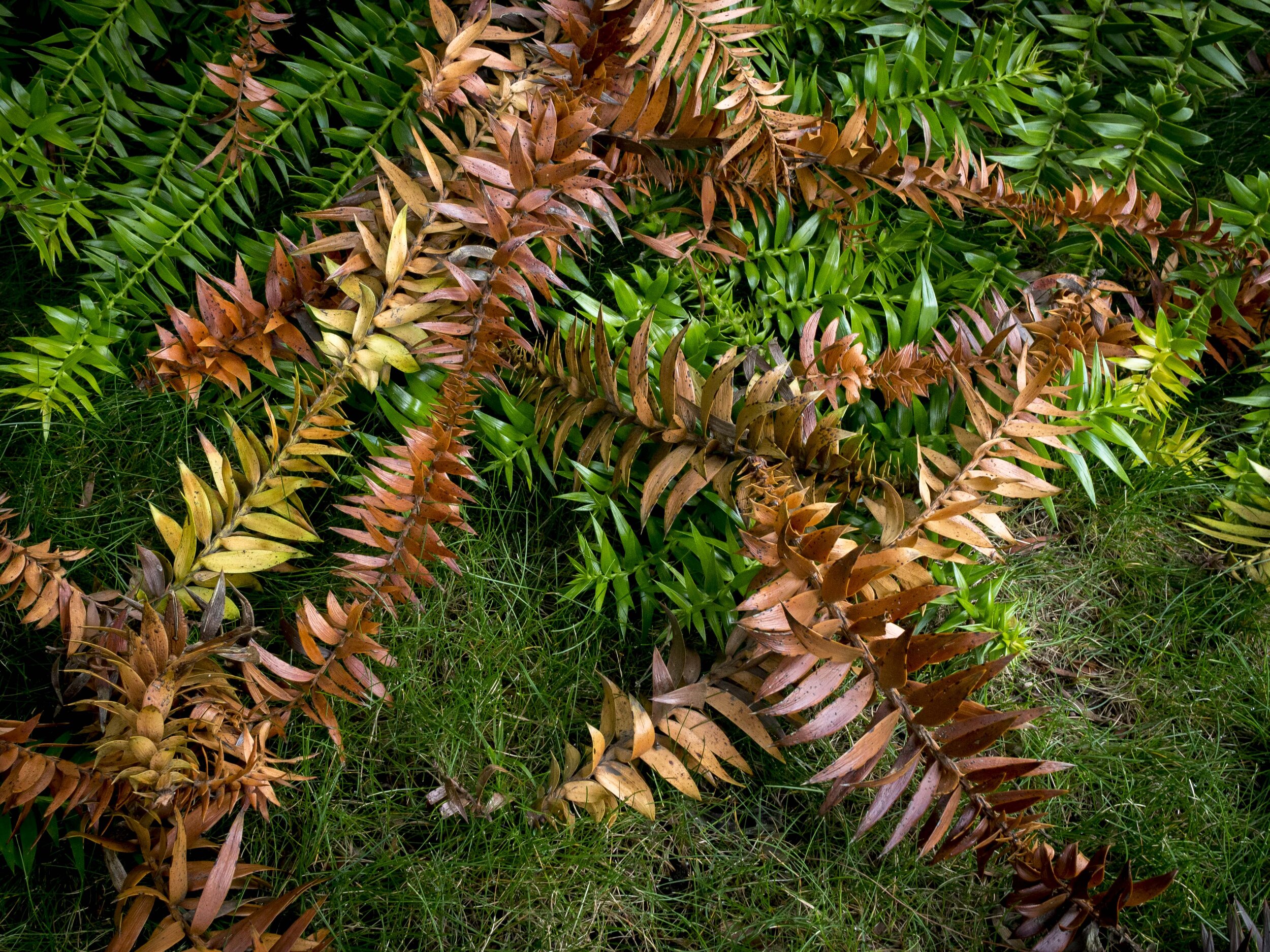
Nothing to see here in colour, but the flat, unexciting tree line was specifically chosen to show the power of black and white for some subjects.

Nothing to see here in colour, but the flat, unexciting tree line was specifically chosen to show the power of black and white for some subjects.

It is a challenge to stick to it. I find mono image making sometimes……too grown up. It is a bit like watching something educational on the TV. You know you will be better for it, but the lure of pure, no strings attached escapism is strong. I feel black and white image making makes me a better photographer and I have a good track record with it, but it always seems to be the more serious road to take. I think I respond too strongly to colour in an instinctive emotional way and often fear black and white will strip too much of that mystery and discovery away. Like any addiction, the more I apply myself to the “one true path”, the less I miss “the dark side”. My usual process is to shoot colour and “see” mono images occasionally in them, but maybe I need to do the opposite (or both?).

It will make me a better colour image maker. I certainly will not abandon colour, but the more I train my eye with mono, the stronger my foundations for future colour images will become.

The Fine Art of Fine Art

It has been a long time since I have tapped anything out for this blog. There are a few reasons for this, but the main one is photo industry burn-out.

This is not, you must understand, photography burn-out, but it has the same effect. Being close to the industry 5-6 days a week leaves me apathetic to the more important things in the “greater” art form of photography.

The things that matter to me (content integrity, produced as still pictures with simple, soft touch and realistic processing) are usually pretty battered and bruised after endless weeks of the opposite, so the last thing I feel like doing is picking up my own cameras.

How bad did it get?

My most powerful bits of gear (EM1, 12-100) were in our front window on consignment for a week or two and I doubt I would have looked back if they sold.

The fix, which was simple and direct, came out of the blue.

I quit!

I will miss the customers, the good photographic conversations and the other staff (and the pay check), but in the short term, I need to give the process, as I like it, another go.

Preparation

  • A single camera, set up for black and white landscapes at the moment, (Pen F in the Tri X setting, but RAW master files).

  • Three batteries, three cards, a tripod and a mechanical cable release.

  • The 12-100 f4 and 75-300 with polarising and ND filters.

All of this fits into the small Think Tank Turnstyle 10 bag, which is ready to go near* the door.

Process

The thing that has been lacking, is a clear, un-interrupted run at the actual doing of it. Between work shifts with rarely 2 days in a row off and never three or more, dogs walked morning and evening and being an attentive husband (I hope), time flies. I have often felt that three equal parts of work:self:family, is a good balance for me (with no kids).

I have found that the reality of “embedding” myself into the process in a meaningful way, needs at least three days in a row of full immersion and the longer the better. It needs to be done until you need to walk away from it, not the other way around.

Once, this was automatic, but life changes and time constraints with it.

To my shame I have a new printer that has had little use, a premium “oh I dreamed of a lens like this” bit of glass in the 12-100, that has been used three times this last year and a perfect mono landscape camera in the Pen F, also languishing in it’s bag.

This will change.

*Lucy and Daisy still amaze us with their playfully destructive games, so the bag is not left at ground level!

How To Be A Content Micro Four Thirds User Part 1

In photography, especially in the sales/purchasing/technical comparison and review side, opinions abound. I have many and I am sure so do you.

One of the main areas of debate falls in the sensor size arena. I am on record already as saying I think the future (immediate that is) of serious cameras will take two divergent paths;

The first is the “smart” camera stream. These cameras are not smarter than other cameras by default, but they will need smart functionality to stay relevant. Their sensor size (1” to 4/3) dictates that technological advancement is needed to keep them relevant and viable when compared to their competition.

Which is;

Bigger sensors, more pixels, larger cameras and ever larger lenses. This stream of thought looks to have no short term upper limits, even though we have realistically reached the point of sufficiency. They just keep offering stratospheric pixel counts on ever increasing sensor real estate. This hunt for more is what makes the little guys relevant. If bigger is better (only because it is bigger), then smaller has it’s place as long as the returns allow.

My feet are reasonably firmly set in the smaller sensor camp, with occasional bouts of the small sensor jitters. These qualms go away when a little grey matter is applied, but I cannot claim to be completely immune to the call of lower noise at higher ISO settings and wider dynamic range, even if I know these are un-needed for me personally.

Logic does not follow that a bigger sensor will make my images better, in fact quite the opposite (there were many sound reasons I left the full frame camp), but the mind does play tricks.

With this in mind, I intend to do a short series of articles on “How to be a content 43 user”. There will not be a lot of deep thinking involved, just sounding out what I have found over the last half a dozen years with the system.

Remember, it’s all in the lenses

The secret sauce for me with M43 is in the lenses. One of the format’s reasons for being, and a major reasoning behind going back to a squarer format* is better/easier lens design. The only other move as radical in recent years is the extra wide, extra deep lens mount in “Z” Nikons, but the 43/M43 consortium, unlike all other makers, bravely chose their bespoke format from day one with lens design in mind.

What this means in practical terms is great glass that is small, cheap and very consistent even at the low end. The squarer sensor allows the lens to cover it corner to corner with less spread. A lens designed to cover a 3:2 ratio sensor needs to cover an area in effect much wider than the total sensor area, making them either larger than needed or providing softer extreme corners if size and cost are prioritised.

The advantage the format has in depth if field then plays it’s part, as the small and fast glass, that performs so well across the frame, can be pushed to it’s limits regularly. In my own experience, using a f1.8 prime wide open is not an experiment in “one look” dramatic Bokeh but rather a practical application of the amount of depth of field you need while taking advantage of as much light as the lens will allow. Every aperture is useable. This also holds true for landscape imaging where you effectively gain two stops of speed, handy for poor weather shooting. Ironically, many full frame shooters gravitate to the work horse f2.8 zooms, which offer the same DoF as wide open f1.8 M43 primes, but with 2 stops less light (which is often the practical ISO performance difference).

Is the Bokeh hungry shooter going to miss out?

No, because the same focal length (acting as a a longer lens in this case) will still provide the same effect as shorter lenses on bigger formats (a 50mm in any format will offer the same DOF at the same distance with the same aperture, just a different perspective and magnification) and many offered lenses have pushed apertures to as wide as f1.2 or even f0.95. This has the benefit of offering double magnification in much smaller and cheaper lenses. These lenses are powerful tools, that can be regularly used wide open creatively and practically, unlike their super fast larger format cousins, which can be creatively same-ish when used at their maximum aperture regularly. You can put an f0.95 M43 lens in your pocket, but Nikon’s new one comes in it’s own case!

Taken with the 75mm at f1.8. A similar lens on a full frame camera would offer identical depth of field, but only half the magnification or a longer lens would only give half the dof at the same magnification.

Taken with the 75mm at f1.8. A similar lens on a full frame camera would offer identical depth of field, but only half the magnification or a longer lens would only give half the dof at the same magnification.

Coming from one of the two traditionally dominant brands with some dated, though still current at the time, expensive and heavy Canon glass, M43 was a revelation. Tiny, super sharp, fast focussing and sporting all new lens designs, M43 offered what I was sick of waiting for from the big guys. Also every lens is designed only for the one format, not the patchwork quilt of ageing “Pro” grade full frame glass mated with an almost adequate smaller frame filler range.

My first sobering revelation came from comparing my much loved 35 f1.4L mk1 on a 5D2 to an EM5 mk1 and 20mm Panasonic mk1. The first contrast was size and weight (about a 5:1 difference, not counting camera), but it was in results that the little guy wowed me. Sharper wide open and in the corners through most of the range, it was only in focussing speed that it lost out, but mirrorless came through again offering better accuracy (and faster focussing in all future lenses). The lens was so superior, it bridged the massive format difference. Sure, things have changed, but I would still back the new 17 f1.2 against the new version of the Canon at half the price and weight.

There is no doubt we are at the dawn of a new super lens era and M43 is just as relevant in this space as anyone, it is just tackling the problems from a different direction. The 12-100 pro, various f2.8 zooms and f1.2 primes, even the cheap f1.8 primes are cutting edge, but effectively industry sleepers due to their format. Once you try them, your want/need perspective can drastically change.

*The squarer M43 format is not the odd one, the 3:2 ratio 35mm “full frame” is the relatively new kid on the block. Not wide enough to be called a true wide format, not square enough to be a practical size for publication, the 3:2 ratio format is actually at odds with most of the industries needs and took a full generation of shooters before it was accepted. It is the widest non wide format and the squarest wide format, managing to do neither well. I remember reading many “smaller is better” articles in my youth, defending 35mm against the bigger formats (much as this article is now for M43), but the shape never sat well with everyone, especially editors.

Good Light in Nara

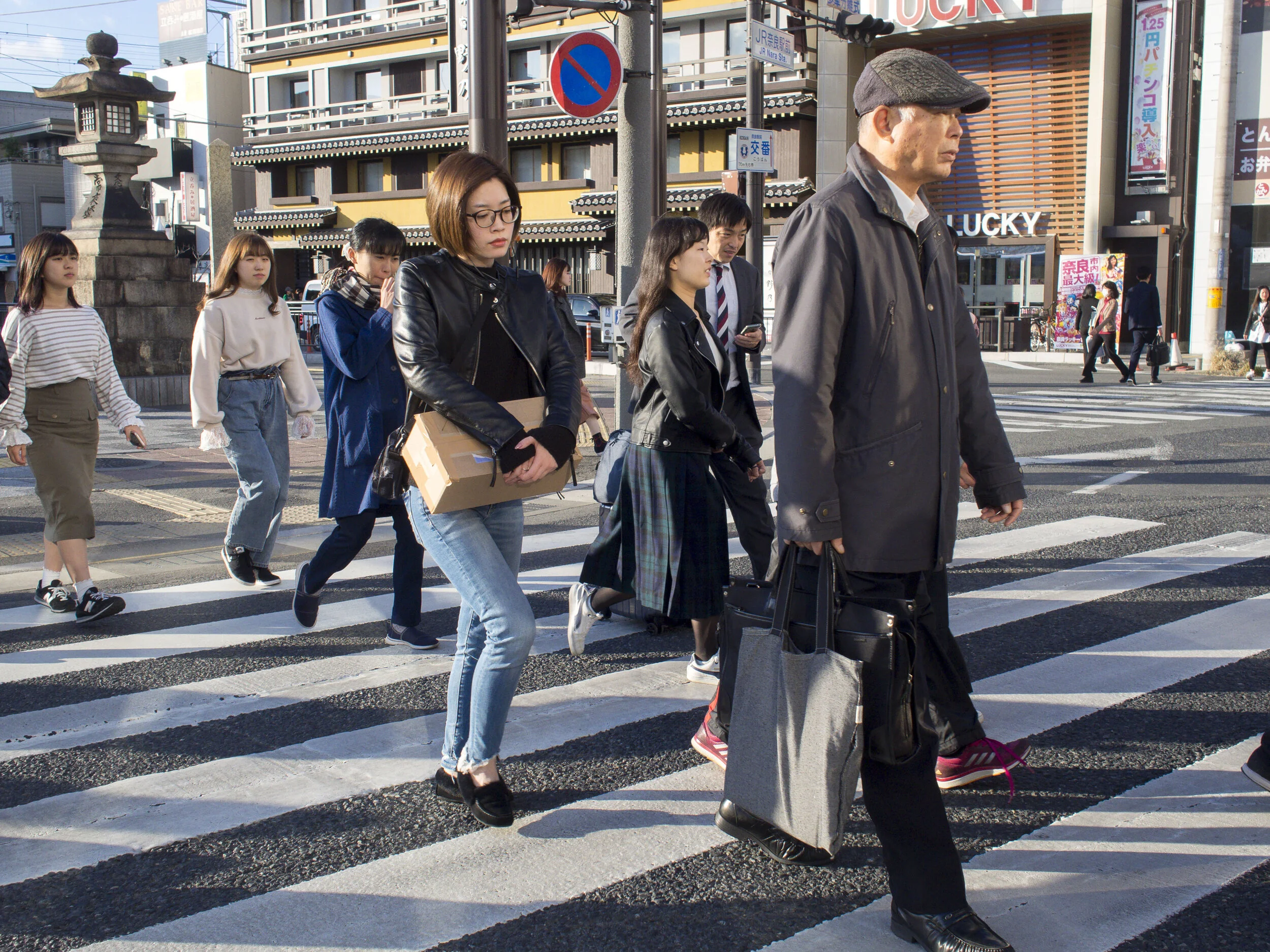
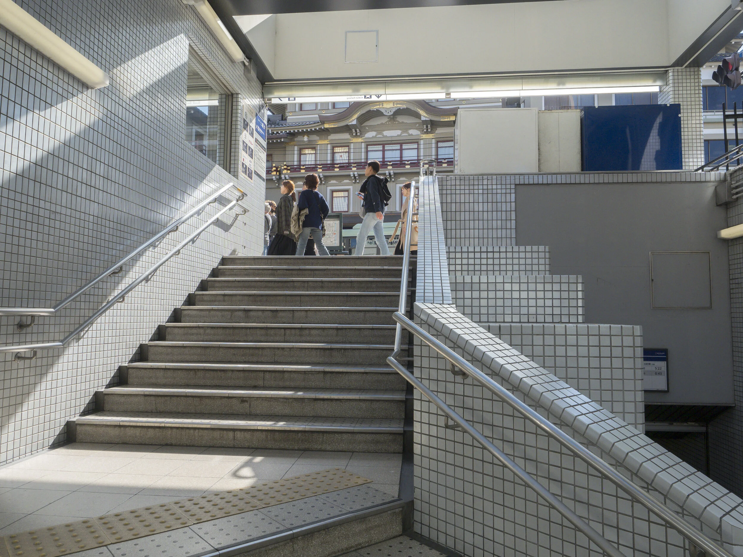
Known for temples and Deer mostly, Nara has a long shopping street that leads to both. The light runs the length of it in the afternoon, bouncing off the typically Japanese well worn, but clean and shiny street scene.

untitled-120966.jpg
untitled-120962.jpg
untitled-120978.jpg

Images taken with the EPM-2 and 17mm lens.

Applied Relevance

There is a lot written about image quality these days. It is almost a hobby in itself. I, like most enthusiastic image makers have “done my time” obsessing about lens “X” vs “Y” and still do to point, but lately, the game has gone from “what is the best” to “what is the limit”.

By limit I mean the limit of what can come out of the creative stream. The realistic end point.

My end point is a print. Something in the A2 to A3 range, with enough quality to have a quality and no obvious signs of falling technically short.

This goes to another point worth mentioning and one that is emerging as a counter point to the “uber” lenses currently being produced. That is the defining of “quality” or “a quality”.

Recently a friend of mine decide to trade in his massive 85mm f1.4 after purchasing a tiny German f2 equivalent. The big bruiser was technically perfect, but at the cost of character. The mistake he made was exploring other options and seeing the difference.

As I have said before, perfection is only one type of good. Flaws, such as they are subjectively measured in photography are often where this character hides. His own tastes have drifted towards little gem lenses with modest maximum apertures, simply based on his responses to images made with them.

Bokeh is one area where more is not necessarily better. Bokeh is very subjective, but should not be limited to quantity only. Indeed the best lenses usually have qualities that really shine a couple of apertures in from fully wide open.

Taken with a kit lens (40-150 f4-5.6), used within it’s reality envelope. There are certainly better lenses, even better kit lenses (apparently there are a couple of Pana kit tele zooms that are brilliant), but how much does it matter to the viewer …

Taken with a kit lens (40-150 f4-5.6), used within it’s reality envelope. There are certainly better lenses, even better kit lenses (apparently there are a couple of Pana kit tele zooms that are brilliant), but how much does it matter to the viewer of a 12x18 inch print of this image?

My own needs have changed over the past few years, with the sudden realisation that super lenses like my 12-100 f4 get too little use, while little “junk” lenses like the 40-150 kit get too much.

Looking at my kit rationally;

  • I do not need tracking AF or super fast focus lenses. The majority of my work is methodical fine art or low profile street, needing neither super cameras nor lenses. All of my cameras produce images to the limits of my needs and all of my lenses are optically strong and application relevant.

  • I do not need lenses that perform faultlessly wide open, because I prefer some flaws/character and never shoot perfectly flat objects wide open. The 75mm is nearest to the perfect lens and it stands out, but it is also my least characterful lens.

  • I usually use the best aperture for the lens and subject, not the most extreme.

  • Technique has more effect on quality than gear. Or to say it another way, technique usually fails well before lenses do.

  • My print quality needs (my bar) are based more on processing controls more than purely “front end” lens/pixel quantity.

  • Too much gear, for me, has never produced more images. A core of primes with a couple of zooms for cover/landscapes, work perfectly. Any more than that and my focus changes for the worse.

With that in mind, I think I will shed my EM1 mk2 and 12-100.

Both of these pieces are arguably my best equipment, but neither fits into the balance-is-better equation I am seeking. The camera makes me want to buy a long, fast sport or birding lens and the 12-100 is relegated to landscapes only (where it has had a grand total of three uses this past year).

They both create pressure to use them in ways that are more distraction than release of pressures I actually have.

I have been here before.

This would leave a smaller and cheaper kit of;

  • 4 primes, all f1.8 covering 17 to 75mm,

  • 3 zooms covering 12-40, 40-150 kit and 75-300. The 12mm end rarely gets used, but having one covers me.

  • 2 EPM-1 bodies and an EM10 mk2 that have seen little or no use, for street and travel,

  • My Pen F that is my best IQ landscape and art camera,

  • 4 EM5 mk1’s of varying utility for general purpose (the worst performing of which took the images below the other morning).

  • Any other bargains that pop up through work (like a mint Pen 5 with 2 lenses for $399).

It is good knowing that we are finally at the point where your work is not limited by gear as much as perceptions. Older sensors are evolving through processor upgrades rather than revolutionising the industry with massive jumps, letting us get back to a more film-era speed of change.

This is very settling and I think good for photography, not the manufacturers necessarily, but good for us.

There will always be improvement, but have we finally reached the realisation that enough has been reached for most uses and more is simply a luxury or point of difference?

So to sum up I feel I (maybe you) need;

Fast enough glass for low light and shallow depth images, but anything wider than f1.4 to 1.8 on M43 is not needed. The super shallow, maximum Bokeh look is covered by the 75mm which seems to be in balance for me.

A couple of wide range zooms for landscapes etc, which do not have to be big, heavy of fast in either focus or aperture as long as they are optically predictable and useful.

I do not need a true macro, but several lenses offer good close focus.

My cameras do not have to be pro calibre, because that will in no way effect the quality of my images (me that is YMMV). I need depth and consistency, not super tracking speed or heightened durability.

No high ISO monster camera as my fast glass, stabilisers and good tripod technique are enough.

Himeji Parade

Stand still for a day in any city or town in Japan and it is likely a parade will pass you.

Prostitutes and Playgrounds

Sometimes, when framing an image for maximum activity and interest, stories are captured that examine contradiction, social contrast and tension.

On the fringe of a slightly shady part of Tokyo, that overlaps with the zoo and a popular park, the “playground” takes on multiple meanings.

On the fringe of a slightly shady part of Tokyo, that overlaps with the zoo and a popular park, the “playground” takes on multiple meanings.

Seasons Bargains (or Old Cameras are Great)

A small issue that has been looming over the last few months has been partially fixed by being in the right place at the right time.

A real bargain camera (Em10 mk2 $329 au. on clearance) and a lucky second hand grab (a mint EPM-1 black with VF 4 for $90) have filled the hole left by two EM5 mk1’s that have become a little un-trustworthy*.

My stocks of camera bodies are a embarrassingly ridiculous (9), but given my current desire to run them until they fail, this is not surprising. If the total output of an art leaning image maker is a few thousand top tier images over their working life, then I have potentially several life times of cameras. I also console myself with the knowledge that they are worth in total less than a single Sony A7r 4 body is right now

One of the ironic benefits of never being fully satisfied with my Canon gear was that by constantly changing gear, I was protected from old camera syndrome. Some Canon’s only lasted for a few thousand shutter fires before I moved them on. The EM5’s have a total of 20 years work between them and one has had 6 more with someone else.

My love affair with the 16mp sensor has also forced the issue. I have absolutely no issue with the technically superior 20mp sensor, but they are different in work flow and results. The “film like” rendering of the older sensor, even with their gradual processor evolutions through the years, has something I find reassuring, honest and character filled. Finding this look was not automatic. The images straight out of the first cameras did little to impress me. They were sharp (but hard) and colour rich (although too magenta/yellow for my tastes). I missed the Canon and Fuji looks that I had mixed in with them in the early days of my mirrorless transition.

I now take for granted files that have deep colour and contrast flexibility, and files that have a strong sense of reality. Almost an anti-Hollywood realism. Fuji files (XE-1) were near perfect as was, but very opinionated in their rendering and had…

I now take for granted files that have deep colour and contrast flexibility, and files that have a strong sense of reality. Almost an anti-Hollywood realism. Fuji files (XE-1) were near perfect as was, but very opinionated in their rendering and had little more to offer outside of their signature look. Canon files at that stage had deeper colour (I often think of a tint based paint compared to a white base), but a habit of losing highlight detail and although they looked smooth and clear, lacked the biting sharpness the early Olympus cameras offered. Granted this was something I chose to tame on the Oly’s as their “hard” sharp look was often too much, but that is still preferable to not enough.

As much as newer cameras have to offer, I think it is important to look at the recent history of the major brands. Nikon, Sony, Panasonic, Fuji, Canon and Olympus have offered the same sensors in multiple generations of their cameras for a while now. Progression in video has been strong, but otherwise, things have remained stable for about five years (Em5 mk1 to EM10 m3, D750 Nikon to Z6, Sony A6XXX’s etc). Nursing an older camera, especially for stills shooting is no longer the guarantee of image making short fall it used to be.

The relevant technical benefits I have bought into over the last 5 years have been;

  • Better tracking focus, although I am a little short in the lens area and don’t really care.

  • Electronic silent and vibration free shutter fire, which is a big deal.

  • Option of high res imaging, that I have used a hand-full of times.

Nothing else has had any real photographic relevance for me. The first grab AF on the older bodies still surprises, image quality is as always limited more by technique and lenses than other factors and their handling/interface has changed, sometimes for the better, sometimes not.

This year, more image production (printing), less gear changes.

*The two Mk 1’s will be used for testing etc or when nothing is at risk. Both have issues (one exposure and shutter oddness, one banding occasionally) that can be worked around, but no point in trying too hard with other cameras at hand.

Haiku #86 Autumn Whispers

Haiku #85 Man and Tree

Refinement

We all evolve. Evolution is more likely than revolution (but we can hope). Seeing your own evolution for what it is, a gradual refinement of process (style) is a luxury that digital imaging affords us.

untitled-130112.jpg

My own evolution, or refinement of technique seems to be zeroing in on specific types of light.

Most things are interesting with the right light and many interesting subjects lose impact in poor light.

untitled-130103.jpg

The cool thing about light over subject, is that it can be found anywhere.

Definitions

Recently I wrote a 9 part introduction on street photography for our facebook page at work. This is to be followed up this Sunday by a street photography workshop.

In the process of defining street imaging (as I see it, not the definitive work by any means), I managed to analyse my own work processes and philosophy;

So;

I am not a street portraitist.

I could barely manage a handful of subject aware portraits for the article and those were mostly by chance not design. To tell a story about a specific person, fine, especially as part of a larger story, but in candid street shooting, I see no point for my work. I am looking for the intimate moment, not the posed one.

Far from a street portrait. More a matter of being caught in the act.

Far from a street portrait. More a matter of being caught in the act.

Documentary style?

Closer.

This is probably closest to my natural style, but I have no specific story I am trying to tell. Too many years trying to emulate my National Geographic heroes left it’s mark.

This also ties in to the moral and legal grey areas that are becoming more intense.

Candid grab, a little abstract. Yep, this is close to the core.

Candid grab, a little abstract. Yep, this is close to the core.

Urban Landscape?

To be honest, this is probably the future for me. I am tiring of the traditional candid street images (i.e. people living their life) and the tension that it entails. Sometimes the urge to walk away over rides my desire to get the image. The balance has shifted.

The gentler, anonymous and “quieter image” (as Sam Abell would put it) of perfect composition and light are calling. This means fewer, but better images and a more considered and deliberate approach.

Taken with a kit lens, one of my favourites from this year. The print potential is sky high.

Taken with a kit lens, one of my favourites from this year. The print potential is sky high.

Humour?

I rarely fall back on irony or humour in my images. Most of the coincidentally interesting ones are actually just that, coincidence. This is also directly tied to portraiture or doco style candids, so see above.

One of the rare times I actually recognised all of the elements before they lined up. “All eyes on her” or “Tin Tin’s surprise” would likely be the title if I were that way inclined.

One of the rare times I actually recognised all of the elements before they lined up. “All eyes on her” or “Tin Tin’s surprise” would likely be the title if I were that way inclined.

Benefits?

More intent = more chances to get good images at home = less down time waiting for the next trip, then returning and settling in for the next one. It makes every small trip and every day capable of producing a wonder (OCOLOY maybe!?). Ironically one of the favourite destinations for Japanese tourists is Tasmania.

Gear needs are lowered (no pressure for fast, long glass or super robust cameras, although what you have tends to define what you chase). I have roughly 300k guaranteed shutter fires to come from my current stable of cameras, likely more and I intend to grind them into the ground. At a more considered pace, that is a lot of images and time. My lens stable is more than capable of handling my needs, with options, even excess.

Basically I intend to raise my image making standards, lower my urgency to grab everything and shoot with full intent to print. This runs the risk of my missing the odd good shot through chance, but a groaning computer says I take too many currently*.

Less time in front of a computer, more time printing. This increases my personal and photographic longevity in every way.

I may even enjoy life and travelling more.

Next project is a book and set of prints from the last 5 years of Japan trips, then put a lid on it for a while.

*Lets face it. Our entire productive photographic life is usually defined by a few projects, several outstanding images and capturing important memories. Who among us can honestly say their image library is not bloated well past that. The “just in case” images are really “clogging up the works” files. Maybe a working shooter needs to keep files for possible client re-use, but I bet most of the bulk are just junk waiting to happen. How did we get by with the limitations of film? Just fine.
I bet, if forced to, most of us could get by with a limit of 500gb of total photographic storage for our entire life’s work, especially if you ask you potential viewers how deep their genuine interest would be.

Fuji Unleashed

We had a product night with the X Pro 3 last evening.

Wow!

The thing that struck me straight away was the attention to photographic empowerment. This camera is not playing catchup. It is not making excuses or showering you with fluff features (see previous post), but is aimed squarely at empowering the dedicated photographer to take photographs.

This is a sharp tool, made to purpose.

Yes, the menu is again differently laid out to previous models and the features are almost uncountable (again see previous post). There was a refreshing shift away from video for the dedicated stills shooter.

The features that were focussed on were;

improvements in sensor design, image controls in camera, with an aim to making the in camera image the finished product and better flow through of in-camera manipulations into RAW work flow.

You really get the feeling that this camera, controlled fully, can give you almost an entirely in-camera work flow or near to it.

Styling was refreshingly simple and consistent with previous X Pro’s, with only good tweaks, and those were mostly tactile. I especially liked the flip down screen. This is something that I am finding an issue with newer Olympus cameras, after using the flip out and roll style screens for street photography.

I just do not like the video-centric screen design for street shooting.

Will I jump ship into Fuji?

No, but there may be a long term re-integration into some Fuji gear for specific roles.

The X200 (X100 mk2?) with improved sensor (see XA 9) and better view finder might do the trick, or maybe the XT30, but no whole sale switching. A long lens is still in the want pile, with the Fuji 100-400 being a true contender. Adding the Panasonic 100-400 is tempting, but I feel a Pana camera would be needed to get the most out of it, so switching to Fuji for just this lens is actually reasonable, but that is usually where the rot sets in. Having multiple brands with me, usually means fleshing them out fully, creating duplication, guilt and rationalisation. Fully switching would actually be more sensible, but I am almost perfectly happy as is.

The reality is though, another Pen F (still very close to the same dynamic as the Xpro even after several years), or a Panasonic G9/95, allowing me to move on from the EM5’s makes the most sense.

My ideal kit?

Way too hard!

Learning and Teaching "Camera"

Part of my job is teaching photography, part is selling cameras and the thing that keeps coming home to me at the moment is; “We must teach (individual) camera before we can teach photography”.

Let me put this into some context.

Up to the 1980’s a photography course could be taught without any consideration needed for different camera models or brands. A Pentax, Nikon or Canon in the same group would have a shutter speed dial, lens aperture ring and ISO dial. These are the pillars of all camera’s operation. The placement of these controls would vary and some models (generally entry level, fixed lens cameras) would have simplified symbols such as a mountain rather than F16 for landscapes, but when the instructor said “now change your aperture to “X” ”, everyone was on the same page.

From the 80’s to the mid 2000’s, even considering the change to digital, the basic layout of a Canon, a Nikon etc was pretty much unchanged, but now cameras are very different from each other brand to brand. This strengthened brand loyalty, as people tended to stick to what they knew.

Often the brands had three levels of SLR; the entry level, heavily dependant on the mode dial and scenery modes, the mid level or pro-am models with more (often the most) controls as reliance on scene modes and semi-professional options had to co-exist and the top end pro models with their very workman-like interface, but going from one model of EOS or Nikon to the next had a gentle adjustment curve.

In the last few years all of the rules of predictable transition seem to have gone out the window.

This makes teaching and learning photography difficult. A mixed group of new camera owners, spread over 4-6 brands, 2-3 levels of camera, 1-5 generations and with varied experience bring a huge number of variables to a photography classroom. “Change the ISO”, becomes a series of 1 on 1 menu explorations. Checking depth of field can sometimes leave a student falling behind as they struggle to understand the concept and work out how to apply it. Switching to manual focus, a basic function, can even be a crowd splitter. To be honest, a group of students, all with the same camera and at the same level is enough of a challenge.

One group I have taken included a novice with a brand new 5D3, an old hand trying digital with an EM5/2 (but bought their film camera just in case and kept trying to match features, just because they looked similar), a compact camera user who misunderstood what type of camera they had and ticked “SLR”, a user of an older DSLR who was quite proficient, but their camera lacked most of the features we talked about and a drop-in who was mostly interested in video-with a Go Pro.

Problematic?

untitled-090314.jpg

I see three core reasons for this.

First, the brands are reinventing and transitioning into new operational forms, which for some brands seems to free up their thinking a lot. This is especially true of the more conservative brands, inventing button types and over-hauling interface with gusto. The “Z” series Nikons, for example, are quite different to any of the their full frame predecessors. The subtle differences between a D800/810/850 have become dramatic enough in the newer cameras to have the user thinking they have moved to a different brand or at least a different series/level of camera. This is good, but needs to settle down fast.

Next there is the stronger emphasis on live view and video. This has made the screen both bigger and more important. Slow at first to introduce touch screen tech and WiFi (another contributor to their loosing ground to phones), the latest batch of cameras can be considered to be fully operable from the screen and often with better responsiveness than previously. This is necessary and inevitable.

Lastly, is the reality that the Japanese companies and designers are always driven to add at least one feature of note with each new model. In the past a new sensor or improved AF were all that was desired and could be enough, but with many brands using the same sensors for several generations of camera* , the emphasis has switched to “fluff” features or interface fiddling. Video is the obvious upgrade engine, pushing still photography aside just as “surround sound” threatened to do to regular HiFi in the 90’s, but the other “gimmick” features are camouflaging the more important basics really well. This is marketing driven and damaging to still photography priorities.

Looking at Olympus as a good example.

I use the EM5 mk1, which I know enough about to get what I need accomplished without thought or undue process. Do I use and fully understand all of the features and terminology they offer? No and I never will unless I am forced to find out for someone else. I would bet that if I spent the time to fully master every feature the camera offered, something else, something central to the creative process would have to suffer**. These are pretty basic cameras by current standards.

I also use the Pen F, which is a sentimental favourite, but I have set it up to do one specific job (landscapes), so if quizzed on the spot about less used settings, like composite images, HDR, focus stacking, deep jpeg colour settings etc, then I have to sit done and go through the menu just like anyone else. Yes I do have a good idea where to look and whether there is anything to look for, but the differences between the Pen and the older OMD are significant, both in button placement and menu options. They are technically only a generation apart.

I also have the EM1 mk2, which has almost twice as many menu options, features and external buttons as the EM5 and many of these are differently located between the various cameras. It is pretty fair to say, that the three cameras would only share 20-25% of the same controls. Apart from the language being mostly the same, they may as well be made by different brands for all they share in common outside of branding and lens mount. I feel that if I added a Panasonic into the mix, the learning curve would be no greater. It may even be easier as the base language and feel would be different enough to remind me I have “changed hats”.

Then we come to my wife’s EM10 mk2 (and now mine thanks to an even harder to resist clearance sale). Another similar, but different interface :).

The Irony is, I really just want them to do the same things, the same way, but have to learn different ways of accomplishing that with very similar cameras.

I was a little embarrassed recently as the “Oly guy”, when asked on three occasions to find specific features on the EM5 mk2, a camera I have not owned, or used in the field. All of the questions were pretty reasonable, but I was stumped in the short term by all three. One camera had some features changed using the many custom options, but even then, they may as well have been on an unfamiliar brand. That was when it struck me that we are trying to teach photography, while, at the same time, teaching camera. Being comfortable with your own camera is a use driven dynamic, especially with applied customisation options. Being that comfortable with all current and recent cameras is unrealistic.

Olympus is by no means the worst offender and considering the depth of options they have introduced in a short time, there can be some concessions made.

Sony, with their RX100 mk1 to 7, A6000 to 6600 and A7 range (9 models and counting) are taking this same-but-different approach to new heights, especially as most of the models are on the market at the same time. Even if I worked in a Sony only camera shop, it would be a decent job keeping up. Fuji has been transitioning, firmware updating and reinventing for a while. Canon and Nikon have totally reinvented their thinking with mirrorless, but do not seem to have it knocked as of yet and Panasonic is just as guilty of constant generational change.

A customer/friend of mine and I spend 5 minutes recently trying to find a relevant feature on a major brand’s camera. Stubbornly we decided not to google it (which another staff member also tried without luck) as both of us felt the feature should be easily found and we both had some familiarity with the brand. Frustrated, he bought the camera knowing the feature was in the camera, but discovered it had been moved by a firmware upgrade between his reviewing and the purchase.

Even compact cameras can add un-needed variation. The Panasonic small sensor models disable custom control changes to their front control wheel when in Ai. The 1” models, cosmetically and operationally similar, but aimed at a more hands-on user, do not. No matter how sensible, even logical these little things seem, they trip us up all of the time. The expectation from the designers assumes that all of these little differences, that I often agree with, will be understood by a buying public, or that someone “buying to their level”, will appreciate their efforts without knowing the difference.

Looking around our shop there are usually 50-60 serious picture taking devices on the shelves. We also have 40 odd compacts, Polaroids, Drones, Video cameras and Action cams. This is not an exhaustive representation, but gives our customer in this small part of the world a decent enough range to pick from. That is 100+ individual menu and control interfaces, with as many as 300 (!) individual menu options each (try finding the command dial options on a Panasonic TZ, assuming you know what or why you are looking in the first place. They are on page 7 of the custom menu as long as you are not in Ai mode, which is about 40 options in, in the second-custom tool menu).

Rarely do they stick to the same terminology or conventions (A=AV=AP, S=SP=SV=TV etc) or menu lay-out and even more rarely do they use terms that are fully aligned with their application (should Vibration Reduction describe an optical stabiliser or mirror lock up?).

Fuji, with their old school/new school lay out are close, but their menus are diabolical to the uninitiated.

My last gripe is the removal of actual, useful features, such as lens barrel markings, or a simple, universal, mechanical remote cable connection (Pen F has one, which is one of the reasons I use it for landscape).

Taken using lens barrel markings to zone focus on the fly.

Taken using lens barrel markings to zone focus on the fly.

Here are a few things I have observed from my years around cameras;

1) No one knows all of the features of their camera inside and out unless they are gifted (not me) or have an actual use for all of the features the camera has and actually use them regularly.

2) No one is familiar with the basic interface of all brands unless it is their job and they are good at it.

3) No one needs/uses all of the features on even the most basic compact camera (but what do you leave out?)

4) The level of photographer understanding and ability is almost always below the potential of the camera (me included), which is good as long as it does not stand in the way of learning. Sometimes the camera is way more than is needed.

5) The amount of information out there is not helping people grasp the basics, but is empowering the photographically irrelevant.

If we want to grow the camera industry, should we be diluting the brand advantage (which was familiarity and consistency), increasing fluff features, mystifying the simple or driving the wave of unrealistic expectation?

Maybe if one brand, other than uber expensive Leica, went back to basics, they would find a market share no one else has identified? Maybe a camera with a “simple manual” mode as well as a dumb auto mode.

*The 24mp Full Frame used in most Nikon, Sony cameras for over 5 years and the 16mp M43 used in the Olympus and Panasonic range from the first OMD until the current base models for 7 years plus.

** This brings up the tension between basic creativity (fundamental controls and the physics of photography such as long exposure or handling based panning etc), vs camera dependant creativity through technical gimmicks, both great and small (such as composite techniques, colour or other manipulations). For this there is no easy line in the sand to draw. It is up to you what you define as too easy, cheating, gimmicky or irrelevant.

Post Japan Gear Thoughts

Back from Japan and thinking on gear.

What got me through?

The EM1 with the kit 40-150 did the lion’s share of the image making. The camera is a little big for close-in work (the pen is for that), but battery and camera reliability are good. If I were to upgrade anything in these same circumstances, it would likely be to the Panasonic 35-100 pro. The size is similar and weight tolerable, which is important, but the extra aperture speed would be nice from a creative and practical standpoint.

Quality wise the kit lens is outstanding, regardless of price and build considerations. Prints made from this lens do not need excuses or considerations. They are fine.

A crop from a quick snap. I cannot see anything that could be improved in these circumstances. Detail, colour, bokeh and contrast are equal to my best printing techniques, AF is fast and accurate and handling is fine, once you get over the lightness…

A crop from a quick snap. I cannot see anything that could be improved in these circumstances. Detail, colour, bokeh and contrast are equal to my best printing techniques, AF is fast and accurate and handling is fine, once you get over the lightness of the lens. The Oly 40-150 f2.8 is brilliant, but too heavy and big for my needs, as is the Leica 50-200.

he next most used combination was the EPM-2 mini with 17mm lens. This did exactly what was needed. It was fast, in-obtrusive and very functional (except for my regular issues getting the camera straight). The only issue I have with the lens is some flare, likely due to the lower end filter I have on it.

The final piece to the kit, was the 12-40, that was great for general scenic images, but too big and a little heavy for street and long travel days.

The little 45mm was hardly used, which is a shame, but there was little need. Maybe in winter or bad weather I would have pulled it out, but not this trip.