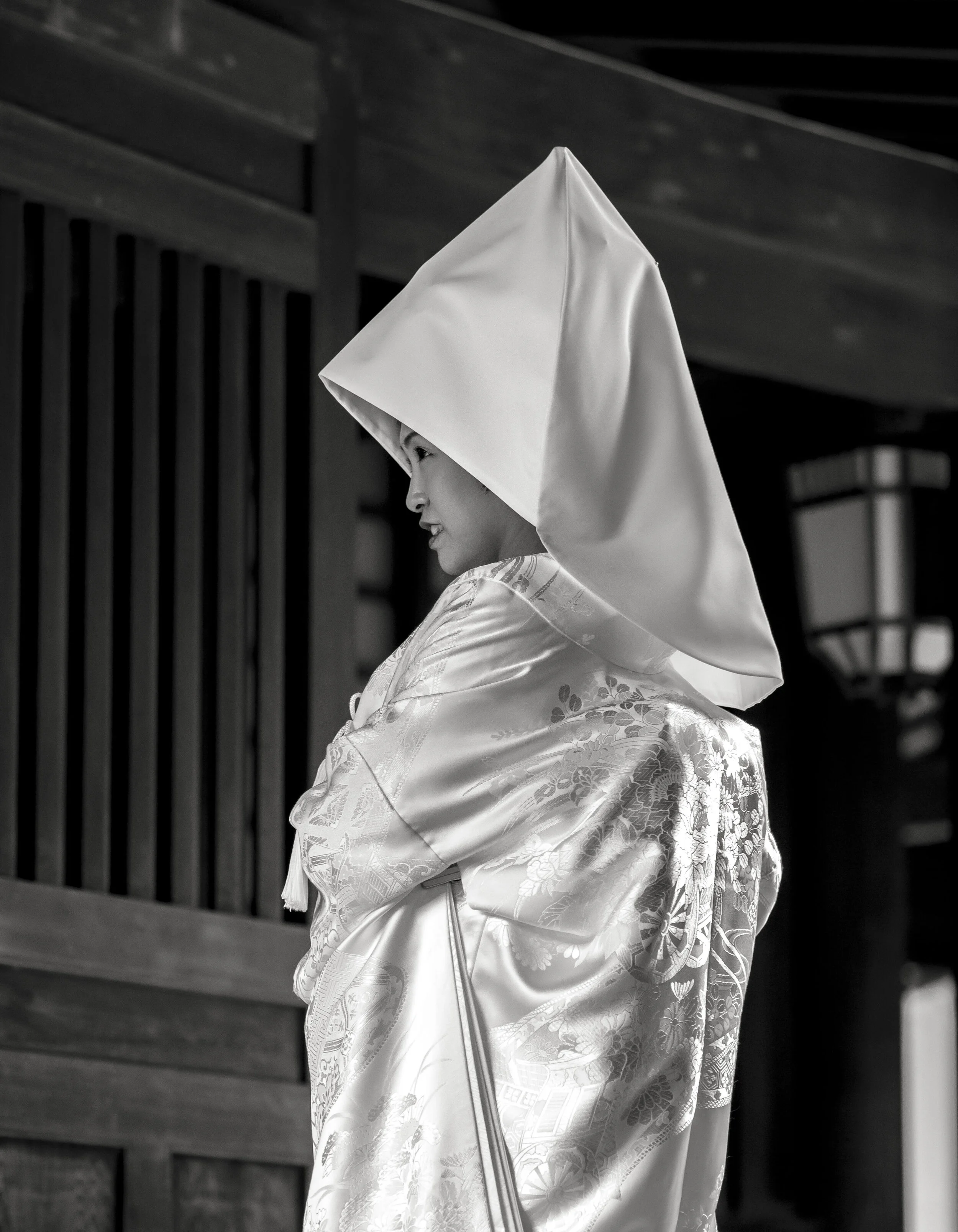
The (re)Invention of Flashman

Flash.

For some a great problem solver, equaliser and creative gateway, for some, too much trouble to do well and far to easy to do badly.

Once a regular user of flash (early film TTL), I stepped away from it naturally when I started to shoot more landscapes and more when I switched to digital.

I need it now. I probably don’t need it really need for my normal shooting “style”, but I want it to be mastered so I can control my environment better. The reality is, photography is light dependent (quantity and quality), and when the subject’s situation is fixed, you have to be flexible.

I am turning to two masters for info and inspiration; Neil Van Neikerk through his books and at neilvn.com and Joe McNally, mostly through one book, “The Hotshoe Diaries”. Both of these guys generously offer all the instruction you need, both technically and creatively.

This is enough. More opinions and things start to get confusing, any less and I become a mirror of just one mentor. I would like to think I am just “brushing up”, but the reality is I have ignored flash for over a decade, so realistically I am starting from scratch technically and I am well rusty aesthetically.

The big learning curve for me is the way flash now works compared to my long memory of past techniques. I have been falling back on old thinking, which turns out to be well out of date.

TTL with digital pre-flash and manual, just using output fractions rather than the old “GN divided by distance = aperture” stuff is sooo much easier.

Gear.

I have a couple of excellent, manual only Yongnuo YN560 III and IV units and the TX off camera controller for a few years, but have not up till now been interested in using them and I have now added a Godox TTL 685. Straight out of the box, the Godox gave me predictable results. The very first image I took, of the news paper, was given a tiny -1.7 TTL blip, producing about what I had hoped. Daisy’s second image shows reduced strength in the black stripes and slightly softer light at about -.7 (if only she would hold still). Magic!

The YN’s will be used on light weight light stands with Neewer 16” circular soft boxes (2x set on Amazon for au $45), giving me a neat little portable studio, the Godox will be used for TTL bounce flash with the $2 “black foamie thing”*, possibly with a large Neewer reflector on a stand in lieu of a handy wall.

This latter is for speed as manual fill on the fly is indeed possible, but needs some time put in to perfect.

I also have a pair of tiny Oly flash units I can always carry for direct outdoor, gentle fill or possibly to trigger the Godox in slave mode.

The “Black Foamie Thing” allows you to flag or block stray flash light, giving you maximum control of light direction. The images above (thank you my long suffering wife), were taken indoors, using a wall as a giant soft box, with the light looking directional and natural (a little post was added). The second image shows the base exposure at -2 ev without flash. Too easy. I forgot to take the image that makes this necessary, the brightened non-flash image with a blown out background.

I will of course fall back on a reflector and natural light as often as possible, but I fully intent to get this mastered. The motto going forward is “keep it simple stupid”, using less first, more if needed only.

*Neil Van Neikerks “Black Foamie Thing”, https://neilvn.com/tangents/about/black-foamie-thing/ is a revelation that, in his own words “lets you throw out the over priced Tupperware” commonly used for flash modification.

I will also experiment with a white foamie thing to reflect light in when the ceilings are too high.


Haiku #89 Kimono Life

Journey's End

We (my wife and I) have been to Japan seven times over the last five years or so.

There was little planning involved. It starting as a need to use a ticket credit for me from a cancelled trip after the Tsunami, with my semi reluctant wife for company, then an urgent need to return, driven as much by her as me, then a couple of opportunistic impulse trips, then a a few later ones that had a feeling of consolidating re-visits and deeper exploration.

We grow as we go. Repetition allows refinement, new vistas broaden our own.

My photographic journey has been one of evolution within a consistent technical envelope. Before each trip, I stress about lens and camera combinations, leave home never happy I have the perfect combo, but I am never disappointed when I get there. The lesson is; what ever, where ever, will work on some level.

The only consistent factor has been Olympus cameras and lenses. The travel kit is always kept comfortable (I have little tolerance for heavy bags, cumbersome rigs or in the field confusion).

The last set-up was sparse in the extreme (for me). An EM1 mk2, 12-40 and 40-150 (kit version).

My first trip was a pair of EM5 mk1’s (and a spare in my case), a 17, 45, 75-300. Regardless of the set-up, the results are always similar. The reason is of course, that regardless of my gear, I shoot the same subjects in the same or a similar way, because that is my “style” and what I chose is never far from that thinking. It seems I adapt to my gear rather than the other way around.

My processing on the other hand has evolved a great deal.

Early on, I seemed to be looking for almost an “anti-Canon” look, in response to what I perceived to be an anti-Canon or Canon curing colour foundation from the OMD sensor.

An image from the first trip, early eyes and early processing. The colour is dulled, the look heavy and dark and the angle, a very self conscious shot from behind the subject. The trip took place during a moody, wet spring, which did also affect my …

An image from the first trip, early eyes and early processing. The colour is dulled, the look heavy and dark and the angle, a very self conscious shot from behind the subject. The trip took place during a moody, wet spring, which did also affect my perceptions, so on the whole, this was me.

As I evolved with the cameras, I found that I could extract nearly any look or “feel” from the sensor, much more than I could from the Canon, Sony or Fuji sensors I had been co-using before committing to Olympus only.

A few trips later, more self confident and of the sensor in the camera, I pushed harder, enjoying the warmth and depth of the files.

A few trips later, more self confident and of the sensor in the camera, I pushed harder, enjoying the warmth and depth of the files.

COVID-19 has forced a pause on the world. This pause has allowed me to take stock and consolidate my ideas and images from the seven trips, with plans to top them off with a book ( called “Japan 7” or “Japan #of days” maybe).

We will return as soon as we can, but that will likely be next year at the earliest and I will be a ways down my journey by then, so the evolution will continue.

Who knows.

Full Frame Jitters (As Usual).

This one is familiar to many smaller format users and I know before I start what the outcome will be, but for your and my benefit, here is the thought process. This post should really be titled “Being a Content M43 User part 2”, but I am not going to put that much thought into it.

I am contracted to a school.

Their standards are high and their catalogue of previous work is deep.

I know from my previous work that I can match what I have seen, but the nagging little voice in the back of my brain pan keeps saying “do you think you will need full frame?”.

Image Size.

I already have a large image sample, taken with an old OMD and a slightly better than kit lens (75-300), using “snap shot” technique (at best), that has been enlarged to a 3x4 foot wide sign, after some cropping. That is the size reality addressed. I know that 16-20mp is enough to max out most printing formats, especially if logical viewing distances are factored in. Full frame would increase the maximum possible enlarge-ability of the file, but not by much and should not be necessary. The reality is, photographers have been doing billboards with less for years.

Light gathering and image noise.

This one is tricky. From a purely technical perspective, there is little need for a larger format all things being equal.

Firstly there is the critical mass of the math. If an image needs to be taken, the light available will be (in non artistic or astronomical fields), good enough to see by, so good enough to photograph within a reality envelope I can reach.

Then there is the image making format math. The depth of field to reach to light gathering balance M43 gives me is usually a good balancing point for full frame.

Let me explain.

First the foundation to the argument;

F1.8 in M43 has about the same depth of field as F2.8 in full frame at the same effective magnification.

If we accept that 2.8 is the pro’s “working” and often widest available aperture, using a full frame standard or workhorse tele zoom, as it offers good low light performance and enough realistic depth of field to be in the comfort zone of soft backgrounds and sharp subjects, then M43 matches it with cheap, light primes at F1.8 at two ISO settings lower. Sure, the full frame user can pop on a 135 f1.8, but at what cost and bulk and then you still have the issue of very shallow depth of field that is often not practical (it is more practical at longer distances, but the magnification falls away, forcing cropping…). I have owned a Canon 135 f2 and very rarely used it at f2, but my 75mm f1.8 (150mm f2.8 equiv.) is used at f1.8 regularly.

Shot wide open at f1.8 on my 75mm. Any longer (an actual 150mm) or with a wider aperture and the focal point would be pretty twitchy. Thinner depth of field is often only useful for exaggerated Bokeh effect, not practical subject coverage.

Shot wide open at f1.8 on my 75mm. Any longer (an actual 150mm) or with a wider aperture and the focal point would be pretty twitchy. Thinner depth of field is often only useful for exaggerated Bokeh effect, not practical subject coverage.

This is the important bit. At the above outlined safe maximum working aperture, an M43 camera can use ISO 800 when a full frame is using ISO 3200. Have a look at the noise in the EM1 mk2 RAW file at ISO 800 compared to the Z6 Nikon at ISO 3200 on DPreview. They are nearly identical. The difference is even less if you look at the “print” image sample.

The reality is, for most critical work I will need some lighting control, not high ISO performance. The times this will not be the case are performance images (already done) and winter sport photography, that will never have unrealistic quality or big enlargement needs.

Glass.

Then we come to the lens issue, which is where M43 started for me.

Note; M43 lenses have a 2x cropping factor.

To get the best full frame glass from Nikon, Sony and Canon costs big dollars for big glass and unfortunately, many of the affordable Canon and Nikon offerings are still designed for SLR’s, making the thought of spending big bucks on them even less enticing. Even if I did go that way (within budget), the cropping needed to match the M43 lenses I have (600mm equiv) would take much of the full frame quality edge away. (Canon is releasing an affordable 100-500 zoom soon and some new cameras, but how much and how soon?)

The powerful end of the M43 lens range is very approachable. I switched to M43 when I realised that my favourite Canon glass* was matched or bettered by their tiny equivalents in M43.

The future of Olympus aside, I have plenty of good options at hand now (35-150 equiv at F1.8) and available, covering the core of the professional’s pro zoom range.

This process is irrelevant and tiring, but when your livelihood and reputation are at stake, all options need to be looked at. The reality is, bigger format potentially create better quality, but quality needed and potential quality are often not the same. Cropping to make up for focal length shortages, using smaller apertures and higher ISO settings than desirable for depth of field reasons and choosing not to buy or carry every option due to price or weight are all valid points of consideration, not excuses.

*35L = 20 Pana, 135L = 75mm Oly, 400L f5.6 = 75-300 Oly and 85 f1.8 = 45m Oly.

The Future

Ok. So what do you do when your brand, the one you have committed to decides to sell off it’s camera division to another company with a mixed reputation for brand integrity and development?

  1. Cut and run (as I suspect many will).

  2. Look at your stocks of gear* and if you think it wise, just sit and watch, planning to not plan.

  3. Do as #2, but transition where needed.

  4. Trust that Olympus or more likely Panasonic will support the format long enough to see me through (5 years?). Add a couple of lenses and a top end (?) body or two and just keep going.

Looking at option number 1.

I have too strong a connection with my Oly gear to just up sticks and leave. My fast primes are just too good to easily (and cheaply enough) replace and my zooms, such as they are, are good enough for the tasks they are set (at this point). Also, realistically, in this market, with this news, the gear I have has little value.

Number 2.

This is perhaps the wise route, except that I would like to expand my sports capabilities (see below) and that means either adding more m43 or looking at good options.

Option 3.

Maybe this is the logical one as I have plenty to do most of what I want*. Upgrading my sports/workhorse core would start the transition, then I can just take my time for the rest.

Option 4.

The last is the most tempting. I am aware that m43 is and always will be seen as a non or at best semi professional player, but I also know that, that is for the most part crap-ola in a can.

Nobody I have shown any of my work to has ever criticised it on a technical level and nor should they. These cameras may be behind some of the top, current models in some respects (many measures are irrelevant in the real world and some work in M43’s favour), but we are talking about the handful of current cameras that have an edge. The reality is, more has been done with less in the past**. The last time I had any technical feed-back (three days ago regarding some low light school performance images), it was highly positive, without the commenters being aware I used “little and ancient” EM5 mk1 cameras.

I cannot show the school images, but here is a new discovery that should enlarge to half door size. I love the “quality” of these images.

I cannot show the school images, but here is a new discovery that should enlarge to half door size. I love the “quality” of these images.

It really is a case of “the photographer not the camera” these days, as no one makes a bad camera, format or lens. There is just enough difference between the various models and brands to split them for comparison and many of these measures as I said above, are pretty much irrelevant in the real world***.

To top that off, I can get what I need and want from these cameras, and have no guarantees that I will not shift sideways or even backwards if I switch (techniques that work can be fickle). Anyone else make a razor sharp 150 f1.8 equivalent I can afford?

Sports are the only real area of concern. The 75-300 punches above it’s weight up to 200 (e 400)mm and is occasionally brilliant at longer focal lengths, but it is light dependant. Summer cricket should be ok, winter football is more flexible for shorter focal lengths and as for indoors, the 12-40 and 75 have done the trick. The 40-150 Pro or maybe a Fuji XT# and 100-400 as part of the transition? I would even, if it was the smart move, get an SLR kit again just for sports. No sport at the moment anyway, so no rush.

All of this highlights something I was becoming aware of before I left the shop. It is hard to buy gear at the moment, especially if you are wanting top end results from a start of nothing. It is equally hard to buy badly in a general sense, but the crystal ball of the future is dim enough to make long term planning pointless.

Fuji seems to have a strong base and commitment and they have a unique take on the dynamic of APS-C and Medium format.

Nikon and Canon are the waking giants, finally taking on Sony in mirrorless.

Panasonic is clearly targeting FF Sony as well, as they should being their traditional video opponent, but their M43 may pay the price (logically, M43 makes an ideal second format, as long as sales stay strong enough). I am hoping that Panasonic’s foray into full frame will take the pressure off their M43 offering, something Olympus lacked as an option.

There is every likelihood that I will get a G9 or EM1 mk3 in the future and maybe a better long lens (100-400 Leica). Even if I flog them, my needs will likely be met.

*A gear stocktake revealed about 500,000 to 1 million potential shutter fires left (not counting “free” electronic ones), spread over 9 bodies with some near new flashes and plenty of well looked after lenses. Quality aside, I have tons of quantity.

**My OMD EM5’s produce images at least equal to my old 5D mk2’s and blow away D700 Nikons without many of the negatives, such as size and lens inconsistency. These were the industry backbone for close to 10 years.

***There is a reason we are on a fast track for more measurable quality. It is because we can now more easily measure quality.


Possibilities

I recently picked up a contract as a school photographer. This goes against the grain of the current market, COVID, economic and social trends, so I am fully aware how lucky I am.

To add to this lucky streak, I was asked to do some sport and performance photography during my “trial” week, so I had a chance to fully exercise my skills and gear.

The great thing about this type of work is variety. The tough part is variety. I have let my gear run down a little, selling the 12-100 Pro recently and the 40-150 Pro last year, so it was with a little trepidation, that I pressed my “budget” 75-300 into service as a sports lens, in winter, in the early morning.

What I learned.

The 75-300 on an EM1 mk2 (original firmware) was fully capable of capturing crisp and contrasty images in most light, of running high school age subjects and acquired perfect tracking lock 90% of the time. The other 10% came down to AF confusion, usually locking on to the background when two subjects split the AF area or mistakes on my part.

In poor light/weather, which was unfortunately the case on the first two days, I had to resort to shorter focal lengths with the zoom or my much faster 75mm prime, to get an acceptable combination of ISO (3200 max ) and shutter speed (1/250th min). Performance was still good, but everything was stretched.

It also managed a high hit rate with some recumbent cycles at good speed in reasonably close confines, although the bulk of the better images came from the 12-40, due to distance.

The 75mm f1.8 was also a good performer, although I did not use it wide open on moving subjects as I have always been a little suspicious of it’s AF. This lens often missed focus or hunted on earlier cameras, when the cheaper 75-300 did not. I did however, get some surprising results with indoor basketball with this camera and lens combo (razor sharp at f2.5, crops from portrait orientation below), so maybe the Em1 gets enough out of it.

At this point I have been successful shooting indoor sports with either an EM5 mk1 and 40-150 Pro or EM1 and 75mm, but I would love to try the 40-150 and Em1 combo as it is considered the best on offer from Olympus.

I also need to pull my finger out and do the all too painful firmware updates for the cameras and lenses. I wish they were as easy as the Fuji ones.

Overall I am impressed by the 75 and 75-300’s performance with the EM1 and expect them to jump again noticeably when I update.

*

The news of Olympus selling their camera division, has generated some discussion and at first I felt equal, but controlled amounts of disappointment, betrayal and frustration. The reality is, nothing is for ever, especially in the camera world. Change may be good, or not, but either way I have cameras aplenty*, lenses in equal abundance and Panasonic as an option. There are also millions of Olympus cameras in the world and I am sure stocks of original Olympus gear will be hanging around for a while at least.

The most likely path is to add a G9 and 50-200 or 40-150 for action and as a general work horse, then an 8-18 for rare wide angle use (if needed). The G9 has the same or slightly better AF tracking (lens dependant) and more AF configurations than the Olympus EM1 mk2 and better video, with otherwise the same features. It is wise to match new Pana lenses and cameras to get the most out of their DFD focussing system.

Would I change brands?

Fuji is likely and ready to jump right into. I like their high ISO and jpeg performance and their lenses are stellar. Earlier issues with focus, processing and handling are gone to the point where they are market leaders. I have dabbled with the idea of switching in the past, but have stuck with what worked. Lie the Panasonic plan, I would add just a work-horse sports kit (40-150 or 100-400 zoom and 18-55 or 10-24), then replace other bits as needed.

Nikon and Canon less so as I really do not need full frame and their crop frame options are minimal, but if pushed I could start to transition as needed. DSLR’s for sports are an option, but I really do not want to drop money into a “dead-end” gear trail.

Sony? No, not for me. Again, their best offerings are full frame and I am not a fan of their colour, menus and their lenses are still a bit of a mixed bag.

*Tons of portrait grade cameras and lenses, with the EM1 as my workhorse for sport etc. I could probably use my Olympus stocks for portrait and studio style work for 5 or more hard years work, so only the EM1 would need replacing after all of the sports work it would be doing.

Haiku #88 Winter Eyes Open

A little visual Haiku taken while scouting out a job.

Surprise Packet

While doing a little, much overdue Gallery maintenance, stumbled across this little series of images from Japan.

Two things stand out.

Firstly, they are spider images, not my usual thing of late and secondly, they were taken with the 40-150 kit lens (with only a little cropping).

Again that lens surprises!

And for those arachnophobes out there, yes they are big, about the span of an Australian Huntsman, but thankfully far less active.

To me, this is further proof, that for my needs as an occasional and casual close-up shooter, a true macro lens is not required.

Four Portrait Lenses And Four Styles

Portrait photography has a very long history. From the very earliest days of image capture, people and their immediate environment have been the main subject matter.

Technique has change a little over time, from the first “person and environment” record keeping shots, through still life, street capture, boudoir, and journalism, style has changed a great deal, but technique only a little. The adoption of the 50mm lens as the standard is an indication of our draw to portraiture. The true “standard” or truly neutral lens is closer to 40mm (FF), but 50mm is better for traditional portrait images.

The basic principals are;

The subject(s), sharply in focus, posing or not as required and the their surrounds either in focus (deeper depth of field) to give context, or blurred out (shallow depth of field) to remove all other distractions.

This is a gross over simplification of course. There are plenty who break these rules, but they work as a starting point.

Lets have a look at four lenses I use regularly for portraiture and street photography.

The Environment lens, the Olympus 17mm f1.8.

I love this lens. It is not my first stop for portraiture because it needs to be employed differently and is at the extreme end of my personal portraiture style. Including the environment and to a certain extent needing some action to fill the space, is ideal for candid street imaging, but in confined spaces, with larger groups or simply to expand the viewers awareness of the subject, it can be useful.

untitled-1230464.jpg

The strength of a wider lens is your ability to use placement and depth to either dilute or to reinforce the main subject’s importance. This is especially useful when the place is actually more or as important as the person.

Actually taken with a 40mm on a full frame (much the same dynamic), this shows the importance of the surrounding environment to some subjects.

Actually taken with a 40mm on a full frame (much the same dynamic), this shows the importance of the surrounding environment to some subjects.

The 17mm has a “hard” or micro-contrasty look, that is not ideal for general portraiture, but is designed to purpose. Olympus have made a lens that has ideal properties for street imaging. The out of focus elements blend seamlessly with the sharper parts, so unlike any portrait “hero” lens, this one actually promotes environment inclusion. I have no issue using this lens wide open at night.

The best application for a lens like this is multi layered primary subjects. You can emphasise one primary subject, but also include other, less obvious ones. You can tell story in layers.

The best application for a lens like this is multi layered primary subjects. You can emphasise one primary subject, but also include other, less obvious ones. You can tell story in layers.

The geometry of the space and the light were the primary drivers for this image. A tighter composition would have emphasised one or two people, but lost the feel of the overall image and spoilt the balance.

The geometry of the space and the light were the primary drivers for this image. A tighter composition would have emphasised one or two people, but lost the feel of the overall image and spoilt the balance.

The first of the true portrait lenses, the 25mm f1.8.

Actually, it turns out this lens is closer to a 45mm lens on a full frame, not a true 50mm, it took a while to gel with me, but is now a faithful friend. I think my 25mm is a little unpredictable. Maybe it has an optical issue that only comes up occasionally (mildly de-centred, or better up close than at longer distances etc.), or maybe not. Either way, it seems to fit well now that I am used to it. The reality is, a lens is as good as the best image it has taken.

I think copy variation is a thing with most brands, but has two sides. I think it is genuinely hard to find a real dud lens, but relatively easy to get a different feel from one copy of a lens to another. Maybe I am just being a little too sensitive to something that is just in my head, but I have noticed the phenomenon with myself, friends and customers. One person’s “the one” lens can be another’s “so-so” optic.

This focal length is the ideal “two elements working together” portrait lens. Using it’s deeper natural depth of field allows for creative use of Bokeh and that Bokeh is good. It can be hard to get the sharp to soft balance right and this lens helps rather than hinders that process. M43 has a reputation for not offering enough blurring, but I disagree. Massive blurring is easy to achieve technically and looks great for a few images, but wears thin after a while. Creative blurring, that is using the blur as an element of balance rather than just blowing it away in to mush is far more beneficial, if a little more challenging.

“Thomas and Friend”. This one could have been taken either way, with the TV sharp and Thomas (true) softer.

“Thomas and Friend”. This one could have been taken either way, with the TV sharp and Thomas (true) softer.

This is an easy to use focal length, but lacks the strong focus drop off, slight compression and tighter cropping of more traditional portrait lenses, so it can feel a bit of a portrait light weight after extended use. I often start with this one, getting tighter as I work.

Also good for longer range street shooting. It has the ability to include, but also to control depth of field better or just differently to the 17mm. The Bokeh effect is more pronounced than the 17mm and the close focus better, so the two are a usef…

Also good for longer range street shooting. It has the ability to include, but also to control depth of field better or just differently to the 17mm. The Bokeh effect is more pronounced than the 17mm and the close focus better, so the two are a useful, quite different pairing.

Ground zero for portraiture, the Olympus 45mm f1.8.

By far my most used portrait (and probably general use) prime lens, the 45mm is a star. It has a magical feel at about f2 to 2.8 making it a good light gatherer when used at it’s best. I have two at the moment (three until recently), and do get a different mojo from each. They are all good, just some are a smidgeon better.

So small and discreet, this little gem rarely gets noticed (or taken seriously).

So small and discreet, this little gem rarely gets noticed (or taken seriously).

Apparently, this and the 25m are nearly identical in design, but the results (of mine) are quite different. The 25mm is less forgiving of it’s errors (like the 12-40), the 45 rarely makes them.

Another easy candid. The working distance is ideal for this type of grab.

Another easy candid. The working distance is ideal for this type of grab.

This is one of those lenses that allows you to think in terms of Bokeh. It seems to help create it’s own compositions. This was taken sitting on a bed in a Tokyo Hotel room and the image just jumped out at me.

This is one of those lenses that allows you to think in terms of Bokeh. It seems to help create it’s own compositions. This was taken sitting on a bed in a Tokyo Hotel room and the image just jumped out at me.

For official portrait jobs, this is the first lens picked. It is the core of the idea, guiding me to change (longer or shorter) as needed. I really like how it reminds me to include some context.

For official portrait jobs, this is the first lens picked. It is the core of the idea, guiding me to change (longer or shorter) as needed. I really like how it reminds me to include some context.

Super sharp detail is not always the models friend. This lens can offer high detail, but in a friendly manner, pleasing to the eye.

Super sharp detail is not always the models friend. This lens can offer high detail, but in a friendly manner, pleasing to the eye.

Not everything is perfect however. The closest focus distance could be better (making the 12-40 or 25mm handy to include) and the edges are a hair behind the closer focussing 42.5 Panasonic if you are a top-tier landscaper, but it is possibly superior in the centre for portraiture. I love it.

The one big trick pony, the Olympus 75mm f1.8.

When maximum compression and blurring are needed or if working distances are restrictive, the big gun is produced. The 75mm (150mm in full, frame terms) is an odd focal length. In truth I would have preferred Olympus made a far more useful 100mm f2, but that was not to be.

This thing is near perfect optically. There is occasionally the slightest bit of purple C.A. wide open, which is easily fixed. It also has a strong flattening effect, more even than the focal length would indicate. This seems to be the modern phenomenon of highly corrected glass losing some of it’s three-dimensionality.

Regardless of it’s very few and quite mild negatives, it has a role to play. Blurring is actually stronger than the 45f1.2 Pro, compression is handy and the “pop” of the images is indisputable. I can zoom through my catalogue and spot images made with this lens easily as I go. They are just “perfect”. Compared to the 45mm, the 75 has less character and perhaps less “generosity”. It is soo reliable in it’s rendering, but can be over used easily.

A quick grab in near darkness. The tightness of the focal length forces either perfect or more creative compositions, often compositions unseen by my eye until I look through the lens.

A quick grab in near darkness. The tightness of the focal length forces either perfect or more creative compositions, often compositions unseen by my eye until I look through the lens.

Big by M43 standards, it is smaller than a Canon 85 f1.8, and half the size of it’s nearest rival optically (that I have seen) the Canon 135 f2L. It’s performance against the Canon was the tipping point for me going fully m43. It not only had similar quality, but similar optical characteristics. The 45mm was more like my 200mm f2.8L, rich, smooth and character filled, the 75 and 135’s were just reliably perfect.

Tokyo Fish Markets are a tight space and you have to be quick, but there is enough room (just) for the candid reach of the 75mm.

Tokyo Fish Markets are a tight space and you have to be quick, but there is enough room (just) for the candid reach of the 75mm.

A good working distance and ideal separation.

A good working distance and ideal separation.

Sublimely sharp, every stitch on this Kimono can be seen in detail.

Sublimely sharp, every stitch on this Kimono can be seen in detail.

The lens has good focus. It is spot on accurate, which is vital for it’s speed and length and quick enough, although it could be slightly faster for indoor sports, where it would shine.

The working distance can be a terrific boon for candid street.

The working distance can be a terrific boon for candid street.

Looking at my image bank, there is a clear pattern. I use the 17mm and 45mm lenses almost exclusively for travel, street and general work (unless I take zooms), and the 75, 25mm lenses are ear-marked to fill specific roles. The 75mm tends to be left behind and a tele zoom used unless low light or portraiture are the job, the 25mm is the “walk out the door with only one lens” option or tends to be the last packed.

These are not my only choices, as I have a clutch of zooms that are seeing more use, but they are my primary “people” lenses.

The 40-150 kit os a surprise. It has many good to excellent qualities and will be the extra lens packed when in doubt. The slower speed does not lend itself to smooth background work, but the it’s fast AF and small size make it a contender for street.

My 75-300 is just a great bargain lens. Would I like it to be faster, better built, brighter? No. That would unbalance the bargain that it is. This lens renders beautiful images and can hold it’s own against the 75mm and 40-150 pro lenses in their own back yard, then offers a lot more reach in a compact package.

untitled-210155.jpg

The 12-40 Pro. This is similar in rendering to the 25mm, rich and “glowacious”, but shares it’s Bokeh characteristic of being unkind to slight focus errors. If used for portraits, I would employ the eye detect function with this one.

Unlike the 17mm that tends to disguise focus plane differences, the 12-40 (and 25) tend to exaggerate them.

Unlike the 17mm that tends to disguise focus plane differences, the 12-40 (and 25) tend to exaggerate them.

Moving Away From "Hard" Sharp

I recently sold my 12-100 f4 Pro. It was my most expensive lens and my least used.

I struggled with selling it on a few levels, as I had little really to complain about.

  • It was super sharp through the range.

  • It had tremendous range (which was why I bought it as a landscape all-in-one).

  • It had very good close focus at a decent working distance.

but,

  • It was big and heavy, especially for M43. I am very acclimatised to the M43 dynamic now and when one lens weighs more than any other camera and lens combined, it is a struggle to include it. As intended, as a landscape fix it was a decent compromise, but that was all too seldom. The 12-40 just fits my hand and bags better.

  • I respected it’s “hard” sharpness and micro contrast, but preferred the nicer images made by the 12-40 or primes. This is much the same thing I found with my 40-150 Pro compared to the 75-300. The Pro lens was superior in every way, but I just like the images the 75-300 put out enough, for half the weight, one third the price and twice the reach.

  • I find the 12-40 easier to use for abstract macro work. Shorter macro lenses generally are, but the added working range of longer macro lenses is better for insect stalking.

  • I much prefer the bokeh from my primes, the 12-40 or even the 75-300. The jittery Bokeh that all of my hard-sharp Oly lenses have had was a little unpredictable. Sometimes I could not get it to disappoint even when I was trying to find fault, then there it was. It seemed to especially dislike sunlit winter trees in the middle distance. Both 40-150’s also have this quality, likely due to superior micro contrast.

  • I find an f2.8 or faster aperture more creatively exciting, especially in M43.

  • The 12-40 feels like a premium hobbyists lens. The 12-100 is over-kill for me right now.

Minor things I know, but in an under used kit with too many options, it felt unbalancing and wasteful.

The 12-40. Just pleasing to the eye.

The 12-40. Just pleasing to the eye.

This leaves me with a kit that has two lenses left in the “hard” sharp-high micro contrast category (17mm and 40-150 kit), one in the “perfectly balanced” class (75mm) and the rest in the bolder, smoother “simple” sharp camp (25, 45 and 75-300).

An image that would benefit little from more micro detail. 75-300 at 300, 50% crop.

An image that would benefit little from more micro detail. 75-300 at 300, 50% crop.

Below a close-up comparison between the 12-100 and 75-300. In super fine detail, the 12-100 wins by a mile, but they are equal in perceived edge sharpness (any contrast differences are easily fixed). The finer detail has it’s place, but rarely adds to a print in any way except to occasionally make an image look less smooth. The 12-40 and 75-300 are harmonious, lush and gentle lenses. Lenses that do not get in the way of your images. Some of the “sharper” tools are less forgiving.

*

I usually get a feel for a lens pretty quickly and the cost to like equation is pretty unpredictable.

I bought the 12-100 as the perfect “best technique” landscape lens, which on paper it was, but it never really took.

The 40-150 kit lens on the other hand was a freebie in a cheap three lens set that I bought for the other two lenses, but it has become an unlikely go-everywhere lens with the 12-40*.

Shot straight into the sun with the 40-150 kit. Never fails to surprise, although I have never had a lens so flimsy I am already assuming it will be replaced in a year or two.

Shot straight into the sun with the 40-150 kit. Never fails to surprise, although I have never had a lens so flimsy I am already assuming it will be replaced in a year or two.

My 17mm lens was a compromise purchase at a time when M43 offered several lenses in it’s class with equal strengths and weaknesses. Chosen over the 20mm Panasonic for it’s better handling and focus and the Leica 15mm as a slightly cheaper lens and one that was already “in the hand”, it has proven to be one of my favourites and perfectly suited to it’s intended task (street).

The 12-40 was purchased hurriedly on special the day before a family holiday as a catch-all standard in response to the size of the 12-100 and over fussiness of primes for casual shooting. It is my first choice for most things now.

More than enough macro for a standard lens even if the depth of field is soo shallow you can hardly see a point of focus.

More than enough macro for a standard lens even if the depth of field is soo shallow you can hardly see a point of focus.


*Something I am aware of is my natural suspicion of top tier lenses and my adoration of little lenses that punch above their weight.

A Deeper Problem Explored

I have lost my photo mojo.

I can talk for hours about probable causes, but I wont. I will just try to get to bottom of my feelings as quickly as possible.

1) Still photography has lost it’s audience.

Short attention spans, the need for immediate gratification and a whole generation of viewers who see little value in a still image, have created a picture eating monster with a bottomless digestive system. It is sad that the very best image you take over a long career will likely garner mere seconds of appreciation to most viewers. Truly powerful and relevant images and bodies of work are still capable of holding a viewers attention, but even their power is measured in days, not years.

Things change and I get that, which is the point of this post I guess, but some change dilutes the importance of important things. Gone are the days of the seminal book, published after years of work and bought/collected/handed around for years after. Book projects these days are an indulgence, and an expensive one at that. The TV and movie industry is going through the same thing at the moment. Huge sums of money, time and mountains of talent resulting in one or two days of binging from the viewer.

2) Video is dominating professional work.

This is something I have seen first hand. If you are intending to be a pro photographer these days, with very few exceptions, you had best get into video or lower your expectations of success. In a business driven by client expectations, video is now the norm. Not every client will use it, or even know what to do with it, but they will go with the hybrid guy over the purist. Why not have both options?

This domination will change the perspective of photographer and viewer. Ironically, I think many of the better videographers and photographers share much in common, but the media they use forces this perspective change. Without the ability to freeze an image, it’s timelessness and every day access wanes.

I have images on my wall that have been there for years and will probably be there for years more. As I pass them each day, they occasionally catch my eye and effect me in some way. The efforts of the greatest film makers are fleeting. My collection of movies is large, but each will be viewed maybe two to three time more before they are forgotten and each scene in it’s entirety only has the power of a single still image in my memory*.

3) It is easy to do, even if it is still as hard (or harder) to do better.

Modern cameras, digital format and mirrorless cameras are making photography as easy as it should be. It has been, and has hidden behind, a veil of technical secrecy for most of it’s life, but now the major challenge facing the budding photographer is not how to, but how to how to find out how to on ever more difficult cameras.

Teaching photography these days is a dual pronged dynamic of teaching photographic technique up from nothing while teaching the application of it by pairing down ever more complicated devices. No wonder phones are so popular.

More users, better cameras, more free time, access and inspiration equals a raising of the base, which rarely raises the peak. This puts more pressure on the elite end to show something that stands out from the crowd, which is good as long as it is appreciated. The industry plays on this need by offering more pixels, accuracy, speed and complication/options in the expectation that your fear of missing out, of being left behind as one of the pack, will stimulate a new purchase. It usually works.

4) Most of the big “firsts” have been done.

Many great photographers of the past had the advantage of technical mastery, less common opportunity and the chance to be first in their selected field. To be first to go somewhere, first to see something, first to master a technical hurdle, first to capture the unlikely was the basis of a good start. Little is left to be done and the kudos for achieving a new first is less satisfying. All the lost tribes, all of the natural events, all of the extreme places and events have been done, often multiple times and in innumerable ways.

In my relatively short photographic life, an image like this has gone from a feat of technical and situational success, to a simple hand held snap shot with minimal processing and even less meaning. The days of Michael Kenna being the one true maste…

In my relatively short photographic life, an image like this has gone from a feat of technical and situational success, to a simple hand held snap shot with minimal processing and even less meaning. The days of Michael Kenna being the one true master of the moody mono image are over.

It seems that to see something new and thought provoking, we need to look to ourselves and delve the shallower but all too abundant depths of social disturbance, decay and conflict. Once, to be a war photographer meant something. We felt one good image could make a difference. Now it is just more news on top of more news, with little reward for personal danger or effort.

*

So what is left (for me). The realisation that photography will now only ever be an exercise in self satisfaction has been sobering. It has always been this way, but now it will only ever be this way. Drowning in oceans of competition, my only refuge is the harbour of the self accepting hobbyist. My audience is family, friends and the odd blog visitor.

This is all fine, as it will likely make me a lot happier and frees me up to do only what I want and how I want it.


Travel well.

*I think that our memories of scenes in movies are generally taken in as single captures. If I think about an emotive scene from a favourite movie, I do not think of the perfection of each frame in the movement of the scene, but the “still frames” my mind has created along with the story line and possibly accompanying music. Many of my favourite images have the same effect, but my comprehension of them is deeper, because I can dwell. This has the added dimension of story creation from a static point. Rathe r than pushing aside multiple blades of grass to see one that best defines a scene in my imagination, a still image is a seed.


Touchy Shutter Magic

The shutter on the EM1 is very light. I often take “travellers”. Sometimes they are ok in their own right.

resistance.jpg-5120132.jpg

Limited Opportunity

Like most of us are finding, getting out of the house is tricky. Walking the dogs is our best excuse. Carrying a camera, I am happy to say, has become a habit of desire, not just a habit.

EM1 mk2 40-150 (kit)

EM1 mk2 40-150 (kit)

Comparisons

Which do you like?

Both have equal merit to my eye.

I like the openness of the mono image, but the colour adds context and interest. I often use the term “mystery” when describing colour images. I feel that a sense of mystery is only possible in colour as black and white lays things too bare.

This comes back again to emotion and perception. In the colour image, I am drawn to the depth of the shadows and illusiveness of the fountain spray within deep green shadows.

The mono image opens up the image, removing the increased tension between light/dark and colour/mood.

When processing, I feel obliged to reveal more in mono. In colour I often choose to hide detail, using negative space more aggressively. Slight changes in colour can do a lot to add interest, while black and white images equalise textures and tones, forcing re-prioritising.

Do you see the flattening effect the mono process has given the image in comparison to the more 3D effect of the colour one.

Revelations

I have been thinking and writing a lot recently about my take on the differences between colour and black and white image making. This has touched on several different influences and avoided a few others, but today I stumbled across the one truly important matter or segregation between the two forms.

Emotional response.

Our response to an image is often formed quickly and draws on innate pre-conceptions and feelings we use every day to make decisions. Within seconds we decide on the emotional “flavour” of an image when forming the basis of our response to it. We can (and ideally should) find something deeper in the image, but often our first impulses form our lasting opinion of the work.

The effect of colour is immediate, but sometimes shallow. It is often the foundation stone of an image, setting the scene before any other elements are recognised and can often be the only element of measure.

Effectively a mono tonal image, blue instantly conjures up thoughts or early mornings, deep shade and cold. In actual fact this was a warm morning, but it was early and in the shade.

Effectively a mono tonal image, blue instantly conjures up thoughts or early mornings, deep shade and cold. In actual fact this was a warm morning, but it was early and in the shade.

Take colour out and you have a more “bare bones”, modest and plain image, relying on the next level in of information to help you form an opinion. It is of course possible to tone a mono image or even to create a mono tonal colour image, but without strong application of colour, the image is forced to open up. To bear all.

Colour has it’s place in our work, especially if strong and immediate emotional responses are needed, but it may also disguise a deeper message, or even the lack of one.

Colour can be used for a cheap shot, often unintentionally, as we have evolved to respond to it, so we take a shot, but our mistake was to follow through with an otherwise weak image, taken based on this response. This surface trigger is one I am slave of and (I think) this is where my problem lays.

Each of the images below works for me on some level in black and white and colour.

The sets as I see/feel them;

1) Warm summer evening vs brilliant winter day.

2) Deep shade in warm weather and the glasses dominate vs anytime, anywhere, but the face dominates.

3) Late afternoon light, yellow and orange objects dominate (and hold it together) vs anytime, wall textures and contrast dominate.

Which ones push my buttons? Unfortunately for me I cannot easily choose. Part of this may be a natural tendency to shoot for colour, weakening my mono conversions, or most likely, an in ability to break from that very knee-jerk response I am discovering in myself. For my wife, it was much the same colour/mono/colour, but she did say that generally she would prefer a mono image hanging on the wall.

Both of the wall studies have a pleasing gentleness due to their colour, but glow more and display stronger graphic elements in mono. The portrait is a little mysterious in colour, but adopts better balance in mono.

Conversely, the basic blandness of a world without colour can be emotionally draining. You must switch your way of seeing to an unnatural method, ignoring colour and looking only for form and content. We evolved responding to colour, but we also evolved to be better than just our surface instincts.

To combat this, somewhat ironically, we can add back some colour as a mood trigger. Does this add to a stronger image or revert it to a cheap trick, colour hit?

Below are 4 different takes on the mono image in the set above.

  1. The first has darkroom style manipulations (the darkened glasses, added grain and vignetting).

  2. The second is tones for warmth. The toning was applied with the shadows slider in Lightroom, which is similar to toning paper.

  3. The third image is tones with a colder blue tone, again to the shadows mostly.

  4. The last is “split” toned, which is where Selenium and Sepia were used, one effecting the highlights with a warm tone and one the shadows with a cool, reddish-purple tone. A hazardous and time consuming technique, but uniquely powerful when perfected.

So. Is the path to use black and white and all the tricks traditionally (and in mimicry of tradition) used to enhance it?

My Lens Options For Black And White (Zooms)

The previous post touched on a subject dear to my heart, analysing the character or actual photographic application of my arsenal of modest lenses.

The primes were easy, as they are consistent and relatively well known to me. Zooms on the other hand are difficult to pin down. By their very nature they will change as zoomed, both in technical performance and in visual characteristics.

Lets give it a try though.

The 12-40 f2.8

Fast becoming a favourite again after selling my first, this lens has a similar feel to the 25mm f1.8. It also has in common with the 25mm a good close focus range and a rich, glowing personality. This is an XP2 film like lens, able to be a little adaptable, never harsh, even if pushed, and reliable. Bokeh is generally “new school” again matching the 25mm. It blurs out so smoothly, it has been blamed for some softness, when poor attention to depth of field and/or focus was the actual culprit. Originally only purchased to give me a wide angle for work, I have become a convert to it’s charming ways. It just makes this “primes only” guy, feel all warm inside. The lens also balances perfectly on my EM1 and covers a good range up to the surprising kit 40-150.

Just nice, as usual. Good black and white candidate? Will I be able to avoid the call of colour?

Just nice, as usual. Good black and white candidate? Will I be able to avoid the call of colour?

The 12-100 f4

This one has pretty much the opposite character to the 12-40. The Bokeh can be a mixed bag, the sharpness is hard, even harsh and the micro contrast is through the roof. I once tested it against the 75-300 and although similar in edge sharpness at 100mm, the 12-100 showed a whole world of fine detail the 75-300 ignored. Insanely versatile and good at what it does for me (landscapes), I much prefer almost any other of lens for people and shallow depth work. This is like medium format Tri-X film, gritty tonally, but otherwise high quality. It also has very good close focus and stabiliser/AF performance.

Prone to slightly nervous Bokeh, this lens is superb if used within it’s strength envelope. Urgh, more freakin’ colour.

Prone to slightly nervous Bokeh, this lens is superb if used within it’s strength envelope. Urgh, more freakin’ colour.

The 40-150 (kit not Pro)

Bought in a cheap set with a second 45mm and new standard kit lens for my wife, I soon found myself treating it like one of the big guys. On my last two trips to Japan it became the invisible lens. Weightless and oh so handy, it went everywhere and was used indiscriminately. Strong micro contrast similar to the 12-100, lends it a feel of more than decent optical quality and other than it’s flimsy build quality, it offers good performance at a piffling price and weight. This lens has actually made me think of it as a “colour Tri-X” lens even before this process started. I feel what black and white will do for it is actually make it better. Without the limitations of slightly flat colour and middle of the road bokeh, it will shine as a tone and detail lens.

With stunning light and ample subject matter I asked myself “what more do you really need” shooting a long series with the one”el-cheap-o” lens. The some of the light in this image was almost unbearable bright to the eye. The little lens controlled …

With stunning light and ample subject matter I asked myself “what more do you really need” shooting a long series with the one”el-cheap-o” lens. The some of the light in this image was almost unbearable bright to the eye. The little lens controlled it well, saving me from myself.

The 75-300

What more can I say that has not already be said of this lens on these pages. I love it, I respect it’s giant killing capabilities and I am grateful that Olympus supplied a more than decent “filler” lens in this space. Better optically than the kit 40-150, mainly due to superior colour and slightly nicer Bokeh, this lens surprises again and again. It falls very much in the same camp as the 12-40 and 25mm lenses and is my go-to for shiny cars and brilliant light detail. It has little micro contrast, which has the benefit of letting it make nice images, without too much micro contrast baggage. It hides polishing scratches and skin blemishes that lenses like the 12-100, 40-150 (pro or kit) and 17mm would reveal.

Glowashious! This lens does this time and again. I can honestly say, processing the files from this combination of lens and subject matter is a total no brainer.

Glowashious! This lens does this time and again. I can honestly say, processing the files from this combination of lens and subject matter is a total no brainer.

Scientific analysis? No. This is more of a mojo type of thing. It felt good to revisit the kit after a break and to re-align my thinking for mono work. Lets see if it comes to anything.

My Lens Options For Black and White (Primes)

Black and white imaging brings to light different lens characteristics. These are not wholly different to colour lens characteristics, but sometimes the emphasis of these characteristics changes.

Since leaving the camera industry, I have been able to shrink my world down from shelves of expensive lenses, back to just what I know and trust. My humble 25 and 45mm lenses, which were assuming near cheap give-away status are again precious and appreciated friends. Already the self inflicted therapy is showing benefits.

The primary characteristics that mono will effect are contrast, micro contrast, brilliance and Bokeh*. Each of my lenses are pretty well known to me now, but not in a black and white context, where I suspect the subtle differences will out, but maybe not as I expect.

The 17mm f1.8

This lens has always exhibited high micro contrast and gentle colour, that I suspect will manifest as nice, film like roll off of tones and pleasant highlights. This will likely match a Tri-X** film feel, which I have heard referred to as a “cold” or fast roll-off film . This type of film rarely showed much “glow” or brilliance, but rather emphasised deep and gritty textures and expanded mid tones. This characteristic suits the lenses expanded, slow transition Bokeh, which also emphasises texture.

Not strong on shiny, but good on tone.

Not strong on shiny, but good on tone.

The 25mm F1.8

This has always shown the opposite characteristics to the 17mm. This one may be the Ilford FP 4*** film look alike, as it tends towards brilliant and generally more contrasty. Fantastic for reflected light, metallic and water subjects it should produce strong, deep blacks, glowing whites and compressed mid tones. FP style films was not a favourite back in the day, but I used it when it’s unique characteristics were ideal. Bokeh with this one is pleasant in the modern sense, but a little over the top for my tastes, going to smooth mush very quickly (I know I am off trend here, but trends are just that).

Lots of abstract miss-cues work with lenses like this as they render out of focus areas smoothly and add brilliance to blurred colours.

Lots of abstract miss-cues work with lenses like this as they render out of focus areas smoothly and add brilliance to blurred colours.

The 45mm f1.8

This one falls somewhere in between the 17 and 25. It shows brilliance when needed, but also offers haunting subtlety in mid tones especially and when light is difficult. Like the 25, it has forgiving, beautiful Bokeh, but more highlight control and like the 17mm it has tons of character. The slight flattening effect is natural, that is to say not too flattening (see below), which adds to the very natural feel the lens offers. I think this one will perform like XP2 film, which is the C41 colour process mono film, that has the unique ability to change character as needed.

These harmonious characteristics I hope will make the 45mm the work horse of the pack.

These harmonious characteristics I hope will make the 45mm the work horse of the pack.

The 75mm f1.8

Rounding out the 1.8’s is the powerful 75mm. It is by far the most opinionated of all of my lenses, flattening and separating subjects with little doubt to it’s intent. This is a lens with a task to perform and that it does with aplomb. It can be a bit of a one trick pony, so should be used sparingly or the near perfect look it has can become boringly predictable, like perfect days in the tropics. If I think of the beautiful tonality of Pan F 50, as a versatile ISO 400 film, I have maybe got a handle on this one.

This lens is so consistently good it has defied categorisation since I have tried. It shares both strong micro detail and tons of rich glow. It is sharp wide open and the colour is beautiful. The only issue it has, and the main reason I have avoided the f1.2 lenses, is it is a little too perfect, lacking character and a little unpredictability, that makes life fun. It is, and will always be, my “big look” lens.

Even though it provides a decent candid working distance, you still need to be a little careful.

Even though it provides a decent candid working distance, you still need to be a little careful.

*Bokeh, meaning the in to out of focus transitions of the entire image at all focussing distances and with any aperture, not just wide open and in your face.

**Tri X or the “cold” S-Curve films included (from memory), Agfa APX, Ilford Pan F, Delta and HP5 films. These films “round off” blacks and whites, strengthening mid tones. These films were often referred to as “gritty”.

***The “Hot” or steep S-Curve films included (again from memory) Ilford FP 4, XP2, Kodak T Max and Fuji Neopan films. These films tend to go into deep black and brilliant whites very quickly at the expense of mid tone range. Some even had limiters built in so they would not blow out completely. They tended to have a smooth tonal look.

Why Not Colour?

So, looking at the my ramblings on black and white, what can be said to solidify my feelings on colour one way or the other (keep in mind I do love colour and consider myself a colour image maker, but that is the problem).

Some of below touches on the last post’s thoughts, but needs to be covered for completeness and again, I am not promising to write anything other than a ramble-fest of disjointed thoughts, but this is my thought process.

Colour can confuse. Colour can take a simple message and dilute it’s power. Sure it can and often is the power of the image, but sometimes all it does is sap the power from an image. Poor light, uncomplimentary tones, blandness, can all reduce the clarity or strength of an image’s message. Sometimes, even a small spot of colour can distract the viewer from the true intent of the photo. Imaging an image of despair or poverty in one of the worlds less lucky countries, powerful in content and composition, with a back lit flash of yellow, contrasting despair with joy. Maybe that is the intent of the photographer, or more likely, that colour would be removed. Mono would simply turn it into a tone that could also be reduced, but only on brilliance if needed. The point is, the colour evokes a mood, which switches the emphasis from central subject and message to a peripheral impulse.

In the image above, your eye is drawn to the yellow and red parts of the image and away from the faces. In the mono image, the main subjects become the central focus again.

Colour can dominate. As above, colour is usually the visual bedrock of a colour image. This is at the core of the difference between colour and mono, “seeing”. Most, if not all colour images are colour first, other compositional factors second. Many of my personal favourite images (taken by other photographers) are based on the power of colour, but many of these can be converted to mono and be equally powerful. It is telling, that many of the worlds best photographers split their images between colour and mono, simply because their intent can sometimes be diluted by poor colour, but it can also be perfectly grounded by strong colour (Peter Turnley is a good example of this).

Without colour, what is this image? It is eye caching and it actually works ok in mono, but it’s suddenly just one of many texture based images.

Without colour, what is this image? It is eye caching and it actually works ok in mono, but it’s suddenly just one of many texture based images.

Colour lacks latent artistic compulsion. Colour is an interpretation of the mundane in an easily understood form. We see in colour, so we see colour images naturally. To be artistic or even iconic, a colour image needs to be transcendent, often manipulated or simply unusual. The subject needs to dominate the colour and the colour just get out of it’s way. Colour is obviously the main part of colour image composition and can be strikingly powerful because of that, but always on it’s own terms. I feel a mono image always asks for interpretation by the viewer, where a colour image can just “be” unless it elevates the viewer’s interest.

Black and white has the ability to transform my thinking, which I need to do to make the most of it. The deliberate reduction of options black and white forces, helps us focus our attention more sharply, because of reduced options (i.e. distractions).

In colour this image lacks a sense of scale, impact or abstraction. It is essentially just sand on a cool winters day.

In colour this image lacks a sense of scale, impact or abstraction. It is essentially just sand on a cool winters day.

Colour is always fake. As much as we might like to think otherwise, no colour image is literal to it’s subject. This has always been the case. Your choice of film, camera sensor, software, paper and even your viewing screen will have some effect of the accuracy of your colours. Mono is always consistent to the image makers intent (toning not withstanding). Colour’s variation leaves it open to fashion and evolving interpretation, which in turn creates time stamped periods of this-or-that look. Mono tends to be timeless, leaving few cues to the viewer. It also tends to withstand short term trends. Take a walk on the forums discussing the various brand’s colour interpretation and you will soon see that no one brand or process is really right over all others and nothing is consistent. Conversely, the mono forums are mostly concerned with film/film like or digital processing.

Kyoto back street restaurant 1973, Hasselblad medium format with Tri-X film, or 2017 EM5 mk1?

Kyoto back street restaurant 1973, Hasselblad medium format with Tri-X film, or 2017 EM5 mk1?

Colour is hard. Balance, interpretation, accuracy, or the manipulation of, processing fashions, technical constraints and limits are all part of colour image making. Talk to your present self about your current technical capabilities and preferences, then time trip back and chat to your 10 or 20 year younger self and you will have two very different conversations. This is not always a one way street either. My Canon using, 10 year self would be colour and processing obsessed. My 8 year younger self would be struggling with the colour from my OMD EM5’s which would evolve into a more enthusiastic advocacy of the “film like” look that I will now miss when I am forced to move on. Most of my own issues with bonding with the Olympus system, came from an allergic reaction to their colour after coming from Canon and Fuji.

Colour is easy. When the quick fix of colour is present, the image comes easily and naturally (or not at all). This makes me (YMMV) lazy and easily satisfied, but the resulting images are rarely outstanding. If the image also contains the elements that make it work in black and white, then the colour image is also stronger for it. If not, then the colour is all that is holding it together. Very few of my own favourite images cannot work in black and white and those that cannot are the weaker for it. I think, for me, the instant grab of colour can sometimes short circuit or even limit further thought processes.

A quick hit of colour. Red, orange and contrasting blue work on a base level with other, but In mono this image offers little, revealing it’s the overall weakness.

A quick hit of colour. Red, orange and contrasting blue work on a base level with other, but In mono this image offers little, revealing it’s the overall weakness.

It feels less like film. Feeling like I am still shooting film feels like my early excitement with photography has returned. Something has been lacking over the last few years. Digital colour is easily satisfying, but ultimately lacking depth of satisfaction for me. I blamed zooms over primes (still do), digital over film (still do), but shooting black and white has the strongest bridging effect to film like work habits.

The images do not get hung on the wall. I have a few of my prints hanging around the place (a series in the foyer of a school, several in family and friends houses etc) and they are all, except for one, black and white. The only colour one, hanging in our hall way needs subtle colour to work (revisit?), but my wife has recently expressed dissatisfaction with it in that space. She says it is too big for the space, or maybe it’s the frame? I think it is that colour has worn off. Have you ever noticed that most artistic photographs hanging in peoples houses are mono, but most family snaps are in more relevant colour?

In a nutshell, I can go on and on (and on…) about the benefits of one form over the other, but for now I need to face the reality that until I commit fully to the black and white process, I will never truly know the benefits on offer. Like any mild addiction, colour is the easy road, the well trod pathway that gives easily, but at what cost?

Why Black and White?

When I decided to embrace my new found freedom (short term and mostly illusionary it may be), my mind went instantly to black and white.

Why?

Not sure, but rather than fight the feeling, I have been trying to explore it without any pressure from my current, sparse, work practices, or any long practiced pre-conceptions. My usual process with black and white is to declare my desire, start the process and then come crawling back to colour like a sugar addict to candy.

I (we all) see in colour naturally, but some of us can also “see” in black and white. I am not sure I am one of these gifted few, but I have desire. Lots of desire. Ironically the enemy of film (digital) offers us the brilliant tool of seeing in mono jpeg through the view finder, while shooting on colour with RAW.

Now all I have to do is turn this desire into some discipline and turn out some work.

Here are a few things I have (re)discovered while pondering this newish direction (many trains of thought will overlap, but these are not the thoughts of a fully coherent mind, just the ramblings of someone trying to get a handle on their art).

Black and white offers no safety net. Stripping away the very thing that often attracts us, colour, requires the artist to respond with tones textures and contrast only. Black and white offers no “quick fix”. No eye catching, or mood forming foundation. It works on one level or it does not.

It is obvious what element makes this image. Would it be as relevant in black and white? Maybe, but it immediately looses the one thing that caught my eye in the first place, so it will have to work in another way. This whole series was shot with co…

It is obvious what element makes this image. Would it be as relevant in black and white? Maybe, but it immediately looses the one thing that caught my eye in the first place, so it will have to work in another way. This whole series was shot with colour in mind. I wonder if any of the images taken would have been taken for a similar series of mono images.

It is more artistically compelling. Mono image making is artistic by nature and realistically it is not much good for record keeping (your mind has to fill in too many blanks). It compels you to be an artist, because it is not particularly useful for anything else. It has always been a post-process based medium, which has much in common I guess with digital work flow. No black and white image maker now or in the past should feel constrained to try to create a purely literal representation of the world. It is not possible nor desirable. Ansel Adams is a fine example of an artist who developed deep and lengthy controls over his black and white image making, but was forced occasionally to shoot colour basically “straight” which he struggled with. In recent years I have been unfortunate enough to see what modern photoshop meddling can do to those colour images, but for 60 years of their lives, the images were left essentially untouched. His black and white work on the other hand seems reasonably impervious to tampering.

The colour image was similar as the visual elements are basic, but even the smallest amount of colour forced a mood response. In colour, the image was colder, in mono it has been toned warmer.

The colour image was similar as the visual elements are basic, but even the smallest amount of colour forced a mood response. In colour, the image was colder, in mono it has been toned warmer.

It is less driven by fashion. Mono is mono with small sub-sets of harsher, grainier and colour toned. Colour is much more a slave to what ever is “in” right now or is even limited by choices such of film stock or digital camera sensors/settings and will always show this out over time. Most colour images can be time stamped to their era as a visual record of slowly evolving technology or tastes. Black and white images are much harder to categorise. I have seen many subtle and not so subtle shifts in colour perception over the years, but black and white has the ability to withstand time, simply due to a lack of pesky colour. It must also be remembered that even though colour image making is often limited by the perception of it needing to be accurate to life, it rarely is anyway. For many years the world thought of exotic places, far away in a National Geographic, Kodachrome palette, then Fuji took ascendency, changing that, then digital. Ever changing, colour is a poor time-neutral observer, but it is excellent for recalling a feeling of time and place because of this.

It is easier. No colour balancing and fewer limitations forced on you by poor light or limited time. Tones, textures and contrast are all easily attained with even the most mundane subject in almost any light. Mono has many moods and can adjust as needed, but it can also shine just as well as colour when the stars align. It even simplifies the basic requirements of printing. This is of course a bit of a tempting trap. Seemingly simple, it requires a lot more than it would seem to work.

This girl’s red hair caught my eye, but the colour files never looked settled. Mono allows me better placement of the high and low tones and emphasises the shapes and textures, rather than being dominated by the colour of her hair (incidentally the …

This girl’s red hair caught my eye, but the colour files never looked settled. Mono allows me better placement of the high and low tones and emphasises the shapes and textures, rather than being dominated by the colour of her hair (incidentally the wall behind her was red also, creating a harsh balance).

It is harder. It forces me to push for more honest visual strength without falling back on any habits of lazy gimmickry, which colour can do. If you see an eye catching red leaf on a green mossy rock? Don’t get too excited, because all you will have to use are tones, textures and contrast, which may not translate well as the colours do, not to mention the inevitable deflation taking the colour away can inflict. Mono makes me (us) work harder and look for excuse free visual impact through strength, or subtlety. Nothing comes for free. Basically, mono has little tolerance for weak crap, held together by simple colour tricks. It challenges us to see differently from the conventions and triggers evolution has made us respond to.

Editing is fun and freeing. Editing in colour forces rigid decisions on the photographer. Push too hard and the image shows it, push too little and the natively unprocessed image looks flat and uninviting. This is exactly the same dynamic as colour film. You are forced to use what you are offered, limiting your controls to basic film/digital file choices (which ironically forced a specific palette on you), then you pushed and pulled within those constraints. Exceed this and your image falls under the umbrella of over Photoshop art. Black and white invites you to experiment. It almost demands it.

Mixed and difficult light, compounded by poor exposure, dominated this colour image. Much of it was nullified by switching to mono. This also highlights the flattening effect mono has, making the Bokeh vitally important as out of focus areas move to…

Mixed and difficult light, compounded by poor exposure, dominated this colour image. Much of it was nullified by switching to mono. This also highlights the flattening effect mono has, making the Bokeh vitally important as out of focus areas move to the same visual plane as the foreground elements of the image (in the colour image, the girl on the far left was a cool pink-blue, contrasting with the warmer natural light in the foreground, making her feel further away).

Editing needs constant review and realignment (and courage). Editing black and white images well is a difficult art. Basically, the biggest problem for me is remembering what is important and staying true to the path. Just going out and shooting some colour images and converting them in Lightroom is not going to do the job. You need to shoot for black and white from the get-go. Editing a good black and white image is often a fine line between too much and too little. True some of my favourite mono images have been salvage jobs from poorly realised colour files, but you put enough monkeys up trees with type writers….

The colour file was washed out, milky and flat. The images problems translated into character in mono, complimenting the subject.

The colour file was washed out, milky and flat. The images problems translated into character in mono, complimenting the subject.

Black and white changes the shape of the world. Mono images change our perceptions of depth, mood and relevance. The single red leaf in a sea of green, the yellow taxi in the distance that creates a feeling here-to-there. These are all gone. the world often seems to flatten out, often brighten and visually equalise in black and white.

Technical concerns become less limiting, maybe even more creative. Technical constraints in colour often come down to noise degradation at higher ISO settings, sharpness and colour quality. With some (though ever fewer) cameras, these can be severely limiting. Colour noise is not nice, just as colour film grain was less than ideal, but mono grain in either medium adds texture, which is just as valid as any other contrast controlling tool. Sharpness also has few useful tools to apply in colour and these are easy to over use. In black and white, natural contrast abounds as part of the process, offering strong clarity tools without making an image look too harsh or manipulated. This gives you more options and flexibility as the limits of naturalness forced on you with colour, are far less defined. The Lion image above was a good example of a bad colour digital file. The texture added by refining the noise into film like grain does nothing to diminish the image’s power and even helps to fix other issues it had.

It is abstract. This is a little difficult to sell as I find colour is also good for abstraction, but mono generally suits abstraction well simply because the things that make it work are a combination of abstractions wedded together the make a coherent whole. Abstraction is just the removal of more or less of the key indictors or form and shape.

These tiles were basically mono anyway, but switching to true mono enhanced their clean strength, removing any hint of colour induced, mood bias.

These tiles were basically mono anyway, but switching to true mono enhanced their clean strength, removing any hint of colour induced, mood bias.

It is accepted. Black and white has spent many years on the fringes of the art world, working often fruitlessly for acceptance, never fully competing on an equal footing until relatively recently. We forget though that for most of it’s life black and white was the grown up or “real” photographic art form and colour was lucky to ride on it’s coat tails, desperately trying to cash in on the left overs. Black and white images as old as 150 years are highly sought after, but colour has had a much patchier journey. Sadly, when colour was finally finding it’s feet, digital saturation has diluted it’s power. Strangely, mono has retained it’s integrity.

It is different. The more pictures that are taken, the more marginal variation becomes. The simplest way to be different is to do something off the main stream and do it better than the average. Mono has been a little lost over the last decade or so, so it is ripe for a few dedicated souls to get back on the train and ride it for all it is worth. The best advice I can give is pick up a few books of film shooters work, like Michael Kenna, Salgado, Nick Brandt etc and give yourself a visual refresher of what mono is capable of. Even Adam’s relatively ancient The Camera, The Negative and The Print trio of books are still relevant.

It makes me work differently. This one is a given. I use different lenses, see things differently and work towards different goals when shooting in mono. This goes back to my film days, but with jpeg mono previews it is even easier (which is good because I am out of practice). I have no doubt that my photographic brain changes shape when I consciously shoot for mono.

Nothing to see here in colour, but the flat, unexciting tree line was specifically chosen to show the power of black and white for some subjects.

Nothing to see here in colour, but the flat, unexciting tree line was specifically chosen to show the power of black and white for some subjects.

It is a challenge to stick to it. I find mono image making sometimes……too grown up. It is a bit like watching something educational on the TV. You know you will be better for it, but the lure of pure, no strings attached escapism is strong. I feel black and white image making makes me a better photographer and I have a good track record with it, but it always seems to be the more serious road to take. I think I respond too strongly to colour in an instinctive emotional way and often fear black and white will strip too much of that mystery and discovery away. Like any addiction, the more I apply myself to the “one true path”, the less I miss “the dark side”. My usual process is to shoot colour and “see” mono images occasionally in them, but maybe I need to do the opposite (or both?).

It will make me a better colour image maker. I certainly will not abandon colour, but the more I train my eye with mono, the stronger my foundations for future colour images will become.