A Capture 1 Longer Term Review

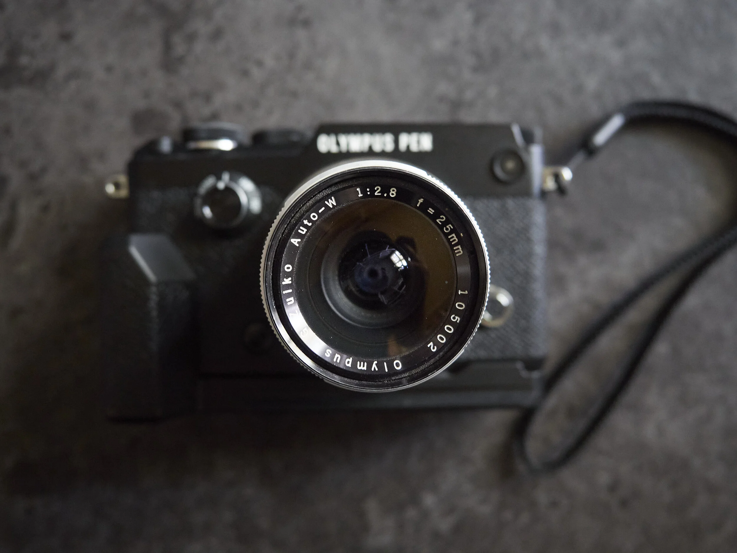
Capture 1 (C1) is now the bedrock of my processing stream and I have been using it for long enough to form some more concise thoughts when comparing it to Lightroom, at least with the tools I use.

Core File Import.

No contest. Files, especially higher ISO ones are just better. This comes from a slightly sensitive M43 user’s perspective, but I can honestly say, I can now use ISO’s 3200-6400 without too much cause for concern.

Gone is the mushy, bland, contrast robbed base file I would have struggled with. Coming at the same time as the EM1x this combo have really freed me up to handle some pretty horrific light, very common in a school environment (for example last night’s play had lots of single, coloured side lights, for ultra moody sets). Where I once got jittery at 1600 under artificial light, I now feel about that same at 6400 under much tougher light.

Sharpening.

Not as overtly sharp as Lightroom, maybe not as snappy looking, C1 starts out less punchy (read more natural, but with less “Hollywood”), but on close inspection is usually holding very fine detail. The tool is more intuitive and the results more predictable. The too and fro of Lightroom’s sharp/noisy vs plasticky over noise reduced seems to be gone. The anti halo slider is also good for those times you need to push, then disguise the result. Sharpening, especially with the brush tool seems to even be able to sharpen the slightly un-sharp. This is very handy for groups or moving dynamics to even things out visually. I think PS does sharpening better than LR, but without the mass processing benefits.

Noise reduction.

This tool is less aggressive (effective?), but most of the work has been done on import processing. I very rarely need to use it, but if I do, I feel confident it will not monster my files.

Cropping/straightening/distortion.

I won't lie, I like Lightroom’s simpler tools better, especially the straightening tool. The C1 tools are more cumbersome for me as I prefer the slider tool for both distortion and straightening which are not it’s natural state of operation. There are more tools, which is great when you need it, but the simplicity of Lightroom’s tools (not as simple as previous versions) was a boon for mass processing jobs.

Marking and cataloging processed work.

Much the same and I will admit to being slack here with both. The colour code marking is quicker. I do seem to be able to get through bigger jobs faster. Colour categorising is a direct right click > select, not left click, > chose selection type > choose colour. Much quicker There is likely a shortcut for something like that in LR, but C1 came naturally. I usually mark primary exports red, secondary exports orange etc and “star” duds if needed.

Vignetting.

I will give this one to Lightroom. I found it’s shape and graduation tools better/gentler, but both work similarly for quick application.

Clarity.

I had an older version of LR (“stupid Adobe not upgrading older Macs making my get C1 for my EM1x”, or maybe “cheers Adobe for not………”), so I did not get to try their structure tool. I prefer the clarity tool in LR (often used with mild sharpening, then applied locally with the brush tool), as I find the C1 version punches contrast up too much, but the structure tool has it’s uses. Overall a tie I guess. I will say though, what I found was a must with LR is now more of an emergency tool.

Dynamic Range.

Again, like sharpening, no contest. The core file has more depth, the various controls offer even more. The one I missed at first was Brightness, with no LR equivalent to prompt me. This one is way better for taming strong sunlight as it avoids HDR-looking highlight recovery. It basically re-sets the files curve. Highlight recovery tends to go to a colour, often yellow, which can be fixed easily enough and can lean towards an HDR look. Shadows also recover well with obviously less noise.

De-haze.

I feel the opposite to clarity here. I found Lightroom’s de-haze to be clumsy and brash. C1’s tool is a magic wand. I now tend to smile to myself when I see some lens haze.

Colour Editor.

On balance, I like the C1 more for speed and if I need it for depth.

Lens Corrections.

No contest. C1 has all my lenses loaded, LR did not.

Black and White and Grain.

LR could have a lovely clean look to it’s mono conversions, something I embraced. I feel C1 is better, more mature, but so far, I have not explored enough to have an educated opinion. C1’s application is a little more direct and specialised.

Layers

Not really a fair comparison, because LR does not technically have layers (but bounces over to PS easily enough and can layer some things like HDR), but in C1 layers makes the core tools more powerful. LR has some annoying habits when splitting or not some functions. C1 allows you to experiment and mix-match your efforts easily. As a photographer, not a graphic designer, this form of one page layering is ideal.

So, summing up, how has life changed?

  • Shooting in to the light does not scare me (De-haze and dynamic range recovery).

  • I work faster, especially with big jobs (better base and faster colour categorising).

  • I try to shoot straighter to avoid slightly more cumbersome straightening procedures.

  • I am no longer afraid of ISO’s 3200 or 6400 and use 1600 without thought.

  • I use sharpening more, clarity less, but usually trust the file to be pretty good without either.

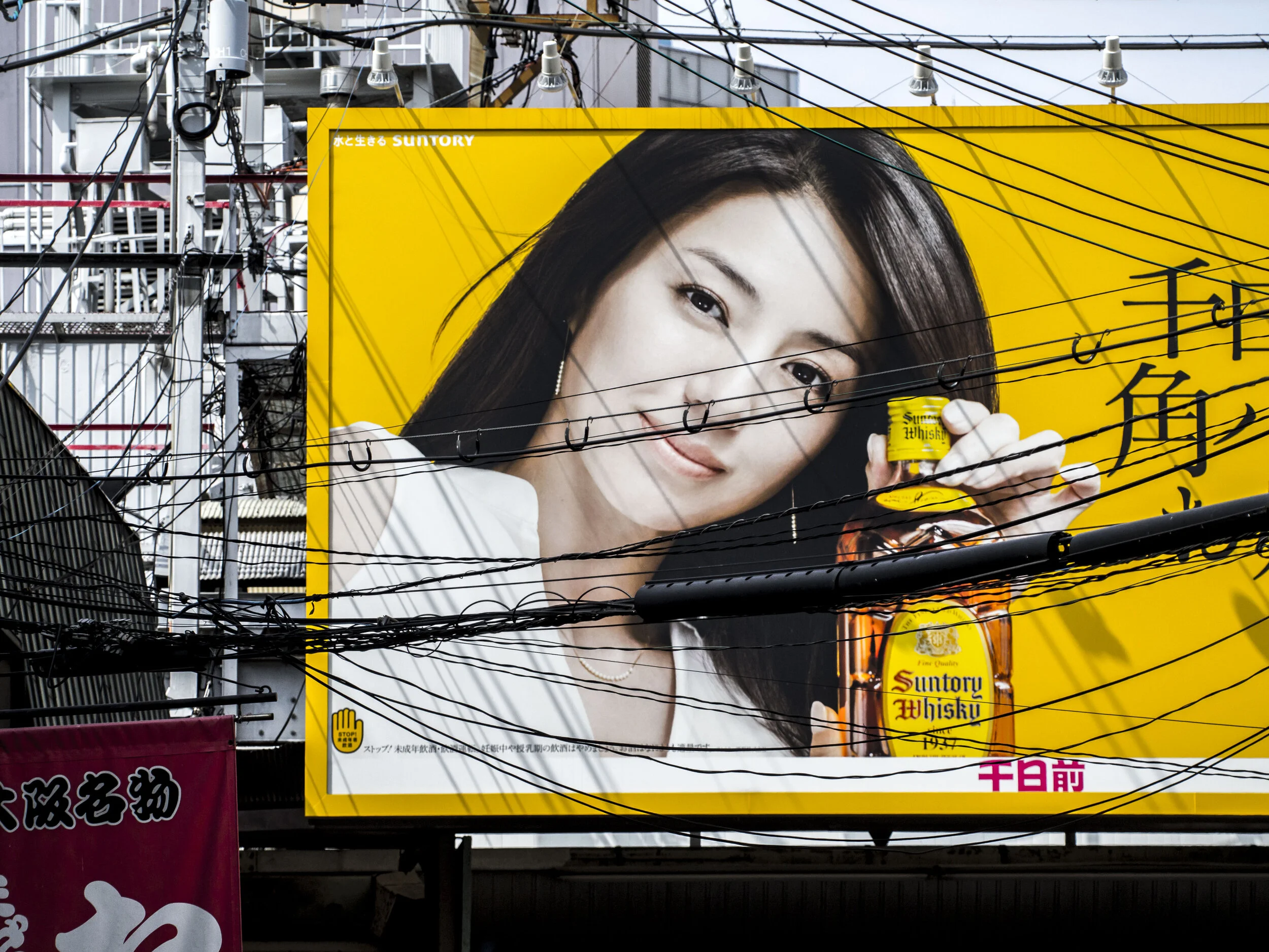
  • I have an even greater respect for M43 and it’s abilities (and I dare say many Fuji shooters feel the same). There is a slightly cropped 4x7’ billboard at both of the campus gates (below) taken from an early C1 file. In hindsight, I should have tried the Brightness tool as I first encountered the HDR like highlight recovery, but it was good enough for this. There is also a bus getting a full length shot from an EM1x and 300mm “snapshot” taken in torrential rain at camp. Several older full frame files failed to make the grade.

  • I am exposing more for the subject, rather than for the overall frame, because I can pull and push things better.

  • I am actually thinking a lot less about processing, while shooting.

Grainless and sharp, this has maxed out the printing process used, with 30% of the file wasted.

Grainless and sharp, this has maxed out the printing process used, with 30% of the file wasted.


Simplicity

Waiting for Meg in a doorway, I found one of those images that takes me back to older times and older techniques.

“One up, two down”. EM5 mk1 14-42 kit lens

“One up, two down”. EM5 mk1 14-42 kit lens

Meet Joe Black

Not the movie, my new model :).

My poor wife gets bush-whacked regularly, pressed into service as an impromptu model for my tests (and I have a knack of picking the worst times) and I have found fans, stools etc make poor substitutes for people.

I needed a very patient face, so I bought one.

Joe’s matt black finish looks good for shadow, highlight and hot spot analysis and his anatomy is near perfect and essentially gender neutral.

EmptyName 15.jpg

Designed to be in the limelight showing of the latest shades, Joe will unfortunately spend his days in a dark room waiting for very occasional glory in front of the camera.

Another Ball, More Lessons Learnt

So a little ball snuck up on me (year 10’s) which is a little bit of a rehearsal for all concerned.

As usual I over thought the process, but did make sure to take a few options, not knowing what to expect*. My intention was to keep it simple, but to be prepared for literally anything. The full seniors ball has red carpet arrivals, formal groups and dancing/mingling shots, all curtailed to some degree over the last year or so because of COVID, but I have still prepared for the full deal, knowing that even a little bit of it has the same needs as a lot of it.

This was not that event. I was asked to try to hit a middle road between the red carpet arrivals and the formal shots. Basically semi-formal arrivals.

Arriving early (always the number one recommendation for any photo gig), I had a couple of choices in the space. The overly well lit, boring and busy front foyer was a no go, but the actual room was enormous (bigger than the senior’s more formal space), so I decided to try an idea I had wanted to try for a while, to use the actual venue’s ceiling and stage lights as a back drop. I set up just inside the door facing across the room at the stage.

So, insert 2-8 15 year olds and you get the idea except the lights were a lot bigger, rounder and warmer (focus here is on the podium 30 plus metres away, not 3m).  Most of the images had those up-lights, bigger on either side for an added “party” feel.

So, insert 2-8 15 year olds and you get the idea except the lights were a lot bigger, rounder and warmer (focus here is on the podium 30 plus metres away, not 3m). Most of the images had those up-lights, bigger on either side for an added “party” feel.

Not as big as these, but closer.

Not as big as these, but closer.

The technical process for this style is easy enough.

Expose for an effectively black frame with only the lights showing (see above). Adjust the shutter speed to get the right ambient balance. The ISO and aperture will match the flash settings and passively affect the overall exposure, but the shutter speed will do the heavy lifting there. In this case about 1/30th, ISO 200, F2.8, 1/8th power, but it varied about a stop depending on group size etc. The slow shutter is not an issue unless you are getting too much ambient, then blur may creep in.

Blur the lights out with shallow depth of field (f2.8 focussed at 3m with my 12-40, remembering that this is f5.6 depth of field on a full frame). If I had fixed group sizes, I would have switched to a faster prime.

Light the primary space with……..something.

Fill it with…….something else.

Use the ambient lights as back light and possibly, if you are lucky, some rim/separation lighting also.

*

I started with my new 26” double baffle deep soft box. Coverage was too small for bigger groups.

Then I tried the even newer 32” single baffle, bought to get a cheap S-Clamp. Slightly less focussed but still too tight. One issue was height of the little stands (2m), reducing the possible angles. Lesson learned.

Switched to a 42” shoot through, that has managed to have a start at every gig so far. Lesson learned.

Switched that to reflected configuration again which has softer “hot spots”. Lesson learned.

Fill with a 42” shoot through lower on axis, which was fine, except my camera could not see to focus! I disable the focus assist because it does not always work focussing off centre and I do not like it distracting subject sin quiet situations. The camera’s all focus fine in all but complete darkness. Darkness like I was seeing this time.

What to do? I tried a trick that came to me on the spot, simply because I packed every option that came to mind and they were there, talking to me, like so many urgent, noisy little friends. I set up my 480 LED just off axis opposite side to the key, as both a fill light and a focus assist light. The light was dialled to maximum warmth (3200k), matching the golden lighting from the ceiling and tables and was running at only 10%, which was it seemed plenty to do the job.

This one light was providing colour balance, fill and fixing a focussing issue (the camera, an EM10 Mk2, only missed once and that was a huge group well back and out of the light’s range).

How did it go?

Keeping in mind I was using ($au) a $120 flash, $50 controller**, $100 LED, $45 worth of stands, a $30 brolly and a budget camera, I got some of the most consistent and attractive artificial light images I have produced. I am genuinely frustrated i cannot post any, because some are really beautiful, but if any are posted by the school I will revisit this.

The flash worked flawlessly until the batteries got tired (1/8th power 400 odd shots in “fast three’s” with, it turned out, not fresh batts :0), but a quick unit change and all was good.

The LED hardly used any power, and the whole rig handled, with only a little fiddle (power upped to 1/4 and a slight turn of the brolly), groups up to 10 wide. These were a little dark towards the edges, but post fixed that easily enough. If doing this again, I would have a second “B” light on axis turned on as needed for extra grunt and coverage at the expense of nice directionality.

The 42” (Godox) shoot through (with a little LED fill) gave really nice warm, gently soft, semi brilliant, but clean light when used in reverse mode (reflective) and I only lose a stop of power maximum. This just seems to work better for me, striking a balance between the more brilliant “hot spot” prone shoot through and flatter soft box light.

Lessons learned (some again);

  • The same light modifiers keep coming to the top of the pile (42” shoot through’s reversed and 4’ soft boxes).

  • The new stands are great for ancillary lights, but I need at least one taller one for the key.

  • I have tons of light/power/coverage, so no need to carry the lot.

  • Be prepared to be versatile.

  • Go with your gut. Experiment, but be there early enough to do so.

  • Concerning the above two, have a few plans and ideas, but let them go as needed.

  • Don’t worry, because it all seems to come together in the end.

  • Constant light is great for a variety of uses, but not necessarily as the key light.

  • Diffuse the LED because they are bright.

Today I have totally re-imagined my lighting kit(s), which deserves a post of it’s own.

*I decided to trial my “amazing disappearing lighting studio” of 3 super-lite light stands, 2 soft boxes, a pair of 42” umbrellas, three YN560 flash units and a 480 LED. The whole set comes in at about 3kg.

**Tooling around looking for other spots to set up, I forgot to turn the controller off and it fired the flash multiple times from across the room, about 70m.

Brands Of Choice

I am an Olympus guy, well Olympus and Panasonic or just M43 format fan.

I love their lenses (both brands) and the cameras fill my needs as well as I could want and often better than I expect, especially given the tough environments I feed them to.

In lighting accessories, I have become equally a Neewer, Yongnuo and Godox fan. Budgets being what they are (slim) and actual needs probably not that high, I regularly indulge myself with something from their ranges because they are always good value and so cheap (sometimes ridiculously), that I often need to buy multiple items just to get to free freight thresholds! My last order included a 32” soft box with sexy red trim, and a phone case just to get another S-Clamp (with the soft box effectively free).

I come from 35+ years in store retail environments and I know it is tough.

Recently the school I work with asked me to look at a bricks and mortar store quote for some lighting and camera gear.

For the Rode and Olympus/Panasonic gear I said go with the local guy, but for lighting gear, often sourced from the same base manufacturers in China, but coming through several levels of wholesale, I could not accept that some items were 1000% dearer than the very same thing I had purchased for myself only recently and none were genuinely better for the money*. In some cases an item was literally 10x the price, i.e. add a zero to $14!

To be clear, I am not sponsored or influenced by any force other than my own conscience.

For me Yongnuo came first. Their YN560 mk 3 & 4 strobe units are awesome, for about the same money as a name brand makers flash accessories. Without going into actual numbers, I will use broad equivalents.

For the cost of Canon, Nikon or Olympus’s second to top unit, I can get 3-4 YN’s with an off camera controller. That is an entire portable flash studio setup.

Powerful, controllable, reliable, replaceable. Perfect.

Powerful, controllable, reliable, replaceable. Perfect.

Now first up, these units are not all fancy pants clever like the name brand units. That requires getting the models that you only get 2-3 equivalents for the same money (Godox 685 etc), but they do match them in grunt and durability (except weather proofing, which is rare in any case). They have a decent warranty, but to be honest, I doubt I would bother. When one eventually terminally falls over (literally and/or figuratively), I will simple mine it for parts. Two have had decent falls and survived, so I am confident I can always rely on most of them at any one time and I have extras.

The same goes for the base model Godox units (the 600 series) and the even cheaper Neewer’s. If you do not need TTL control, which is often not the right choice for studio or repetitive work, then these are the same functionality as using a name brand unit. The secret I have found is to use decent batteries, which applies to all brands.

They are however very capable in other feature areas. All of these are 2.4g radio controlled. This was science fiction when I started with flash, but now comes standard on most of these units. Some of the flash units have this feature built in both ways, so they act as backup transmitters or receivers.

I do not blame the retailers for the huge disparity. They have bought a product as they have always done. One that has however gone through several wholesaler’s hands, all taking their cut (often double or more), so that by the time the shop gets the items needed they are (a) paying at least half of the difference in the price themselves and (b) have to pay based on a misleading gauge of it’s real value. Legitimate retail has it’s advantages, but sometimes, the math does not stack up.

The difference with Neewer in particular is you still get a decent level of consistency, quality control and backup with a small manufacturer to user markup, by bypassing the bulk of the wholesale chain.

Extreme cases of bargains to be had, not representative of the average, but findable. I will use a nice light meal for two at a well priced local Tapas bar as my “equivalent” to give you an idea.

  • 1x very sturdy C-Stand = meal for 1

  • 1x 1.2m steel arm and clamps for same = meal for 1

  • 1x YN 560 mk4 flash = meal for 2

  • 3x 260cm stainless steel light stands = a little less

  • 1x pair of 4’ umbrella type soft boxes/silver reflectors = 4 standard drinks

  • 1x 660 bead bi-colour LED light panel with barn doors and battery = a meal for 2

  • 1x 530 bead, remote controlled RGB LED panel = same

  • 1x 72” umbrella (silver or white) = meal for 1

  • 3x light weight and compact, but solid aluminium stands = meal for 1

  • 1x TTL, full smarts YN or Godox flash = meal for 1

  • 1x 5x7 backdrop, diffuser or reflector/flag cloth = entree

  • 1x powerful portable studio grade strobe (AD200) = three nights out for 2

and it goes on.

So, what do you get?

In most cases they are very good copies of an item, sometimes they are a rebrand of the same item, or made from the same sourced parts, sometimes they are a little heavier or older in style or just cosmetically different, but very rarely are they different enough to actually justify the added value of the named item. Very occasionally they are just better than name brand product. The fact is, most accessories are made in China by a third party who will make/sell their wares as they can, sometimes to spec, sometimes they make to sell then find one or more wholesalers.

The premium price tag item may come with a good name, local warranty and good backup (or not), but the product is often, not always, but often, effectively or actually the same. In Australia, most Neewer is sourced from local wholesalers, so they are subject to same laws as everyone else. Godox and Yongnuo has recommended dealers, who for a little more offer extra peace of mind.

Light stands.

Many are so cheap that you can literally buy two to four times as many as you need for so little, that breakages, even the odd screw coming off that you don’t have time to find, can be fixed instantly by just picking up another. The super light weight 200cm stands I bought recently are made of the same parts as many of the better light weight tripods that have been around for ages, so it is more a matter or finding another use for something already made in such large quantities that they are almost costless, than paying for a bespoke design. The reality that there are tripods on the market right now for hundreds of dollars made with these same parts is the “buyer beware” part.

One trick I have learned is to always buy stainless steel stands if possible. When buying black it is hard to pick what is plastic and what isn’t, even for the same price.

Bags.

I purchased a large backpack from Neewer, that is exactly the same as one specialist Drone maker’s premium priced product for one third the price (piping colour is different but nothing else). Bags large and small have been a sub-hobby (addiction) of mine for decades. A name brand bag big enough to hold what I wanted would have cost 3-4 times as much. I love my Domke’s (5+), have had Billingham (3), LowePro (tons-lost count), Temba (2), Filson (2) and many others. Sometimes you just want a smart, useful tote of padded shoulder bag for your flash kit for the price of a T-shirt, not the price of a lens. When they do not cost a bomb, they don’t load you down with guilt when their usefulness wanes.

Lighting mods.

Mods in their many forms are a little different. The stems and spokes of brollies etc are lighter and more prone to damage (but also lighter to tote), their reflectance and diffusion are different (not worse, just different as they all are when compared). The heavy-duty build of the premium brands is missing, but not that of the middle of the road brands and as one expert in the field said, light is light. I have so many (20+), that I am not only bullet proof in depth, but have been able to discover for myself which ones I like to use, all for the price of one premium brand soft box. The excess can then be used to experiment with or as backups. Best value so far are 2x 42” white Godox brollies, often used as reflectors.

Flash units.

Godox is my “smart flash” go to with a 685 AA and 860 Lithium powered models. To these I added the TX1 radio control, all for about the same value as a second from top name brand unit (also AA powered). On M43 format with a 2 stop DOF > aperture > power advantage, these give me about the same power as a portable studio light like an AD200 on a full frame. The AD200 which is fully compatible with these, would then give me a seriously strong light for less than the cost of that brand name flash (with 3 times the power). Their SL series wall-plug lights are also a bargain if you need constant light, but Neewer LED’s are even cheaper and cordless.

Mixing brands was not ideal, but Godox seemed to have risen to the top of the smart speedlite ranks when I was looking.

For “dumb” manual only flash, Yongnuo is my choice, mainly because I purchased my first two when they were “the” disruptor brand. Powerful, robust, consistent and reliable, they are a bargain. I have 5 which is enough (on M43) to light up a group of 30+ with modifiers.

Eneloop Pro batteries, my only non compromise item have literally breathed new life into these. They functioned well enough with good alkaline’s but chewed through them and as they exhausted, some exposures were well under. The Eneloops just go and go. My only issue is I bought too many (30), before I found I could get through a full event shoot with one set of 8!

For constant or mood light, I use Neewer LED’s. A little 176, a Bi colour 660 and RGB 480 give me hair, wall or fill light in many circumstances where time is an issue. The little one is the “10x cheaper” example above, the three, with monster NB 970 batteries came in at about the equivalent of the Godox 860, which is half of a name brand flash etc.

Other stuff.

A set of cut down gel sheets for $5, a quality sunglass model head (matt black) for tests $25 (I found an ugly one in a haberdashers in low grade styrofoam for the same price-that was $2.50 online!), a dozen super-strong clamps $20, and so on.

I could (and often do) go on, but you see where I am going. Local retailers need your business and often work really hard to get it, but in some areas their hands are tied by wholesale systems as old as retailing.

Buy hardware and name brand items from them and you get the support of a local, often for not that much more than a dodgy online source (apply the 10% rule here and remember to add freight), but for those things that look like they should be cheap, think cheap and look around (maybe apply the 100% rule!).

So to cut to the chase;

A stand only has to be solid, reliable and convenient. Durability can be balanced against price/quantity and realistic usage needs and weight can be supplied after (Did I tell you story about the $5 K-Mart 2kg ankle weights?).

Light is light. It needs to be diffused (through smoke, cotton, nylon or poly, not silk of God’s breath), bounced of a surface, or focussed. It needs to be versatile and reliable and it has to be strong enough to work for you when you need, but mostly it needs you to use it well. Light does not get better when you pay more for it but it can get stronger/faster to recycle etc.

I am not naturally tight fisted (see my gaming page if you want to see excess), but over the years I have become wary of wasting money on things that are just tools.

Travel well :)

*case in point, on a recent visit to the same store I came across a rattly, light to medium light stand with plastic joints for $149. Much lower quality than the stainless steel Neewer 220cm ones I picked up recently for $9.15. Yup, real.

Plan For Versatility

Over on my tech pager, there has been an exhaustive analysis of my school ball planning.

Getting lucky last year with a minimum of kit, this year I have an embarrassment of options and the strongest intentions of getting something better.

The issues last year were;

  • A bad backdrop wall (same pink as fake tan, commonly found at end of winter balls)

  • Stray up lights overpowering my set-up.

  • A shortage of reliable battery power, making recycle times, reliability of output and enough power for the whole night, real issues. I went through 24 “photo” alkaline’s.

  • A flash that went to sleep a lot reducing my options from 3 to 2.

Wins for the night were my 40” brollies, my 2 YN560 IV flash units (the mk III overheated) and my little EM10 Mk2 that went the distance as my studio shot camera, while the EM1 did candids and entrance shots.

*

Lots of planning, re-planning (see tech page) and over thinking and this is how it went.

Originally determined to try the actual room as background (putting myself in a corner shooting into a large open area), giving me more room, especially for large groups, I quickly gave up trying to fight the ever changing colours and consistency.

The backdrop became black velvet curtains, which picked up light spill as silver highlights against deep black and complimented the theme (Venetian Masquerade), perfectly. They looked like theatre curtains, so I used them as such. These curtains were apparently there last year, just drawn in behind the stage.

In the test shots below, the gentle, plush shimmer proved ideal as contrast and texture, without causing any issues. The masks were handy allowing me to use a student and teacher “incognito”. As the night went on, I adjusted the lighting to deal with larger groups and to improve coverage. In this image, the fill and hair lights were about a stop low. The hair light would have been better on the opposite side (facing the main light, sharing the shadows with the fill), but a stack of speakers resided there, just out of frame.

Skin tones were natural and clothing popped out. The cross light-hair light combo separated everyone well enough for a little post to perfect, unlike the moveable feast of last year.

My light set-up ended up being;

  • 1x YN 560 unit* in a feathered 4’ soft box as main, running at about 1/4 to 1/8th power.

  • 1x YN 560 unit* opposite side and lower as fill from a reflective brolly at 1/8 to 1/16th power.

  • 1x 660 LED as hair light, which just enough to help find brunettes against black.

  • 1x Godox 860 and 685* for arrival (direct TTL, sometimes high speed sync) and dance/room candids (flagged for high-ceiling bounce at 1/4 power). This will be better thought out next year.

I tried a blue gelled wall light, but it added nothing. I also toyed with dual lights in the soft box, but went with one and it worked fine. In hindsight, a spot light effect on the curtains might have been good, but too risky at the time and useless for groups.

I requested the up-lights be removed from my area, problem fixed.

The only lighting issue** I had was the on-going one of the YN’s defaulting to 80mm zoom because I was forgetting to change it wth the transmitter setting, not just the flash head itself.

I changed no batteries all night!

The Godox 860 needed a rest from over heating (I assume after 200+ 1/4 power shots in under half an hour on the dance floor***), so I switched to the 685. It and all the other units went the night with charge to spare and no noticeable drop off in recycle time or output. The monster lithium in the 860 was still half charged next day and it seemed fine after a short rest. This changed my mind on getting a second 860, as the 685 performed nearly as well.

The 2 NP 970’s ran all night at 75% power on the 660 LED (full yellow, half white) and would likely still be going on the next day. Next time I will just use one 970 or the 550 batts. This means I can set up long term multi light LED rigs without fear of constant battery or unit changes.

*

So the moral of this little tale.

Plan for lots of different eventualities, but not so you can or will rigidly stick to any one of them. Plan to be open minded, using what you have in any way needed to get the job done.

Plan…..to be versatile.

*running on Eneloop pro batts.

** room was my other issue, but that was out of my hands.

***The big advantage of M43 for this type of work is the added depth of field you gain, allowing a wider aperture than larger formats, effectively adding 2 stops of power to your flashes. I can shoot at F2-2.8, at 1/4 power and ISO 400 with a high ceiling to bounce off where a full frame camera would need f4-5.6 and ISO 1600 or 1/2 to full flash power. The beauty of it is, I can choose what to stretch when I need even more grunt, rather than everything. Or maybe the camera with grip was playing up. I have had it checked with no fault found, but very occasionally the grip disables the main shutter button until turned of.


The Curious Case Of The 60 Year Old Lens

The ancient 25mm is still drawing me. I guess I want to see if it is worth using, or offers something genuinely different, creatively at least.

The lens holds decent sharpness to the eye, down to pixel level. Focussing was an issue, but the peaking option works on the Pen F so that is to some extent, sorted.

Colour is unique to lenses of it’s time. Not a huge lover of muted tones (or a chaser of ye olde film looks), the option to have them, without doing anything drastic in post is attractive, but not compelling. The images below have had a little processing applied, but they defy too much pushing, which quickly contradicts the core look. They loose their naturalness.

Hazing is definitely present especially at f2.8 and a little at f4. The files clear up nicely showing pleasing sharpness, with the de-haze slider seemingly custom made for this.

Flare is well controlled, although the highlights can be amusing, often showing some form of the five bladed aperture ring. The fix (on the left below) is fine, but in reality the original was not too bad either.

Chromatic aberration The only time I have seen any CA is on the edges of really high contrast areas like below, in the form of very mild red fringing.

The big one is Bokeh.

In the near-ground and non highlighted areas, Bokeh is a bit like I get from the modern 17mm f1.8, that is to say long transition and forgiving of focus errors (ideal on a manual focus lens). Below, the leaves transition interestingly, but the background branches are jittery. This is similar to my 40-150 Pro and some images I have seen from the latest Nikon 70-200 VRII, so not just an old lens thing.

Highlights and outer edge Bokeh on the other hand can get a little funky.

Notice the “cats eye” shaped highlights around the edge? This lens has a mild case of something I first noticed from a Canon 50mm f0.95 rangefinder lens from the same period called “swirly” Bokeh because it looks at odds with the more circular centr…

Notice the “cats eye” shaped highlights around the edge? This lens has a mild case of something I first noticed from a Canon 50mm f0.95 rangefinder lens from the same period called “swirly” Bokeh because it looks at odds with the more circular centre.

Is this useful? probably not. The performance of the lens with solid, calm subjects is commendable, but when busy highlights are involved, I doubt I would take the chance.

So, what is the initial impression after some ad-hoc, non scientific testing?

Yes, I will use this lens, mostly for personal stuff, but also some creative work and it will sit on front of the Pen F as a working lens cap as the pair do little other duty.

No I will not be using it for paid work. There is little point unless someone specifically said they would like an '“old school” feel.


The Perfect Distance

There is a look in some great photography, that I do not seem always to be able to get.

Pondering other things photographic, I realise that many of my favourite images have a perfect distance and perspective. Take this away and they lose their power. This distance is not too tight, nor too wide. It is by definition, just right.

My own struggle with this (consciously-unconsciously?), has tended to side with the “tighter is better” school of thought, making me a details person. Never a fan of the sweeping landscape, especially in my own work where I prefer the portraitists perspective, I have often missed something obvious.

The middle distance.

The main focal point is supported by the whole. If tightened up, it becomes a single statement image (“Intimate Japan”?), but loosened off, it allows for the main subjects to be contrasted with others.

The main focal point is supported by the whole. If tightened up, it becomes a single statement image (“Intimate Japan”?), but loosened off, it allows for the main subjects to be contrasted with others.

The one exception to this for me is in my street images. Often standing out to me as different, I assumed because of location and subject matter, I have come to realise it is as much because they are taken differently.

My 17mm lens (35m in FF terms) and the constant movement that defines our trips, forces on me a compositional style that I seem to ignore the rest of the time. Always a little self conscious when working at home, I may actually use tighter compositions to avoid the stress of shooting more and wider. From including people that may not appreciate my artistic endeavours.

With no particular point of connection, the image above only has any strength when seen as a whole, letting your eye wander through it appreciating the patterns formed.

With no particular point of connection, the image above only has any strength when seen as a whole, letting your eye wander through it appreciating the patterns formed.

Every image has a perfect distance, an ideal perspective and even an ideal size to be viewed at. These choices are often ignored in favour of “preferred style”, probably at our peril.

A Better Fit

After the EPM-2 and old 25mm Pen F lens failing to make a useable pairing, I tried a different and more fitting combination.

I present the Pen F (new) camera and Pen F (old) 25mm lens.

EmptyName 17.jpg

The finder on the Pen F is way better for focussing, the heft is perfectly balanced and the tactile feel of the all metal combo is soothing, natural. The lens, Fotodiox mount and camera have a “tightness” to them, that feels like it will go on forever. Sad to think, the sensor in the Pen will be the thing to go in ten years or so, otherwise it feels timeless. Ironic. The lens gets a new life, faults fixed and all, but the new tech will still be outlasted by it.

Sharpness is fine from f4 on and useable, after some post at f2.8. It is perceptually strong. This is similar to the performance of my old Zeiss 50mm, that was not sharp on a micro level, but more than sharp enough to the eye. Micro contrast. Compared to a lens like my kit 14-42, which is a surprise packet, this lens is not technically as good, but is pleasant in a different way and defies toe to toe comparison. It has earned the right to a gentle, but active retirement.

Colour is also different to that of my newer lenses, which I also see as a real win. The colour I am seeing takes me back to older images, film era ones (specifically Kodachrome 64). It is cooler than my current glass and tends to lean on a 1970’s period purple-green hue in the shadows. Most of my Olympus lenses are leaning towards the warm end (not all of their lenses, but many of the ones I have), so a cool accent is another arrow in my quiver.

Old Timer

On a day trip today, I paired an odd couple. My recently ignored street camera (EPM-2) and the ancient 25mm Pen lens (original 1960’s half frame model).

The coupling turned out to be almost unworkable. The EPM can have an eye piece added which was needed as I found out the manual focus assist does not work with mechanical only lens connections. Combined with a poor screen for bright light viewing and you have an almost unusable camera.

Shame, because it is a capable performer optically, if a little twitchy.

First up, sharpness.

Not only pleasantly sharp, but interestingly micro contrasty. The 25 is not one of the legendary lenses of that range, but if this is the low bar, then there must be some gems in the range.

Next up, flare (no hood, filter nor care taken).

The top set show the wide open (f2.8) haze the lens always exhibits, which cleans up well in post. Originally I guess this would have been seen as a real issue, but ironically, digital offers an easy fix, a bit like CA I guess (which this lens seems to avoid). I seem to remember Lightroom doing an even better job.

The lower images show the difference between 2.8 (unusable) and 5.6 (unusual).

Bokeh.

EmptyName 14.jpg

I knew it would be interesting from previous try-outs, but this is very cool. The background is playground rubber mat with small white specks about 2ft away. Notice that the glass shard is razor sharp at f4. My 40-150 f2.8 shows similar characteristics sometimes!

Slightly out of focus (like many), this image shows pleasantly coherent transition, until highlights are encountered (see above). The colour is gorgeously old school, with the perspective of variety being a good thing.

Slightly out of focus (like many), this image shows pleasantly coherent transition, until highlights are encountered (see above). The colour is gorgeously old school, with the perspective of variety being a good thing.

Inspirations And Influencers

Inspiration. People and other elements that help us define what we do, how we do it and why.

Influencers. Those people or effects that change what we do and how we do it.

When I explained the form of this post to my wife, she suggested the original content and title may be too limiting (“Inspiration”). She felt I needed to sub-categorise my inspirations into inspirations and influencers.

For most of my early life with (film) cameras, my inspiration came funnelled through magazines, the odd book and word of mouth. The day I discovered my desire, my need even to photograph, there was a perfect junction of a piece of music (Enya “Storms Over Africa”) and a magazine article about Jim Brandenburg’s Aerial images of Africa, Namibia in particular. A perfect, un-intentional coincidence and my first influencer. The hairs on my neck stood up and I still remember, thirty plus years later, that all I wanted to do was see and shoot like that (maybe to music?).

I bought the magazine “Photography” because I had just purchased a camera (T80 Canon, a homage to the worst of 80’s styling) and it felt like a sensible reinforcement of my purchase, but the actual driver to do photography as a life imperative came with these images and the accompanying music at an impressionable and overly romantic time in my life.

In a nutshell, the camera was irrelevant (good thing as it was an odd and limiting choice), the true inspiration came from perceptual stimulation, just as it should.

To be inspired by, or even influenced by someone does not mean you set out to copy them, but that they have helped set creative parameters, validations to apply to the loose ideas in your head. They have helped define and clarify who you are and where you want to go.

From that point on, I can identify several photographers and more importantly their images that have helped “focus” my journey through the years*. These are my influencers. I have not provided links, because I may be overstepping the copyright line, but a quick search and you will find them. I have added some of my own images. These are not for comparison as they would not withstand that, but simply to show how an influence can be interpreted to develop another stream of creation, even a lesser one.

Sam Abell; “Branding” Rosman Ranch Utica. This image revealed, with it’s accompanying article in American Photo, the importance of composing from back to front. Abell settled a lot of concepts for me. The term “Sam Abell light” is still synonymous in our house with late afternoon or pre-storm “golden” light and I carry a quote with me about the strength of the quiet image. Include for good measure any of the cowboy images by him.

Not really the same, but composed with similar thinking. Front to back depth and elements of colour to hold it together. This image is probably as much “Alex Webb” influenced in style, but not in thought process.

Not really the same, but composed with similar thinking. Front to back depth and elements of colour to hold it together. This image is probably as much “Alex Webb” influenced in style, but not in thought process.

Sam Abell; “View of the Kremlin” Moscow. The first time I “got” the relevance of the mundane against the extra ordinary and how they are perceived by real people. This fundamental idea went from abstract-artsy (boring b.s.) to uber strong story telling.

No Lemons and no Kremlin and almost the opposite dynamic, but definitely inspired by my image memory. This image was the very first posted on this blog. My wife actually first noticed the similarity in style.

No Lemons and no Kremlin and almost the opposite dynamic, but definitely inspired by my image memory. This image was the very first posted on this blog. My wife actually first noticed the similarity in style.

Sam Abell: “Grand Hotel” Hagi Japan. This beautiful image first seen on the cover of his book “Life of a Photograph”, highlights to me both of the above, with a gentle colour palette, reminiscent of the early colourists and sublime, intuitive use of Bokeh as a creative element. The things that hold the image together for me are the red tail lights of the bus with the brilliance of the light on the table.

Sam Abell; “Straw Hat” Kentucky. Another example of the power of light and perfect technique with a relatively mundane subject. He took lots of images in Shaker communities, but this one stands out for me.

A sewage truck in Osaka, highlighting that beauty and serenity can be found anywhere.

A sewage truck in Osaka, highlighting that beauty and serenity can be found anywhere.

Perfecting perfection is also a strong driver for my work. Ever looking at parts of something rather than the whole, I once visited an old car show and stoked with the results, shared some images with the car club. The majority of comments came back…

Perfecting perfection is also a strong driver for my work. Ever looking at parts of something rather than the whole, I once visited an old car show and stoked with the results, shared some images with the car club. The majority of comments came back along the lines of “great, but where is the rest of the car?”.

Unappreciated by the owner, I felt this (with others) could define the essence of the car and the effort put into creating it. The lesson here is know your audience, but stick to your true self.

Unappreciated by the owner, I felt this (with others) could define the essence of the car and the effort put into creating it. The lesson here is know your audience, but stick to your true self.

Sam Abell; “Dorymen Joe and Clarence Hawkins” Newfoundland. All of the things that make an environmental portrait powerful.

My closest example of the balance between empathy and relevance.

My closest example of the balance between empathy and relevance.

Bill Allard; “Benedetta Buccellato” Sicily. Simply the best and most on point soft/sharp image I have seen. Before Bokeh (or even AF) was a thing, this defined that concept visually for me, before it had a name. He managed to focus on the face net perfectly, allowing the sublime Bokeh and colours to hold the rest.

I have nothing of that calibre, but a few that take my head into a similar space. The red lipstick (under processed in this version) allows a flawed image to just hold together.

I have nothing of that calibre, but a few that take my head into a similar space. The red lipstick (under processed in this version) allows a flawed image to just hold together.

Ansel Adams; “Caladium Leaves” Honolulu. A colour image, rare for that photographer and by time (1948) rare for most. The velvety splendour was the best of it’s type for me at a time when “Classical Nature” images were my calling. No matter how many black and white images I look at, especially from this period, minimalist colour always wins out.

A gentleness in craft I had not manifested before this. This image pays homage to both gentle, classic tones and negative space.

A gentleness in craft I had not manifested before this. This image pays homage to both gentle, classic tones and negative space.

John Sexton; “Cornlilly” California 1977. This slot probably belongs the John Shaw, who allowed a young 35mm photographer to think and work like a larger format shooter, but Sexton’s work, especially that image, have been a strong and defining influence on my abstract wilderness images. I would probably take it in colour though ;).

The two above and below are sides of the same coin.

Many years or trying to capture that elusive gentleness of the early Adams images has led to many, many files I may have otherwise passed over. I struggled to find one I liked enough to bother with here. I am fully aware that the audience for this t…

Many years or trying to capture that elusive gentleness of the early Adams images has led to many, many files I may have otherwise passed over. I struggled to find one I liked enough to bother with here. I am fully aware that the audience for this type of image is generally found in midwest America (possible too long ago), so the influence was/is strong enough to hamper the relevance of my resulting images, but an influence it was.

Ansel Adams; “Green Hills Evening” Gilroy California. Again a rare colour image from a reluctant Adams, the subtlety and gentleness of this ( and most others of his like it) is a product of the photographer and the limits or character of his medium (beware of modern over-processed versions). If you see this in any form other than with soft, light lime green and equally soft red-brown’s, you are seeing it incorrectly.

That rare light that defies technical logic, but just works. All it needs is some lime green ;).

That rare light that defies technical logic, but just works. All it needs is some lime green ;).

Ansel Adams; “Aspens” New Mexico. Several black and white images from his huge portfolio that really woke me up to the power of light and dark made stronger together. All are good, but my favourite is the one where the trees look like they are walking toward you.

Very common in my own mono imaging is the use of negative or black space. It is really handy at the zoo.

Very common in my own mono imaging is the use of negative or black space. It is really handy at the zoo.

Phil Borges; “Maralal” Kenya. Revelatory when first found, Borges work uses light, selective colour and format in a way I had never before seen nor forgotten. He allowed me to break formatting shackles and inspires us all to take the studio into the real world.

Shape and placement, but without selective colour. The way Borges does it (darkroom bleaching and toning) makes it art. Just removing it from a digital file seems gimmicky.

Shape and placement, but without selective colour. The way Borges does it (darkroom bleaching and toning) makes it art. Just removing it from a digital file seems gimmicky.

Sebastiao Salgado; The Sudan Images. Back in the 80’s we felt we could actually make a difference with a camera (the Bosnian war broke that spell). These images are always where my mind goes when someone says the word “Famine”, but equally, dignity in suffering. I cannot claim any images of the power and relevance of these, but I will never forget the message, that one image can change a person’s perspective (it did mine).

Michael Kenna; The Rouge, Study 13, Dearborn Michigan. Another example of Bokeh used creatively with Kenna’s typical minimalist strength. There are lot’s of Kenna landscapes on my remember list, images that help remind us that the world is full of beauty, no matter how mundane the subject. Really, his images say to me “get off your %#s and take photo’s anytime, anywhere and in any light”. Other images, often in magazines etc, with similar structure resonated with me well before I understood or had heard of Bokeh, but this one and Eugene Smith’s “Steel Mill Worker” series are the memorable work from this period.

An early and technically flawed attempt at “Kenna” style. I wish I had the patience, because I have spent far too long dwelling on the technical.

An early and technically flawed attempt at “Kenna” style. I wish I had the patience, because I have spent far too long dwelling on the technical.

Michael Kenna; The Ratliffe Power Station series. I am particularly drawn to his urban and industrial images, especially the power station ones. These were for me the second time beauty clashed with environmental horror (the first was Robert Ketchum’s work), but Kenna’s won out because of their simple strength. Ketchum actually hid the horror inside the beauty, Kenna harmonises with it.

Pentti Sammallahti; Pretty much the whole book “Here Far Away”. Coming late in the piece, this work bought together all of the influences from my own past into a new work, done old style. Pentti shoots film and prints to suit. His book is timeless and perfectly presented, but at the same time so obviously “old school”.

A bit of a cross-over between old school abstraction with colour and Penti’s natural grittiness.

A bit of a cross-over between old school abstraction with colour and Penti’s natural grittiness.

Saul Leiter; “Through Boards” 1957. About 15 years ago, I realised, I was drawn to the early colour photographers (1950-70), especially early street shooters. Leiter’s work in particular became a firm favourite. The palette they used (were restricted to), their brave, sometimes miraculous technique and their use of abstraction, which seemed more acute and advanced than mono shooter’s, all struck to my heart. Even mono image maker’s who made rare forays into colour, seemed to be different artists there.

That Hollywood set, semi-fake light that I find so compelling. This elusive and timeless light followed me one day in Kanazawa Japan (more images below).

That Hollywood set, semi-fake light that I find so compelling. This elusive and timeless light followed me one day in Kanazawa Japan (more images below).

Ernst Haas; His reflection, abstraction and detail images and a stunning shot of a swimmer with her eyes closed that I cannot find a name for other than “Swimmer New York City 1988”. Haas was also better known as a black and white image maker. Like Leiter, he takes on a different artistic persona with colour.

Light and abstraction vs form and function, the early colourists battle.

Light and abstraction vs form and function, the early colourists battle.

Fred Herzog; “Granville Street from Granville Bridge” 1966 and similar. A compressed by long telephoto, colour, urban landscape from that period is a truly rare beast. I love taking these and these days they are so easy to take, but when this was made it was a genuine boundary pusher.

Never averse to some depth compression, my longer lenses get a lot of work when travelling.

Never averse to some depth compression, my longer lenses get a lot of work when travelling.

Fred Herzog; The “Crossing Powell” series. Another favourite work environment of mine is late afternoon, often reflected or restricted light in big cities. I discovered Herzog in quantity only relatively recently, with a realisation that if I had found him earlier, he may well have helped define my own style sooner and better.

Lots like this, which in cities are so very easy to do, but the Crossing Powell series are so much stronger, especially when you consider the vast technical differences.

Lots like this, which in cities are so very easy to do, but the Crossing Powell series are so much stronger, especially when you consider the vast technical differences.

Closer to the same dynamic.

Closer to the same dynamic.

Fred Herzog; “Foot of Main”. The urban landscape, as more recently defined by artists like Stephen Shore or Joel Sternfeld, likely gained inspiration from images like this. I truly believe many of these images are stronger, maybe even only relevant, in colour. The mood colour adds effortlessly, cannot be translated into mono only. Mono has it’s own strength, but colour, often the poor artistic cousin, cannot be discounted.

Countless images of the empty places people make. These have always been a strong element in my work.

Countless images of the empty places people make. These have always been a strong element in my work.

Harry Gruyaert; “Fort Mahon” France. If Phil Borges makes the world his portrait studio, Gruyaert makes it his stage. Limited as we all were by the capabilities of out film stock, Gruyaert makes his sing like few others can. His work, especially his book and prints, have the same feel as a black and white printer’s, just with colour added. He is bold, mysterious and deep in tonality with the added richness of heavy, almost unreal colour.

Rich deep Kodachrome colour with a modern twist. Gruyaert and others of his time were not afraid to embrace the limitations and strengths of their medium. My old EM5’s in particular seem to be tuned into this.

Rich deep Kodachrome colour with a modern twist. Gruyaert and others of his time were not afraid to embrace the limitations and strengths of their medium. My old EM5’s in particular seem to be tuned into this.

William Eggleston; “Glass On Plane”. This one haunts me. Light is the heart of all photography and such blatant glorification of light can backfire, but with perfect time and place, transcend. I was not a huge fan of his work, but as I mature I see the importance of it.

Ha! Just kidding, not even close but one day………

Ha! Just kidding, not even close but one day………

Stephen Dalton; His high speed stop motion wildlife images. Dalton was an early pioneer of super high speed flash captures. I am still amazed by the quality of these images, many using 35mm film, taken 50 plus years ago now. Google; Dalton “Swallow skimming water” or “Frog landing in water”

There are many I have not mentioned, mainly because they do not fit the brief of “pivotal” works in my photographic development. Sometimes this is because they are too new, some because they are too new to me, or some simply because they are inspirations, but not influencers.

They include;

Jan Meisner who has a similar feel to Gruyaert or Webb, using the streets of New York as a stage set for deep and complicated compositions, often full of shadow and mystery.

Nothing about this image works except for the man in the middle, an island in his own spirit. The image does contain elements of Guyaert colour, Abell depth and Meisner theatre, but it otherwise contradicts many of the things that make a truly great…

Nothing about this image works except for the man in the middle, an island in his own spirit. The image does contain elements of Guyaert colour, Abell depth and Meisner theatre, but it otherwise contradicts many of the things that make a truly great image. Still like it though.

Nick Brandt, doing for nature what Borges does for people.

Peter Turnley, a rare master of both black and white and colour. This is the work of a communicating street photographer, not an opportunist like me.

Alex Webb, a master of deep, busy compositions often using silhouettes or near obstructions for framing.

Kate Kirkwood, who manages to merge rural and urban street (lane?) photography into something unique.

Keith Lazelle, David H Wells and McDuff Everton who came to me through the pages of Camera and Darkroom magazine pre 2000’s, each bringing their own style and lessons.

Nathan Benn. Benn’s work, only recently published has two distinctions for me. He is unheralded, but thankfully re-discovered now and his book Kodachrome Memory, is sublime in accuracy and feel for the film and it’s times, but like Adam’s colour work was butchered in all other reproductions I have seen*.

John Shaw, Galen Rowell, Art Wolfe and Alan Rokach, who’s early books on conventional colour photography are still with me and are still relevant.

The bulk of National Geo photographers up until about 2000 when I stopped looking.

Last but not least a personal friend and mentor Peter Motton, a local photographer, advanced black and white technician and winner of numerous international awards for his mono work.

*

I bet I have forgotten someone from the last 30+ years, but I hope not too any ;).

What have I learned about myself from this retrospective?

  • I like colour over black and white for my work and my inspiration, but will use and I am influenced by both.

  • I like abstracts, details, mood influencers and the correct application or colour and tone.

  • I also seem to like the abandoned, the run-down, the melancholy and quiet places.

  • Lastly, I like multi layered, multi faceted and complicated images that tell a story, especially those containing contradiction and contrast.

  • I guess I am just like most of you.

*These images are without exception prints from my book collection. When looking for examples be very careful to chose the most accurate, gentle, accurate to source ones, not the modern over-photoshoped takes, especially the Adams colour ones or most things from the Kodachrome era. I have seen the newer printing of “Adams In Color” and I can guarantee, he would not be pleased. Benn’s work also got a good processing (Photoshop) work-over by reviewers doing the beauty and relevance of the work no favours at all.


Cheap Toys

I have been writing a lot in the tech section about my processes coming up to the school formal.

While packing my kit, I stumbled on a cheap Gary Fong rip off I bought years ago. The thing is so rigid and poorly moulded that I had to cut large chunks of rubber off it just so it will fit on a standard flash unit.

GF el-cheapo on the right, no mod on the left. Any difference? probably a better test would tell more, but my initial response is yes, the GF E-C shot looks a little more open and warmer, both good things. The near chair wing and shadows in the blinds and behind the chair are marginally nicer. Not a super powerful tool and probably less useful than a couple of cheap on-camera soft box options I have and rarely use (test coming), but it is easier to use.

It also came with blue (lost) and orange “correction” domes, but they look to be about twice as dense as the real GF ones, so not much use. Last Ball, I had plans of using the orange one as a hair light, but the flash used played up on the night.

It also came with blue (lost) and orange “correction” domes, but they look to be about twice as dense as the real GF ones, so not much use. Last Ball, I had plans of using the orange one as a hair light, but the flash used played up on the night.

Haunted By A Ghost (Gum)

As I walk into the senior campus of the school, I pass this tree. It has haunted me for a while now.

Ghost Gum? Not sure, but haunting none the less.

Ghost Gum? Not sure, but haunting none the less.

Different time and light and it changes ever so slightly.

Different time and light and it changes ever so slightly.

Weddings And People Part 1

I did a wedding recently.

My wedding photography has been patchy over the years as I have never chased the business, but if chased, especially by friends or family, I tend not to resist. Currently, I am busy enough with the school, so I will not be hunting for too much other work, but I am so glad I did this one.

The couple (Phoebe and Trace) are the sort of people you want to do this with. Easy going, keen and accepting, they make you want to do better and accept, with realistic expectations, what it takes to get what you intended for them.

The process.

Communication.

The bride’s father is a friend and colleague of many years. Joe and I have known each other since he (a customer and photographer) first came into the shop I had just started my career in some time in the 80’s. We always shared similar interests and philosophies, so when he asked, I was delighted. In other circumstances, photographing a wedding photographer’s daughter could be considered a curious type of madness, but I felt no pressure from day one.

Pre-wedding communication is a must. Not only do you need to all be on the same wavelength, but it is a photographers duty to empathise and connect with the mood and expectations of the couple and their family. No point in arriving with grand plans, if no-one is on board with your vision.

The impact of your images is also heightened by a genuine connection. It comes through.

Plan.

Once you have seen or had the wedding described (turn up to rehearsals, do walk throughs etc.), then it is time to plan. This is the boring stuff from battery life, lens selection and lighting. If you go set for the whole day in one bag, you will likely have to skip some parts of the process, especially creatively, so think in stages. If you plan correctly, you will be able to “kit to purpose”, saving your back and the embarrassment of not having the gear or resources to cover something (like when I forgot my tripod which was sitting on top of my bag when I left making video a no go…..).

Be Early.

Waiting at the end of the bride’s bed when she wakes up is probably too much (things you learn during the communication step!), but get there as early as can be tolerated. Some of the best subject-photographer bonding and resulting images will happen outside of the core event.

Preparations, like shoes, dresses and makeup are all part of the day. For the bride, often some of the deepest memories are when her support team swing into action and months of planning come to fruition. Details are important, but so is context.

Preparations, like shoes, dresses and makeup are all part of the day. For the bride, often some of the deepest memories are when her support team swing into action and months of planning come to fruition. Details are important, but so is context.

The first hour or so is usually a little restrained, especially in a confined space, so being nice and early allows everyone to get the measure of each other, then we can all relax.

Bridesmaid, deep on thought.

Bridesmaid, deep on thought.

Work quietly and efficiently and be useful. Nobody wants to trip over you and there is nothing stopping you being assistant champagne poorer, bag opener or tag remover. The hero of the morning for me was my little multi tool.

Candid moments of quiet contemplation are usually easier to capture after an hour or two of blending in. Ideally, the bride should feel you are a part of the process, not an outsider. This image was semi contrived, but with an eye to letting the nat…

Candid moments of quiet contemplation are usually easier to capture after an hour or two of blending in. Ideally, the bride should feel you are a part of the process, not an outsider. This image was semi contrived, but with an eye to letting the natural flow of the morning take over. Don’t push against the river, go with it.

A photographer can be equally part of the problem or part of the solution, so how you carry yourself can actually help everyone through the day.

Complicated lighting rigs are rarely appreciated here, so go with natural light and fast primes (in my case 17, 25, 45mm f1.8’s on a Pen F and EM1 mk2) or at most add some flagged bounce flash or the odd reflector.

This is also a great time to get to now the parents and family who are often found floating around the preparation process.

The father of the bride and friend Joe holding it together admirably. The only person in the room that fully understood both sides of the process.

The father of the bride and friend Joe holding it together admirably. The only person in the room that fully understood both sides of the process.

Once the bride is ready, but before she leaves, give yourself enough time to get to the ceremonies location.

A casual moment in the best man’s day. Getting to understand the character of all of the players helps with defining them in images.

A casual moment in the best man’s day. Getting to understand the character of all of the players helps with defining them in images.

Generations are defined by events like weddings, so connections between them are important.

Generations are defined by events like weddings, so connections between them are important.

Before the ceremony, everyone is looking for an outlet for their nerves, making for some wonderful images.

Ok, that was the easy bit, now the big event itself.

A Tail Of Two Dogs

Two years grown, our girls have taken on some interesting habits (neurosis?).

Lucy, for example likes to spend the late afternoon hours sitting on the now misshapen couch cushions looking out the window through the equally misshapen venetian blinds, while Daisy spends her time chasing reflections on the walls.

Pretty much sums them up. (EM1 mk2 25mm f1.8 at f2)

Pretty much sums them up. (EM1 mk2 25mm f1.8 at f2)

Good Light Lightroom

Partially switching to Capture 1 was a forced change, as Lightroom could not support my new EM1x without a new operating system (i.e. computer), but it was and still is a revelation.

Lightroom was pushed aside in favour of the more powerful and system empowering C1, but there may a use for the old stager still.

In good light, with lower ISO settings, it may be I like the files from Lightroom more. Noise and high ISO sharpness/contrast are definitely better in C1 for a M43 user. No contest. Brilliance and that glow Lightroom can offer when the situation is more likeable is a different and fully valid interpretation of an image.

I processed the above files on their own merits as the programmes I used felt they warranted. C1 on the right with a little added saturation. Lightroom held more brilliance in the highlights in the starting file and after gentle editing. It had more colour snap and seemed more at home.

The C1 edits became more about reducing highlight blow-out without losing brilliance and colour warmth. I know a different editor or even me with more time with C1 would probably disagree, but as I see it now, Lightroom is still a real option when the image requires maximum “Hollywood”.

Interesting thing is I have obviously responded to different criteria with each processor, adding saturation in C1 and cropping differently.

ISO 3200 poor light indoor sports and it would be a different matter, but for these shots, images I have always gravitated towards when using Lightroom (for good reason?), the programme sings. One thing that did happen though is a glitch in the (slow) start up where none of my cursers worked in Lightroom until I shut down and re-started. I think a lot of my recent mouse issues may have been Lightroom’s fault, so another reason to have an option.

A Project For New Times

COVID stopped a lot of things from happening for most people around the world. For us, fortunate as we have otherwise been, the only major stoppage has been travel (mainly to Japan).

In a way, this has actually been well timed (only in this circumstance, no other horrors of the year considered), as we had started both become habitual in our travel, rather than fresh and excited.

Seven trips in five years to the point of feeling almost like sharing ourselves between two homes finished with COVID, which coincided with the demise of my faithful EM5 mk1’s as reliable travel companions and changes for both of us in career and life style. Things already felt like they were coming to some kind of end point, COVID aside.

When we go again in the near or more distant future, things will be photographically (technically), possibly environmentally and certainly psychologically different.

“Sunset Men”The distinctive look of the EM5 files, the open, intrusive naivety of our first trips and the softness of Japan and it’s people pre-COVID may all change.

“Sunset Men”

The distinctive look of the EM5 files, the open, intrusive naivety of our first trips and the softness of Japan and it’s people pre-COVID may all change.

Now is the time for me to look at my Japan work as a book project (tentatively titled “Japan; ### days”) with a print project used for “proofs” and a separate body of work.

This has been too long coming, but it needed an end point, as a starting point. The book will be the best I can afford, aiming to be a portfolio work in itself with a low number run and will be a turning point for me in how I see my images and how I want others to see them.

Content aside, the physical book will need to sit confidently in my collection.

Step 1.

All files (200+gb) will be exported from my beleaguered computer onto two hard drives. The originals will be re-imported into C1 from scratch. I know my favourites, but I am also aware I have been looking at them in their original processed form for too long. I need consistency and a fresh eye, applying what I have learned over the last few years. Nothing much has changed over those years except my processing, so that inconsistency needs to go and I am excited to see how C1 interprets some of the more troublesome images.

Step 2.

Get all of the contender into files organised by….not sure of the criteria yet, but that will come. It may be as simple as a chronological journey, subject or location based or more of a story form.

Step 3.

Reduce down to the absolute winners, the “best in class” and more powerful files, those that mix well with others, emphasising the images with the strongest emotional connection.

By far the toughest part, I will rely on the editing skills of others at many points of the process.

By far the toughest part, I will rely on the editing skills of others at many points of the process.

Step 4.

Print them as a body of work and as proof that my processing is print friendly and again consistent. This will also underline the emergence of a printer’s lifestyle choice I have been avoiding, helping to justify my ownership of two good printers.

Step 5.

The book.

Step 6.

Start again next trip with new gear, a new agenda and new dynamic.

Shooting For The Moon

I tend to avoid cliched shots. Maybe too many articles or customers trying the latest fad, but for me I tend to have an allergic reaction to what is on trend at the moment.

So anyway, here is a moon shot/300mm experiment from today.

“Bokeh Moon”.

“Bokeh Moon”.

Always suspicious of a new lens, especially one that cost as much as the 300mm F4, I find myself taking “reassurance” shots when the whim takes me. The shot above way taken after a few standard roof and chimney detail images on a perfect Autumn day.

Curious to see how much difference the higher res image would make, I gave it a go, with limited success until I realised the shutter speed limitation had been exceeded (the images were still ok, just not fully formed composites).

Hand held HHHR jpeg with 300mm with 1.4 tc (840mm eq). The Teleconverter has really impressed, being used on the 40-150 with little thought at all. On the 300, the performance seems fine also, but to be honest it is too long for most applications.

Hand held HHHR jpeg with 300mm with 1.4 tc (840mm eq). The Teleconverter has really impressed, being used on the 40-150 with little thought at all. On the 300, the performance seems fine also, but to be honest it is too long for most applications.

Cropped with a little post. Like anything, you get better the more you do it, but I am happy enough with that for my first try, keeping in mind I am hand holding an 800mm+ at 1/125th, (polariser may have helped as the atmosphere is a little wintry).…

Cropped with a little post. Like anything, you get better the more you do it, but I am happy enough with that for my first try, keeping in mind I am hand holding an 800mm+ at 1/125th, (polariser may have helped as the atmosphere is a little wintry). Maybe a night time image next time.

Not a field I will be trying to conquer, but the more you try the better everything gets.

The Mathematical Advantages Of Micro Four Thirds

I must admit to being a little sick of the funny looks I get or uneducated comments I hear or read about when M43 is the subject. Most come to the format’s defence citing things like size, cost and weight with an almost apologetic feel, but realistically, there is more to it than that.

Here are some things to keep in mind when comparing.

Comment; “M43 can’t blur out the background enough”

Answer; M43 lenses have exactly the same depth of field as full frame lenses with the same actual focal length, which is to say my 45mm f1.8 is near enough to identical to a FF 50mm f1.8 (and optically better wide open). Do you use f1.8 much? It is a risky aperture to use for paid work* and 50mm on a FF is a mediocre portrait lens focal length. In M43, that 45mm is a true portrait lens. The trick is to remember that even thought it is technically equivalent to a 90mm f2.8 in FF format it is still actually a 45mm f1.8, so you need to be mindful of just how shallow that depth is.

The same (shallow) depth of field from a 300 f4 M43 as on a full frame camera, but the catch is, this is actually a 600mm in M43. If a full frame 600mm f4 was used, hand holding, snap shooting from the hip and enough depth of field to guarantee focu…

The same (shallow) depth of field from a 300 f4 M43 as on a full frame camera, but the catch is, this is actually a 600mm in M43. If a full frame 600mm f4 was used, hand holding, snap shooting from the hip and enough depth of field to guarantee focus over the whole head would likely not be possible, not to mention the impracticability of taking it in the first place.

An even wider aperture than f1.8 is really falling into the realms of risky business, reserved mostly for special effects shots and slightly distant shallow depth images, and guess what? The M43 2x focal length modifier gives you the reach to use this way more often, where these are highly specialised lenses in FF. My 45 and 75mm lenses are used regularly wide open for portrait or detail images and both are usable wide open, which is the widest aperture I find to be practical. Both fit into a bag without thought, one even in a pocket and they draw little attention. In other words, these are lenses you will have with you always that do the job of specialised glass in full frame kits. If I had more speed/shallower depth of field I would rarely use or need it professionally, which is one reason I have not bothered with the f1.2 lenses (and the 75mm still has the best at Bokeh and compression of the top four).

*Keeping in mind though Olympus first (12 years ago!) and now most mirrorless cameras can focus “eye sharp” so much of the risk of wide aperture focus is mitigated.

Comment; “The tiny sensor can’t handle low light”

Answer: Because you can use wide open apertures with shorter lenses that act like effectively longer lenses, you can often use up to 2 stops more light gathering than a full frame camera user at the same distance. Just look at the math; The M43 user is using ISO800 with a 75mm f1.8 vs the FF user who is using ISO3200 at f2.8 (70-200 zoom assumed). Very rare FF lenses can match the 75mm’s effective reach and speed (Sigma 135 ART), but these cost/weight 2-3x as much. Assuming the two cameras are pushing 20mp, the FF will still have a slight advantage, but at higher pixel densities, sensors even out pretty quickly.

Artificial light users have also effectively gained two stops of actual power. Many do their math based on a range of F2.8 to 5.6, but f1.8 to 2.8 is the equivalent with M43. I use a set of 5 Yongnuo and 2 Godox speedlites, that act much like a couple of mono blocs for me.

Olympus in particular can also offer ridiculously low hand held shutter speeds (the smaller sensor actually helps here), so you have effectively gained two more stops in many situations although the FF gang are catching up here.

My 17mm used wide open can easily handle low street light shooting at ISO 400. The added depth and camera stabiliser of the format/brand guarantee good images most often. The designers of that lens even added in long throw Bokeh for good measure. When it comes to available light to no light shooting, I have never felt freer.

Another recent development is the pixel shift hand held high res mode, which can shoot at 50mp and reduce noise to next to nothing at ISO 1600. It is mapped out during the high res stitch and I assume this will improve both aspects in the near future.

Any other complaints about the format are simply opinion and often clouded by mis-information, so I won’t even bother addressing them here, but the two above are the main culprits and the least understood.

Most photographers go out intending to take the best images they can. Few image makers are genuinely limited by their environment, as most do not shoot in bad light deliberately. If you are forced to, then all cameras will compromise image quality to some extent for “just getting the shot”. If you have control of your environment, then most quality issues are addressed by that control, so M43 is as good as any other format, often better dollar for dollar.

The reality is for me, I recently had a reasonable amount of money to spend, enough to add a whole system to my existing outfit and I chose to add more to my M43 kit. When I asked myself what I really needed, only M43 gave me the reach, sharpness, speed, durability, features, with the versatility and depth I needed for my reasonable budget, and I have never felt I compromised. My current job offers a little of everything, from winter and indoor sports, to studio grade portraits and my little kit can handle it all. I shudder to think how much an equivalently capable FF kit* would cost (or weigh).

The format’s advantages are currently being eroded in the normal world at the moment as others catch up or surpass Olympus and Panasonic, applying their tech to larger sensor cameras, but ironically, they will come back again as the tech being perfected will make the bigger sensor a hindrance rather than a boon. Noise, depth of field control, and resolution are all partly controllable with existing tech now. As this improves, the bigger sensors actual reason for being will be eroded by smaller sensor options, just look at the phone industry. I can see a time when super clever 1” cameras rule.

*Pro 16 f2.8 to 600 f4 equivalent’s with several fast primes from 35 to 150 equivalent, multiple pro and several pro-am bodies, 60fps, 16 to 80mp resolution, best available hand holding performance, AF speed, good video, weatherproofing through most and small and light enough to carry everything needed all day at the ready. The 600mm along would pay for most of my kit.

Is There Room For Both Lightroom And Capture 1

I have been immersed in the delights of Capture 1 for a while now. A couple of months of school images of all types, a wedding and some personal stuff have given me a task of what it offers and what it does not. All of my observations are based on those of a a new user with Olympus M43 cameras and lenses, so they may not apply to everyone.

The other day I was asked to do some images in strong midday light for the school. A perfect early Autumn day for any other purpose, produced harsh and hard to like files, so it was off to the processing bench we go.

Now I am the first to admit that, even though C1 has felt intuitive to me from day one, I have barely scratched the surface. In poor light, where noise and colour/contrast can be reduced, C1 has opened my eyes to a different and better way, giving me confidence in my cameras up to ISO 1600 basically issue free and even beyond that with a slight compromise in quality*.

The harsh sunlight I was dealing with was giving me some issues though. C1 has a hardness, that is a real boon when fighting poor light, but seems to be a little strong in intense light and with my 40-150 pro, that nasty Bokeh was really obvious. Highlight and shadow recovery are excellent, but a delicateness I am used to from LR was less obvious**.

On a hunch I gave LR a go and to my surprise, the files looked more natural and the Bokeh was less offensive. I could not push the files as far and on close inspection, slight noise was evident even at ISO 400, but as was, the files looked pleasant and most importantly, realistic.

So, where does that leave me?

C1 strengths;

  • A better base image, especially with noise and image “snap”.

  • More and generally stronger/better*** image making controls for almost everything from sharpening to dynamic range and colour control (don’t love the levelling options, but that is the only one).

  • A one page interface, fully customisable.

  • The built in layers tool with an on-off dynamic.

  • Any feature pre-sets, even cropping and levelling.

  • The ability to apply almost any control to any layer and tool.

  • Import and export interface, that just feels more intuitive to me.

  • It remembers what you last used, unless you make it a pre-set.

  • A feeling in most situations of “there will be an answer, I just need to find it”.

EM1 mk2 and slow zoom at ISO 3200, in poor light taken as a test shot against a pro Fuji combo and processed with C1. This is fine for most applications and way better than some. This image swayed me away from the Fuji direction, because I and other…

EM1 mk2 and slow zoom at ISO 3200, in poor light taken as a test shot against a pro Fuji combo and processed with C1. This is fine for most applications and way better than some. This image swayed me away from the Fuji direction, because I and others actually liked this image more! The Em1x is even better, making indoor sports fun again.

C1 weaknesses;

  • Control layout. The dialog boxes are all the same to look at and quite dense, making finding one amongst many tedious some times. Colour coding the text or box or similar would speed up things (it may have, but I have not found it). LR has less to worry about, but this helps with quick identification.

  • The levelling tool (either option) is not as fast and easy as the LR mouse scroll option.

  • It does not have as many options as LR once you get away from image processing (printing, books, GPS, stitching etc).

  • Files can be a little hard, especially when the light is good.

  • Lots to learn, if that can be considered a bad thing.

LR strengths;

  • Batch processing can be a little quicker.

  • Easy Photoshop linking (which covers some of the missing controls from C1).

  • More non-processing specific options.

  • Nicer files in good/bright light.

  • More “Hollywood” in the images with a natural glow and juicy colour.

  • Handles jpegs as well as C1.

  • I personally seem to like the black and whites more, but I have not had a chance to compare.

This image of my friend Kate has a certain “glow” and delicate sharpness to it that LR seems better at.

This image of my friend Kate has a certain “glow” and delicate sharpness to it that LR seems better at.


LR weaknesses;

  • Multi page interface.

  • Base RAW image files at higher ISO’s range from not as good to just poor for some cameras (EM1 mk2 at 1600+).

  • My LR does not support my newest camera on my older (but not that old) operating system.

  • Lack of processing options both generally and in their fine controls. I was a big fan of their brush tool, but compared to C1 it is rudimentary at best.

  • The tools remember a default that only changes if you change it before you use it, which after years of use, I still find annoying.

  • Pre-sets are limited to only certain functions.

  • Some tools are limited in strength or go to a bad place if pushed too hard.

I am sure to have missed something and will revisit here if needed and I have not even gone into the old Chestnut’s of renting over buying or industry support, but as things stand, this is the dynamic;

C1 is my primary, especially in tougher lighting situations, It is the more specialised Chef’s knife.

LR is my easy job, quick fix and my preferred option for bright light and better Bokeh with my twitchy 40-150 and 300mm’s. It is my Multi tool.


*M43 rarely needs more than 3200 with fast glass and it’s DOF/stabiliser advantage.

**Something I have noticed with C1 is the ability to push sliders further as the images hold together well. Doing the same in LR, coming from C1, reminded me that that is not always the case.

*** there are a few that LR is better at, such as softening backgrounds etc.