Backdrop Arrived With Mixed But Realistic Feelings

I ordered a second Lastolite backdrop, one that had been calling to me for a while, the Pewter and Walnut.

I chose this because the Pewter adds a slightly textured grey with a darker base, which appeals (it’s where I tend to take my processing) and the Walnut looked to be the most realistic looking of the antique textures. The Tobacco and Olive seems to be the favourite around the traps, but I do not like either for my style. I dislike either of the overly mottled and “brush stroke” looks. What I was after was the look of an old wall or worn piece of cloth rather than the deliberately textured look of the others.

First up, these are beautifully made. Unlike the cheaper collapsibles I have, there is no sign of ware points or even the potential for them (one of the bigger Neewer Black/Whites I bought for peanuts by comparison, came dirty on the white side and already had a small tare point forming, so galaxies apart). The metal is strong, but seems smooth edged and the seams are very well done. More industrial than hobby grade.

I have been tempted by the Kate version of these, but I and others have been stung a few times by their colour and texture accuracy as well as build and considering they are still 2/3rds the price, it does not seem a good gamble. The Kate’s are also rounder, which is limiting.

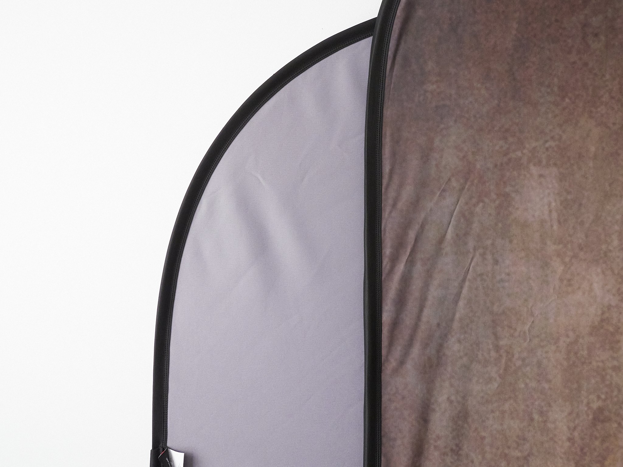
Compared to my Black/Grey the textured ones are all a little smaller and lighter, which is a plus. The B/G is a monster coming in at 1.8m on the short side and the difference is clear below. The two are laying on their sides and you can see a clear width difference.

For comparison, I painted my studio walls ceiling white.

The warm grey of the B/G is versatile and useful, but I really prefer a lightly textured near black.

Standing up you can see the subtle vignette on the Pewter starting to show. Note the wrinkles.

My standard processing from the grey is vignetted and dark, so the Pewter should give me more processing latitude without effecting the subject and the “perfect” smoothness will go.

The Walnut is a bit less appealing on first opening. I expected this to have been in storage for a while, because the business selling it has had this one on special by $50 and in stock since before I bought my first. I like this combo, but it seems to be less liked generally, so slower selling I guess. Flash will likely remove these wrinkles to some extent as it does with my Grey, but I would like them to at least drop away by half.

Wrinkles aside (ugh!), the texture is quite soft up close. This is normal and expected, but this thing is not cheap. I am hoping the images I take look similar to examples I have seen and the wrinkles drop out with a few days standing open. If not I will probaly have to steam them out with the iron and hanging it will help also.

Now, to be fair I have poor light in that room at this time of day, it was ery directional and I only just opened it out. After taking a shot, it looks closer to the samples I have seen than to the naked eye. Even while writing this and looking at the quick snap above, I am settling with it better.

The texture is nice and the vignette handy. The Rory Lewis video on this one is unfortunately not my favourite subject or look, so I have to make this my own.

I am happy overall with this purchase.

It adds options and back-up, especially to my portable set-up and when the wrinkles go, I will be able to manipulate the three levels of texture to the colours and hues I need.

Being smaller also makes a difference. the weight difference is noticeable (helps me grab the right otherwise identical bag) and I should be able to hang it on a smaller stand sideways like the Neewer 220cm, so I will not need the much bigger 260’s or my C-Stand). The 1.8x2.1 is so big, that even hung sideways it is too tall for my shorter stands.

Options as they stand;

Large Black/White, Black/Grey, Textured Pewter/Walnut (collapsible).

Medium sized 1x1.5m Black/White (collapsible).

Small circualr 1m Black/White (collapsible).

Huge 12x20’ Black and 12x20’ Chroma Green cloth (need a cross bar).

Medium 6x9’ Grey and 5x7’ textured Grey cloth (need a cross bar).

4 colours of mildly textured soft vinyl in rolls .8 x 2-3m long (need a cross bar).


Too Long?.........

Portrait lenses come in all shapes and sizes, but what happens if the only lens you have at hand is a 600mm?

Lots of detail, plenty of Bokeh and some working room, but maybe too much?

I had the chance to back off a bit, which helped. The reporter is about 6’4”, so over the shoulder is more star gazing with his interviews.

Even good for other portraits.


Beautiful Day

I covered a Triathlon today at the lovely seaside town called Bridport.

Bridport is known to local photographers for it’s collapsed jetty, which has drawn snappers for years.

Aside from this though, it is becoming one of the half a dozen premium beachside towns in Tasmania and this Triathlon shows proof of why.

A misty start.

A perfect early summer day is coming.

The gentle start of the Standard or Olympic class. These athletes will complete 65km of swim/ride/run in relatively little time.

Some of the old jetty remnants can be seen in the background.

Sprint class start. More revs. Jack Woodberry who will win this is #160 out the front.

Woodberry coming in.

Jack Latham, second in the Sprint. My 300mm is sharp, but I am becoming more aware of its slightly busy Bokeh.

Jack Woodberry, winner of the Sprint class.

Quality Enough By Far

Micro Four Thirds format is a curiosity to many, a guarantee of inadequacy to some, but a well kept secret to others.

I have not had any issues getting the images I need under pretty much any conditions with the following things taken into consideration;

Lenses are the secret. They are the power of the system, but are also the main requirement for best quality. this is the same with most formats, but the difference is the main thing to pay attention to and comes with a vastly reduced stress element. You need great glass and without breaking your bank balance, back or sanity and you can have them.

A 150mm f1.8 is a dream lens for a full frame user, but for M43, it is only a very well corrected, regulalry priced and sized 75mm f1.8. Yes you can crop the full frame camera, but all that would be achieved is an equal pixel count or maybe even less and do you need to?

Processing helps. Just running M43 through Adobe processing is ok, but to get the best out of the system, look elsewhere. Again, like lenses, this goes for all systems, but for Fuji and M43 especially, because Adobe does neither any favours, use a hungry competitor.

When I used Lightroom, the constant battle of sharpness vs noise was tiresome and limiting. In Capture 1 this became a near irrelevance, with ON1 No Noise as a sidecar addition, it effectively disappeared. I almost never see that “grittiness” so common with Lightroom from ISO 1600 or above and can confodently use ISO 6400 expecting good results, 12,800 even with care.

Be confident, realistic and aware. The call of full frame is strong, but do the math, look at things realistically and use the gear without reservation. Can you afford a 600 f4? If not, can you accept that a very good 300 f4, doubled by the smaller sensor, can actually give you 20-26 very sharp mega pixels of quality, that are in real terms indestiguishable to a full frame 20-24mp. Full frame systems emerging are starting to tackle the same thing backwards, providing us with slow 6-800mm lenses at a budget price, but sacrificing 2-3 stops of light. What is the difference, apart from the maturity of the Olympus and Panasonic systems and the real benefit of actual light gathering for the reach?

Embrace the benefits. The added depth of field, smaller size lens to reach/speed dynamic and the easier lens design advantage are strengths not weaknesses. F1.8 that acts like 2.8? What is the problem. In most practical situations, more is more. M43 was designed for a few reasons, not the least of which was lens design.

To make better lenses, one must either use a smaller sensor (smaller image areas are easier to make good glass for) or use a larger mouth to image surface area, like the the new Nikon Z mount. The M43 format is smaller, but squarer also, which helps.

Ever wondered why Sony needs to make huge front elements for their fast lenses, when Olympus or Nikon can make relatively tiny ones? The main reason is the ratio of lens mouth to sensor size. The Sony “mouth” is smaller than their actual sensor diagonal, the M43 and Nikon Z ones are larger, meaning full coverage of the sensor is easier to achieve.

In some cases, they can do the seemingly impossible. The f2 zooms from the original 4/3 system, the 9mm f1.7, the 10-25 and 25-50 f1.7 zooms. The average size to lens speed are all M43 benefits.

The advantage of gathering f2.8 light, but shooting at effectively f5.6 depth means misses are less brutal and less common.

Super shallow depth of field is fine for effect, but from a professional perspective, more is more. Try telling a pissed editor that you were looking to show of the beautiful Bokeh of your lens when half the subjects face is out of focus. Realistically, f2.8 is as wide as you need to go, but retaining f2.8 from f1.8 light gathering? What an advantage.

Smallow depth is still easy to achieve, but it is not a liability.

Recognise “enough” when you see it. We are all after great quality images and sometimes forget when viewing at 2-400% on a screen, that we usually have more than enough and that skill and application are the true measures of quality, not obsessive pixel peaking. To me, a pin sharp, fine art grade 12x16 print is the standard I aim for.

Portrait Photography Basics 3

Now the gear and background have been looked at, it is time to talk process.

Here is my basic process for artificial light portraits.

Step 1; Background.

Once the place is set, decide on the background. If it is to be supplied by me, it is usually the magnetic bracket on a tall stand, or my 8kg C-Stand if I can for extra stability.

This allows me a few options. I can use a Lastolite Black/Grey (no texture) or Walnut (antique texture)/Pewter (mild texture), a Neewer White/Black or even a cloth backdrop on a pole will hold. If a bigger backdrop or a vinyl is needed, then I will switch to a pair of stands with a cross-bar. This allows me to use clips for tension and takes more weight. I can even use a third stand for my widest backdrop.

For me colour is not too imortant, but texture is. I can change colour several ways, but texture is harder to mimic.

From here, the basic distances can be set. Usually about 4-6 feet from the backdrop is plenty, then what ever is needed for the subject to lens magnification and your cropping. Supply a stool if sitting is needed.

I always use manual flash. The main reason is consistency of setup and consistency while shooting. I know from experience that at ISO 200, f2.8 and about the same distances (2m to subject, 2m subject to background), I can start at 1/64th power for my “A” lights and adjust from there. At this power setting, I can shoot over 1000 images with a single set of Eneloop Pro batts.

Step 2; Key light.

I have waaayy too many options here, but at the end of the day, bigger and closer equals softer, smaller and further away is harder. My softest modifier is a 72” reversed white brolly with my double diffused 5’ soft box second, but anything from 33” up will work. Smaller than that is less soft, more directional.

Even softer is bouncing light onto a large surface then through a large surface, called “book” lighting, which is when my extra flash units will come in handy, because that type of light is power killing.

Shooting into the room supplies a mix of a black and location abckground. I use a single 42” reversed brolly for these shots 45/45 right side, which is forgiving and gentle and generally devoid of hotspots, but less brilliant or efficient than a shoot through (about 2 stops). For fill, I used on this occassion a single 480 LED panel set to warm and about 50% power, which helped me focus as well. My lucky camera for these balls is an EM10 mk2 and 12-40 zoom.

The key light is effectively you deciding on the look you are after. There are a lot of terms used here like Rembrandt, split, butterfly, open, closed, loop etc, but for now, just go with what you see. The basic and I mean “average” key light is about 30-45 degrees to the side of the photographer, and about 30-45 degrees above. Aim the centre of the light at the subjects eyes, then adjust.

Butterfly lighting, which is shooting down from above is a differnet look from standard. Key light choice is image defining.

The light, modifier size and “shape” will determine softness of the light and intensity. I have found a shoot through umbrella is bright and has some subtle hot spots, a reversed one is more forgiving and gentler, but looses power.

A single Westcott pearl-white, black backed 45” reflective brolly at the 45/45 angle. There is plenty of room in the file to add post processing “fill” by raising the shadows, but that was not what I was looking for.

Using a massive 48” soft box located just off to the left and above, this image did not need any fill, but in hind sight a rim light would have helped brighten it up a bit. Poor Meg does get the toughest gigs as I experiment with new gear.

Step 3; Fill light.

Once the key light is placed you need to decide on your fill light. This may be nothing if you are going for dramatic-powerful, but if you use a strong key light and a more open and softer image is wanted, then fill is usually a must.

Fill can be from a reflector, even bounced off a wall on the opposite side to the key. For more reliable and stronger fill (usually about 1/2 or 1 stop to 1/4 or 2 stops less than the key), a second light is ideal. This is often placed close to the photographer and often lower than the key, basically aimed at the shadows created by the key.

A 42” shoot through brolly key light 45 degrees to the left/30 degrees above, with a reflected 42” at eye level and the same distance. By reversing the brolly, I have reduced it’s power by 2 stops at the same distance. Easy to remember. Both lights can be set to the same power and channel on my remote, saving confusion, or the fill can be moved closer or further back for fine adjustments.

Step 4; Rim light.

At this point I will decide on a rim light or not.

If I do use one, only a little soft box (65 cm) on a third light or even an LED panel will do. This is often a warmer light, but not always. The rim light helps a lot with dark haired people against dark backgrounds, but it is really a matter of taste (and time). I have found I generally dislike the third light, but clients respond well to it.

The rim and fill lights in this portrait allowed me to push contrast a lot in post, without risking impenetrable blackness, which I did not want. Notice the mild hotspot on the forhead, which is the price paid for the ectra brilliance of the shoot through brolly.

Step 5; Back light.

If a different background is wanted, a light can be applied to the background. A single flash with a 7” diffuser grid and a coloured gel, which is a cool way of saying a bit of coloured cellophane, can change a background colour or create a hot spot-halo effect.

Camera is irrelevant, but I usually use an EM10 Mk2 for warmth, Pen F for maximum crispness or Panasonic G9 for the skin tones. Lenses range from 12-40, up to 75mm f1.8.

Re-capping, so far we have a basic camera, lens to suit and three YN560 flash units and controller with a pair of 42” brollies and 65cm ARTDNA soft box on Neewer stands and my Lastolite Grey collapsible on a fourth stand and bracket (but that could be anything, even a wall).


Portrait Photgraphy Basics 4

Processing.

We should always try to get the best result straight into the camera, but there is no denying that post processing is and really always has been a major part of the whole.

My preferred shape for protraits is the square. There is something logical, gentle even about a square image and it allows for subject placement in the “box” to be more creative, less strict.

This subject screamed mono to me.

Then I tried the faded, antique look. The image is also slightly shifted.

This is the core file with a little vignette added. Again shifted to the “normal” place, which is the rule of thirds coinciding lines applied to the left (his left) eye.

Colour is important.

All the shots below were shot against a plain grey background, I then brush the background in C1 and can shift the white balance from brilliant blue to deep purple or muddy brown.

The trick is to compliment or contrast, depending on what you are trying to achieve. My own personal habit is to go with my instincts, then try the polar opposite, working back through the process.

The basics of portrait photography are simple enough. You need to control light and apply basic technique, but otherwise pretty simple.

Practice is the key and the ability to connect with your subject.

Pushing It

Bit bored at work. This happens, like most places I guess. All or nothing.

Thought I would give ISO 25600 a go.

EM1 Mk2 (I have better cameras), 40-150 f4 at 150 wide open.

C1 only. Grainy, unsurprisingly, but still sharp and the colour is workable.

With some ON1 NoNoise love.

Compared, they look similar at these sizes, but at 100% there is a clear difference.

I got up close to the actual sticker and the roughness on the edges is from the ticket printing. Fully useable in print and even on screens.

A bit more processing. Generally, the best process for me is to do most in C1 before dropping the file over the ON1 as a tiff, then exporting out of ON1 pretty much on standard settings.

Something Special

I am happily exploring recently neglected cameras and lenses. Having a work kit that stays there most of the time, has allowed (forced) me to use the “left overs” for school and personal projects.

The crowning glory is the Pen F, a camera I have always admired, but sometimes struggled to commit to. Recently it has been identified as my premium black and white image maker, mating nicely with a couple of similarly sidelined lenses.

I must admit though, I had forgotten the very special colour images it can produce also. The sensor is the last evolution of the original EM5 mk1 series. It has more pixels, slightly wider dynamic range and looks more delicate in rendering, but the files share that same earthy, natural depth and robust reliability. A little bit old school, film-like even.

One thing I really do appreciate about it is the files, either colour or mono, rarely need much work.

All these images were taken using the Olympus 25mm f1.8, usually wide open, but the same magic is obvious using any of the better Oly or Panasonic lenses, especially the 17mm, 15mm and 45mm’s or the Sigma 30.

Unlike the other images here, this was taken at f2.8. The deeper depth is still harmonious, but the snappiness is curbed.

The maturity of the files is a reminder to me to back off when processing some of my other cmaera’s files. The Pen is a partner in the process, not just a step.

Gorgeous muted tones, something I recently put down to the antique 25mm f2.8 Pen half frame lens, is it seems, partly down to the camera. The Sigma 30mm tends to go into slightly magenta hues, but otherwise, all my lenses seem to be more neutral on this camera than most of my others.

The teal and amber look so very common on modern TV series. These files hold on really well.

If I had to descibe the files by “feel” when processing and the results coming from them, I would say they have the same neutrality and deicateness as the G9‘s, similar sharpness to the EM1x and the robustness and consistancy of the EM5 mk1’s.

On the other hand, they are also noisy like the EM5’s sharing the same film grain-like sharpness and the AF is frustrating sometimes. However, to really enjoy the camera, I feel you should use it with the screen flipped inward and in manual focus.

I have often put the quality of this image down to the 25mm lens, but I feel the Pen F, taken only once on a trip to Japan, must share the credit.

Favourite lenses are the 17mm Oly, often mated with the Pen in kits, which has the dual street photography advantages of forgiving, long-draw Bokeh and real manual focus, the Leica 15mm which has a rendering that is just very special (and it’s annoyingly light aperture ring is disabled) and the 25mm Oly, which is such a good pairing. The Oly 25mm is also slightly wider in reality than it’s name suggest, converting closer to a full frame 45mm.

That 75mm magic at work on a very harmonious and sound platform.

Other lenses that work well with it are the 75mm and 45mm teles and the old 25mm half frame lens. I have even had some luck with the 40-150 kit, although the balance is odd.

Speaking of balance, the Pen F is heavy. With the little grip added, it is a solid and reassuring lump of a thing, feeling far more substantial per square inch than even an EM1X.

A Little Accident, A Little Stress, A Little Fix

Packing away my Zoom F1 mic the other day, I dropped it, well it fell a few inches onto a wooded bench and the battery door broke.

I was a little surprised by this until I googled it and well, it seems to be nearly inevitable.
The odd and annoying little battery door is under some considerable contact spring strain and a very thin little bit of plastic is all that stands in the way of battery, full projectile exit.

Further Googling found little of use. A replacement door or clip fix, even a service agent seemed to be hard to track down. I have only used the F1 a few times, so breaking a $200+ item (including mount) is annoying, but I perservered.

Turns out a helpful blogger came up with a simple fix.

A cable-tie, synched tight and the tail clipped off holds the door closed, slides out of the way easily (more easily than the stupid little door) and even does double duty covering the on/off switch and record button when being worn as a LAV recorder.

A clean look, replaceable and even a selection of colours. The last image shows that you do not need the tie to be flush, which it can’t be, but the connection is still clean. I used it last week mounted on camera and it did not miss a trick.

Ironically, battery changes are now quicker and more secure.

A few for later :)

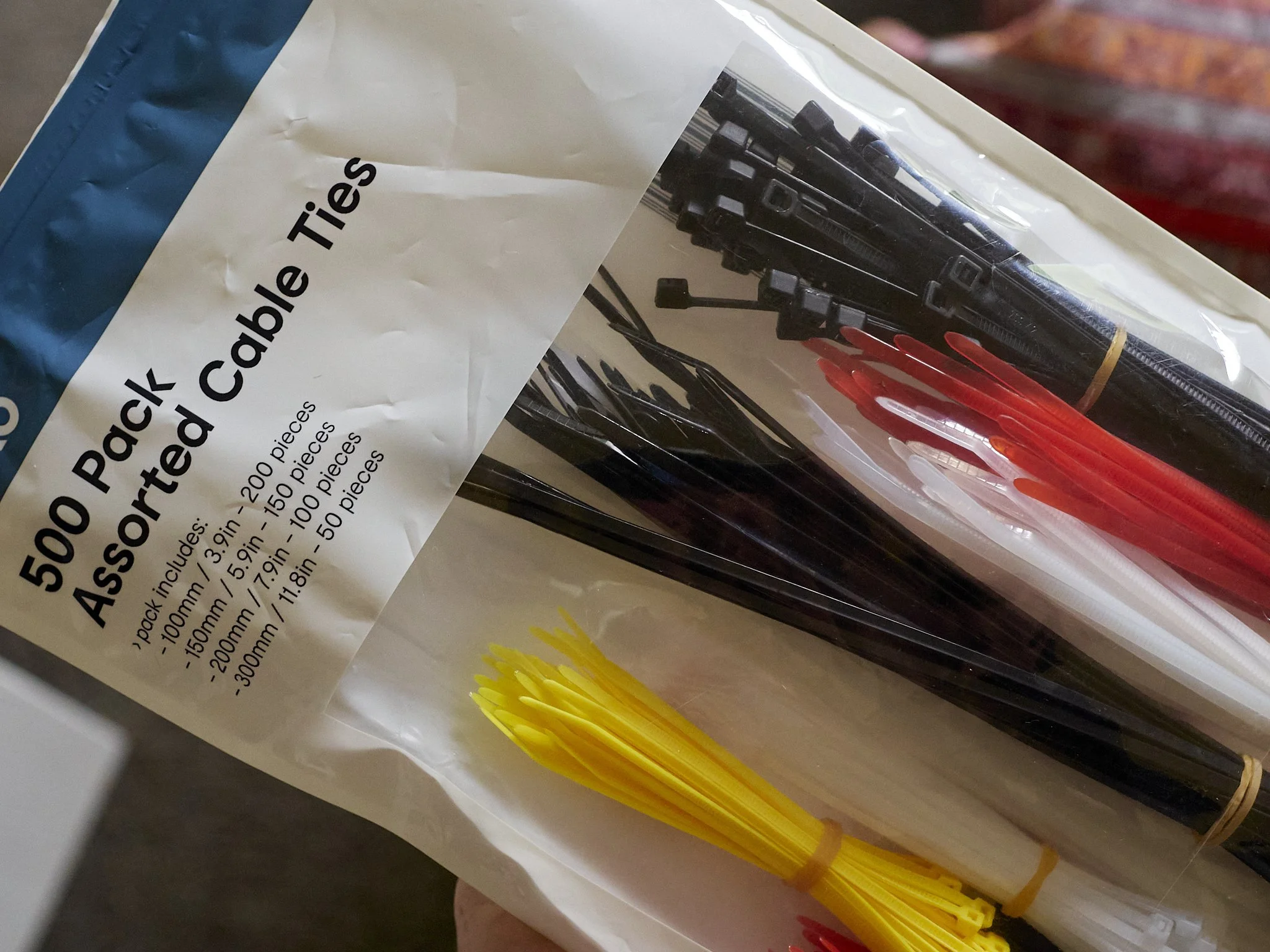
The original poster said he tried a few and settled on 4.5mm ties, but I went to Kmart and bought this bag for $6.00 and they are fine. First one fit, was clipped clean and there we go.

Best Bag So Far, Well, At The Moment

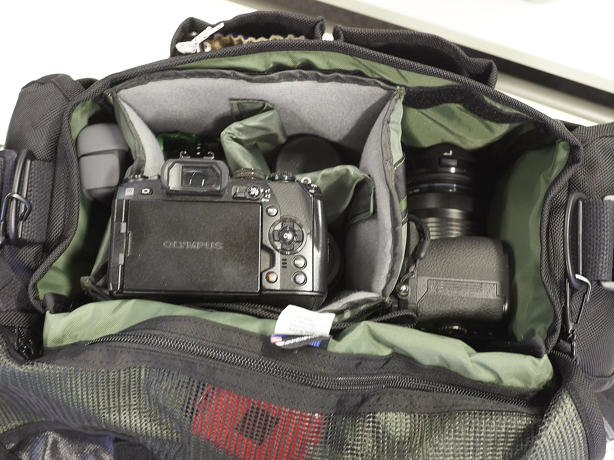
The Domke F2b (ballistic) is proving to be a good choice. It’s about time after a couple of expensive misses. The F804 is relegated to a tote bag for studio gear, which it does well and the Crumpler Muli is my going to work bag. The reliable F802, now the wrong shape, is basically retired except for occassional use at the school.

The bag has proven to be weather proof, put to the test the first week I had it when Tasmania suffered record rainfall. I had wet feet for a week, but my gear was fine. Unlike the canvas or rugged-wear bags, this really engenders confidence. Not only does the slick nylon outside obviously bead and repel water, but the rubberised lining looks knife proof!

Shape.

I went to the F802 origionally because the standard boxy shape was annoying and I wanted a bag that could take the 40-150 f2.8 mounted on a camera. How things change. With the 40-150 f4, I now have a shorter option and the more open, shorter layout of the F2 is far better for my current kit.

This ancient design, originally made for early film primes, has come full circle. The F802 swallowed small lenses and make access difficult. The F2 allows direct access to all. I have added large white rubberised dots to the rear caps of each lens, because even in this shorter bag, they can hide and I am sick of dropping them in on each other, scratching filters and even “loosing” small lenses for a while.

The end pockets are about right for flash, microphone, etc and the small front ones are great for my phone(s), note pads etc. It even has pen holders!

It does feel a little more cumbersome in some situations, but that is made up for by it’s stability when sitting on the floor. The F802 tends to fall over a lot, the F2 does not, but it does roll off a cars back seat easily, I found out the hard way.

Before the white dots were added to the lens caps.

Comfort.

With the added shoulder pad, it is comfortable even when full. This goes for all of my Domke bag, but this one is about perfect capacity to guarantee I do not over do it.

Any complaints? The only thing I miss is the height of the rear pocket. I have taken to carrying a butterfly wing reflector with a handle, but it is taller than the bag. I could fit this in the F802 ok.

After day to day use for over a month, it has doen the intended job and does not look any different from new.


More Thoughts On My Work Mantra

My new mantra C.I.A is working, but a work in progress.

C for Control/Composition/Concept/Communication, which is the main one I need to work on.

The realtiy is, you need to assert control over your cencept for the shot from the very beginning. Anything less and it quickly gets out of hand. Sometimes you need to let things roll until you can get your shot, but make sure you get yours, not the one someone else thought would be good.

The other day I was shadowed by a very pro-active journalist who kept “suggesting” shot ideas in the middle of a flowing situation. I was reacting to what I saw, while he was trying to choreograph me and the two processs were basically filling the same space. I respectfully asked him to let me do my thing and he do his and all was good, but two cooks……. .

In situations like this I like to shoot first, ask permissions later. If I stop proceedings, the moment is lost. Concept is simple, shoot what is happening always, not just at set times, with Interaction and Action coming along for the ride.

Taken quickly while another interview was being conducted (I was shooting that one over-the-shoulder, so this was over-the-shoulder of the over-the-shoulder), this shot ended up being used over all the set shots. My concept here is always to capture an unguarded moment, so the trick is to be prepared.

I for Interest/Interaction is easier.

This is simply putting the subject into their space and letting them do their thing. Hands need to be busy and people relax when performing a familiar task, so you are getting what you want while empowering them also. Interactiona can also be between members of a group.

On a recent shoot for a Rotary fund raiser, the subjects were asked to don beanies for the photo. The shot we used actually came from the set-up as they laughed and mingled while putting them on.

If you have nothing, then concentrate on interactions between people or even with the camera.

All Interaction.

A fleeting glance creates an Interaction. Shots like this break sequences of action shots nicely.

Action and Interaction. Concept took care of itself.

This shot’s Concept was Communicated, with Interaction added in the foreground, Interest in the background and then the Angle and Action were added.

A is for Action/Angle.

Once the concept is formed and an interaction decided on, it is time to add either action and/or an angle. Flat wall photo’s be damned, always create an Angle for Interest and compliment the intended “Angle” of the story. The Interaction can be as simple as leaning or touching, but the the Angle adds dimension.

In situations like this, it is easy to give the whole thing up to the Action only, but Composition and Interactions are still as important.

C.I.A. It’s working as well as I let it.

Portrait Photography Basics Part 2

Once you have the basic gear, it’s time to use it.

The Background

Every image, unless it is of a flat surface, has a background.

Portraits therefore have backgrounds, but this is a tricky space. A background could simply be anything blurred out to an incoherent collection of blobs, or it could be a deliberate augmentation to the subject, a story telling element.

Blur

Using a wide aperture lens at its wider apertures (f1.2 to 2.8), especially a longer lens at a close distance to the subject, will blur the background out. This is called “shallow depth of field”. This is an easy trick to make any background pleasant, even making ugly backgrounds attractive. Even if you have a reasonably slow “kit” zoom, getting closer to your subject than they are to their background can help.

Some rio fencing, bleacher steps and bike parts, all blurred out to be a support to the sharp subject. This was achieved with an aperture of f4, which is not super strong at this, but a longer lens length helped.

Maximum use of a longer fast lens wide open turned a busy hotel foyer into a smooth support act. EM1 mk2 and 75mm f1.8.

Black

If you are using artificial light, any background can be turned to black. This is a good and consistant trick, but can be over used. The technique is as simple as underexposing for ambient light (shooting a black frame), then using flash to light only the subject.

Your main tool here is flash flagging. Flagging is any form of blocking to help you control the spread of light. Transparent umbrellas spread light easily, so if this is an appealing technique, you will need to cover the back of one, buy one with a backing or put up a panel to block stray light.

Using a black background can help, but even then, too much light can rob you of your pure black.

A single soft box from the side. The actual background was an empty room. One huge advantage of black is that you can brush out any strays easily.

Using black does force a feel on your shots. It is great for intimacy, drama and strength.

White

White is a bright and happy backdrop, easily achieved if you have a spare light at hand. Most places offer a clean wall space, but few are “ceiling” white, so you need to push it along a bit. The basic idea is to over expose the background, be it a grey of off white wall (even black if done well), usually by about two stops. If over done, you may produce a flare-halo effect, so experiment a little, or use that if wanted.

A Supplied Backdrop

These take a lot of forms from paper, cloth, vinyl or even wood. Lots of choices such as textured or not, what colour, what size, how will you light it (which can change tone and colour) and so-on.

My own collection includes the excellent but expensive Lastolite 5x7+ collapsible (Black/Grey and Pewter/Walnut), some cheaper Neewer 5x7 to 3x5 black/white or 5-in-1’s and various sizes of cloth from 6x9’ to 12x20’ (green, black, white, grey) and a 5x7 Kate grey microfibre. My special bespoke trick is a series of mottled leather-look vinyl furniture upholstery cloth rolls. They have a subtle texture in four colours (donkey brown, light tan, caramel leather and stone grey) and are 1.4m wide x 2-3m long (or up to 30m).

Three of the four (Grey is missing), all for about $200au. They roll well, do not crease and can be cleaned.

Tough, easily smoothed and sporting a subtle and beautiful almost hand painted texture, these rolls, costing about $60au for 2m of length are similar to look at to the Sarah Oliphant or Savage textures as used by Annie Liebovitz and others, I especially wanted to get the ragged edge-multi drop look Leibovitz used for the newer Star Wars cast movies. Their only slight down side is mild shininess, but this can be fixed/avoided. Something I really like is the cloth-like look, but without excessive wrinkles.

These all need some way of standing up, except the Lastolite’s that can lean on a wall, so I have a couple of stands with clamps and some expeandable curtain rods or a magnetic bracket for the collapsible ones. Most of these can be either backdrops or double up as flagging, diffusers or reflectors. This gives me width, textures and colours up to a point. I intend to add to these a set of simple colours for more dramatic tones like scarlett, deep blue, green and purple.

Post Processing.

Even if you do decide on a background, post processing can modify it to some extent or even supply textures and looks that are not there. Since COVID, artificial backgrounds have become common to apply and still photography has been using these for some time. The secret to infinite backgrounds may be a simple as photographing various textures or downloading them, processing these differently and shooting your portraits against a chroma-green backdrop for easy cut-outs later.

All of the images below were shot against a neutral grey background (middle), then a brush tool was applied and the colour changed. Some vignetting was added to a few, but otherwise, this is how they came. Notice how some compliment different elements of the subject, others create a distinct feel. When I shot these for Telstra Australia, I submitted the top three and the grey and to my surprise, they used the blue (and other colours for other people), which was cool as I only did them as a suggestion.

All the above images were shot against a neutral grey background (middle), then a brush tool was applied in capture 1 (there are other ways) and the colour changed using the white balance sliders.

Channelling Annie Leibovitz, this is the result of $300 of lighting, mods and stands shot against a white wall and some basic post processing using Capture 1, taken on an old EM5 mk1 and a basic 25mm f1.8 (less than $1000 all up).

The Environment

It is totally possible to use your subjects background for their portrait, even desirable if you are looking to add context to their shoot. Many portraitists do exactly that, only using flash to balance shadows or add “pop” to their shots.

Sometimes the place is as beautiful and relevant as the people. This could have doen with a little flash, but I was not a huge user of artificial light at the time.

If working with the environment, experiment with exposure tricks like underexposing, then filling with balanced flash. This allows you to make a boring midday shoot look like sunset or even night.

Just window light and an old wood panel wall. This was an impromptu preview of an upcoming fashion shoot, so we decided to channel a Vogue cover shot vibe (only the head piece was available).

If the environment is your choice, make sure you use all the elements avaialble. Foreground framing tools can make all the difference.

Sometimes they are all you have.

Personally, I use a mix of location, black, collapsible and vinyl/cloth hanging backdrops. Paper rolls are popular, but I have never been interested in them as I need to stay portable. From these I can colour change easily enough, but the texture is key. None, mild, irregular of patterned are all down to your choice. I prefer a subtle, even textures, like the Lastolite Pewter or my fabric rolls in lieu of multi thousand dollar Oliphant’s or natural looking testures like the Lastolite Walnut, which looks like an old wall in an abandoned cottage. For strong colours that may not be used often, I aim to get some colour cloth, likely velvet/velour in red etc.

A Sweet Little Lens Rediscovered

One of my favourite lenses is the Olympus 17mm f1.8.

Recently, it has been relegated to travel only because of the Pana/Leica 15mm, but due to that lenses slight handling issued (a very light aperture ring, too-easily removed hood and overly tight AF/MF switch), I have replaced the older 17mm into my day kit.

It’s main use is as an environmental portrait lens.

All the images below were shot on a G9, wide open or very close to.

Sharp as a tack in the centre, it is delicate, but assured. The Bokeh of this lens has long and coherent transition, making it a useful wide open shooter.

Even at f1.8 it is this sharp in the middle and stays so to cover the bulk of the ssensor, but also notice the coherent background giving a sense of place. The lens seems to produce a good 3d effect. At f2.8 it sharpens up more, but shifts to a more coherent and inclusive draw, but looses the delicate feathering.

Shooting groups wide open may not be super sensible, but this lens allows it. Anyone slightly out is not obviously so and can usually be sharpenned up, but the reward is the delicate feeling it produces.

Often when talking about street images, I will say that my favourites tend to have multiple layers, something I often call the “rule of three”. This lens can produce these effortlessly, simply by concentrating on the main subject, then exploring later.

The delicateness is obvious (G9 file), with near misses disguised by the draw or transition.

This “pop” is common enough these days, but often requires faster lenses on larger formats and then comes at the expense of contextural background detail, which is to say, they sing as individual portrait shots, but not as environmental portraits.

Even more than slight misses are workable. The actual point of focus is the near hand so the streamer and face are both a little out, but this lens often derided for it’s poor Bokeh was, I feel, designed for exactly this, to hold workable details longer. The f1.2 17mm, an engineering master piece does the modern thing, which is to quickly drop to smooth or feathery that in this case would highlight the miss. This lens seems more about practical street applications, old fashioned but useful. It gets a little busy in the background, but holds enough detail to be multi layered (I just noticed the boy in the background looking at the car tire).

It is not a perfect lens by any means (perfection often meaning sans character), but it handles tough light well, adding some interesting spots and some veiling flare, but nothing that ruins an image. I have a metal ebay screw in hood and medium grade filter on and have few issues.

The colour it produces is warm, so often shifting white balance can brighten up slightly muddy looking images. This explains much of the differnce in look it has to the Leica 15mm.

Portrait Photography Basics Part 1

Time for me to talk portrait photography again.

This has been a ground breaking year for me in this area. Starting the journey last year with some experimentation, building a home studio, re-converting that back to a study, because I realised I did not need or even want a fixed space, shooting the Telstra board, several drama casts and plenty of “home” shots, I have become reasonably confident in this space.

Confidence breeds creativity as it reduces clutter, confusion and redundancy and allows for healthy experimentation. At some point, you stop thinking about process, then get excited about possibilities and concentrate on your subject.

The point of this post is to show just how easy and cheap it is to achieve a good quality portrait.

So, first up, what do you need.

Camera and Lens

Anything will do, honestly. A basic and I mean basic entry level SLR, Mirrorless or even top end compact (has to have a basic hotshoe and preferably a 1” sensor or bigger), with a standard kit zoom can do wonders. The reason for this is you have control of the space, so you are using your kit in it’s comfort envelope, not stressing it.

Any lens used wisely with any camera can produce beautiful portraits, some less than perfect lenses even add a distinctive look. If you can stretch to it, a fast prime lens in the (full frame) 50-100mm range (25-70 in smaller sensor formats) can guarantee the best quality and some depth of field control, but probably more than in any field of professional photography, camera and lens selection mean less than most other considerations.

My top end portrait kit is the Olympus Pen F or Panasonic G9 with the 25mm or 45mm f1.8 Olys, Sigma 30 f1.4 or one of the 12 to X zooms. If I have room, the king is the 75mm f1.8, but it needs a good ten feet or more. At a pinch, an OM10 mk2 with a kit zoom works just fine.

The three shots above were taken with different focal lengths. The shortest lens (Oly 25/Sigma 30) adds intimacy and a slight 3d effect. The middle lens (Oly 45mm) is good for a stand-off shot with a feeling of “rightness”, seeing the world rough the same as the human eye. The longest (Oly 75mm) adds compression and tightness as well as maximum background blur if wanted.

Lighting

After a camera and lens have been sorted, lighting must be tackled. Lighting is main determining factor for adding “a” quality to, and determining “the” quality of your portraits. Nothing else is as important.

The rules here are;

  • Enough light to give you control of the balance between artificial and natural.

  • Control of your light direction, number of lights, colour and contrast.

  • Shape or intensity of the type of light also called modification.

  • Keep it simple as possible.

Enough can be as easy as one or two cheap manual flash units. If you only want to do single person portraits, then a single $100 speedlite flash is plenty. I use M43 kit so I gain a slight power advantage over a full frame user, but even if you have a large sensor camera, one light can work. As I will explain below, you usually want your light quite close to your subject, so enough power is easy to achieve.

My kit consists of a clutch of manual YungNuo 560 mk3 and 4’s, retailing for about $100au each. They have been dropped, hammered and have never failed. The on camera controller can be the cheap little TX560 or one of the units, so a bare minimum is 1 flash and 1 controller ($160au), but 2 flash units gives you peace of mind and options. With a half a dozen of these at hand I actually have too much light, but it’s nice to have options and depth.

Neewer, Godox and others make similar, so basically look for the best price and for this buy Manual only units not TTL. These are not brand specific, always give you the same light at the same settings and are generally half the price of their TTL equivalent. TTL is great for gun and gun or straight on camera flash but are a little twitchy in a studio, reacting to changing subjects etc. The main thing here is to get decent rechargeable batteries. Amazon basics or Eneloop are ideal. An even cheaper option is an entry level plug in to the wall studio light set, which usually comes with stands and brollies.

Naiural light is fine, when you can find it.

Control means simply the ability to determine the number of lights wanted, their power and the ability to place them where you need them. A couple of cheap stands like the 2m Neewer stainless or even the really cheap ones in starter kits are a start. If your subject is sitting, then 2 meters tall is plenty, but for standing, go for 2.6m.

I have a ton of these at hand, usually using a 2.6m for my backdrop, a pair of 2m for lights and a super light 1.8m for rim light. The basic rule is, they just need to be tall enough and strong enough, especially if you want to add weights to them for safety (I use 2kg K-Mart ankle weights).

2 lights is a good start, one is enough for many looks. More go into more creative and complicated territory. A key light is mandatory, but can be any strong source (the rule here is to make the part of the subject you want, to be brighter than the background, simple as that). The fill light can come from a number of sources including reflective surfaces, if needed at all. A third or fourth light are optional, but do provide options.

Often a determining factor for power is the lens aperture used (small apertures like those found on cheaper lenses like f5.6 can force you to use more power more often) and distance from light to subject. For maximum softness, you need the light source to be big and closer if possible so the second often looks after itself.

Shape or intensity of light is the creative key for lighting quality. This is the most daunting bit, but also the most creative side. First you need to decide on the look or looks you want to achieve. Do ypu wanrt sfot and open looking portraits, hard and contrasty or a generous mix of both? This will determine the modifiers needed. For 90% of your work, cheap white umbrellas are plenty. Even cheaper, a single light, brolly and a reflective surface will do. I have tested various modifiers and to be honest, a cheap 33” white brolly is effectively the same as a 4’ soft box if used properly.

You will need a primary light, called the key light. This can easily be natural light, like a window or even a room light, but relying on nature can be a trap. With just one artificial light you can mimic nature easily. The key light will determine the look you are after. Often these lights get a second name for the type of light they produce. Butterfly, Rembrandt, Split etc are all types of key light, but regardless, the key light determines what else you need.

The second light is called fill light, which removes sometimes bottomless shadows caused by the key light. Fill is always the weaker light, so any thing from a weaker flash setting to a stronger modifier or even a reflective surface can work. The rule of thumb is 2 stops of light less, but it varies.

The third is the rim or hair light. Purely optional and even the sun or ambient light can do this role, the rim light help separate the subject from their background,

Themost common use of a fourth light is for the background. This is a handy way to change background colour or even at a halo effect. It is even possible to make a grey background white with enough light.

The full house. The key light is a standard left hand 45 degrees to the side, 45 degrees ubove shoot through brolly. The fill is a lower reversed brolly shooting into the shadow side and the hair light is coming from the right side rear.

No introduced light here. The key is natural light through a door on the shady side of a building, no fill was used as the key was quite soft and there was no light to add, but the light behind added rim lighting.

My base kit is a pair of 42” white Godox brollies and a small soft box for optional rim lighting. I bought these first up and could have easily settled. cannot explain why I have 20+ other options at hand, but guaranteed, if I need a reliable core kit, these are my go-to’s. I use the main light with a brolly facing the subject, the light shooting through it, the “fill” light is the same, but reversed, which reduces the output by about 2 stops. The third light if used is fired through a small soft box. A lighter option for me is a single light and brolly, with maybe a small reflector for fill/rim.

As you can see, the bill so far does not need to be excessive. If you intend to be a natural light portraitist, then the lens needs to be a faster one like an f2.8 zoom or even a $200 f1.8 prime simply to control background blur and collect more light. This may be all you need with a reflector or diffuser panel for on the go fill.

Nothing but natural light.

If you want to use mostly artificial light, then a cheaper kit lens is fine, but $2-300 needs to be spent on lights and stands etc.

My “full noise” rig from a recent drama shoot. The continuous black allowed for full length shots, my key and fill were both reversed brollies, the left hand one a backed one, reflecting a little more light and set higher. The floor brolly was to help separate the subjects so they could be cut out in post and the rim light is a little 30” soft box nearest the camera right.

Stands, backdrop, lights, brollies etc came in at about $400au.

In part 2 we will look at technique and backgrounds.


New Screen Saver

Sometimes you find yourself standing in the middle of a field, surrounded by the wonders of (genetically modified) nature.

Bit of a before and after moment.

The Over The Shoulder Portrait

I have started to train our reporters to expect a series of over the shoulder portraits taken when they are interviewing.

Saya Sakakibara, an Olympian and Australian BMX champ. The usual staged shot was always an option, but not an attrative one. This was the chosen shot and I am happy about that.

Another of many pleasant and natural portraits. The 40-150 f4 is proving to be a champion at this also.

One of the main advantages of modern mirrorless cameras is silence. Paired with face detection and multi angle shooting, you have plenty of tools to get any type of natural portrait.

All the shots on this page were taken over the last couple of weeks.

The set portraits were taken, often because context and direct eye line were needed, but sometimes they were not and I can guarantee, that the set shots did not have anywhere near the natural feel of these.

This works for all levels of subject from young student athletes to hardened politicians, social advocates, performers or authors.

Wheels Of Fortune

Another chance to explore my thoguhts on pushing the envelope with sports shooting.

Competition day 1 at the National BMX champs today, after a couple of days of practice.

Having a bit of a moment, I went with my usual day kit (EM1 Mk2 with 40-150 f4), not the gripped one with the f2.8 model like yesterday, but no harm done as my kit(s) are all pretty capable.

The usual stuff, easily enough captured and sometimes even pretty cool.

Next I tried to look for a more dramatic look.

The top left hand image shows the amazing angles they achieve. Number 232 managed to win from here which was impressive.

On the way out, I got a few more on a different bend.

I only had a few minutes to grab these and flet there were many other angles to explore, but happy I went on a tangent.

Cannot forget the little spockets.

For me the winner of the day, or maybe the one above.

The Making Of Luck.

Sport photography has little to do with luck.

Sure you have to be lucky in the moment of capture, no matter how fleeting that is and sometimes you feel the luck is heading away from you at great speed, but when a good capture comes, you recognise it for what it is. Luck born of preparation and affirmative action.

A short lens in close. I was literally sprayed with sweat at one point (and the sweat cleaning crew were next to me), but the intimacy of the image with it’s 3d effect were worth the risk.

What do I mean by that?

To get good sports images (not great though, because I am not there yet), you need to push past safe, to head into the realm of edgy. Your subjects can lead the way here, the better and more exciting ones push their comfort envelope constantly, so it is encumbant on us to do the same.

They put it all on the line, so we should also.

Early in my career I was happy to just get a sharp shot, but now that is not enough. It has to have intimacy and a feeling of being close to missed, even near impossible for me, to feel satisfied. I want the same feeling of excitement I feel when taking an image to come through.

Shallow depth of field, low angles, shooting into the light, shooting too tight, pushing too close to the action and playing fancy with your angles, are all important elements if you want to go next level.

Getting a shot of the team huddle is mandatory and I got plenty, but if you can, a more intimate portrait can be had. Of over 60 images I submitted to the sports team on the night, this one was one of half a dozen chosen. Always worth the risk.

Always look for a stronger shot.

Not an amazing image, but a bit better for employing shallow depth of field (150mm f2.8 and I would have used wider if I could), which helped the front runner “pop”. Deeper focus depth was more than possible on this bright spring day and common sense would dictate you use it, but with safety comes mediocrity. Just because they are smaller, slower or lower grade than the top tier, does not mean you should take the pedal off the metal, because they are not.

So, sport photography has everything to with luck, but only after you push that luck as far as you can and employ decent technique.

This image really pushed the limits of my processing chain and not long after taking it I did move to the less light saturated side, but that extra bit of drama, the genuine threat of failure make it all the more compelling. Realistically, without the dramatic, almost dominant light, it is a fairly pedestrian image. I just realised also, that every player on court is in the frame more or less. Thanks must go to Capture 1 and ON1 No Noise for making this image possible (the original is pretty grim).

This not only applies to action shots. This portrait of Holyee Jackson, a rising star of BMX was taken over the journalists shoulder during an interview. This often nets me a more relaxed and real image, rather than the staged ones we usually do (and yes, I did).

There is no doubt more and better can be done, but that is the promised reward for extra effort.

Video, What Is Missing?

My video kit is pretty handy.

It is not pro, mainly because my recording formats are limited to Cine-D, HLG or Natural on the G9 (no upgrade code purchased), Cine-D also on the OSMO or Flat 4k on the Olympus EM’s. This is actually fine, as many have already proven that with care, even Natural mode on a G9 is actually plenty. I am not producing movies, just upper end hybrido-graphy captures.

The reality is, I rarely shoot footage that needs much tweaking, so Natural, Standard or Cine-D are enough “levels” of control.

The other more urgent consideration though is a 30 min maximum recording limit on all but one of my cameras. This is the killer.

Hard to argue with the value to performance ratio, but 30 minutes is very occasionally limiting.

To record a school production, I really just need one single camera that can go for a full section of a play or event without stopping. The G9 punches well above it’s weight with video*, but it is the one Panasonic with a record limit, probably to keep the overall range logical.

*Maximum 150mbs/4k/422/10 bit/60p-but is highly time limited at this level without an off camera recording option, but 30p is ok for up to 30 mins.

So what are options to;

  1. Fix the time limit thing.

  2. Add better codecs if possible.

  3. Try not to add more complications or annoying exceptions.

Pimp My Existing Cameras

I can improve some of these with an off board recording unit like the Ninja-V or the Black Magic Video Assist. Both have advantages and dis-advantages (the BM’s win overall I feel especially for a DaVinci user, but neither is perfect).

The Ninja V has price and long term reliability on it’s side. They are time proven, but have some special needs I don’t like. They need an SSD, take only one NP battery, record in Pro-Res RAW (a hard fit for DaVinci) and lack some interface options the BM’s have.

The BM Assists can take up to 2 SD’s, 2 NP’s and record in B-RAW or Pro-Res depending on model and there is some choice. The screen is also potentially larger and always brighter, although it has a reputation for being a little magenta tinted and the interface options are better. It is dearer, depending on the one you pick, but overall the extras it offers make that work. This means a shift with one camera to a BRAW colour palette (or not), but with the core accent of the base camera.

With either of these I have the record limit fixed and option of a RAW format, but would probably just record as is with unlimited time and no other benefits. Expensive for what I would actually use. My ideal would be an external recorder that simply records the camera’s formats.

Add To The Already Over-Crowded Stable

I can buy another camera. As usual, there is a balance quotient at play here for me and I just committed to a second hand EM1x. I have plenty of options and only small things to fix, so no need to get too carried away.

G85/G7. On these, Panasonic removes the recording limit and for most uses they can act as a very good, Panasonic colour matched static “A” camera, freeing up the G9’s for movement, effects and alternate angles. It could also be a useful stills option for travel (like I need more!). In the mix at the right price.

BMPC4K gives me a full spec semi-pro movie camera with only a few niggles (battery and storage options, poor AF, limited stabilising and colour matching considerations), but it is fully compatible with DaVinci Resolve/BRAW (which it also upgrades for free). Unlike the BM Video Assist it is a one-off, so no upgrades of existing cameras or much flexibility. This means one “hero” camera and a bunch of others that need to be matched to it. Easiest direct line to most fixes, but I feel too complicated overall and a shift away from my existing kit.

BGH1 Panasonic. This adds a GH5s level camera (BMPC4K/GH5s sensor) in a little box camera, which is very versatile and colour matched to the G9’s, but is as dear as a GH6. It popped up on my radar recently, but price ruled it out as quickly. Too dear.

The GH6 Panasonic, sitting top og the Pana pile and offerring some stills benefits. Too dear-too much.

GH5s which is the BGH1 with stills capabilities. Too dear.

OSMO Pocket 2 or another version 1. The mk2 is the same basically as the OSMO I have with a zoom lens, the mk1 is half the price. This is a genuine contender.

A specialist pro-sumer video camera. The reality is, there are a wealth of good video cameras out there and they are cheap, light, high quality and versatile in comparison to many hybrids. Cameras like the Canon VIXIA HF G20 or Sony AX43 offer a true video camera experience (no hybrid compromises) at a good balance of quality to price.

Work Smarter With What I Have

This is the bit where I make my multiple options work for me. The record limit is only a limit to continuous single angle recording of productons, interviews or events.

If I used the OSMO Pocket as my primary static camera (up to 140 min record time at 1080p if the gimbal is not used), I can function well enough with the others. This means the entirety of a play could be recorded in one take. I have all the needed accessories like the 3.5 jack and tripod mount etc to make it work. Sound and alternate angles could be recorded separately, then the lot synched in post.

The OSMO is a very sound base for the master capture, being a close enough match to my Panasonic colour and it’s corrected 24mm lens with good depth of field even at f2 is probably ideal as the main camera. Even adding the OSMO pocket 2 as the main camera, the older one then as the gimbal cam, means I can record two angles with matched results for over an hour.

Using the gimbal and full 4k can limit recording time, but using one or the other is still workable. I think I can also plug it into my computer when recording for backup and power? Need to check that. Cine-D is a decent codec for this use, but the standard colour out of camera is impressive.

I can even put it at an extended angle (up to 3m) or attach it to a point close to the action and monitor it through my phone or even under water. I think on writing this, I have far too easily forgotten the potential of this little power house camera.

Another huge benefit of doing this is the OSMO is not getting enough use.


Lost Connections

I fear a time of change is upon me.

Change is inevitable and should be embraced, especially when it is self motivated, but sometimes, it is just a little sad and the reality is, some choices have no perfect answer. I have never left a job that was such a positive and perfect fit for me, but circumstances forced adaption.

I have had an odd last three years compared to most. While most of us are remembering or even healing from COVID, my recent history is actually filled with some of the fondest memories I have ever had in my working life, memories that will stay with me for a long time, but they will leave a feelng of loss and take some time to scar over.

No, I was not there that long, but celebrations of the schools heritage were highlights.

Working for the school in the semi-limbo of full acceptance by the staff and students, but never on anything more professionally, than a casual contract or “good faith” basis left me in a lop-sided relationship.

On one hand the school had an on-call, fully equipped, fully committed*, widely experienced and multi skilled still and video content creator who was happy to spend a sizeable chunk of his meagre earnings on the gear needed to do the job (only possible with my loyal wife’s support).

Long lenses and fast cameras are one arrow you need in your quiver, but were far too rarely called on.

From my end, I was earning basically the same as I would if I stayed at home and did nothing, contributed nothing to my superannuation, covered (or not) all of my own expenses and played dismissively with fate, knowing that if I had to take any time off, like five years ago when I got the flu (pre-COVID) with pneumnia complications and spent 2 weeks in hospital, then three months recovering, I again only had my wife Meg to fall back on for support. No sick leave, no compensation.

The school production of Schrek, something I felt privileged to be a part of.

When the paper offered me full time, it is no exaggeration to say, I was instantly 600-800% better off in wages, equipment, expenses and retirment savings. I do not even need all of these benefits, especially the gear, preferring to stick with my own and my work flow, which is already paid for, but I am still 3-4 times better off.

That does however do little to reduce the feeling of hollowness I feel leaving an institution I am so attached to. In many ways I feel like the child sent to the city to work in a soulless job, leaving the family farm I am spiritually connected to.

I wish I did not have to make any choice, but after several counter offers made by me to the school, even offerring to take a 50% cut from the paper’s offer, becasue I am really just needing something concrete for security, not a fotrune, they still had no wiggle room (the school is a not for profit organisation and my desired role just does not fit into their structure).

Year 10’s last year, kids who would be this coming years leavers.

My offer to stay in contact as much as possible looks to be a poor judgement call also.

I coverred a few engagements as I promised I would for the end of year and still have a couple to do, but the reality is, it was hard for me. Regular conversations with recently found friends quickly turned to ponderings on “what could have been”, or more precisely what should have been as many kindly reinforce what I feel, that the school and I were a good fit and the role had room for expansion.

Being connected in any way just seems to be too hard.

The toughest days recently were in the junior campus where “photo-man” has become an excited catch cry for the younger students, something I hoped to build on in the years to come and a relationship that a new, frop in shooter will find hard to develope.

I and others feel this long earned connection is too precious to loose, but it looks like that is exactly what is going to happen and more the distance I give myself, the better it may be for me. All in or all out. Anything else is an emotional trap.

Problem for me is I live literally over the road from the school, so blinkers on.

*Not coming from a working photography background, but one of retailing and teaching, meant I had a very small client base to build from. The reality is, the bulk of my contacts are photographers, not people in need of one and trying to build up a client base when you are committed to one client for the bulk of the year is problematic. More problematic though is three months without an income.