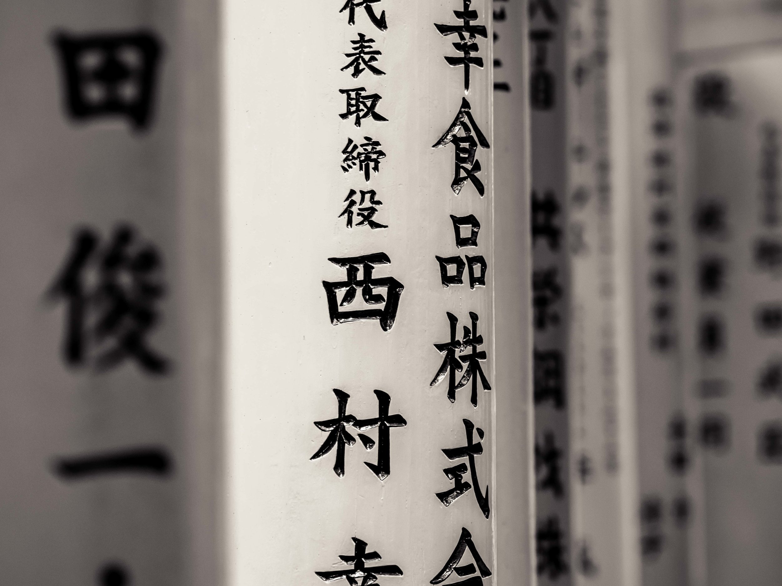
Another look at the contrast between mono and colour processing. No superior choice here to my mind. I honestly cannot choose a "winner". The vibrant colour vs the restful tones. Both work but differently.
Pen F 75mm f2
A trait of some converted images is they can look "dirtier". The mono image needed a lot of spotting out of a dozen or so tiny, but noticeable black spots on the front column. They are in the colour image, but the strength of colour hides them. When reduced to tones and textures only (with an increase of contrast to make the mono image stronger), they stand out a lot more.

