What already? Yup, the second in the series, hot on the heels of the first.
This a much simpler image to work on, having no actual faults, just needing some help. I love this image for it's mid 20th century look, both in style and subject matter.
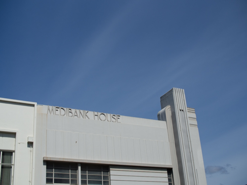
The first image is poorly composed, flat and lifeless.
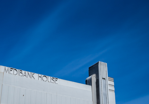
The second image has had cropping applied and the intensity of the image was boosted with +40 contrast, -60 highlights, +35 whites and -60 blacks. The whites slider adds brilliance and the blacks adds intensity. Clarity is also boosted to +35 and there was a little sharpening and noise reduction. The noise reduction is a good way of adding smoothness to an image as long as you have not applied too much sharpening, that will create a "painterly" look. The Lightroom technicians seem to have been working on retaining sharpness when NR is applied. The smoothing element is a bonus and tends to add to the medium format film* look of sharpness without effort.
When sharpening, the radius control is important here as it can be used to smooth or exaggerate the effect of texture in the concrete building. I chose 0.8 to smooth it.
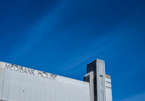
The final image has had the standard brush sweep of +10-15 clarity, sharpness and contrast applied to bring out the detail in the left side of the building. The crop has also been slightly adjusted to make the angle of the building more majestic.
*Recently, Ctein, a premier colour printer and photographer of many years, stated that Pentax 6x7 film and M43 files from an EM5 are about equal in quality. He has used both extensively and interchangeably for his portfolio prints. He is also a bridge image fan (among other things), which has strong similarities to my love of older buildings.