Photography sits is in a difficult and delicate position in the artistic world. On the one hand it is generally accepted as an accurate enough recording system for every thing from dinner to dinosaurs, where most other forms of art disqualify themselves by their difficult and bespoke nature. On the other hand, the art world often assumes it to be a traitor to it’s own best characteristic, accuracy. It is assumed it is manipulated and compromised as a matter of course
Photoshopping has even become as much a household word as “Hoovering”, giving the modern photographer, in the eyes of their viewers, little solid ground to stand on if they claim to produce “pure” or untampered with work. The reality is, it never has been.
The fact is, no image making can be or has ever been perfectly accurate or unadulterated. There will always be forces out of the control of the photographer. Even in the film era, often cited as “real” or true photography, the choice of film, processing, light, filtering, lens coatings, film age, exposure, printing paper, printing chemistry, framing options etc. etc. would inevitably erode the accuracy of any attempt at literal reproduction. Ironically, this was how photographers controlled their style or signature process, by harnessing these differences.
So, does it matter if an image is not perfectly accurate? If it does, then how far from accurate is ok and how far is too far?
The argument of whether or not to manipulate a digital image will never be resolved to everyone’s satisfaction. Many reject too much obvious processing, added and fake elements, while others make a strong body of work doing exactly that (just look at most novel covers). The trend of regular over processing seems to be behind us to some extent, but these things do have a habit of coming and going. The biggest offenders recently seem to be well known film era photographers who have had their old work manipulated (knowingly or not) from it’s previously accepted form (Steve McCurry, as an example has copped a lot of criticism for this lately and my personal bugbear is the difference between Ansel Adam’s colour reproductions old and new).
Anyone shooting in RAW is by definition deciding to process to their own tastes, aggressively or gently. Those who subscribe to an “untouched”, straight out of the camera jpeg. file are simply letting the preferences of the camera manufacturer take precedence. There is no escaping the fact that someone’s ideal is being applied. The logic of then processing the jpeg file heavily escapes me.
Where to draw the line is a personal decision. I cannot do more than offer my own thoughts, with no intention other than to share, not judge.
Lightroom is my line in the sand. It allows me to manipulate the same functions that I could in a purely photographic sense when using film, but much more accurately and easily. Some of these decisions would have been at the film selection stage, some during processing and some in the Darkroom. Lightroom gives me much the same control in a more repeatable and cost efficient form. Printing also, is now simply a matter of accuracy (although instinct rather than technical processes is usually applied).
The basis of this approach is because of it’s inability to add anything that was not there. It only allows manipulations within the file as captured or the removal of extraneous details and flaws. These are exactly the same limitations we had before.
The more “graphic arts” applications of Photoshop leave me cold, but I also know that their lure would be too much temptation to ignore. I am aware however that the controls in Photoshop are sometimes more refined and powerful.
There are many other programmes similar to Lightroom, some with superior core pre-sets for some cameras, but the features I love to use most are only found in the Lightroom suite.
The all-in-one nature of the programme is helpful. It is my filing system, my processor and my printing interface. If I have the need it can also produce books or other styles of presentation, so for now, it provides all I need or may need.
The tools that are the most useful to me are;
The Brush tool. This gives greater control and subtler application of the more aggressive editing functions. Localised contrast, clarity and sharpness are simply better to look at than global settings. If you use global sharpening or clarity, the entire image, even the soft parts will change. If on the other hand you apply mild (positive) clarity, contrast and sharpening to the area of main interest and negative values of the same to the softer areas, the image gains “pop” and three-dimensionality. The thing to remember with the brush tool is to apply it in multiple sweeps of gentle settings rather than heavy, one off sweeps.
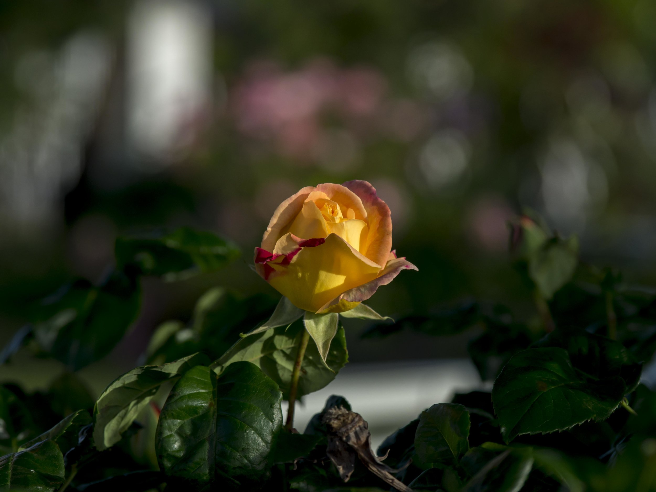
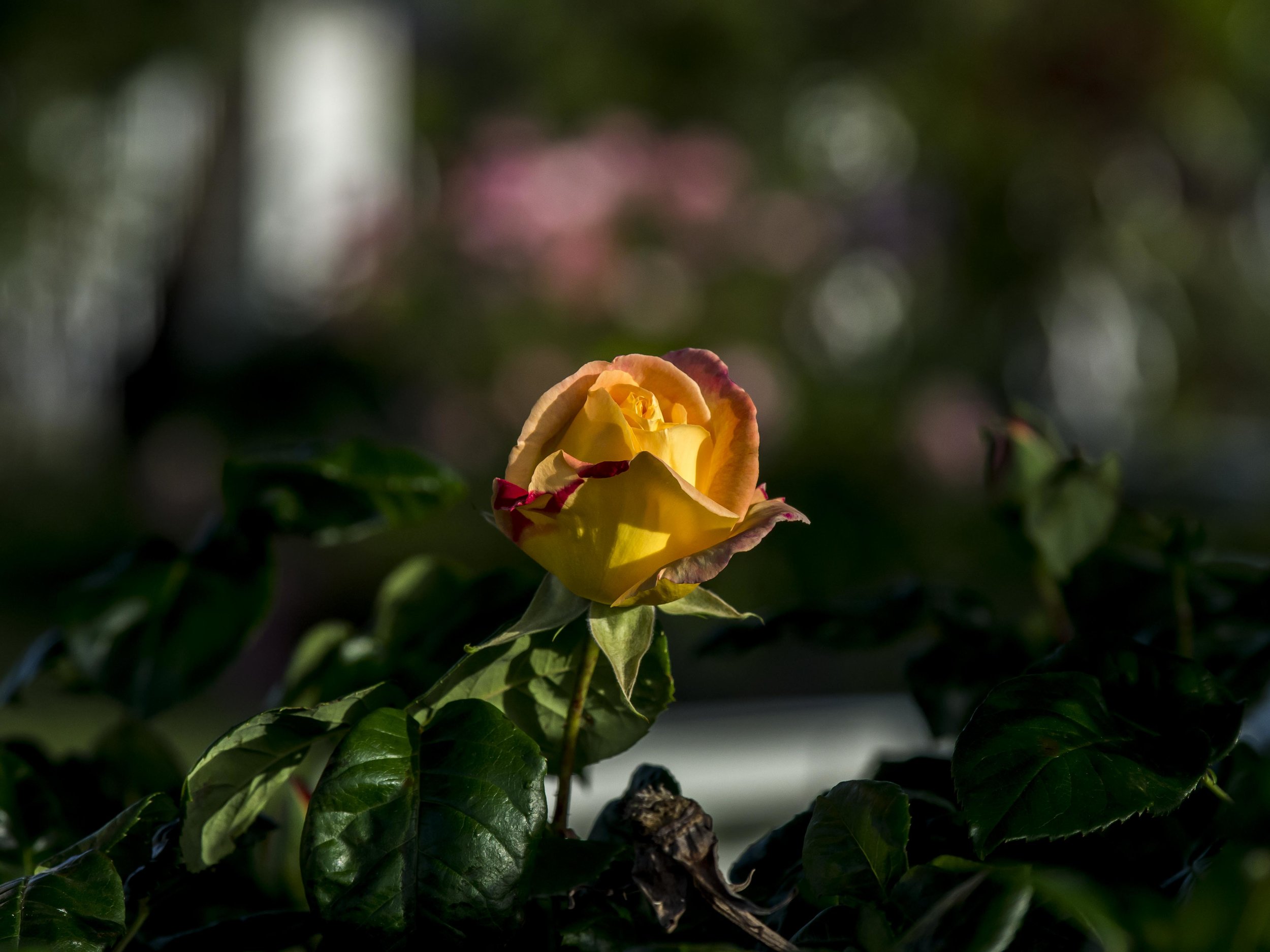
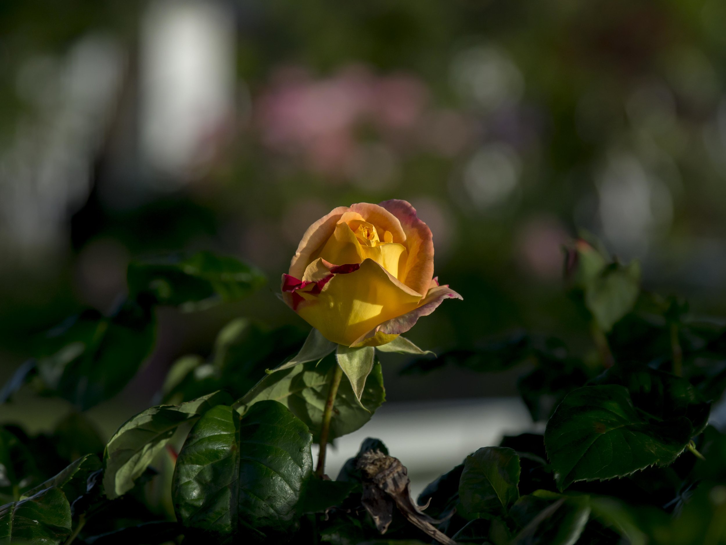
The first image above only has a basic pre set applied. The sharp and soft elements are too close to give a real feeling of separation. The second image has global contrast, sharpening and clarity added. The rose looks stronger, but the out of focus elements have become rougher. The final image has the same settings applied with the brush, but only to the rose and negative settings applied to the OOF areas, making the slightly less than perfect “onion ring” Bokeh smoother and creamier. This also add the three dimensional effect.
Camera Calibration. This one slipped under the radar for ages, but once discovered it gave me the ability to change the core colour rendering of my camera’s sensors. The EM5’s in particular have a colour base that is not to my liking. For ages I was frustrated with a magenta-yellowish baseline that took too much fixing to be comfortable (the more you process, the more file quality you potentially loose). The Camera Calibration sliders don’t just adjust colour like the normal colour sliders, they change the core colour bias of the file on a fundamental level (think of it as adding raspberries to a cake mix rather than putting them on top of the baked cake later). Just a little (+20) blue channel saturation for example makes my files cooler/deeper/more mysterious in the cool tones and by contrast warmer/richer in the warmer tones and not murky.
In the set above the first image looks cold and a little dull. The second image, with +20 added blue channel saturation warms it up and adds some brilliance. The colours could be played with individually, but this simple fix usually suits and I feel it does a lot more to the base colour than is obvious.
Black/White sliders. These two, again for the EM5 mk1’s add a richness and bite to the files that the simple contrast control cannot. Darkened blacks and lightened white make the files more contrasty and brilliant fashion. Each needs adjustment to compensate with their less aggressive siblings (+ shadows, - highlights). This is not as necessary for the newer sensors, but for the older 16mp sensor, it adds clean punch. I have heard that using the curve tool to do the same is a cleaner application, but I cannot confirm that.
This is my style, applied to my liking. It may be more (or less) than you prefer, but it suits me.