On Tuesday December 11th after 15 joyful years, my wife and I lost a good and loyal member of our small family.
A hard to describe mix of Smithfield and Spaniel, Jack was truly unique.
On the day we found Jack (a few months after loosing Ziggy our 12 year old Schnauzer), both my wife and I, separately and without any coordination found the same litter of pups at a local pet shop and excitedly shared to news with each other simultaneously. Armed with the surety of fate’s intervention, we returned. I picked up one little black puppy (I think I remember he stood out because he came to me), who promptly gave me a little lick of acceptance on the chin and settled in to my arms. Resigned to a choice made by us for her, my wife paid and we went home. More coincidentally a friend of ours got a girl from the litter and named her the name we had for him George (Georgie who is still going ok also), so naming him took a little longer than we anticipated. After a little consideration, Jack (Jack-flash, Jack-in-the-box) seemed to fit his rambunctious personality so Jack it was.
He never looked back.

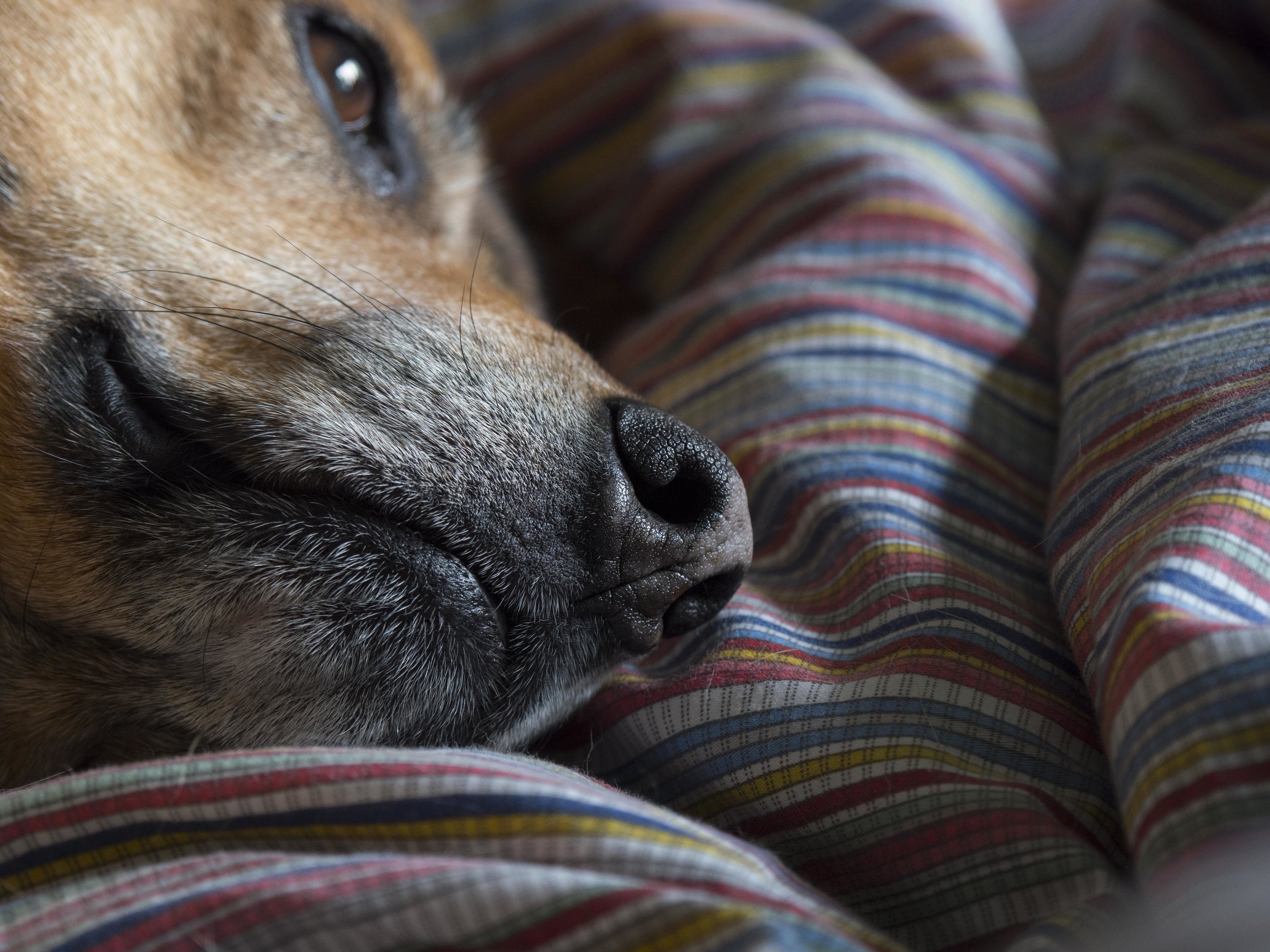
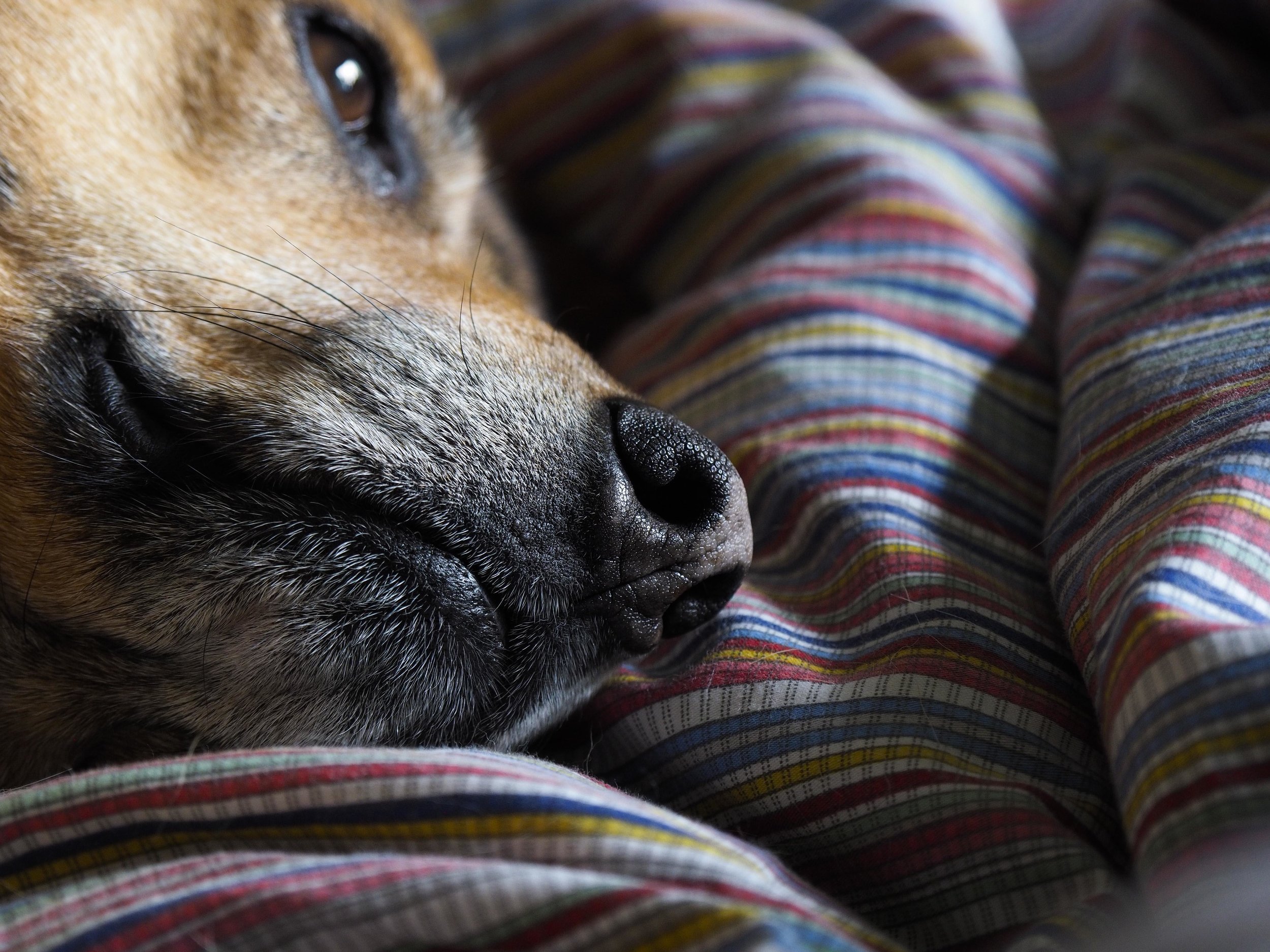
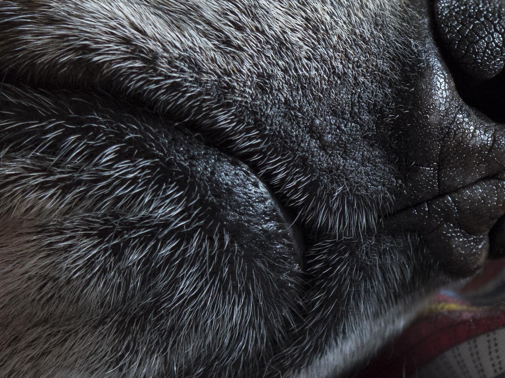
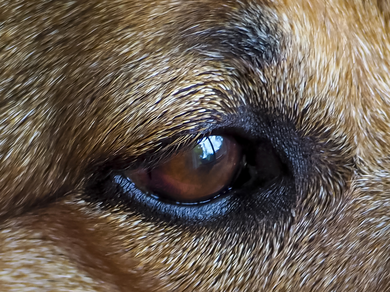
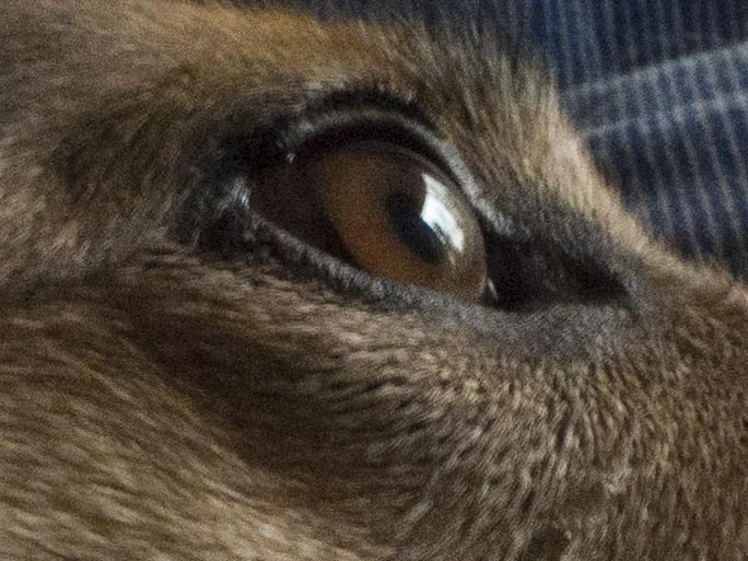
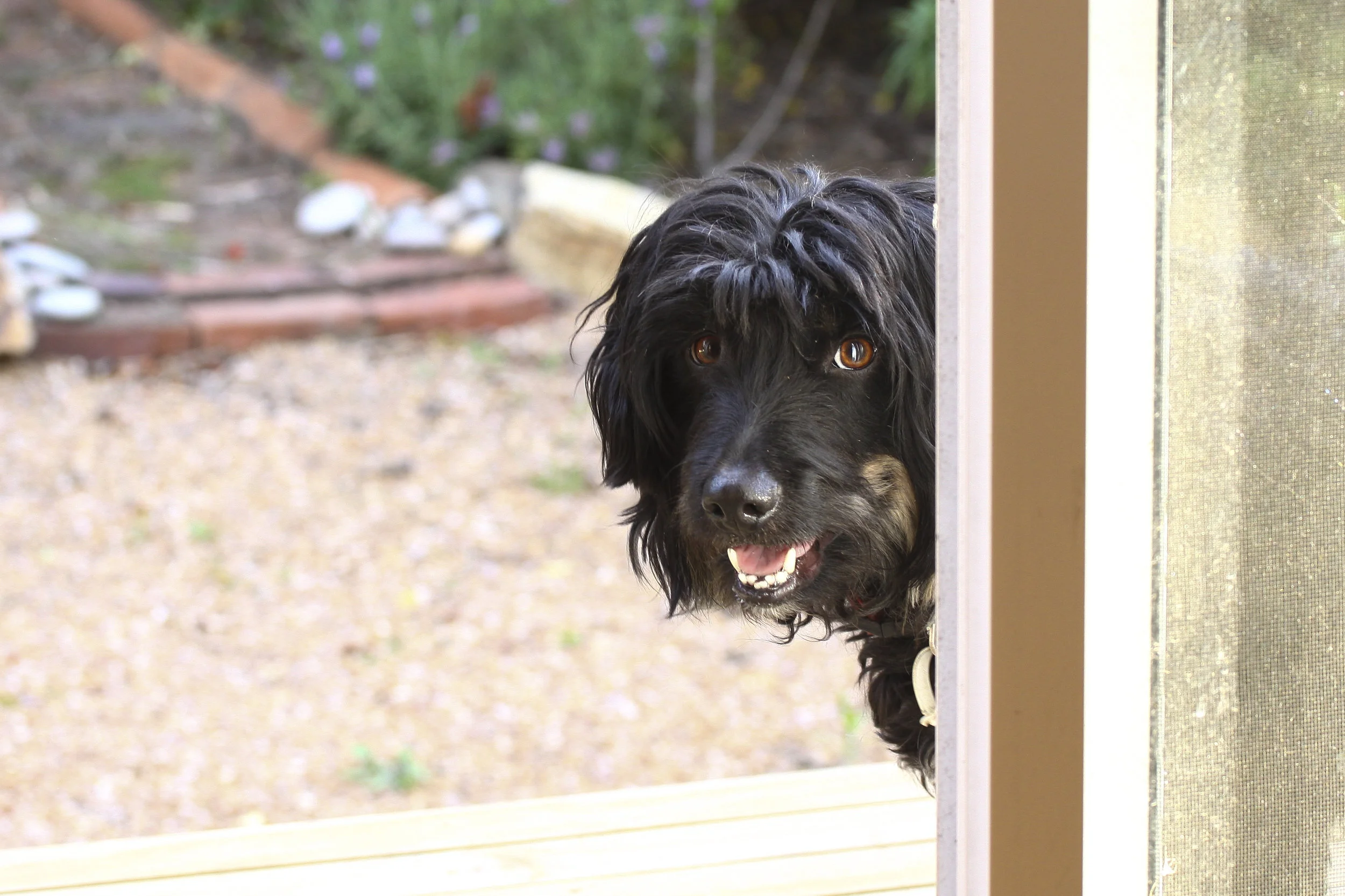
Soulful eyes. He was 13 or 14 here, full of life, although the signs of decline were there.
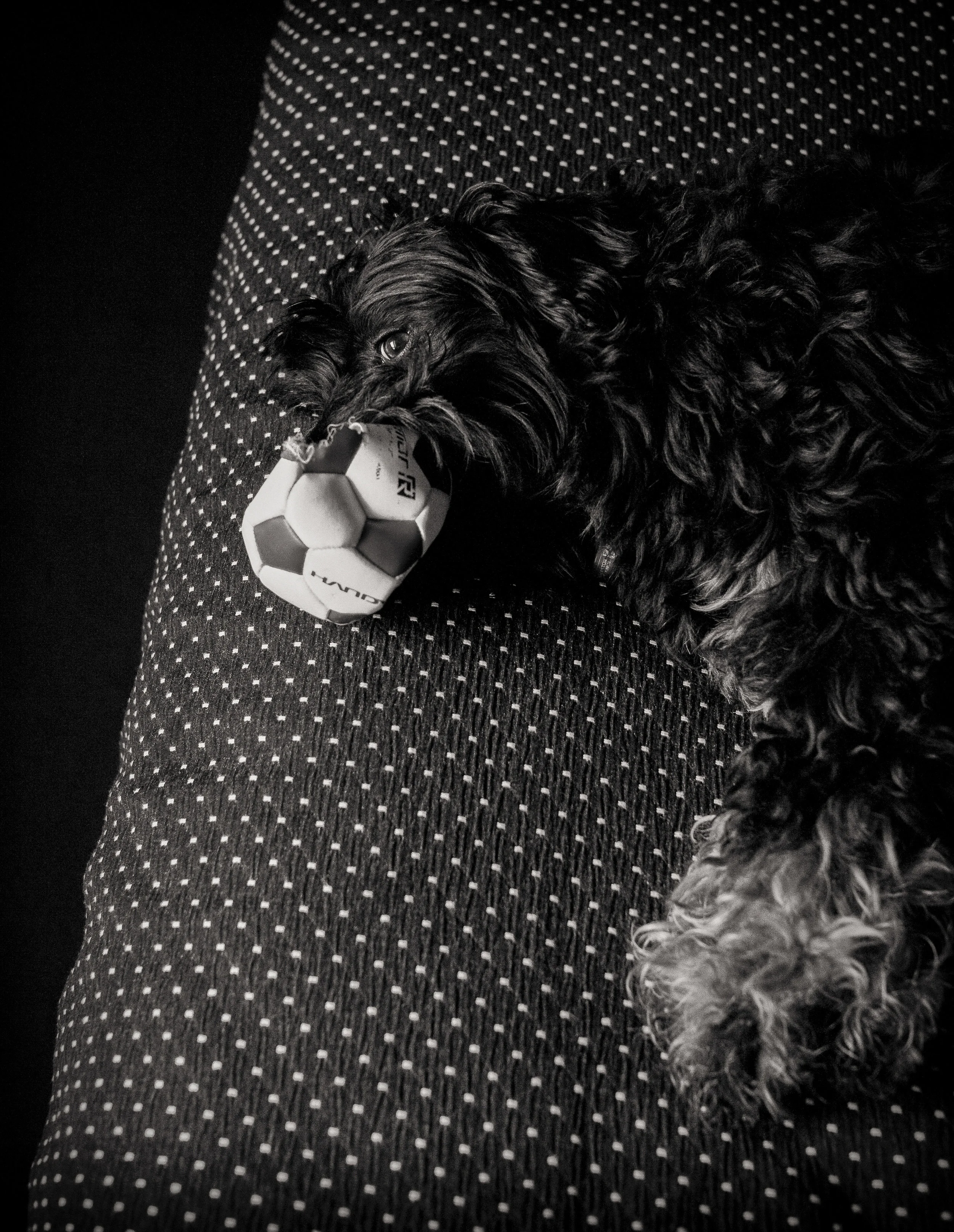
Always torn between herd dog and hunting dog instincts he developed some curious habits of finding, retrieving and delivering his favourite toys (usually Duck-bear, an odd stuffed toy mostly bear but with a ducks bill!), presenting them with a strange delighted wiggle, but then not releasing. We called this the “here is this…but you cant have it” game.
To say he filled a room with his presence is an understatement. We feel that dogs (and people) have two sizes. Their physical one (13kg/1 foot at the shoulder) and a “pack” size. In this Jack was at least 6 foot tall! Pepper, his house mate for the last 7 years is three times his size, but always seemed to take up less room. She can disappear under a table amongst the feet of dinner guests, where Jack would be in a corner interacting periodically.
Never one to whine (I do not ever remember hearing him actually whine), he had several barks that we all instinctively recognised.
The most used was the inclusive or “fishing” one, which he used to connect. It was a simple, quite deep for his size, single woof. As he grew older and slower, with failing eye sight and hearing, he would use this when he needed to go outside*, or just to stay in contact (often when I was on the computer at the other end of the house I would be summoned to at least wave down the hall, which would be enough).
*We learned quickly to react to this, or to his and our embarrassment, there would be a very rare accident (he hated to disappoint, toilet training himself at a very young age and even at his late stage in life only had a very few accidents if left inside all day).

The second was the cheeky, playful bark. With the smallest lift of my chin or eye brow, I could get him anticipating a game on the floor or his favourite, “hide and seek”. The game would start with his head dropping, a low growl and his jaw would drop, revealing a cheeky smile and then it was game on. The actual game usually ended with a gentle nuzzle and we quickly moved on. It seemed the anticipation and contact were often greater than the need to play.

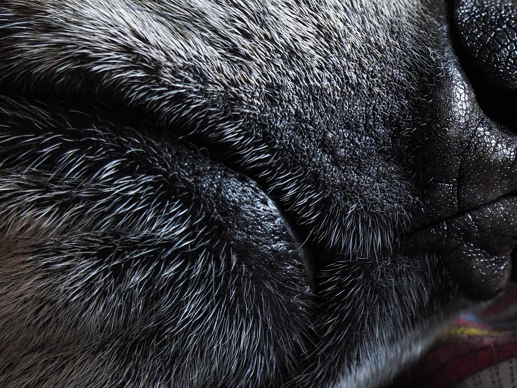
Ready to go. This also shows a slightly ragged rear end, due to the allergies that plagued him for much of his life.
The third, less endearing one was the leash or fence line bark (a bad habit taught to him by his predecessor/mentor Pippin the less friendly Spaniel, Fox Terrier cross). He knew every dog in the neighbourhood and they new him. You could walk Jack down a street he had not been down for years and he would remember all of the possible dog encounters on offer, often sneaking up on the suspect gate (I swear with a mischievous giggle), launching out with a bark, then moving on to the next one.
Not a fighter, he was a rabble rouser, an agitator. He had the ability to bring out the worst in the best behaved, trotting off laughing, job done. We could often picture him hoisting his pants up around his rib cage in anticipation of a friendly bout, but it mostly smoke without fire. Strangely, when he was young he was off the leash at a park once and another dog entered from a hidden pathway. We immediately assumed things would spiral downward quickly, but he simply sat down on all fours as if waiting for instruction, a Smithfield instinct we assume. We sometimes wonder if, without Pippin’s bad influence early on, whether he could have been one of those always off lead dogs, able to handle himself in any situation without fear of pending disaster.
before I paint him as a total rat bag though, I must remind myself of his deep sensitivity. When I was ill a couple of years ago, he was a stalwart companion. It was only right that I did the same for him.

Playing Fooh.
The need to please was the driving force with Jack. Although he had a very Alpha male vibe, usually sitting away from other dogs, magnetically drawing them to him, then feigning disinterest, he was keen to do the right thing and was fiercely protective of his “pack”. People were his focus and he could win anyone over. You always felt with Jack, he knew you were there for him.
I can only remember scolding him once or twice in the 15 years we had him. Usually the hint of our displeasure was enough to bring him back from crossing the line and once learned, he never forgot. Ours was a partnership of mutual understanding, not a one way master/servant one. He had no formal training, but picked up (mostly) good habits from day one.
Jack’s hair smelled like a favourite old jumper. Rarely bathed (and never sporting a particularly good hair cut), he was always pleasant to be around. He took grooming seriously, but unfortunately did not have control of the scissors, something I am sure annoyed him a little.

Really….best you could do?
It is impossible to describe how much my wife and I will miss him. Even people who do not connect with dogs will notice his passing from our family group. There is a genuine hole in our lives, making our house feel bigger, emptier and less alive with his passing (I feel it most at night, my wife in the morning). On the final day he went down hill quickly and our distress from loosing him quickly changed to a strong need to make him comfortable and quickly.
This is always a tough time. Two days before he has a slightly wonky, but fully involved member of our family, the next day he was lethargic, probably caused by a bleed similar to one he had last February when the vet told us his prognosis (he had a large benign growth on his spleen*, that caused little pain, but was growing big enough to limit his normal functions), the next day he refused food for the first time and clearly did not have the energy to even relieve himself without help (but the little trooper still growled to let us know he needed to go out).
This was enough. With little left in the tank to recover with and not even eating his favourite food, roast chicken (we called it the “chicken test”), we knew it was time.
I think if you are torn between guilt at possibly stealing away some days from him and guilt that maybe he should have gone sooner, then you have reached the time for the tough decision.
I will confess to some relief. Feeling him slowly fade away was hard. You are constantly aware he is not who he used to be, but is still a relevant and vital force in your life. We are also locked in for a trip away at Christmas that was threatening to fall flat if he was not either in good enough health to leave with family or (as it turned out) declining quickly and clearly.
Time to move on, but never forget. There will be another dog in the near future, as we are dog people, and Pepper our gorgeous 10 year old Ridgeback/Cattle dog cross would like the company. There is no feeling of disloyalty to Jack, more a feeling of doing our part giving a new life a loving home.
I am glad I have an interest in photography. I feel for those who loose their little friends and do not have any decent photos of them. Unlike Pepper (my muse), Jack was harder to photograph, but over his 15 years managed to keep a record of him and his funny habits. I am sure I will add to this as I go.
*Add to this almost total deafness, poor short range vision, dicky hips (from berth) an obvious heart murmur, another small growth on his heart, summer heat stress (often leading to odd habits like straddling a cool wooden table brace with his tummy) and two replacement knees from his 8th year on, he could probably be classed as a minor walking miracle, especially when you consider how well he handled all of these issues. Oh and the skin allergies, can’t forget the allergies.
Bye mate.