Artificial borders and real limits

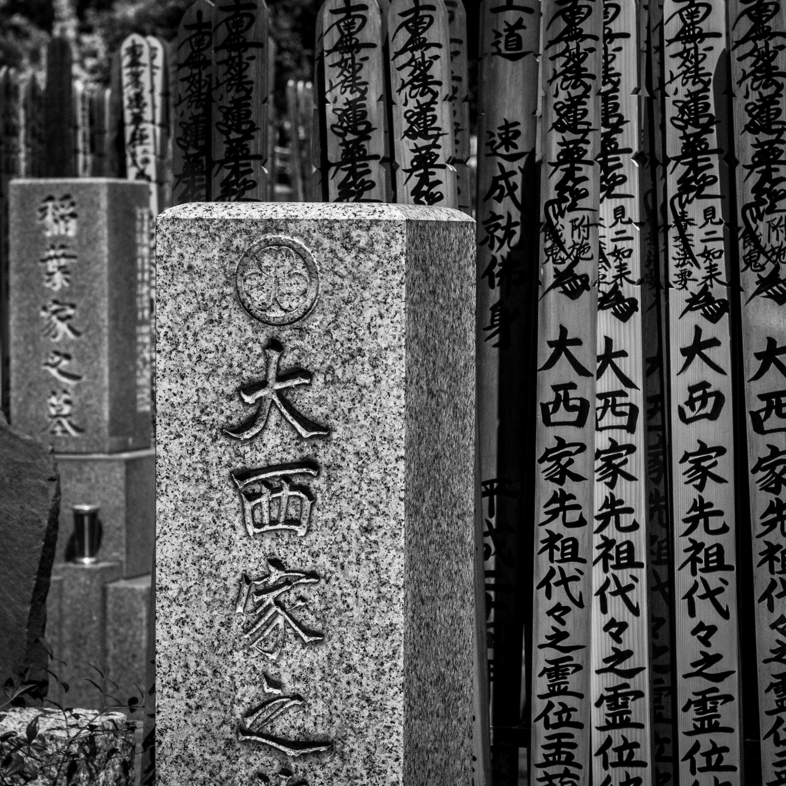
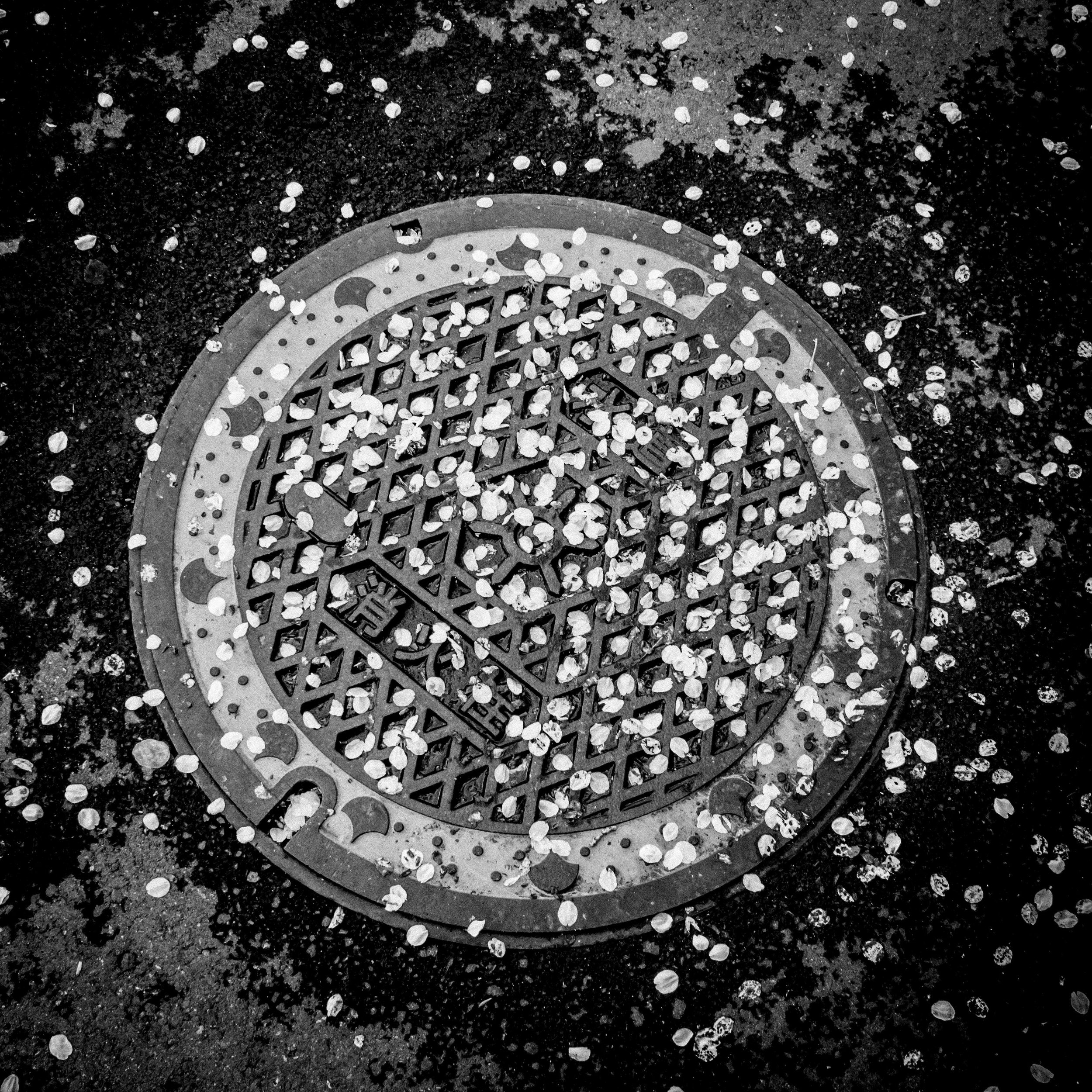
It looks like the two “settled” formats are square and 2:1 or “double square”.

The technical application of these two formats offers a few options.

Option 1.

Shoot 4:3 normally and pull out either a 13.4 mp 2:1, or a 15mp square. This can use the 1:1 or 16:9 ratio preview options as well to help reduce further cropping. This is obviously the most reactive style, but even a very sharp 20mp file may be stretched in bigger print sizes. With best technique applied, I know that even a 10mp image can (always has) been printable to fine art sizes. The desire for more file size is directly linked to screen viewing and industry hype.

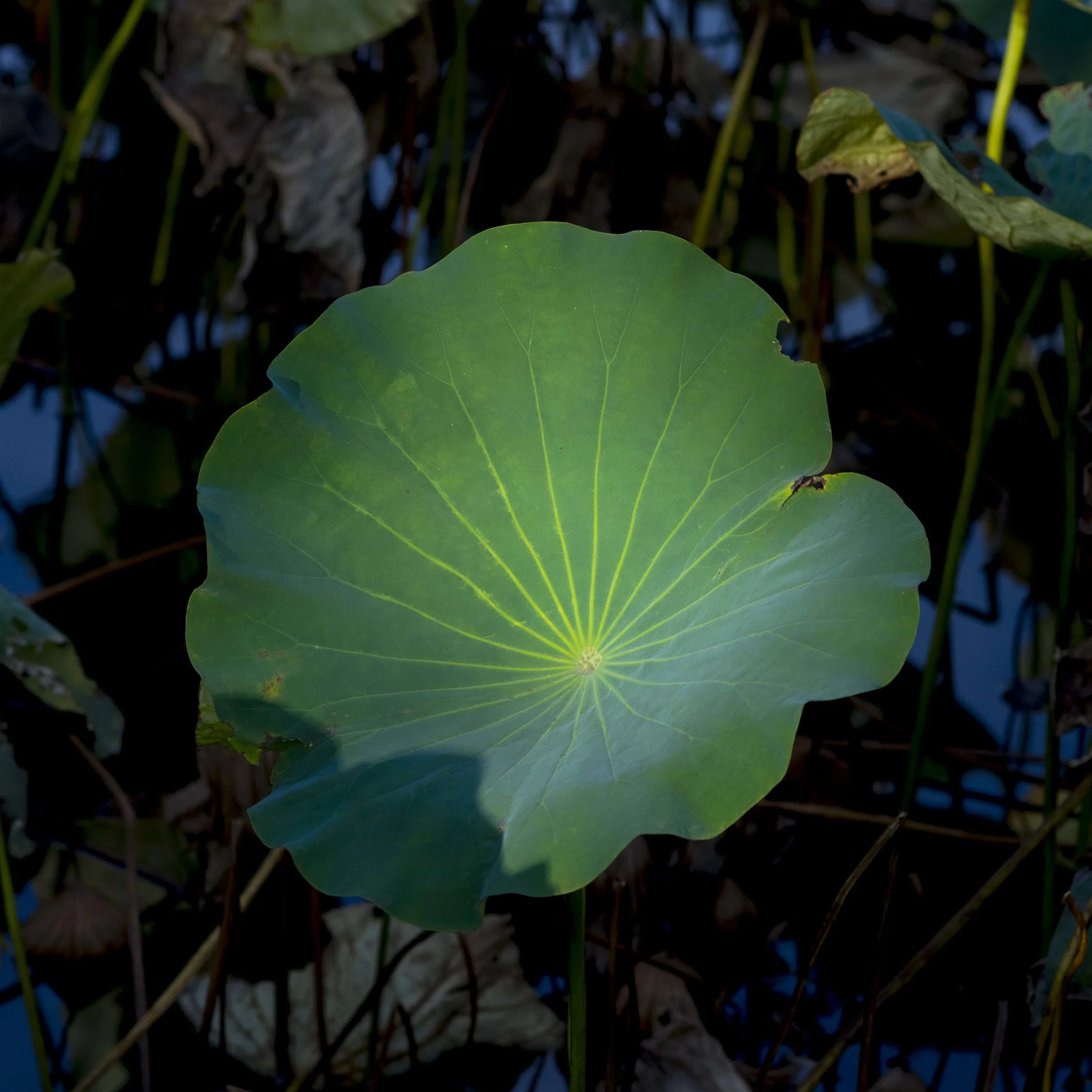
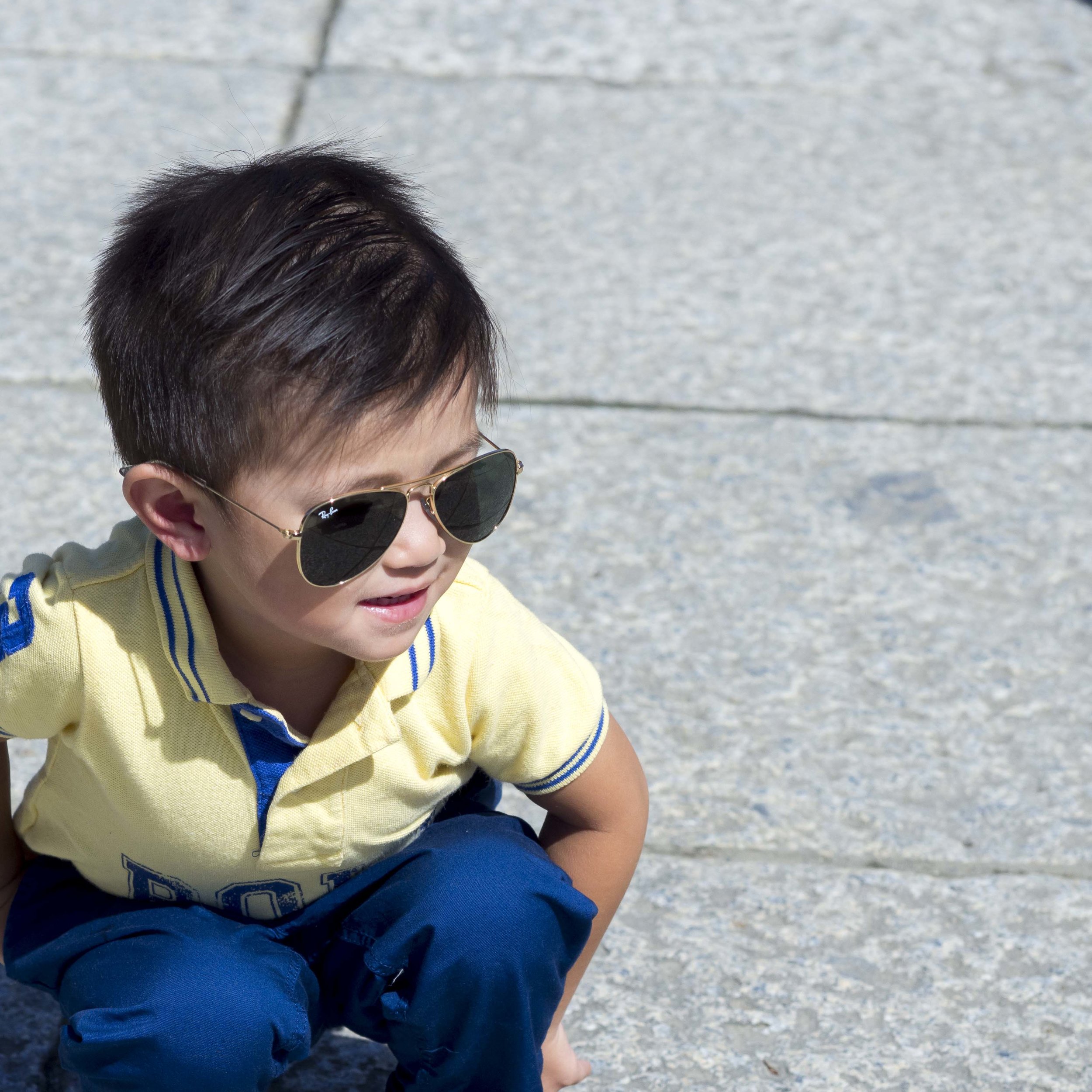
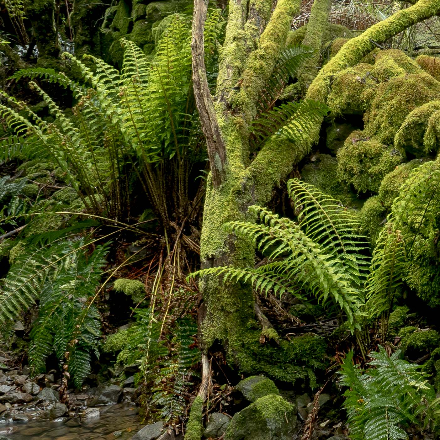
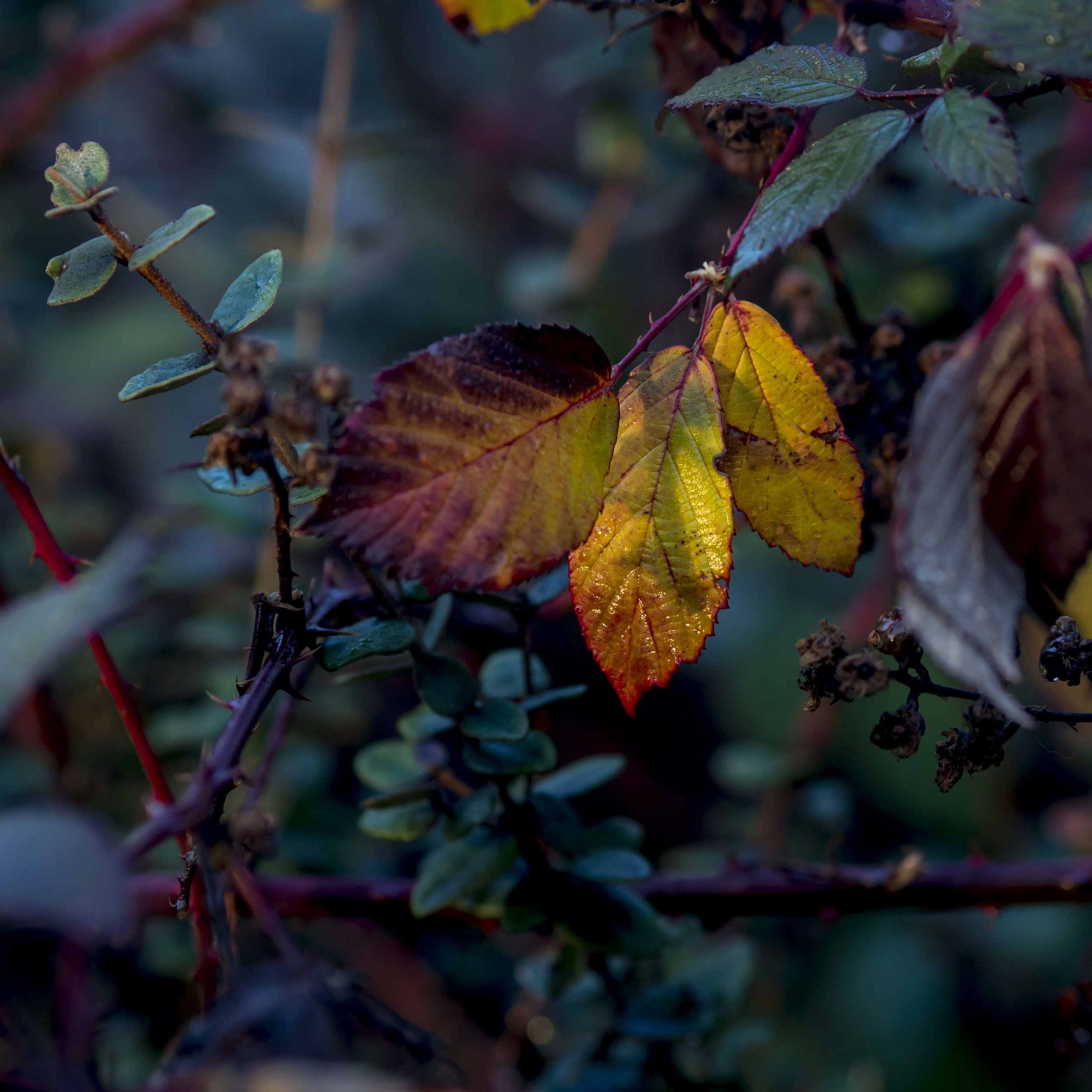
The reduction from 20mp to 15mp is not a big deal as the printable size is effectively identical. A sheet of A3+ paper (13x19 inches), printed “gallery style” as below will still be limited to the short side’s dimensions of approximately 11”x11”. Technically if one dimension is left untouched, the maximum “long edge” print size is the same as not cropping. The image below is from a Canon 550D/17-40L, so it would be approximately 12mp (a 3:2 ratio, 18mp file, cropped square). This has been printed on a 24”x36” canvas with no issue. Love that Canon colour.

Option 2.

Shoot 2-5 square frames at 15mp and print then as sets. This will allow a large overall print size of multiple high resolution (for their individual size) images on one sheet. This will also allow flexible editing as there need be no fixed formula. The true Triptych often uses near-far detail panels, allowing even more flexibility.

Option 3.

Shoot two 4:3 images and create a 2:1 stitched panoramic with a strong over-lap. This will net approximately a 30mp file. This would allow for a cinematic style with moving subjects. If the moving element is shot first and the support frame second (even afterwards), drama can be added. Better for wider angle lens use.

Option 4.

Shoot 2-5 square panels as a non-stitched panoramic. This style appeals, but requires a similar level of accuracy (or more) as the stitched panoramic. This style is predictive of standard or longer focal length use.

Option 5.

Shoot the wide format images in high res mode, limiting them to landscape images only. The res of one image would be roughly 50mp RAW or 35mp in jpeg. High quality jpegs appeal on one hand and they are quite impressive in rendering. The actual benefit would probably be lost in print, except in very big sizes.

The lure of a EM5 mk3 with possible hand held held res capture not withstanding, the high res option is probably overkill and too hard to implement.

Option 6.

Just shoot 4:3 and crop as/if needed to suit the individual image. This no-style style, as I have said before, may lead to a lack of consistency and reliable output. I.e. nothing will get done.

Harajuku wide streets

The back streets of Harajuku are a good example of where wide format images are necessary and strong. This is “double square” or 2:1.

tokyo summer 2-010366-2.jpg
untitled-040022.jpg

Further ponderings on the square

It has been only a few days, but a lot of thinking has been done in regards to the square image as “the one way” or at least the dominant way of the future.

Things I have noticed so far.

Most of my previous images can be made square. Some are pushed into the size, occasionally with a little too much tension introduced, others go easily. Occasionally an image actually becomes obvious and useable, when it was previously over looked (looking with “square eyes” has actually netted me several new compositions), and many are stronger than their rectangle form.

4:3 ratio has helped as it looks like I basically shoot squarer naturally than I did with 3:2 cameras, which also leads me to think, we are all slaves to our chosen formats. The 4:3 format looks to be forcing me to concentrate on the middle of the frame naturally, aware that the sides are of limited value. I am no longer shooting “semi wide” format and I seem to have adjusted to it..

Most of my 4:3 images clean up and gain strength when cropped square, almost like they are finding their true form. There is almost always extraneous detail on the edges that is surplus, even detrimental, to the image that is often only left in to retain dimensional consistency. I think that if I was shooting 3:2 ratio, this would have been deterrent enough, probably pushing me towards panoramic format instead.

Square is easier to frame with well. It is clean, logical and balanced. There are no sides that have to forced into the frame and even thinking of width becomes adjusting height or a “spreading out” of the image area. Every part of the frame becomes equally important. In square i am surer of my framing. It either works or it does not, clear and simple. It seems to have the same effect as the old trick of looking at an image in the mirror to see if it is balanced.

I will be using slightly wider lenses to get the compositions I get now, or over time start to crop tighter. This extra tightness is actually going to be used as for creative benefit. The tight frame is much harder to implement with a rectangle as the looseness of the frame and forced width rarely suit any subject perfectly. This, I suppose could be said of the square, but there is something very settled about the square, very humble and unassuming. Even miss-queued compositions can sit well. It is actually hard to frame badly, although their is usually a best framed option. Something I particularly like is the lack of rules. You can break them all.

Rule breaking centring. This as a rectangle image lacked strength. The eye wandered across the frame finding little of interest at the edges. The square increase the strength (and relative size) of the line in the middle and helps justify it. The ey…

Rule breaking centring. This as a rectangle image lacked strength. The eye wandered across the frame finding little of interest at the edges. The square increase the strength (and relative size) of the line in the middle and helps justify it. The eye now runs north-south rather than centre out.

The balance required in the rectangle frame (unless a true cinema wide format is used) is loose and can be contradicting, even confusing (even the choice between portrait and landscape shapes can be vexing). The square is strong from any direction it is applied, so lower left, upper right, centred, bottom edge all become viable and easily implemented. Rather than being locked into a shape, the shape becomes an aide to creative framing. Maybe it just because using it semi exclusively is new to me, but it is amazing how freeing it feels.

There is less cropping.

The common lens weakness of sift corners is mitigated or avoided fully. This is not a huge problem with M43 lenses, but what little there is, is avoided.

Any shape paper or frame can harmoniously accommodate a square (or squares).

Printing ideas pop up, rather than print to frame shape trouble shooting.

Feelings of “what if the square is too limiting” are addressed by the knowledge that all shots are taken in RAW, so the extra breathing space is still retained for later, but so far this has not been an issue. Shooting for square seems to eliminate the desire to look for rectangles.

Shooting square really fits M43 camera handling. The waist high or eye piece dynamic, square framing preview and minimal pixel loss all blend seamlessly into a harmonious work flow. If I was still shooting 3:2 SLR’s we would not be having this conversation.

The only other format that appeals is the 2:1 or wider cinematic format. I have set this up as a custom shooting set as a high res 16:9, intending to crop even wider. High res is probably not necessary and is limiting in application (maybe an EM1-X for and held?!). Any regular rectangles now seem to be a confused nothing of a format. All restrictions are artificial to a point, but your images have to be committed to a shape at some point. Too me the only two things that are important in a format are (1) being invisible as possible and (2) being as powerful as possible.

The multiple subjects in this image drawing the eye around the frame is diluted in the 4:3 ratio original. A square would not suit as the dynamic would be lost, so extra wide it is. The eye lands first on the woman in the middle, then either left or…

The multiple subjects in this image drawing the eye around the frame is diluted in the 4:3 ratio original. A square would not suit as the dynamic would be lost, so extra wide it is. The eye lands first on the woman in the middle, then either left or right and back.

Technically imperfect, this image still has a feeling of drama out of proportion to it’s subjects. Cropping wider eliminates the distracting irrelevances above and below and the dynamic of the main subjects comes very much to the fore.

Technically imperfect, this image still has a feeling of drama out of proportion to it’s subjects. Cropping wider eliminates the distracting irrelevances above and below and the dynamic of the main subjects comes very much to the fore.

All is not perfect in Squaresville. I have noticed a tendency to shoot wide rather than crop tighter, but this will come as I become more practiced.

There is also a tendency to flatten and over organise the frame, making the frame very rigid. I need to pay more attention to depth, blur and the near-far dynamic.

I still have rectangle shooting habits, like turning to portrait orientation instinctively.

I need to re-learn my lenses, especially my wide angles. I think I will have to stick to zooms in the near future until I acclimatise as my 17 feels like a 25 and my 12 feels like a 14, but the added thought process of landscape or portrait orientation is gone, so zooming will likely not confuse the issue (see above).

To summarise, I am still happy with the move to square, but I am also aware there is a little work and practice to do.