I have stated before, many times, that I like Canon colour. My early years were spent with Fuji Velvia slide film and then Canon in digital. The transition seemed natural to me. Strong, clean and vibrant colours make my heart sing. Can they go too far? Yes, easily as it turns out, but given the choice between cool and dull or bright and brilliant I will go as for to the latter as is realistic.
Olympus cameras (EM5's in particular) produce strong colours no doubt, but they lacked the depth and mystery I was used to in Canon camera's files and could look a bit dark and dull. Sometimes the very discovery of how the Canon's interpreted colour was a revelation. Deep purples in shadows, cold blues contrasting with warm and "happy" reds, yellows and oranges, lush greens and blues sharing the image almost aggressively.
Sometimes hard to control, but never dull (let me say though, the RAW files are as flat as flat, but the colours that come out when pushed are what we are talking about).
I experimented with the files from the OMD's over a couple of years, but never really felt that the under layer of colour was there. Sure, if the image started warm and had strong and contrasty colours it could look fantastic, but was it as fathomless as the Canons?
The break through!
The bottom of Lightroom's development panel has a section I had never really looked at. It is the Camera Calibration section. I suppose in hind sight, the hint was in the name.
Camera calibration allows you to fine tune the colour palette of your camera's files to best suit your preferences, by adjusting not the saturation or vibrancy of the surface colours, but the base layer of the colour. It is in effect the ability to but a "tint base" into paint, rather than a "white base".
How do you use the sliders? Well I cannot explain technically (too lazy to find out, I am sure someone can break it down) , but here is what happens. If you push the Blues slider up to about +20-40 saturation, the file gets warmer (highlighting yellows). Not warmer like white balance warm, but it adds contrast and enhances the perception of the yellow/blue difference. If you do the same for the Greens slider, orange and green hues do the same.
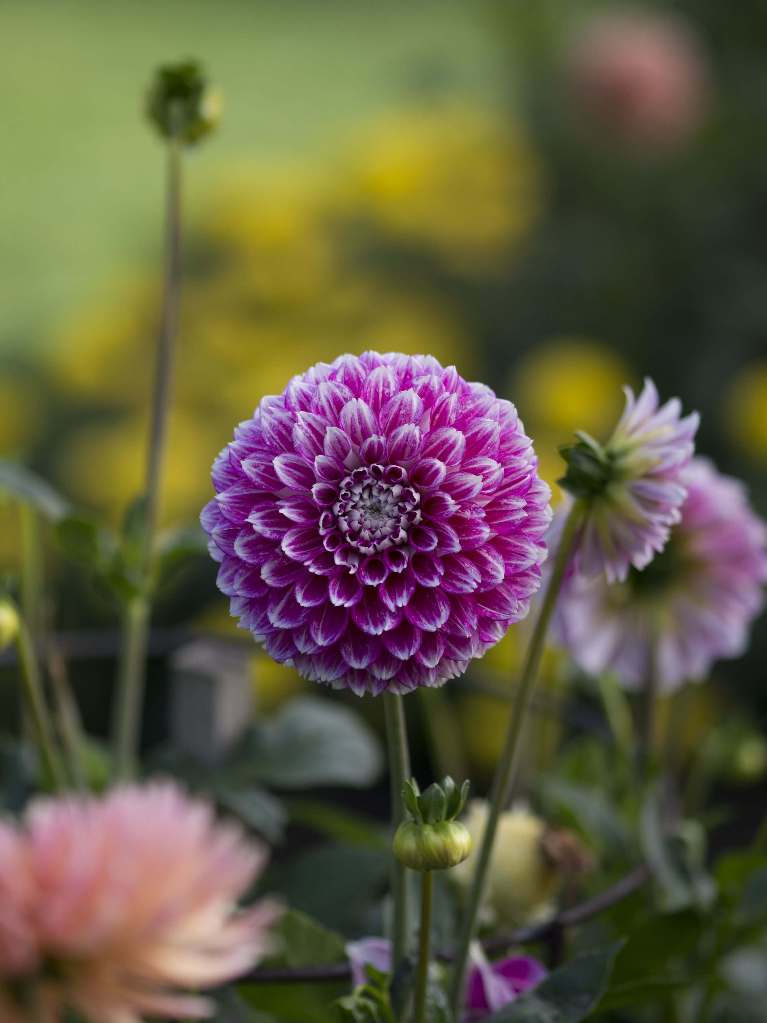
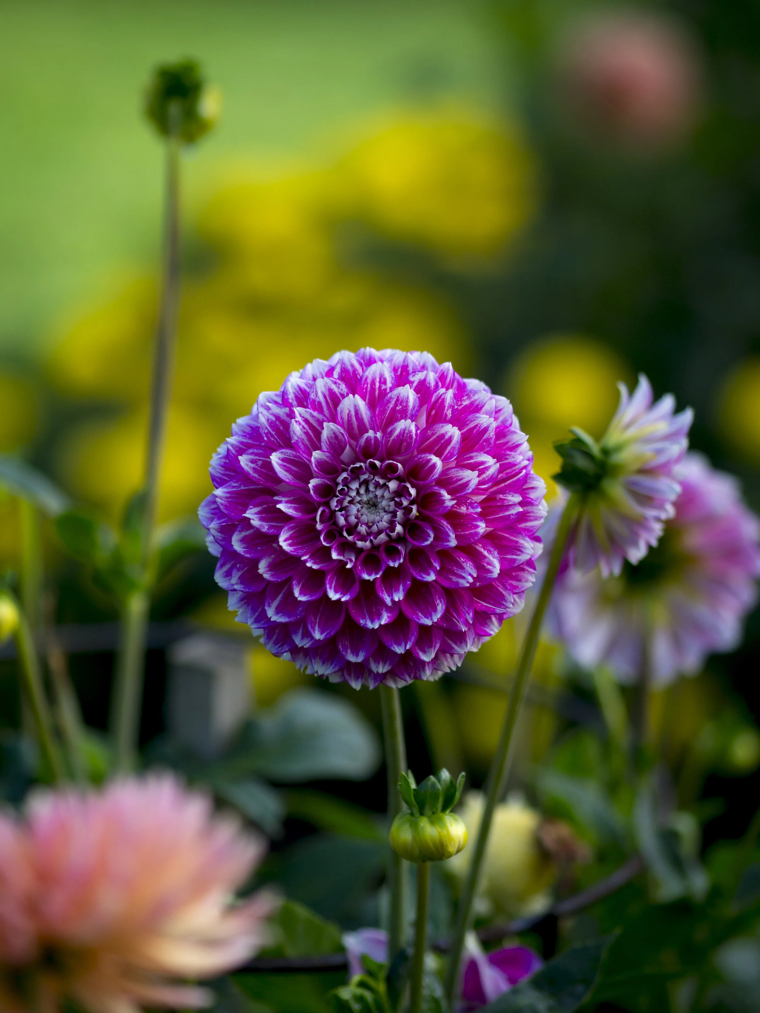
The images below are identically processed except the one on the right has +20 green and +40 blue added. The feeling I get is one of more exciting colour, without over saturation or white balance shifts. Contrast and definition seem to be enhanced also.
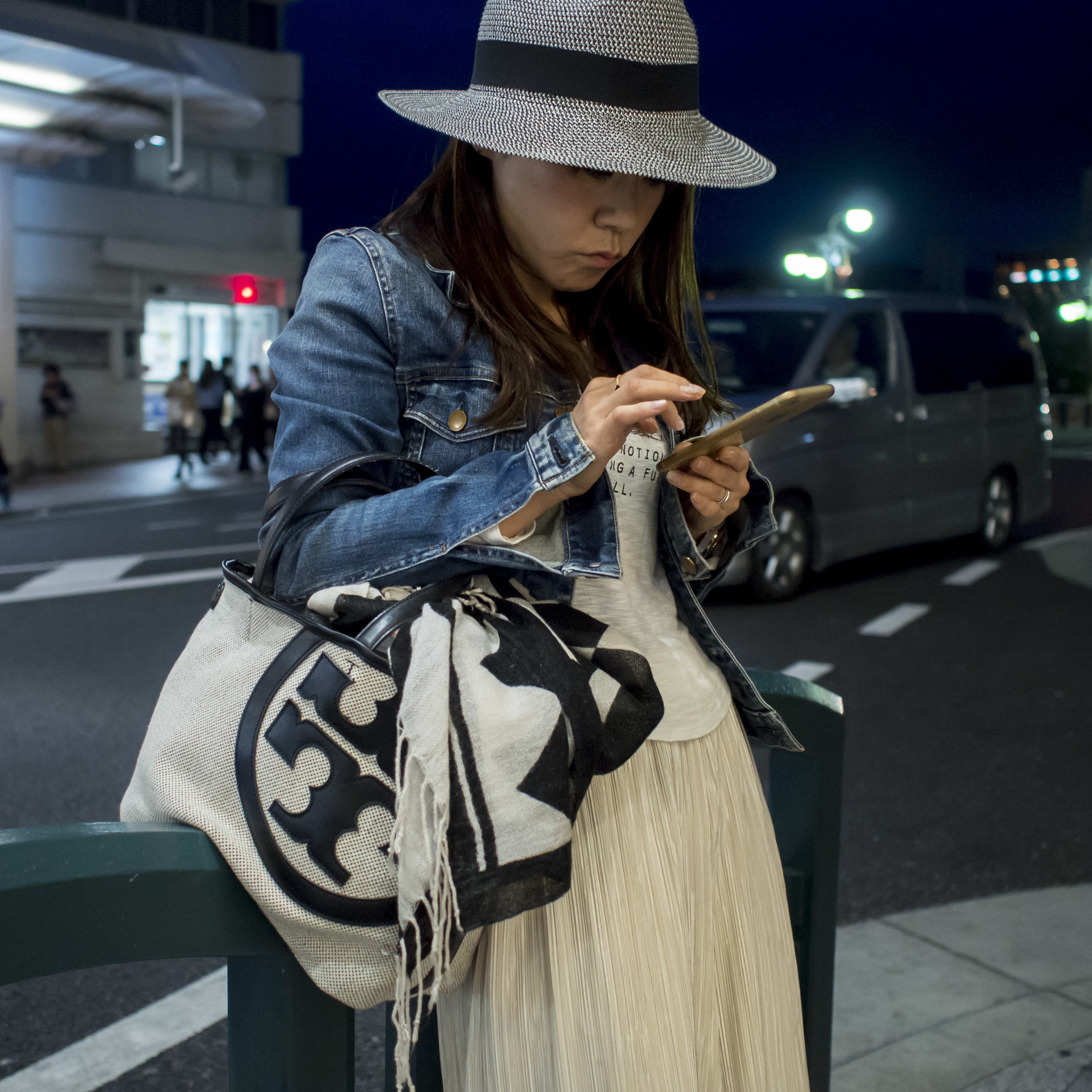
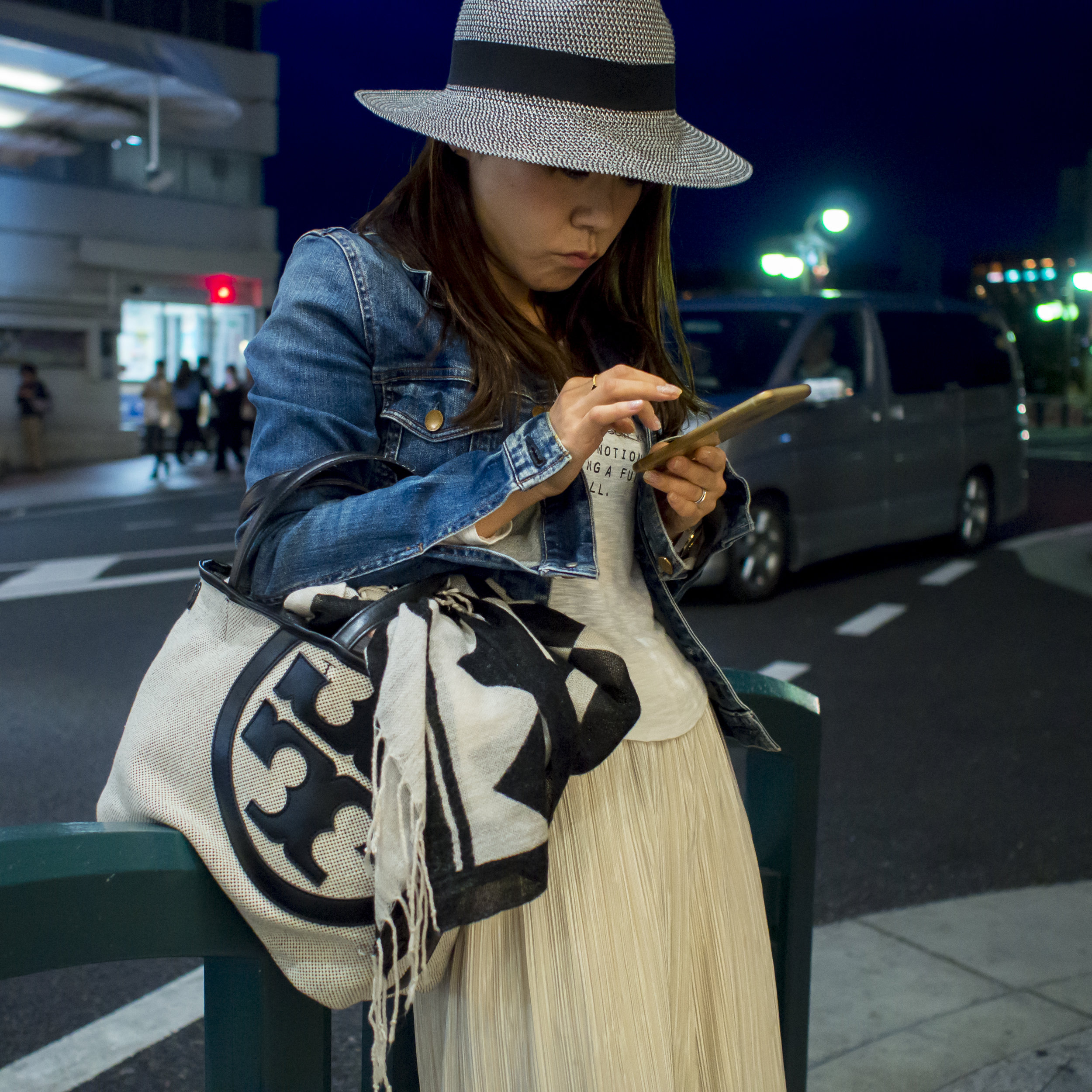
Testing this again with an image I posted the other day (the left one), I only added +15 green and +25 blue to the right image, deepening the skin colour warmth, making the blue jacket stand out and putting some warmth in the dress. The red light in the back ground is also richer and the white/green ones have more colour in them. basically, the shot is snappier, warmer and more pleasant to view.
The beauty of this control setting is it has the same dramatic, but subtle and natural effect as using the brush tool to sharpen, not the heavy handed global slider.
I have not had much luck with the Red control, but Olympus files are strong their and I also have not played with the hue controls, but with just a little touch in the green and blue channels, the "Canoniness" has come out.
I should say though, that the Pen F is not needing the same treatment. The jpeg's it produces are pretty close to the same, even a bit over the top without care taken. It is the EM5 and the early 12mp sensors in the Pen cameras that need the above work.