I draw the line at Lightroom for my processing. It is not that I am fundamentally opposed to the more “graphic design” processing of Photoshop, I just have never needed what it offers for my own images and much prefer the more intuitive style of Lightroom. This artificial boundary has allowed me to explore digital image making with the perspective of a film era shooter, but is powerful enough to take me places film processing would have struggled with. This is especially true of colour. Film probably held as much if not more colour in each exposure, but it has only been since using digital that I have been able to extract it easily enough to make discovery, as well as nurture a part of the process.

The final screen edit. After a basic import preset, there has been a little cropping, then the more aggressive processes outlined below. For printing the image would be reworked to put the punch back in that printing on a fine art matt paper will mute slightly. The printed end result though will likely hold more subtlety and depth. The effect is strong, maybe too strong for some, but all of the colour is enhanced from what was naturally there, nothing has been faked.

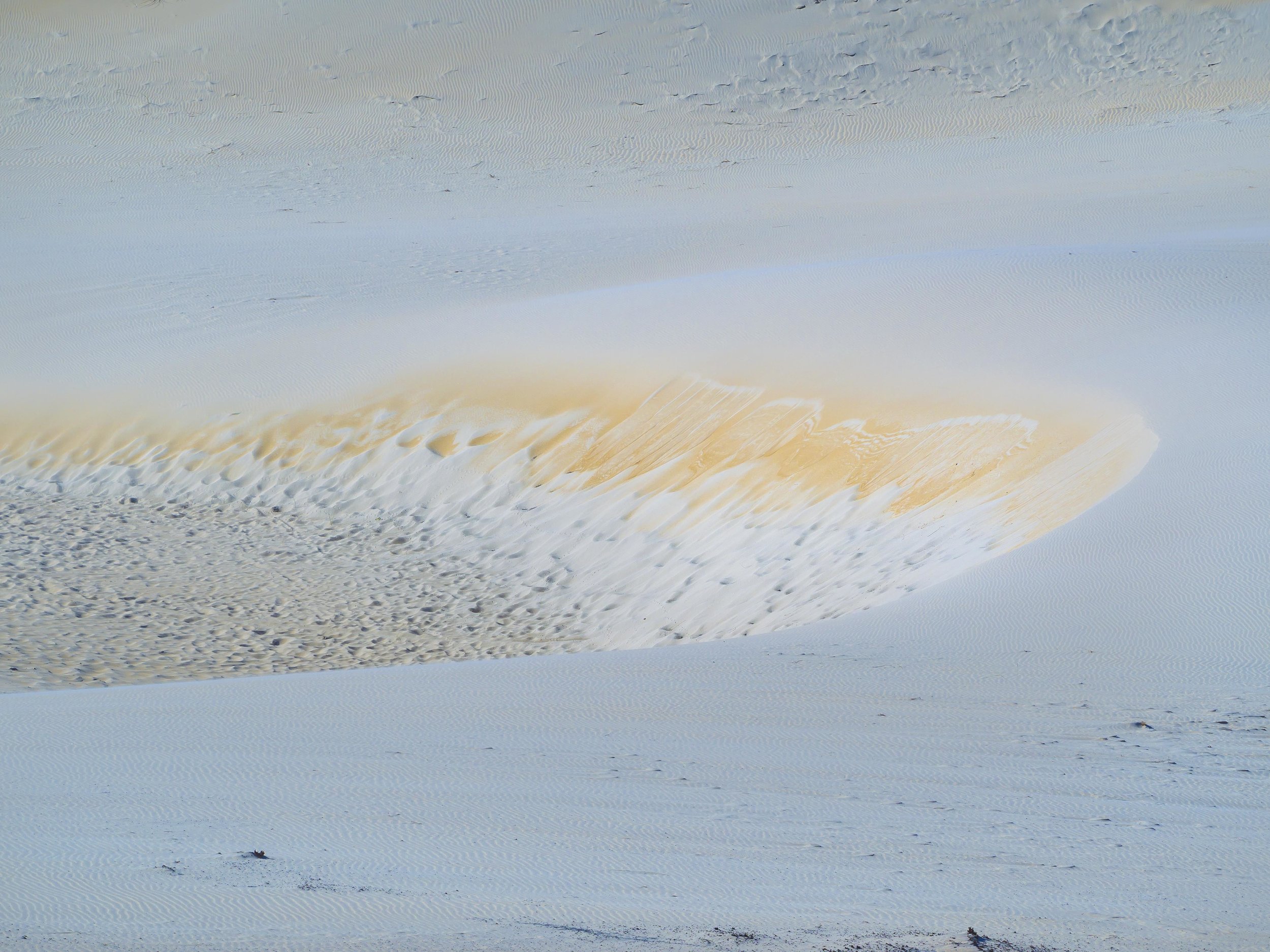
The unprocessed, cropped original. Pretty drab, due to cloud cover and the time of day. My first impulse on reviewing was to ditch it. My second thought, after some success with other files in the set was a mono conversion (see below). Browsing through the files recently, looking for a good mono/colour comparison, it occurred to me to push a couple of sliders and see what came easily. I intended to show the added strength of the mono image, but ended up with one of my favourite colour images from the day.
In this file, only colour saturation has been added to a basic import pre-set which is a mild version of below. (+50 vibrance and saturation and a little more specific orange/yellow/blue saturation). You can see the latent colour in the image coming out a little, but it is subtle.
It always amazes me how much hidden colour an image can have. Night/evening and shaded area shots often have much more colour in them than we see at first sight.

This shows the effect of the basics panel contrast and exposure controls, but without any colour settings being applied. The contrast is +40, highlights reduced by -50 and blacks to -90. Shadows and whites are increased to +40 ad exposure by +20. This shape is pretty standard for EM5 mk1 files as it adds brilliance and crispness without loosing highlight detail.
The blacks slider can be one of the strongest acting and most useful in Lightroom. Deepening the blacks can add the effect of sharpness, crispness and a cleaner, more contrasty image (this is what we used before the de-haze slider was added) and is often where I start with a flat looking image. If the image does not respond to the blacks slider, I will often pass it over as too far gone. Pushing whites adds brilliance to EM5 mk1 images, but often needs reduced highlights to hold the image together. The highlights and shadows sliders are less aggressive than the blacks and whites ones, so they are often the limiting factors.
Combining the two above combinations resulted in the majority of the finished file, then some added brush work (+20 clarity and contrast mainly) added to the dune detail, the foreground and background. I much prefer to use the brush with mild sharpness, clarity and contrast settings, even multiple times, than using the clumsier global settings.
I have since revisited the image, changing the cropping to a more rectangular shape.

The mono conversion. This was the end product of the pre-conceived path and is perfectly serviceable treatment of tones and textures, but as often happens (with me anyway), the colour of the image called.