A little walk this morning around the local market to look around and use the Pen mini with the 14-42 kit, just because. Autumn is showing it's first signs.
The image at the top is warm, but a little unbalanced and busy due to the blue on the left and the face in the back ground on the right. The only post that has been used is my "gentle" pre set, that emphasises the whites at the expense of highlights, darkens the blacks, sharpens and smooths a little and then a mild brushing of the man to add local clarity and contrast.

EPM-2 14-42 widish at f5.6
The lower image is stronger on the man and his face, simply due to removing the colour from the peripheral subjects. The woman's face still fights for notice, but in the mono image I do not find this as annoying.
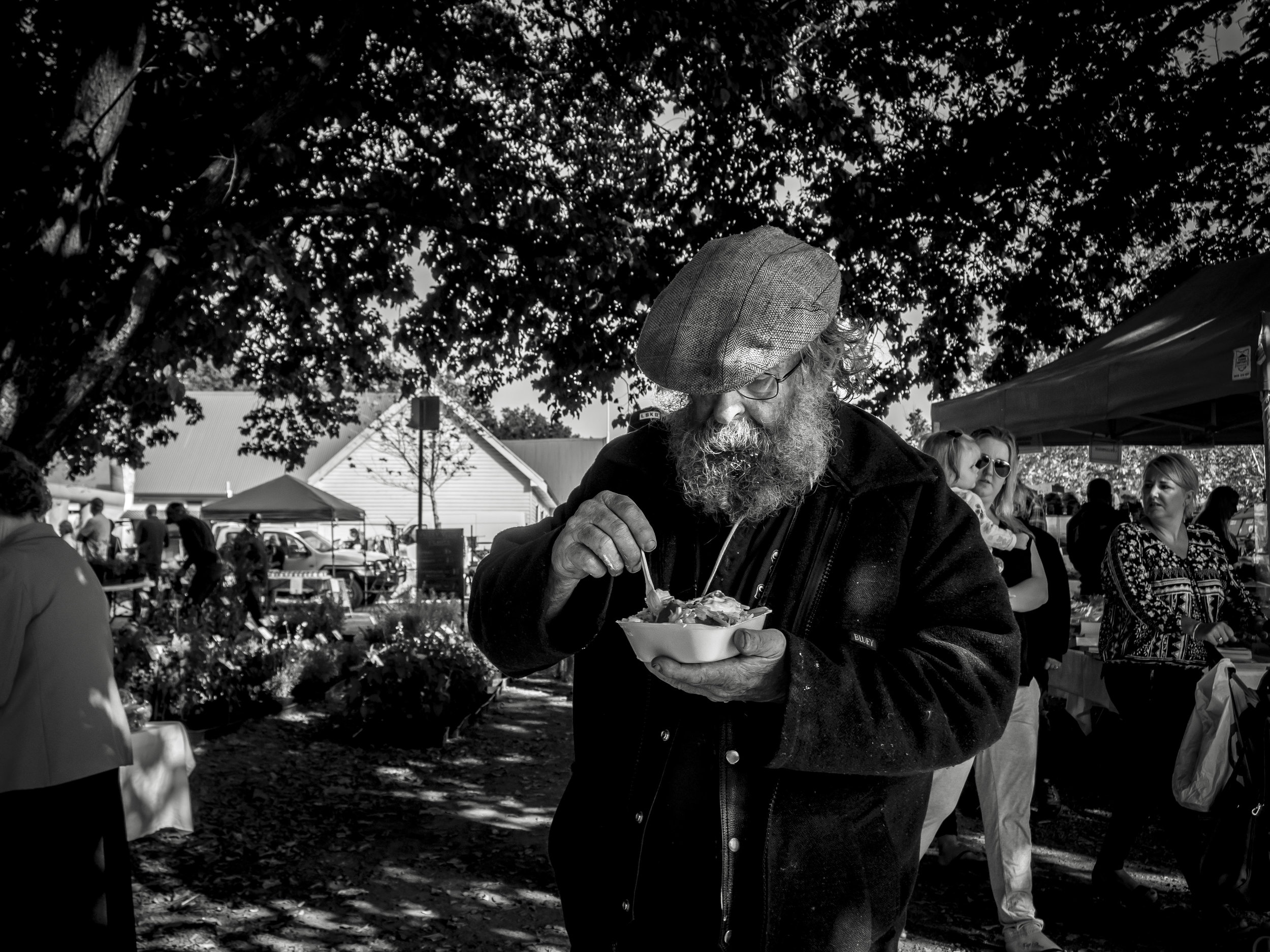
It is rare that a colour image sends a simpler message than a mono one, but I think, with a little work, this one could and is my favourite. Cropping looks to be the obvious thing to do, but it does not work in this case. The image needs the space to breath.
We had a spud straight after this also. Cameras cannot convey the smell!