Off to Japan again. I really cannot call it a second home as I have made little effort to learn the language or really connect, but much like a migratory bird, we pass through every six months or so, seeing, absorbing, admiring.
This trip is very different photographically. It is mid winter. My time!
I am anticipating images that will work very well in mono as tone and texture dominate muted winter colours, but there are of course those "deep" images a little colour only adds to.

An example of an image crying out to be made mono-tonal
It struck me that finding some examples from my other trips might be a little difficult, but the images from just one day, exploring the Golden Temple in Kyoto, actually coughed up several mediocre images that worked better, or at least as well in black and white.
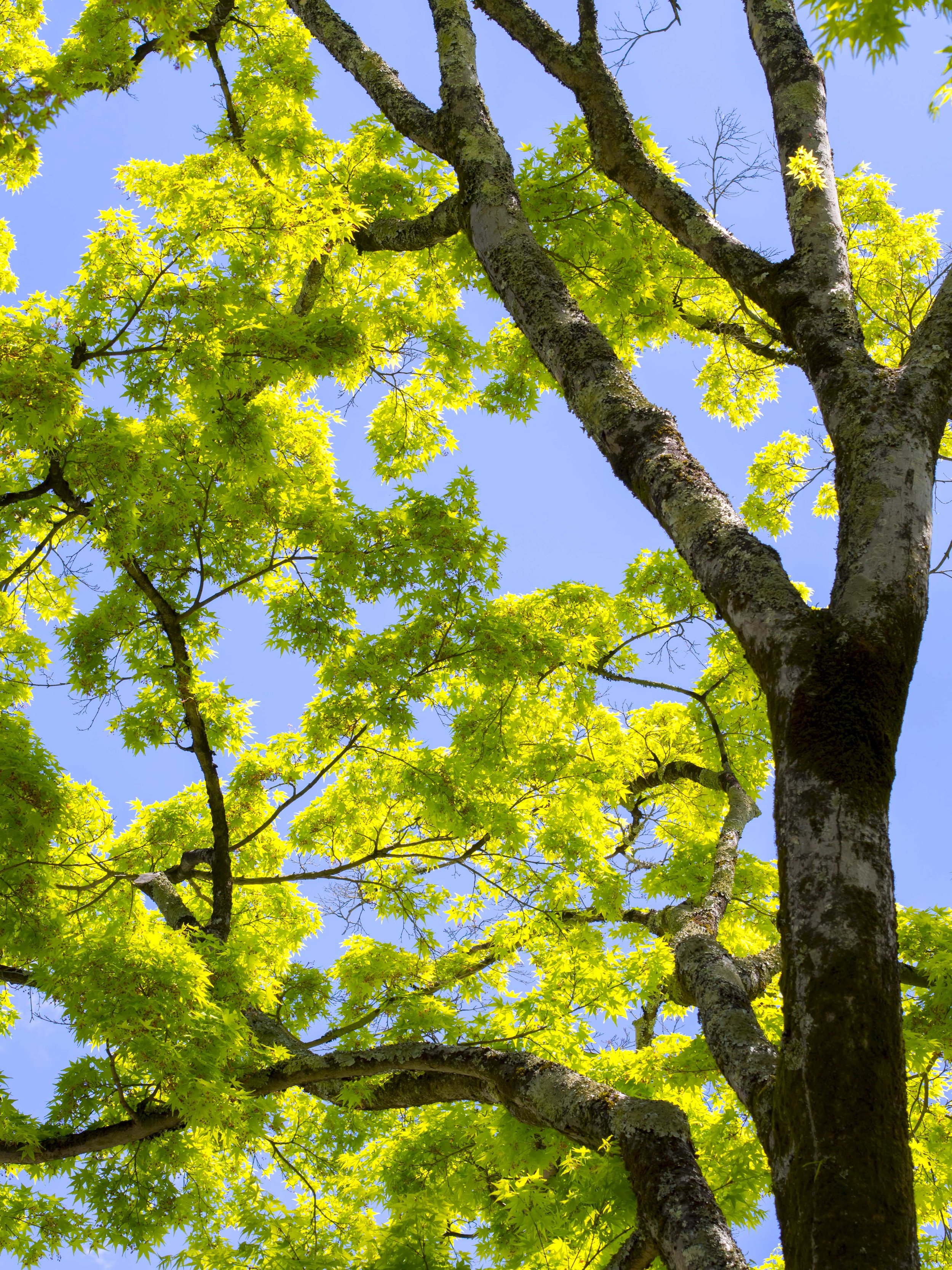
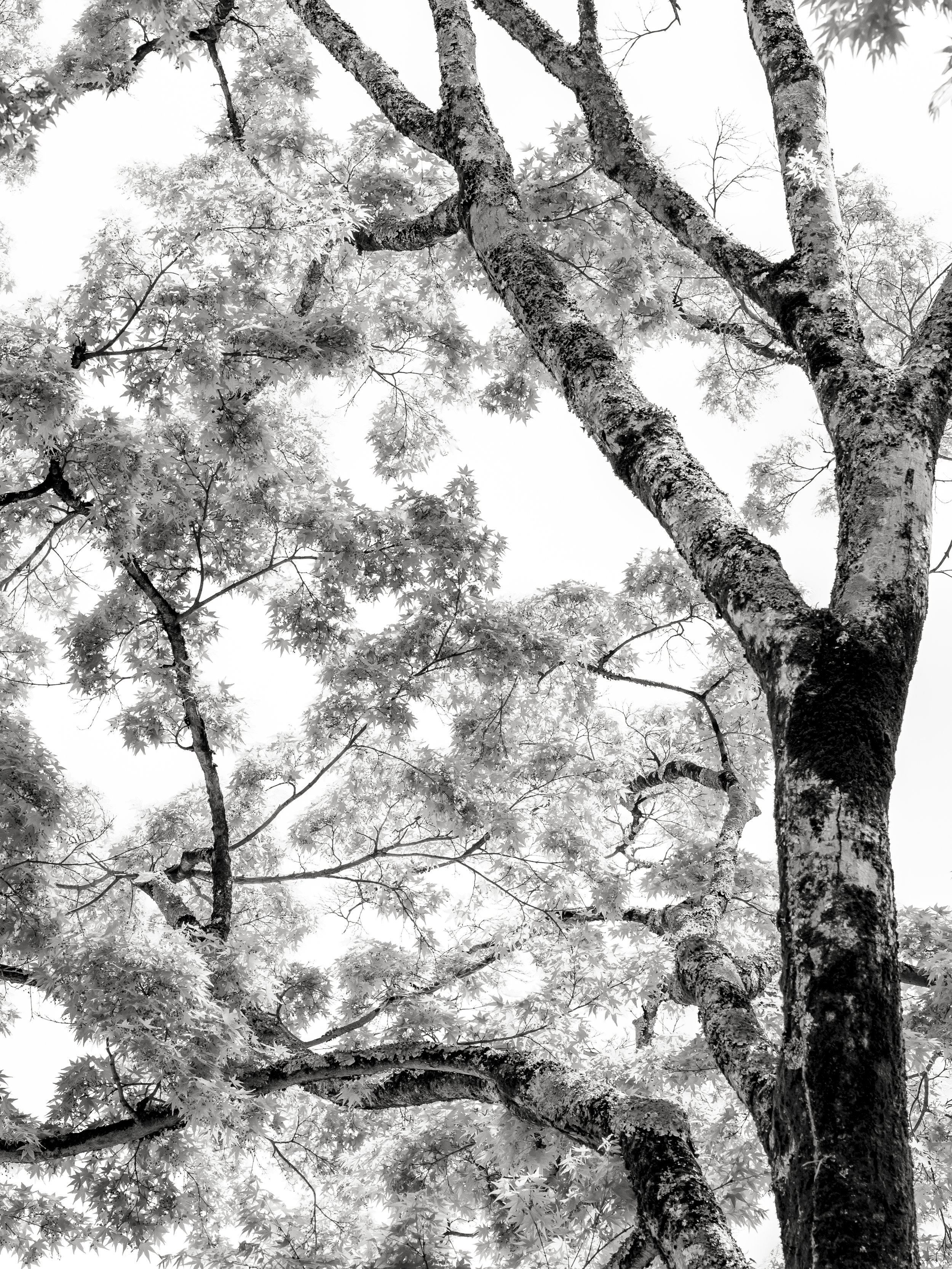
The image above does not work for me in it's original form. It attracts with colour, but ultimately fails in composition. The mono conversion is more satisfying as the images "shape" changes. The leaf brilliance and textural tree trunk are in balance and draw you in. Similar manipulations applied to the colour image only make things worse. The planar flattening, evenness and micro contrast of a mono image work together. The colour only distracts.
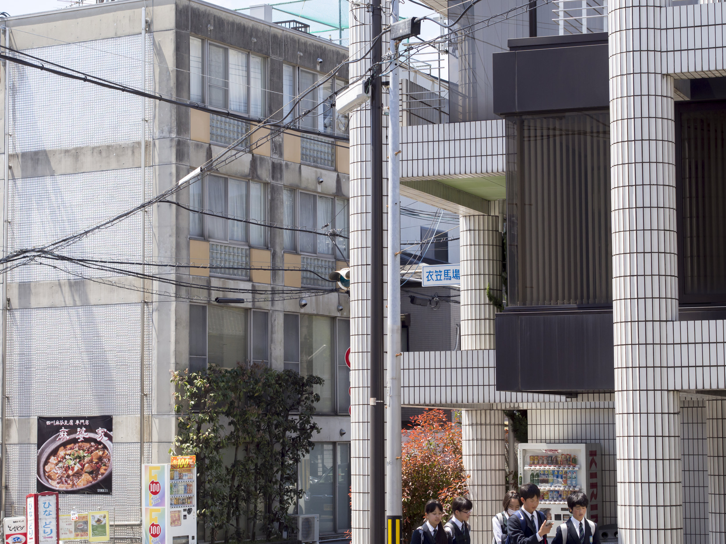
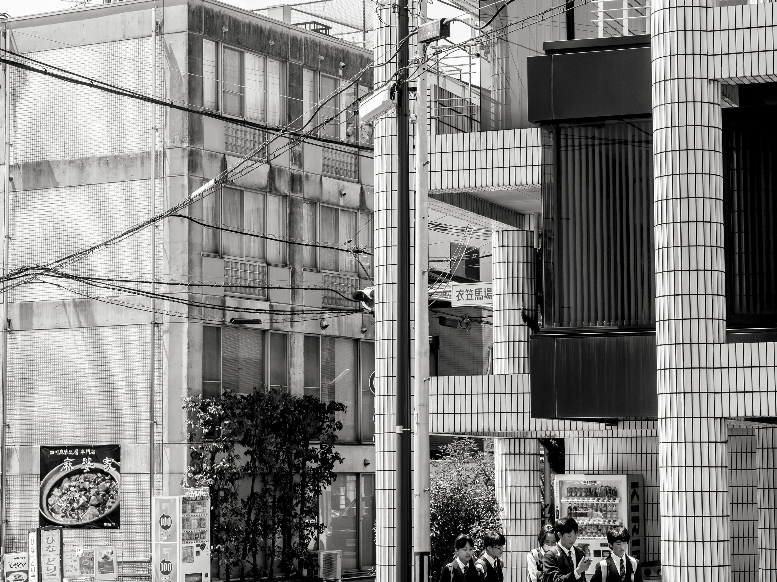
Again above. The clean lines and tonal richness of the mono image cleans up the messy and boring colour shot, giving it a chance at least of satisfying the viewer. Notice in particular, the stronger, less hazy rendering of the shaded building front and the glow of the front building tiles.
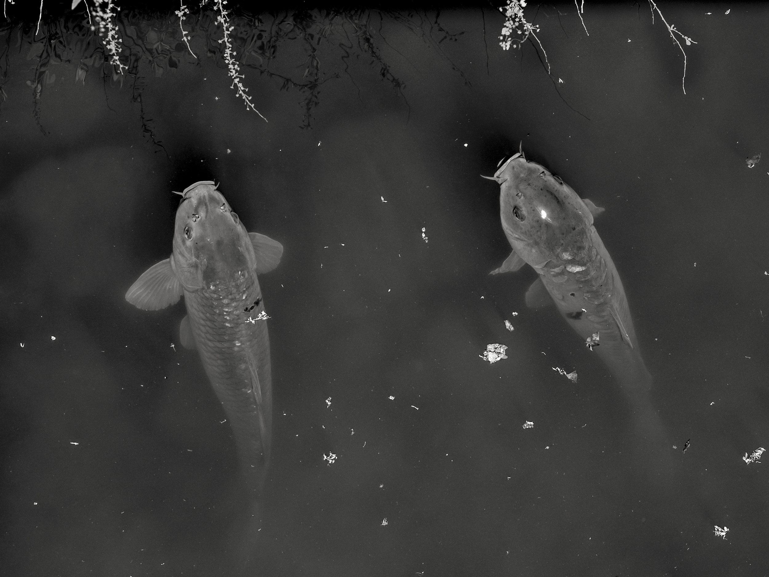
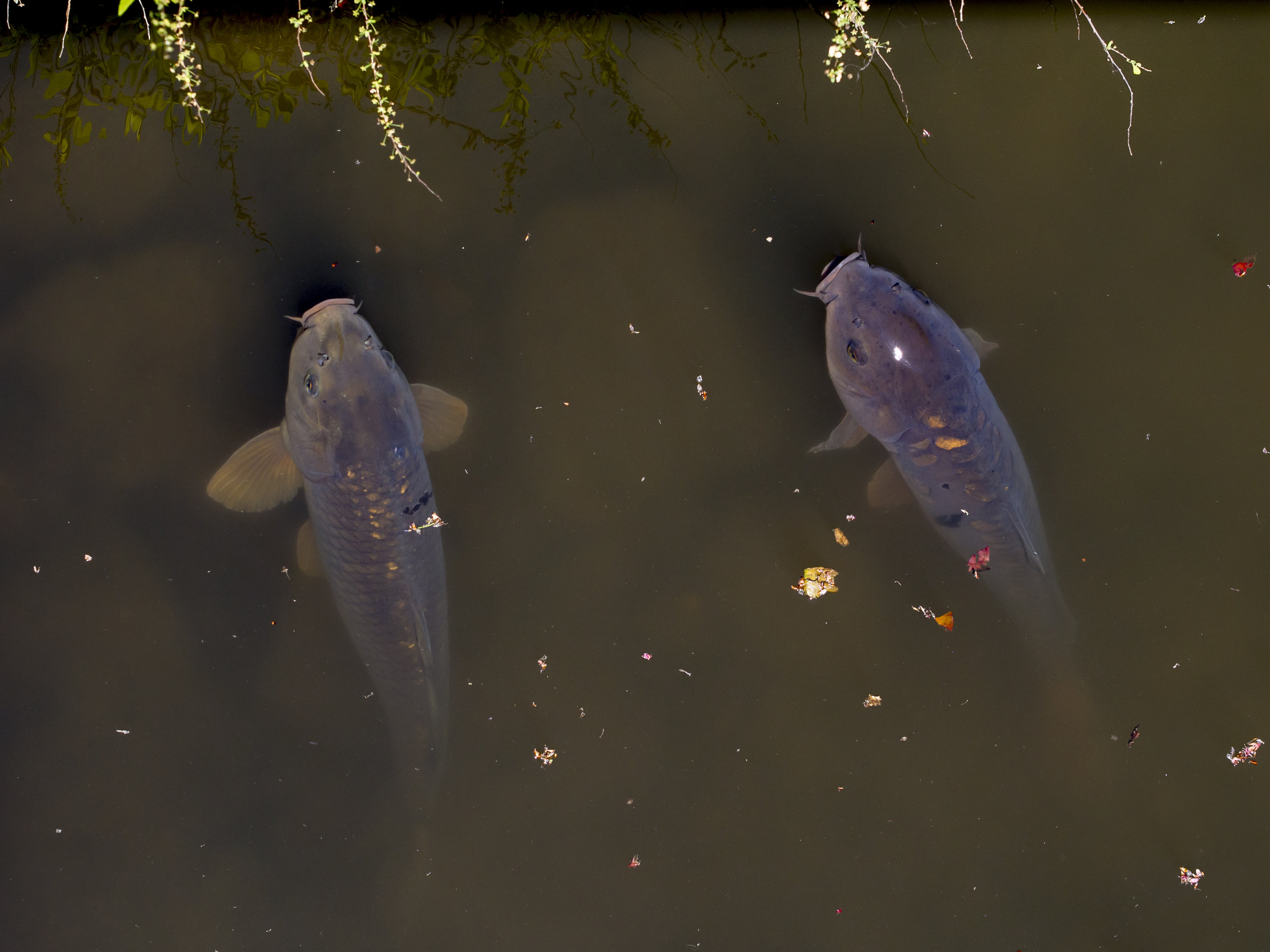
This one is a little tougher as the (heavily processed) colour image has good contrast, a subtle warm tone and scattered colour thats adds interest across the frame. The mono image shows similar strength, just differently. The highlight on the head of the fish, for example, is possibly stronger in the mono image and the translucent skin looks better?
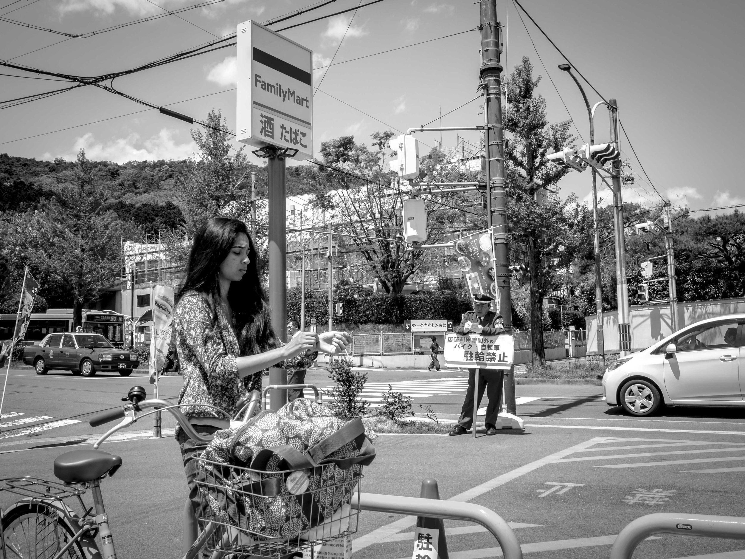
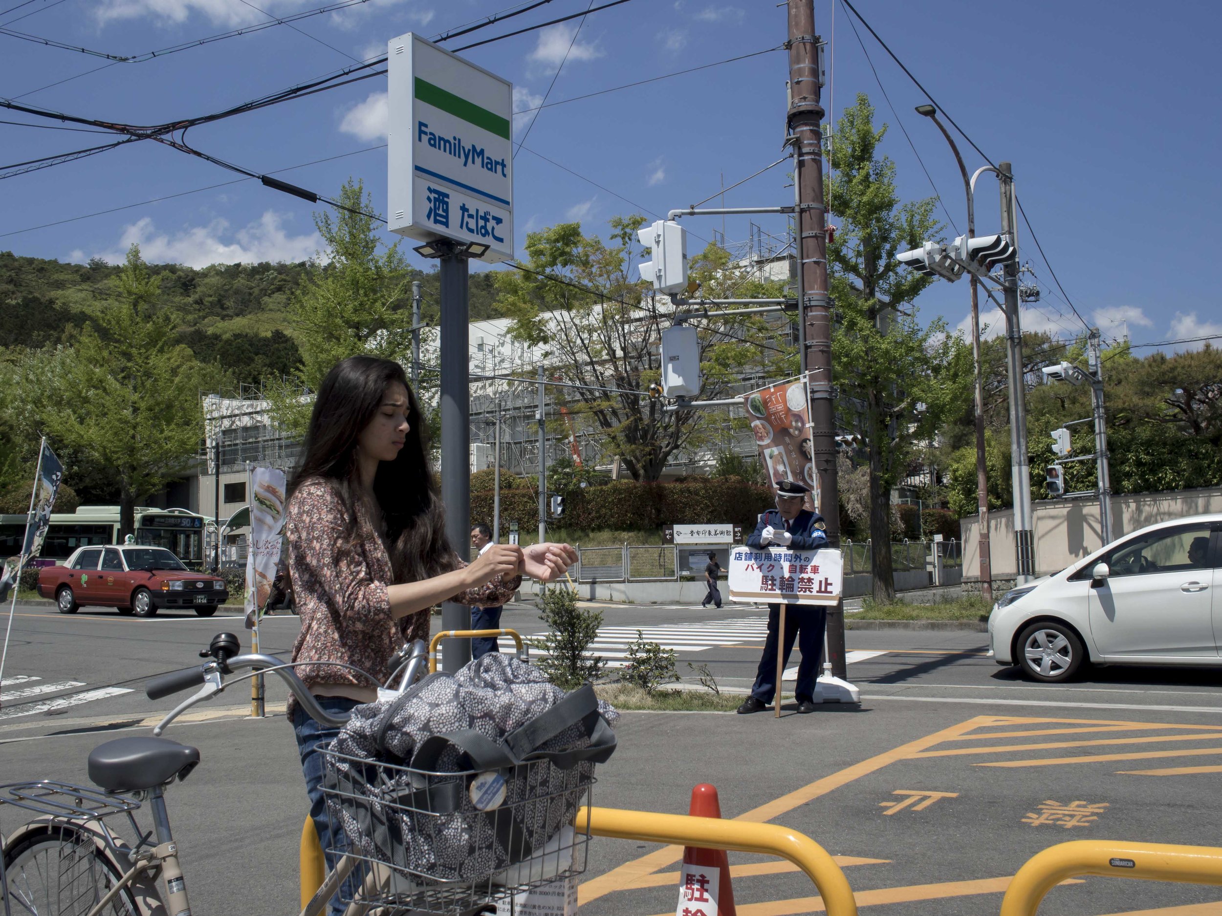
Another tough one. The mono image "flattens" the perspective and opens shadows (as it usually does), the colour image creates a better feeling of depth drop and allows the eye to caught by small objects well placed (or not), but the colour distracts (as it usually does). The red car, muted clouds against blue, red cone, flatter white of the second car etc.
Colour can create mood, for better or worse, and mono does reduce clutter, but can make even a little clutter to bland or "sameish". Both have their strengths, but I feel that winter will favour the starkness of black and white better.
My work method will be to set the cameras to B&W jpeg, but to shoot in RAW, giving me a mono view finder, but a colour image to fall back on. This will achieve two things;
1) It will obviously help with mono composition and determining is tonal separation is strong enough.
2) It will help with composition overall. I feel that sometimes my compositions are dictated to by the very colours that I am drawn to. These images will show themselves in post and in pre shooting "composition in the head", but will not dominate the process. This is much the same as normal (shoot colour and find mono images), in reverse.
As an aside, I personally find black and white images more "serious" when it comes to printing. This brings up the issue I have with my printer which is capable, but not ideal for regular mono printing as it is an earlier model with only a single black tone ink (Pixma 9000 mk2).
OOPs! I forgot to post this before I left and now I am back.