We are all trying to find our niche. Some latch onto a trend or fashion, milk it for all it is worth, then try to adapt to the next look. I have done this as have most of us. I think it may be one of the “5 steps” of photography.
Stubborn as I am, I tend to come back to traditions, even if they are traditions of my own making, possibly making what I do irrelevant at any specific point in time, but hopefully staying relevant over the longer draw of time.
For street photography I prefer colour to look at and to take. Black and white is easier as it eliminates colour tone, exposure and contrast issues to a great extent, but the images that have the greatest effect on me (taken by others or myself) are colour. The early colourists were my early inspiration and in more recent times, colour shooters have again been preferred. Colour stuck.
I have tried mono and even have series of work that ended up as black and white, but the early adoption of mono was usually because it allowed a release from technical issues (usually colour).
Why colour in a traditionally black and white friendly genre? I like the compositional depth it adds, the mystery and emotion id engenders. I also feel colour is more relevant to the subject (capturing reality), where mono is an artistic interpretation. Mono to me strips the image too bare. It becomes all and only about interplay of the main forces in the image and is far too democratic (faces often jump out more). I am after a deliberate complication that it does not offer.
As much as I appreciate the simple and clean message that a mono image can deliver, I would miss the more complicated power of colour.
Why not mono? I tend to shoot my black and white “straight” without any adopted gimmick . I turned my back on faux grain, toning and other cosmetic adornments a while back and find that the beauty and glow of a vanilla mono image is often at odds with the added dimension of colour.
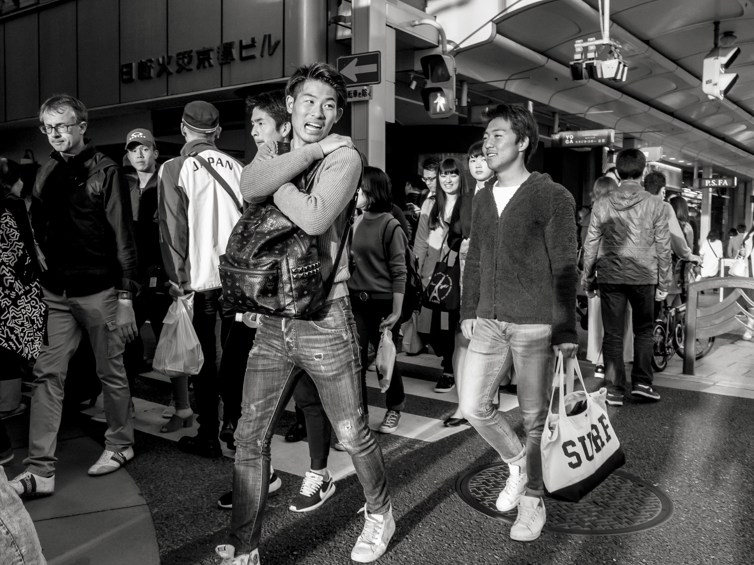
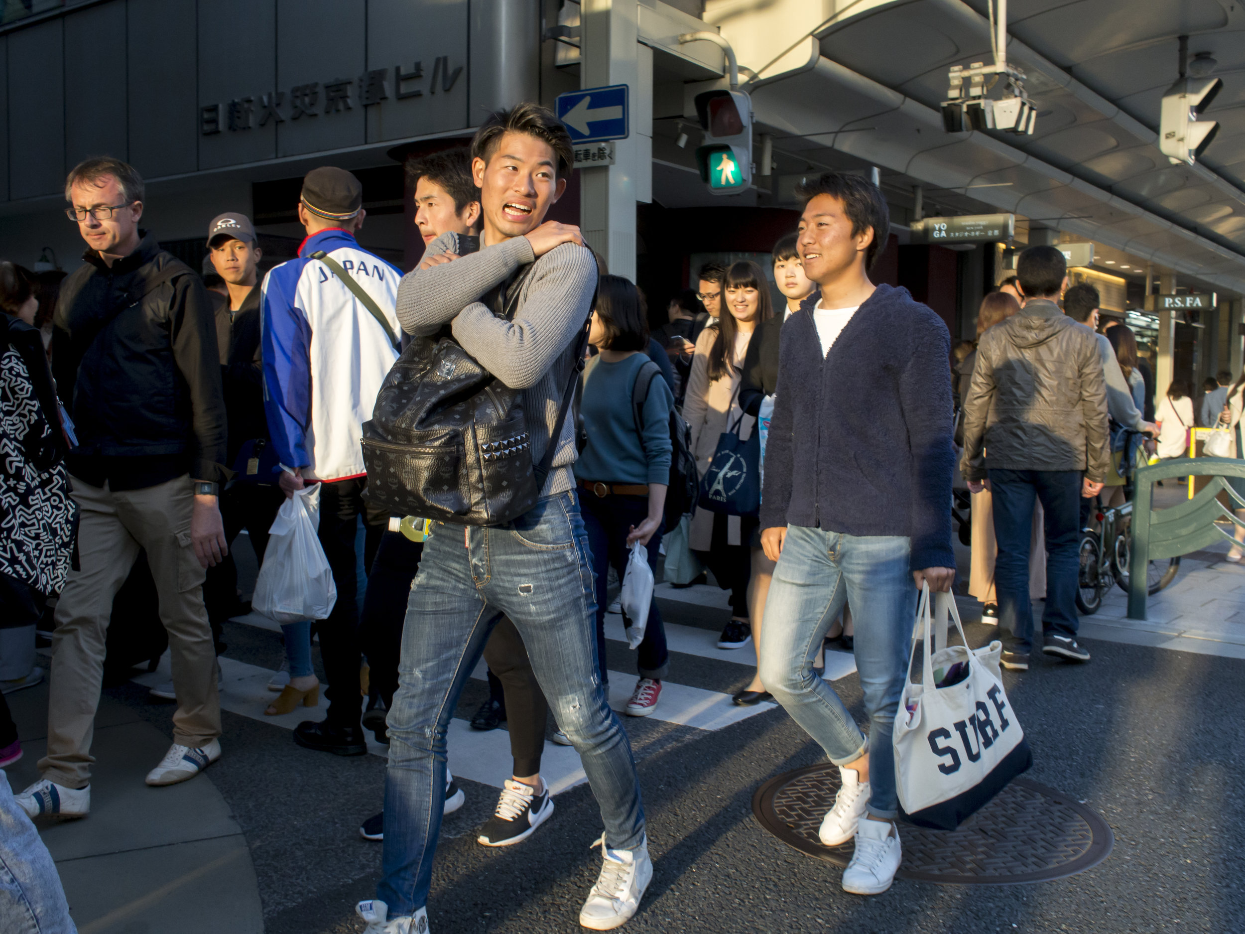
A strong composition in mono, highlighting the personal moment taken by the central figure. The colour image adds the depth indicators that only contrasting colours can. The yellow line, red shirt and the deep shadow vs. the warmth of the sun light complicate the image, making (I feel) the main subject stand out against the chaos. Opinions differ on this one, which makes the choice all the more personal. The colour image is just more balanced.
Landscapes on the other hand are more problematic. I will usually gravitate towards black and white, using the clean strength of mono to empower the composition. The draw of colour is still strong. The process is often reversed to above. Intent on finding a good mono image, sometimes the colour one just jumps out, refusing to be ignored.
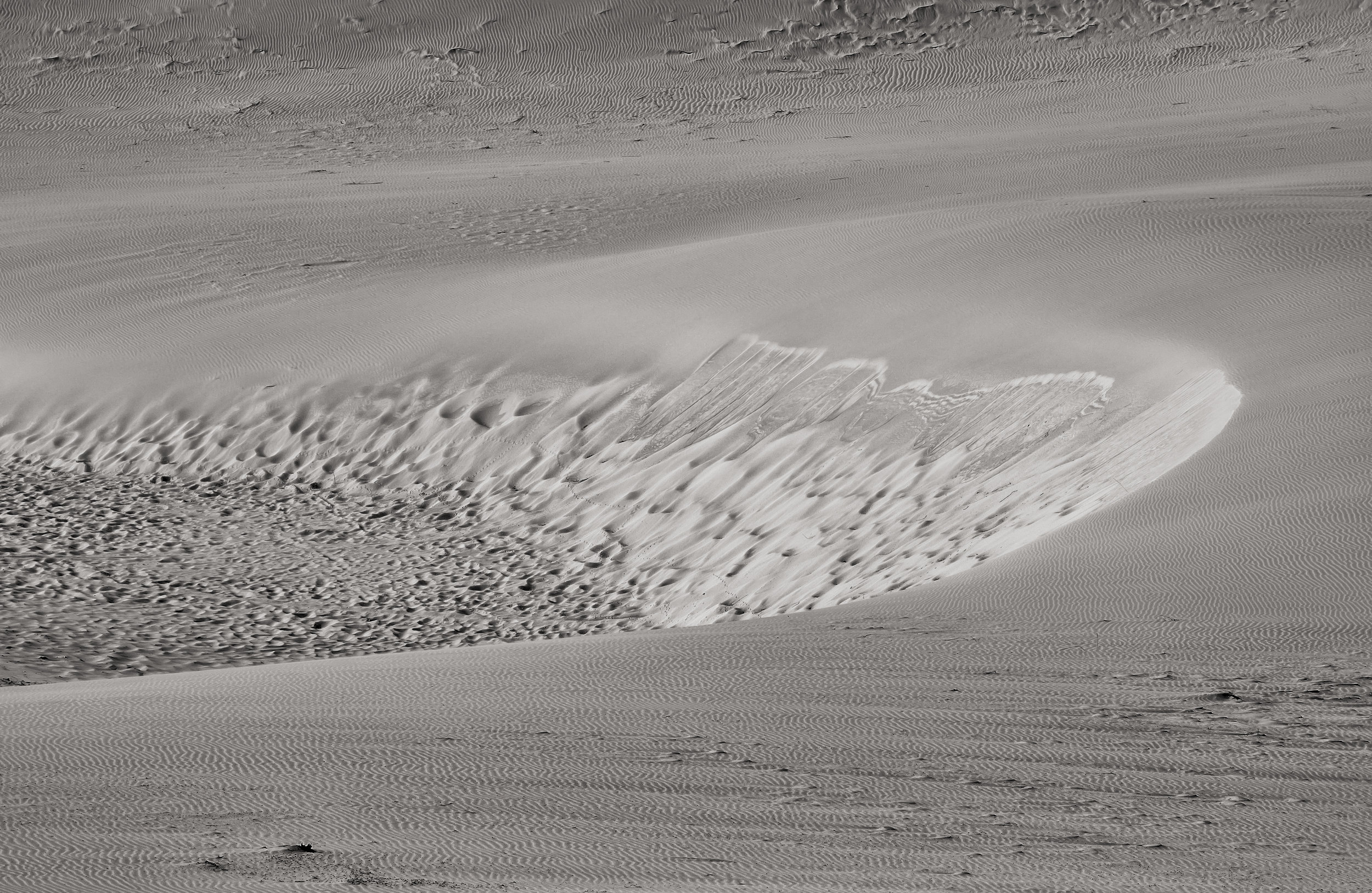
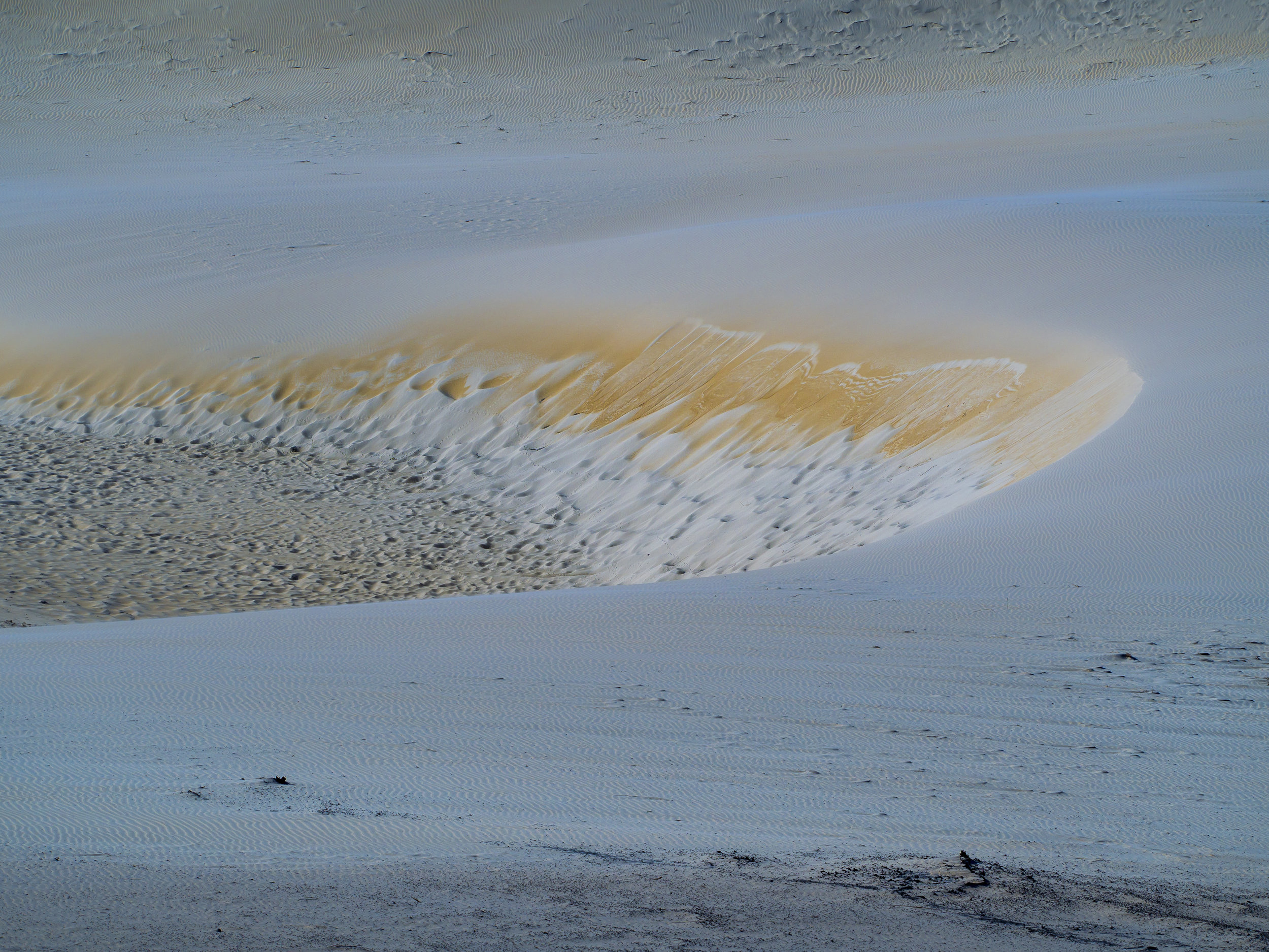
As much as a mono image was the intent, the colour one is just more, emotionally. It seems to have a stronger effect on people (warmth against cool, light against dark) and is more balanced visually. The black and white is just an exercise in tones and textures. Interesting that the cropping even changed when editing these two. I revisited them after uploading and the cropping suits each best. The band of darker seaweed in the frame complicates the mono image.
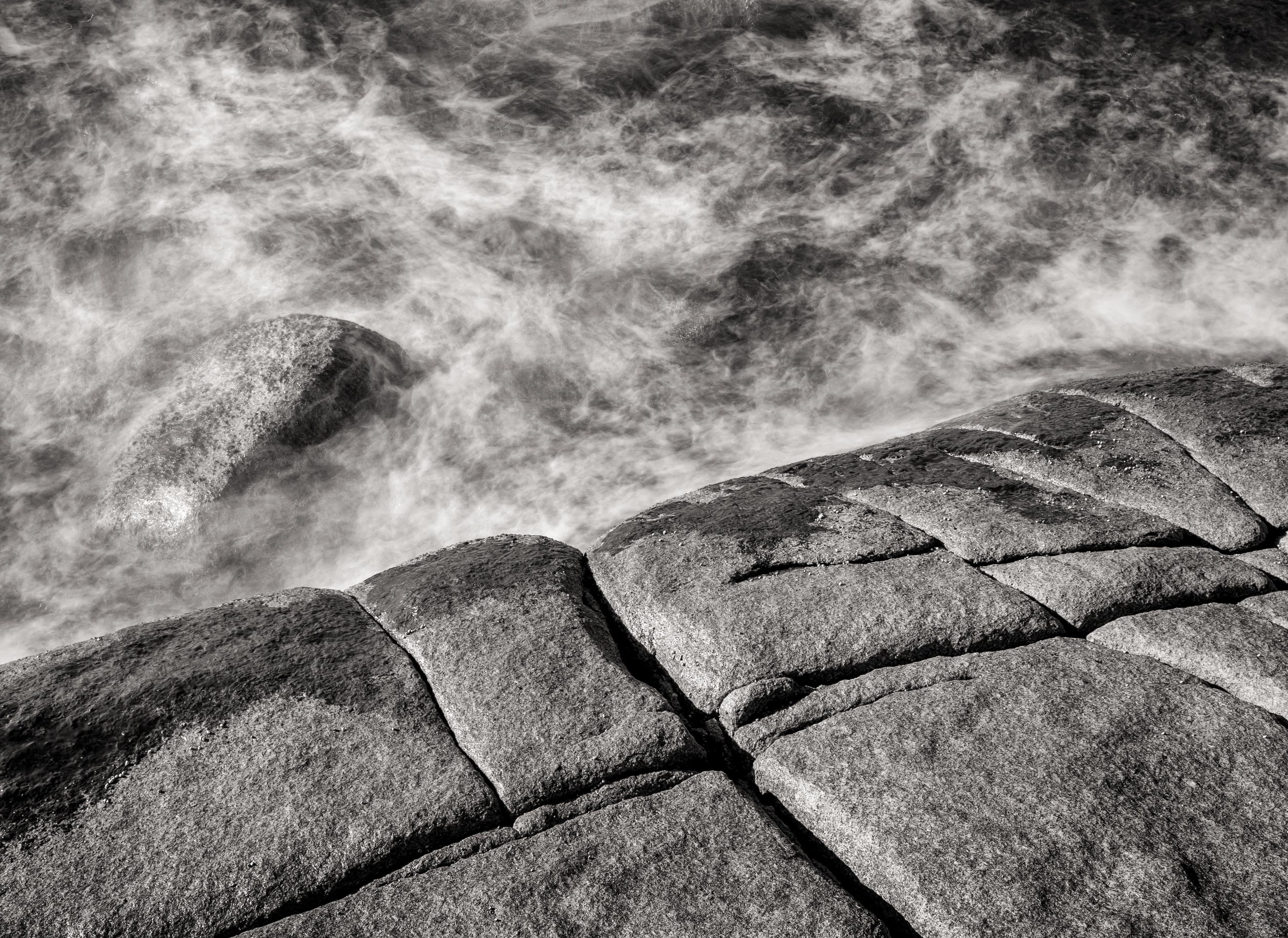
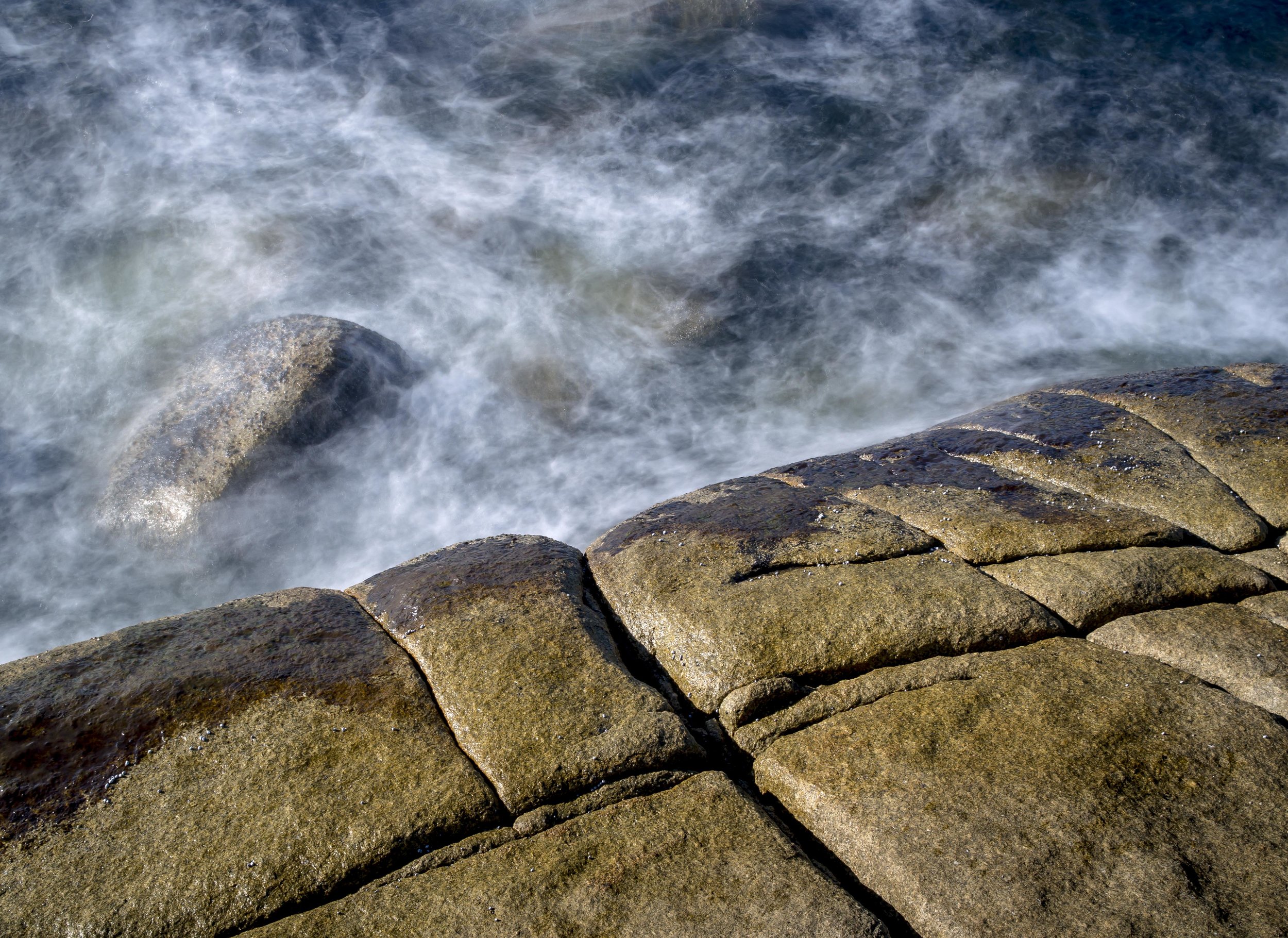
The above set is much easier. The colour just fails to excite, where the mono image has drama in abundance. Actually I prefer the water in the colour image. I feel it has a more mysterious look, but the mono splits the frame evenly and makes the water look more tumultuous against the immovable rocks.
Traditions can be a trap. Old traditions can be seen as a “reinvention” of a classic ideal or simply someone unable to let go. I think there is a little of both in this for me, but I am happy personally to continue as I am, because at some point you have to choose or nothing ever gets done.
If you are not shooting for your self it will show in your work. I would hate to be one of those photographers who shoots to fill their customers needs, ignoring their own.