After a month of clearing out my library and applying the square as appropriate, I am starting to feel better about the process, it’s limitations and benefits.
landscape. The square generally suits my style. The semi abstract, tight and neat crops I like are ideal for square. If I were a regular wide angle user, I do not think it would work for me, but as a landscape-portraitist, it is usually better to crop square than not.
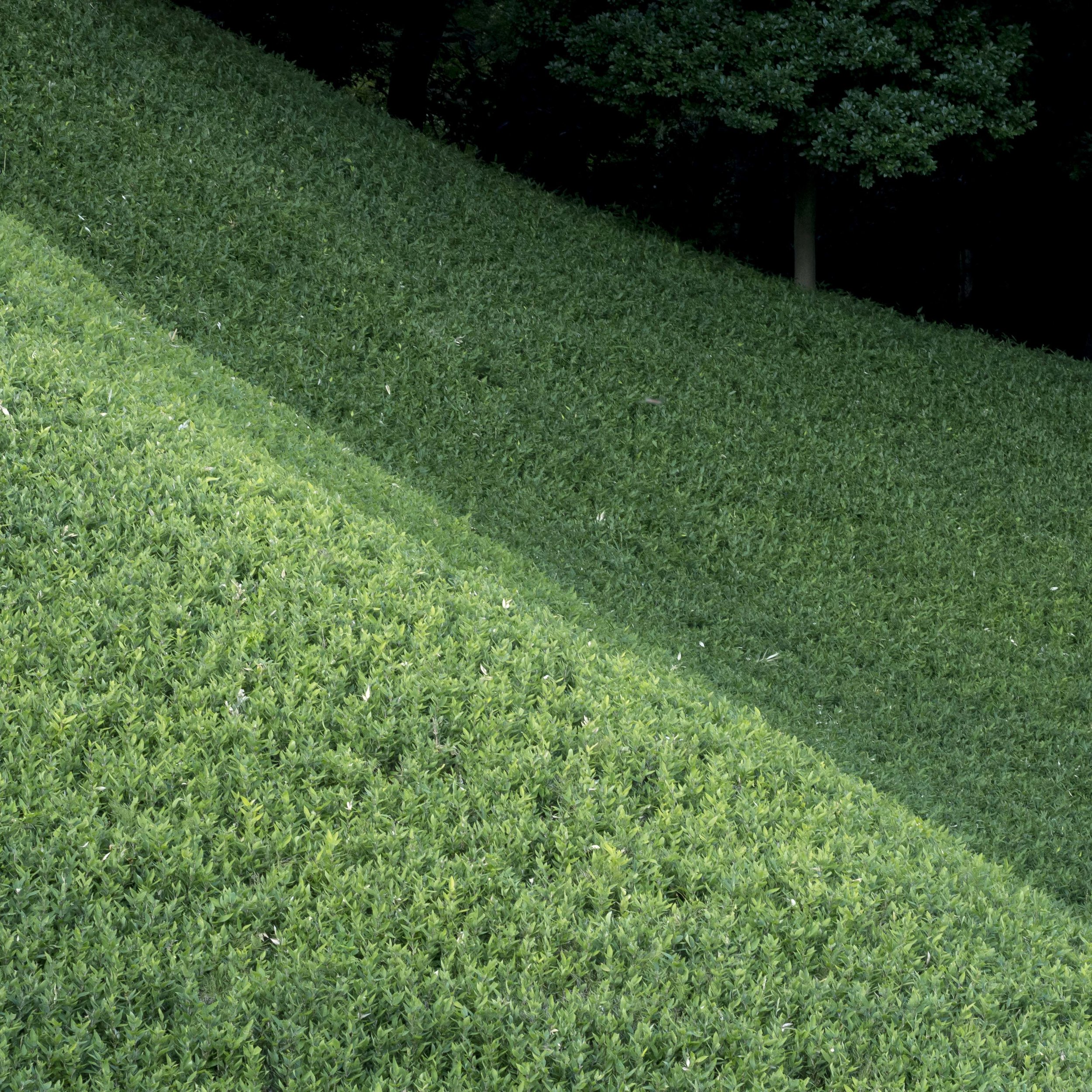
The balance of the single tree, sloping lines and tones really fit in the square. In a normal rectangle, this image is too loose.
Semi abstract “found things”. This format and style are made for each other. The chaotic nature of the subject, often perceived as tones, textures or patterns really suit the rigid neatness of the square.
I have always had trouble with this stand of lilies. The square allowed a more ordered and tighter interpretation. I cannot see myself moving away from this style in the short term at least.
Street. This is the odd one out. The reality is, many of my street images look stronger in square, but often they loose the “eye wandering through the frame” images I like to try to capture. This may be because they were not shot this way, but it looks like they just do not swing unless they are effectively portrait images. It looks like I will shoot street 4:3 and crop to match the needs of the image in either 1:1 or 2:1. Either suits.
Tight and to the point.
Maybe more indicative of a man lost in a crowd?
The square is a time proven winner for portraiture, so no issue there.


