This old pearl again, but I like to revisit it because, well it is important to me we get it right.
Bokeh is an Anglicised Japanese term used to describe the “qualities” the out of focus or in-to-out of focus transition points of an image exhibit.
It originated in our Western awareness from a 1980’s magazine (Darkroom and Creative Camera Techniques) edited my Mike Johnson, who devoted a whole edition to it* after a conversation with a Japanese based contributor John Kennerdell.
He had noticed the Japanese measure sharpness and other characteristics of a lens, then look at the non sharp transition points and blur areas of a lens. Less scientific and more subjective, it was called by them Bo-ke, or the “flavour of blur” and had a series of sub-classes like Ni-Sen (cross-eyed). Interestingly, while the Japanese were selling their super sharp and contrasty lenses to the world, they actually preferred German glass for its Bokeh characteristics.
This image has a Bokeh element even though it seems to be sharp front to back. From the pumpkin head back it is transitioning. It is almost impossible to retain even depth of field sharpness in an image unless you are photographing a flat subject like a wall, so most images have an element of Bokeh.
This is commonly hijacked by the “more blur is better Bokeh” crowd, but it is actually not correct. Bokeh refers to all transitions not just the amount of blur and the blurs quality. All lenses have a Bokeh “look” be they extreme or mild, from long or short lenses, near or far and often change character as the variables are shifted.
Pretty standard stuff. A 45mm at f1.8. It acts like a 90mm on M43, but is still effectively the same as a full frame 50mm in depth of field rendering, just twice as far away.
Bokeh is easier to measure and identify at the extremes, but Japanese aficionados look at more than just f1.4 lense wide open in near-far scenarios. Some Bokeh super stars of the past were actually wide or semi wide lenses used at stopped down apertures like the Leica M series 35 f2 lenses.
Near perfect Bokeh from the Olympus 300 f4. This is of course a cheat, using effectively a 600mm f4 wide open at 1m, but it shows that most lenses can produce perfect modern Bokeh in the right circumstances.
Same lens, same day different circumstance. Here the same lens shows snappy and compressed rendering, but the background objects (old pier stumps) are a little busy. In very close inspection a little “ringlet-y”
A third example take from the same place as the flower above. This one highlights the very busy background or “Ni-Sen” effects this lens can exhibit.
It is also subjective. One persons perfection is another’s blobby mess, or busy mess.
Bokeh has also to be taken in context to other photographic principals like flare, contrast and sharpness, but of these it is the quiet one, the one that we often respond to, even if we are not sure what or why.
This is not a portrait of a person, this is a location portrait of a person (politician) in a specific place (Launceston’s Gorge entrance). M43 at f2.8 on a short portrait lens is just about right. When I purchased a full frame again, the widest apertures again became “special case” apertures.
Micro Four Thirds format gets canned a lot for lacking “depth of field effect”, but personally, I use its ability to allow wide open lens use in almost any circumstances with useful Bokeh rendering. I would rarely use a full frame lens wider than f2.8 unless doing a product, art or personal project.
Taken with a M43 15mm (full frame 30mm magnification, but still a 15mm) wide open at f1.7. There is to my eye the right amount of in focus snap and out of focus detail, the transition blending perfectly. If this was a full frame 35 f1.8 used this way, there would have been a much faster drop-off from focus to out of focus, something that would have lost the balance of the image. A full frame user may have been happier with the background drop-off, but all things in consideration, I like this more.
A client will rarely want a single subject cut out of its environment, set against a sea of incoherent blur, as beautiful as it can be. Stopping down a little helps tell a story, create a sense of place, so with m43 you get wide open and a little stopped down at the same time.
How much is too much? This is a 45mm at f1.8. A full frame 85 at f1.4 would have separated the subject out much more, but why? It may have looked more “pro” to some eyes, but the subject would be the same, the location still blurred out, just unrecognisably.
All of the images below use an element of Bokeh, all achieved with M43 gear. Ironically I over did it a bit, missing a few “landscape” style images for greater context. At issue here is not the amount, but the quality. A few image show nervous looking rendering (40-150 f2.8), something I am aware of, but other viewers may also respond to even if they are not sure why.
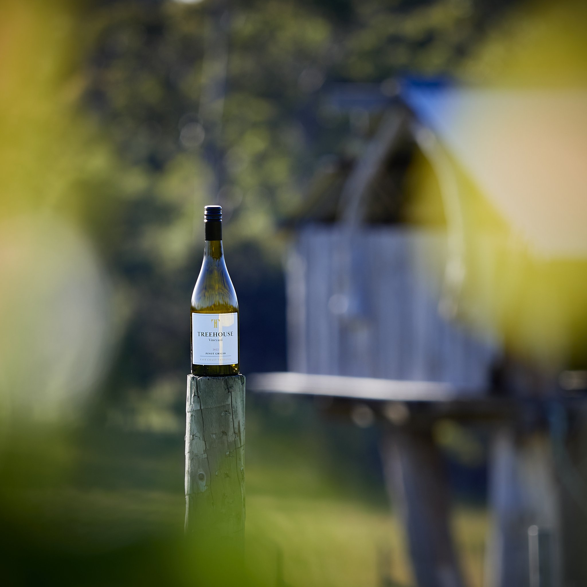
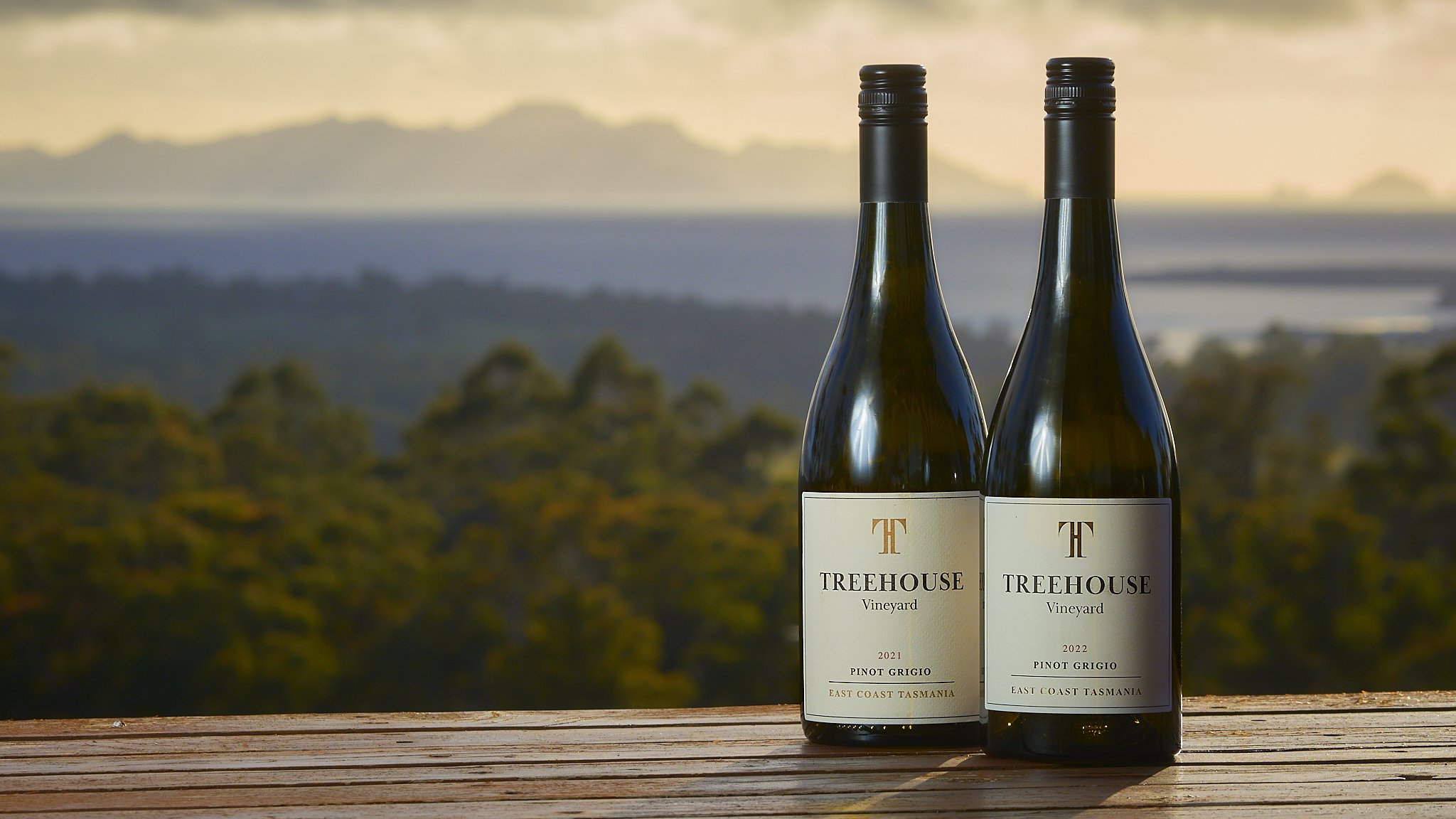
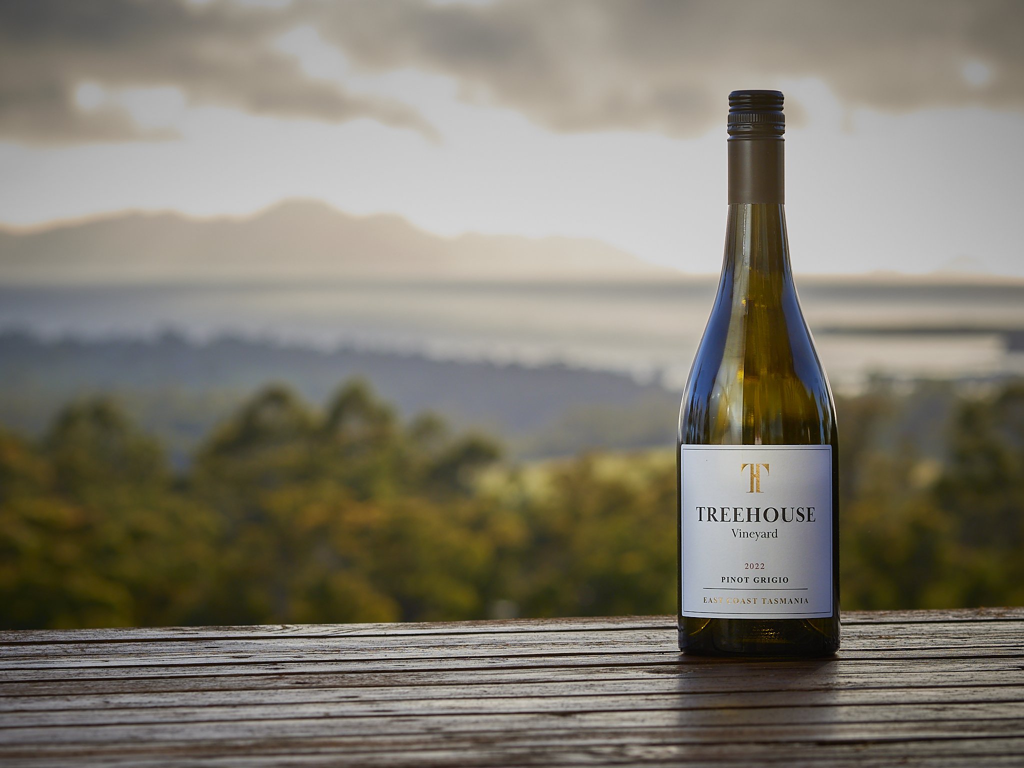
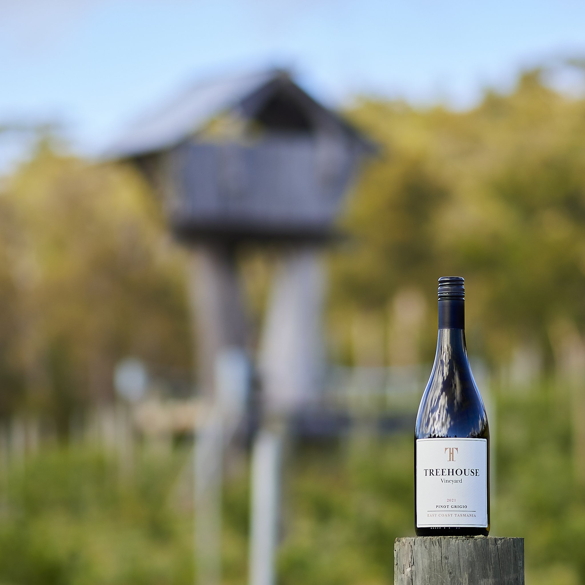
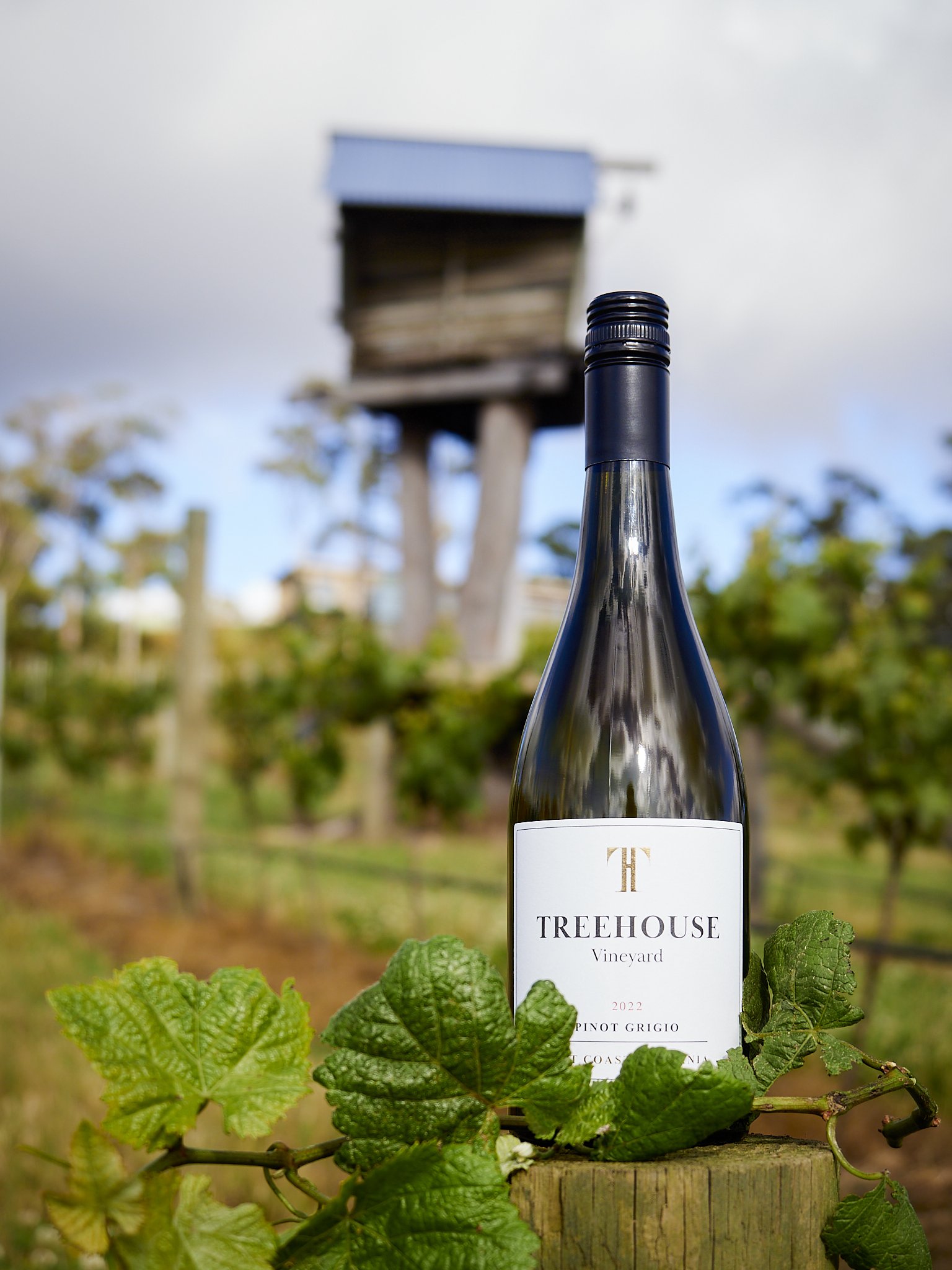
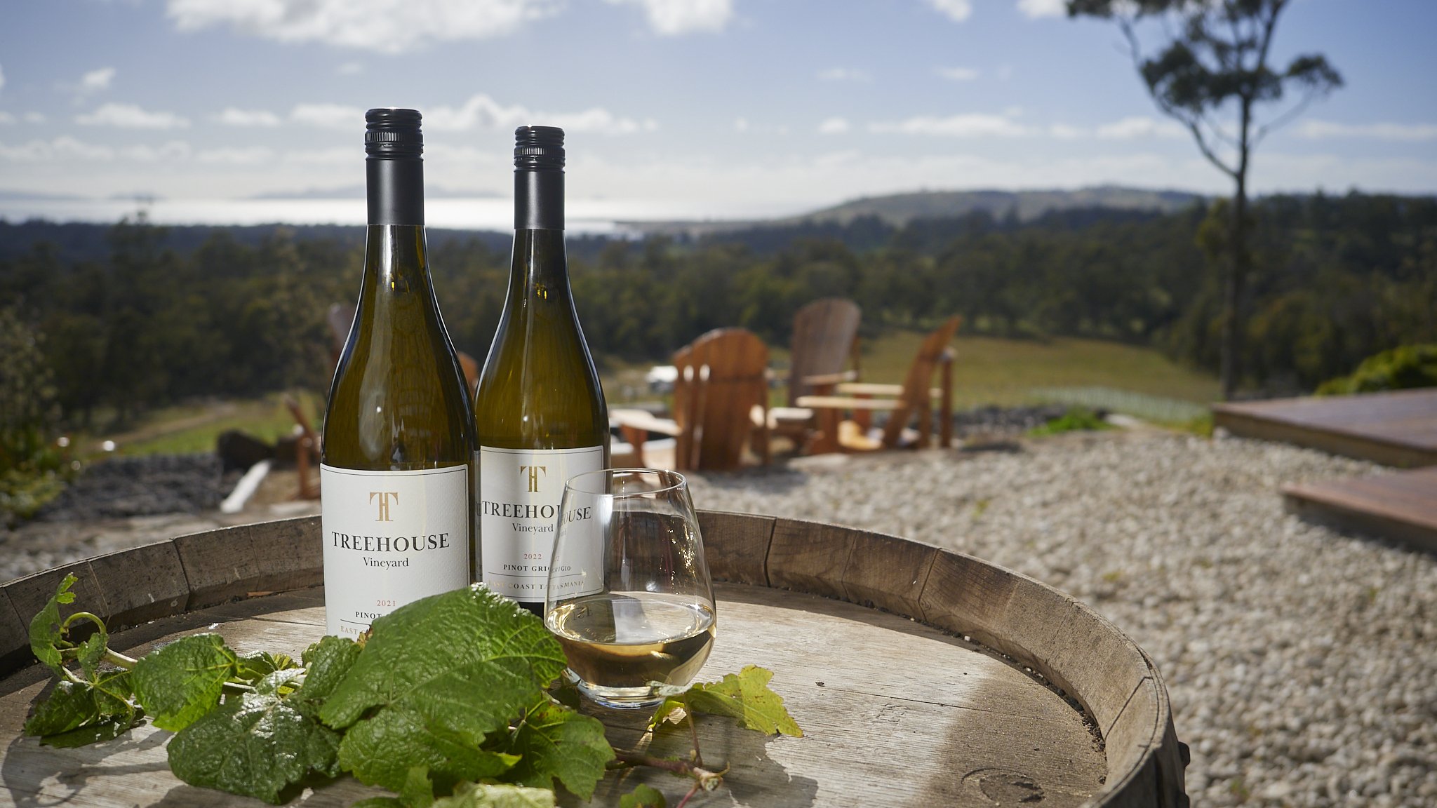


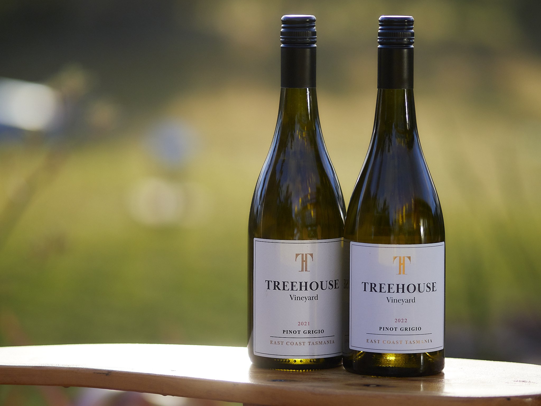
Using Bokeh to pretty-up a nasty background is sensible photographically and part of the reason they pay us, but if over used, it looks same-ish and lacks context. Using Bokeh to support a main subject, maybe not using as much blur as possible, but more contextual blur is also why they pay us to do the job.
Sometimes more depth is important, but Bokeh still plays a part.
Remember also Bokeh is not the only separation tool. Light, movement, contrast and many other elements can be used to control an image. Most studio photographers use small apertures for greater depth of field, then control depth through light.
Anyway, whether you subscribe to the modern “more and smoother is better” camp or find the perhaps old school longer and gentler, even invisible transitions more useful, Bokeh is a thing.
*I have a review of it on my books and bags page.


