I love layers

I love layers. Nothing speaks to me more than 2 or more micro stories happening all at once in a street image. Sometimes the images have little, hidden bits that only come out after some study, but that makes them more compelling. 

Dotonbori Osaka. Great for layers.

Dotonbori Osaka. Great for layers.

Same seat, different stories.

Same seat, different stories.

This one has a couple of elements beyond the central couple. The woman checking her makeup in her phone, the elegant woman walking past and the carelessly misplaced, "dismembered" head on the seat.

This one has a couple of elements beyond the central couple. The woman checking her makeup in her phone, the elegant woman walking past and the carelessly misplaced, "dismembered" head on the seat.

All images Pen F 17mm at f4-5.6 and zone focussed.

Colour mono showdown #8 No brainer?

This image has always been a no brainer for me. The colour makes it and always has. The colour seems to place things better, making the lighter parts sit well against the darker.

EPM-2, 17mm f5.6

EPM-2, 17mm f5.6

The mono version is fine I guess, but the image needs, I feel, the red contrasting with the white. I suppose I could darken the red in the mono image, effectively turning it black, but the warmth does something that a darker grey does not and the skin tones would be lost. I do like the lightness the mono image has, the way it looks more open and balanced, but not in comparison to the colour one. To be honest, if the mono was the only one I had, the image would have been seen as "B" grade at best and probably forgotten about, but the colour adds something that I really like. I think it may be the way the early Olympus sensors (EM5, EPM2, Pen 5) often render a nostalgic look to the colour, deep and contrasty. I see memories or Fred Herzog and Saul Leiter, the true Kodachrome look. I feel images like the one above (assuming they could cut it compositionally) could slide into a page of one of their books, unnoticed.

If the colour image was composed of say dark blues or just looked cold, the mono image would most likely look better.

Something I really appreciate about the OMD and Pen mini 2 cameras I have is, they look a lot like my memories of film. The mono can look like a "hot" S-curve film like FP4/XP2 with it's light and glowing whites, smooth mid tones and deep blacks (like above), or "cold" S-curve like Tri-X, with more grit in the mid tones and detailed, gentle high lights and shadows. The colour is Kodak like (again, above), but with plenty of Fuji colour (Reala) built in for taste. I also see AGFA print film looks sometimes (Portra in particular). Simply put, they often don't look as digital as some files.

Osaka Street life

Just stuff you see.

Pen F 17mm

EPM-2 Kudos

My little EPM2 is probably not going to Japan this time. I think the Two older OMD EM5's will get one last hurrah, before I look at switching to EM1 Mk2/Pen F as my primary cameras. The main reason the EPM2 is not going is the internal battery has flagged, meaning the files are all time stamped from 12:00 am Jan 1st 20XX. every time I turn it off. Very frustrating when you are away for awhile and need to keep track.

All of the images are EPM and 17mm.

Harajuku happy hair

A shot taken outside a hair salon in Harajuku Tokyo, just as a group were coming out for some air.

Pen F 17mm f5.6

Pen F 17mm f5.6

Friendly Hiroshima

I always like going to Hiroshima. The smaller size and pleasant layout of the city are a welcome change from the bigger cities. Like most westerners, I was drawn by the historical significance of the place, but what draws me back is the pleasant feel of the city. The last trip was uncharacteristically bright and sunny, allowing the residents to enjoy their home as much as we do.

Pen F 45mm f2.8

Pen F 45mm f2.8

Fishmarket legacy

Some more images of the old* Tokyo fish market. The trolleys will go with the move I assume, but I don't reckon the rusty old chair/desk/locker will make the move? 

Pen F 45mm f2.8

Pen F 45mm f2.8

The main processing done to the image above was some gentle brush work over the trolley (sharpening and clarity), to pick it out against the back ground.

Pen F 45mm f2.8

Pen F 45mm f2.8

*Soon to be moved.

Ahhh sleep.

Ant where any time.

Many Japanese work 12-14 days with travel time in addition, 6 (or 7)  days a week. Even the tourists get the sleep bug.

colour, mono showdown #7

This is a classic image for showing the benefits of both colour and mono processing.

The mono image is full of character, vignetted slightly to draw the composition in, the pose is full of questions and the lighting, just so.

Pen F 45mm f2. Gotta love a lens this good near wide open with still usable depth of field.

Pen F 45mm f2. Gotta love a lens this good near wide open with still usable depth of field.

The colour image has much the same dynamic, but the warm right/cool left give the image a whole other dimension. The left (to us) in blues and the right in warm tones, frames the man interestingly and dramatically. I feel it also creates a better sense of place and time. 

On repeated viewing, i do feel the mono image is more balanced, but I like the tension and contradicting, but complimenting hues.

Contradictions

As our next trip to Japan draws closer, I am re exploring last years images, as if anew.

The thing that always strikes me is the contradictions my photos often show. The two below were taken not far from each other and could in all reality have been taken in any city or town in Japan. The top image is a little cramped. I have vague memories of there being something in the way, an over hanging ledge?

The second image is a contradiction in itself. Old and new ideas jammed together. In many ways this is Japan. The old and the new worlds forced to live under the same roof, working because the Japanese have managed (so far) to hold onto the best of both these worlds.

Pen F 45mm

Pen F 45mm

Pen F 17mm

Pen F 17mm

Connections

In Japan, friends and family connect often through gentle touch. As an Australian, this is something I find beautiful to observe, but I am aware that it is on some basic level foreign to me.

When travelling, we first notice the obvious and superficial differences. We then we see the many similarities, the reality that all people are more alike than they are different.

Over time, the deeper differences show, allowing us to glimpse into the foundations that build a society. This is where we can learn and understand. This is what we need to learn and understand.

Pen F 17mm f2.8

Pen F 17mm f2.8

Some experiments with contrast.

Hiroshima on a beautiful sunny day. I pretty much maxed out the blacks, shadows, highlights and contrast sliders, but what fun! 

All taken with the Pen F and 45mm.

Olympus and Lightroom sampler #4

This is a simple one and they should all be (I wish). The image is not much on it's own, but it ia part of a series. The problem is, the top of the bolt. After importing with pre set "P1 Pen F base", (not as aggressive as the OMD pre sets as I find the newer camera does not need as much work) the bolt head looks soft. In this case, the bolt head is acting like the eye in a portrait. For better or worse it is attracting all of the attention.

A little brush work, just on the head adding +50 clarity, +30 sharpness and +20 contrast has supplied a bit of a sharpness illusion, balancing out the image.

Subtle in this size, but in editing the effect is quite strong.

Kamakura Yellow

I love the sleepy little coastal town of Kamakura. Where else can you see long boards on vespas, temples in rain forests, warning signs about the giant hawks common in the area (taking your dog!) all within 10 minutes walk? 

The train stations are terrific. The main station has gorgeous light and the smaller station in the middle of town is quaint and interesting looking. The yellow attracts me. 

Pen F and 45mm at f8 

Pen F and 45mm at f8 

Pen F 45mm f5.6

Pen F 45mm f5.6

Pen F 45mm f3.5

Pen F 45mm f3.5

Colour, mono showdown #6

In Japan, the people are the exception. They are very patient and well mannered on the surface (and deeper), but occasionally someone (that's me folks) over steps the invisible line of too much. This is one of the few occasions I have witnessed from my own actions or those of others where a Japanese person showed their ire, if briefly. The thing that pushed it was my overt framing of the image, the main problem of using longer lenses in confined spaces. I am not that person. A photo can rarely do harm, but the clumsy taking of one can. I fall squarely in the camp of "do no harm" and would never publish an intimate image like this in a well trod forum or against someones wishes. The not for profit street genre allows me to share an image of an unknown person with other unknown people as long as the audience is reasonable and aware, as street photographers have done for years. It's a reality that many of the most famous people in street photo images are not even be aware their photo was taken.

Now I have confessed my rudeness, I will move onto the image as it is one of my guilty favourites.

Pen F 75mm f2

Pen F 75mm f2

The colour image works for me. The colours are balanced and avoid the multi dimensional look that colour can introduce by having the strongest (and harmonious) colour on the same plane as the main subject. The warm skin tones, separated by the neutral olive sweater create a pleasant and balanced shape and the overall warmth of the image makes it look relaxed and gentle.

The mono image is deeper. The girls face dominates, forcing a more emotional response. The colder feel introduced by the untoned, grey tones and the dropping off of the background due to the bulk of the colours turning light grey, I feel, gives the image a sadder, more contemplative feel than the warmer colour image. Another phenomenon of converting to mono is the image looks sharper. This often happens when colours are turned to tones and textures. Even thought the black and white image is stronger-more direct, I feel drawn to the harmonious colours of the other image, or maybe that's the guilt talking.

observations of a kit lens.

Kit lenses. Not much I can add to the huge inventory of opinion and test data. The important question is can they produce images that are not "reduced" by flaws in the lens or produce too many misses through poor mechanical application (much the same as any lens, but add a barrel full of "crappy kit lens" doubt). Yesterday I went wild with a 4 year old Pen camera and the kit lens. Part of the experiment was curiosity and part practical.

Ctein once wrote in his "very unscientific lens evaluation" (The Online Photographer blog), that even though he could see (pixel peep) a difference between the various lenses tested**, he saw no reason to take his (1st gen) 14-42 or Panasonic 45-200 kit lenses off the camera in most normal photographic situations for a better lens. Ctein is a seriously top end fine art printer, with a long history of impeccable images, from medium format film and M43 cameras. 

Ok, the pre amble out of the way, lets look at some quickly taken snaps using the above kit. The camera was set to AF with the middle 9 AF boxes activated. The camera was attached to a 30" Gordy shoulder strap and many of the images shot from the hip*.

Note; see also the images in the previous three posts.

EPM 35mm f5.6 This one is really sharp, but the subject matter tends to be sharp. There is little or no CA present and the flare from the chrome work is well controlled allowing some glow to show through. The nearer bokeh "snap" renders well, but th…

EPM 35mm f5.6 This one is really sharp, but the subject matter tends to be sharp. There is little or no CA present and the flare from the chrome work is well controlled allowing some glow to show through. The nearer bokeh "snap" renders well, but the far bokeh is a little busy.

Crop from above. This reminds me of the best quality I could extract from a 50D and "L" Canon lens a few years ago. There was a tiny bit of purple in the highlight near the off sign, but it went away very cleanly. 18x24" print any body?

Crop from above. This reminds me of the best quality I could extract from a 50D and "L" Canon lens a few years ago. There was a tiny bit of purple in the highlight near the off sign, but it went away very cleanly. 18x24" print any body?

30mm f5.6. This image needed a little post to bring out the head of the statue from the back ground, partly because the middle distance bokeh is quite coherent and pleasant. Again this image shows the slightly busy bokeh in the distance.

30mm f5.6. This image needed a little post to bring out the head of the statue from the back ground, partly because the middle distance bokeh is quite coherent and pleasant. Again this image shows the slightly busy bokeh in the distance.

42mm f5.6. This image was quite flat, needing quite a bit of work. The bokeh rendering of this one created a couple of cool optical illusions. Of the three that I got*, two had a bad Photoshop "paste on" look with the Fair(mont) badge, as if it is u…

42mm f5.6. This image was quite flat, needing quite a bit of work. The bokeh rendering of this one created a couple of cool optical illusions. Of the three that I got*, two had a bad Photoshop "paste on" look with the Fair(mont) badge, as if it is unnaturally floating there (have a look for a second or two, it's kind of cool) and the third image had it quite out of focus, but the Premier badge is never sharp on the left side?. At first I thought the lens was a bit de-centred, but I think maybe I was, following the angle of the nearest badge*.

42mm f5.6. Perfectly pleasant rendering and lovely colour.

42mm f5.6. Perfectly pleasant rendering and lovely colour.

40mm f5.6. Taken at ISO 800 indoors. The lens's slightly lower micro contrast tends to give a pleasingly smooth look, but can be a little flat looking in poor light or at higher ISO's. The focus fall off in this image is nearly perfect.

40mm f5.6. Taken at ISO 800 indoors. The lens's slightly lower micro contrast tends to give a pleasingly smooth look, but can be a little flat looking in poor light or at higher ISO's. The focus fall off in this image is nearly perfect.

40mm f5.6. This one also looked a little flat at first, but came up quickly. The colour is lovely, both warm and cool where it should be. A possible use for the lens would be in poor contrast situations, as it looks to process up well.

40mm f5.6. This one also looked a little flat at first, but came up quickly. The colour is lovely, both warm and cool where it should be. A possible use for the lens would be in poor contrast situations, as it looks to process up well.

15mm f5.6. The only shot at wide angle in this set, showing how little I use wide angles. This guy needs to be a little more convincing is he is going to pull that T-shirt off.

15mm f5.6. The only shot at wide angle in this set, showing how little I use wide angles. This guy needs to be a little more convincing is he is going to pull that T-shirt off.

My feelings after using the lens for the morning;

It is lightning fast and accurate enough in focus. It is sharp enough through the range (at f5.6 anyway) and could certainly produce pro grade work with some care and respect. It feels crappy, but that never got in the way. It went under the radar, giving zoom convenience without bulk (or lens speed). It has nice colour, but mixed bokeh on the occasions it showed up.

The future for this lens? I will carry it as a back up for my street and travel kit as it slightly expands the range and offers me an alternative to primes or using more precious lenses in some circumstances. If it bites the dust I will see that as a sacrifice made to save a better lens, a bit like a protective filter.

I can honestly say that it can do the job, as the last 4 posts were fed by the 80 or so images I shot that morning. The cross frame quality in particular was a pleasant surprise. I am not really surprised. I have had experiences like this before with the brilliant Fuji 16-50 and 18-55 lenses and the old kit Panasonic 14-45 has a great reputation.

*I found it hard to use a fixed screen camera in this lighting, so many images were simply missed from poor technique, including not shooting straight.

** Top tier Olympus 4/3 lenses, Leica and other M43 glass mixed in with his own patchwork quilt of lenses.

Olympus and Lightroom sampler #3

This is a simple little fix to an image to show how often less is more and how familiarity with Lightroom can reduce your work load and also reduce the processing harm done to an image.

The image is one of my 14-42 kit lens test shots. A characteristic of the lens is easy processing from low contrast files.

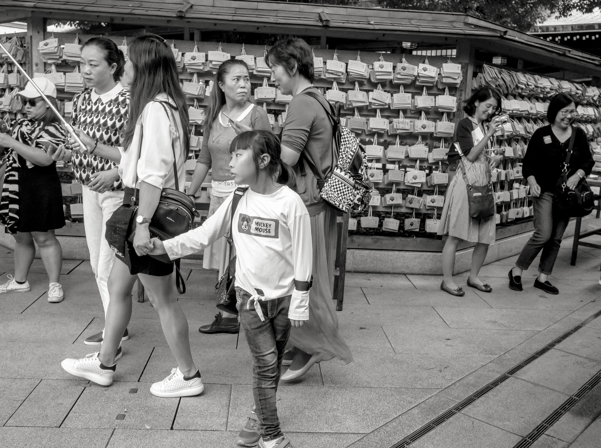
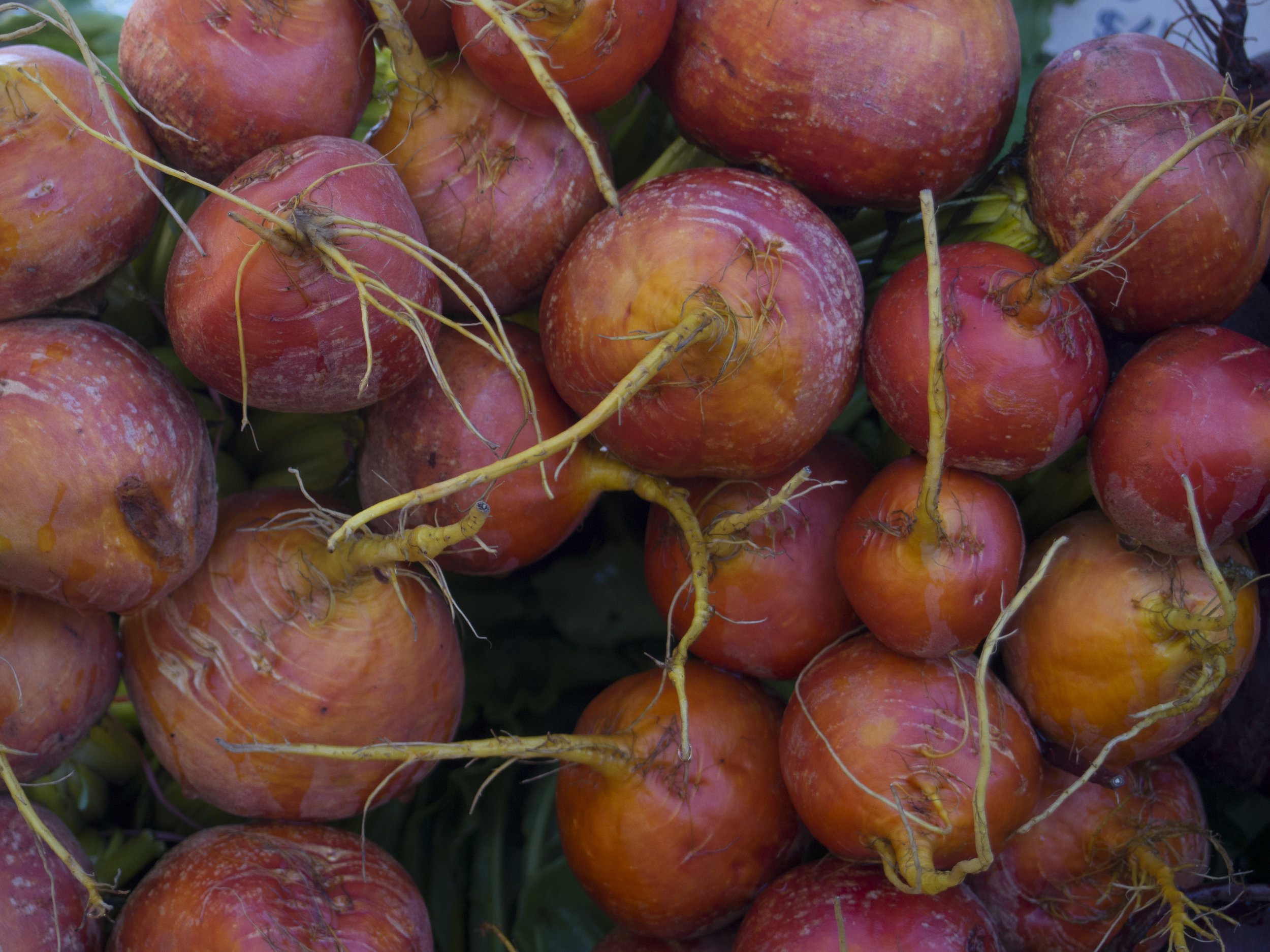
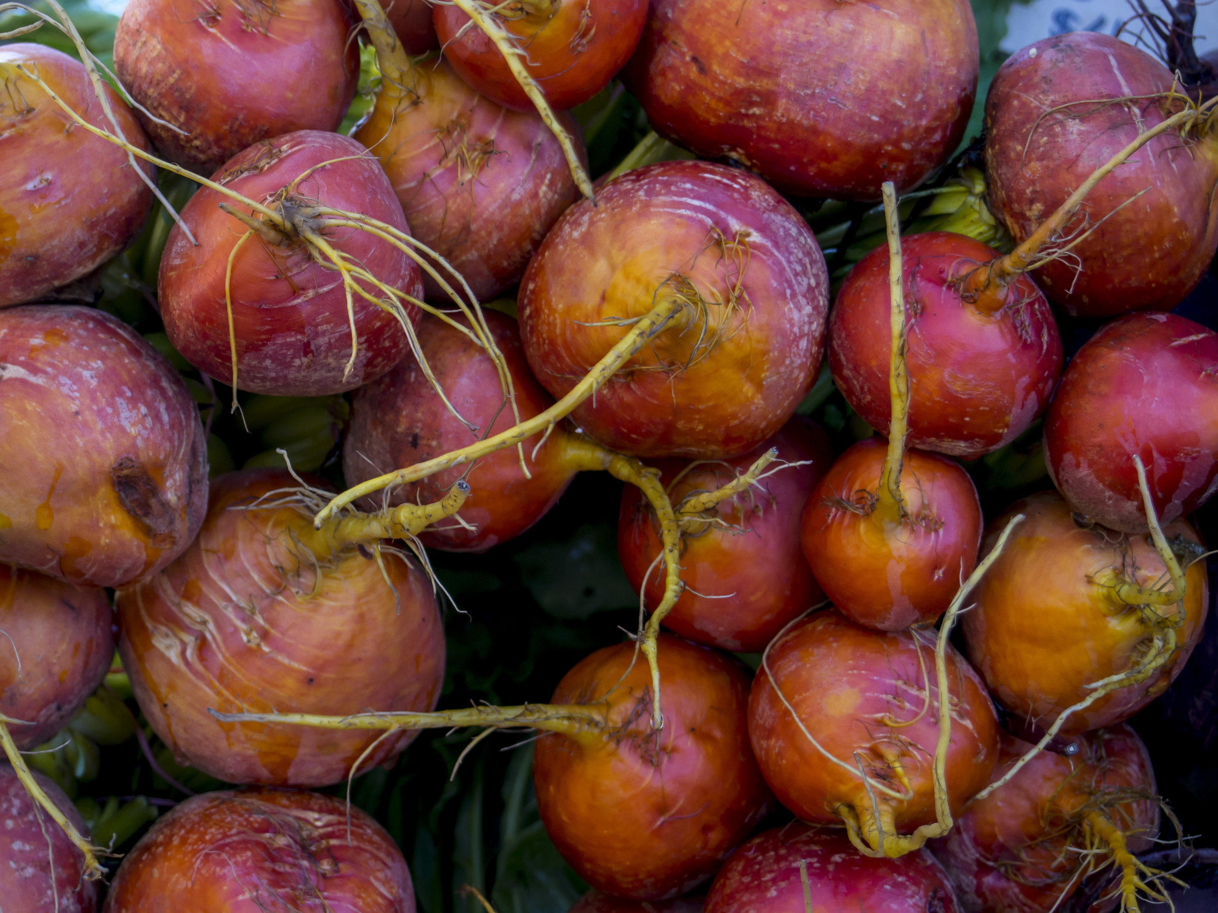
The top image is the import with no processing.

The middle image has my "gentle" pre set applied.This pre set is designed simply to lean the Olympus images towards a cooler, smoother and slightly brighter image, that is towards my Canon colour tastes. Nothing is stronger than +/- 20  except -50 reduced highlights. Reduced blacks and contrast increased whites, a little general sharpening and noise reduction-smoothing. 

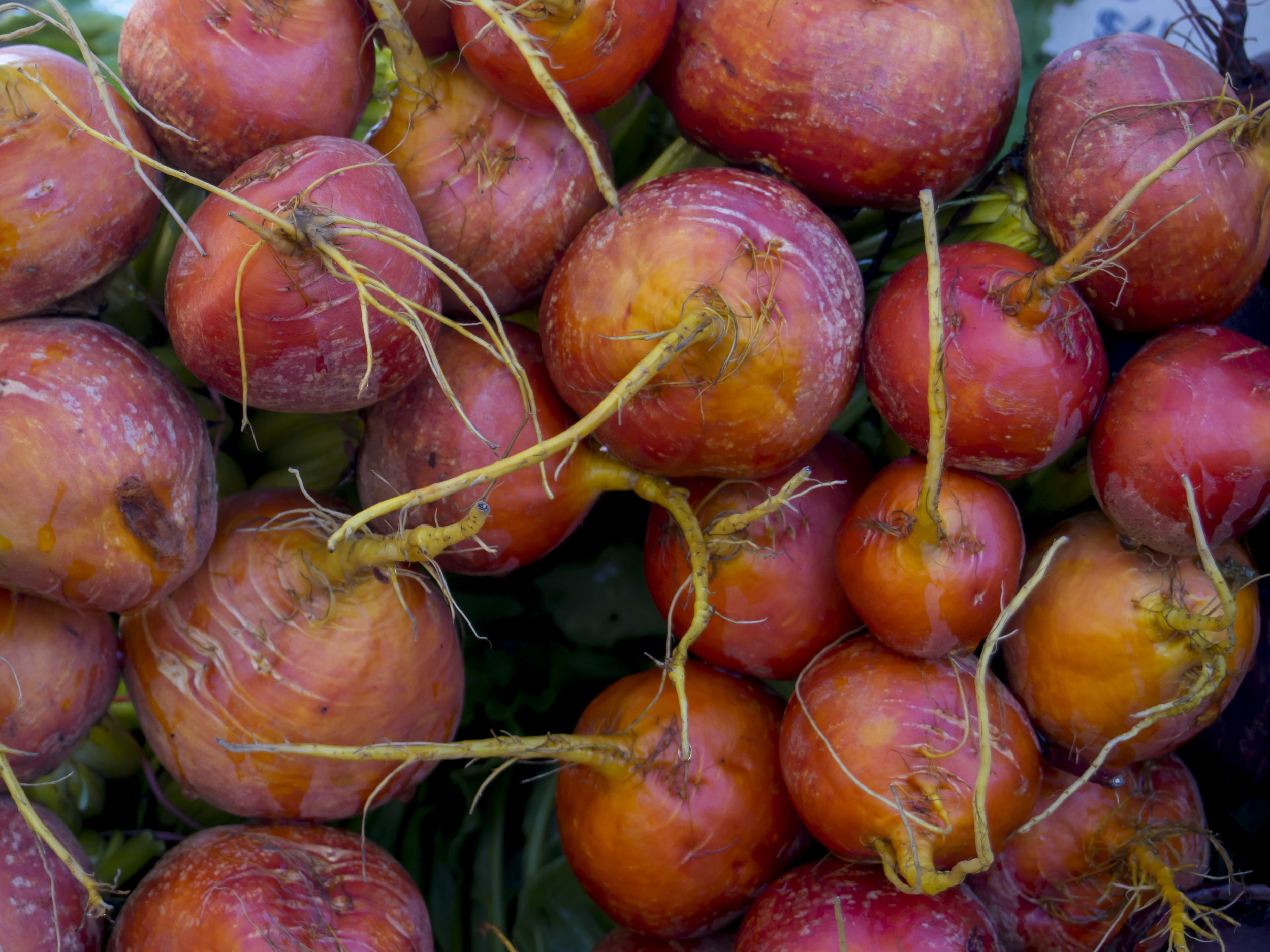
The bottom image is tweaked with a simple brush pre set "gentle push", adding again only about +15-20 clarity, sharpness and contrast. Designed to add "pop" to selected areas of the image. The big front root stem is slightly out of focus, but the added clarity and contrast hide this well. If this is not strong enough I re apply the brush with the same settings, rather than make the single pass stronger.

Either of the second two work I guess, but the bottom image has more perceived sharpness and colour depth.

The more you manipulate and image, the more pixels get "dumped", harming the original file. Try to work as directly and gently as possible, finding what works best for a particular problem. As a general rule, I find that is I have spent too long on an image and I have applied too many different fixes (especially if some are undoing others!), I re-set and start again.

Colour and mono showdown #5

This image, taken a few minutes after the one in showdown #4, is a tough one. The processing in both of these is a pre set, with nothing else added. The first is my "gentle" pre set and the second my Mono #2 "softer" pre set. The mono looks to be near enough to spot on, but the colour one is lacking, but it has not sent me a hint yet as to what it wants. Maybe the clues are in the mono image.

Pen EPM-1 14-42 kit lens at 35mm f5.6

Pen EPM-1 14-42 kit lens at 35mm f5.6

The mono image suits, and draws you to the expression on the girls face. I also exaggerates the glow from the bag and the play of shadows on the wall. Again, as with the last showdown image, the less distracting back ground also makes this image stronger. it has two clear layers, but only two and the girl in front is the dominant one. The colour could be processed to match and I am in a colour mood, but I will give this one to the mono conversion as it was effortless, natural.

The lens is a mixed bag. It exhibits good contrast and colour, reasonable bokeh (where possible) and reasonable sharpness. It suffers from flare and my jury rigged hood, made from two stepping rings is not good enough (nor is it good at keeping finger prints off the lens as it turns out). Sometimes on the middle left side of the frame there looks to be some softness, but it is hard to be sure and I am usually shooting pretty loosely.

Colour and mono showdown #4

A little walk this morning around the local market to look around and use the Pen mini with the 14-42 kit, just because. Autumn is showing it's first signs. 

The image at the top is warm, but a little unbalanced and busy due to the blue on the left and the face in the back ground on the right. The only post that has been used is my "gentle" pre set, that emphasises the whites at the expense of highlights, darkens the blacks, sharpens and smooths a little and then a mild brushing of the man to add local clarity and contrast.

EPM-2 14-42 widish at f5.6

EPM-2 14-42 widish at f5.6

The lower image is stronger on the man and his face, simply due to removing the colour from the peripheral subjects. The woman's face still fights for notice, but in the mono image I do not find this as annoying.

It is rare that a colour image sends a simpler message than a mono one, but I think, with a little work, this one could and is my favourite. Cropping looks to be the obvious thing to do, but it does not work in this case. The image needs the space to breath.

We had a spud straight after this also. Cameras cannot convey the smell!