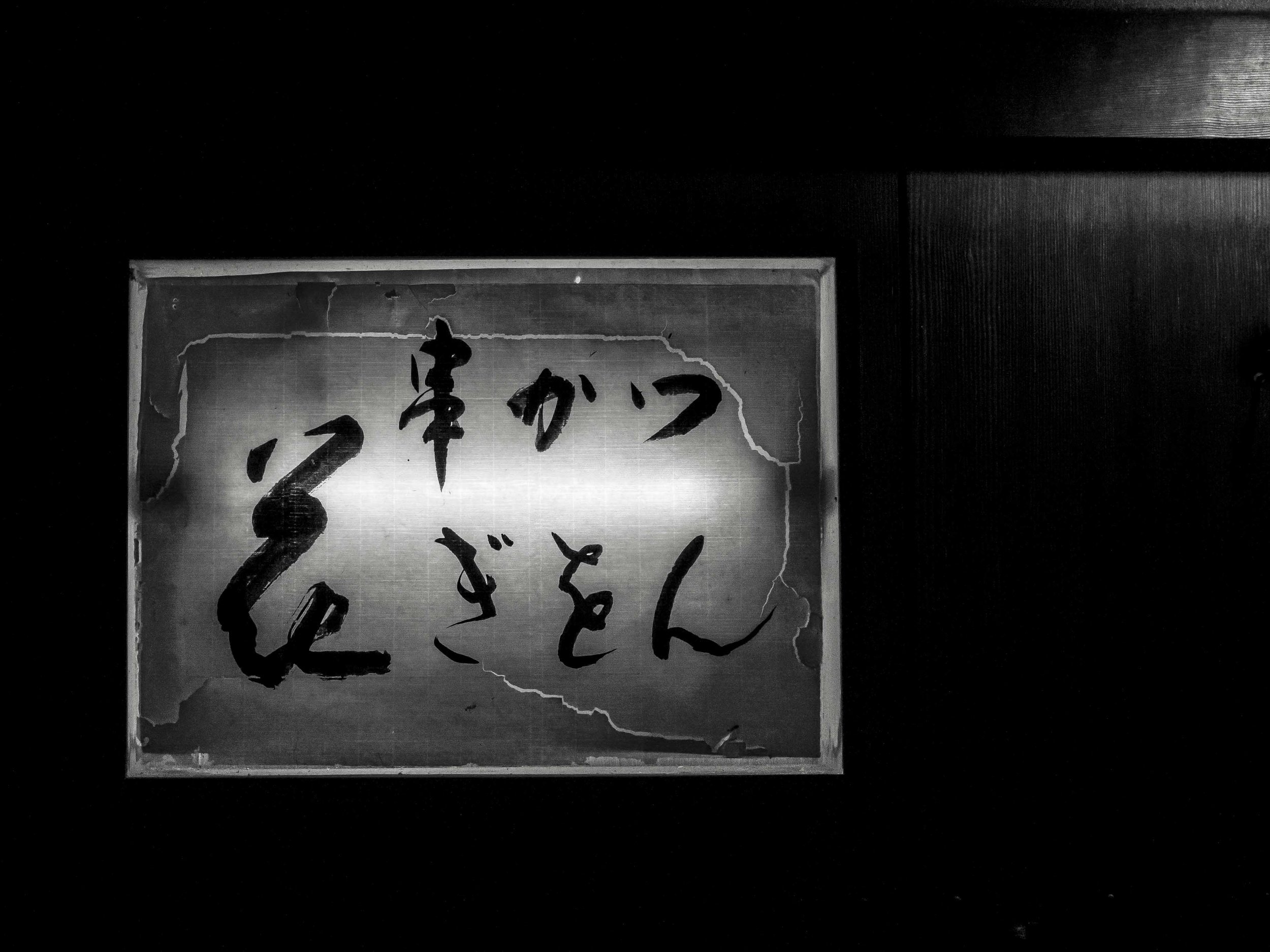
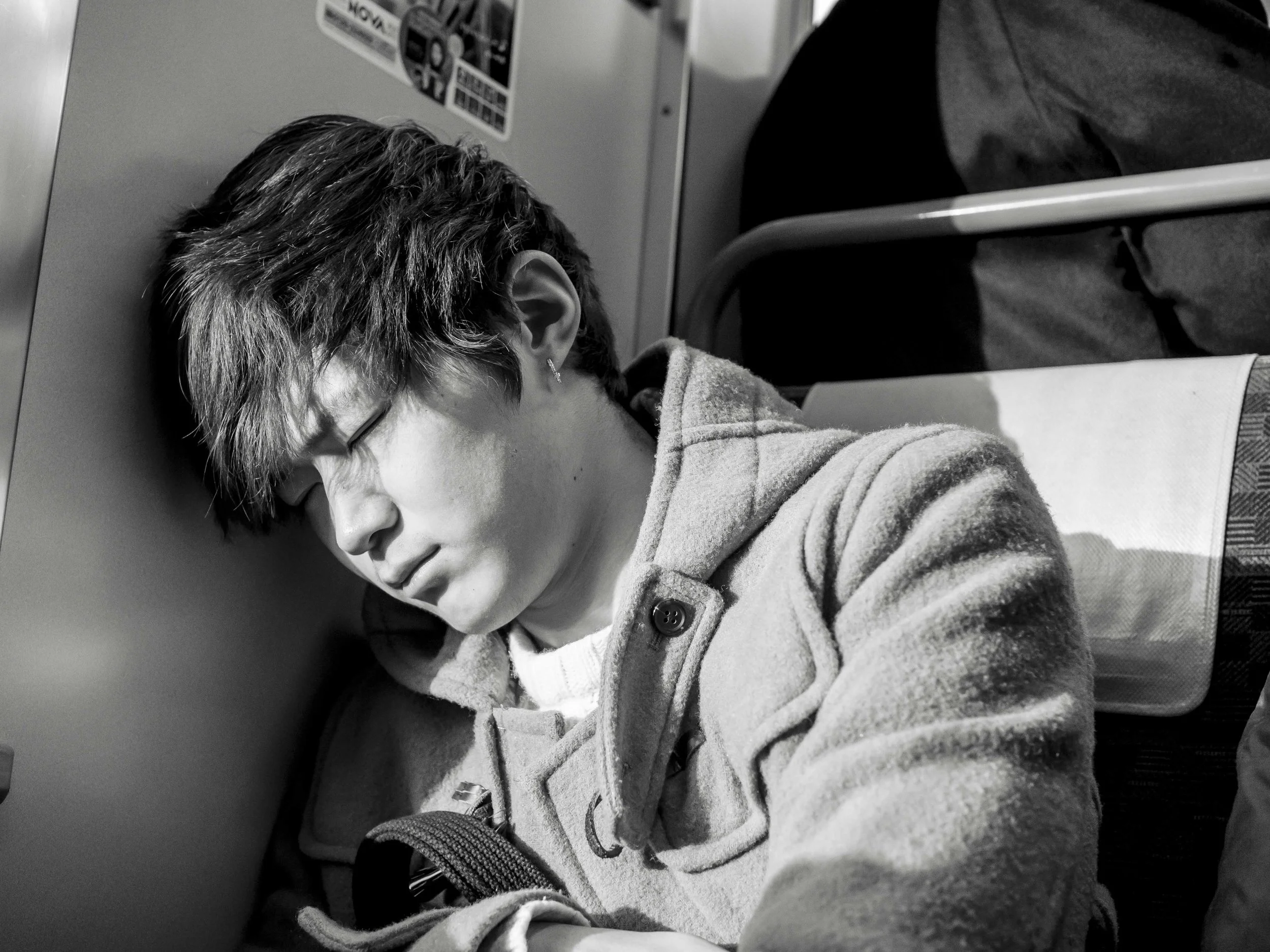
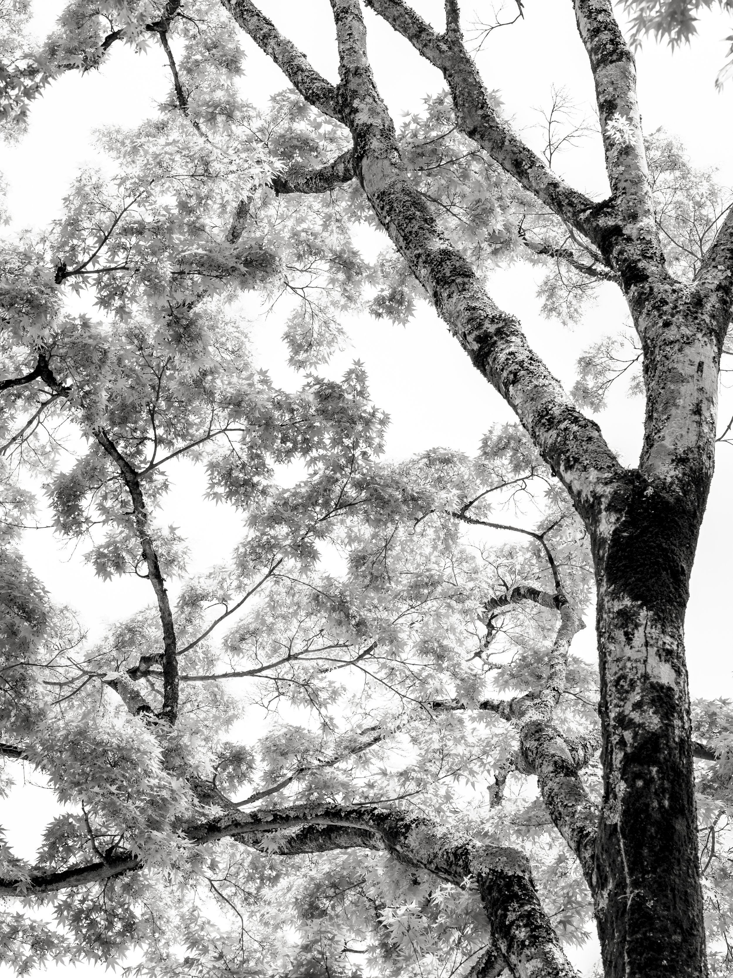
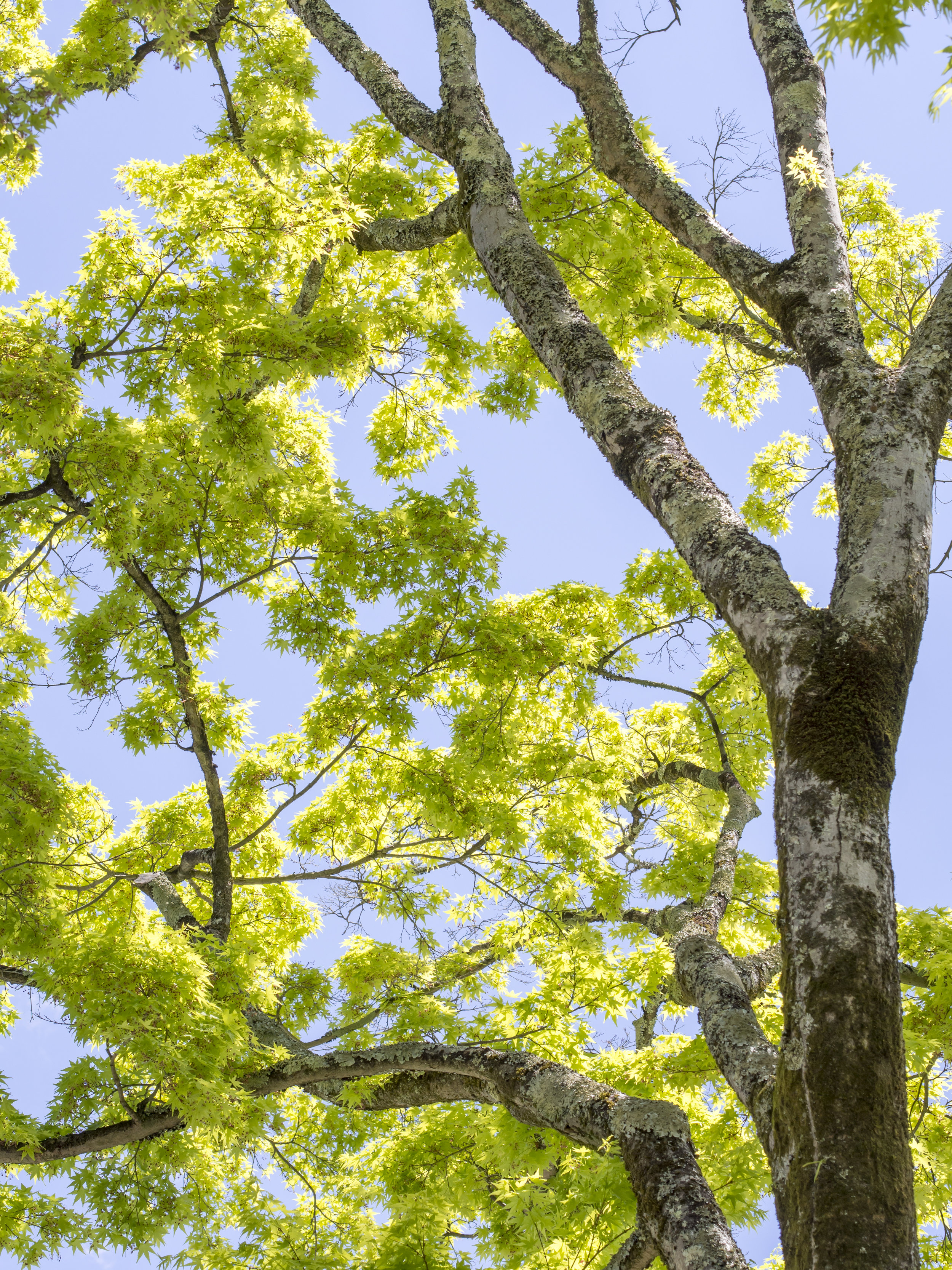
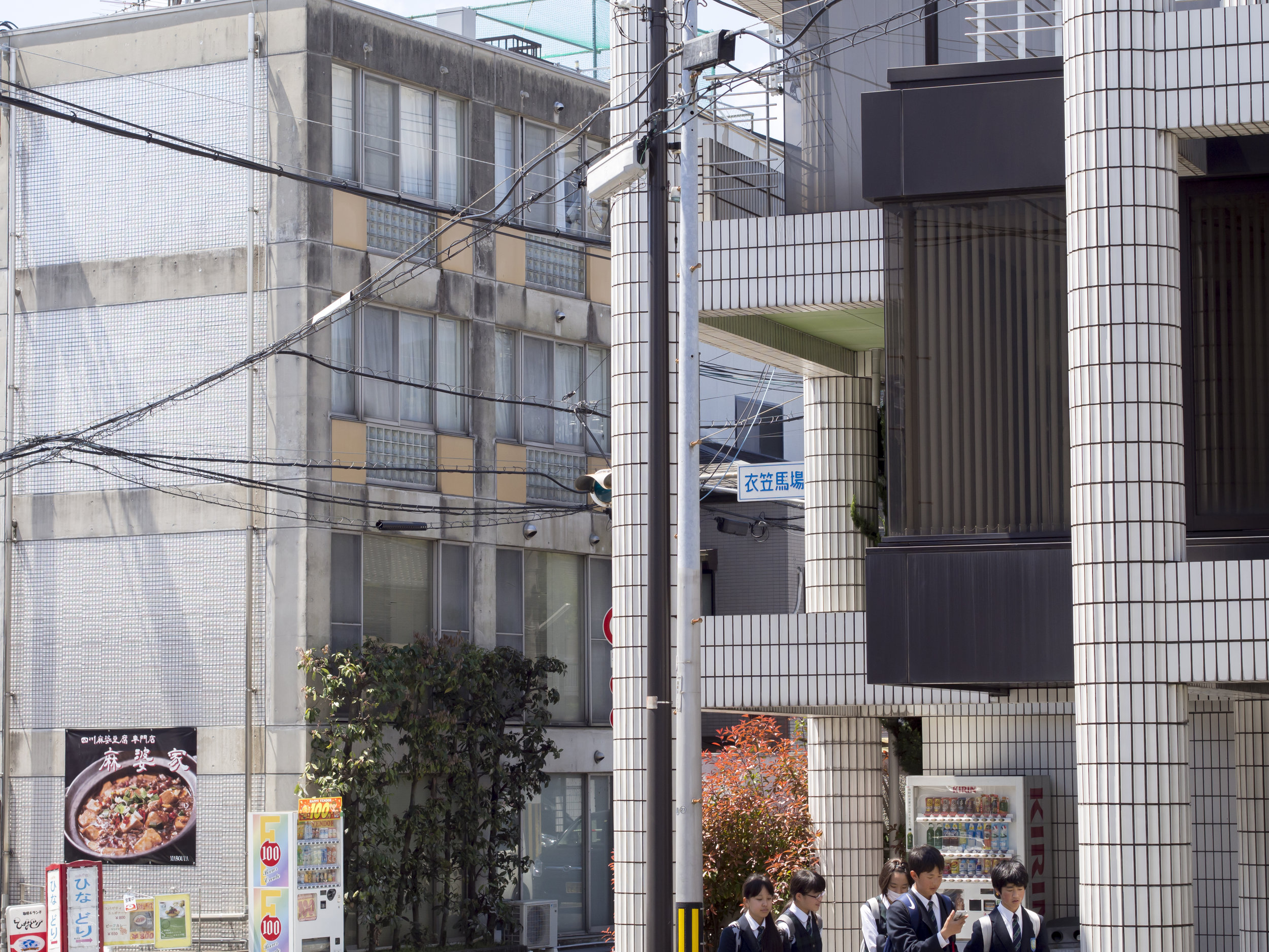
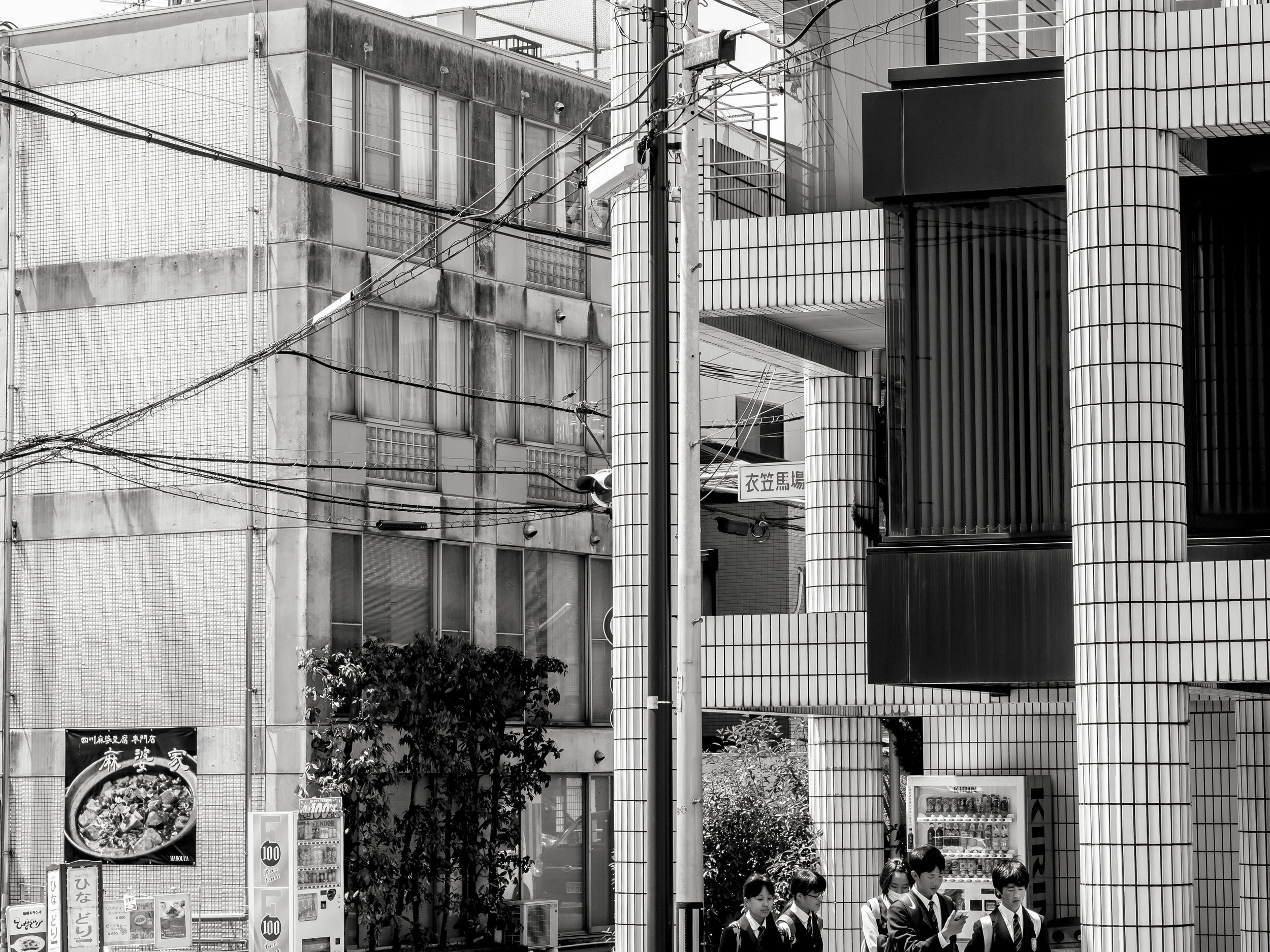
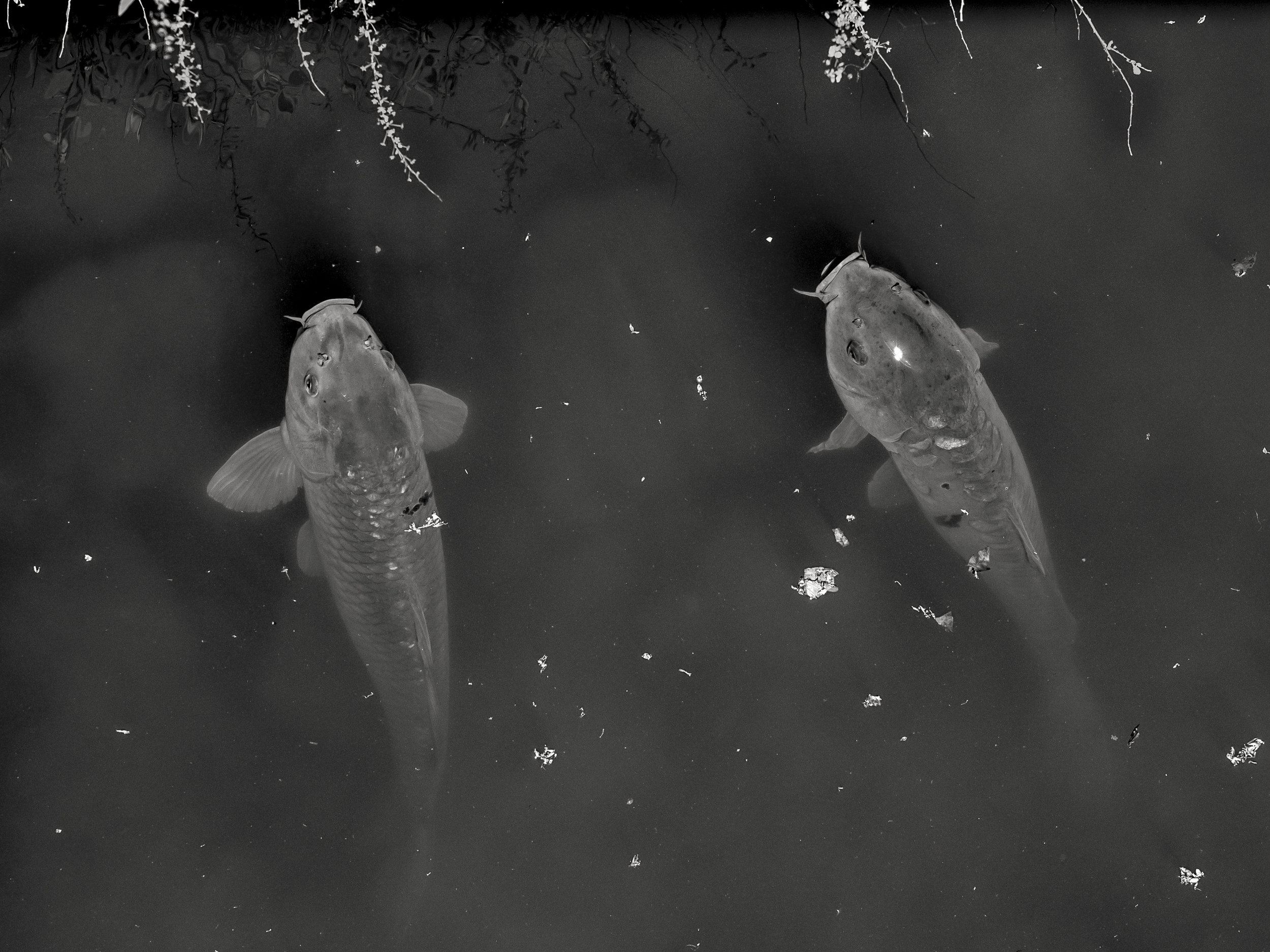
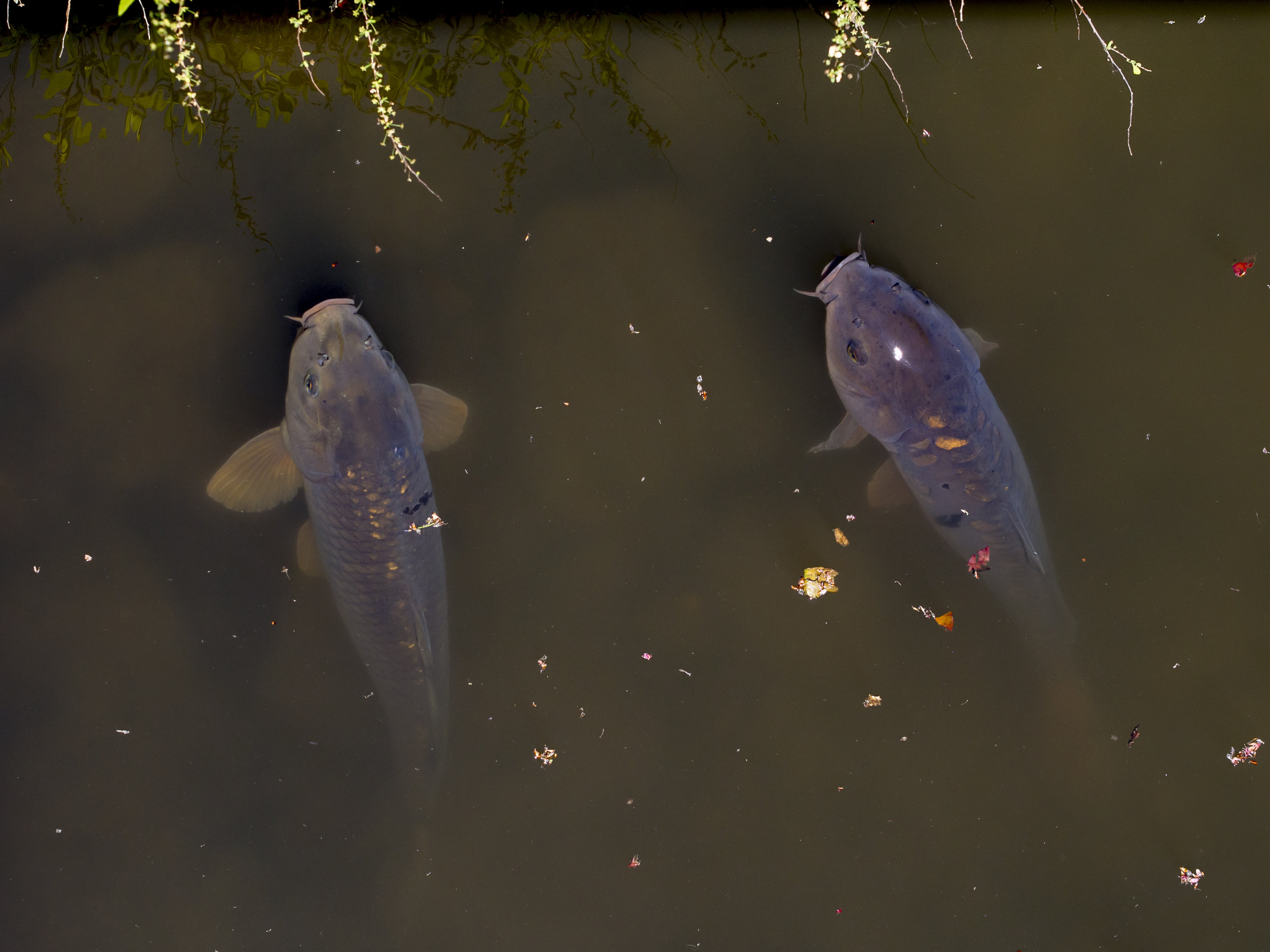
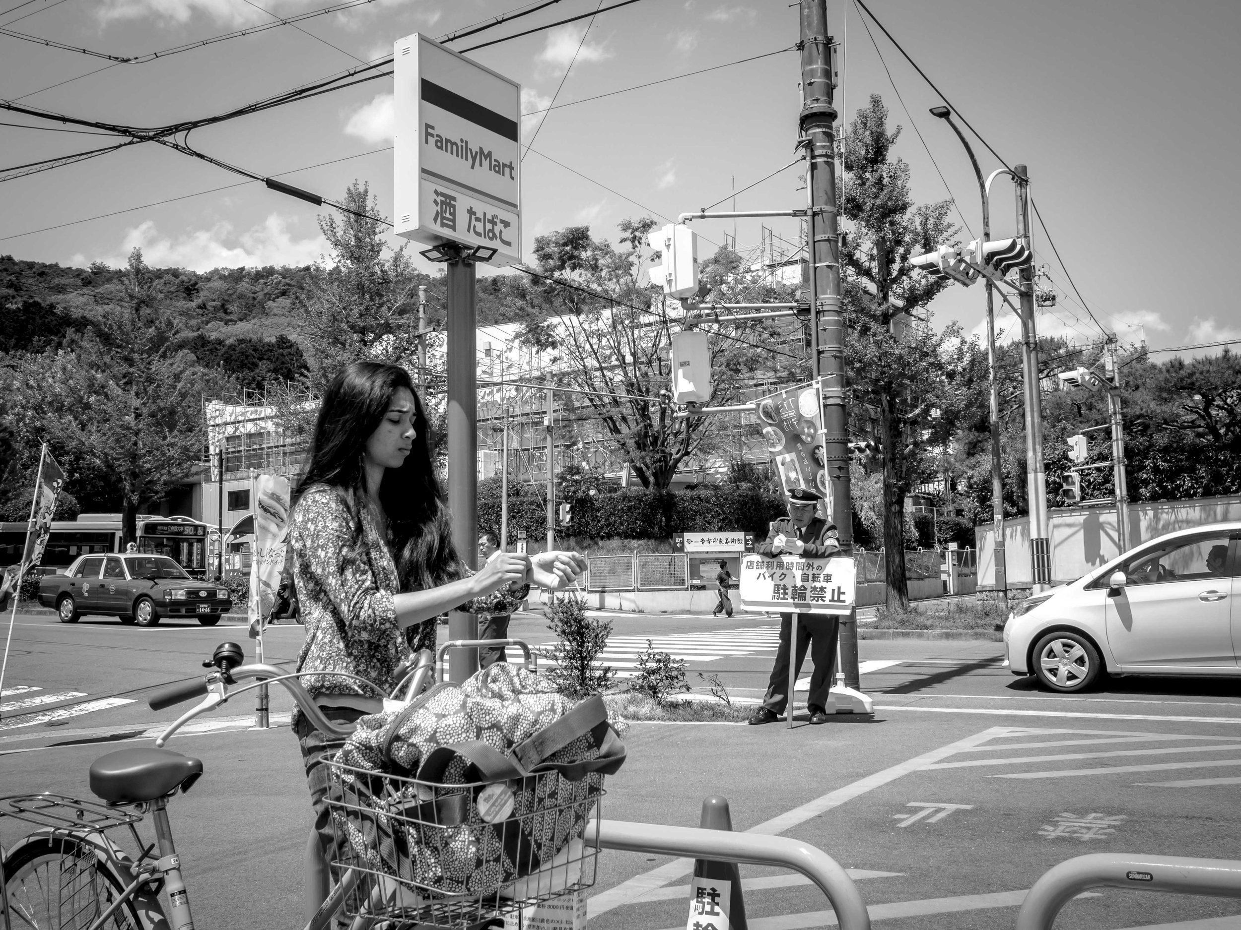
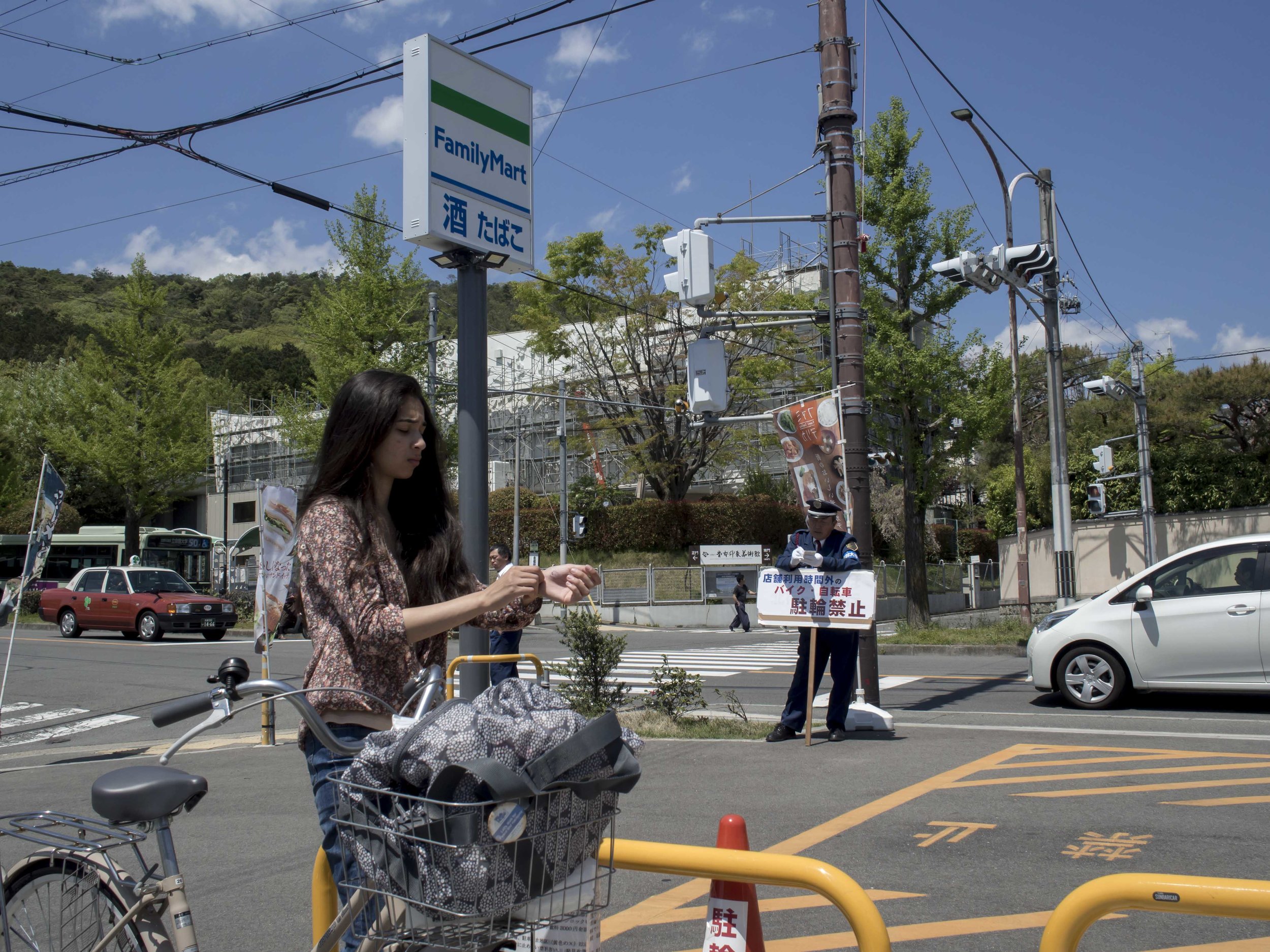
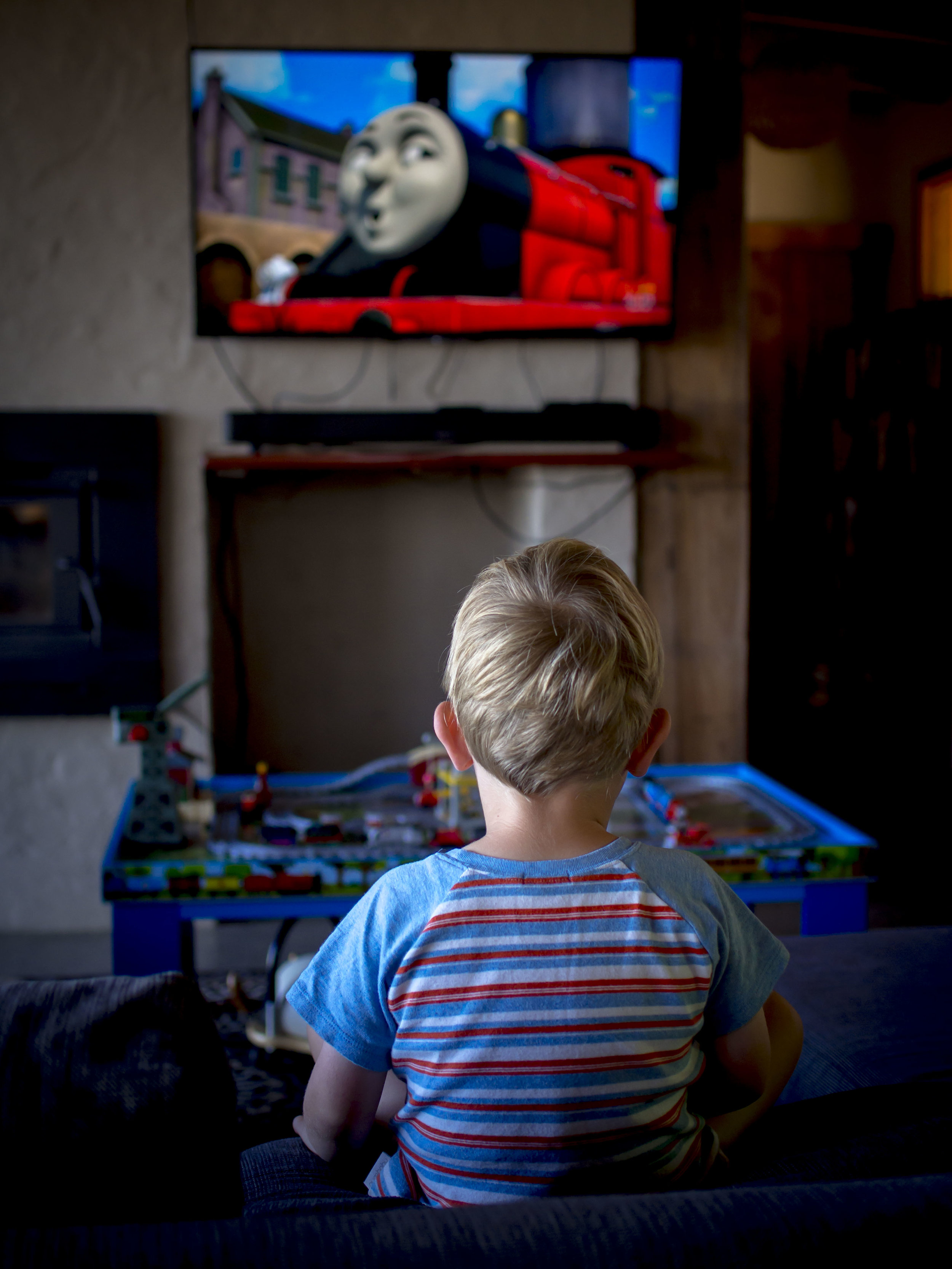
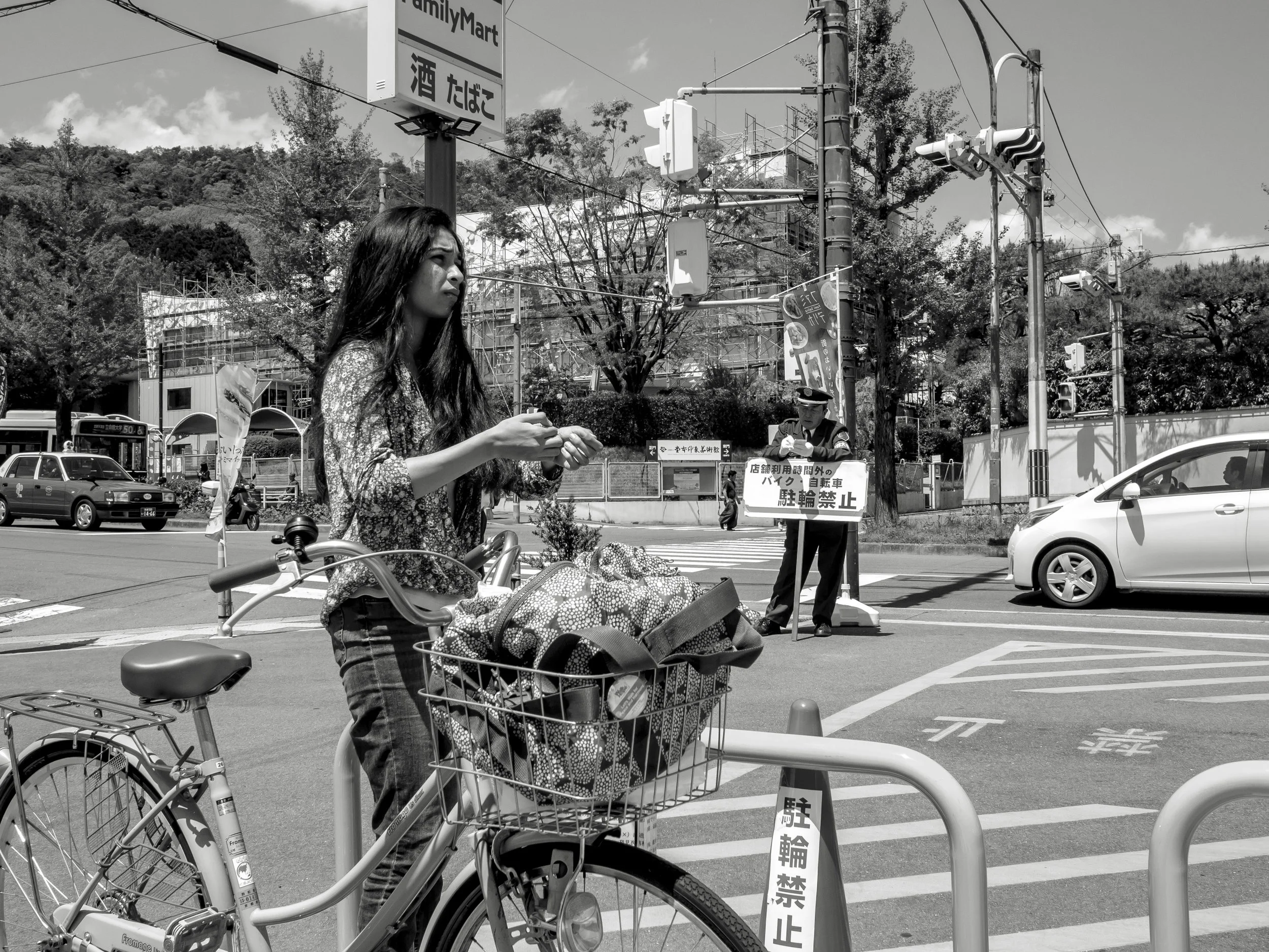
Another tough one. The mono image "flattens" the perspective and opens shadows (as it usually does), the colour image creates a better feeling of depth drop and allows the eye to caught by small objects well placed (or not), but the colour distracts (as it usually does). The red car, muted clouds against blue, red cone, flatter white of the second car etc.
Colour can create mood, for better or worse, and mono does reduce clutter, but can make even a little clutter to bland or "sameish". Both have their strengths, but I feel that winter will favour the starkness of black and white better.
My work method will be to set the cameras to B&W jpeg, but to shoot in RAW, giving me a mono view finder, but a colour image to fall back on. This will achieve two things;
1) It will obviously help with mono composition and determining is tonal separation is strong enough.
2) It will help with composition overall. I feel that sometimes my compositions are dictated to by the very colours that I am drawn to. These images will show themselves in post and in pre shooting "composition in the head", but will not dominate the process. This is much the same as normal (shoot colour and find mono images), in reverse.
As an aside, I personally find black and white images more "serious" when it comes to printing. This brings up the issue I have with my printer which is capable, but not ideal for regular mono printing as it is an earlier model with only a single black tone ink (Pixma 9000 mk2).
OOPs! I forgot to post this before I left and now I am back.