Micro Four Thirds or M43 is my format of choice.
So what?
Sometimes I feel I need to justify my choice, sometimes I feel like I know a secret many others have to learn and sometimes I am simply ecstatic that I have a set of image making tools that are so close to perfect for me that I should never question them in any way.
Is my kit perfect?
No, of course not, none are.
Is my kit more than I could ever need?
Probably not, but also usually yes.
Is my kit better than all others? No and yes depending on specific criteria.
Do I dream of switching to “X” or “Y”?
Sometimes, but it takes little to remember that I have been down most roads and always come to the same conclusion. The gear does not matter unless it restricts.
The kit you use only has to allow you reasonable freedom to express yourself. It is unreasonable to expect all kits to fit all purposes, or for any to be perfect, even at the task they are designed for. The reasonable expectation is that your vision is not un-reasonably held back or curtailed by your gear, especially in relation to other tools available.
There have always been technical limits in photography. These limits have often created styles or specific looks over time as photographers overcome and work within them as best they can. We have fewer technical limits than ever before and ironically, like a person who can choose anything, many are paralysed into indecision and often unhappiness. Creativity is then equally paralysed
What I mean by that is, it is much easier to create a look or style when you have fewer choices and more to over come, but (I think) harder when there is not much that is not achieved easily.
Years a go, one of my mentors used paper developer to develop their medium speed film, giving them amazing super sharp grain and clarity. This combined with a bespoke enlarger set-up rendered stunning (even more so at the time), super clear and sharp mono images with grain so acutely rendered that he could actually focus through it. His compositional eye was better than many and very experienced*, but the technical limitations he overcame also gave him a signature that was unmistakable. The perfect blend of out of the box technical thinking and application. I used to use Rodinal at 1:200, with minimal agitation with super slow film trying to get medium format results out of 35mm, succeeding sometimes, but it would have probably been easier to just go into MF. Each to their own.
What can we do now that circumvents the technology we have to rely on? The choice of editing software is as much debated as the best brand of camera, but at the end of the day the technical limit envelope is set by the software creator. This is likely why many art based photographers are happier with film?
The only tool of difference we have is our own eye, our effort and our dedication, supported by excellent tools available to all. A 1” sensor compact camera now takes a better image than a 35mm film camera and more easily. M43 can match 6x7cm film format and full frame+ enlarges as well as large format film. The camera shows us what we will get either before or immediately after the shutter is fired and pesky things like noise/grain are becoming more of an annoyance than a forced creative element.
With this relative technical freedom comes creative paralysis. If everyone is using the same tools, then aren’t we all playing on the same predictable field? How do we stand out? What is our signature. This is of course the ideal, where only skill in communicating ideas with images count, not tricks, but realistically, many fall to one side out of apathy and an inability to make their mark. Photography (not graphic imaging) is probably doomed as an art form in it’s own right, but artistic communication will still use it to purpose.
It frustrates me that photography has for many come down to a constant micro comparing of tools. Think about the number of sites that are dedicated to gear reviews and the amount of traffic they get. Then compare that to the number of sites that promote only creative photography, especially the format or technique agnostic ones. Unfortunately, the reality is most website hits come from reviews. My most read posts are bag reviews!

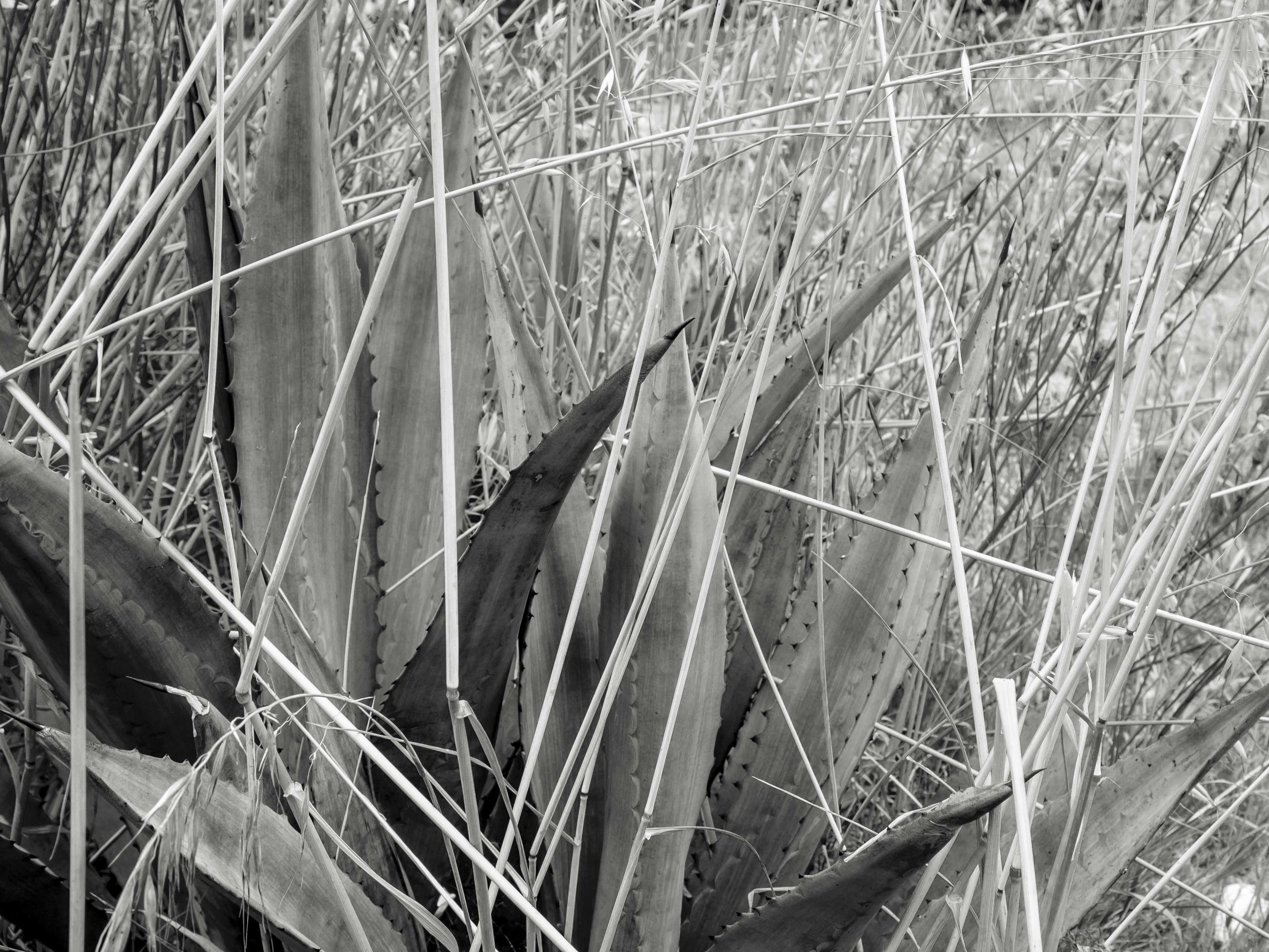
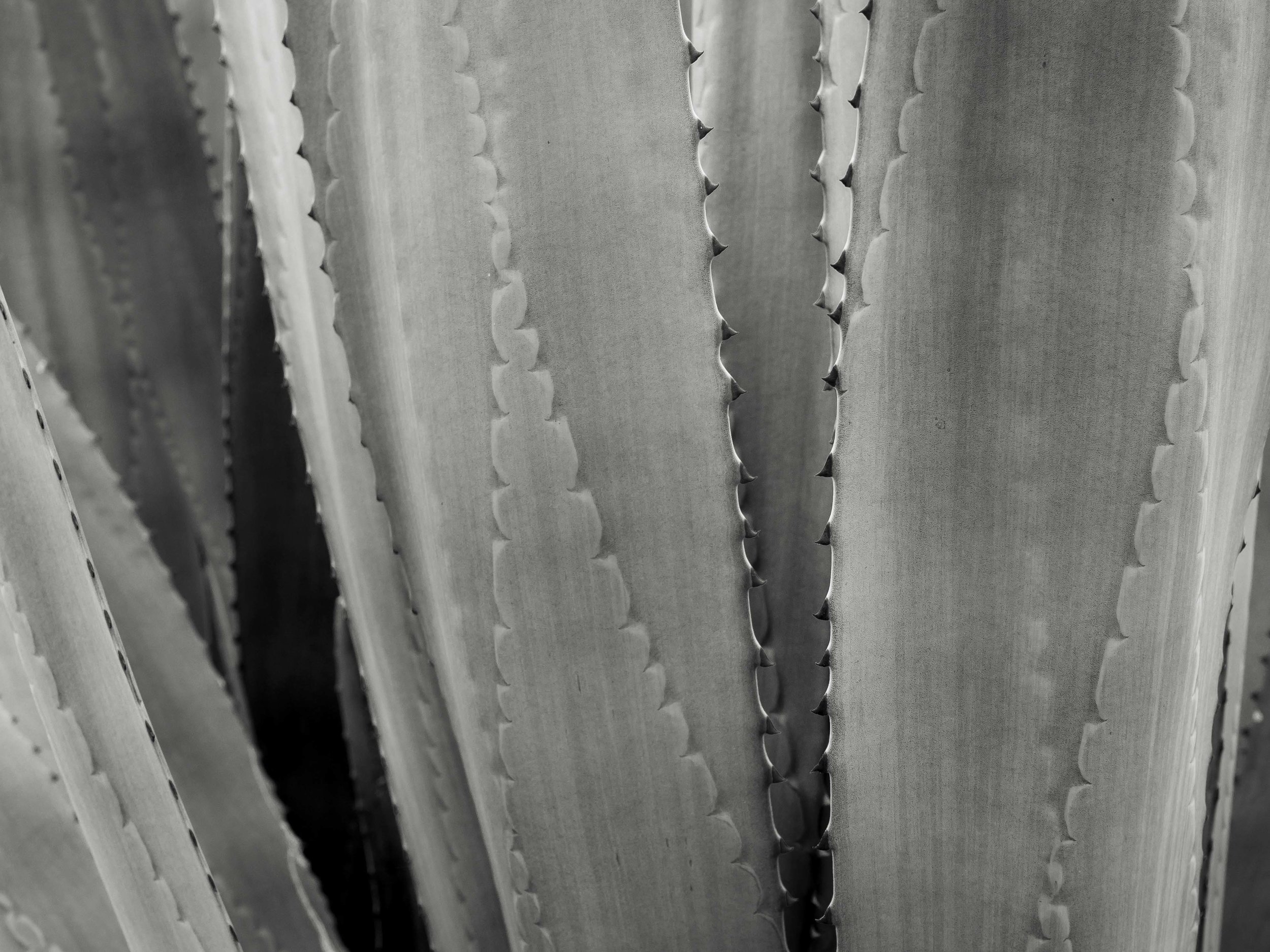
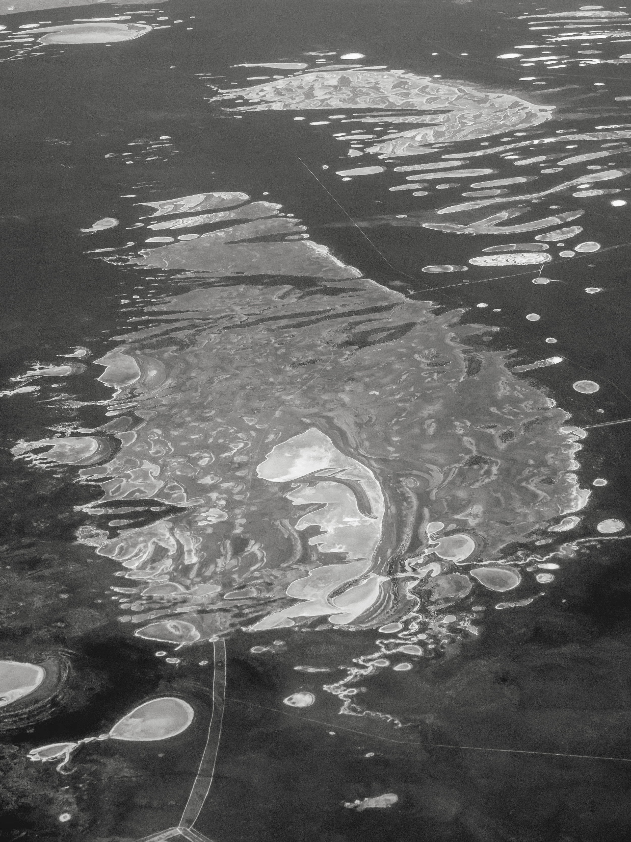
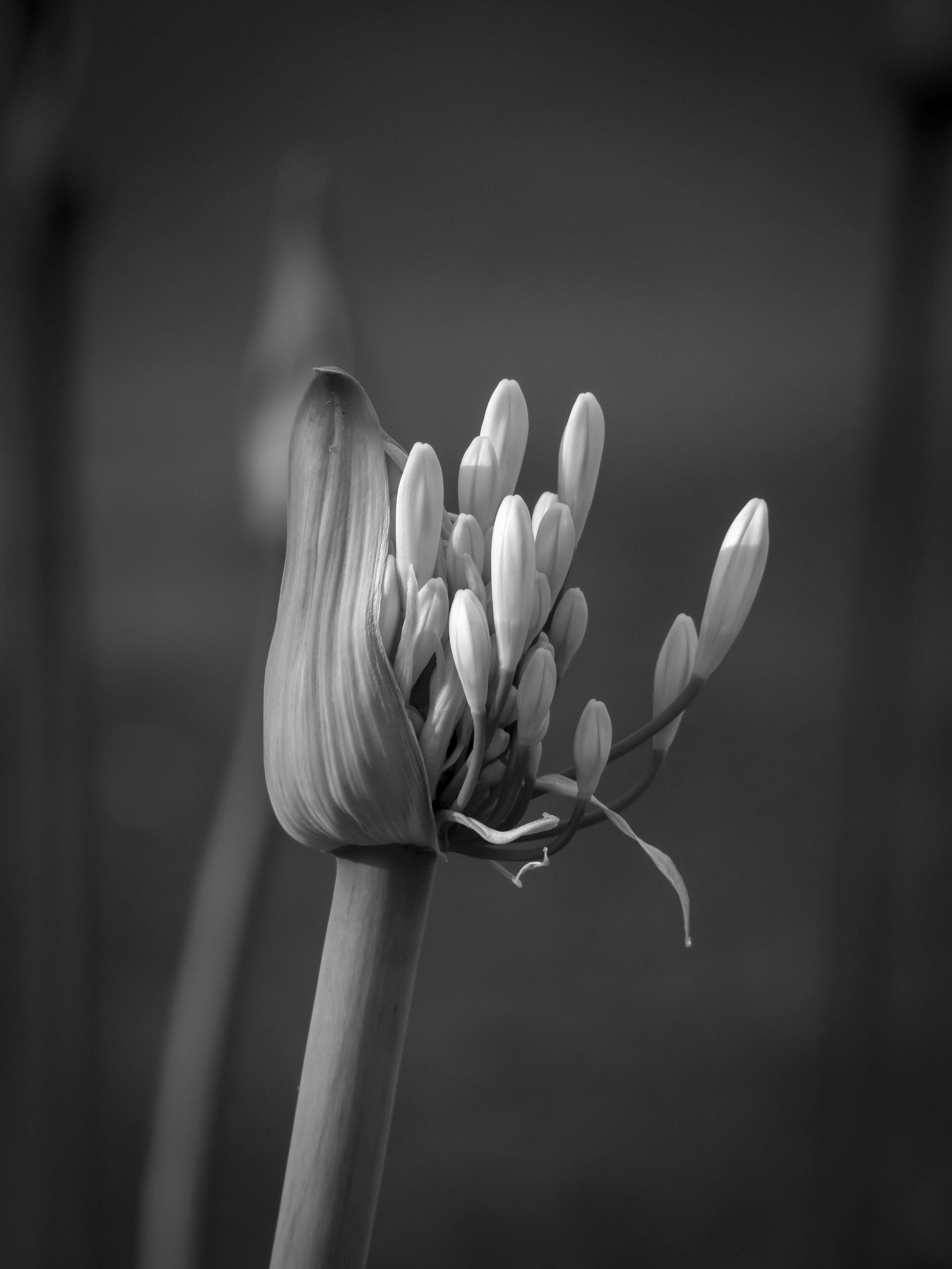
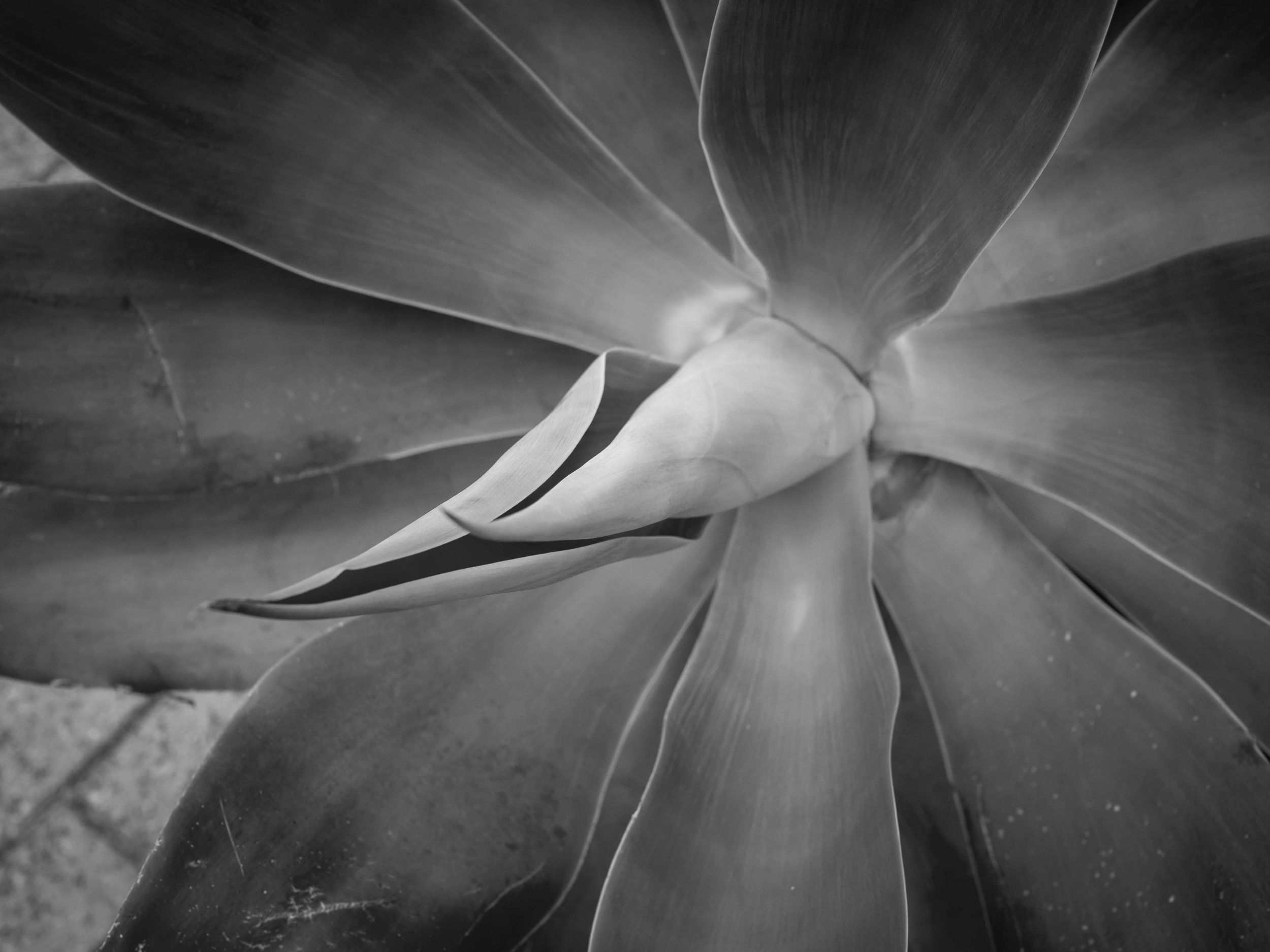
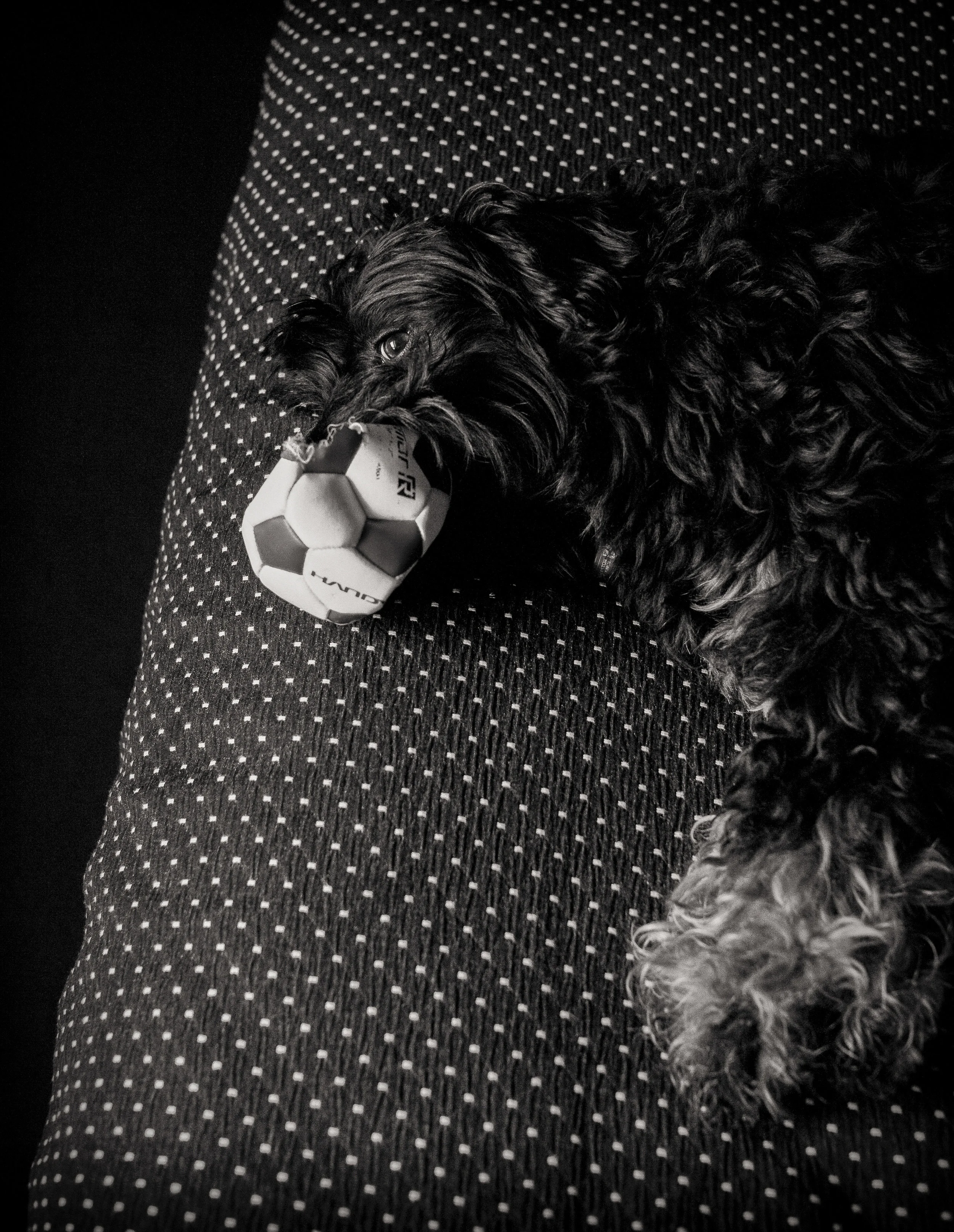
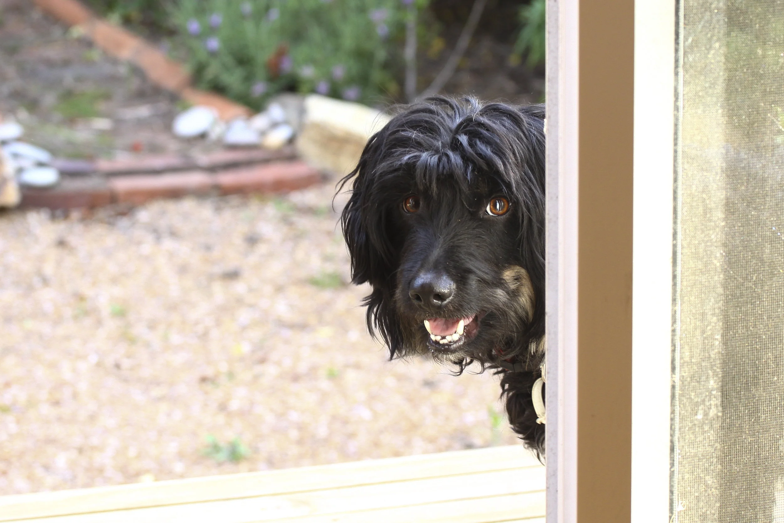
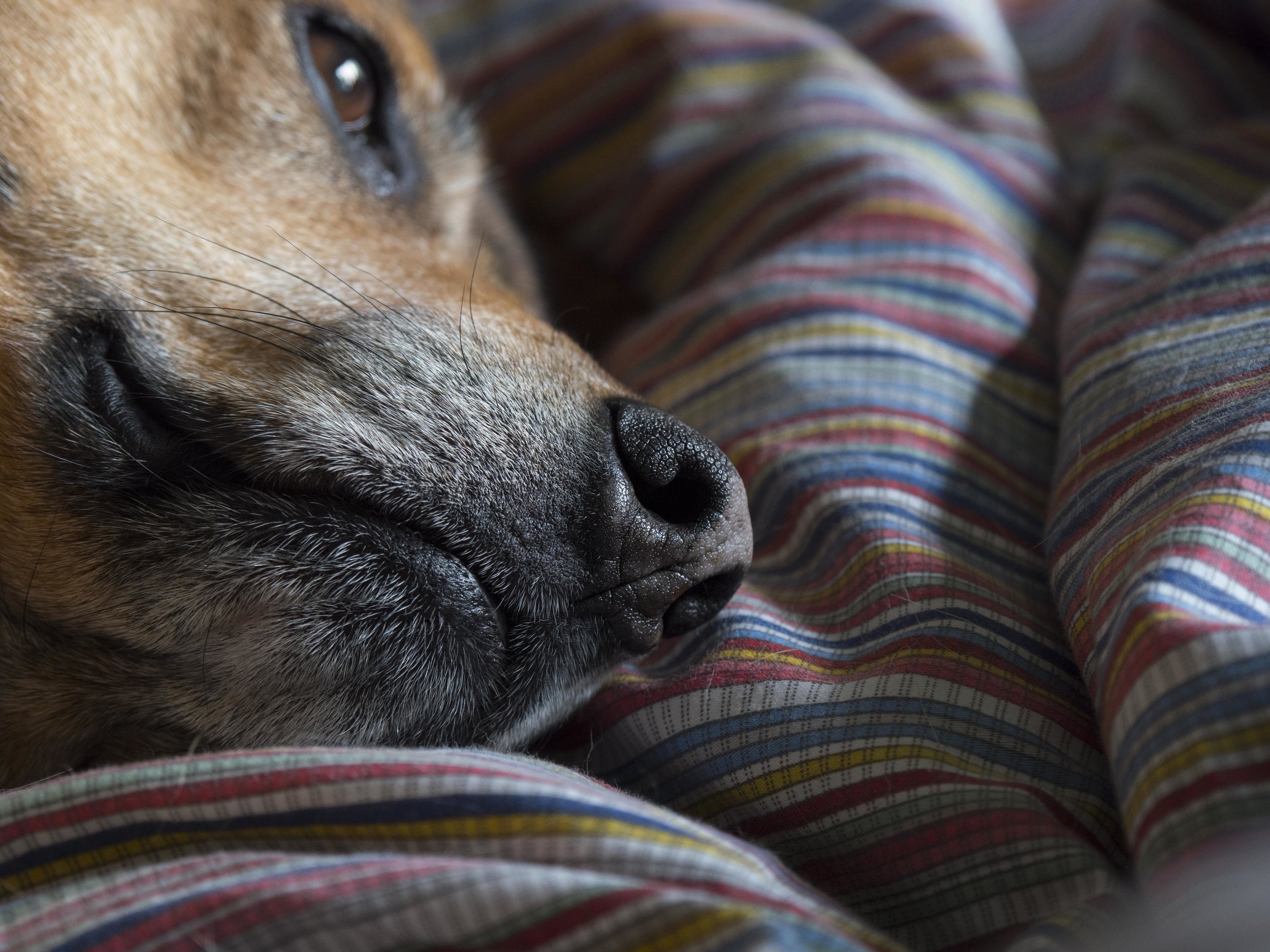
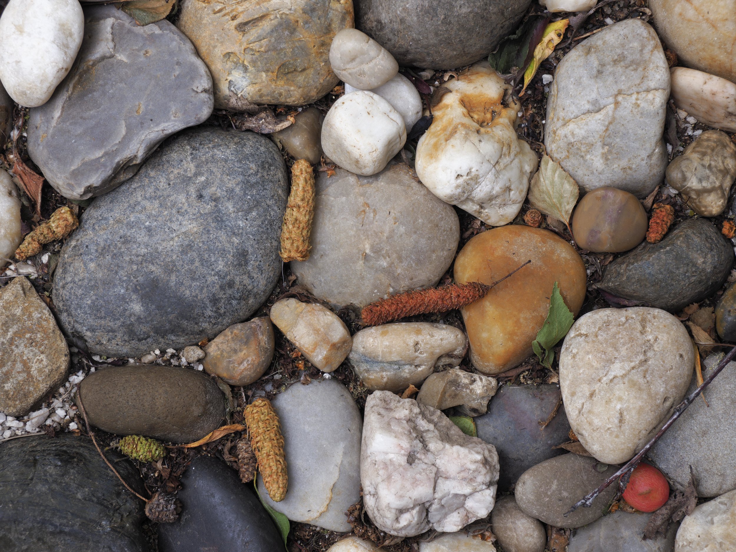
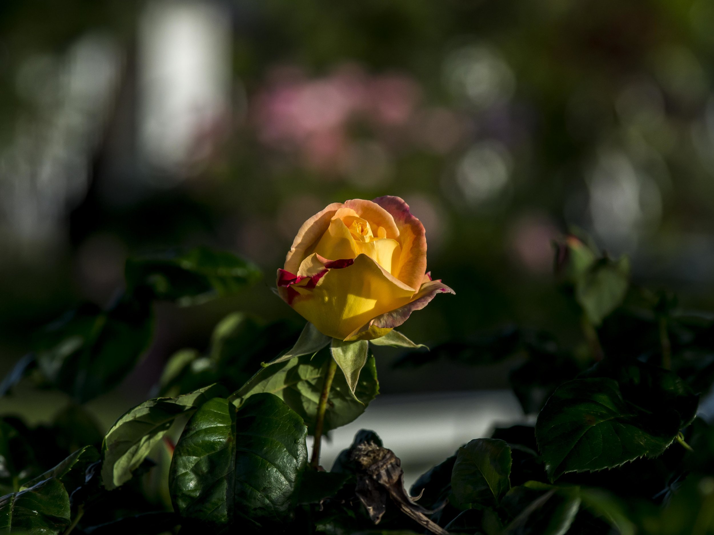
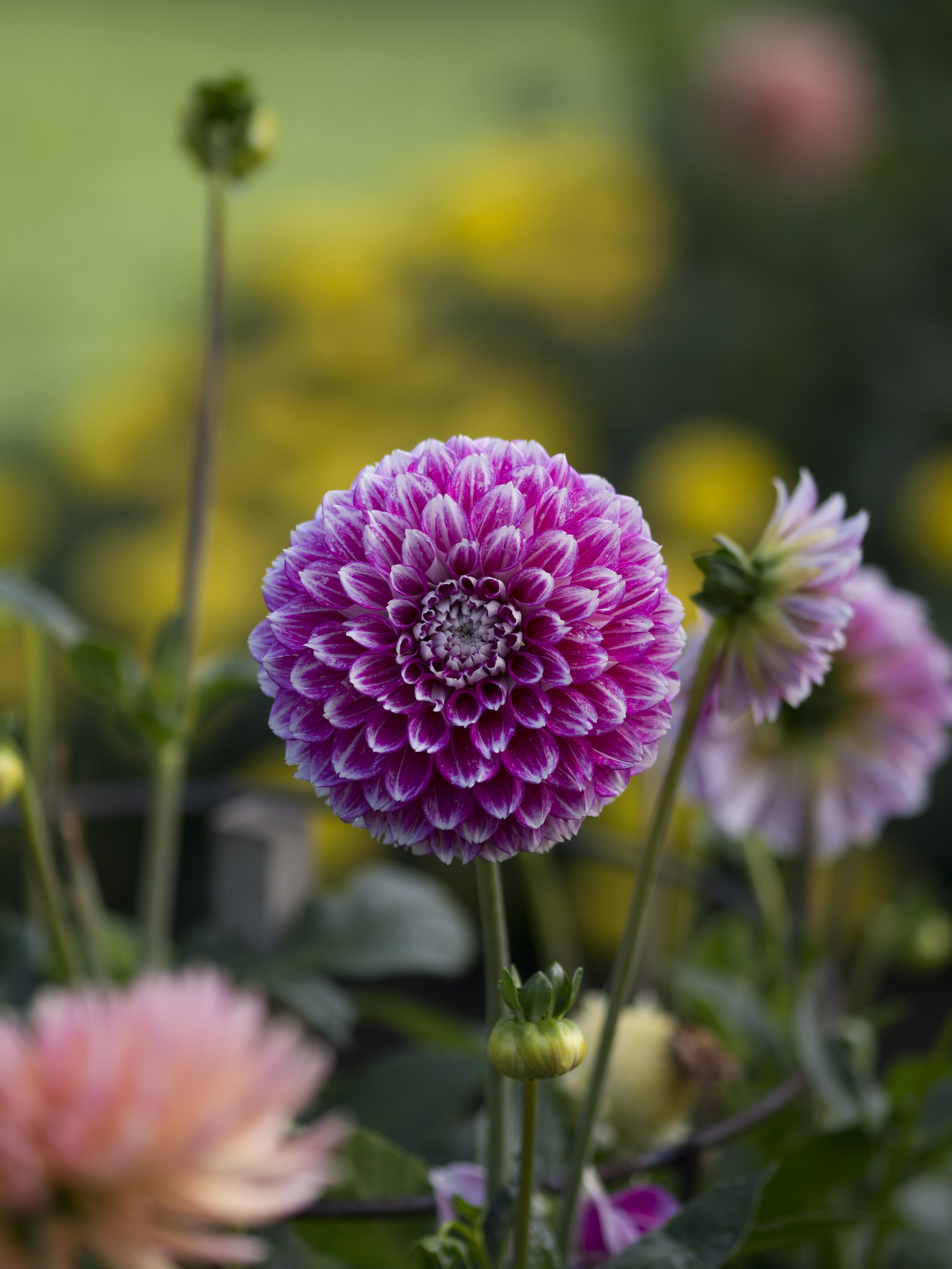
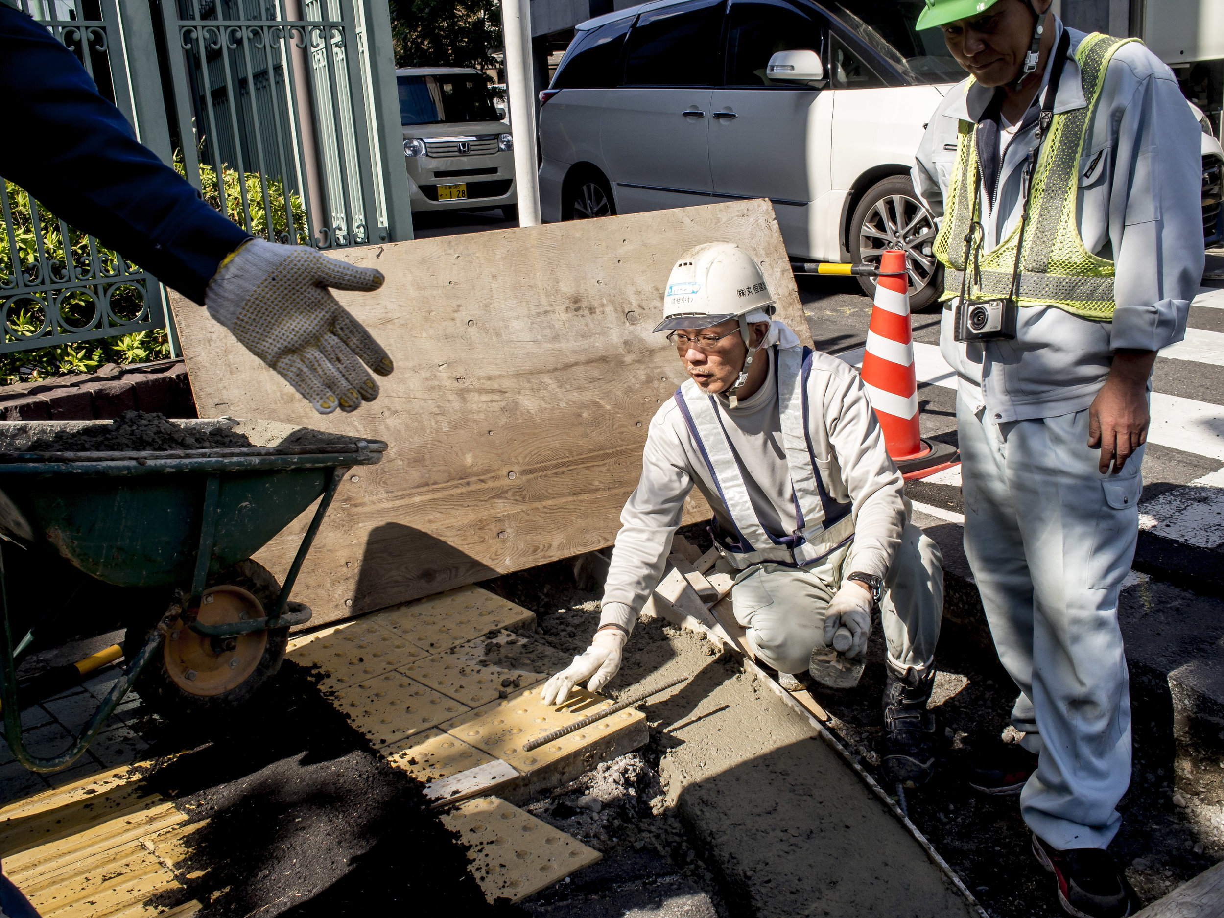
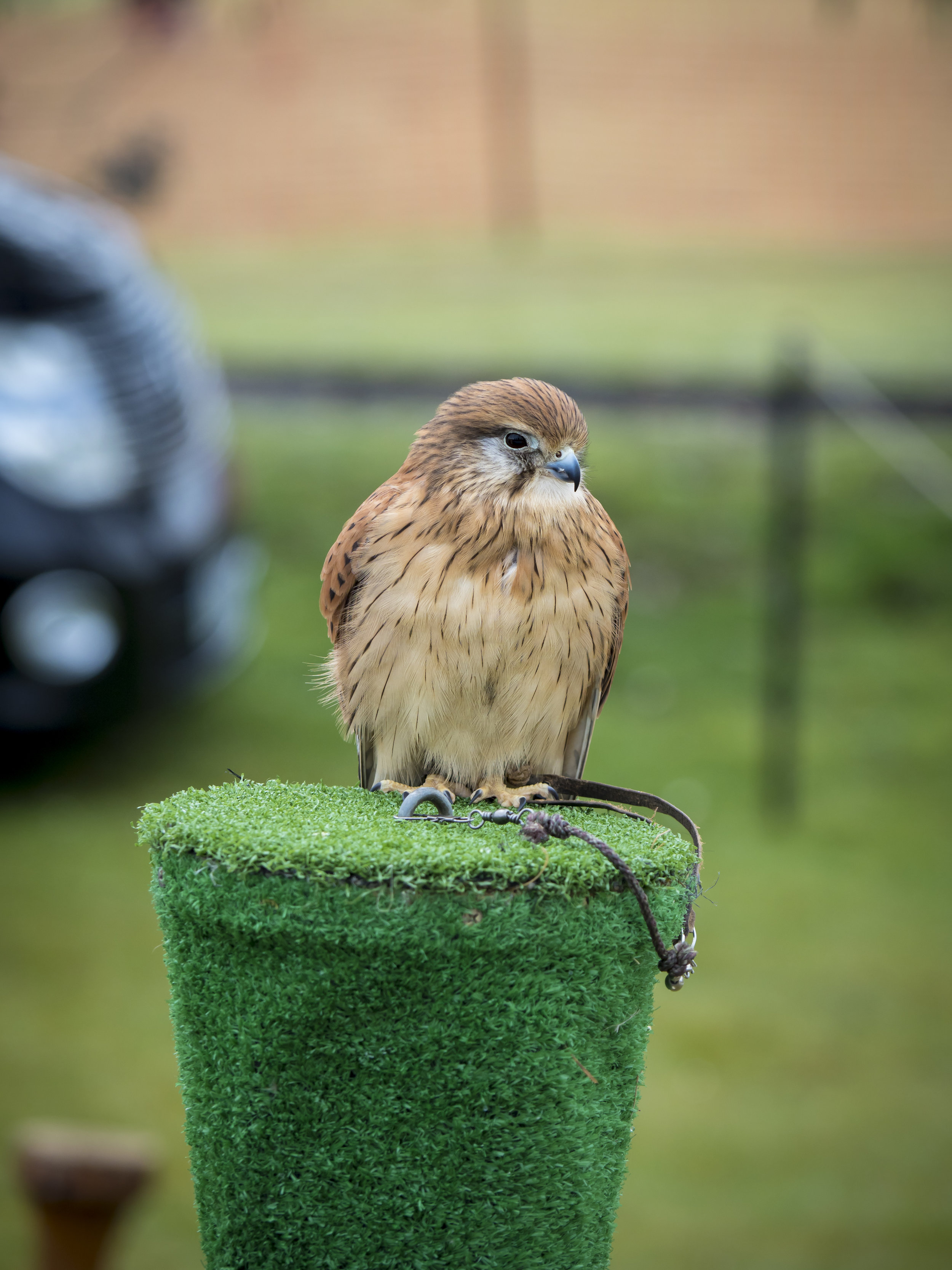
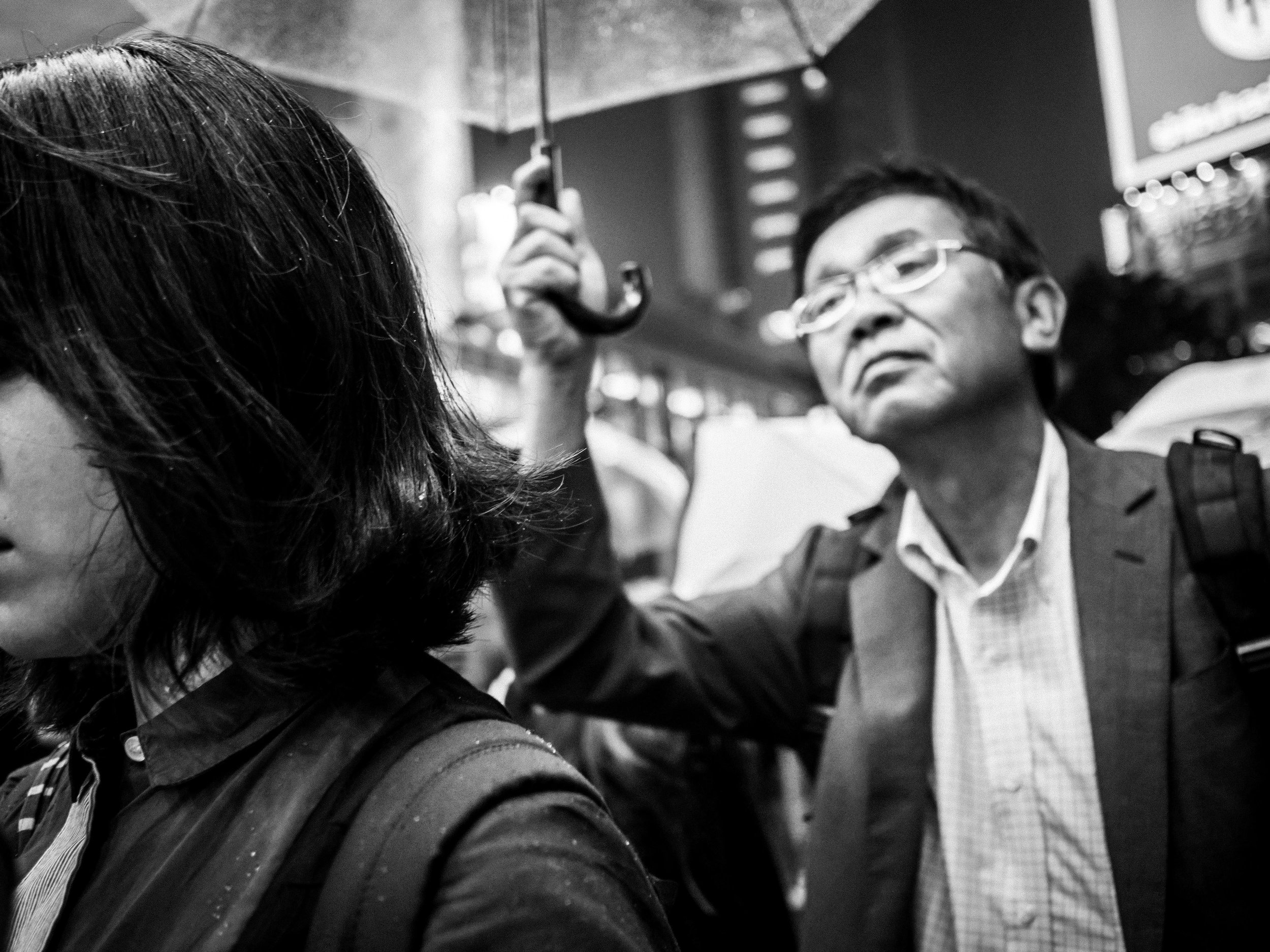
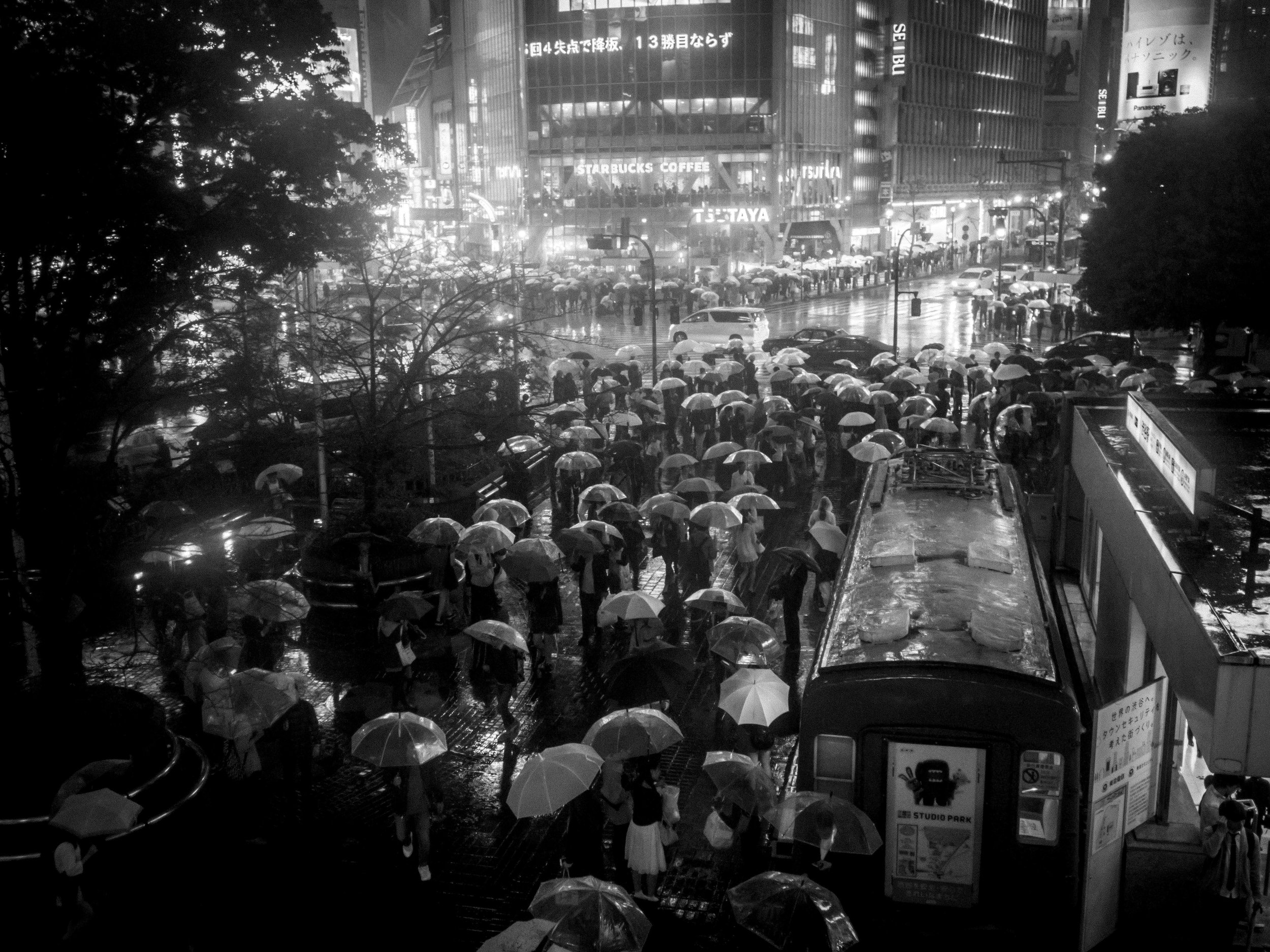
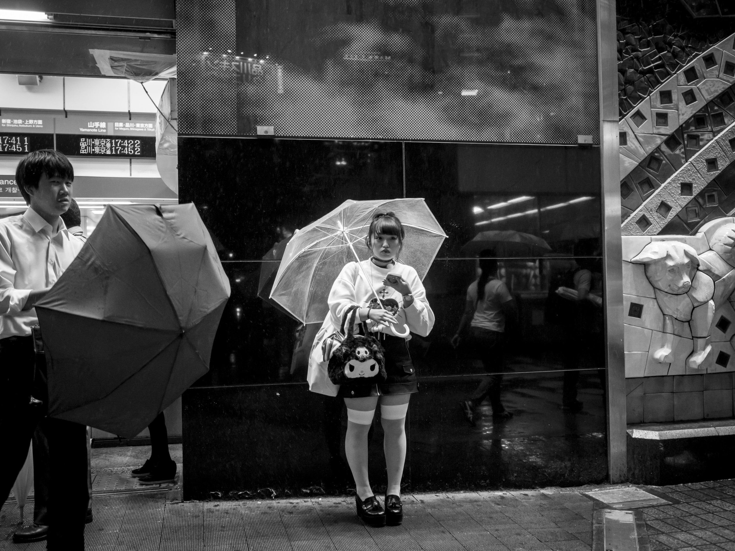
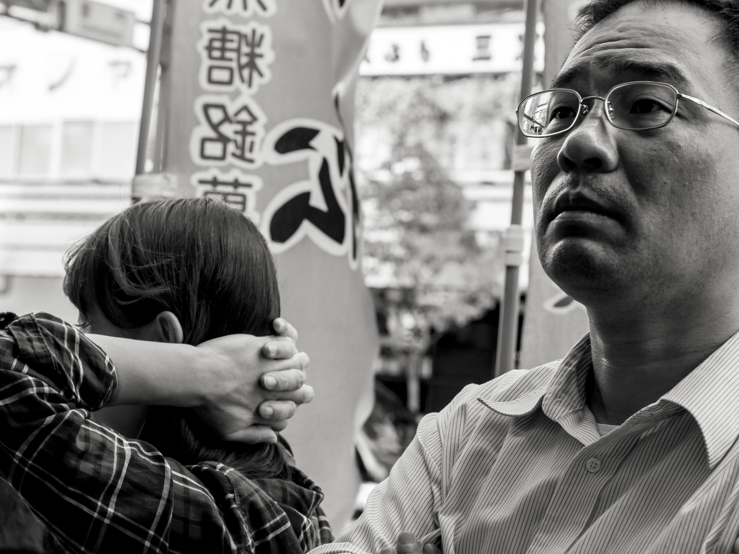
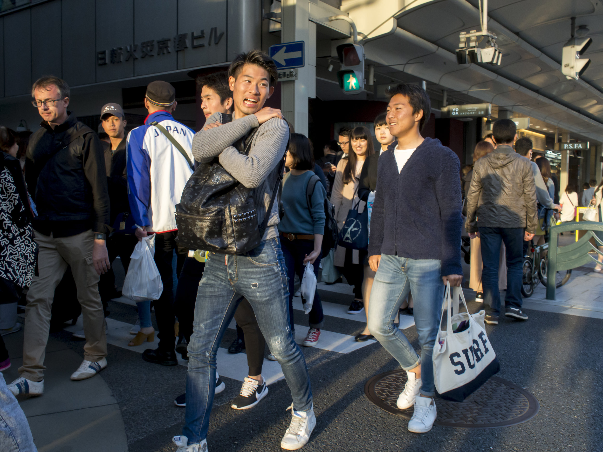
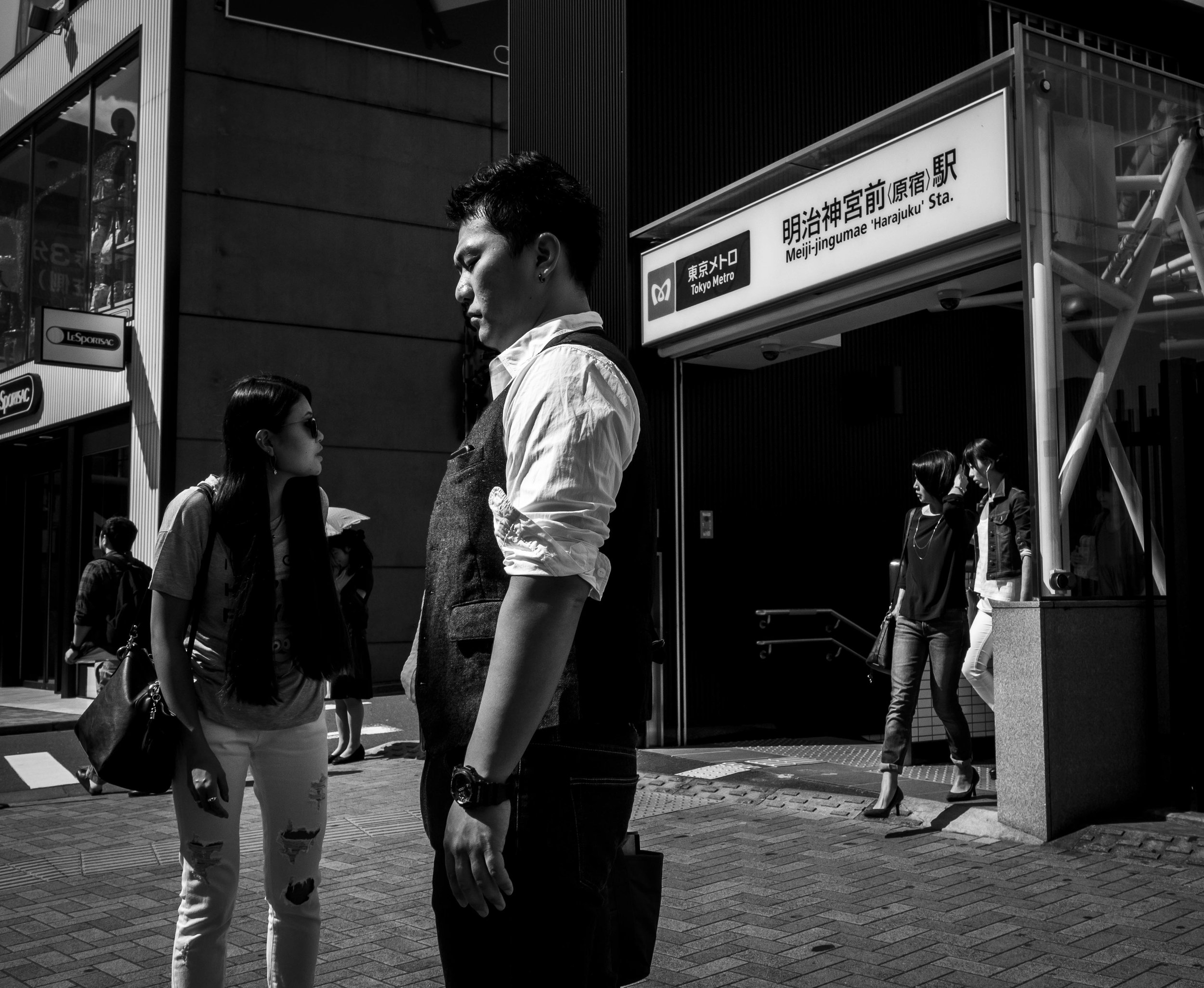
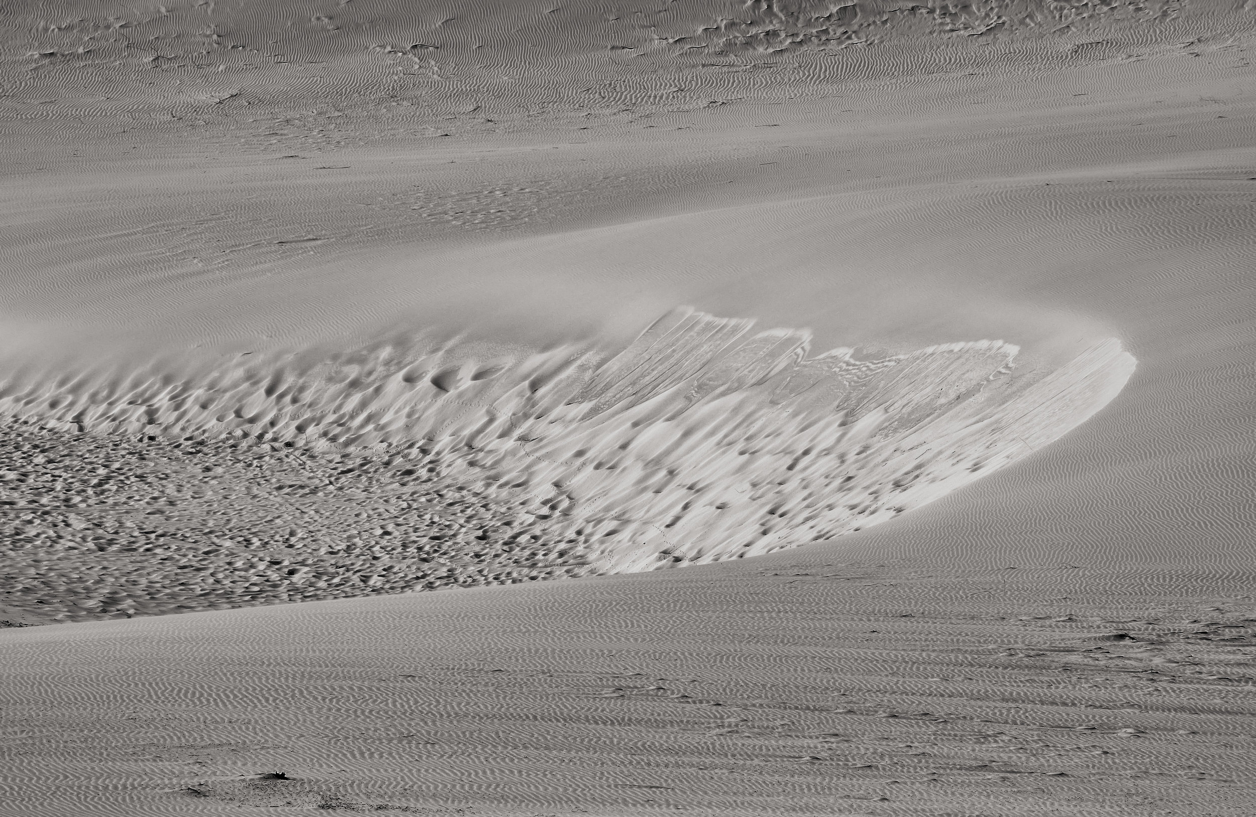
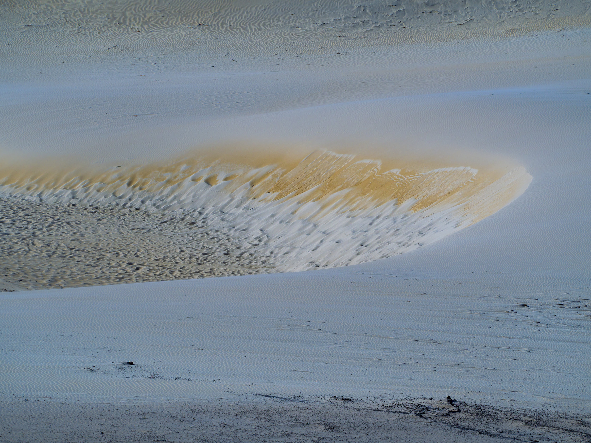
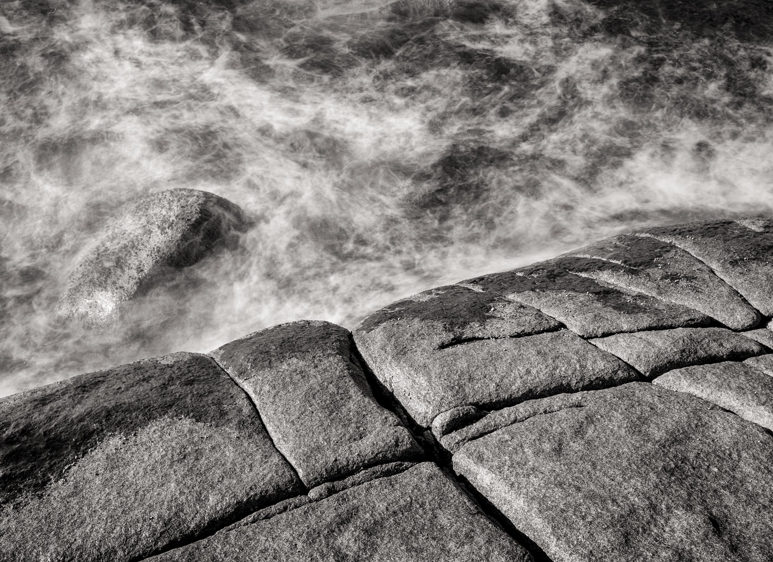
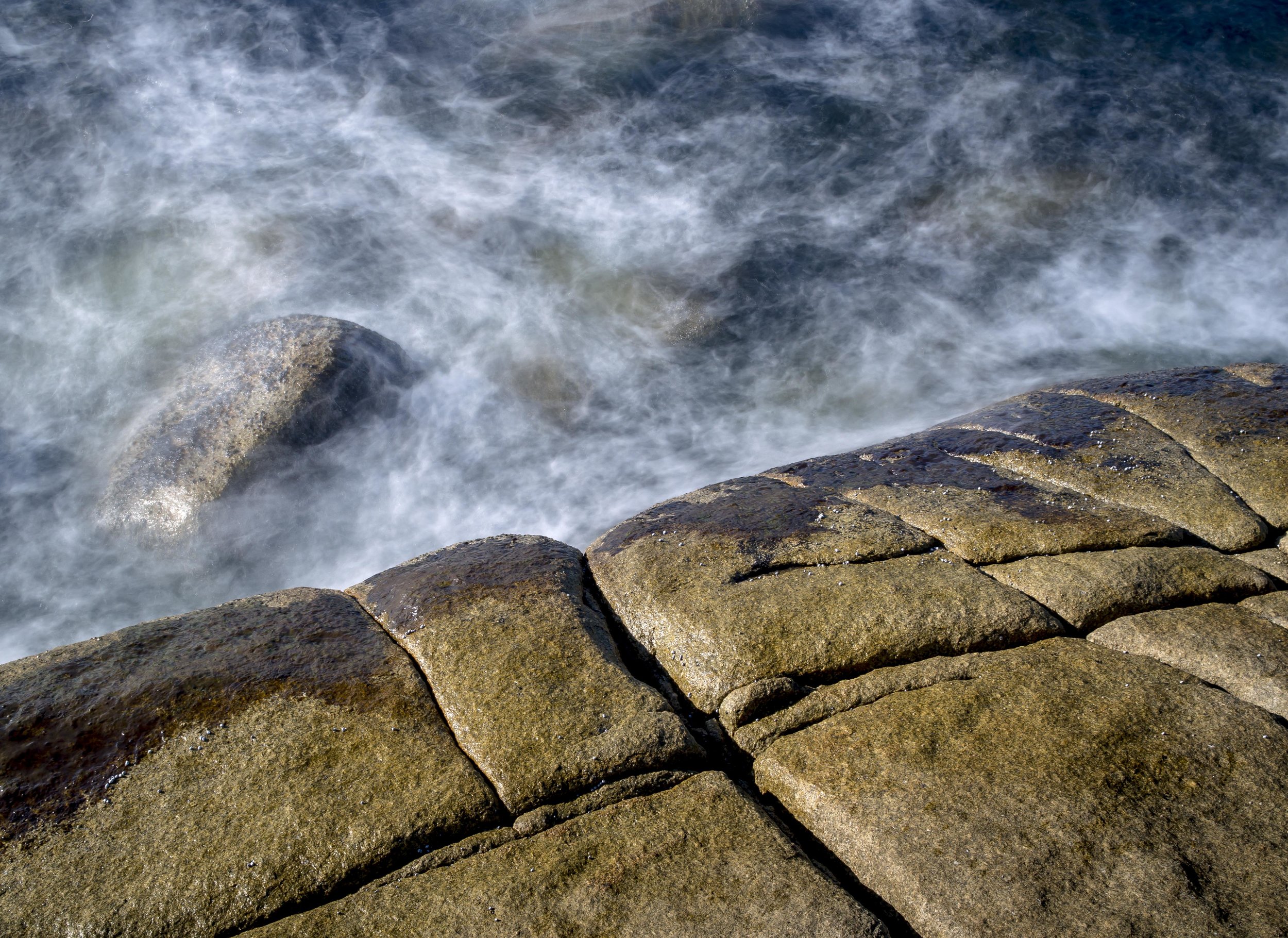
A token image. I do not like a words only post. The unique Bokeh comes from a window panel reflection of the same door.
These generate revenue for some bloggers and guarantee constant traffic which promotes the desire to keep posting. The reality is most bloggers would rather talk about photography as a whole, not just gear, but that as they say “does not sell papers”.
The point?
Take the best images you can and keep on taking them. Take them for you with what ever gear is at hand. Do not compare your technique/gear/results to others or past equivalences as you cannot and should not (there is just too much out there to compare to). Sure, learn from others, but be you, not someone else. The only things that are yours are the when/where/why of your image and your interpretation of it. In that context, the gear used is a minor foot note, a marker in time only, not the defining characteristic.
*He won more prizes in a prestigious international mono imaging salon than some countries and more than all of the other entrants from Australia combined.