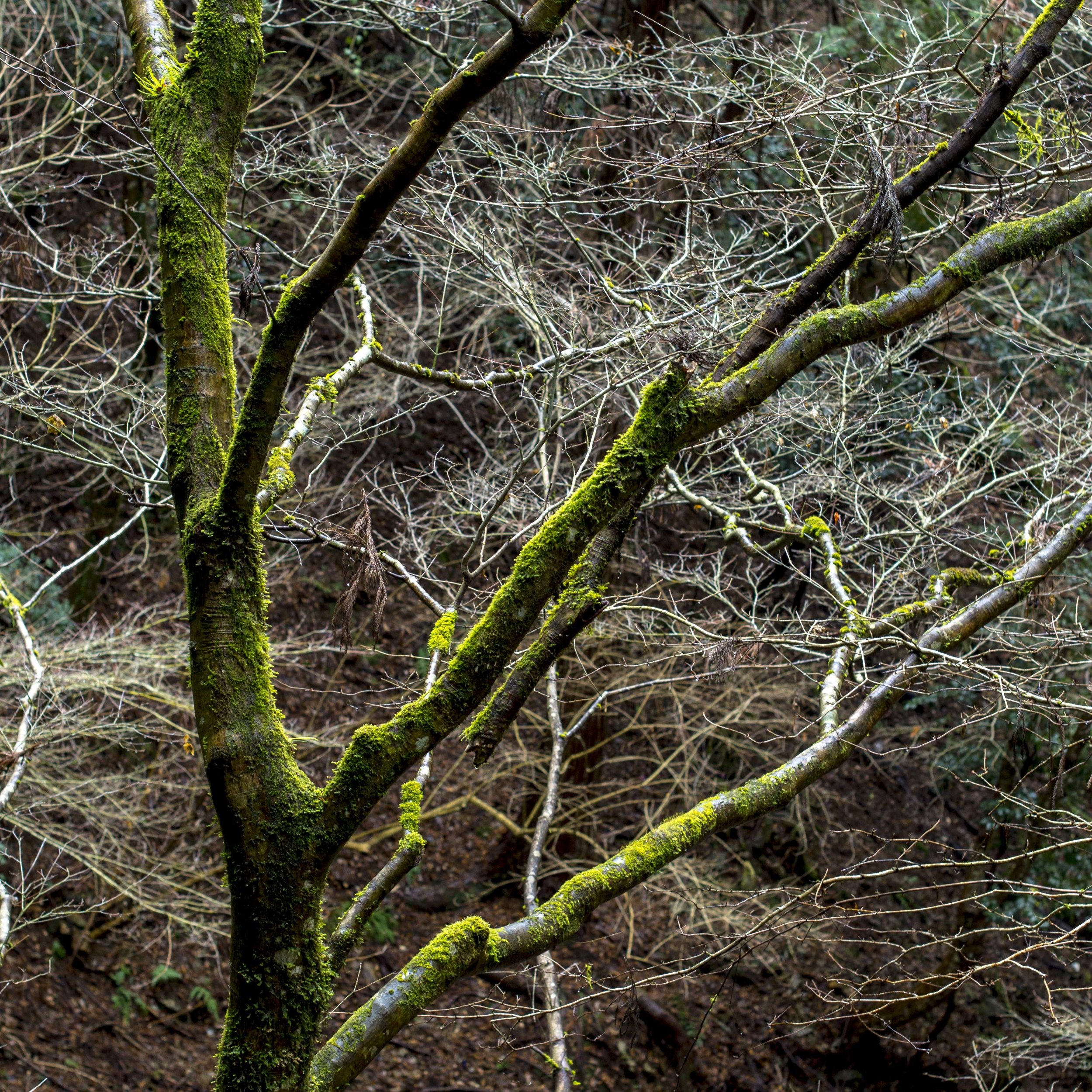
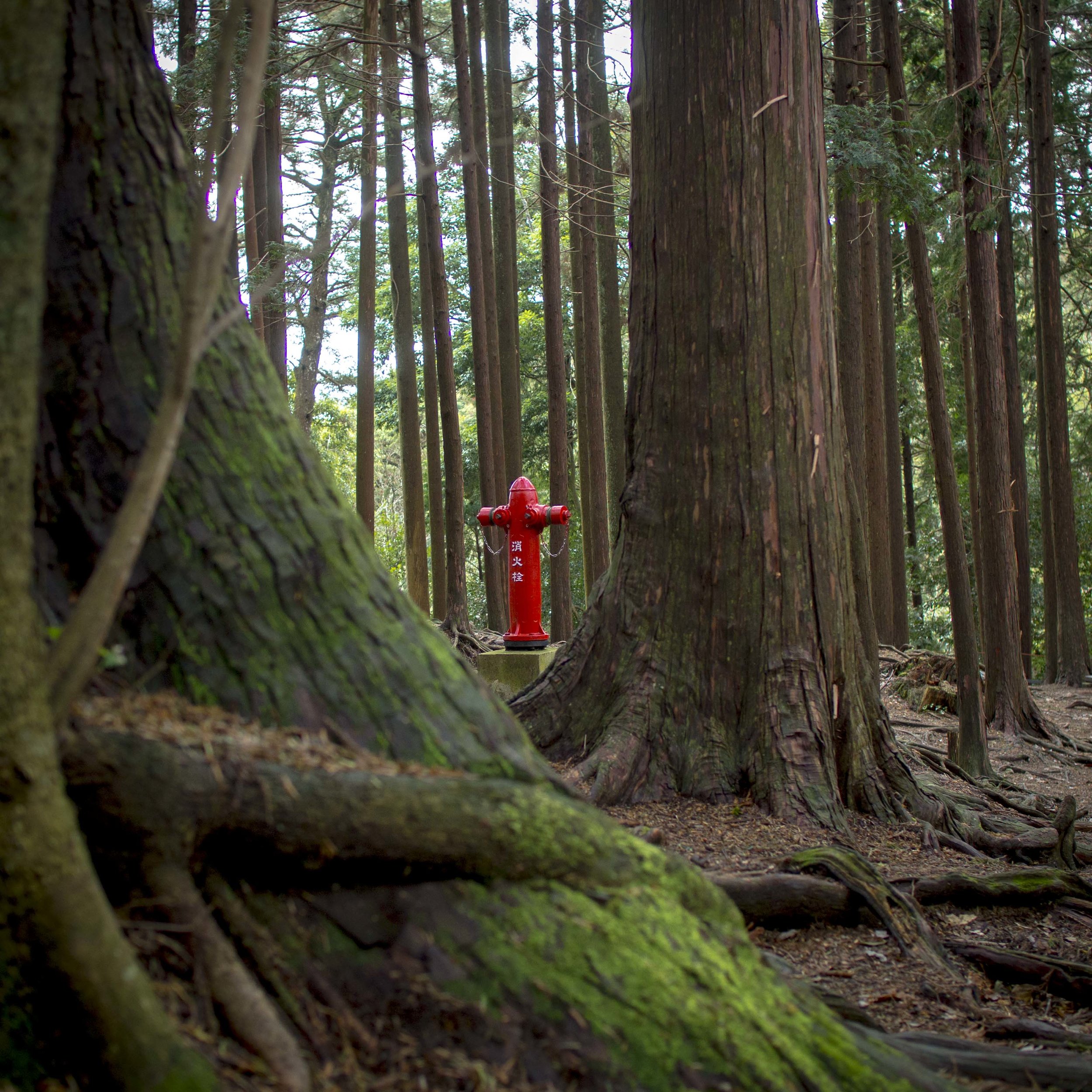
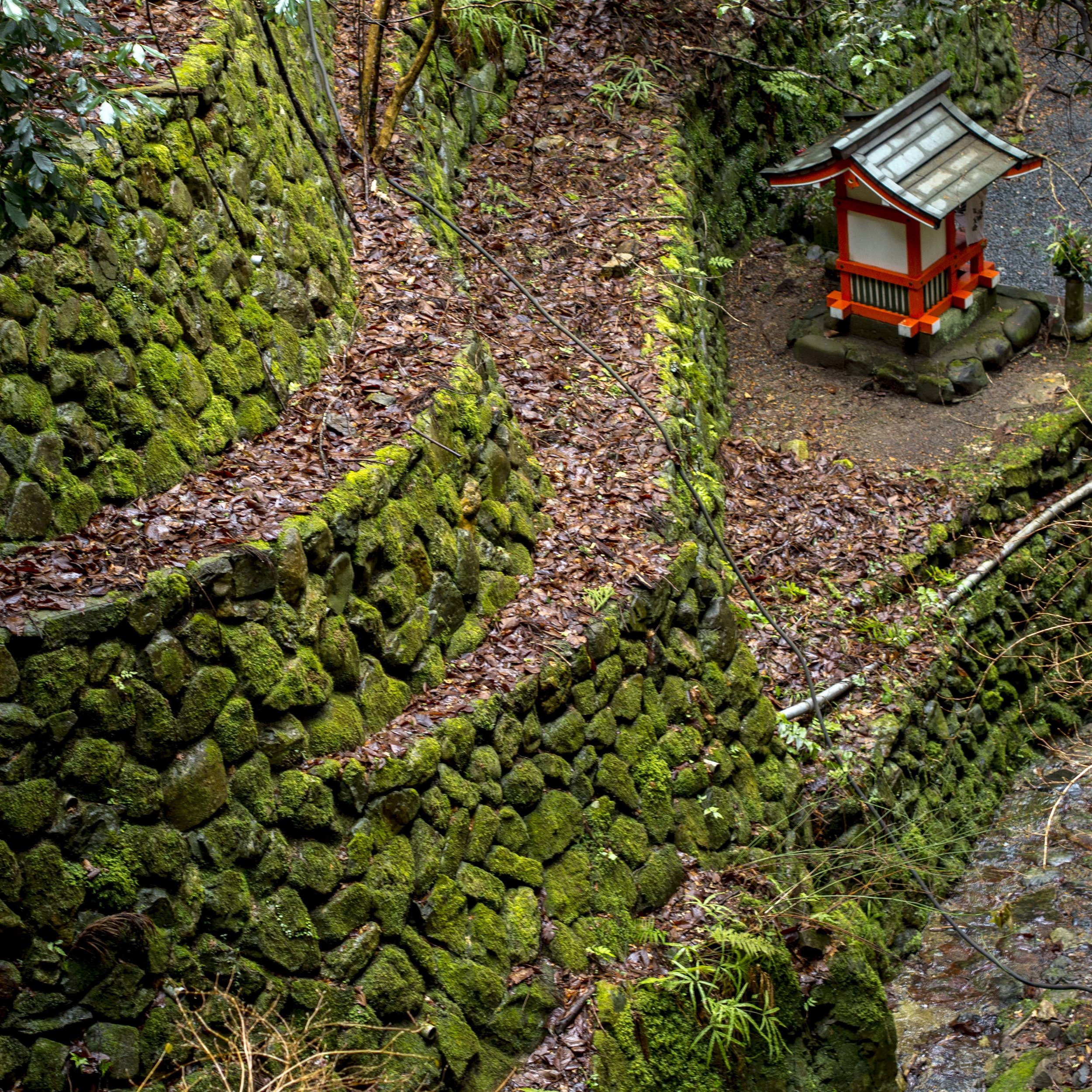
Soft sharp and hard sharp lenses.

My Olympus lens kit has grown a bit lately and it is possible to feel that some of the lenses purchased may have been redundant purchases, but even though one purchase in particular was made on the spur of the moment, the process as a whole was measured.

One of the criteria used to determine relevance, was the “feel” of the lens. This is where two lenses can share technically the same space, but have very different subject rendering.

Lets put forward a theory based on feel, not numbers, charts and resolution charts.

“Smooth Sharp”;

This is where a lens shows a rich, smooth, lushness. This look reminds me of a lot of medium format lenses from the height of film shooting days (Mamiya and Bronica especially). Medium format offered inherently good enough quality to allow the designers of it’s lenses more room for character or just sharpness. I also equate this with the Canon look I was used to with the 5D mk3/7D mk1. Most 35mm lenses were sharpness biased (obsessed), because that format was transitioning in the 1980’s through to the 2000’s from too small, to enough for pro work and the lens was the bigger contributor to the formula.

The lenses I have that are “Smooth sharp” are;

The 25mm f1.8, 12-40 pro*, 75-300 and 45mm at f1.8-2.8.

Both the 25mm and 12-40 have been on the outer with me at one point or the other. Their high sharpness is not clearly evident and both share excellent smooth, but fast drop off Bokeh, which also punishes focus errors (I possibly do not see this with…

Both the 25mm and 12-40 have been on the outer with me at one point or the other. Their high sharpness is not clearly evident and both share excellent smooth, but fast drop off Bokeh, which also punishes focus errors (I possibly do not see this with the 75-300 simply because it is so slow). This had the combined effect of low perceived sharpness, that on closer investigation was false.

Plenty of fine detail and the smooth sharp lens files also enlarge well.

Plenty of fine detail and the smooth sharp lens files also enlarge well.

Smooth sharp lenses are excellent for people, general shooting and jpeg users. The forgiving nature of their sharpness can simply make an image look good with little effort.

What they seem to be weak at is dealing with “mushy” high ISO’s and murky light.

*

Hard sharp;

More like early top tier 35mm lenses of the past, hard sharp lenses have strong micro contrast, which also seems to lead to more coherent (messier), long transition Bokeh. They often look less rounded in presentation, rendering the world in a more literal, less forgiving way, but when maximum perceived detail is needed, they shine. These lenses have a habit of looking sharp even when the image is not perfect, hiding slight motion blur and noise artefacts well. I feel these lenses are best suited to landscapes, tough light (both high and low contrast) and any subject that needs more detail rather than gentler presentation. What they are less good at is communicating glow or glassiness.

My “Hard Sharp” Olympus lenses are;

The 17mm f1.8, 12-100 pro, 40-150 pro, 45mm after f2.8.

The 40-150 pro handled ISO 3200 on the EM5’s better than any other lens I own. I put this down to Olympus paying close attention to the micro contrast of this lens.

The 40-150 pro handled ISO 3200 on the EM5’s better than any other lens I own. I put this down to Olympus paying close attention to the micro contrast of this lens.

The exception lens;

The 75mm f1.8 seems to offer the best of both worlds. Lush and deep in rendering, it also jumps off the page with very fine detail. The only “flaw” it has is pronounced flattening of perspective.

Camera considerations.

There is also a balancing effect these lenses can provide when pairing them with various Olympus sensors. The EM1 mkI/II both use phase detection on-sensor focussing and stronger noise reduction that changes the sensor’s rendering ever so slightly. I feel (and DP review goes some way to bearing this out), that these sensors have a more “smooth sharp” look where the other sensors are “hard sharp”. With this in mind, it is possible to mate the most exaggerated or balanced combinations;

The Pen F with 12-100 for maximum clarity and perceived fine detail resolution as a landscape paragon.

The EM1 mk2 with 12-40 for higher smoothness and gentlest rendering at the expense of the characteristic M43 hyper-sharp look.

I may be talking out of my hat completely, but I do not see any need to ignore my intuition when it comes to how my gear makes me feel and creatively think as I use it, as that alone is a relevant part of the process.
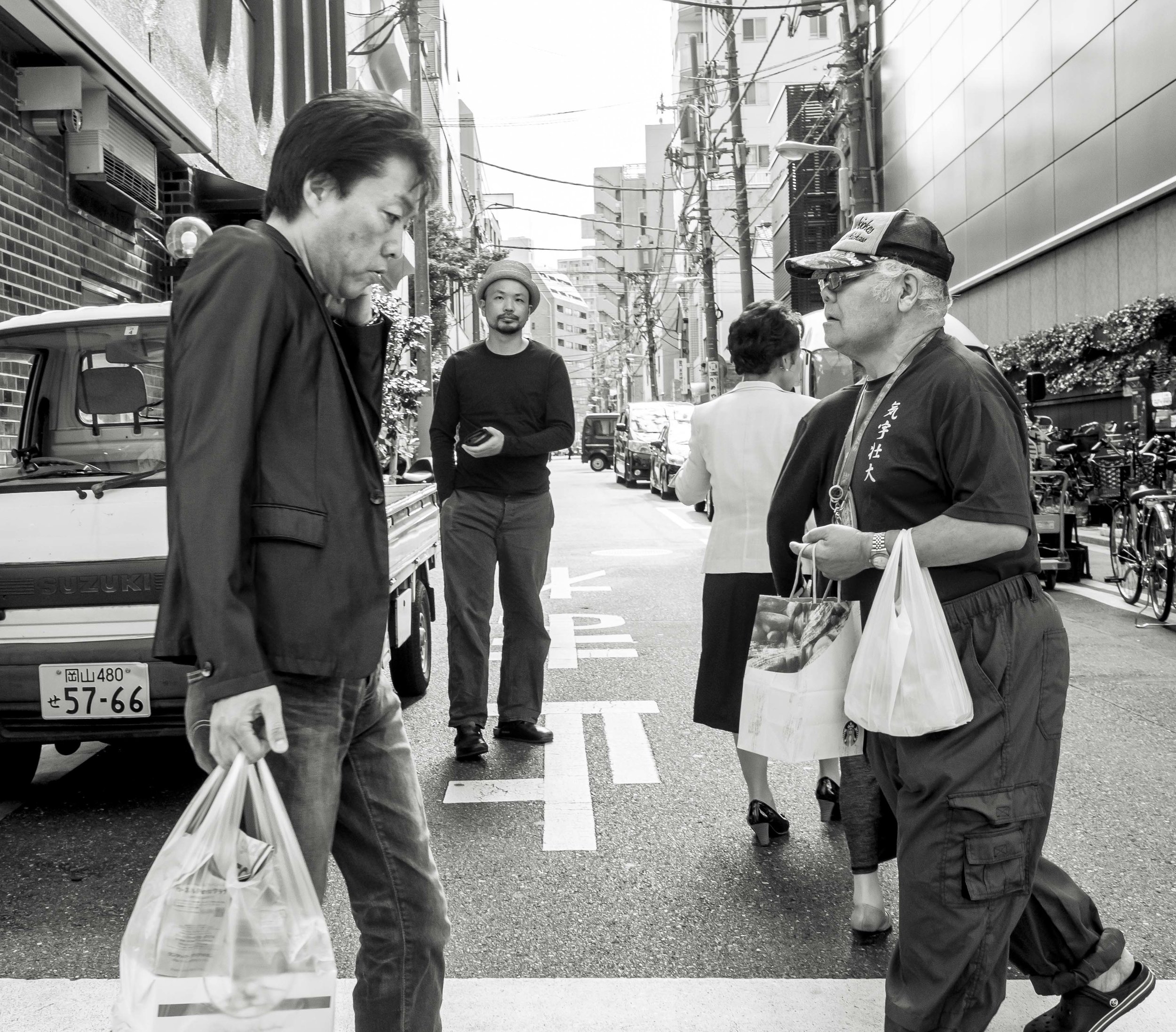
The other "true" format

The other format that I find more genuine and less compromised is the cinematic or semi panoramic one.

The human eyes see naturally into a panoramic or wide screen format. There is a reason films are shot in 16:9 ratio or wider. It looks awesome and feels natural.

For stills, it has an amazing feeling of depth and drama, forcing the shooter to use the whole frame width to tell a story. Rather than the rather ambiguous semi wide 3:2 or semi square 4:3 ratios, the true cinematic super wide commits to a look that is far stronger, but more demanding.

You cannot often lift a super wide from a rectangle (all of these were), but the pixel wastage can be crippling (as can paper wastage).

Rather than the instant, almost invisible comprehension the square offers, the cine-wide makes the viewer look left to right (or right to left depending on the subject).

Rather than the instant, almost invisible comprehension the square offers, the cine-wide makes the viewer look left to right (or right to left depending on the subject).

Comprehension of the space is forced into an exploration dynamic. This is not a glance and hold format like the square, it is a look and explore format.

Comprehension of the space is forced into an exploration dynamic. This is not a glance and hold format like the square, it is a look and explore format.

This “Super-Cine” format can do what normal rectangles fail to do. It can create drama on an epic scale.

_4120237.jpg

Depth can be used, but also the full width can tell a story from end to end.

Extra height in this image dilutes the story the two women on the end add.

Extra height in this image dilutes the story the two women on the end add.

_4090451.jpg
untitled-.jpg
The power of the strong graphic elements in this image are again reduced with more height. The image becomes half about the seats and half the negative space above, to no benefit.

The power of the strong graphic elements in this image are again reduced with more height. The image becomes half about the seats and half the negative space above, to no benefit.

The sweeping landscape suddenly emerges from even confined spaces.

There are even opportunities for multiple stories to intermingle. I think the true master of this format (not me) could balance multiple elements, allowing each their own strength, but use them also to support each other to even greater combined eff…

There are even opportunities for multiple stories to intermingle. I think the true master of this format (not me) could balance multiple elements, allowing each their own strength, but use them also to support each other to even greater combined effect.

Repetition can also be used in a stronger fashion.

Repetition can also be used in a stronger fashion.

Flexible Portrait framing

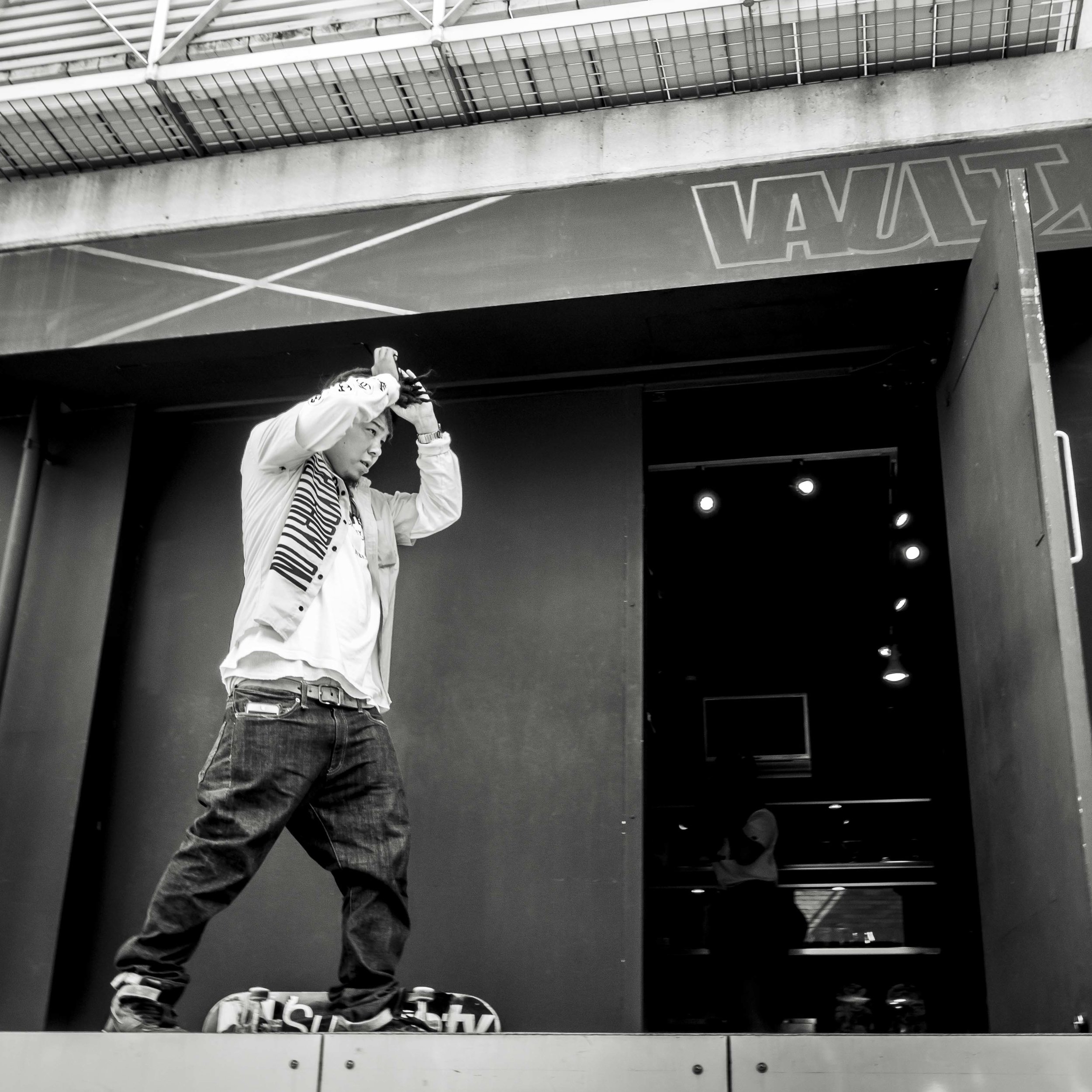
The square image (You may have noticed a tread here), seems to have enormous flexibility in portrait framing options. I am not saying that rectangle images do not, but the square seems to allow the rules to be broken.

The normal “looking in” composition horizontal images prefer and portrait orientated images require.

The normal “looking in” composition horizontal images prefer and portrait orientated images require.

A rule breaking centred figure. Still seems ok in the bias neutral square.

A rule breaking centred figure. Still seems ok in the bias neutral square.

The “looking to the short side” image. Still solid. This can be dramatic with a rectangle is appropriate to the situation/subject, but is usually too strong a statement image for a general portrait.

The “looking to the short side” image. Still solid. This can be dramatic with a rectangle is appropriate to the situation/subject, but is usually too strong a statement image for a general portrait.

Ok, let’s try again.

Centred as a compromise between facing and eye direction and balancing the edge elements. The dynamic of the younger woman on the main subjects shoulder is clear.

Centred as a compromise between facing and eye direction and balancing the edge elements. The dynamic of the younger woman on the main subjects shoulder is clear.

Slightly more balanced. More about the main subject and nothing else.

Slightly more balanced. More about the main subject and nothing else.

More dramatic and tense, but still viable? The introduction of the man on the right changes the feel of the image and the woman almost seems to be cramped, even harassed in this composition.

More dramatic and tense, but still viable? The introduction of the man on the right changes the feel of the image and the woman almost seems to be cramped, even harassed in this composition.

A benefit or something that a rectangle can do?

Square eyes

I am a little hooked on this square thing.

This may even offer a fix to an old favourite, that has never really made the big leagues due to poor luck/skill framing.

Too wide for the height needed making the woman look jammed against the side of the frame.

Too wide for the height needed making the woman look jammed against the side of the frame.

Much less tense.

Much less tense.

It may seem a little odd that I have re-discovered something that has been under my nose for any amount of time, but the reality is, only digital and then mirrorless has allowed me to think in purely square format.

35mm frame film cameras give no preview and even DSLR’s need to be in live view. Mirrorless allows you to shoot in a format or colour/mono setting and see the result before shooting.

Hip to be square.

More thinking on square format.

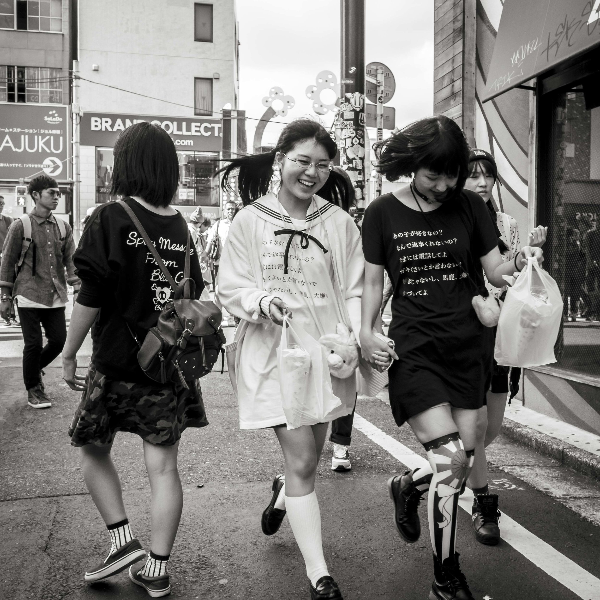
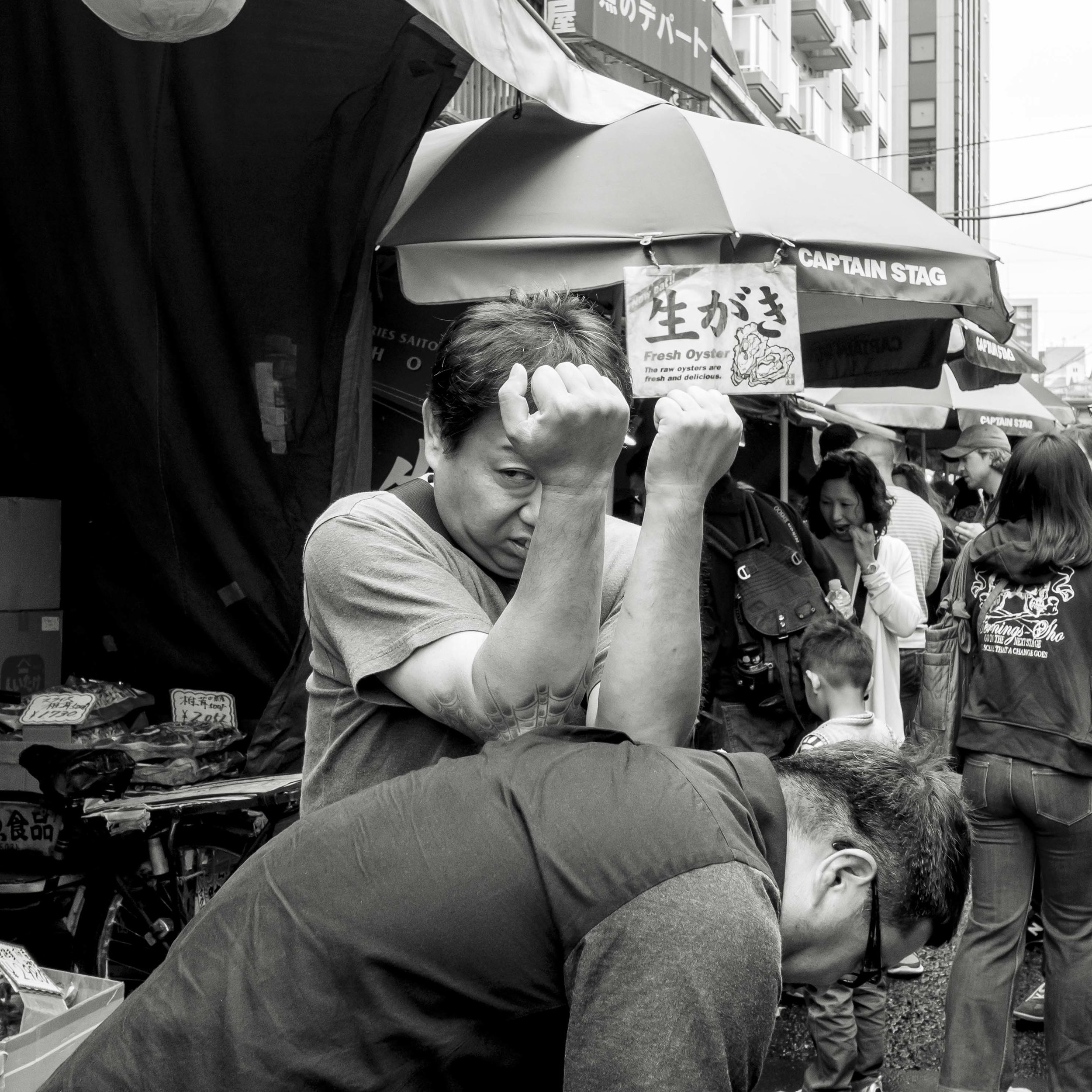
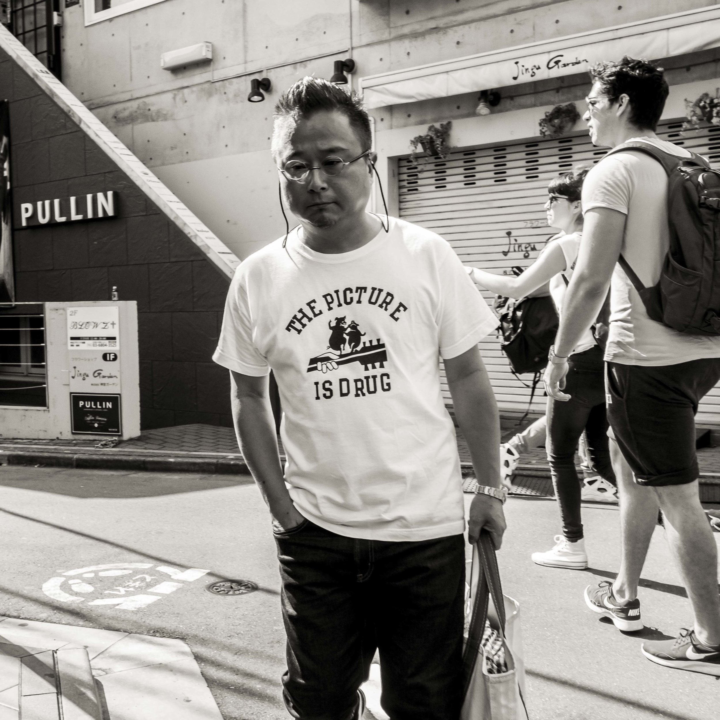
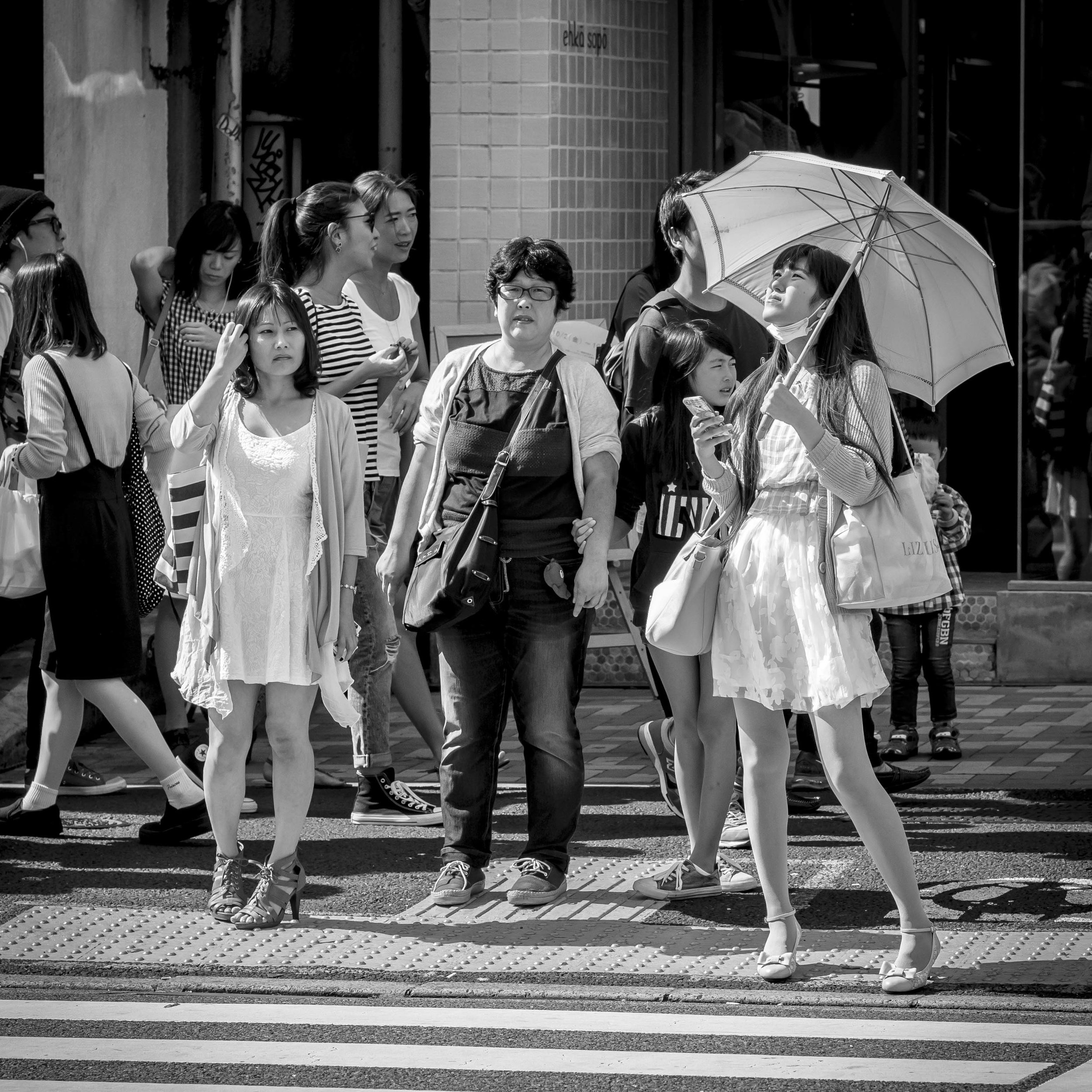
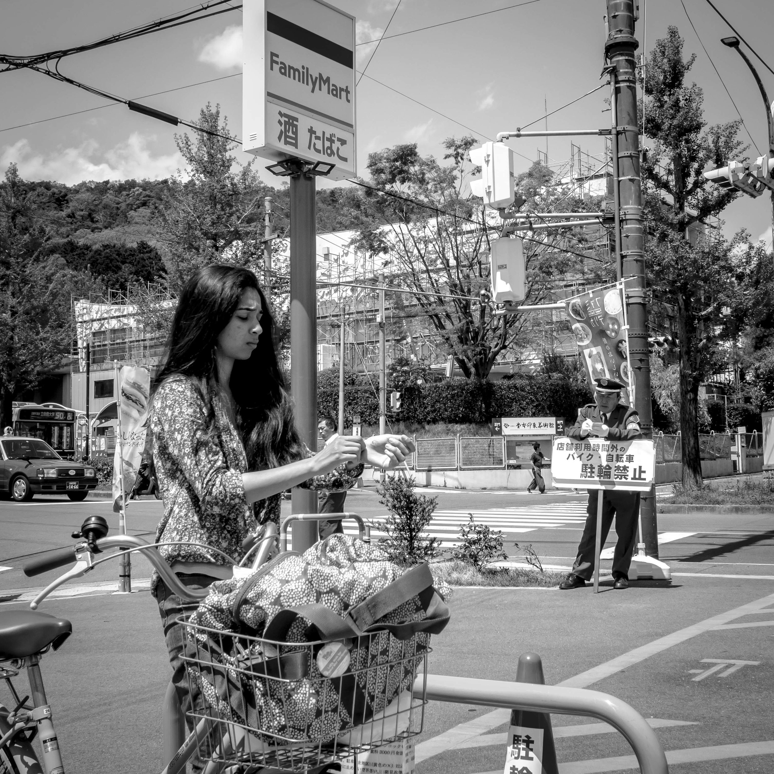
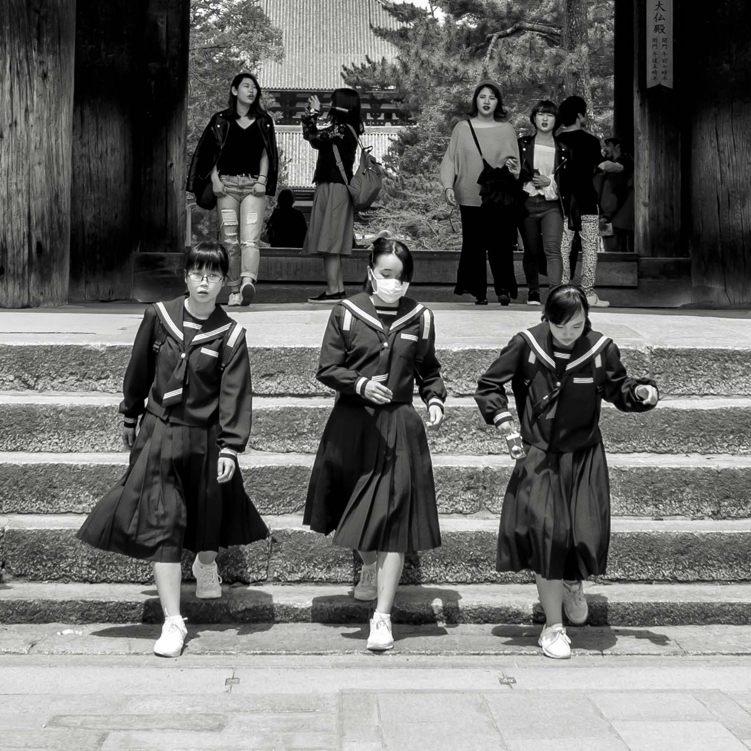
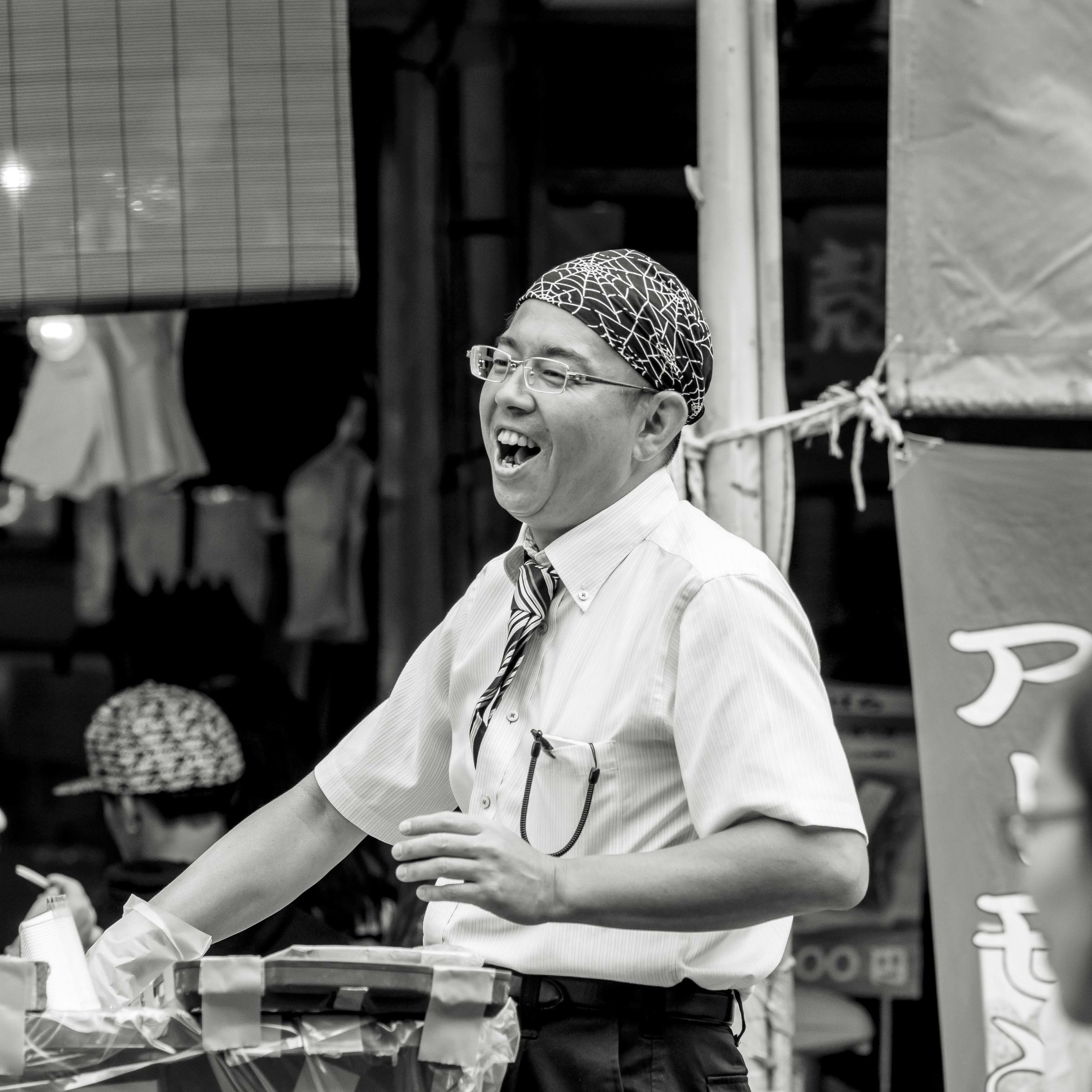
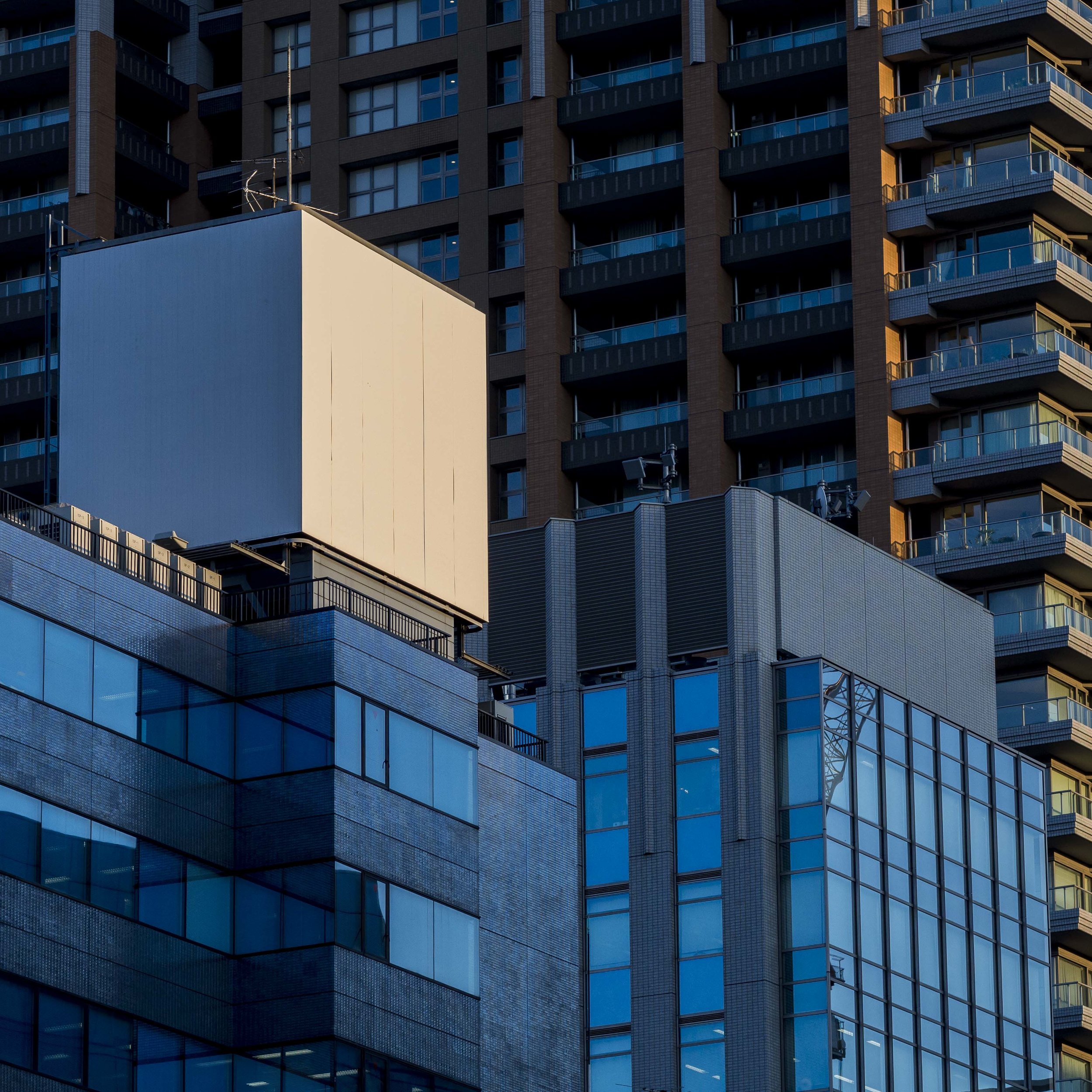
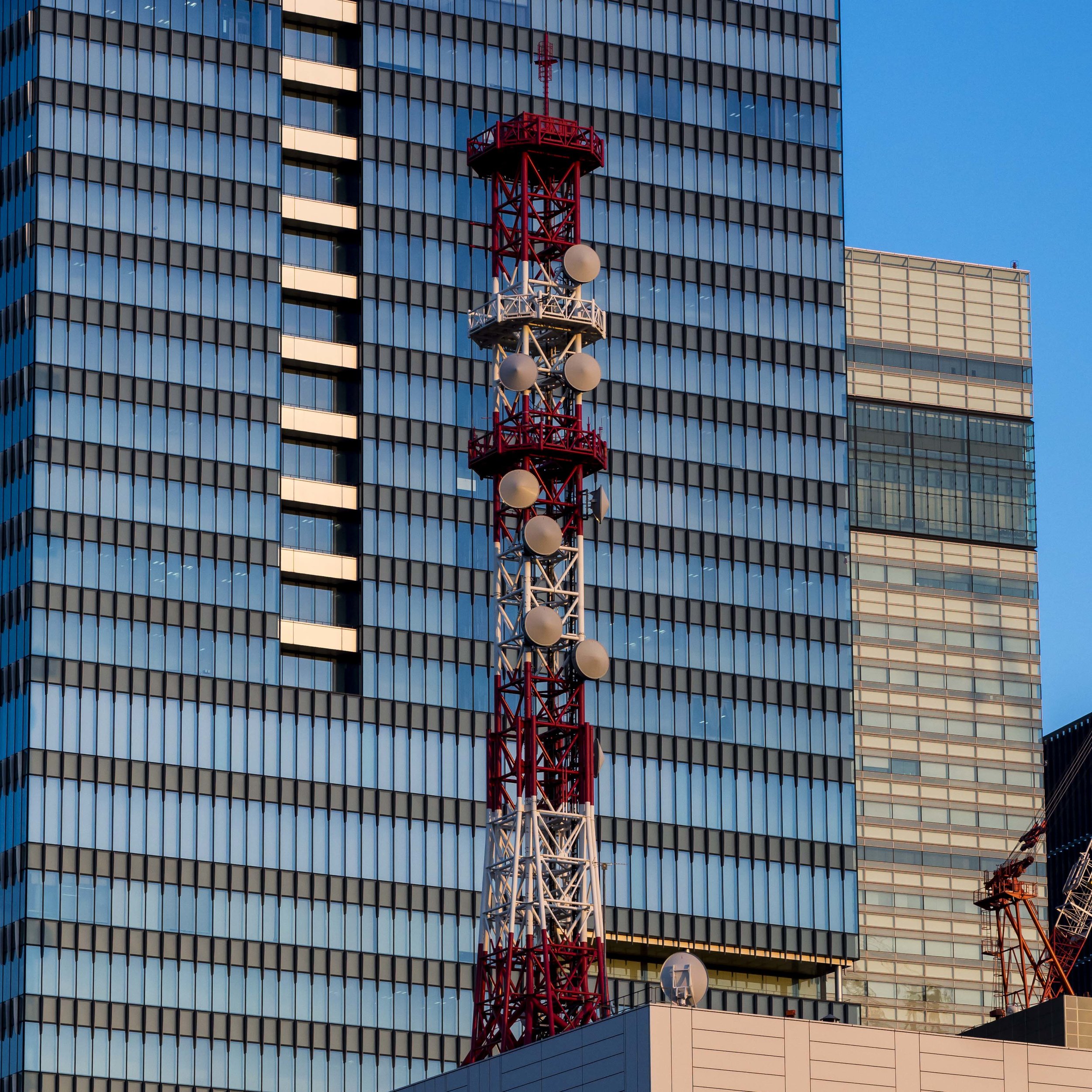
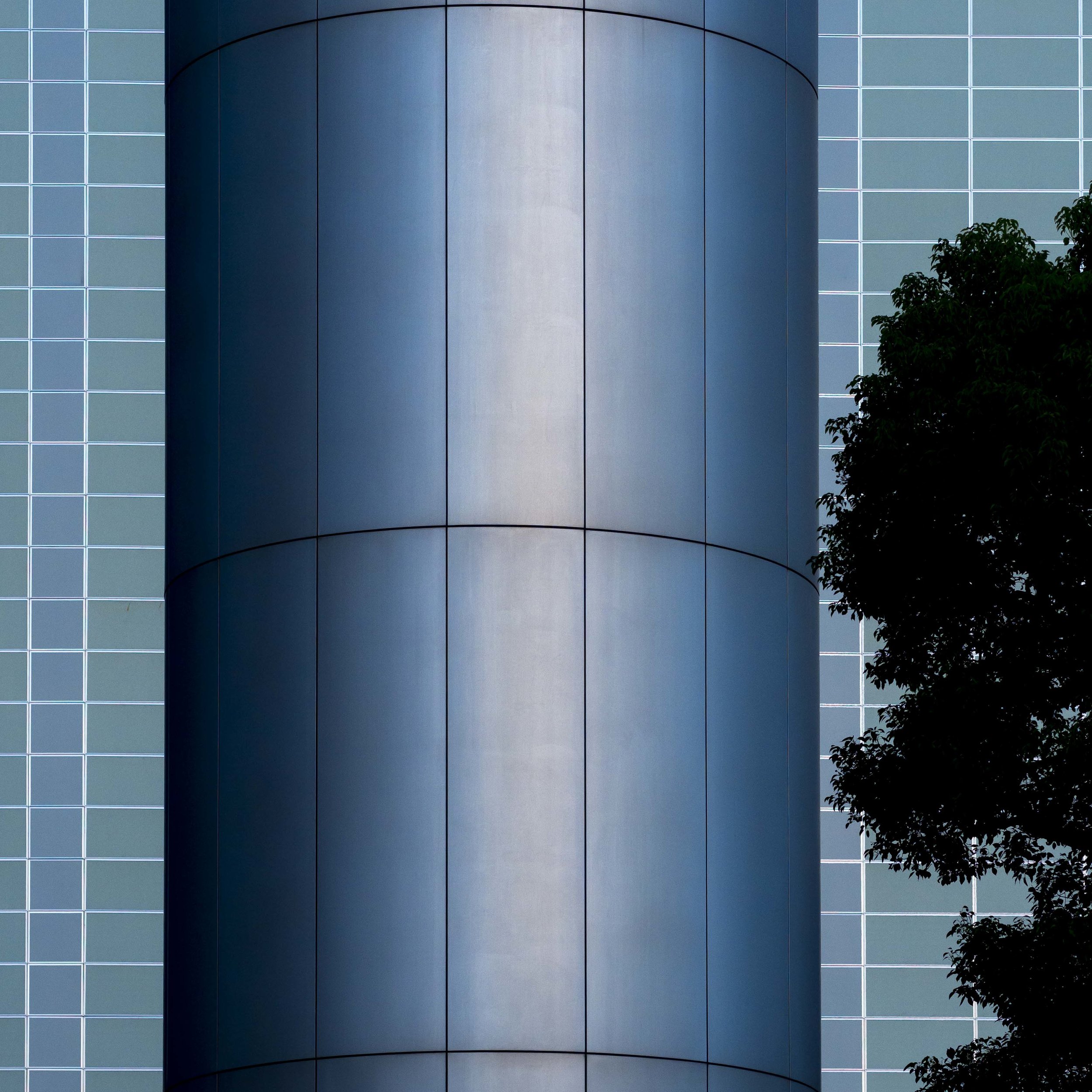
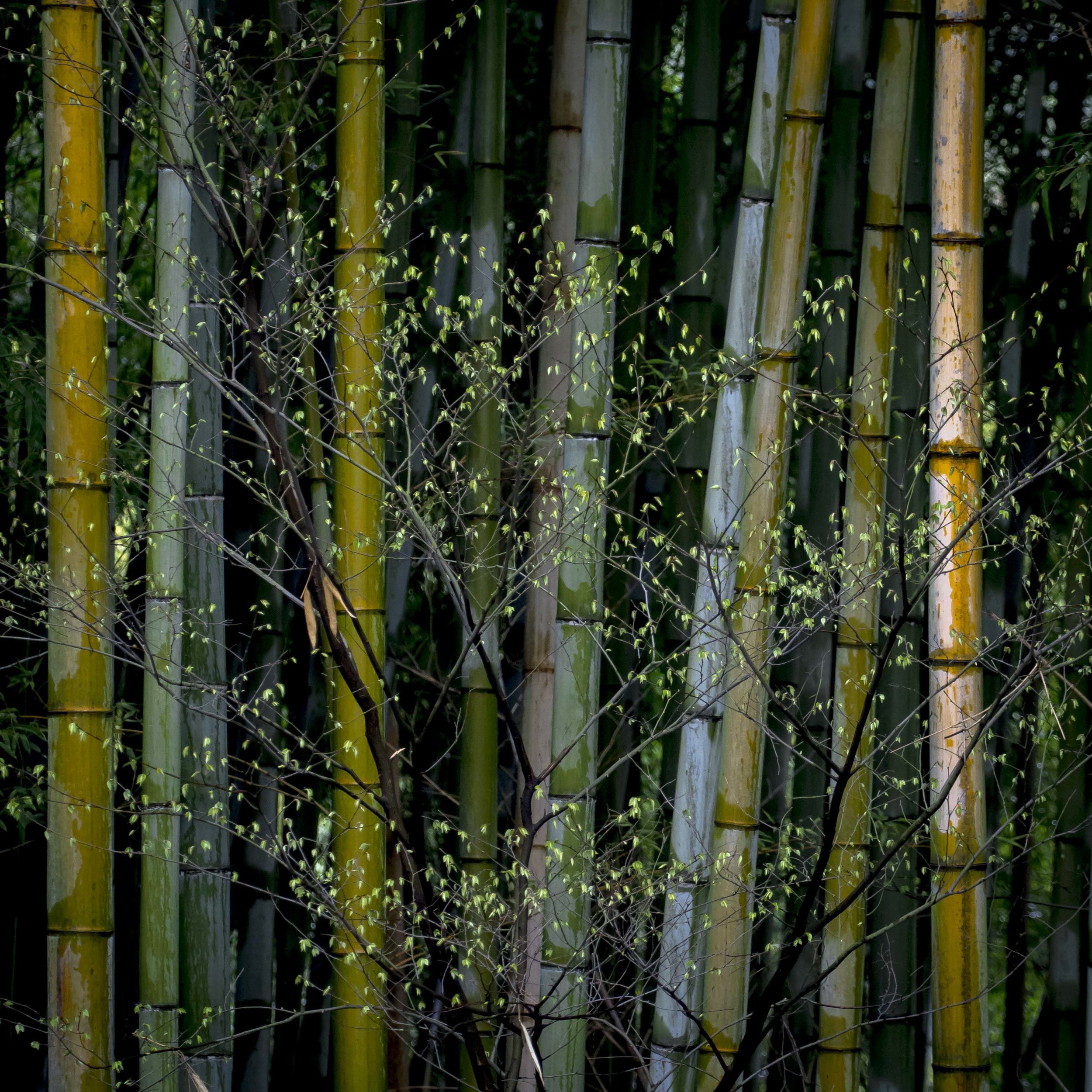
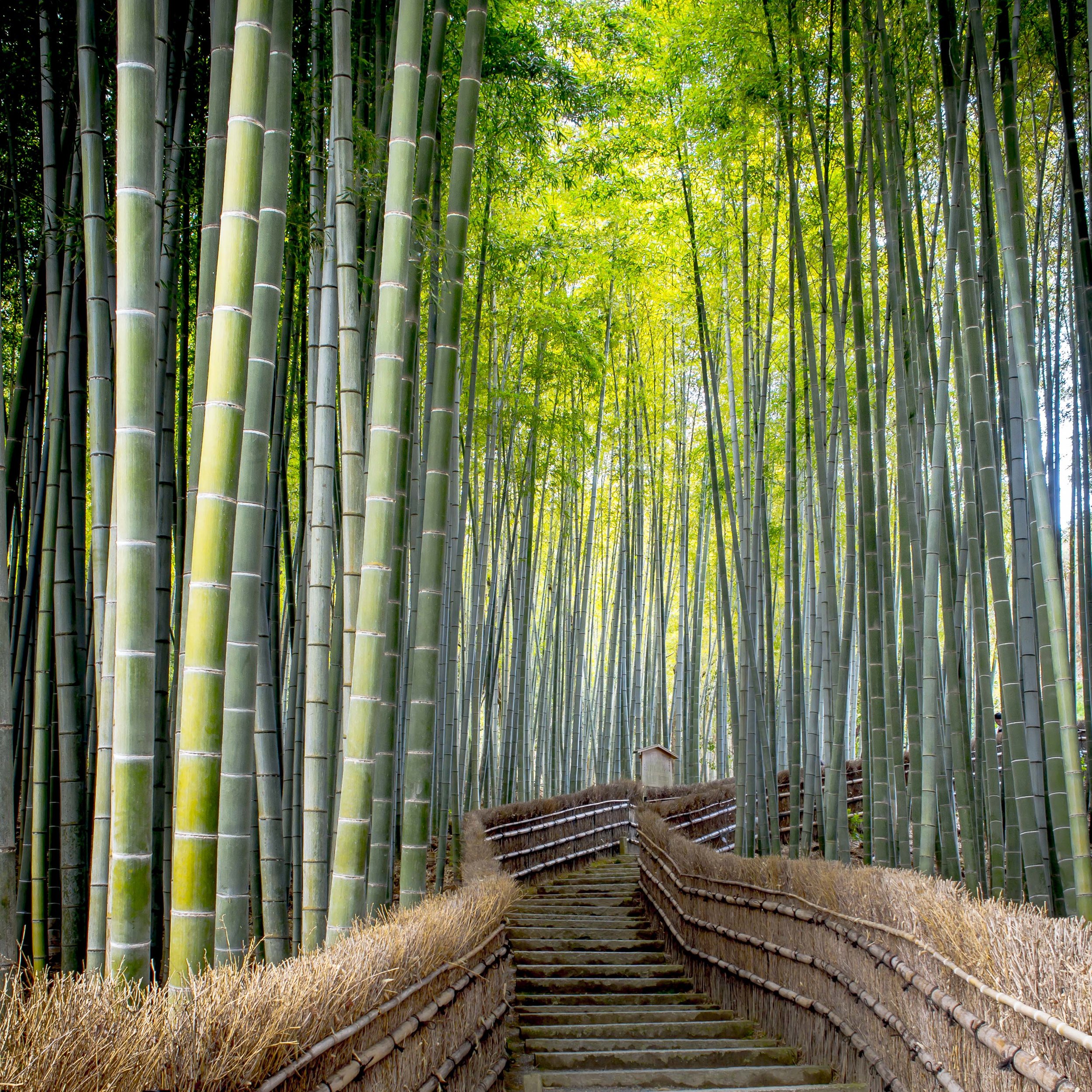
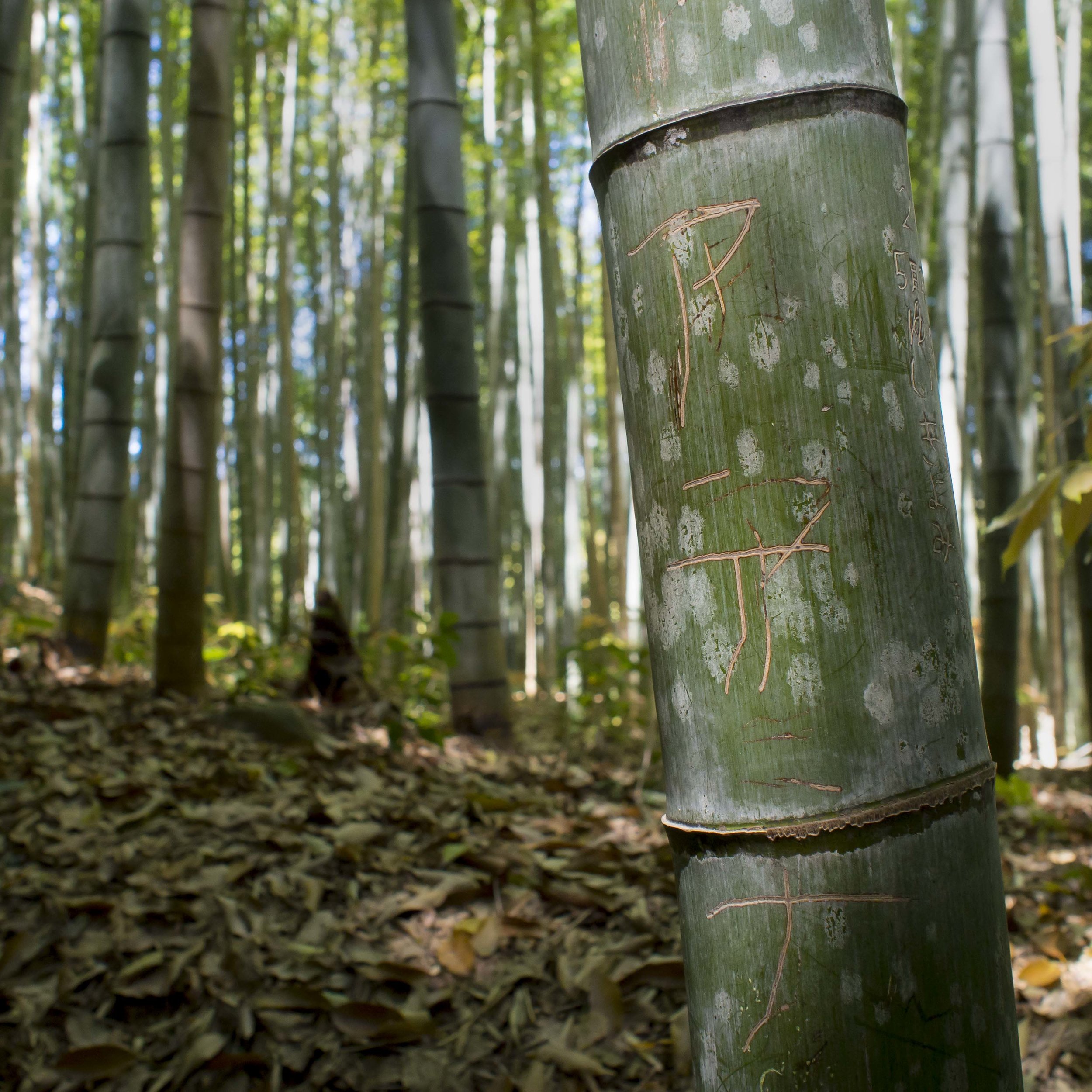
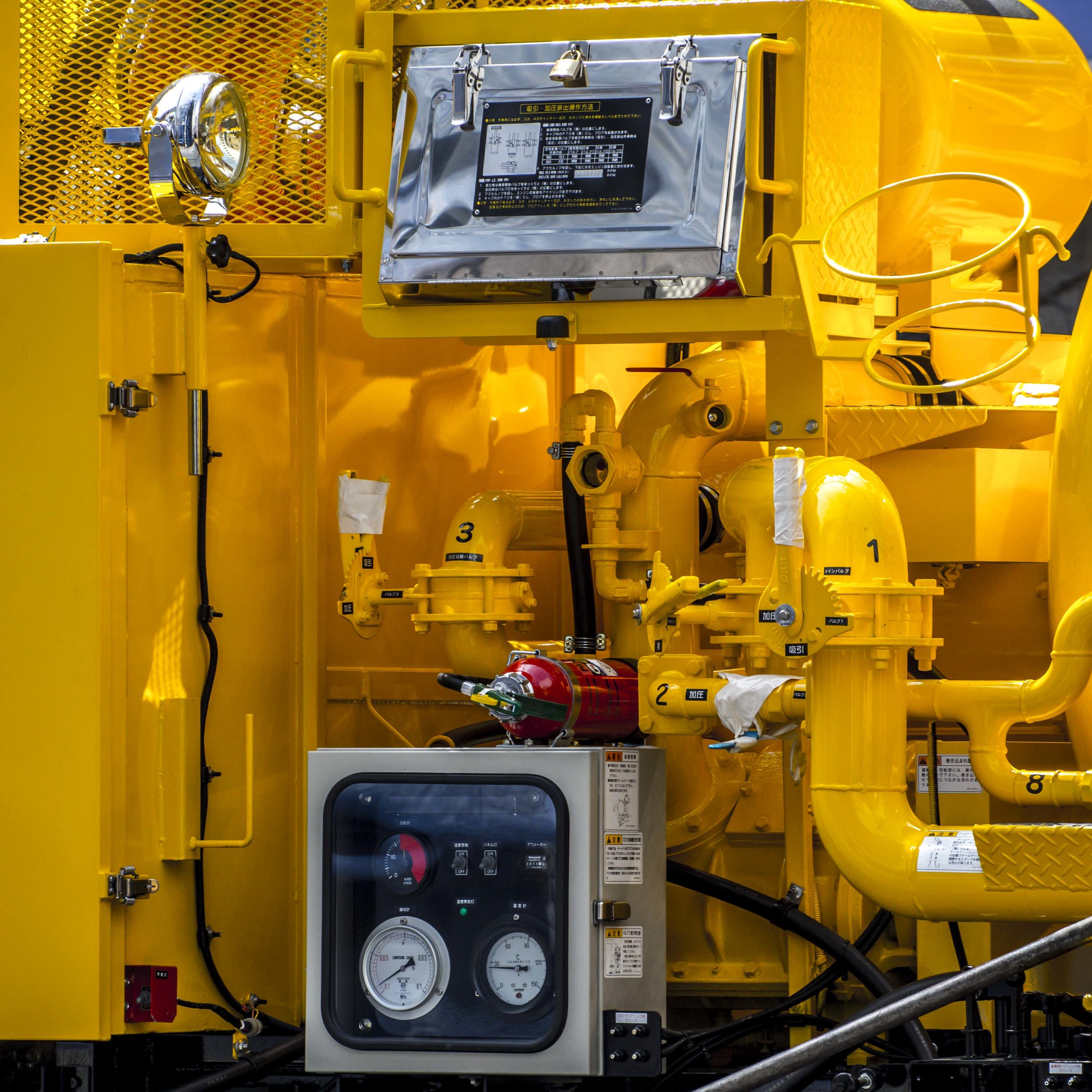
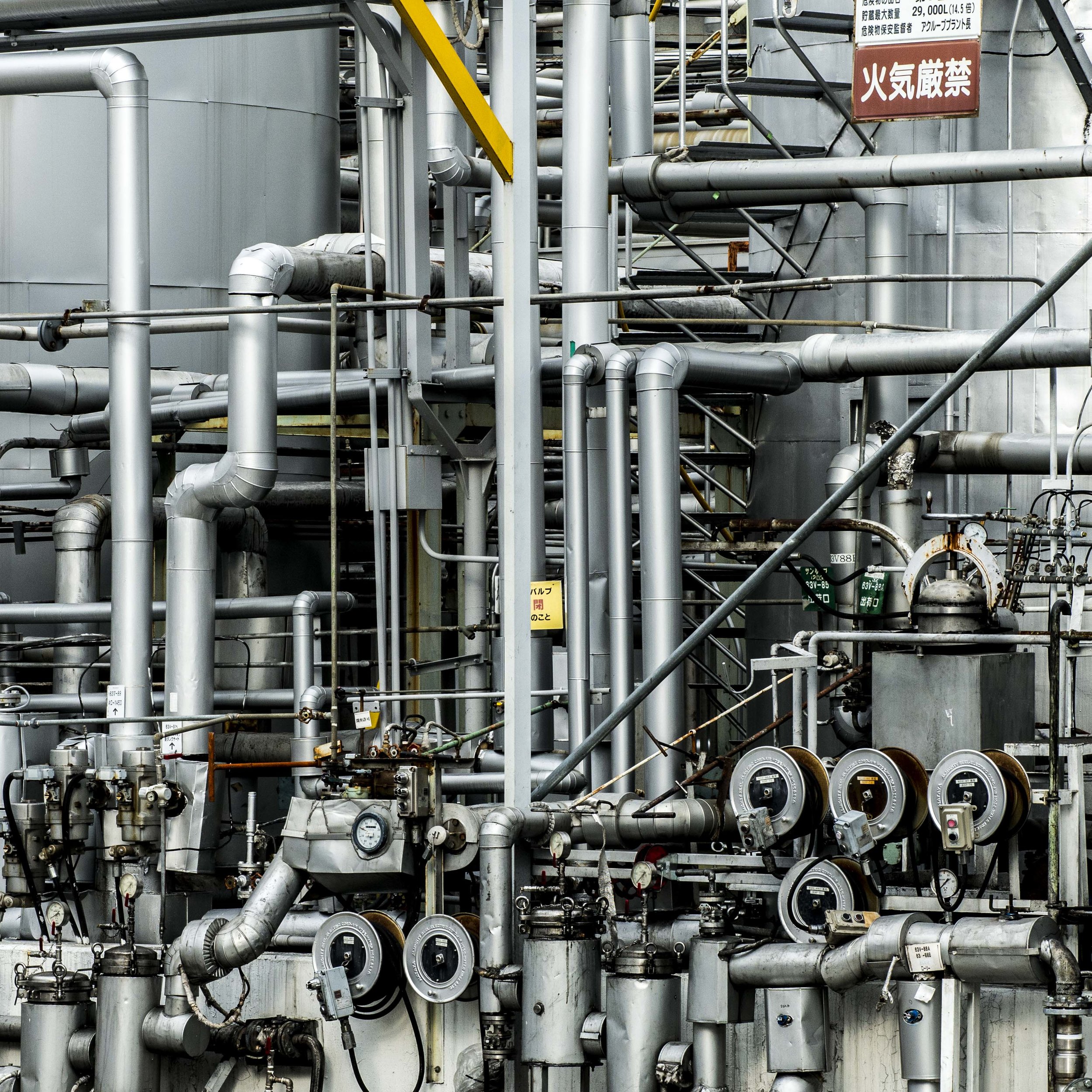
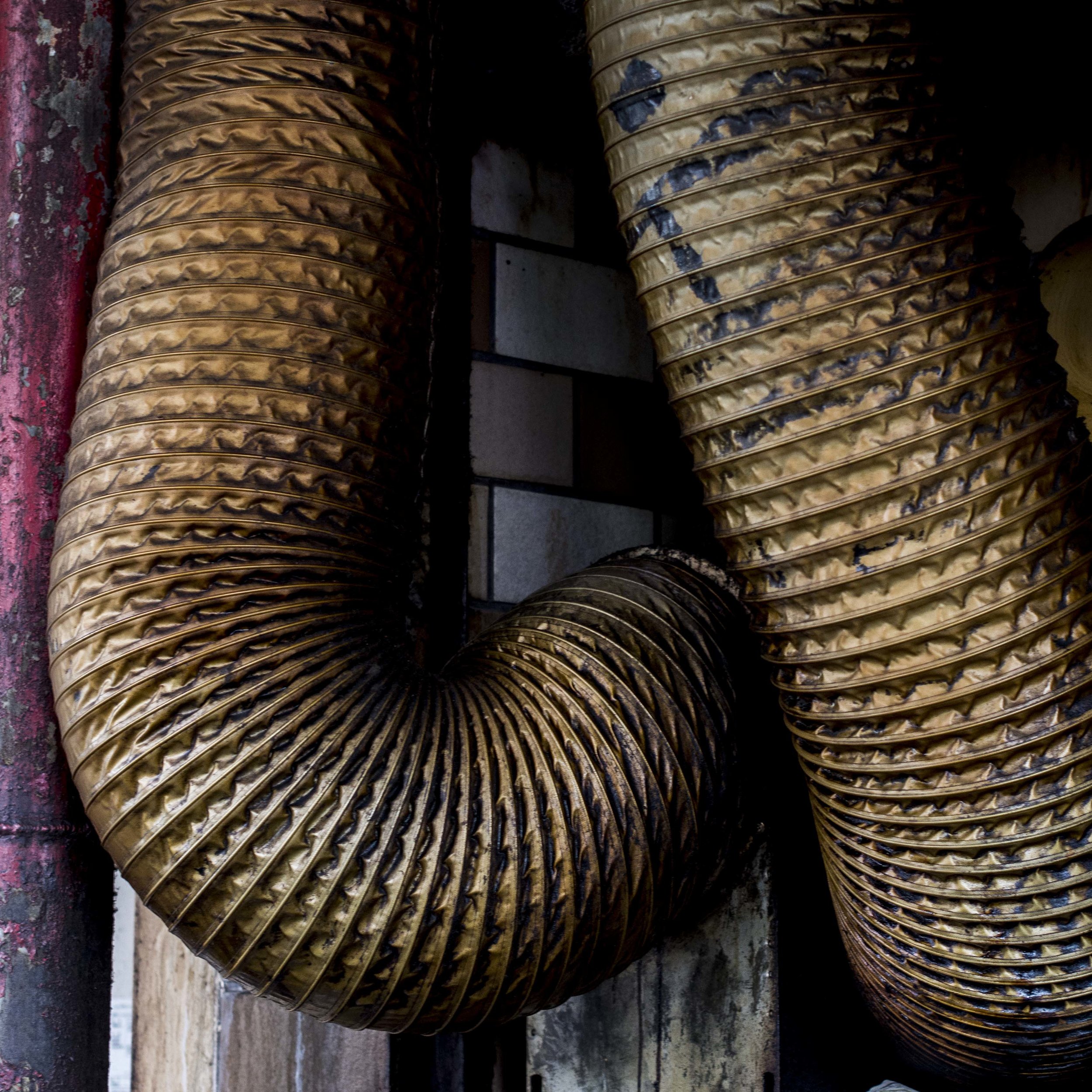
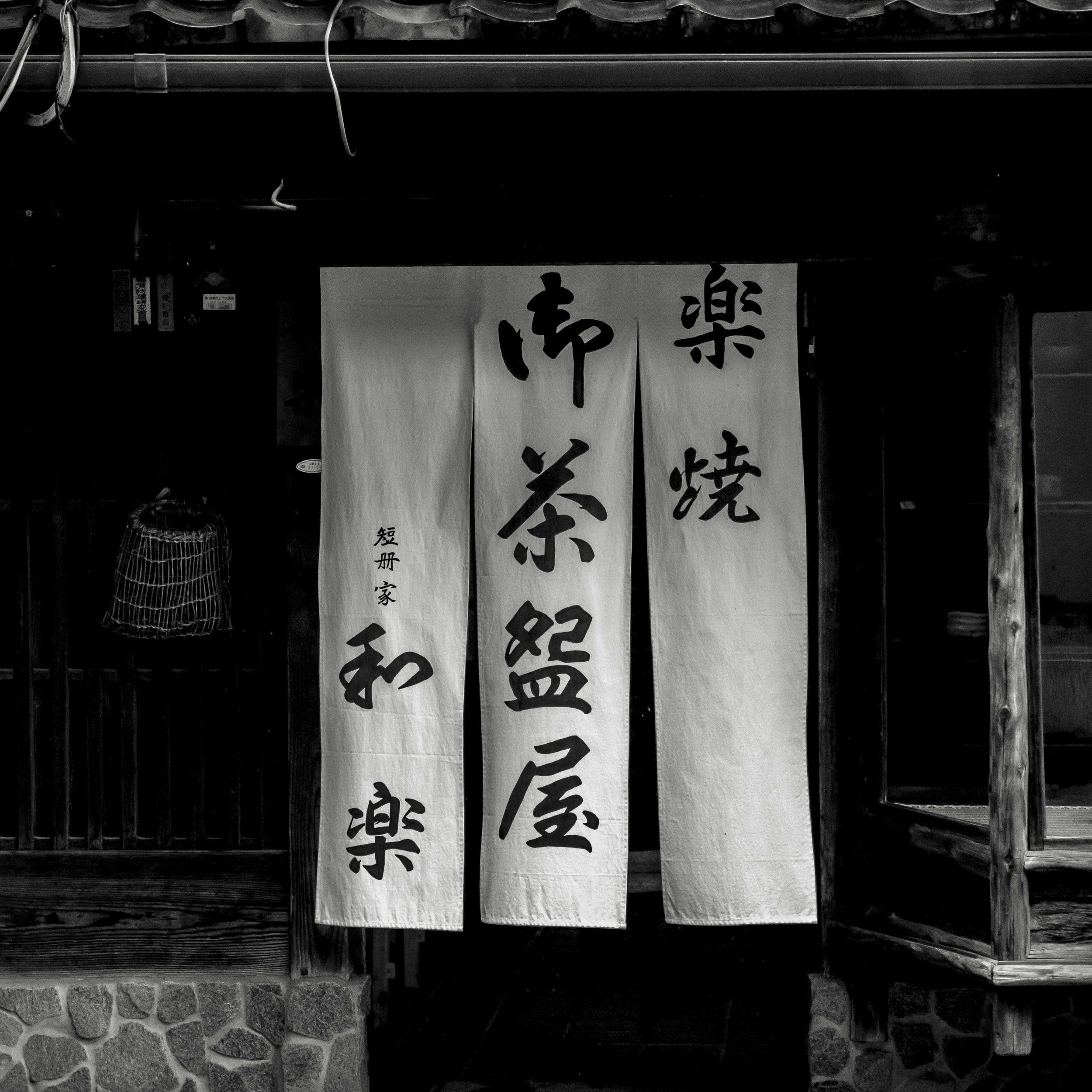
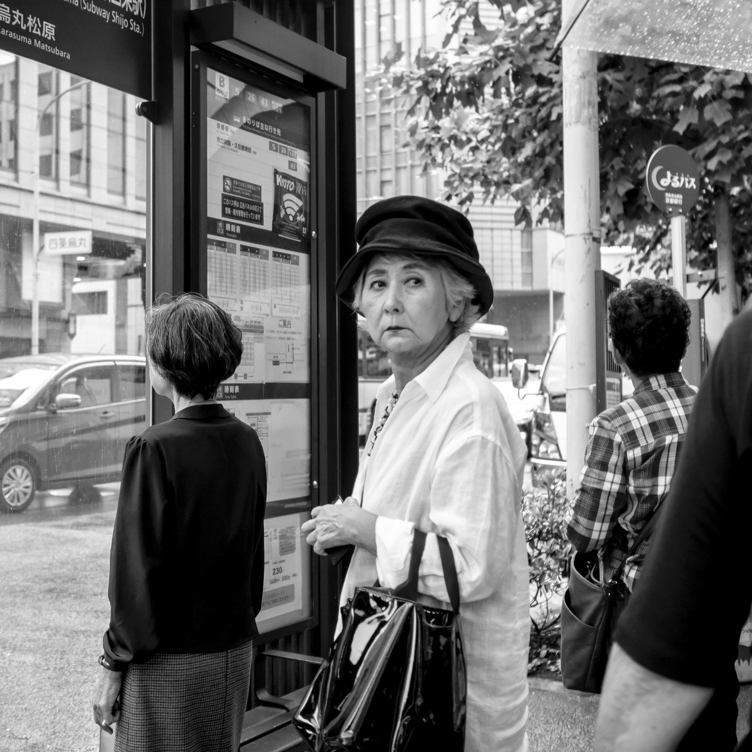
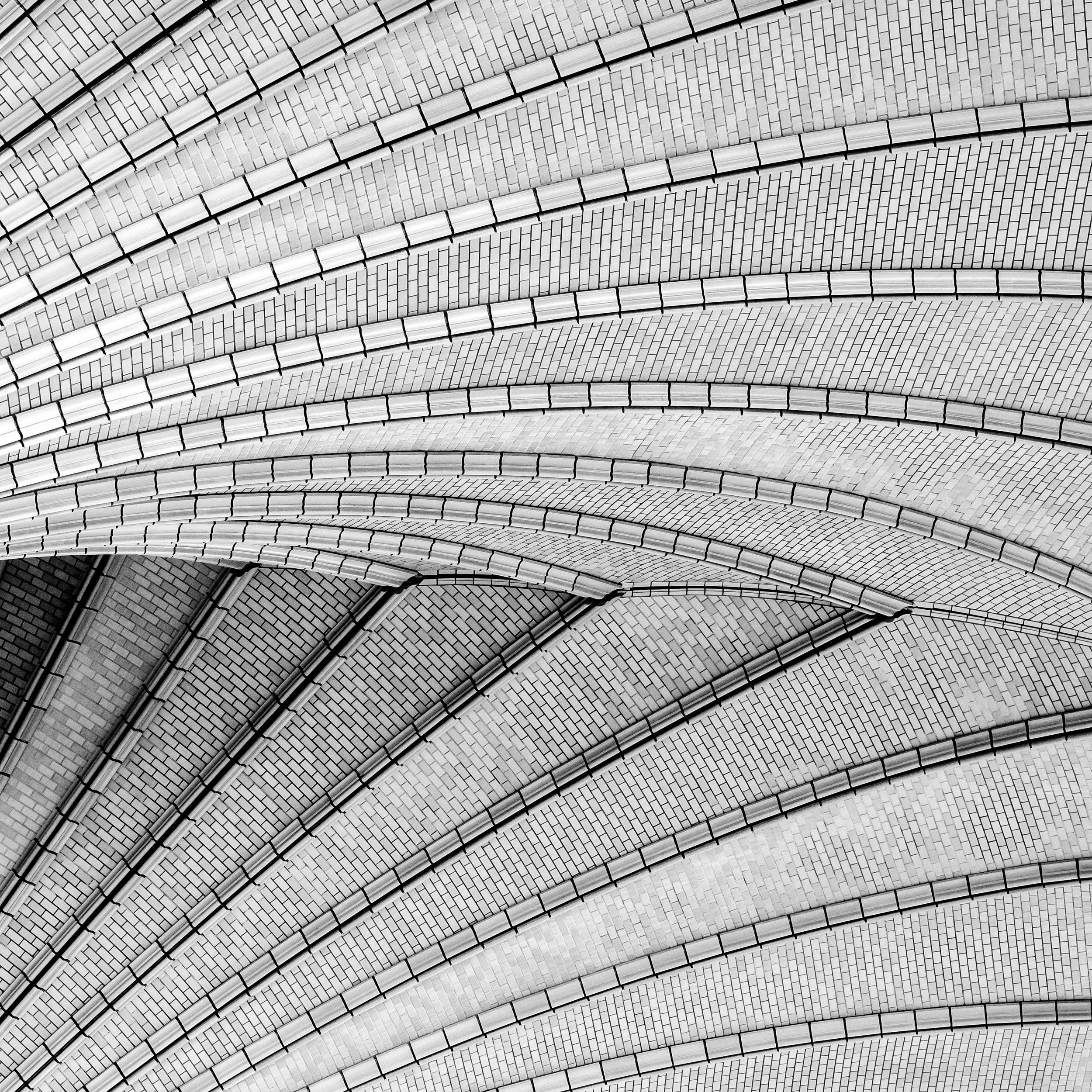
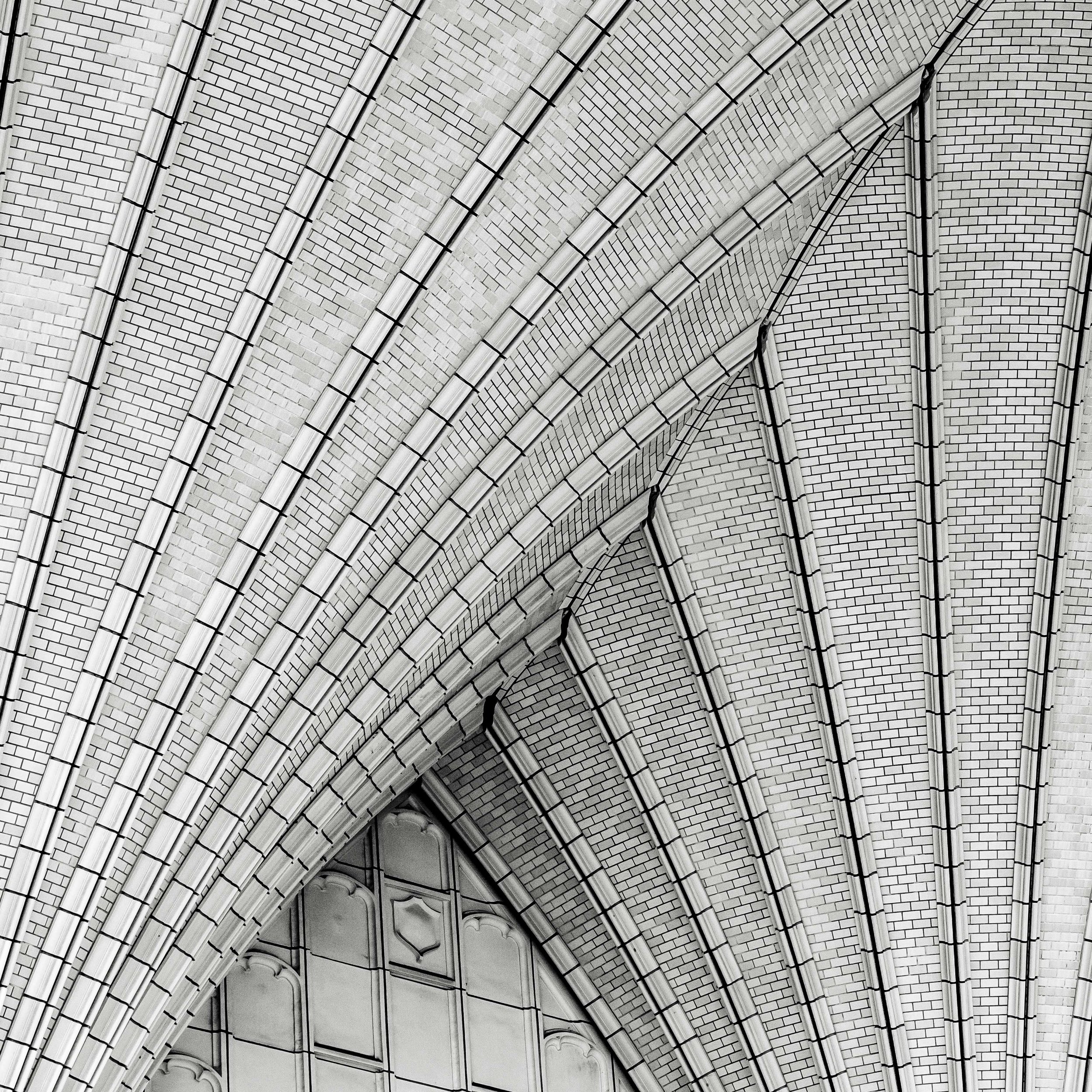
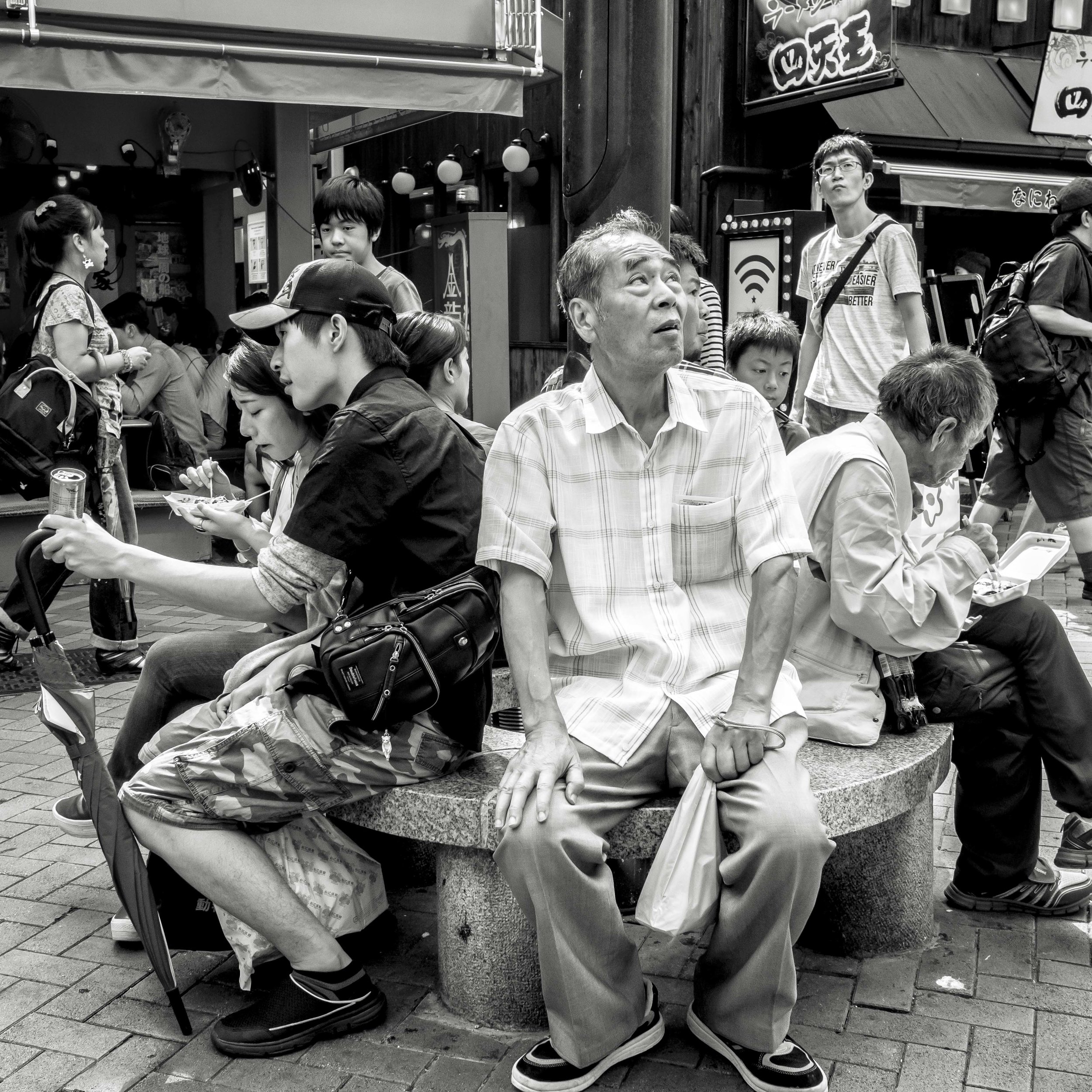
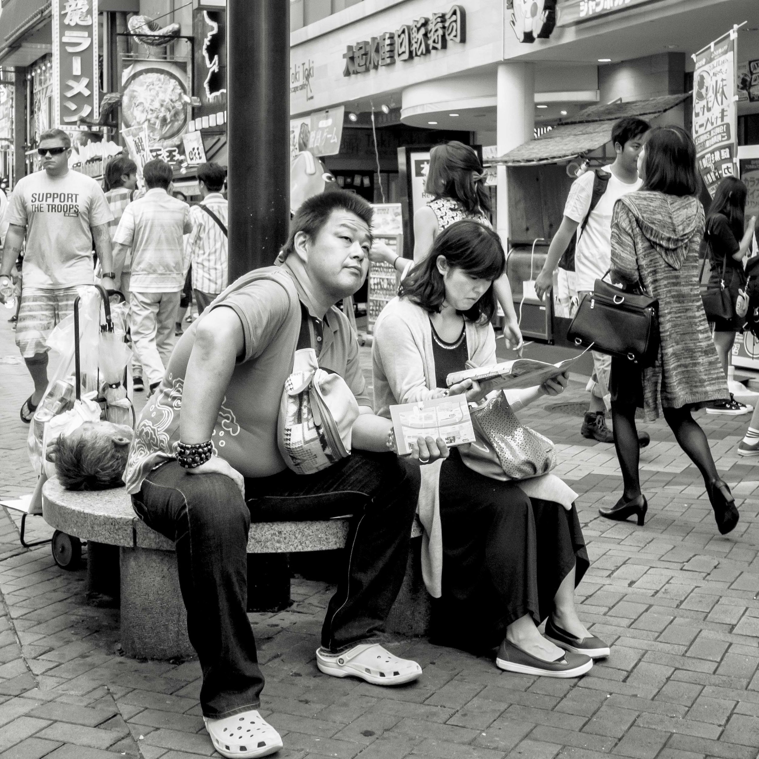
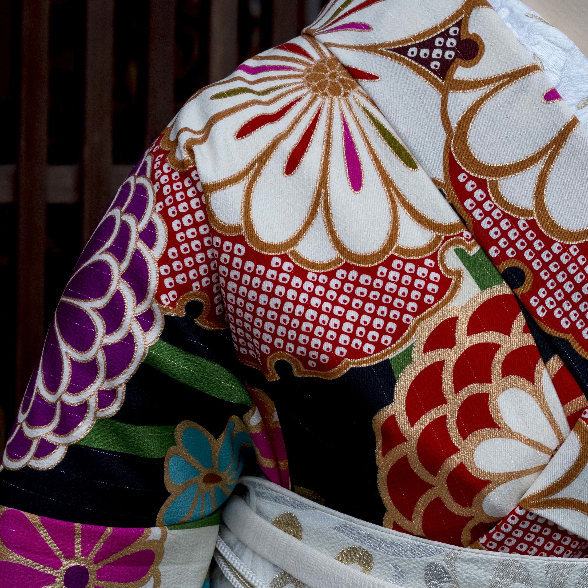
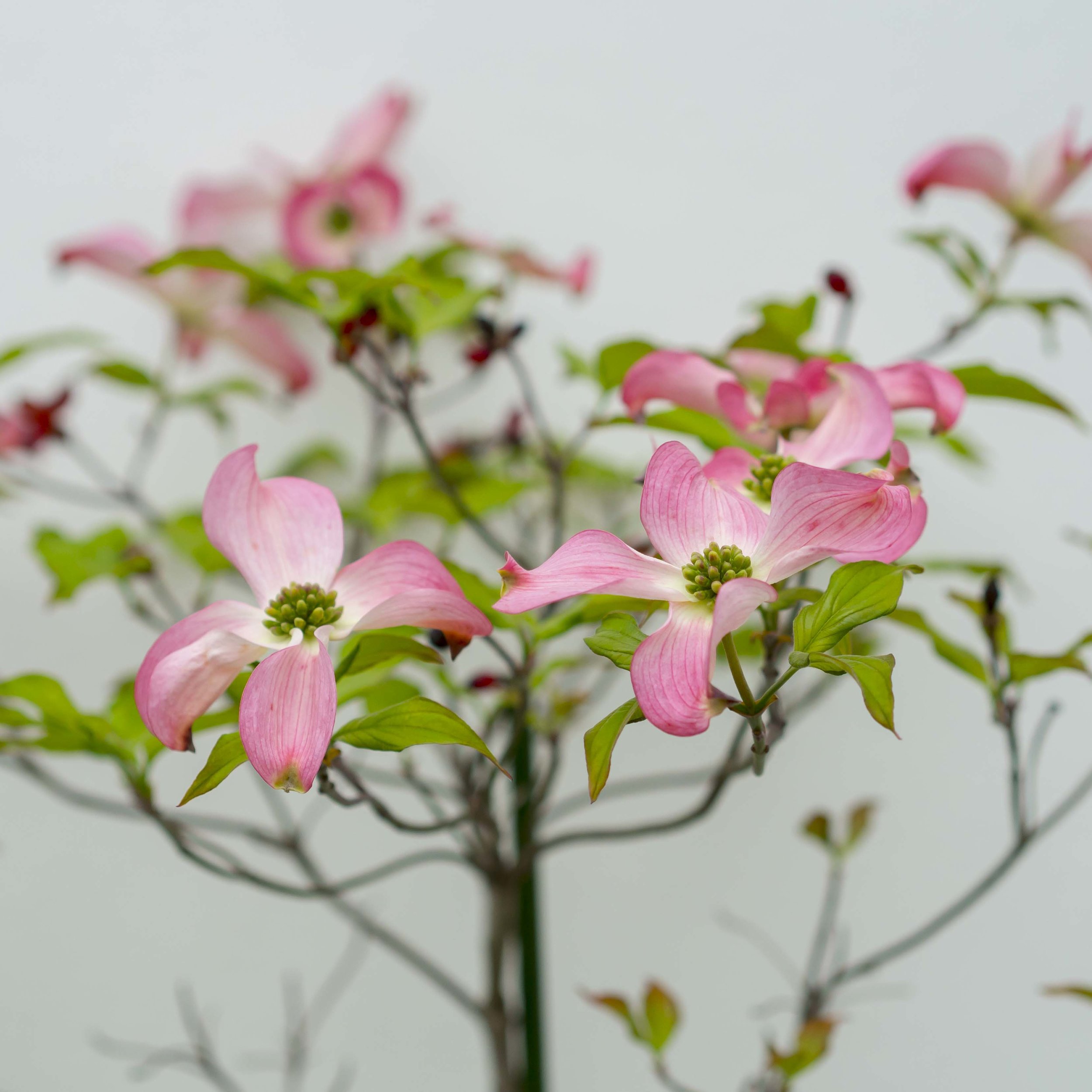
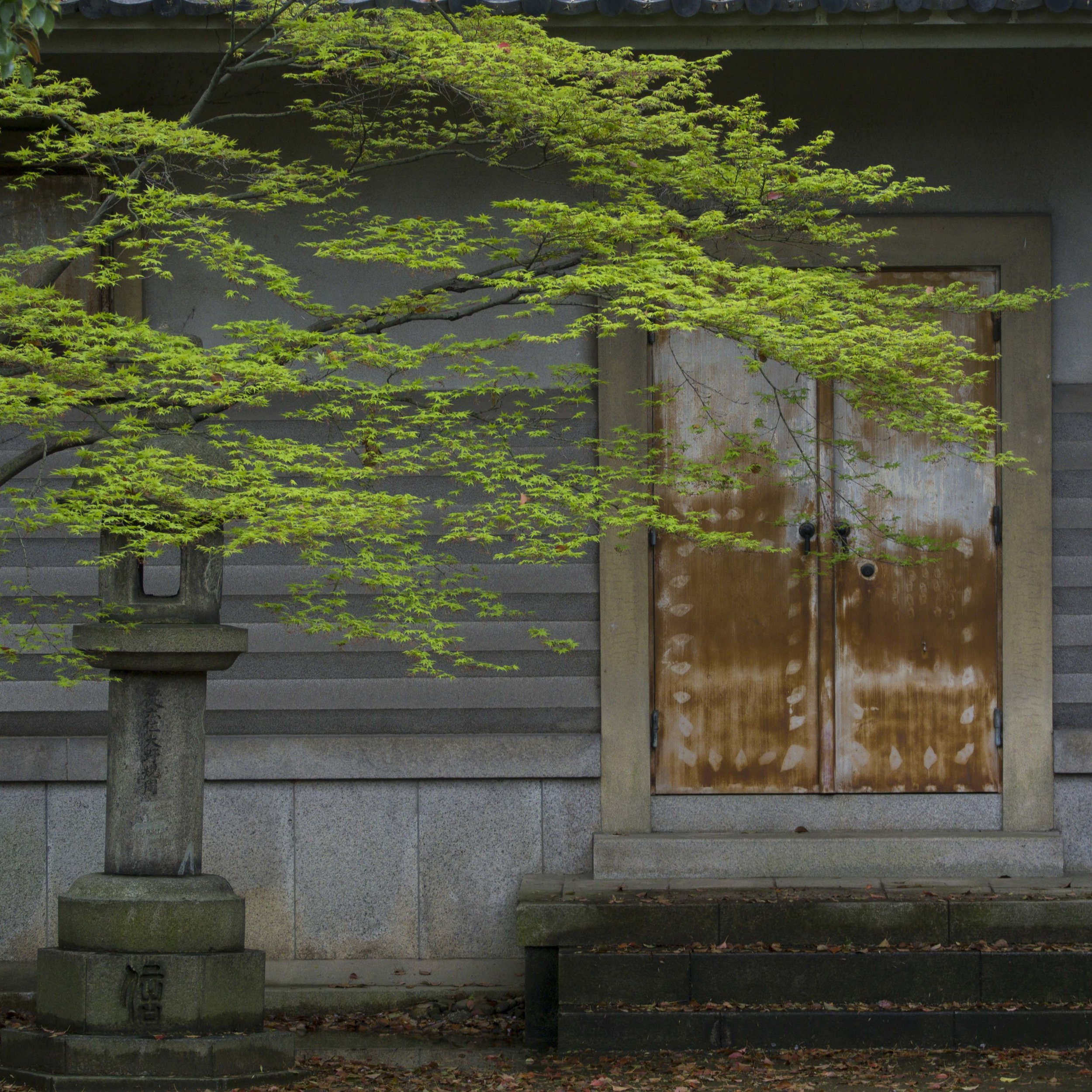
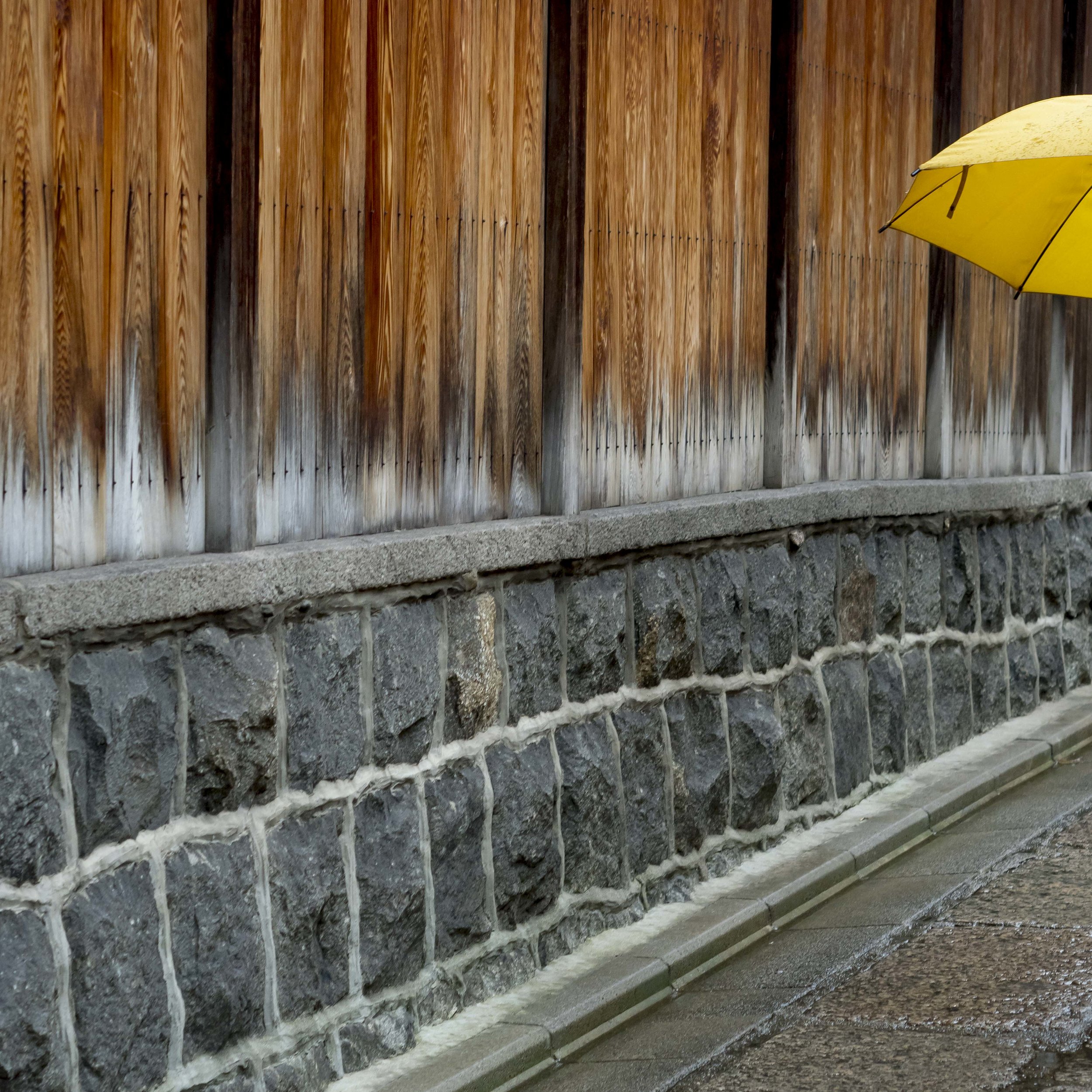
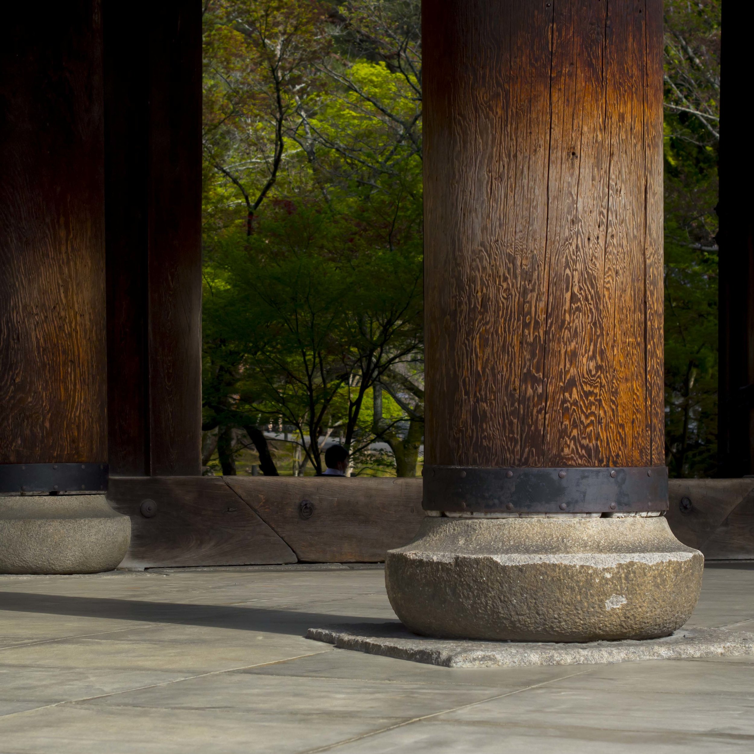
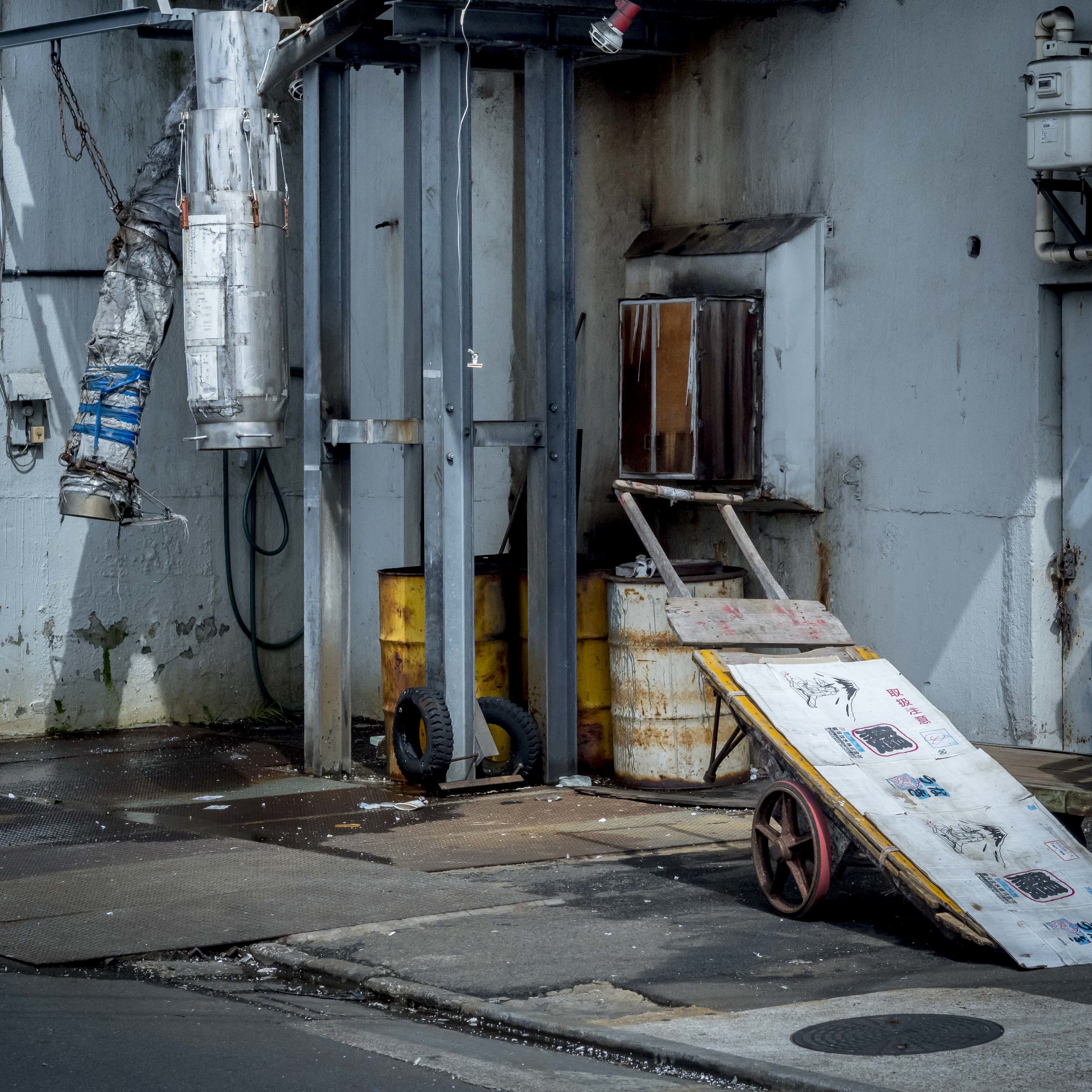
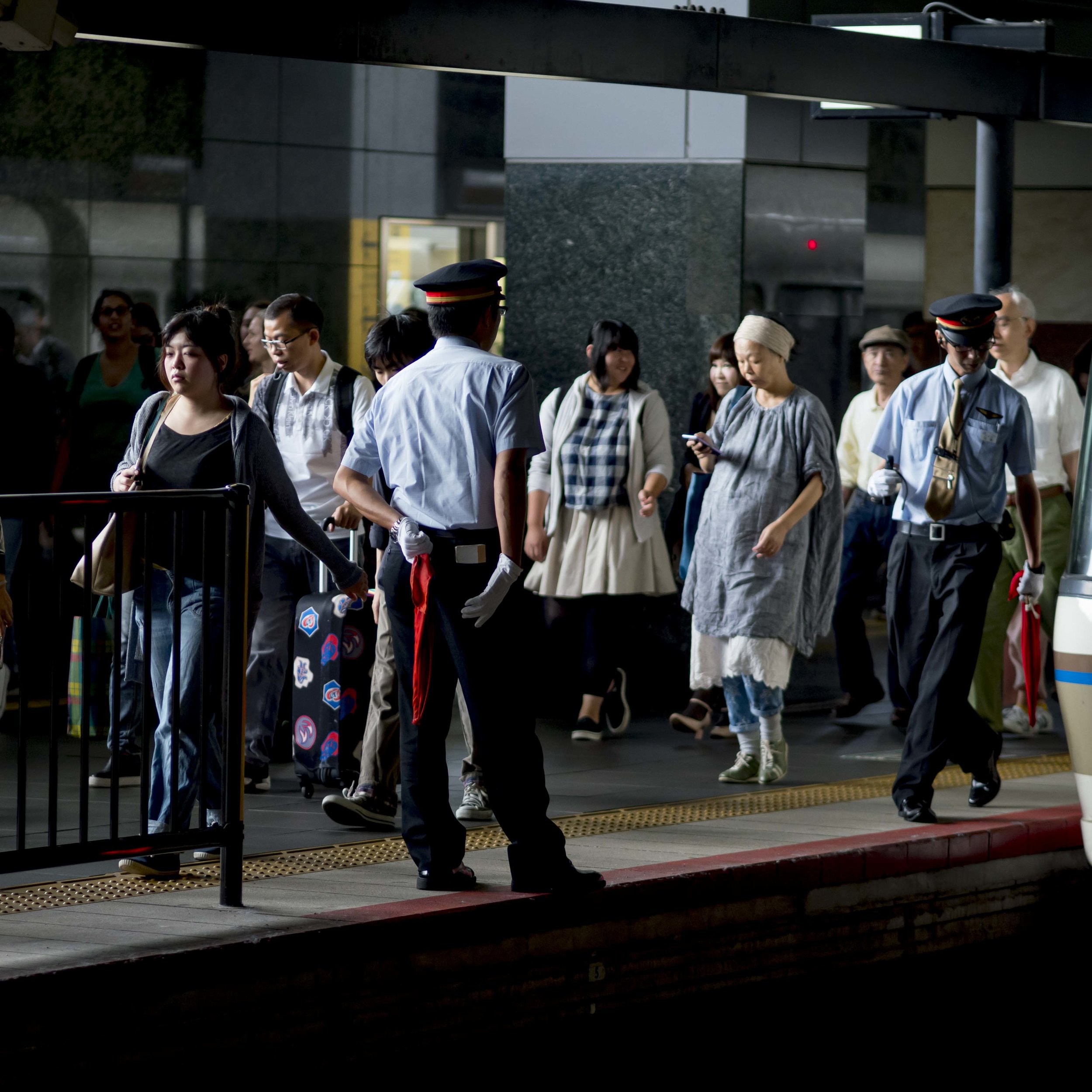
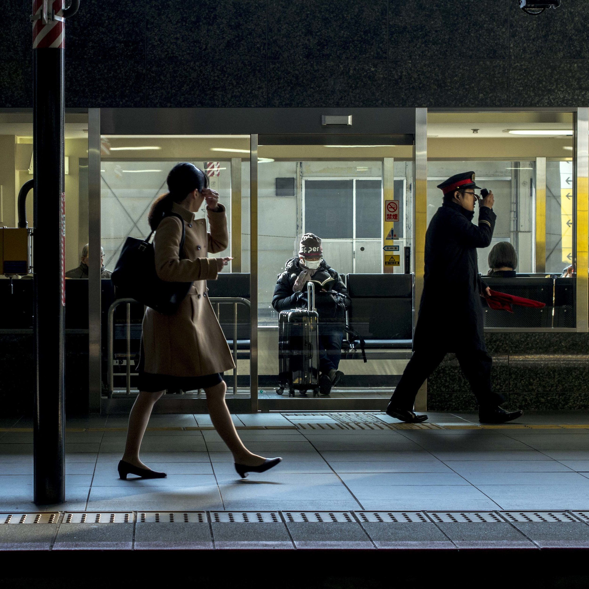
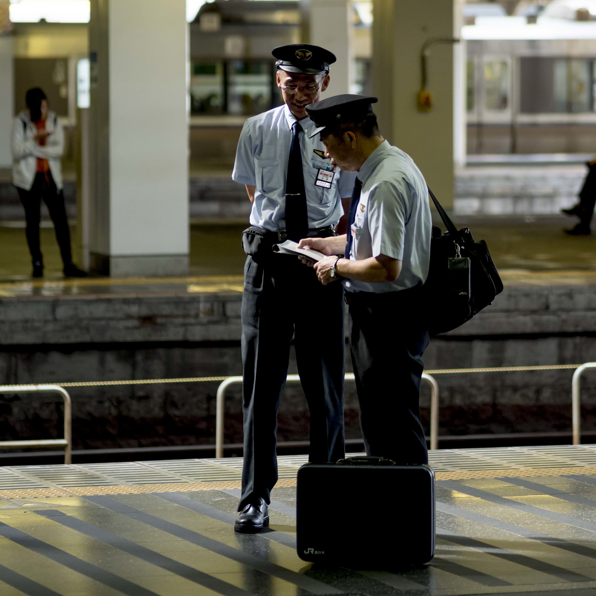
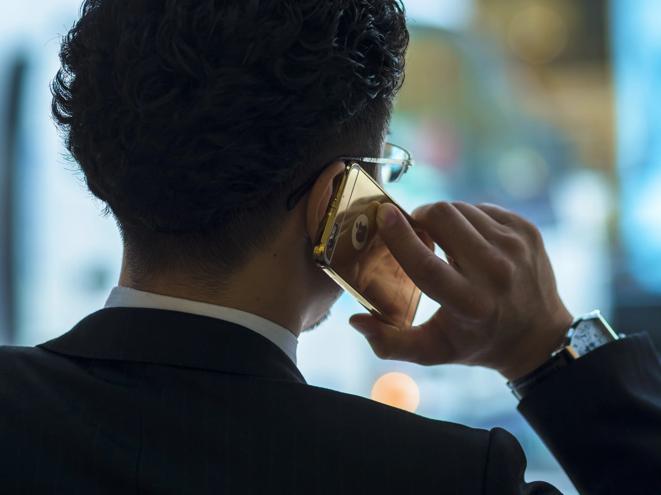
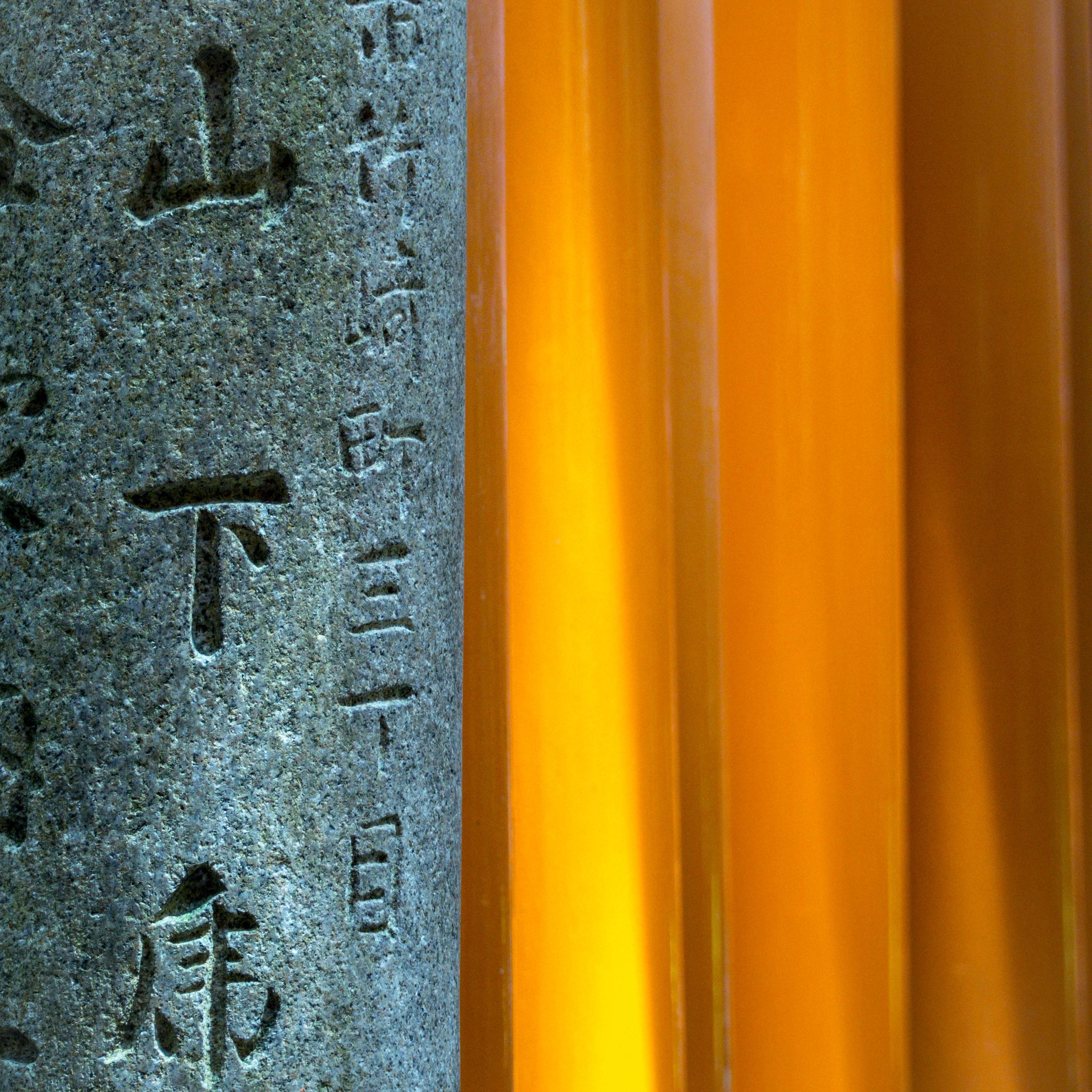
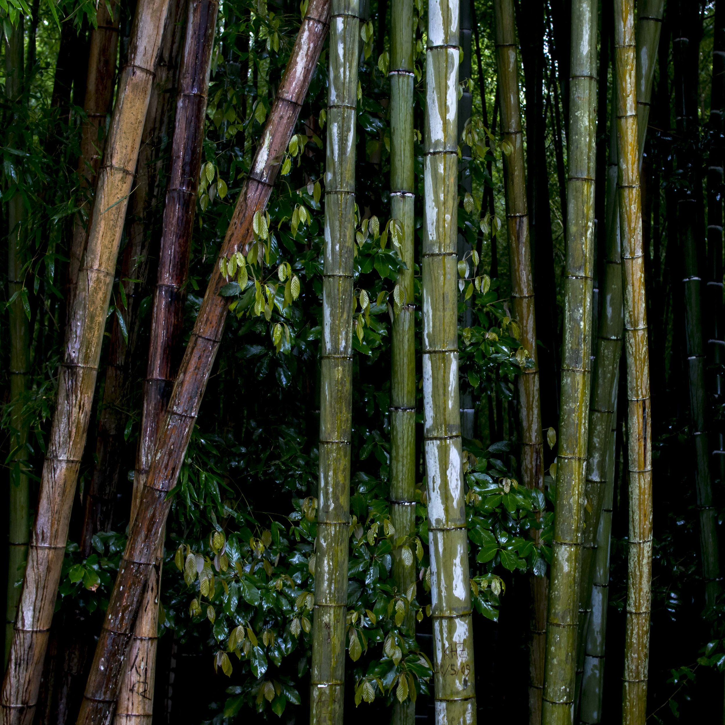
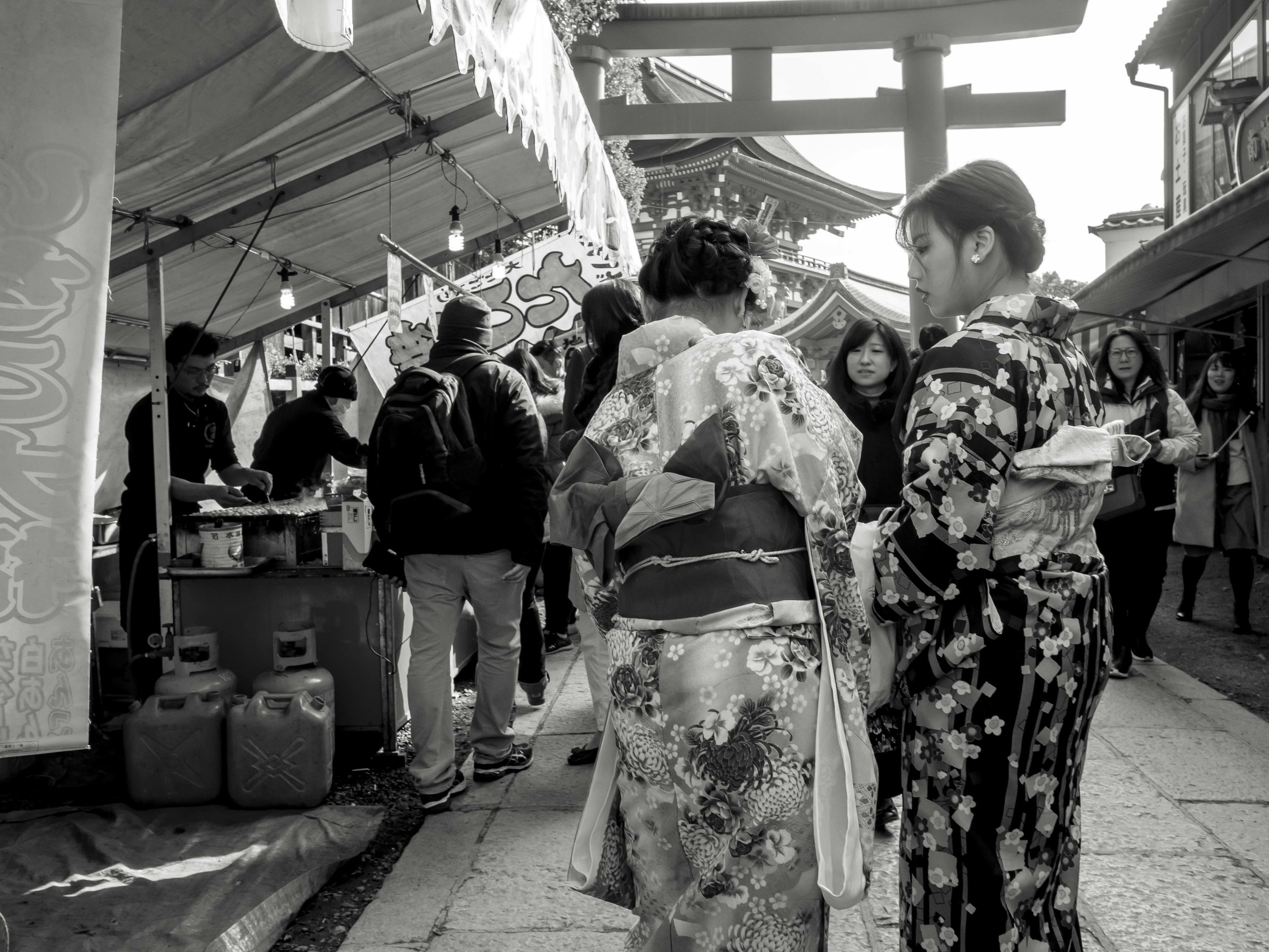
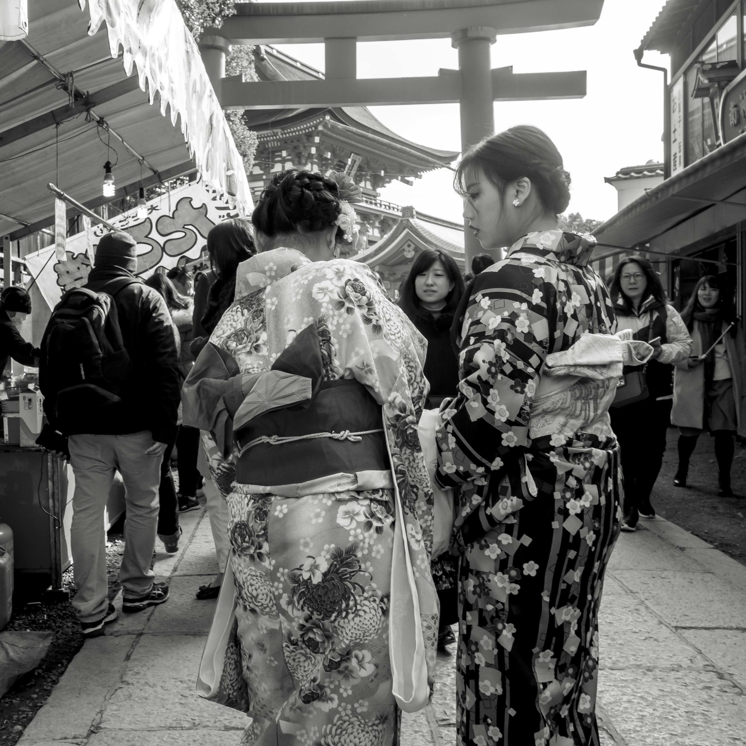
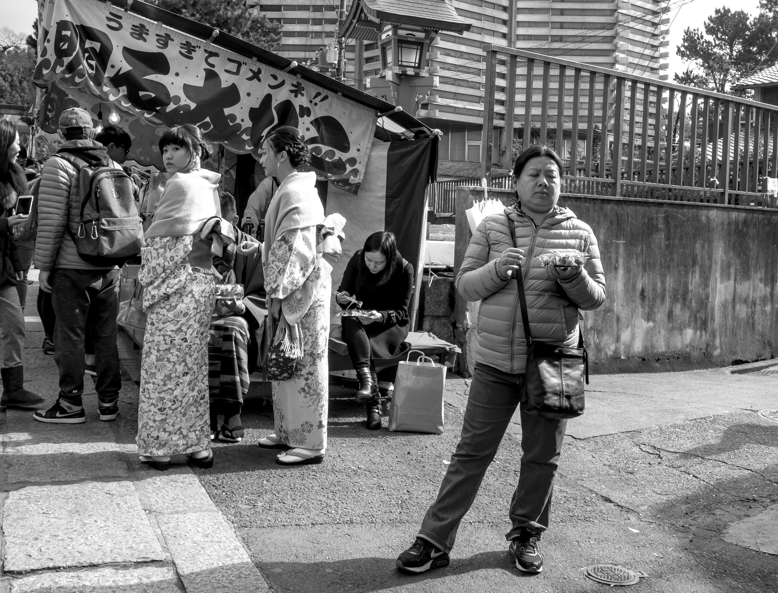
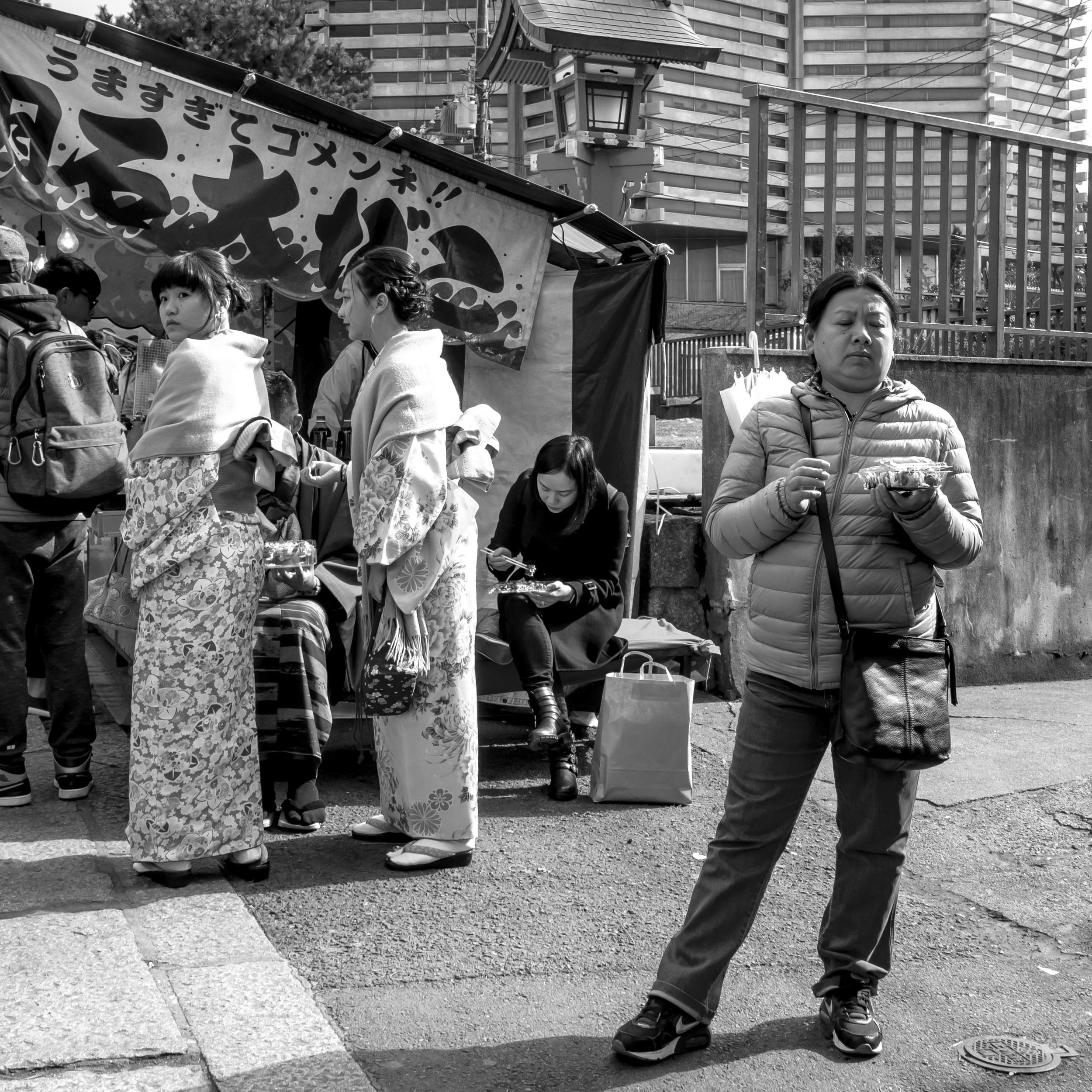
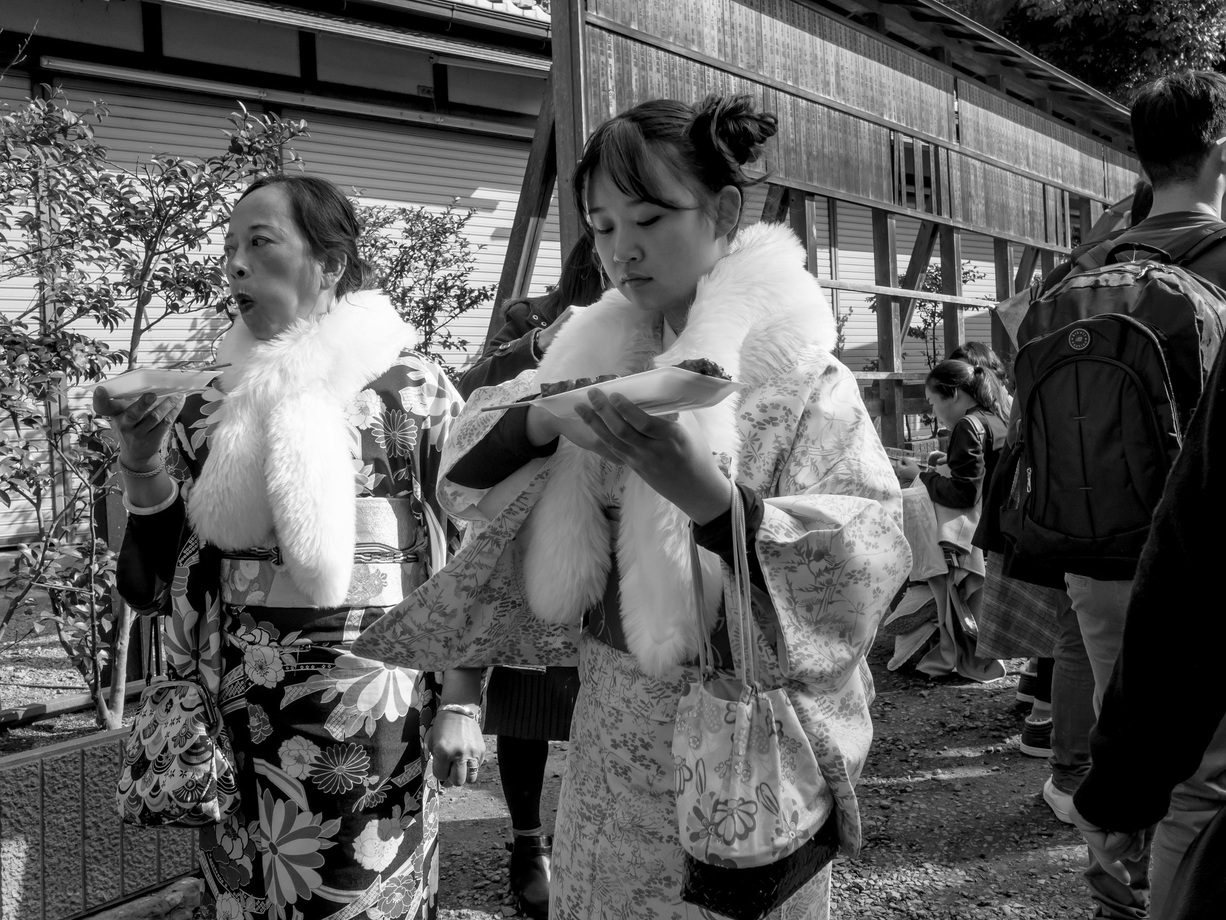
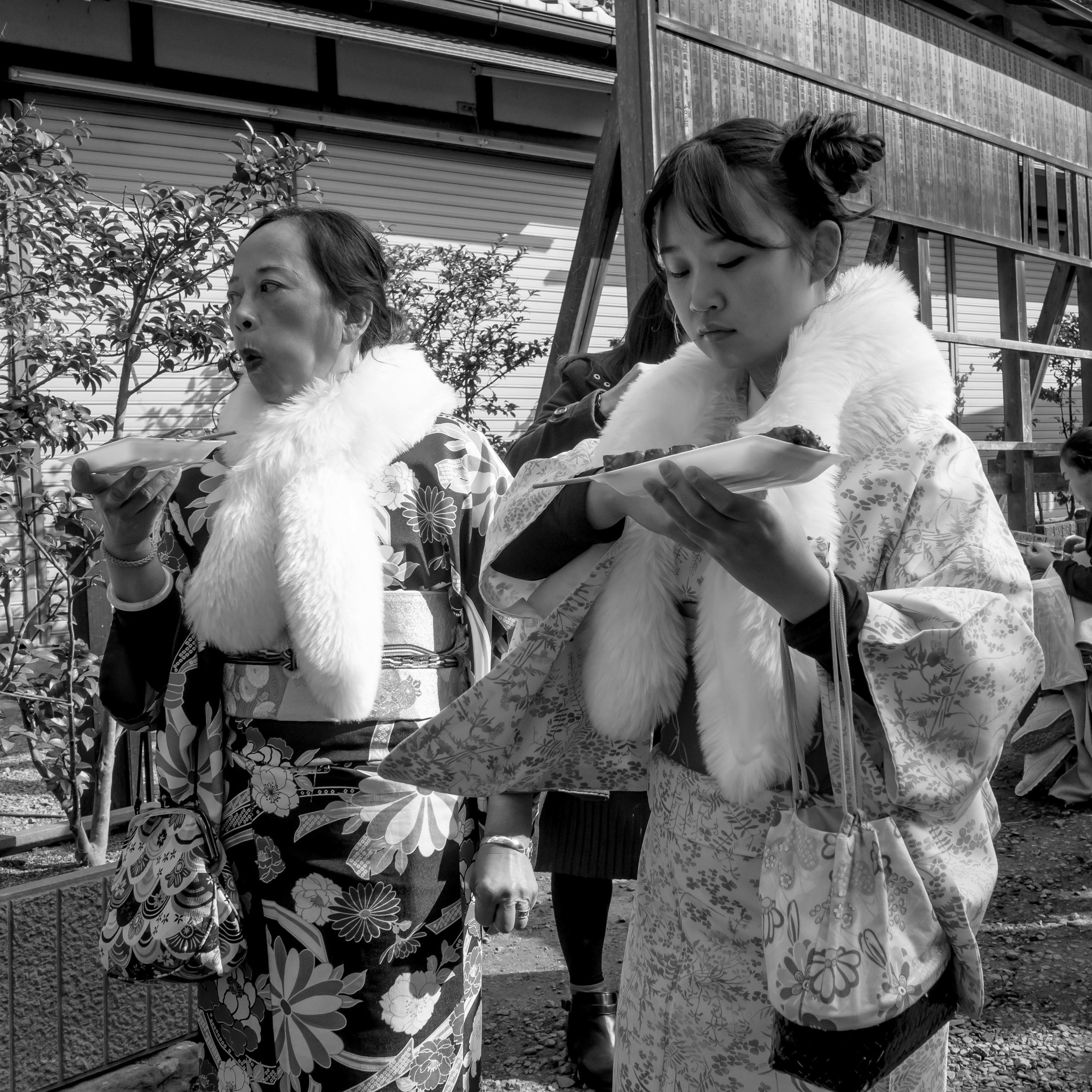
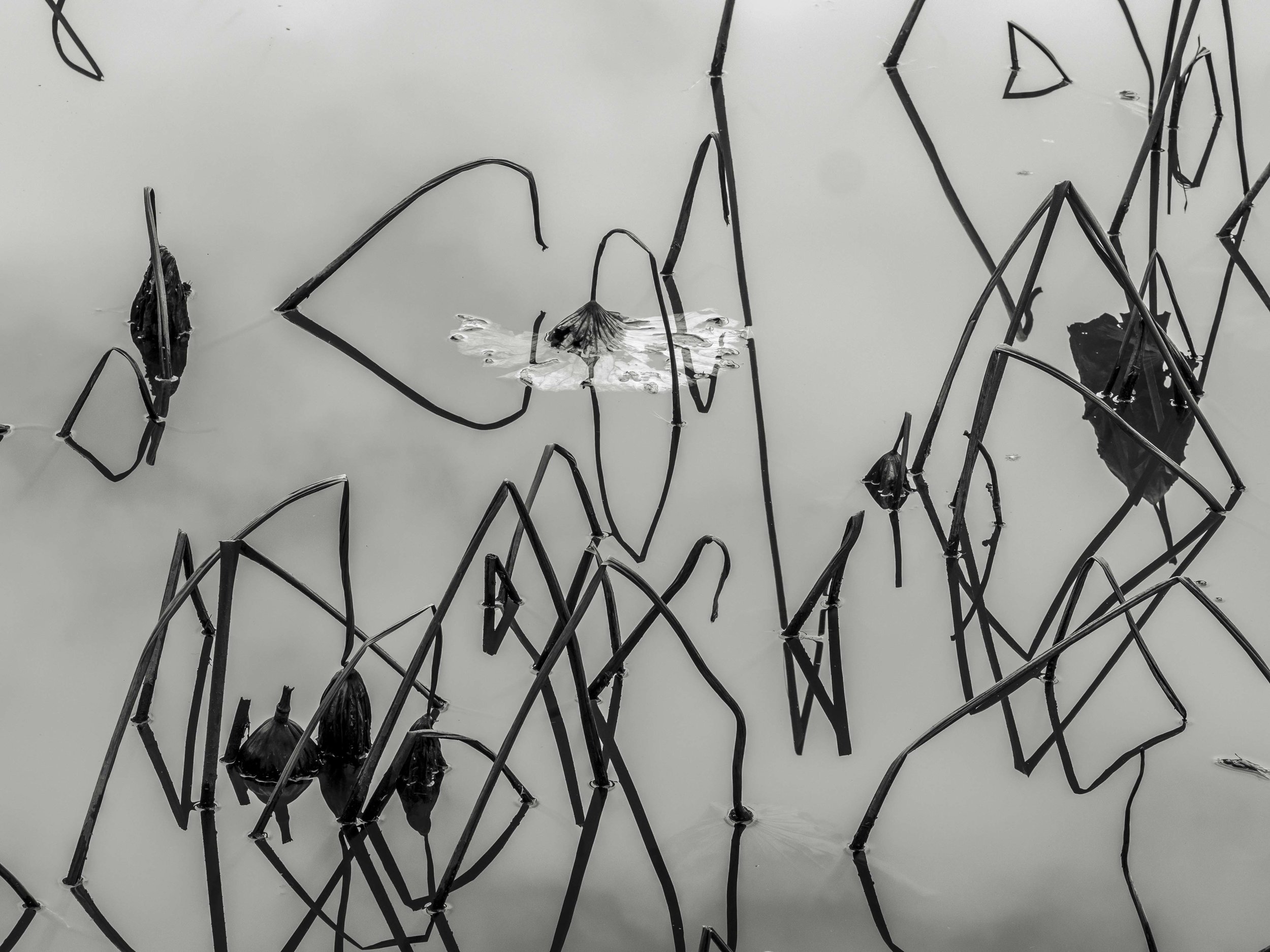
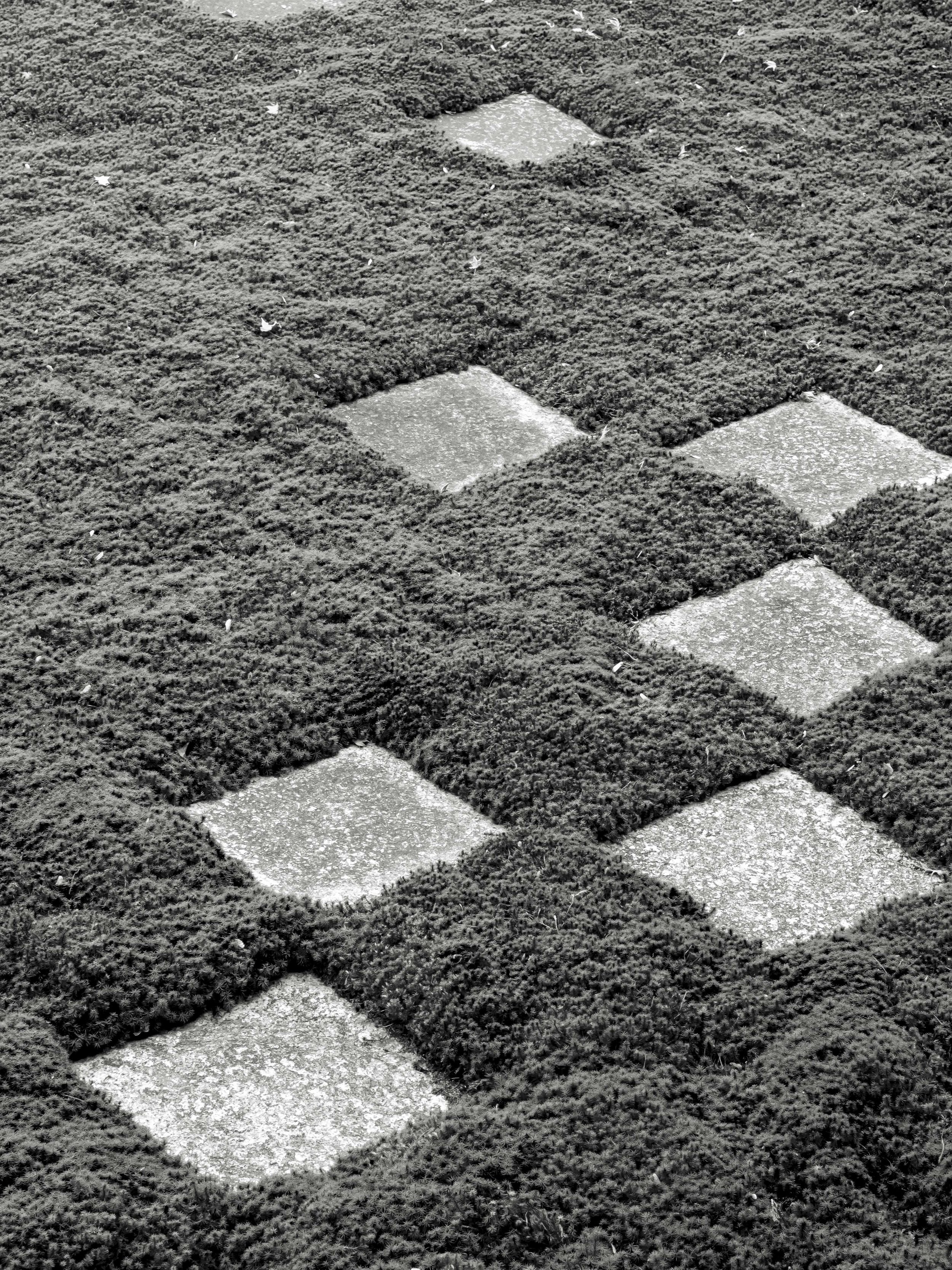
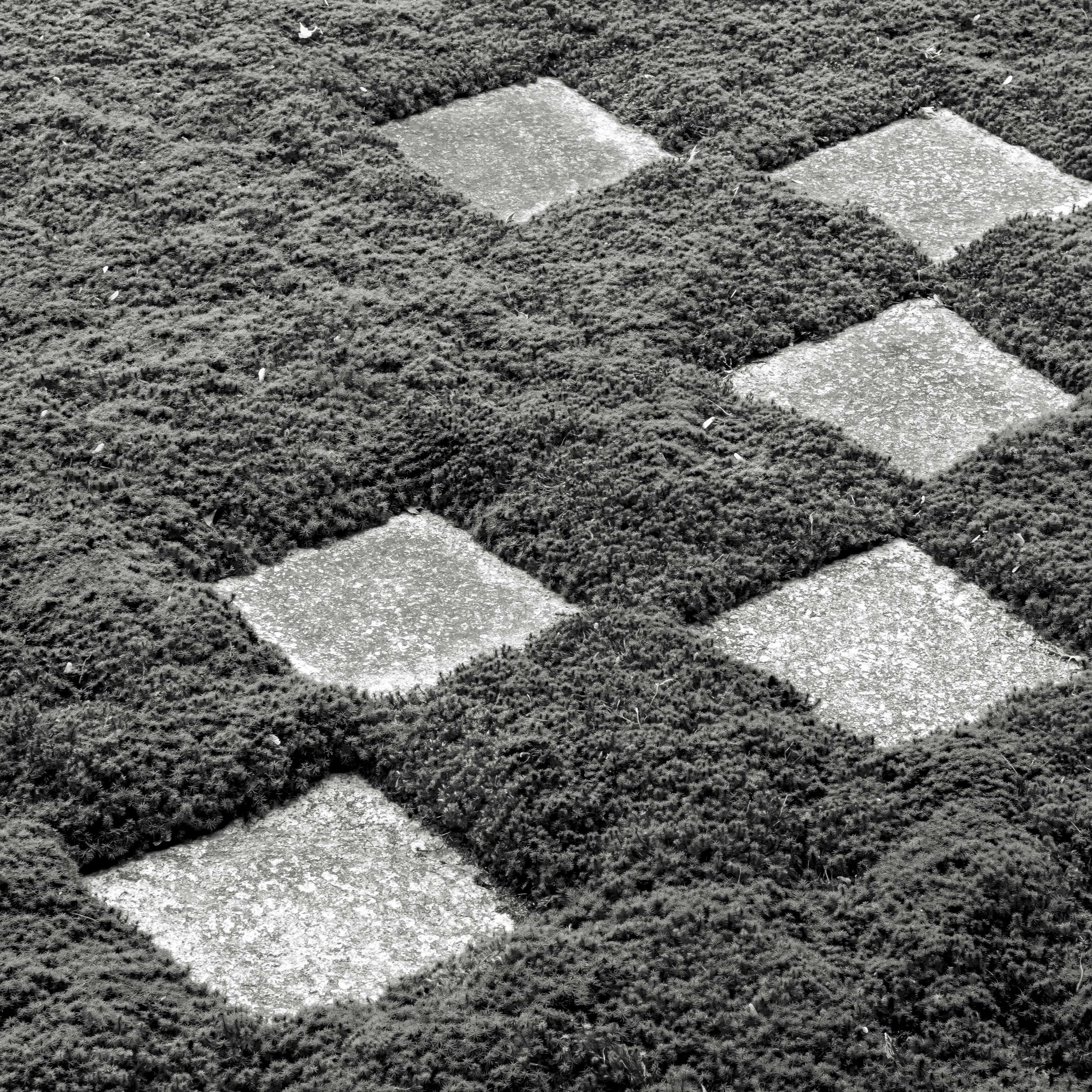
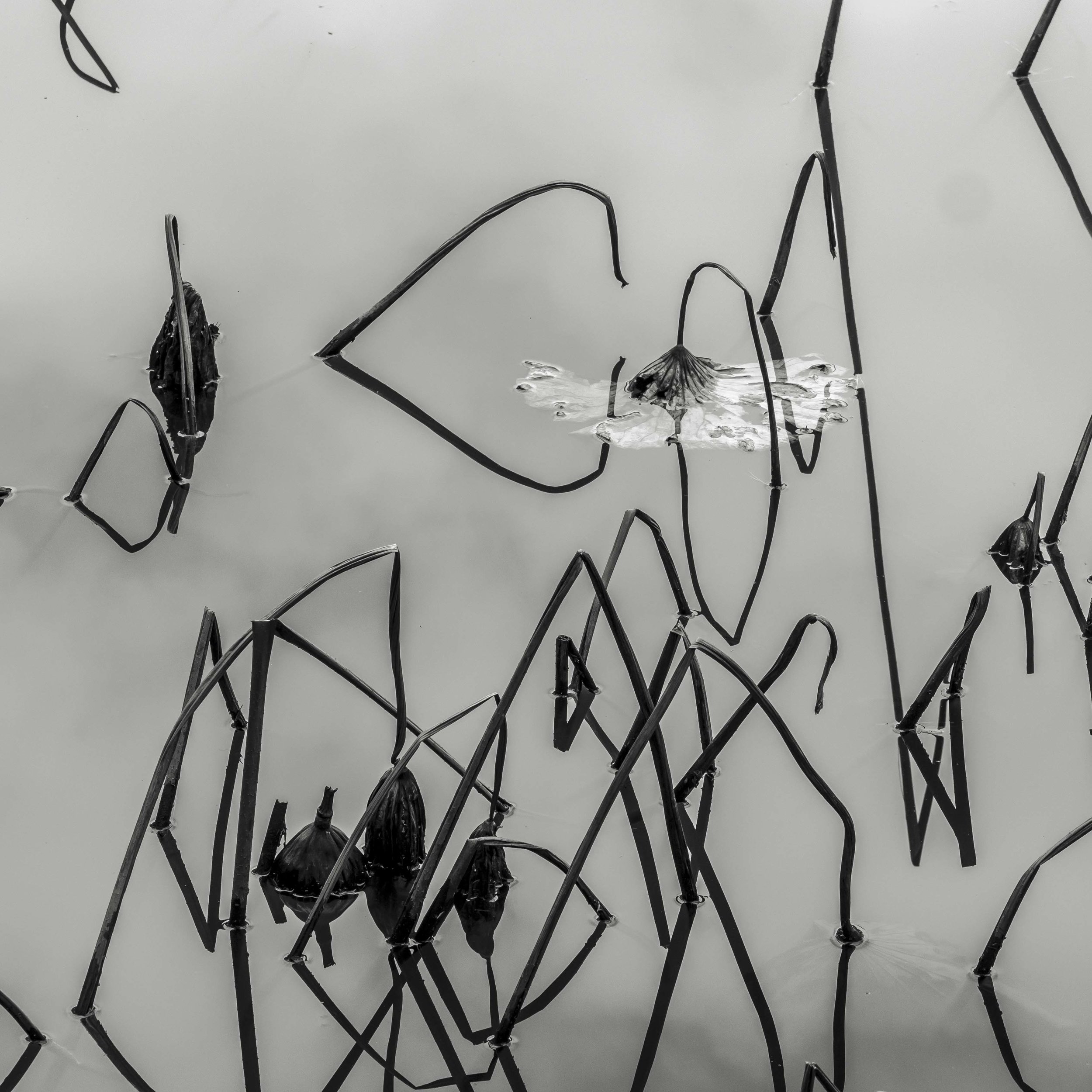
The following images are rectangular images taken on our last trip to Japan (all taken in the same hour for consistency of thinking). All I have done is impose a square shape on them. The reason I have not in the past is simply a lack of this as a focus in shooting and processing. processing square in the past felt like just another, even less compatible shape in a mess of different shapes.

In each case I find the square stronger and cleaner or at least equal to the original. Some of the images were not even on my radar until changed to square format.

The first five sets are definitely better square, the six and seven could go either way, but remember they were shot to be rectangles, and eight is much stronger square. Also, they can now be used in sets as triptych or 2x2 format blocks.

maybe a book of 4 panel groups? A bit like a book of Haiku. Maybe a book of Haiku about sets of triptych sets?

Self Imposed limits for increased productivity

I often start a new creative process or period of high productivity with a desire to force a style on myself. It seems to trigger itself as soon as I say “going to do a project”.

After a period of self examination, I often relent and with some relief, decide not to pigeon-hole myself into a single process. I think this “WU-Wei” style of shooting although very free flowing and can lead to a period of productivity in any environment, but, it also leads to a lot of work, without any cohesion.
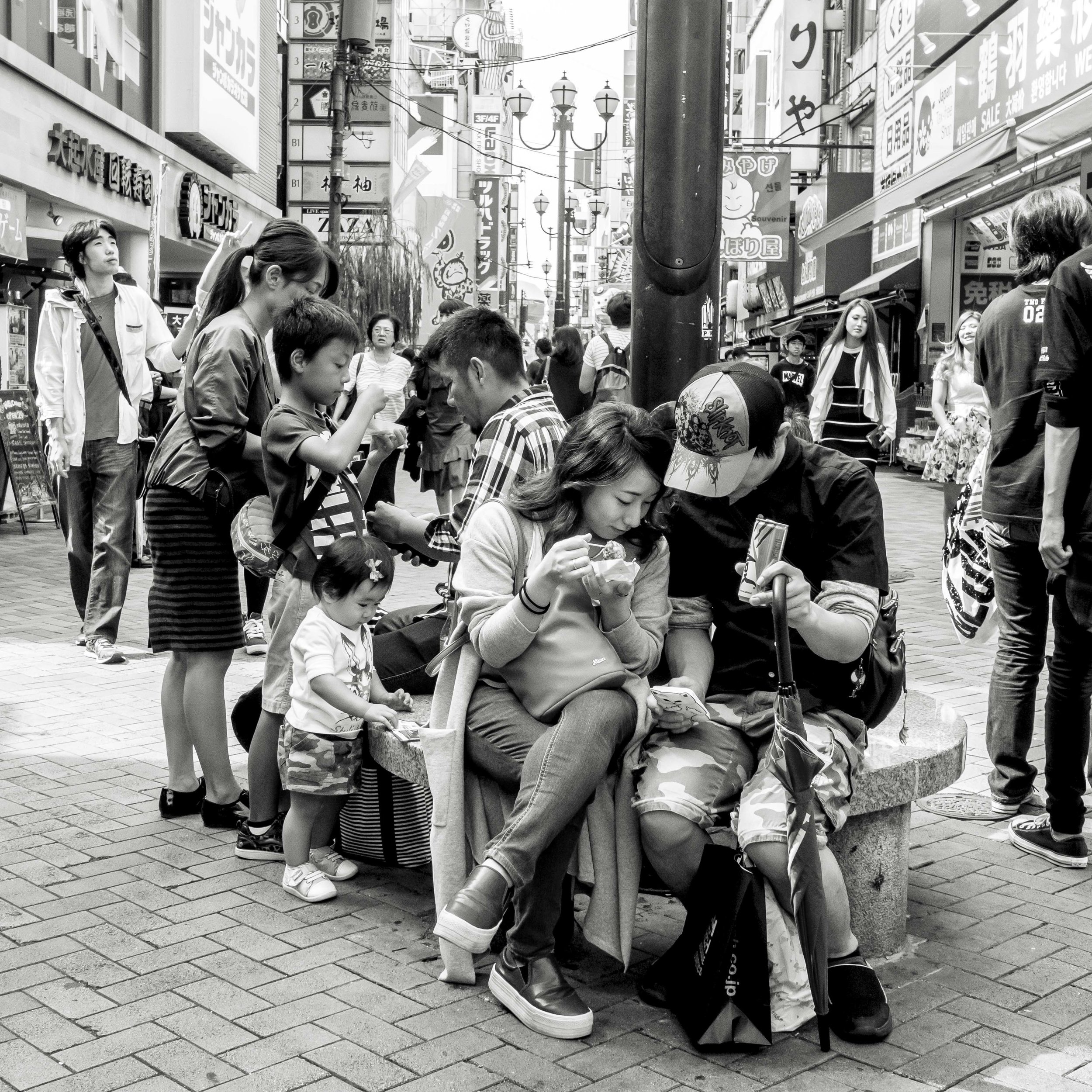
If I ask myself what I need to make sure consistent, cohesive and relevant work is produced, the simple answer is limitations and controls, i.e. a plan.

Self imposed limitation (SIL) #1.

Shoot in square format*. We view images based on their shape. The square is bias neutral which is to say, the subject inside the frame determines it’s perceived shape, not the frame itself. To me, it is one of the two “correct” ratios (the other being 2 to 3:1 panorama or “cinematic” which forces specific, dramatic, but natural compositions). Square images give the entire frame even relevance, making every part of the frame crucial to the image. Even the “negative space’ in a square image is critical to the balance of the whole.

I find this releasing. Rectangles force their shape on the image, and that does not alway sit ideally. Personally, I almost always crop a rectangle image to one degree or another. This creates issues with framing and coherent presentation. When I am shooting in square format, there is no indecision. I use the frame as presented. It is similar to the argument of prime vs zoom lenses. One offers more possible options, the other a clear limitation. When I switched to Olympus it was for the form factor of the cameras and the quality of the lenses not the format.
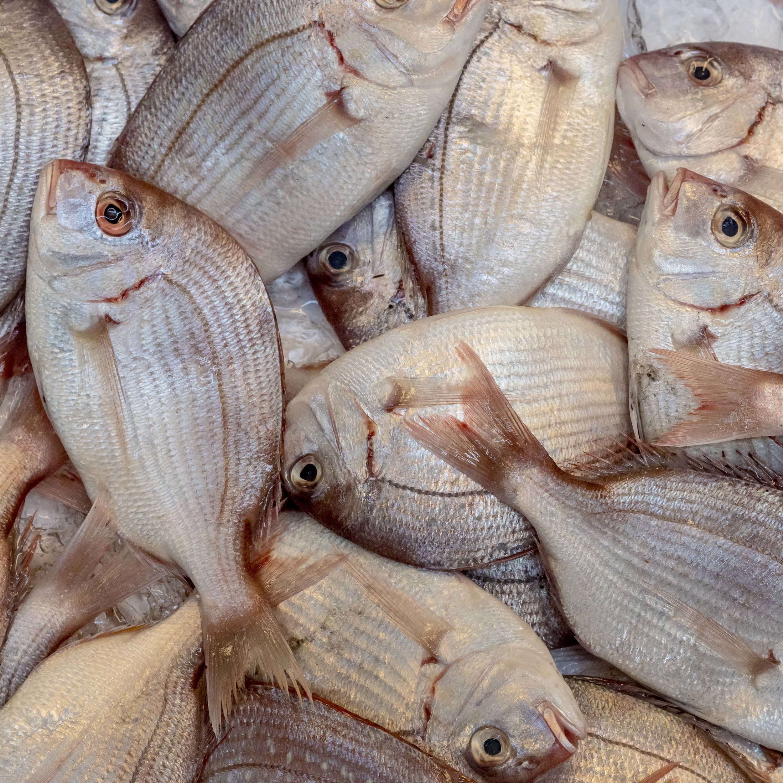
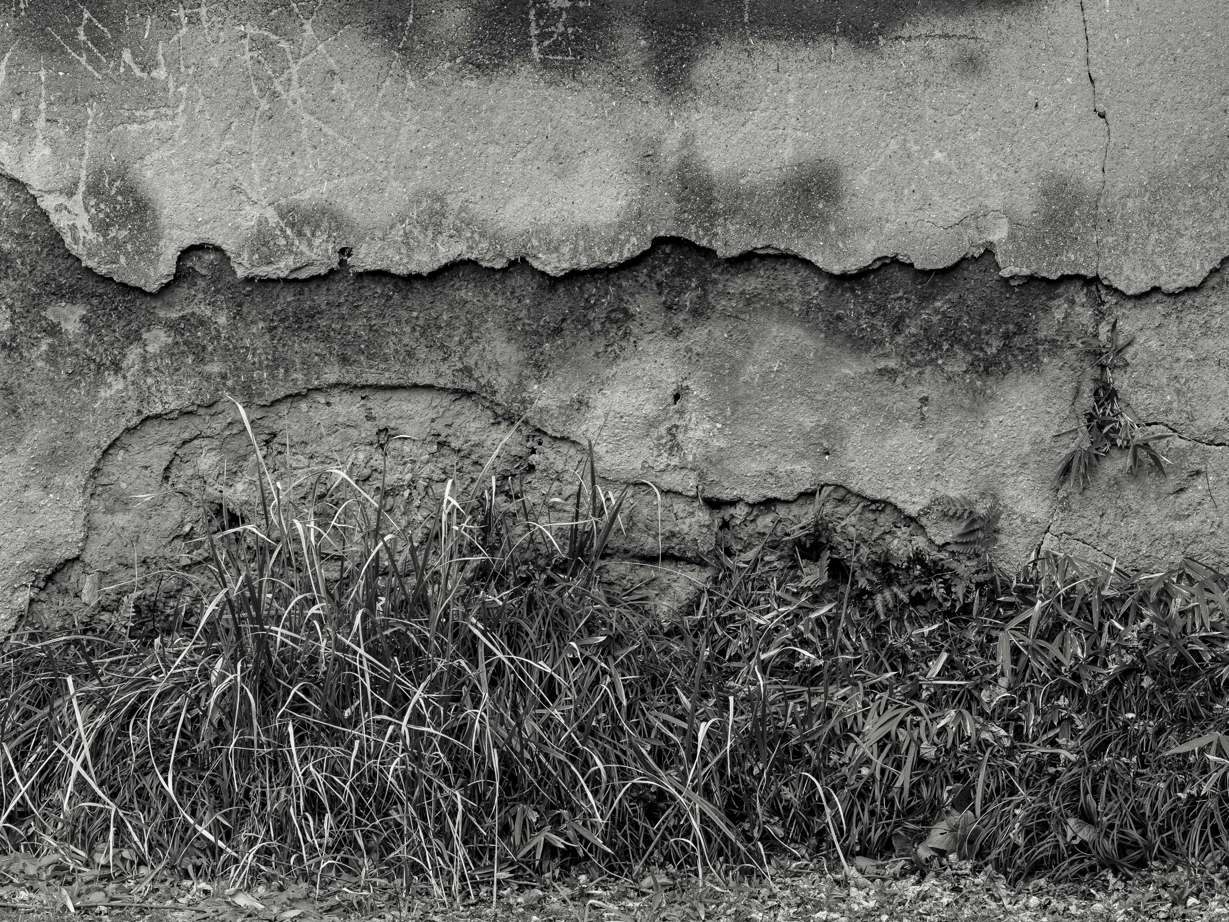
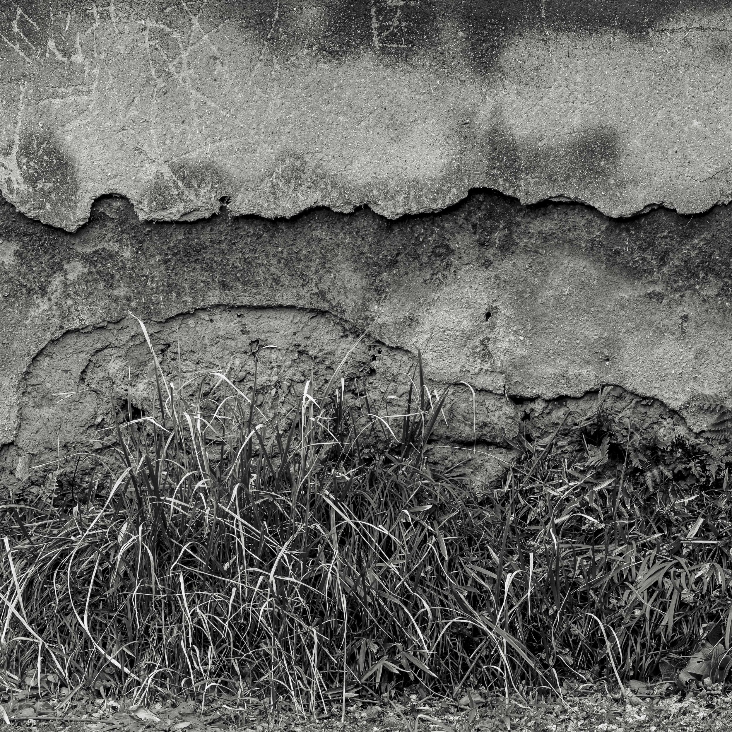
A square allows you lots of balanced framing options. It even seems to promote “out of the box” thinking within the box. The image below does little for me in it’s natural rectangular format.

To be honest, I am not sure I have ever been fully accepting of rectangular formats.

Other benefits of square images are;

Taking them is often easier technically. No portrait aspect issues with tripods/heads and no on the spot aspect ratio decision making. This is especially true if you are shooting in live view or at waist height. For street shooting, this may seem counter intuitive and that may be the case, so I am limiting this thinking to landscapes for now. For street, maybe just shooting wider or deliberately tighter will fix the issue, maybe even force a new and better style, maybe not. The best possible outcome may be shooting in the camera’s native format, but only processing in square (almost a double discovery option).

They frame logically in almost any frame shape either singly or in multiples, just place the print on the paper as suits.

My favourite fine art presentation style and it really only works with a square image.

My favourite fine art presentation style and it really only works with a square image.

Multi image presentation. A 3x3, 2x2 or triptych tell a story, which in turn can make each image more useful (not more powerful). The squares themselves allow for very a balanced layout (they often sort themselves out logically), then sit harmoniously together.

They also can process better, especially if they need to be re cropped for presentation. The added negative space can be used as needed to fill a magazine cover ration or to place text etc (6x7 was often used for magazine assignments because it fit the cover ratio). When shooting in a rectangle format, a choice has to be made to suit the possible future needs of the printer or presenter. With square, they can potentially create what ever shapes they want.

Lastly and most importantly, I frikkin’ love square format. This probably goes all the way back to “the one true format” thinking of the Hassleblad/Rolleiflex era. It excites me and releases me.

The down sides are few;

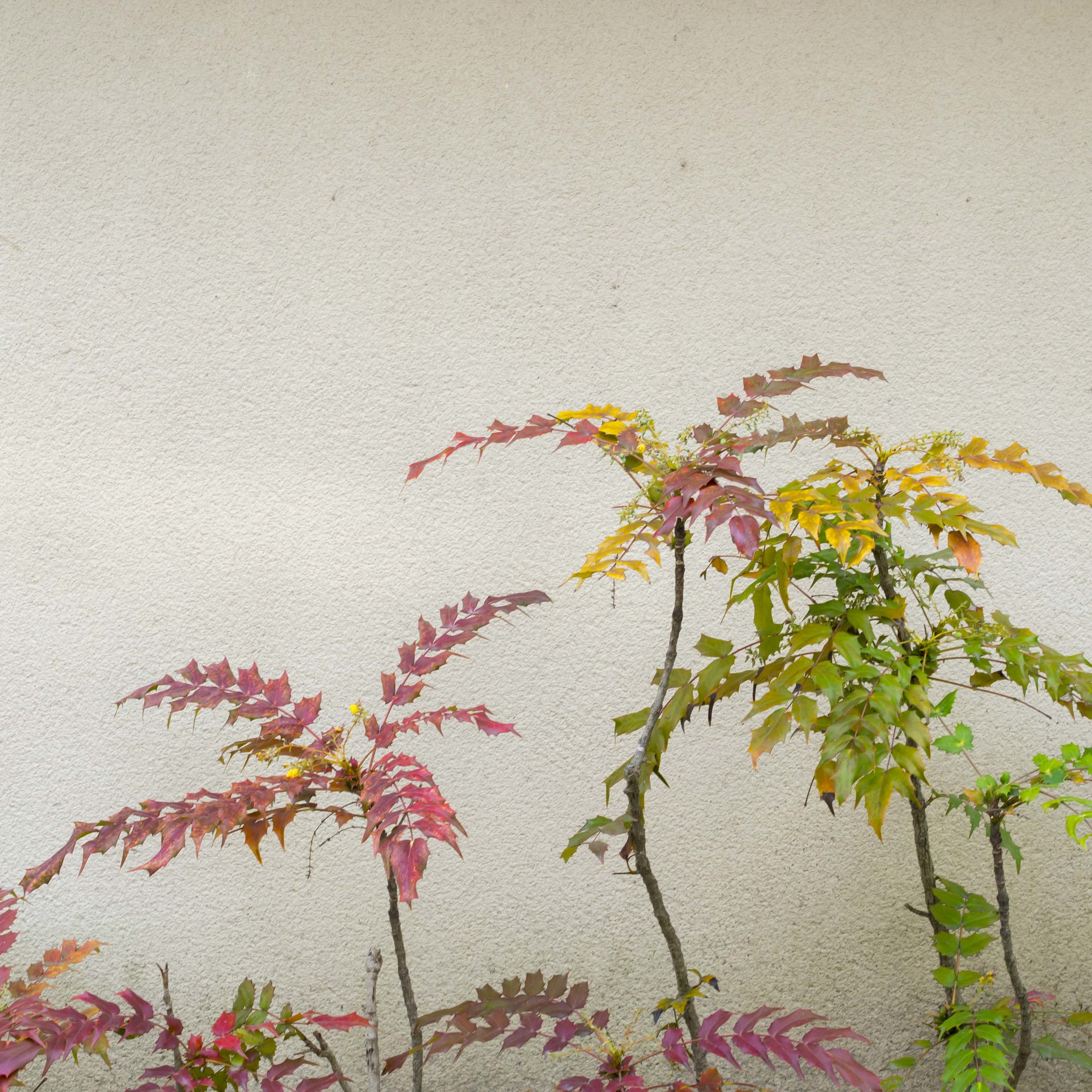
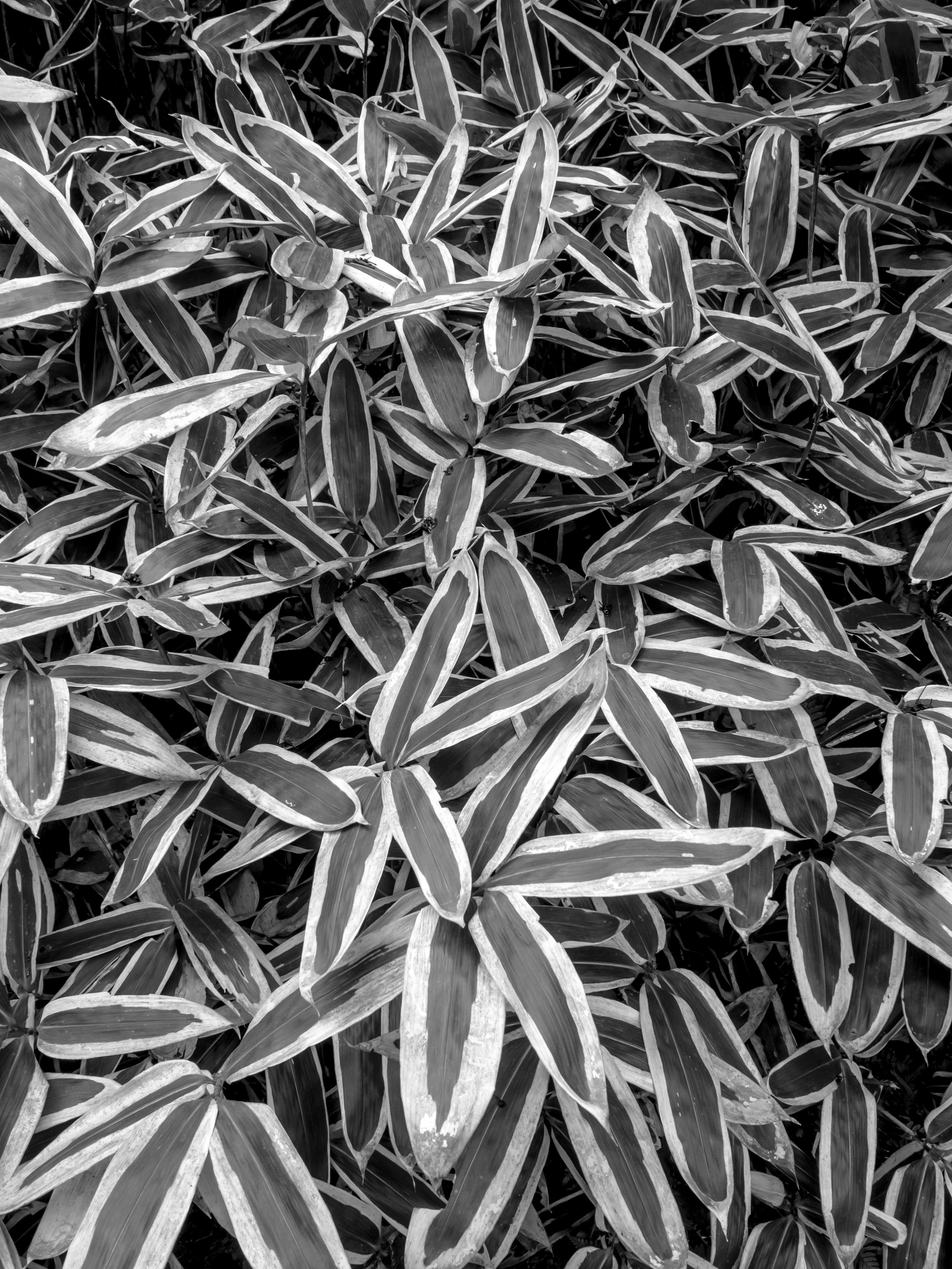
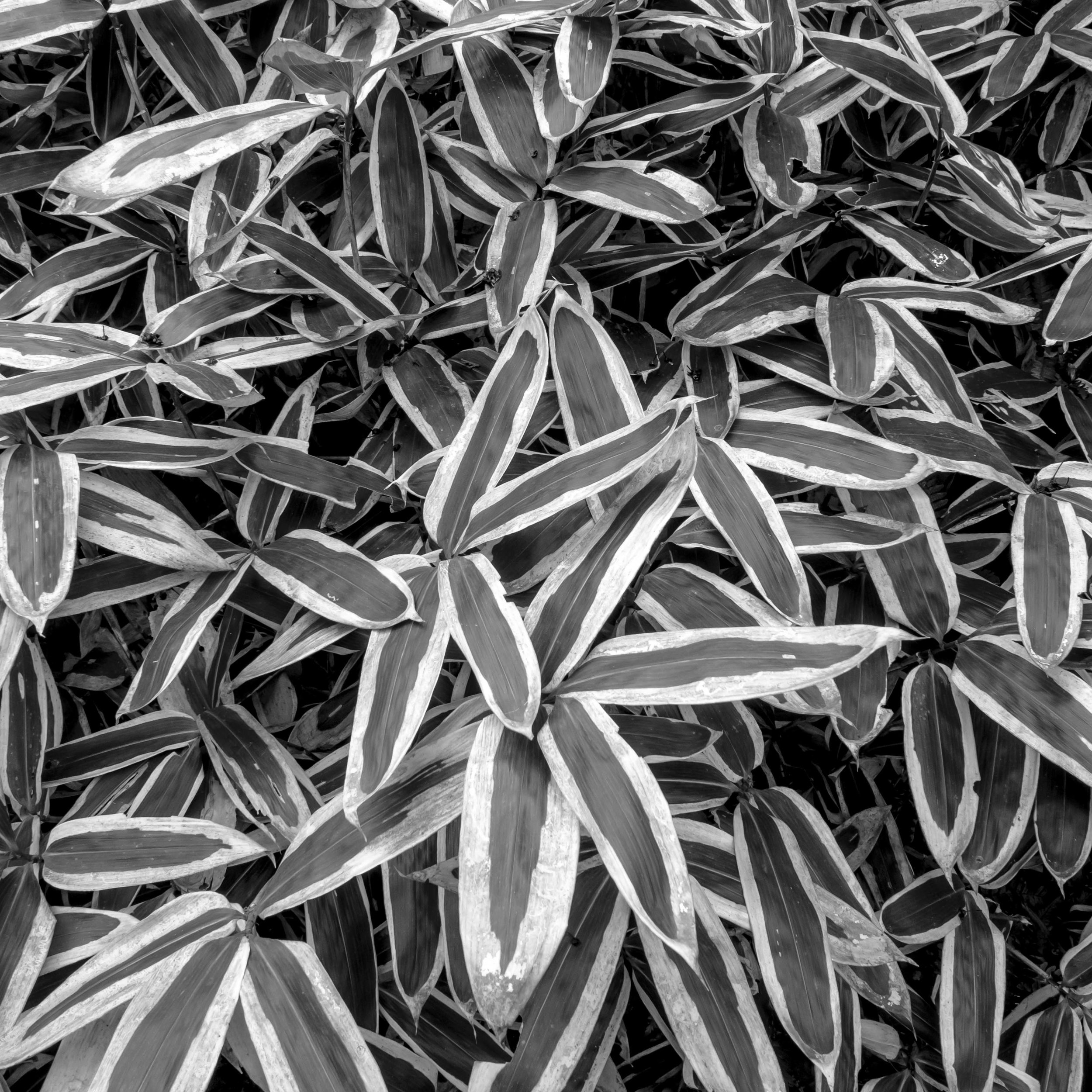
There is some wastage of pixels, although with M43, less so*. The maximum single image size limit is the “short” side of your format, but multi image printing effectively triples the effectiveness of each image with “breathing space” between images taken into account, so wall presence is actually increased. If a single image is printed, unless framed as a square, the wasted paper is actually an ideal framing tool (see the leaf image above).

You may need a wider lens than usual or frame tighter than usual due to the height:width ratio changing. The feeling of missing out on detail to the sides or top/bottom of an image is removed by shooting wider, often forcing more elements into the frame, but in turn creating broader compositional opportunities (remember the negative space option). This is for me a non issue as I rarely use wide angle lenses and recently expanded my range two full focal lengths wider, so my shooting style will remain un changed, with the added width allowed for naturally. I also prefer semi abstract and tighter, cleaner compositions, which this promotes.

You need to shoot with at least a square preview grid in live view mode or risk cramping the file on the short side (see the point above). You need to think square to shoot square, plucking squares out of rectangles can be frustrating. The set above were originally shot in 4:3 ratio, but worked ok, many others did not.

You need to get used to it.

Ok, that is limitation number 1. Next post we will explore limitation 2.

*With digital cameras of course black and white and square are only suggestions to a RAW file, so you can always explore other options after capture.

Fighting the anti-creatives.

Having a hard time staying enthusiastic at the moment, so a little kind to my self mantra.

“If I go out there I doubt I will find anything worth capturing”.

How about this;

There is so much going on at any one time in this world, that if all of us were photographers and we all photographed constantly, we could never capture all of it”.

Better?

Writers block or it’s equivalent, is relevant to any artistic endeavour. It is a reality we all face. The more you want to achieve, the more you perceive you have to loose and generally the more you perceive you do lose.

Taking ownership of the end of the journey before travelling through to it creates three problems;

1) You rail-road yourself down a path that is bound to be different to your pre-conceptions,

2) You set a limit (high and low) to your expectations, not allowing for a flexible ending,

3) You forget to enjoy the journey.

The happiest people are the ones who genuinely enjoy the journey, with or without a clear destination in mind.

Another of life’s Bugbears;

Nothing I do is original, it has all been done before”.

Change to;

“Nobody can do my take on the world, better than me”.

and lastly;

“How do I do work that matters to others. What do people want of me that will impress (I can sell to) them?”

Should be;

“Work I love creating has as much or more chance of being liked by others as work I hate doing, but most importantly I will like it”.

Love this image, even though it less than perfect (would like another foot of breathing space on the right).

Love this image, even though it less than perfect (would like another foot of breathing space on the right).

Familiar thoughts?

We all have them.

Keep plugging away.