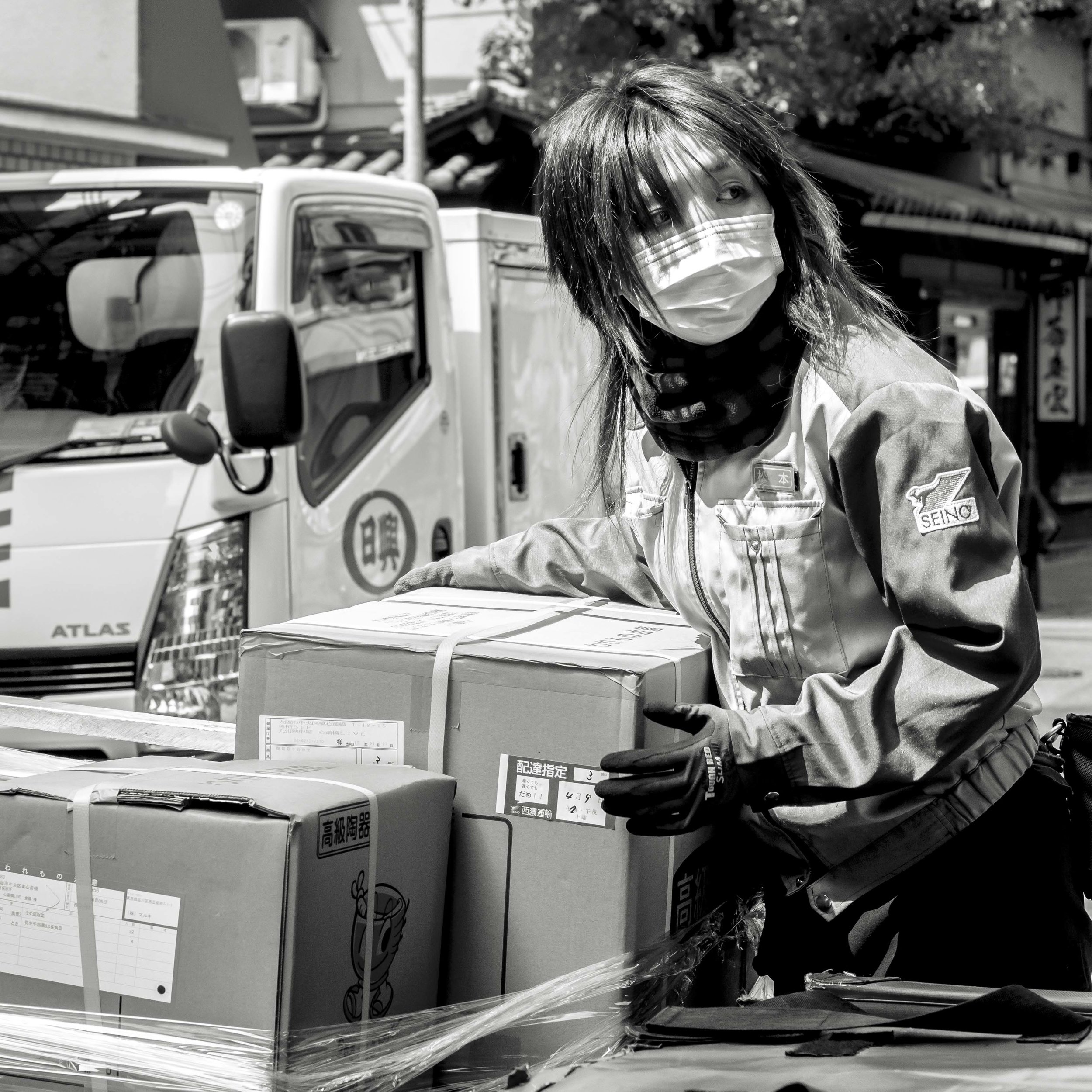
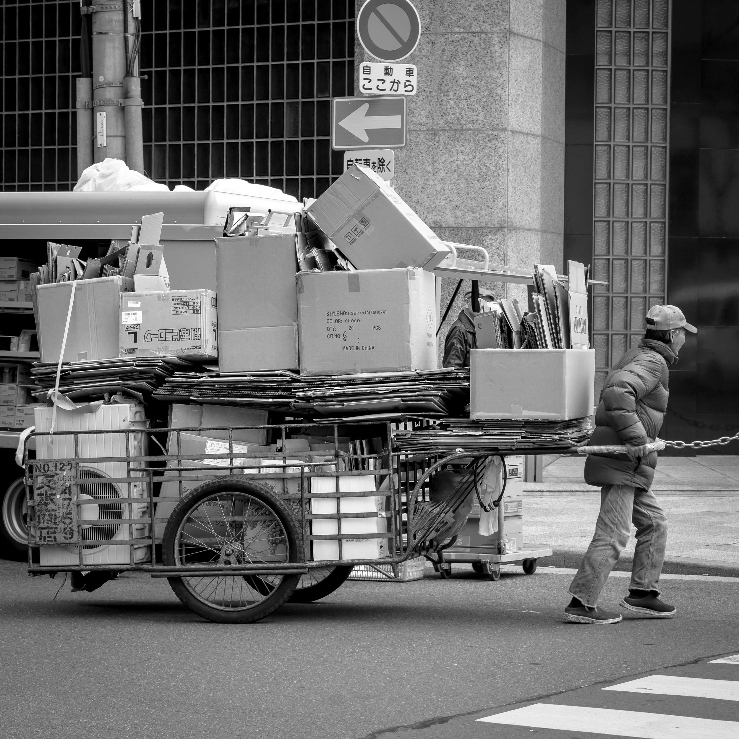
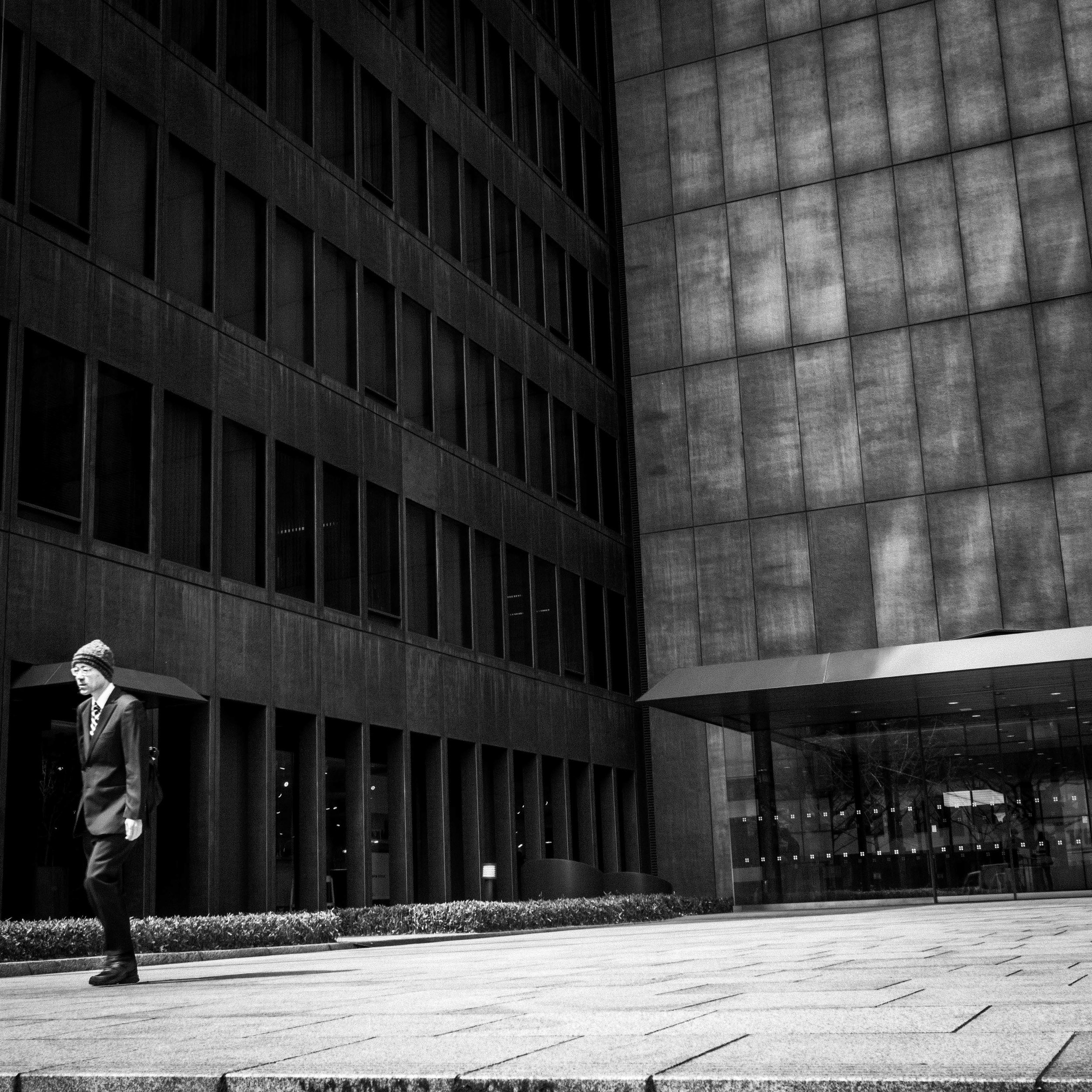
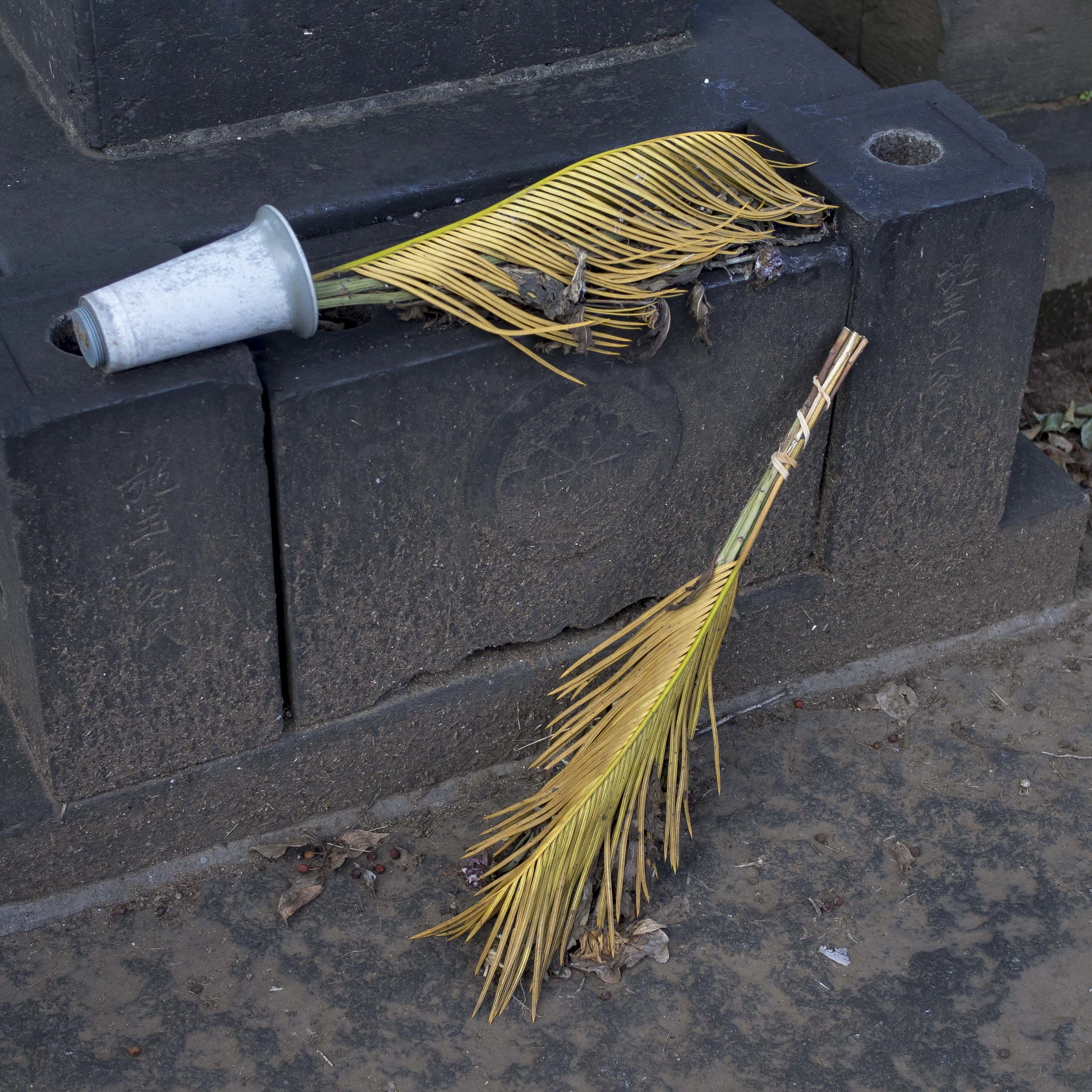
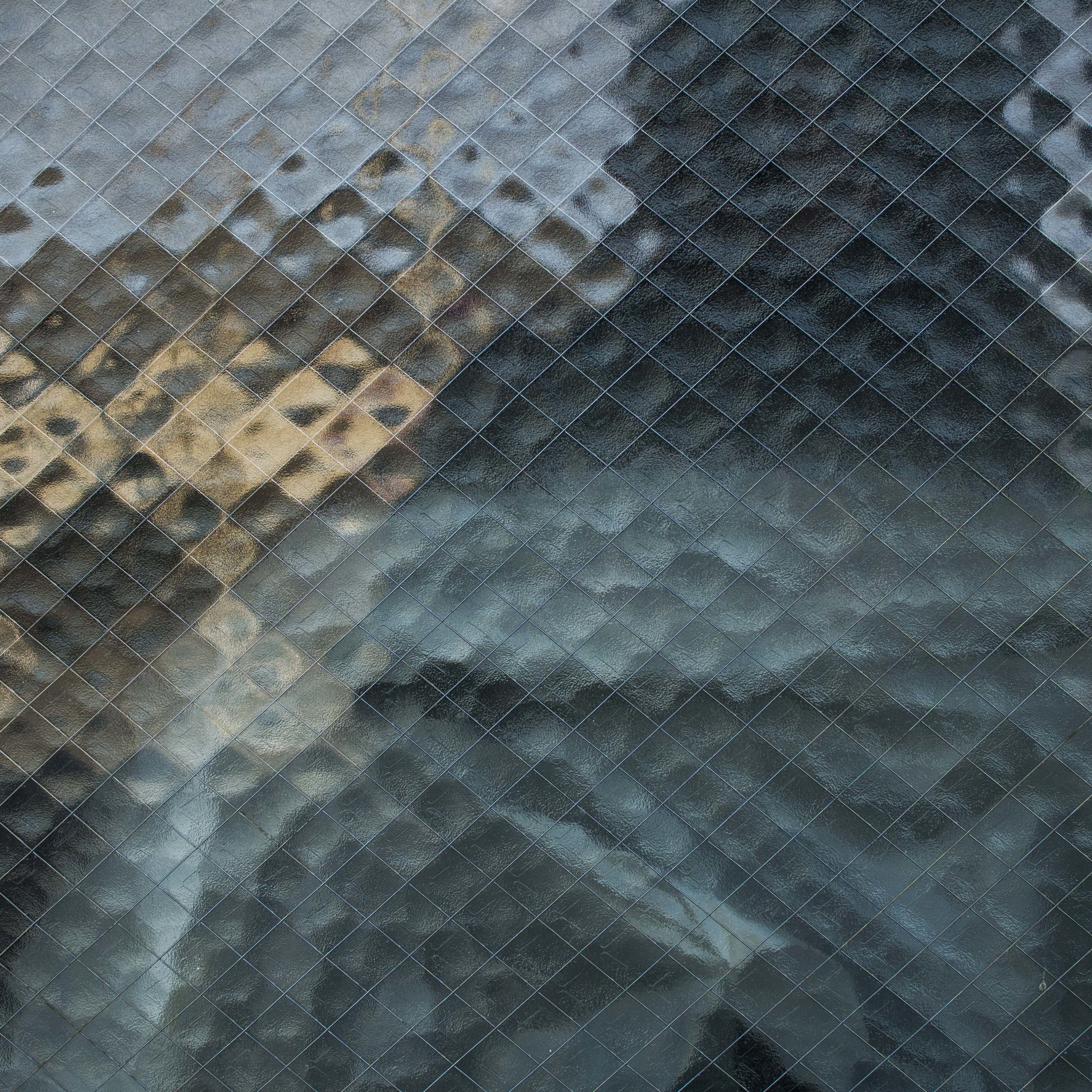
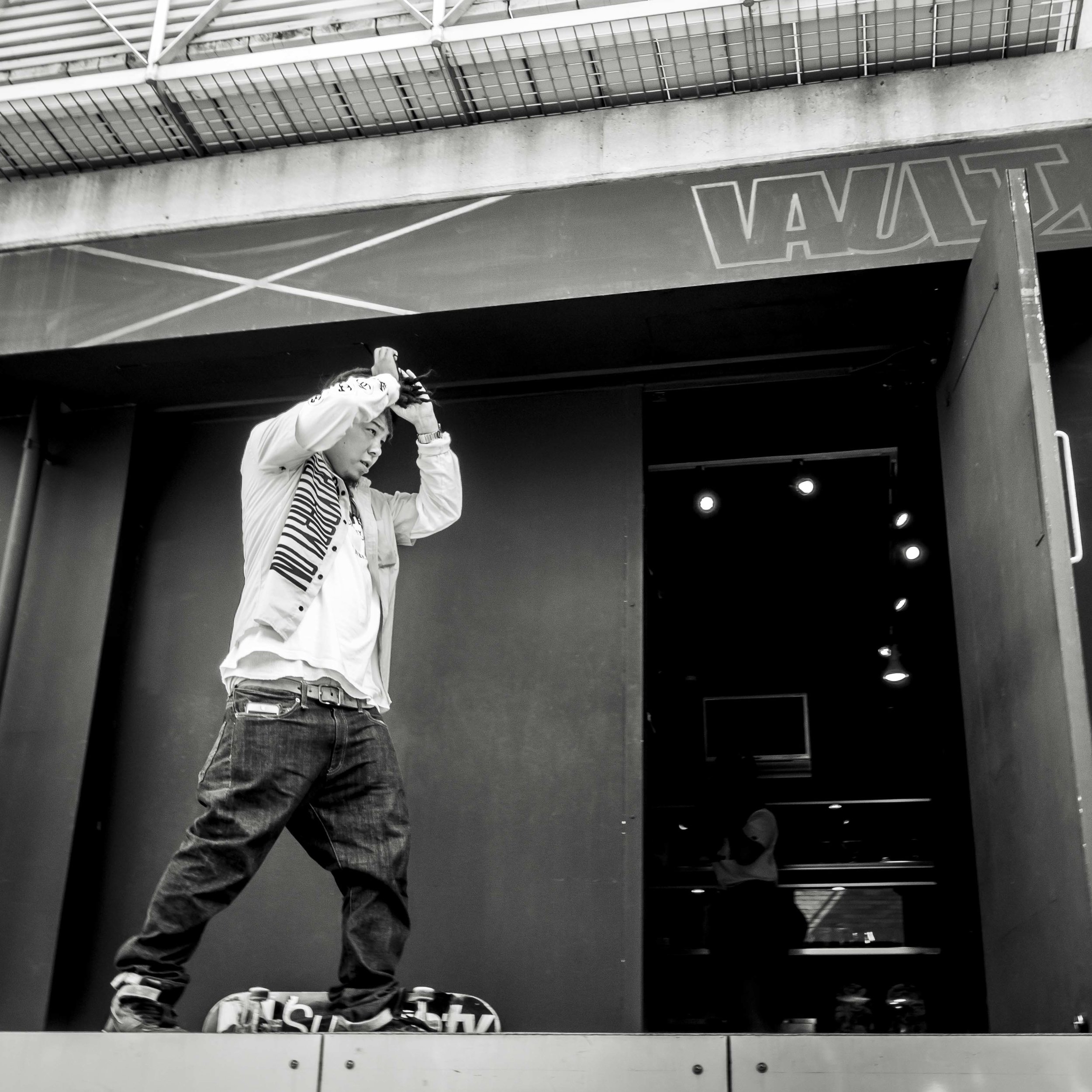
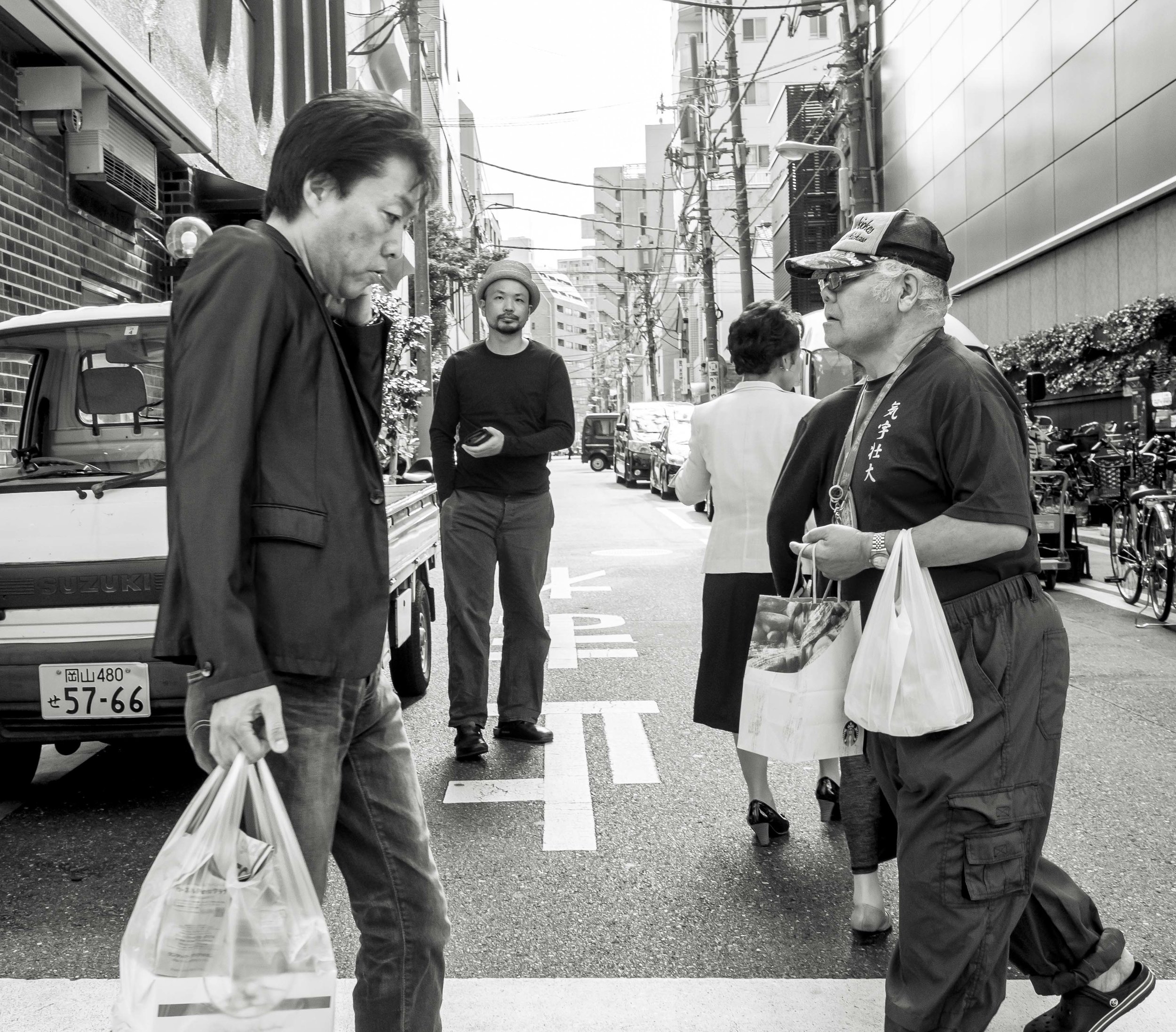
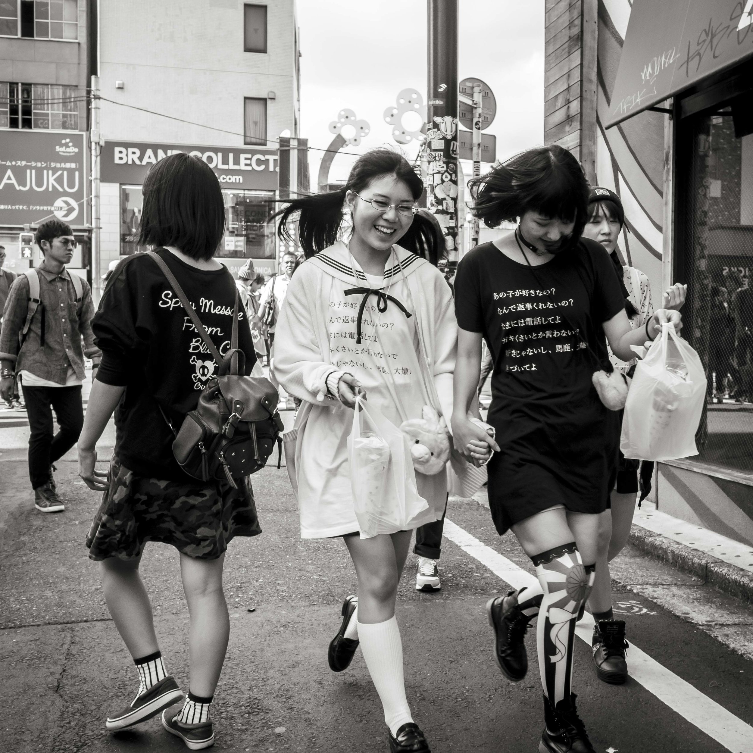
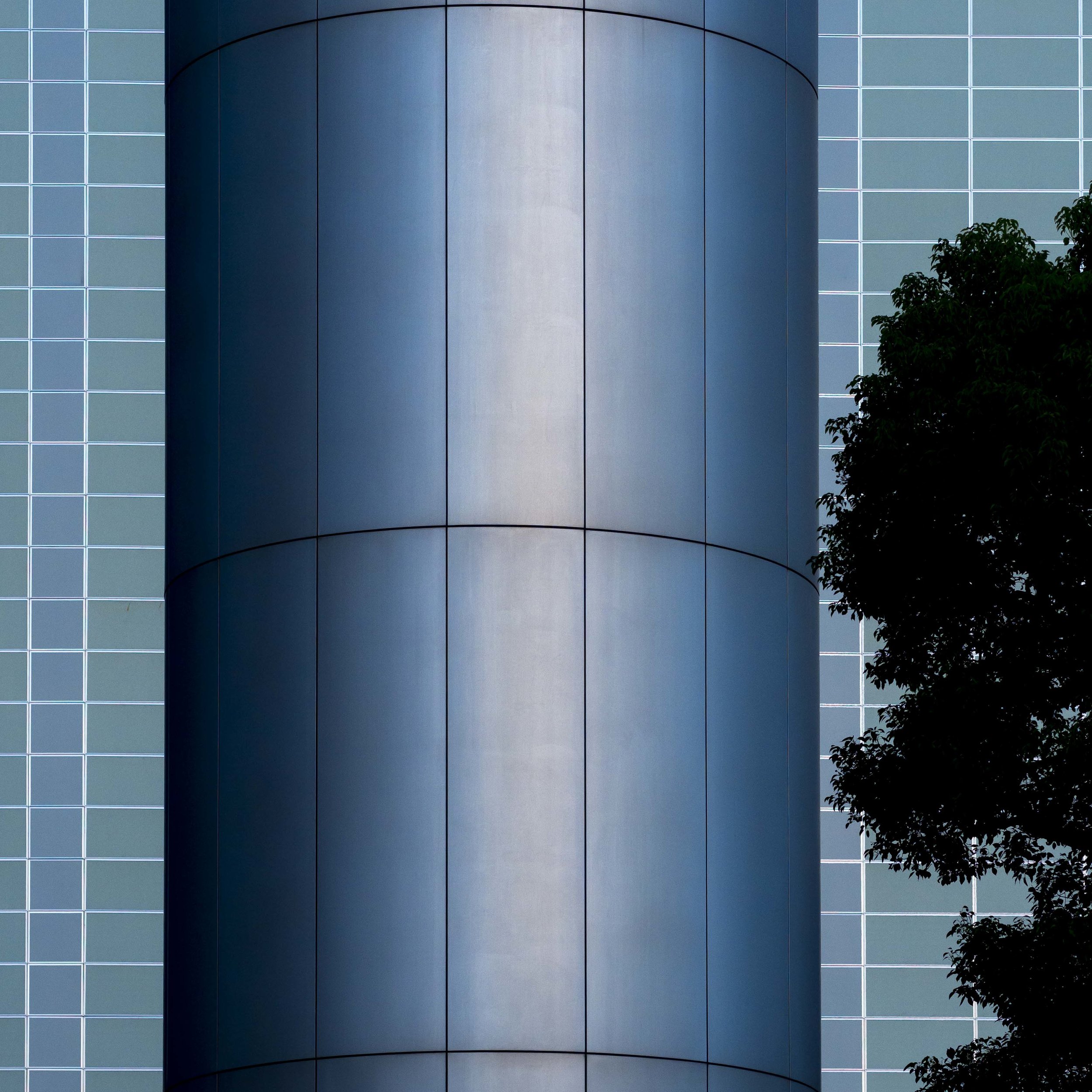
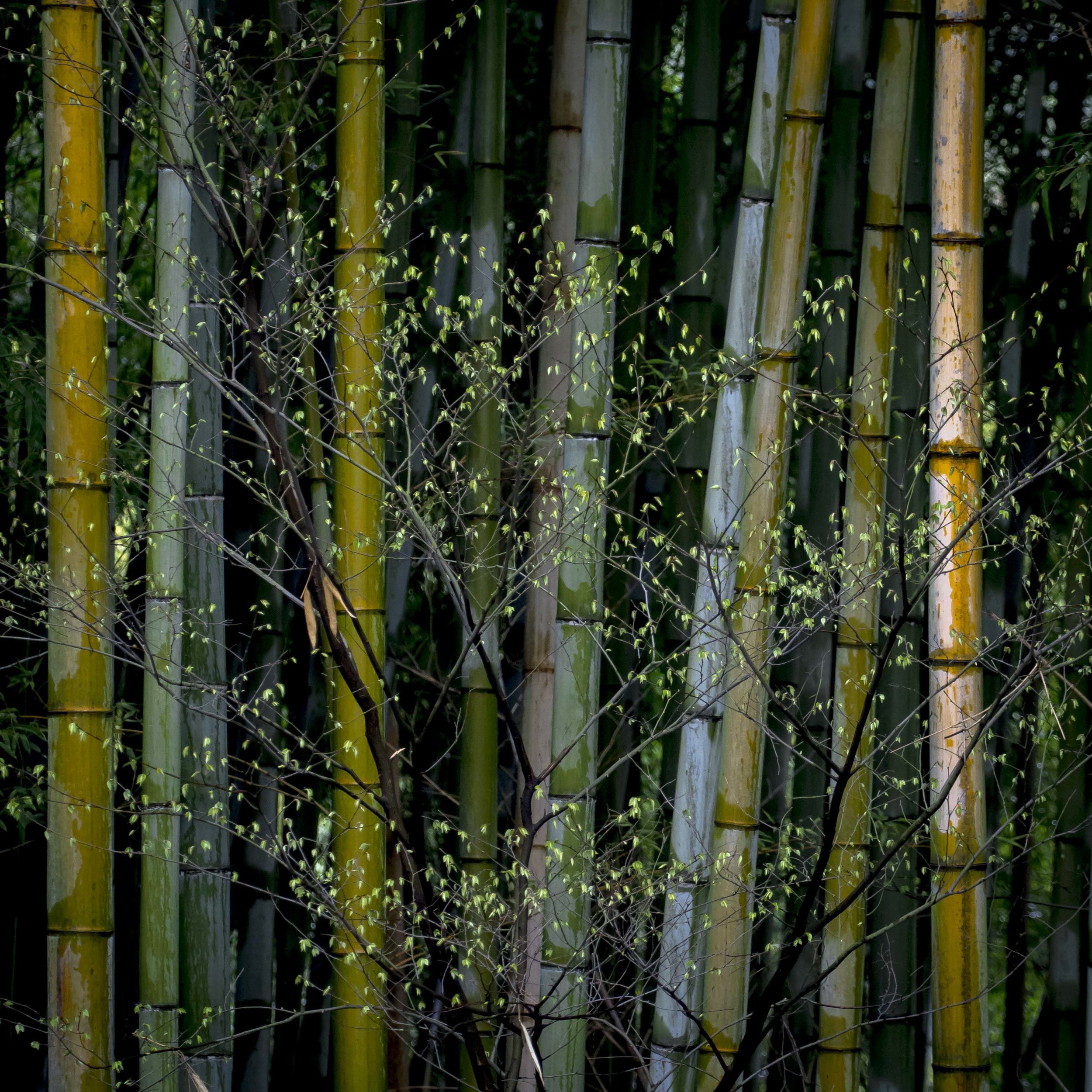
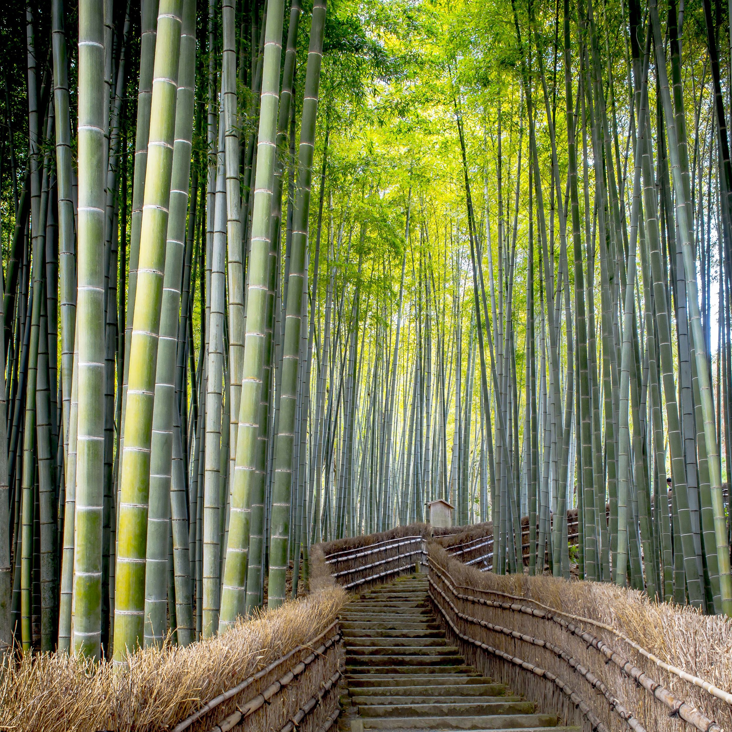

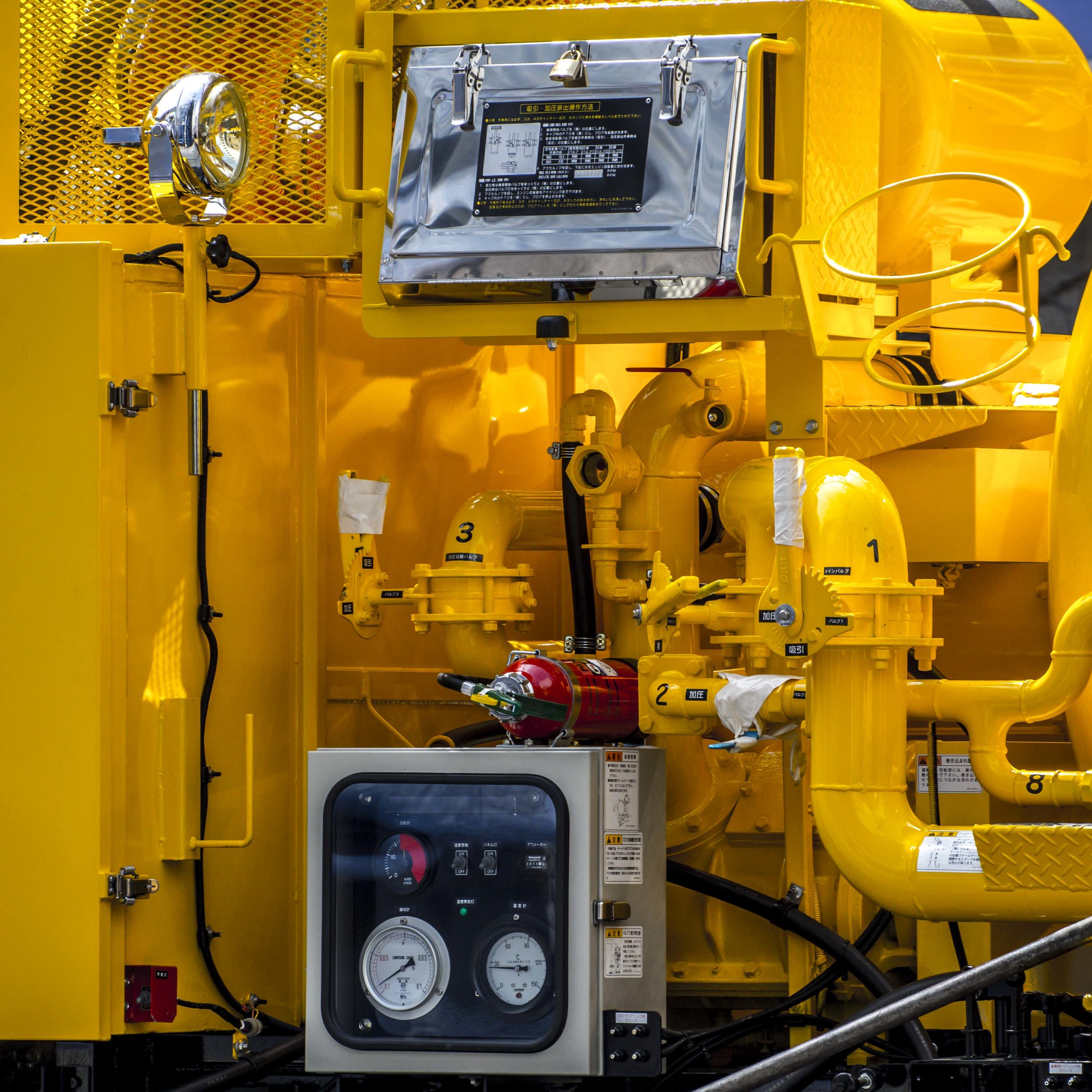

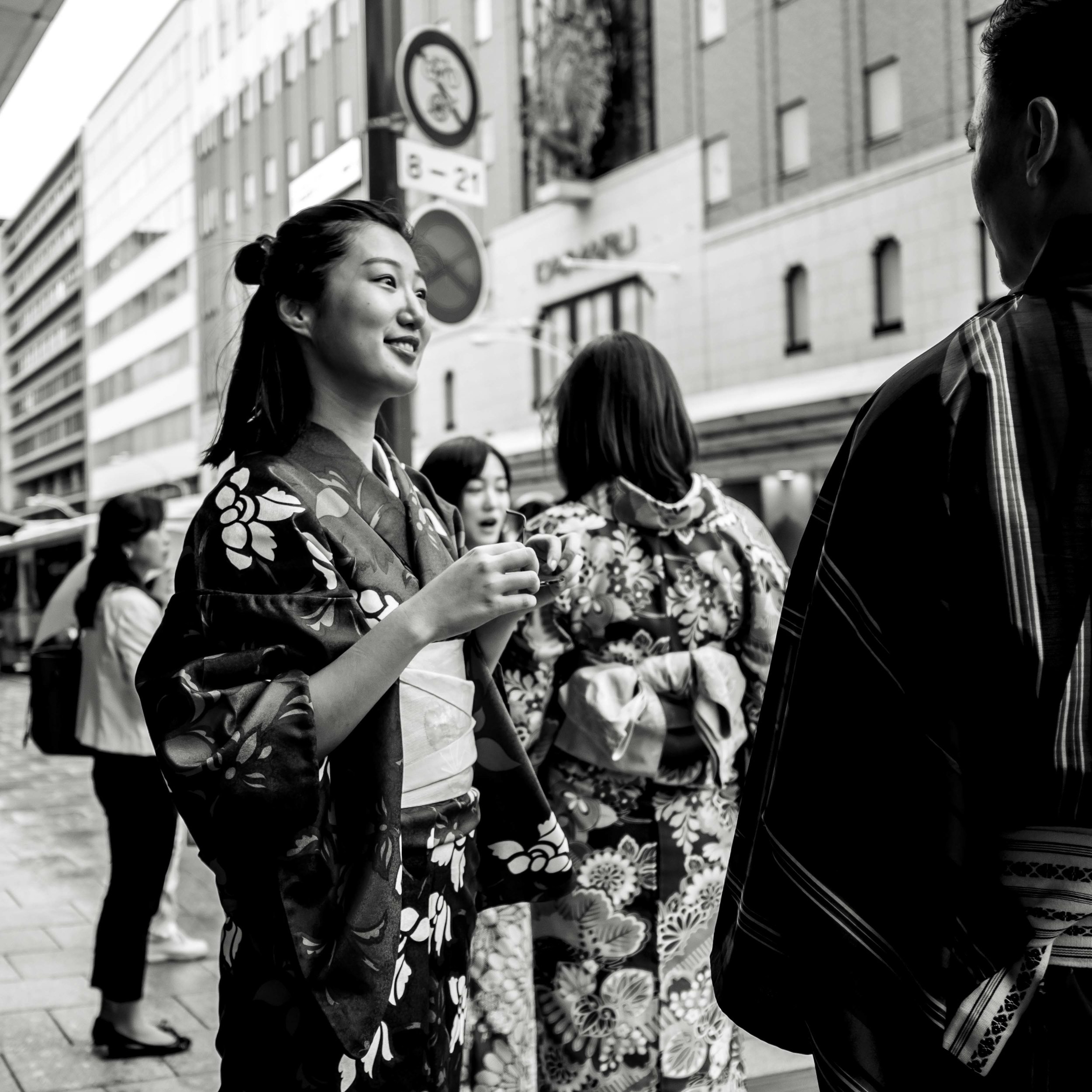
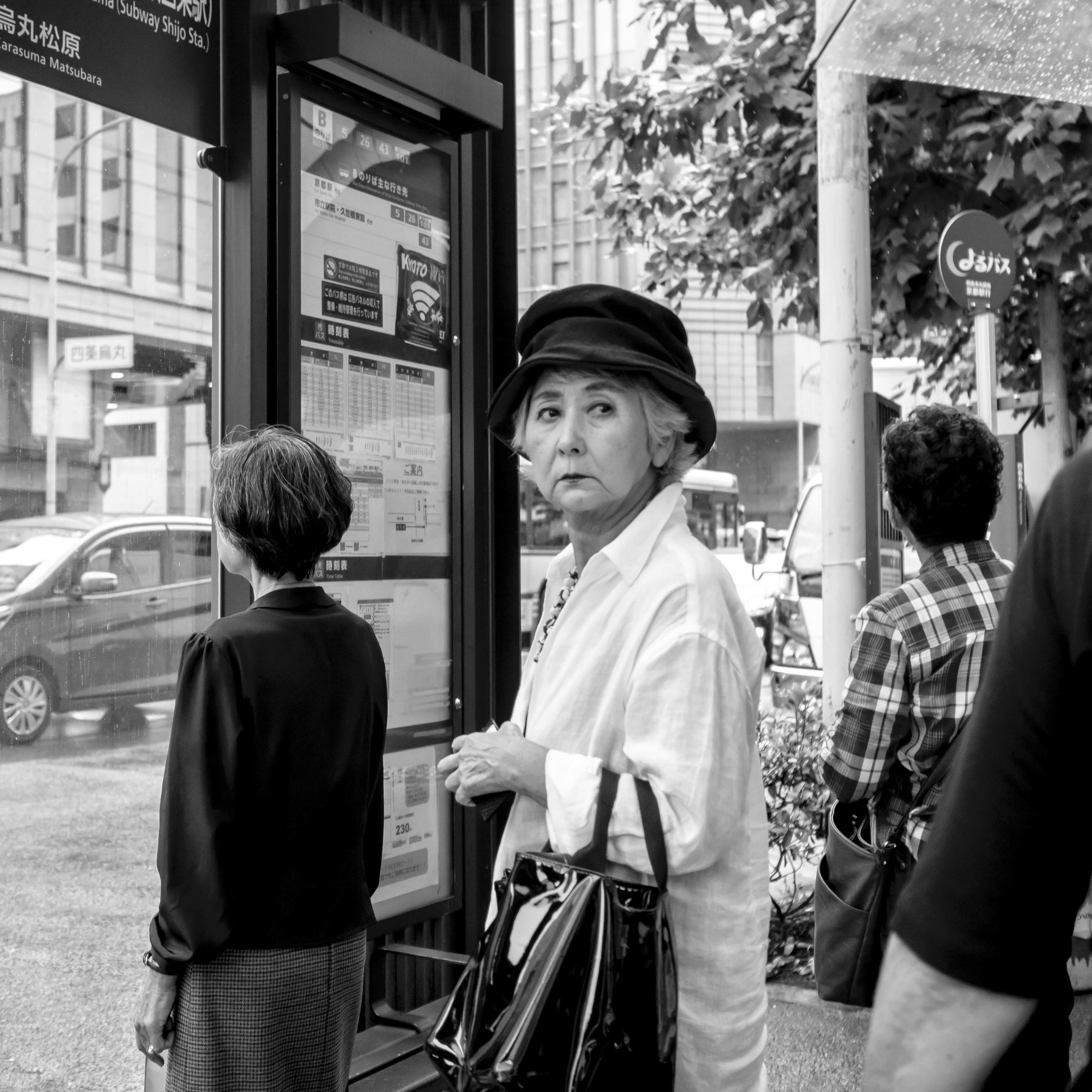
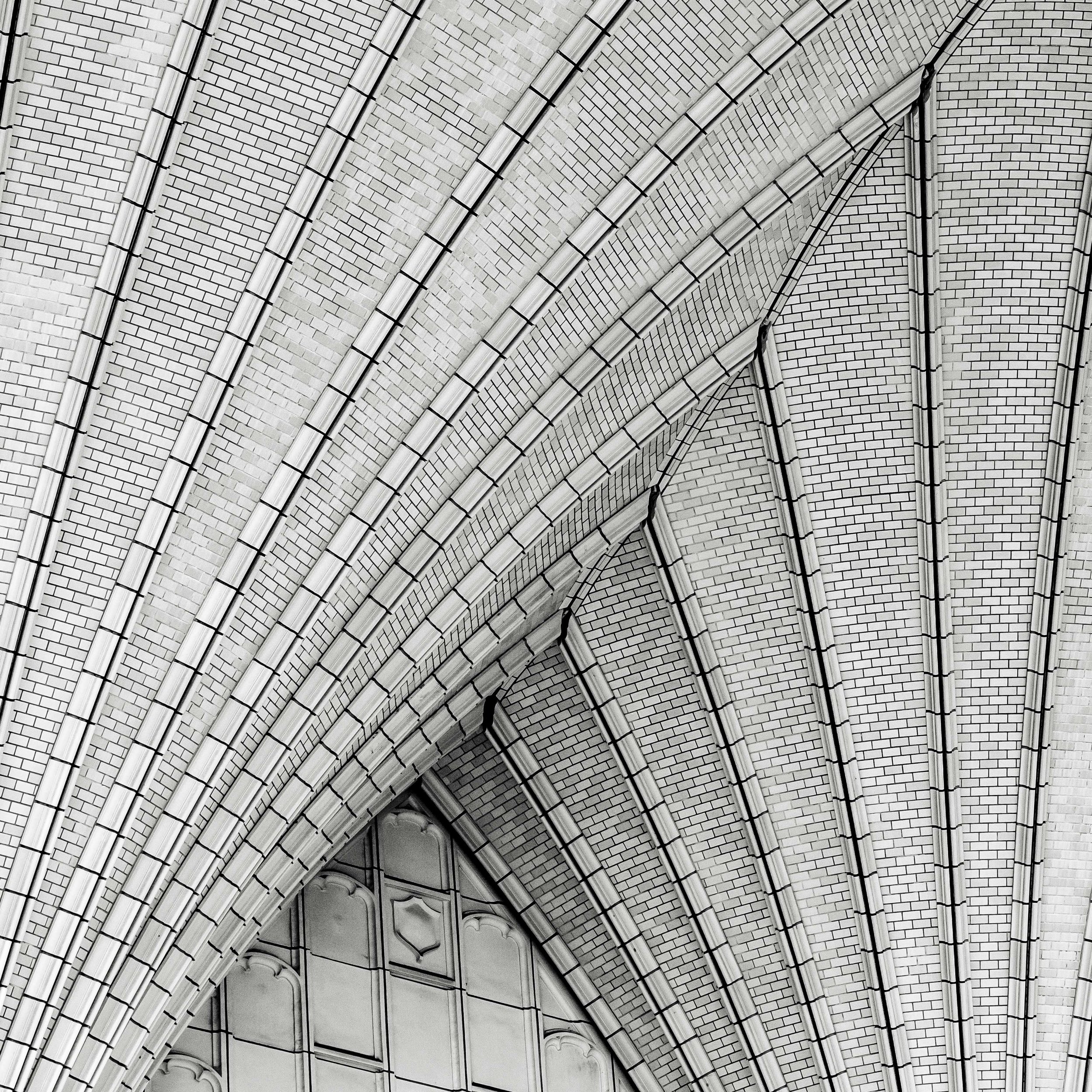
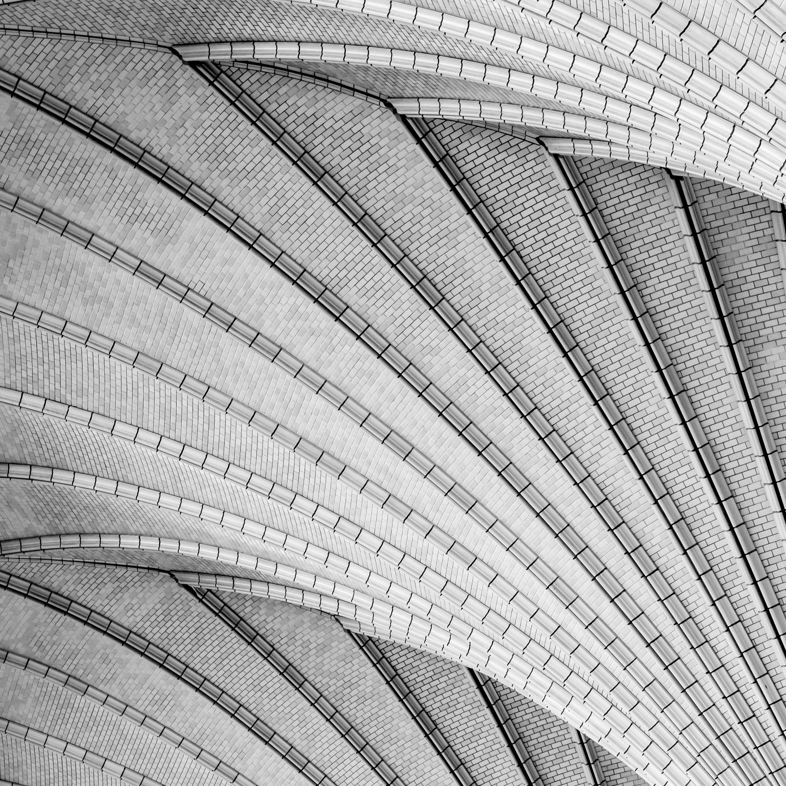
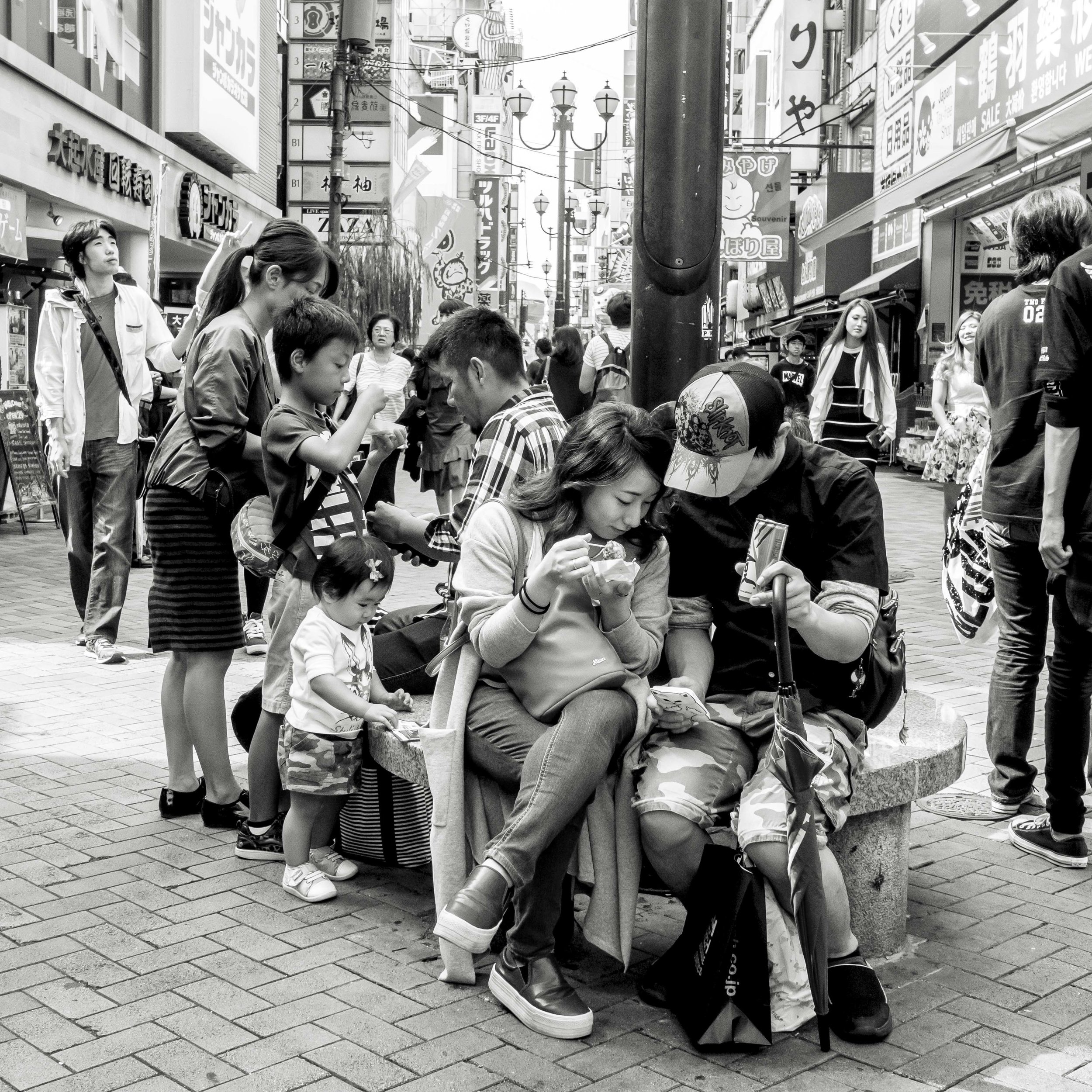

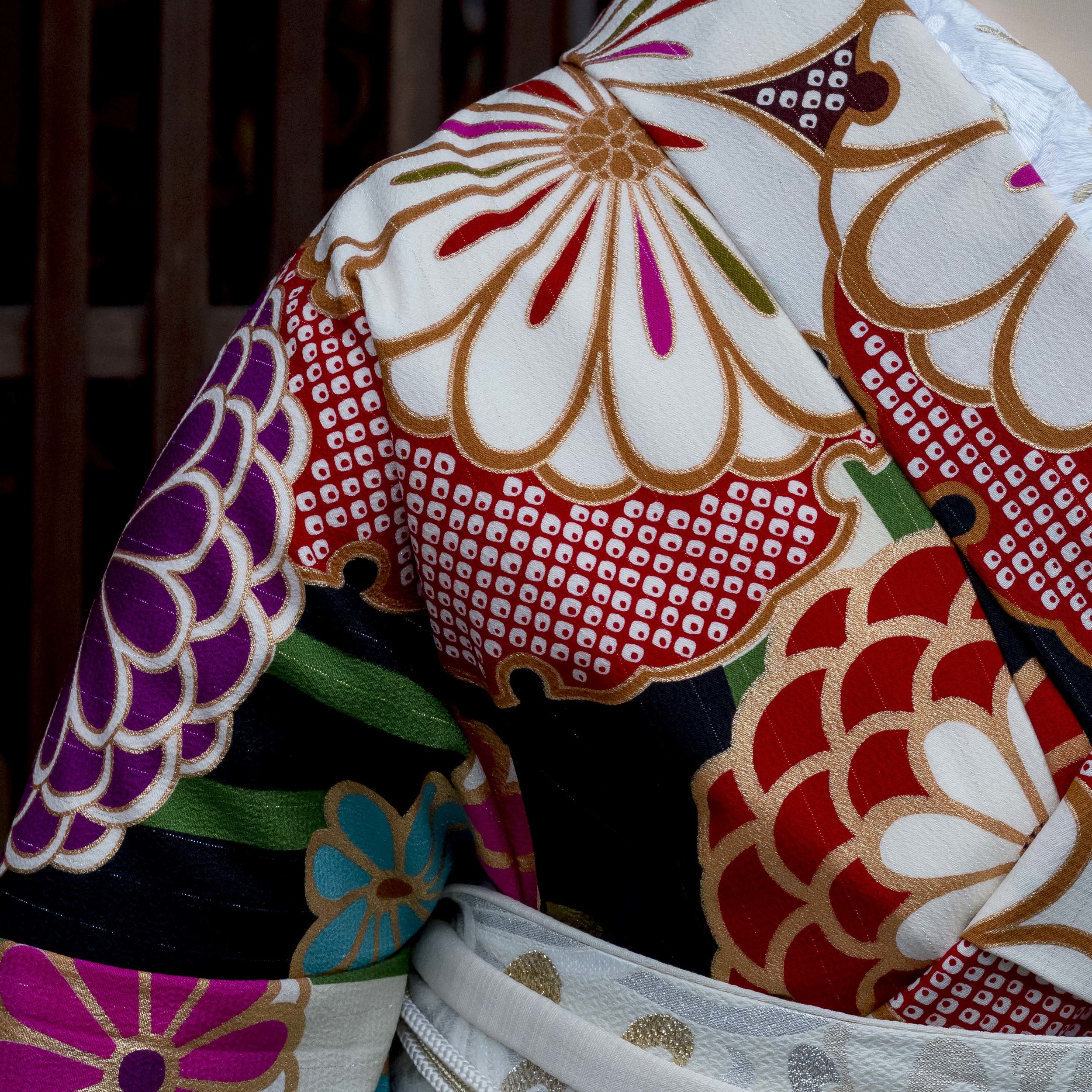
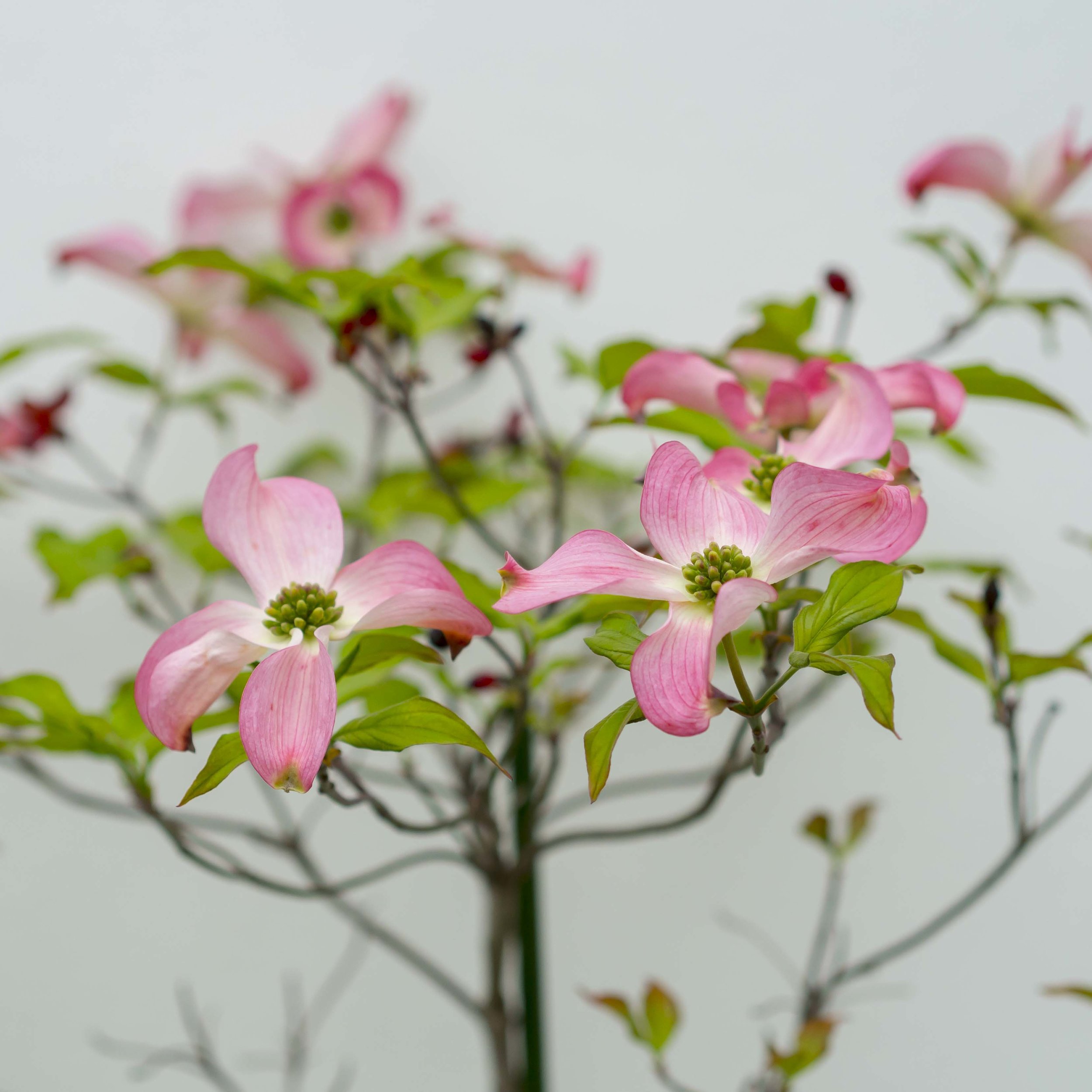
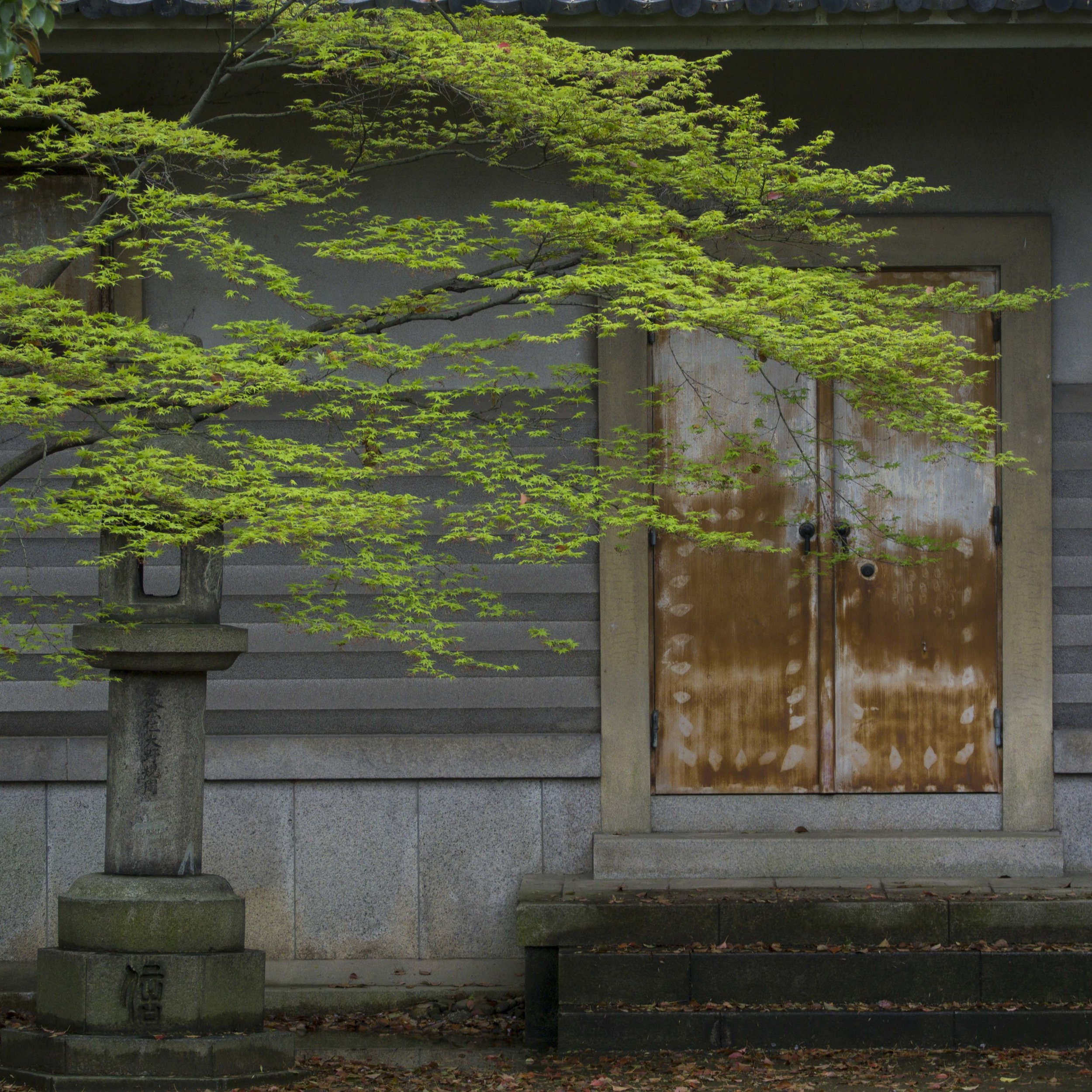
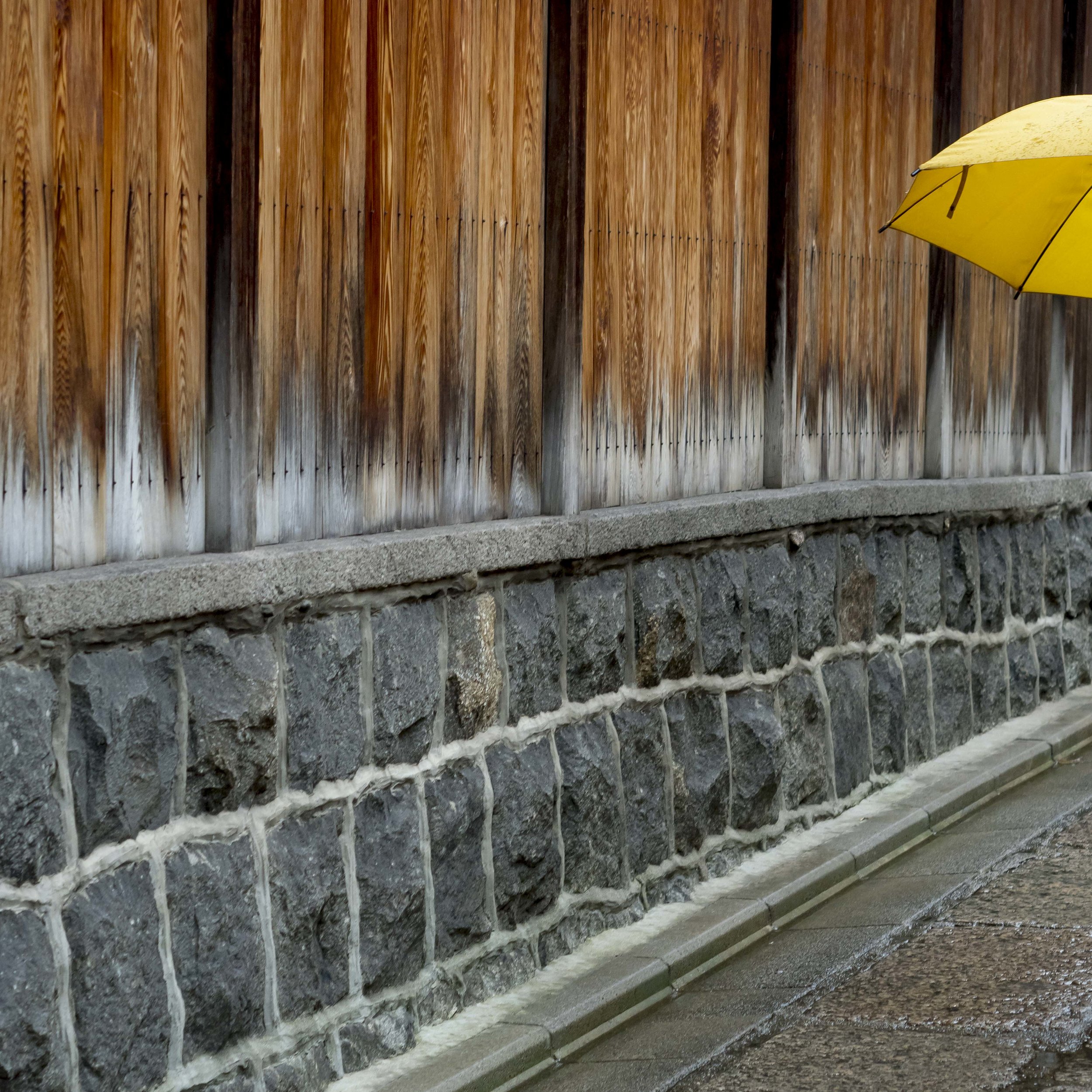
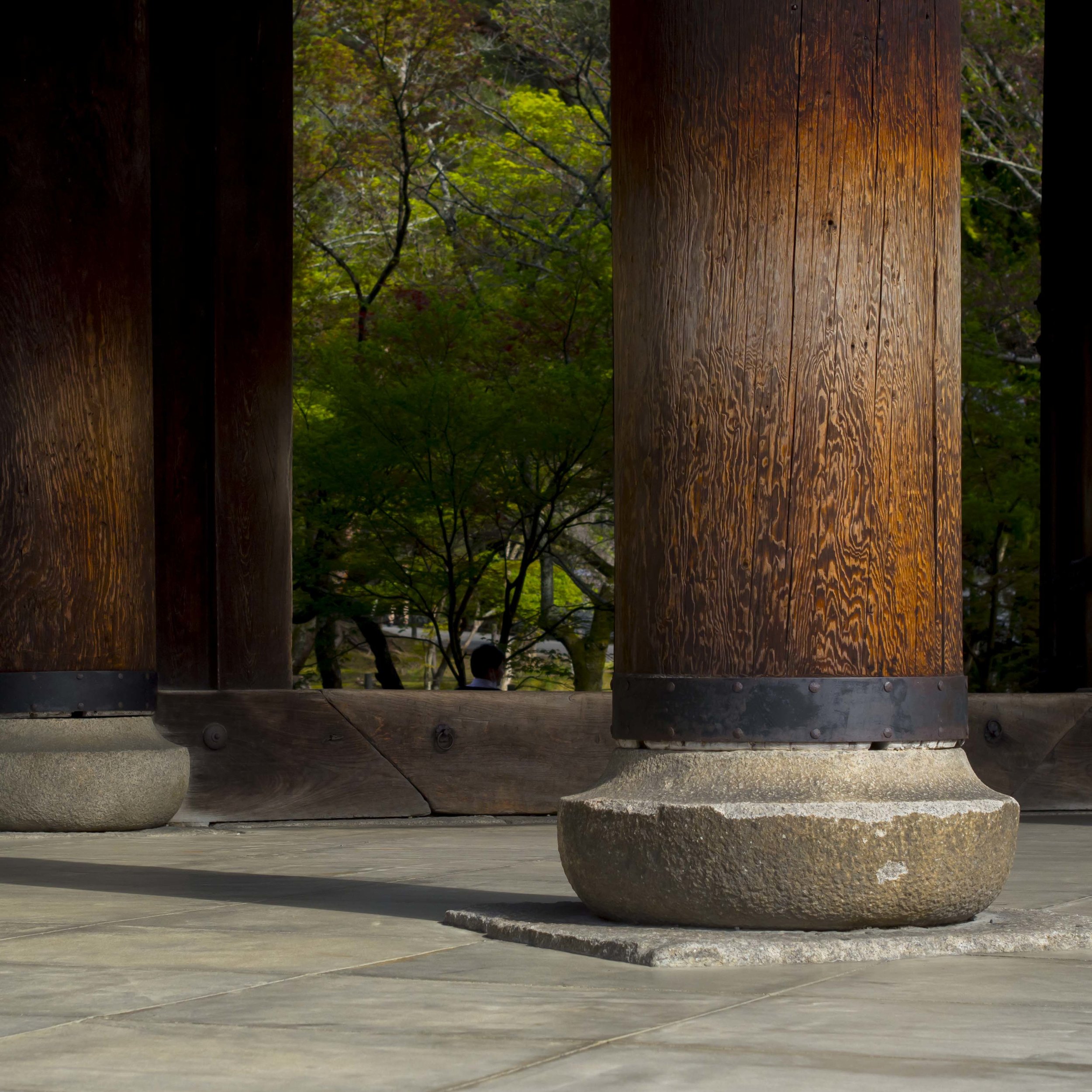
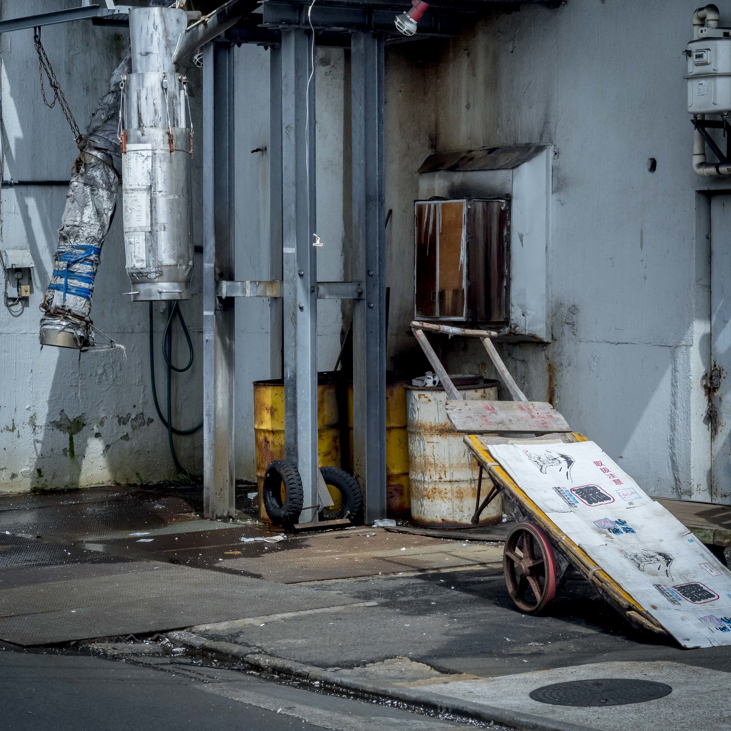
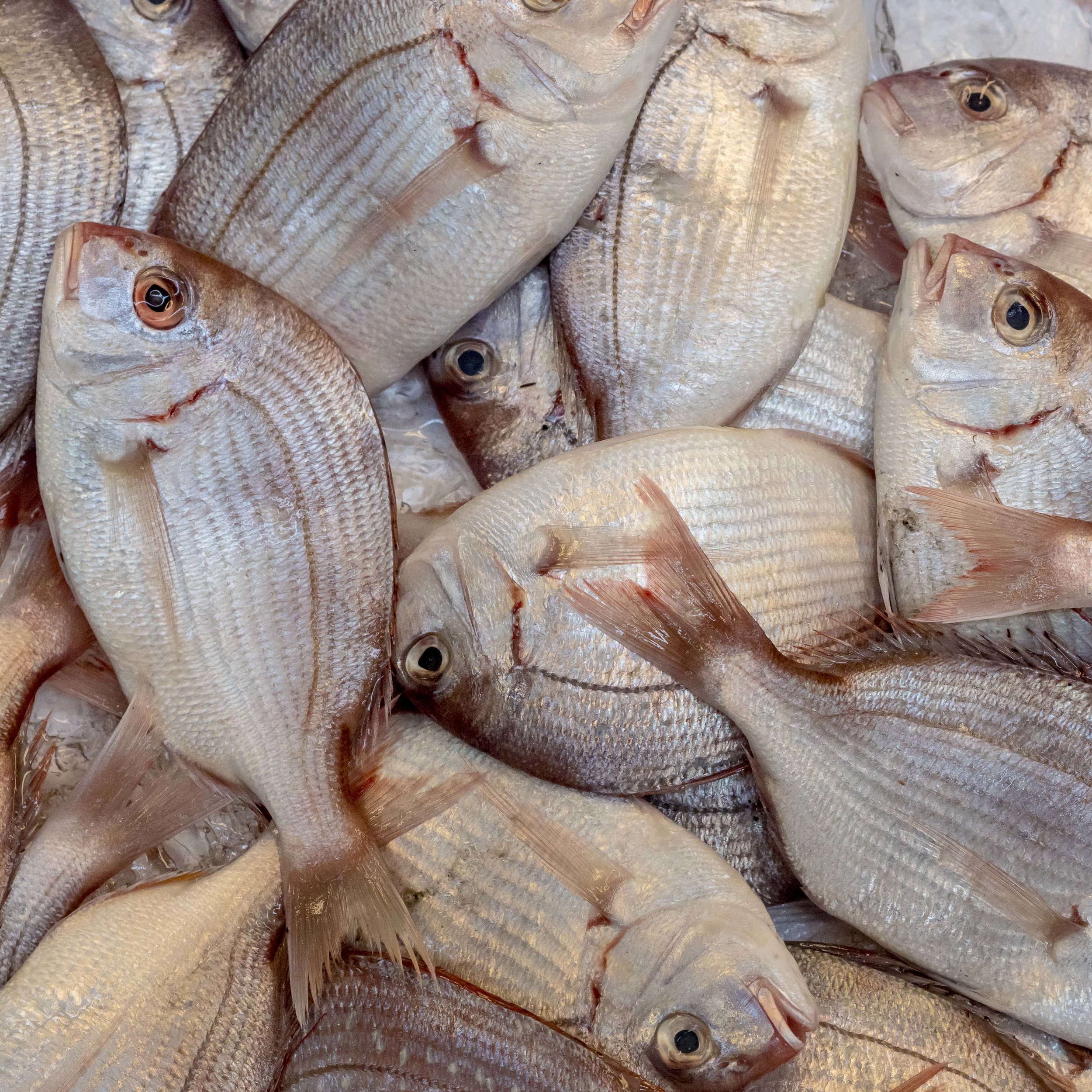
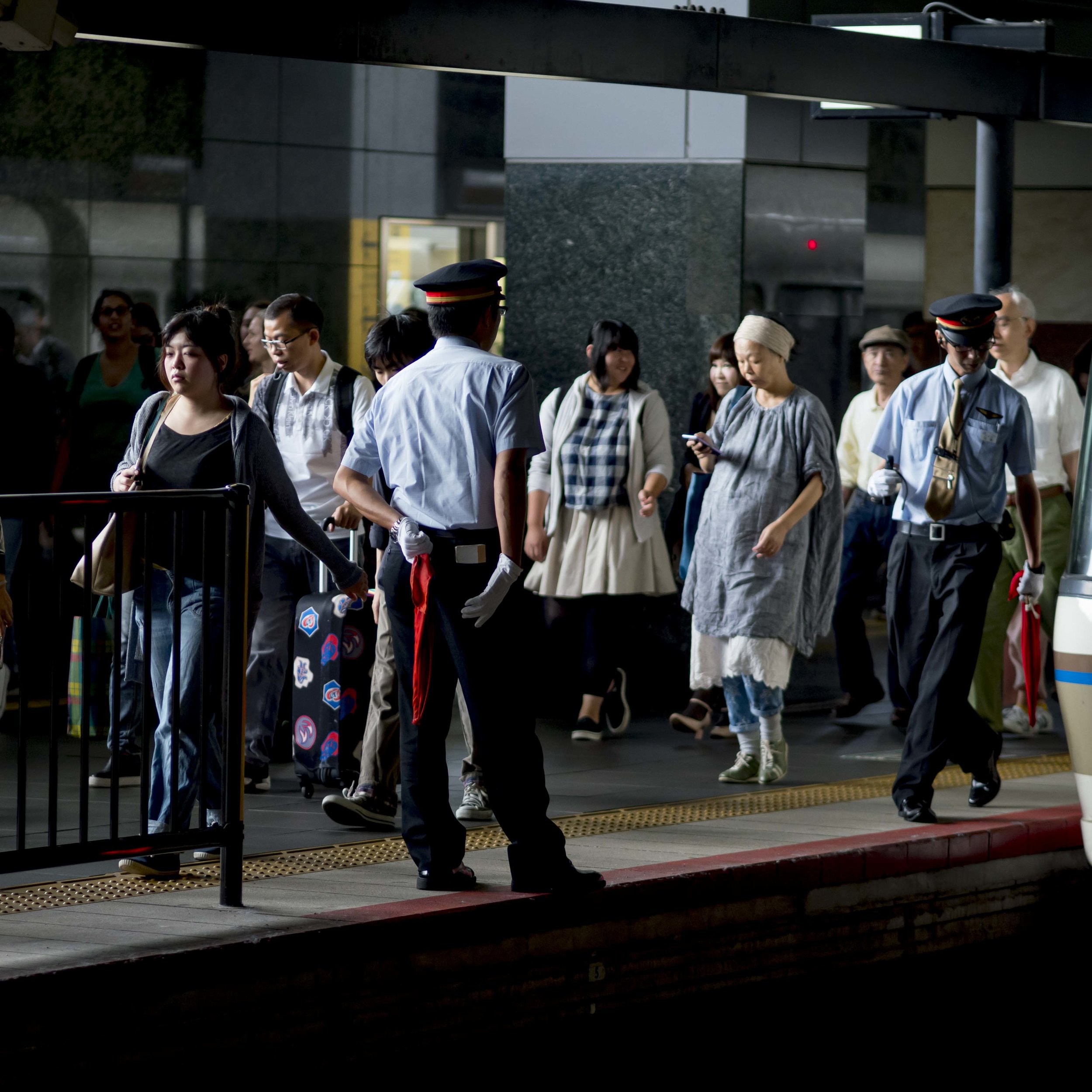
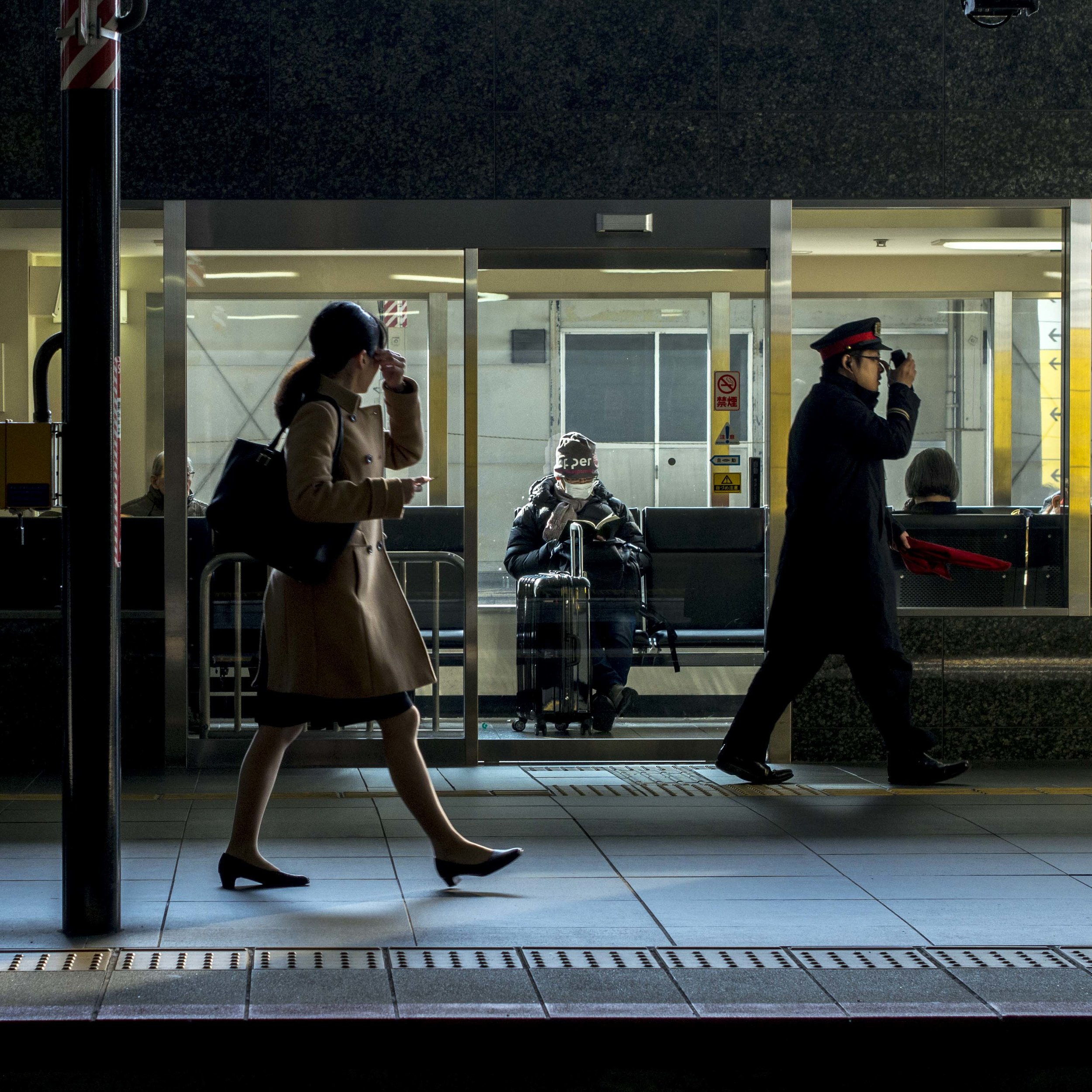
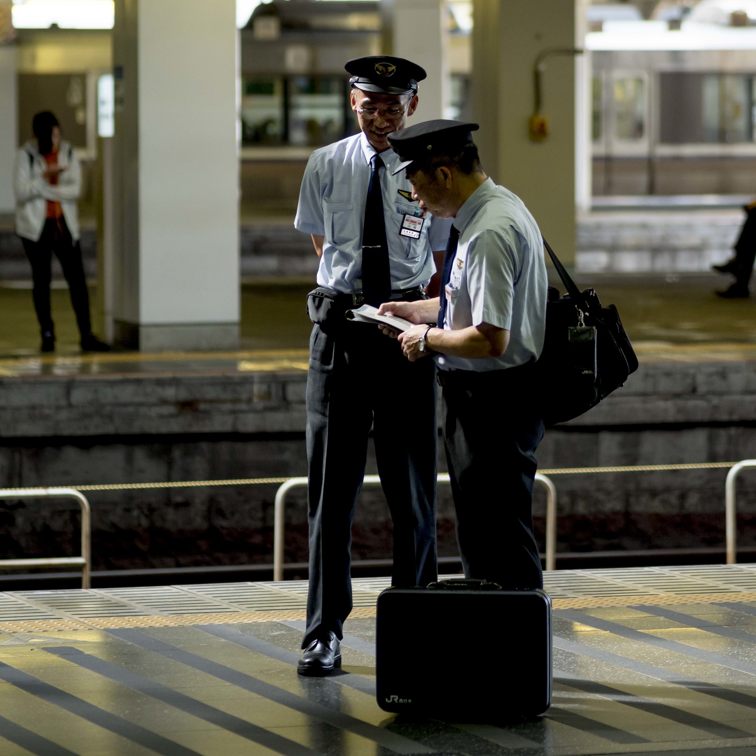
Soft sharp and hard sharp lenses.

My Olympus lens kit has grown a bit lately and it is possible to feel that some of the lenses purchased may have been redundant purchases, but even though one purchase in particular was made on the spur of the moment, the process as a whole was measured.

One of the criteria used to determine relevance, was the “feel” of the lens. This is where two lenses can share technically the same space, but have very different subject rendering.

Lets put forward a theory based on feel, not numbers, charts and resolution charts.

“Smooth Sharp”;

This is where a lens shows a rich, smooth, lushness. This look reminds me of a lot of medium format lenses from the height of film shooting days (Mamiya and Bronica especially). Medium format offered inherently good enough quality to allow the designers of it’s lenses more room for character or just sharpness. I also equate this with the Canon look I was used to with the 5D mk3/7D mk1. Most 35mm lenses were sharpness biased (obsessed), because that format was transitioning in the 1980’s through to the 2000’s from too small, to enough for pro work and the lens was the bigger contributor to the formula.

The lenses I have that are “Smooth sharp” are;

The 25mm f1.8, 12-40 pro*, 75-300 and 45mm at f1.8-2.8.

Both the 25mm and 12-40 have been on the outer with me at one point or the other. Their high sharpness is not clearly evident and both share excellent smooth, but fast drop off Bokeh, which also punishes focus errors (I possibly do not see this with…

Both the 25mm and 12-40 have been on the outer with me at one point or the other. Their high sharpness is not clearly evident and both share excellent smooth, but fast drop off Bokeh, which also punishes focus errors (I possibly do not see this with the 75-300 simply because it is so slow). This had the combined effect of low perceived sharpness, that on closer investigation was false.

Plenty of fine detail and the smooth sharp lens files also enlarge well.

Plenty of fine detail and the smooth sharp lens files also enlarge well.

Smooth sharp lenses are excellent for people, general shooting and jpeg users. The forgiving nature of their sharpness can simply make an image look good with little effort.

What they seem to be weak at is dealing with “mushy” high ISO’s and murky light.

*

Hard sharp;

More like early top tier 35mm lenses of the past, hard sharp lenses have strong micro contrast, which also seems to lead to more coherent (messier), long transition Bokeh. They often look less rounded in presentation, rendering the world in a more literal, less forgiving way, but when maximum perceived detail is needed, they shine. These lenses have a habit of looking sharp even when the image is not perfect, hiding slight motion blur and noise artefacts well. I feel these lenses are best suited to landscapes, tough light (both high and low contrast) and any subject that needs more detail rather than gentler presentation. What they are less good at is communicating glow or glassiness.

My “Hard Sharp” Olympus lenses are;

The 17mm f1.8, 12-100 pro, 40-150 pro, 45mm after f2.8.

The 40-150 pro handled ISO 3200 on the EM5’s better than any other lens I own. I put this down to Olympus paying close attention to the micro contrast of this lens.

The 40-150 pro handled ISO 3200 on the EM5’s better than any other lens I own. I put this down to Olympus paying close attention to the micro contrast of this lens.

The exception lens;

The 75mm f1.8 seems to offer the best of both worlds. Lush and deep in rendering, it also jumps off the page with very fine detail. The only “flaw” it has is pronounced flattening of perspective.

Camera considerations.

There is also a balancing effect these lenses can provide when pairing them with various Olympus sensors. The EM1 mkI/II both use phase detection on-sensor focussing and stronger noise reduction that changes the sensor’s rendering ever so slightly. I feel (and DP review goes some way to bearing this out), that these sensors have a more “smooth sharp” look where the other sensors are “hard sharp”. With this in mind, it is possible to mate the most exaggerated or balanced combinations;

The Pen F with 12-100 for maximum clarity and perceived fine detail resolution as a landscape paragon.

The EM1 mk2 with 12-40 for higher smoothness and gentlest rendering at the expense of the characteristic M43 hyper-sharp look.

I may be talking out of my hat completely, but I do not see any need to ignore my intuition when it comes to how my gear makes me feel and creatively think as I use it, as that alone is a relevant part of the process.
The other "true" format

The other format that I find more genuine and less compromised is the cinematic or semi panoramic one.

The human eyes see naturally into a panoramic or wide screen format. There is a reason films are shot in 16:9 ratio or wider. It looks awesome and feels natural.

For stills, it has an amazing feeling of depth and drama, forcing the shooter to use the whole frame width to tell a story. Rather than the rather ambiguous semi wide 3:2 or semi square 4:3 ratios, the true cinematic super wide commits to a look that is far stronger, but more demanding.

You cannot often lift a super wide from a rectangle (all of these were), but the pixel wastage can be crippling (as can paper wastage).

Rather than the instant, almost invisible comprehension the square offers, the cine-wide makes the viewer look left to right (or right to left depending on the subject).

Rather than the instant, almost invisible comprehension the square offers, the cine-wide makes the viewer look left to right (or right to left depending on the subject).

Comprehension of the space is forced into an exploration dynamic. This is not a glance and hold format like the square, it is a look and explore format.

Comprehension of the space is forced into an exploration dynamic. This is not a glance and hold format like the square, it is a look and explore format.

This “Super-Cine” format can do what normal rectangles fail to do. It can create drama on an epic scale.

_4120237.jpg

Depth can be used, but also the full width can tell a story from end to end.

Extra height in this image dilutes the story the two women on the end add.

Extra height in this image dilutes the story the two women on the end add.

_4090451.jpg
untitled-.jpg
The power of the strong graphic elements in this image are again reduced with more height. The image becomes half about the seats and half the negative space above, to no benefit.

The power of the strong graphic elements in this image are again reduced with more height. The image becomes half about the seats and half the negative space above, to no benefit.

The sweeping landscape suddenly emerges from even confined spaces.

There are even opportunities for multiple stories to intermingle. I think the true master of this format (not me) could balance multiple elements, allowing each their own strength, but use them also to support each other to even greater combined eff…

There are even opportunities for multiple stories to intermingle. I think the true master of this format (not me) could balance multiple elements, allowing each their own strength, but use them also to support each other to even greater combined effect.

Repetition can also be used in a stronger fashion.

Repetition can also be used in a stronger fashion.

Flexible Portrait framing

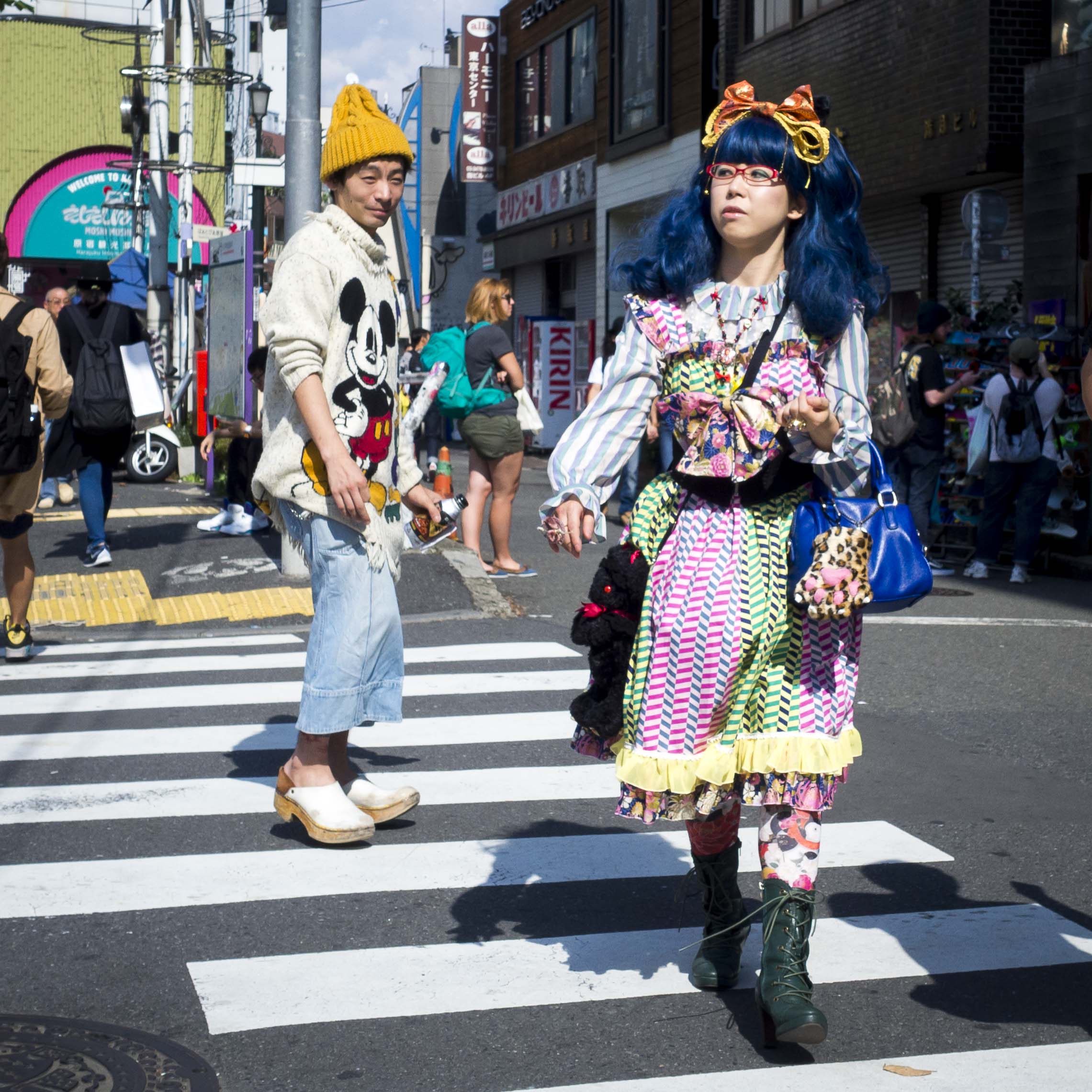
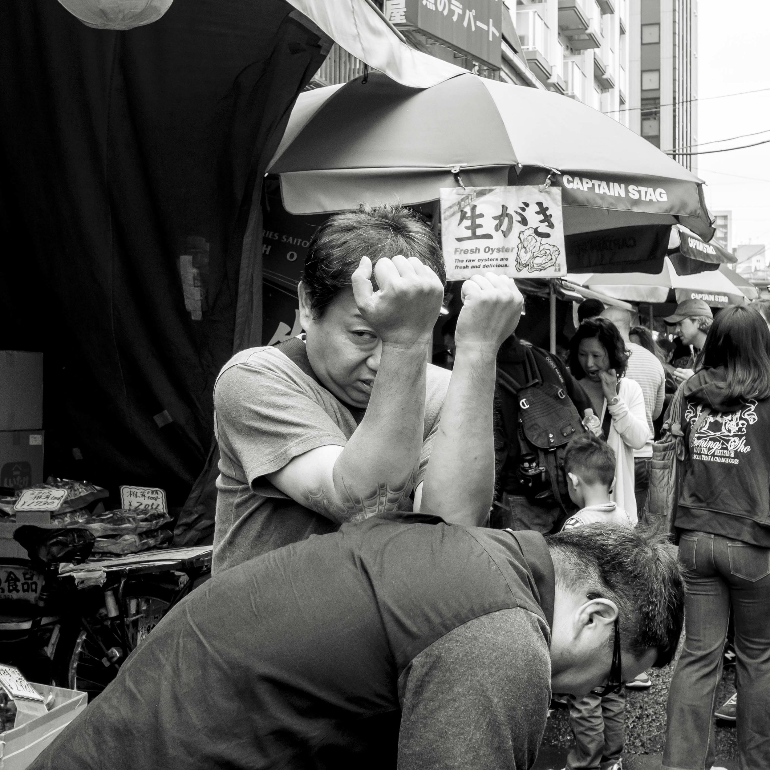
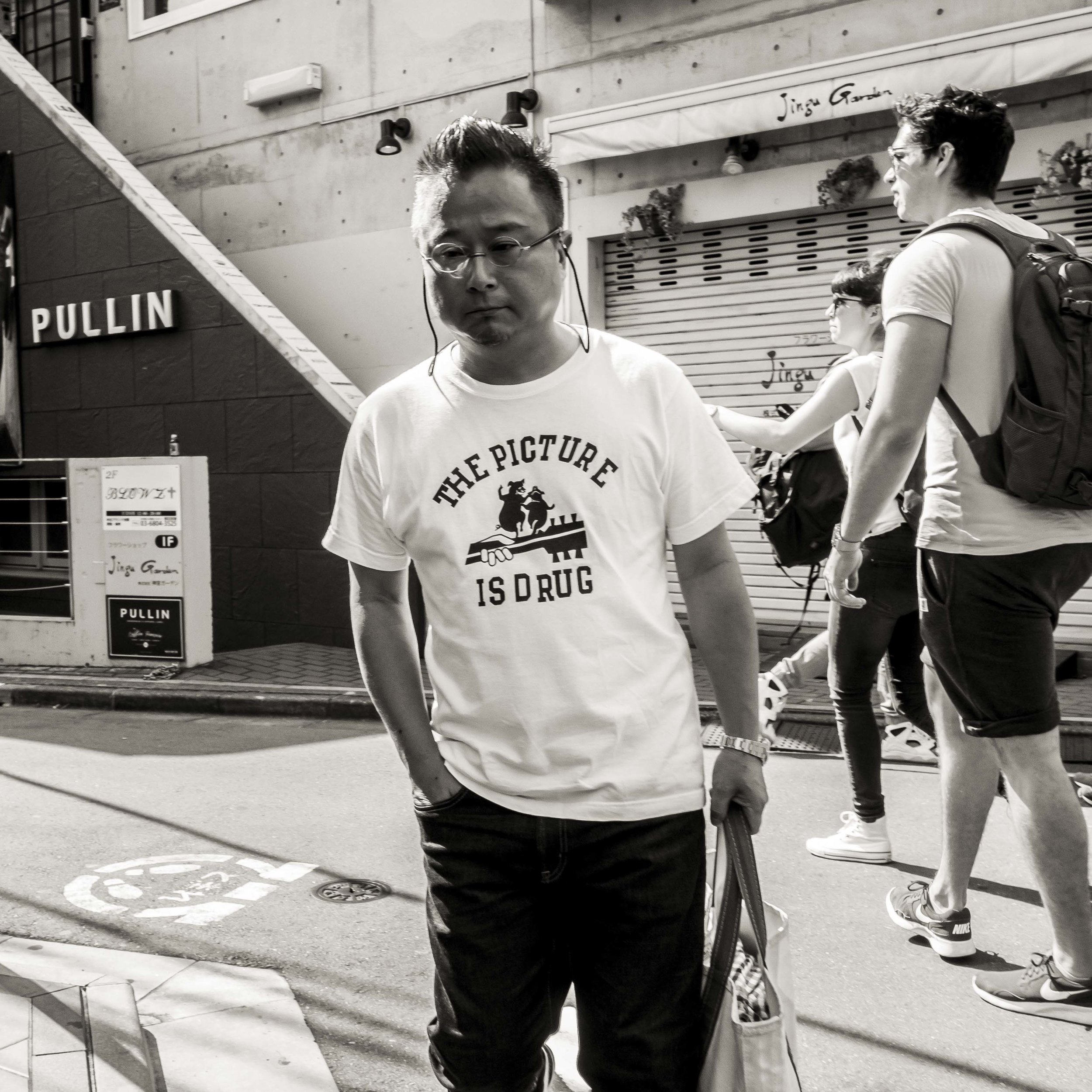
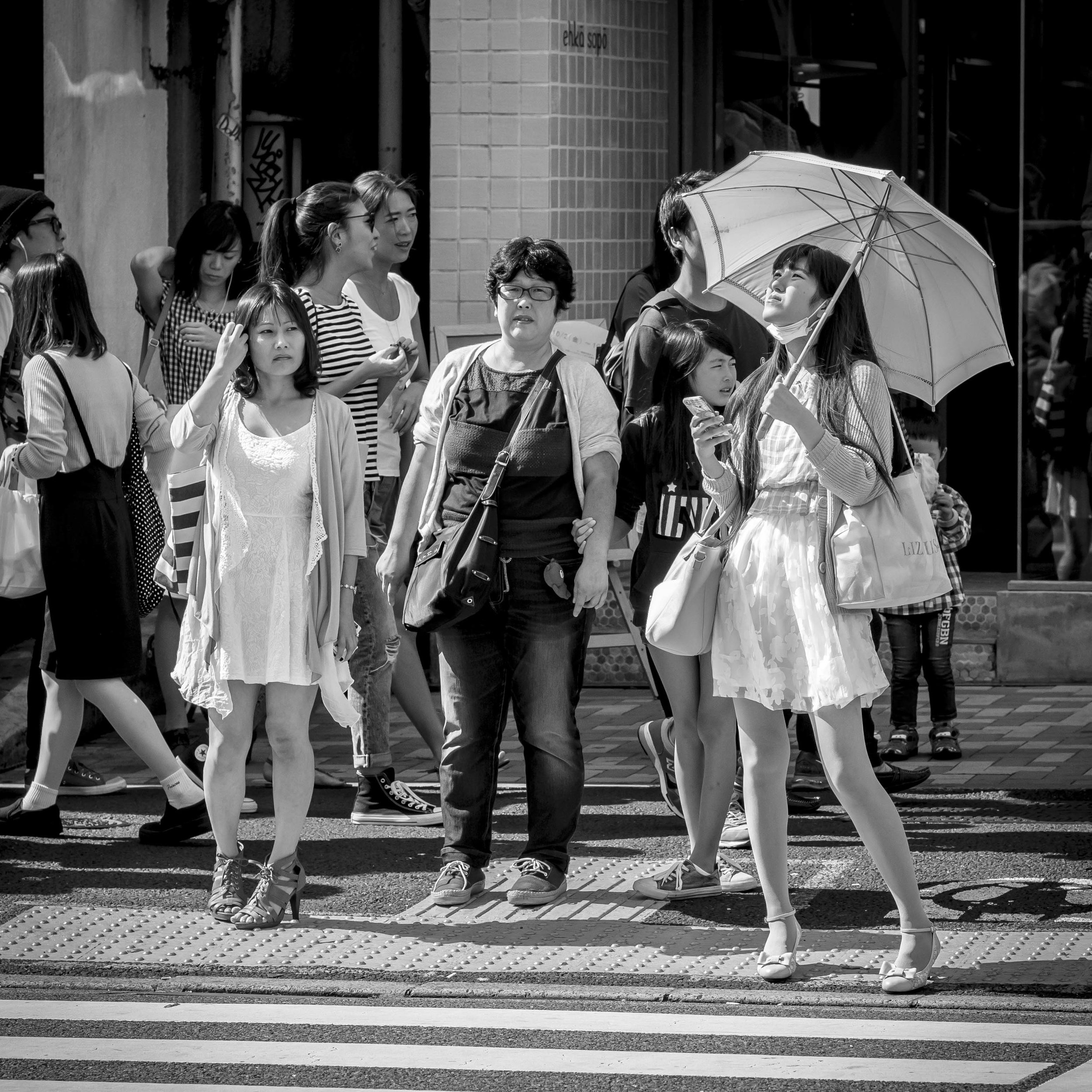
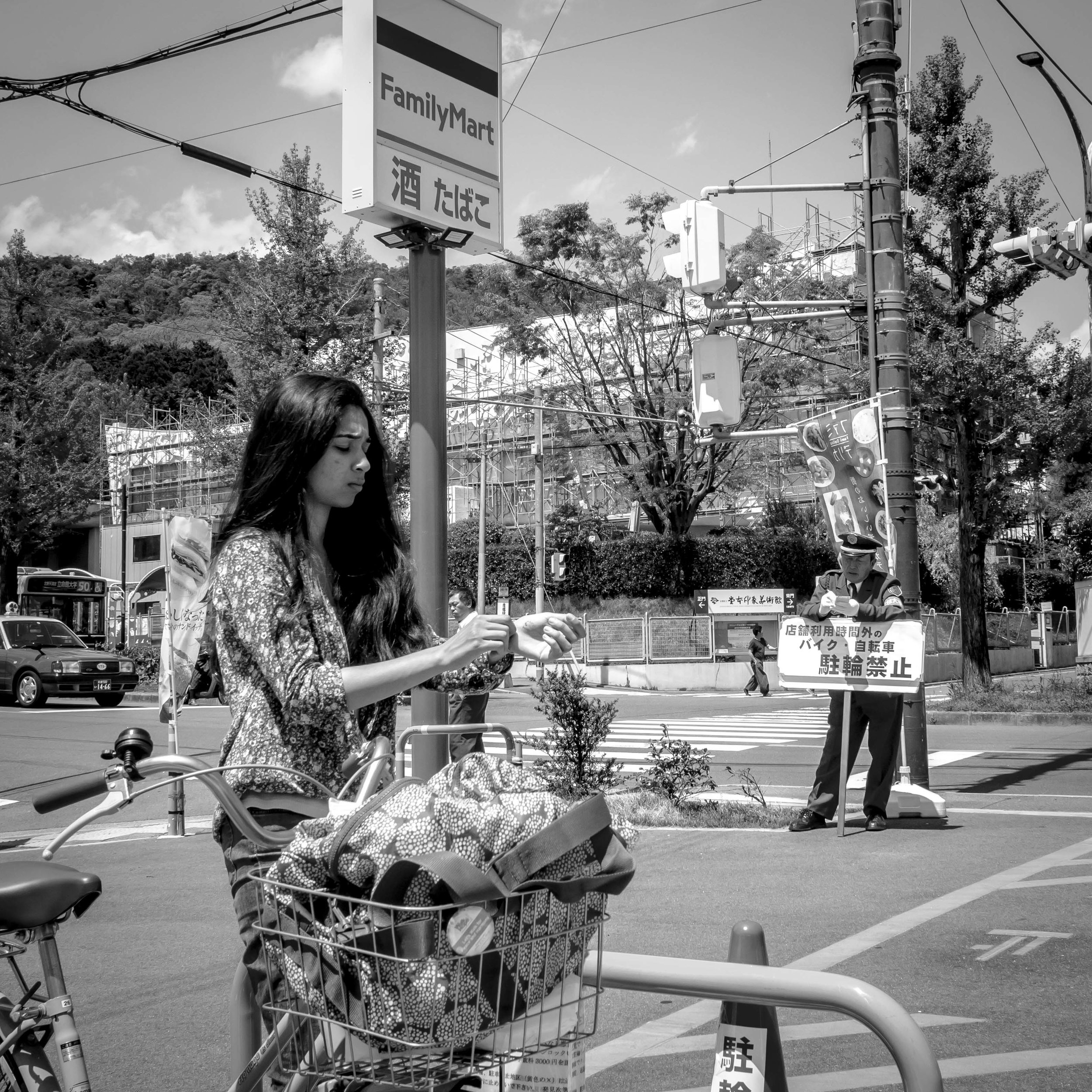
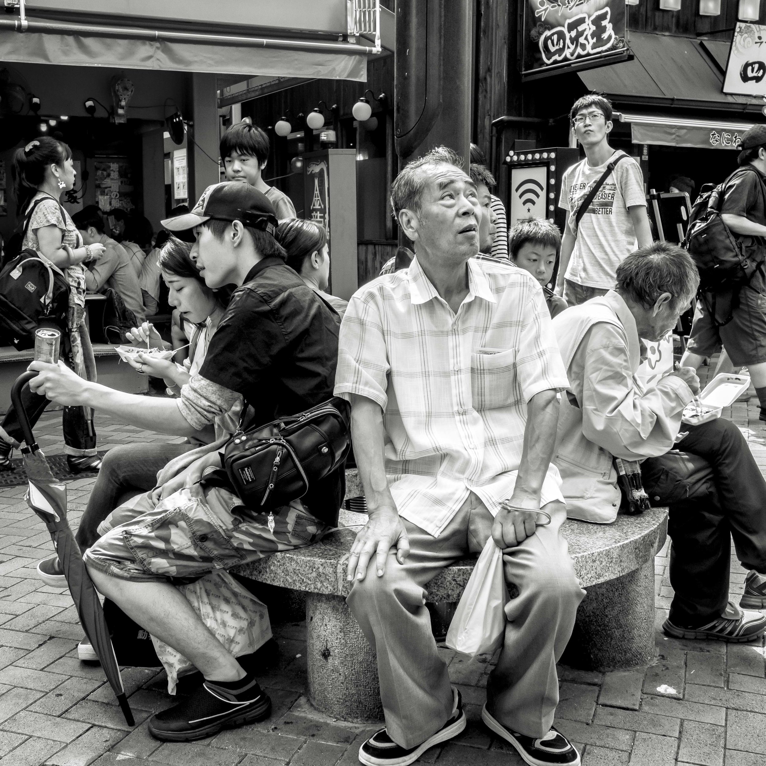
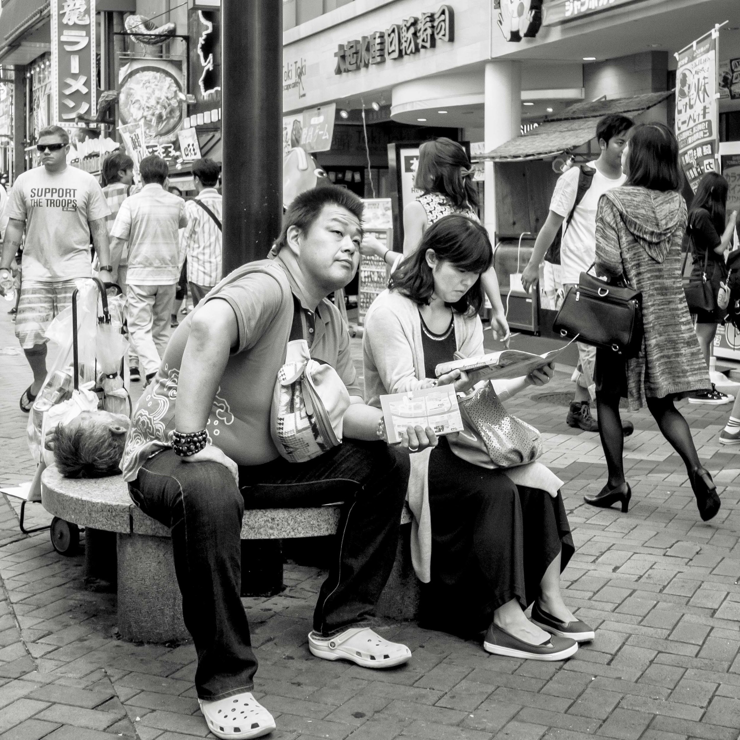
The square image (You may have noticed a tread here), seems to have enormous flexibility in portrait framing options. I am not saying that rectangle images do not, but the square seems to allow the rules to be broken.

The normal “looking in” composition horizontal images prefer and portrait orientated images require.

The normal “looking in” composition horizontal images prefer and portrait orientated images require.

A rule breaking centred figure. Still seems ok in the bias neutral square.

A rule breaking centred figure. Still seems ok in the bias neutral square.

The “looking to the short side” image. Still solid. This can be dramatic with a rectangle is appropriate to the situation/subject, but is usually too strong a statement image for a general portrait.

The “looking to the short side” image. Still solid. This can be dramatic with a rectangle is appropriate to the situation/subject, but is usually too strong a statement image for a general portrait.

Ok, let’s try again.

Centred as a compromise between facing and eye direction and balancing the edge elements. The dynamic of the younger woman on the main subjects shoulder is clear.

Centred as a compromise between facing and eye direction and balancing the edge elements. The dynamic of the younger woman on the main subjects shoulder is clear.

Slightly more balanced. More about the main subject and nothing else.

Slightly more balanced. More about the main subject and nothing else.

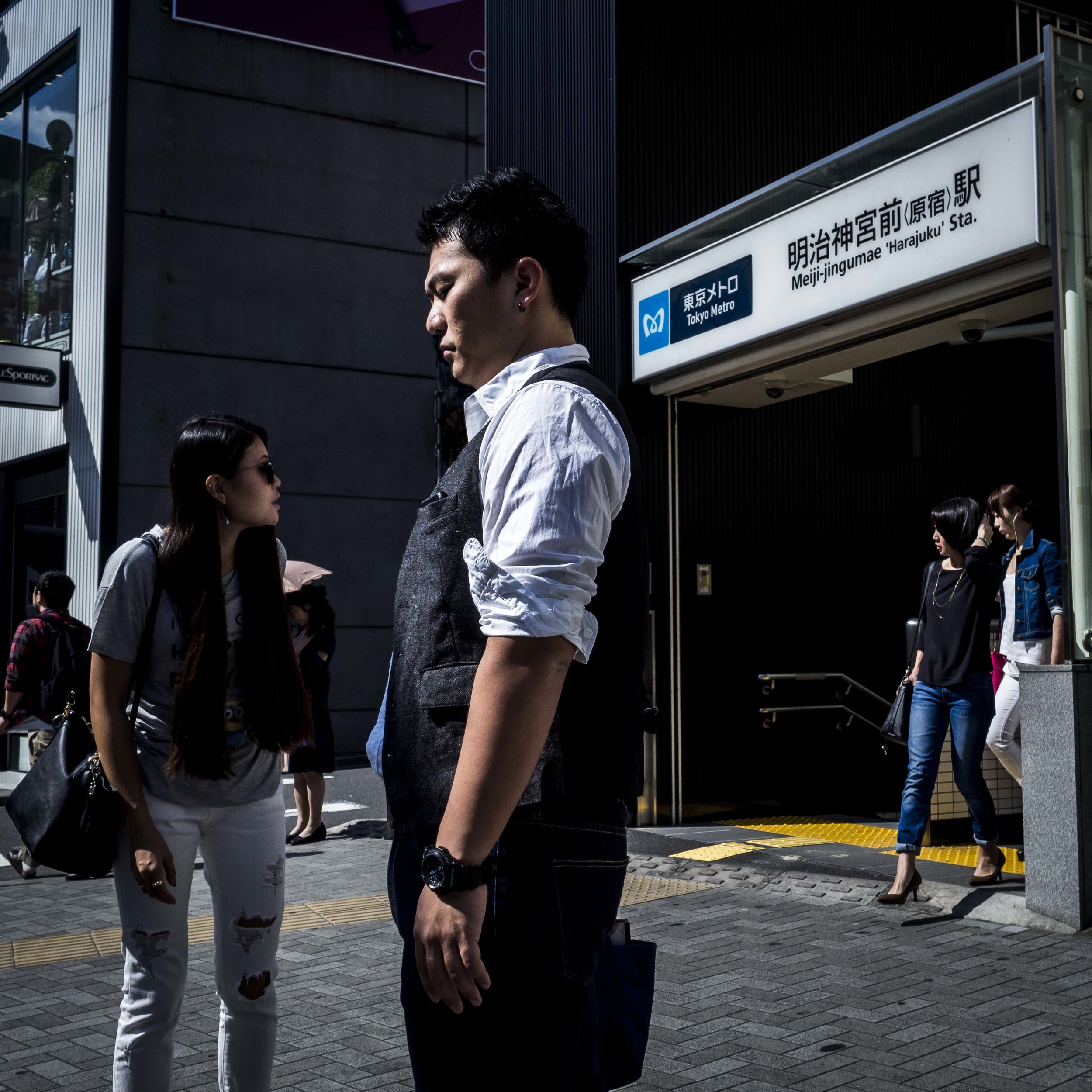
More dramatic and tense, but still viable? The introduction of the man on the right changes the feel of the image and the woman almost seems to be cramped, even harassed in this composition.

More dramatic and tense, but still viable? The introduction of the man on the right changes the feel of the image and the woman almost seems to be cramped, even harassed in this composition.

A benefit or something that a rectangle can do?