Lightroom has become my "all I need" programme. Are there better programmes for certain image manipulations? Yes, absolutely, but there is no programme that I am more comfortable with (not a big computer nerd, I do struggle sometimes), or one that is more complete as a work flow or that overall handles my Olympus files any better.
I thought I might share my work flow with interested readers as I know the learning curve for all of these programmes can be slow and frustration. The things I will talk about will be Olympus biased, but are applicable to all cameras, just a bit differently.
I am not an expert, but get what I want/need out of the programme, always learning as I go. Things marked with an * are often used in a series of presets and applied on import or in batches sometimes after, although I am tending to start from clean, unprocessed images or my "gentle" preset more these days and use the more aggressive pre sets only to try different looks (to add your own preset just process how you want it, then hit the "+" symbol at the top of the presets bar).
From the top, but in the order I use. Note; the surrounding area of the screen around the image is set to black for web processing, but white for print processing, do a right click to change it as suits.
The (Quick) Global controls.
Temperature and Tint. Adjust these as needed, remembering to also use them creatively, not just as correction tools. The cool Fuji look and Canon colour brilliance can be achieved with a very small little bit of blue (but there is a better way).
Colder tones usually do not sit well with viewers, but can add mood and mystery.
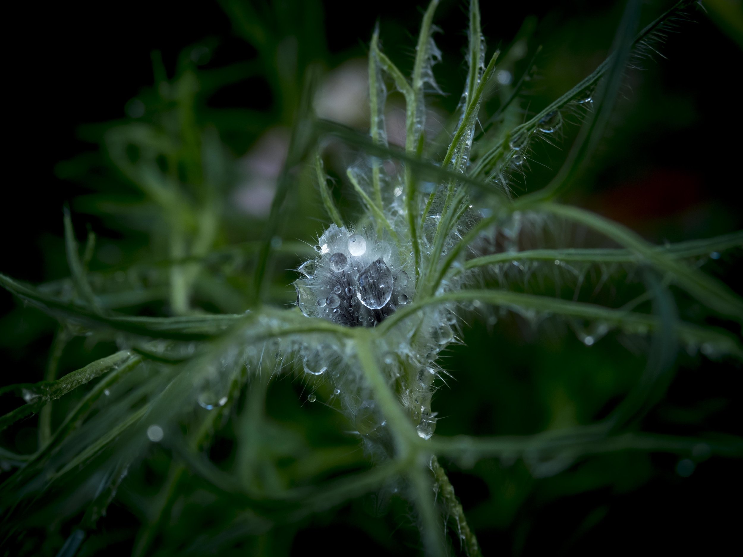
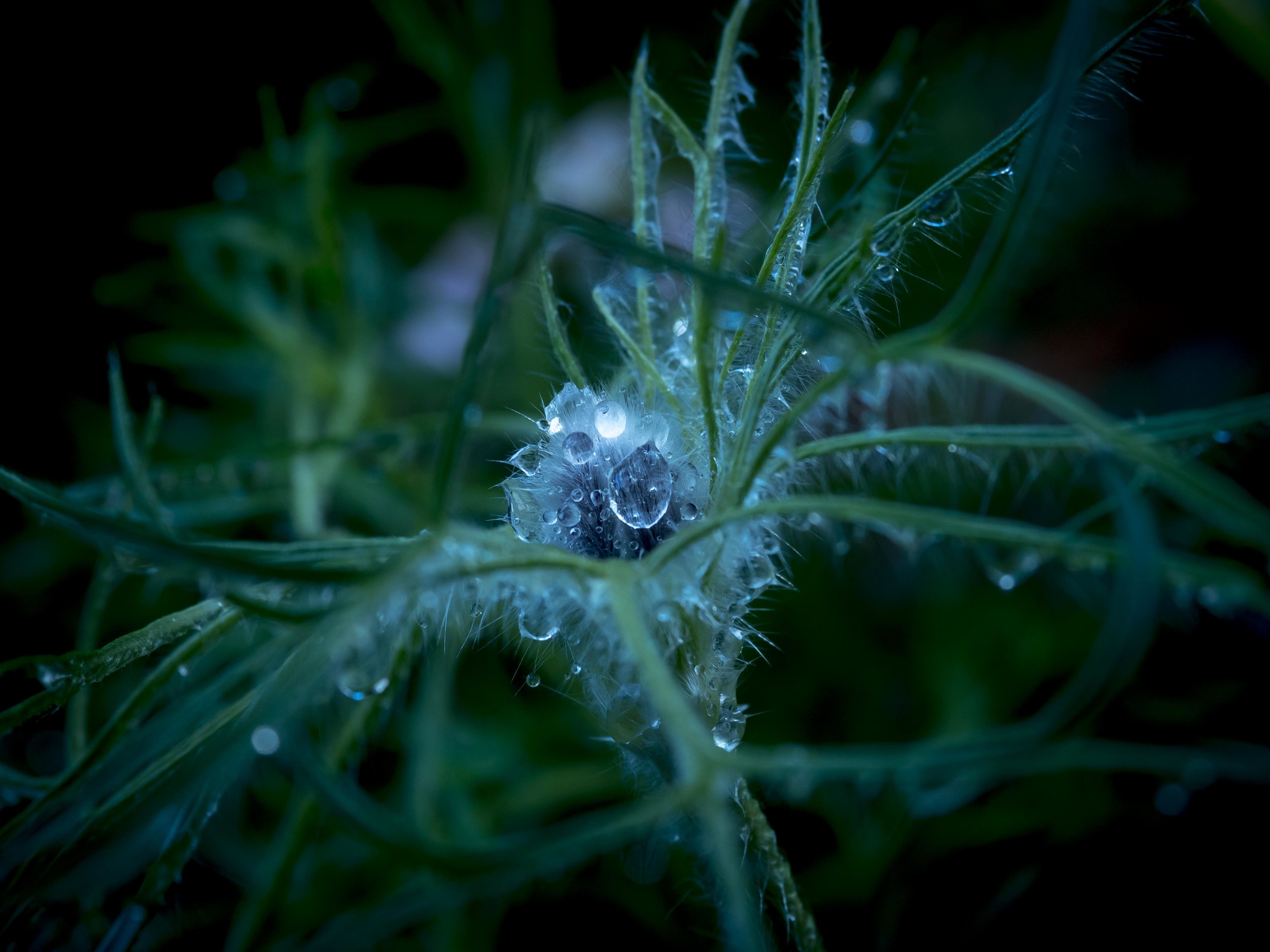
Exposure and Contrast. The relationship between the exposure, contrast and the more specific tonal controls below them is important. My usual habit with Olympus files is to adjust the finer controls first, using the exp/cont controls to balance these, unless the image is in need of drastic repair.
*Highlight and White controls. I adjust the white control up a bit (+30/50) as this brightens colours and increases vibrancy over all and the Highlight control is then applied to control the blow out (as low as -80). I love the Fuji brilliance and this helps give me that look as opposed to the more natural and muted Olympus highlight look, when appropriate.
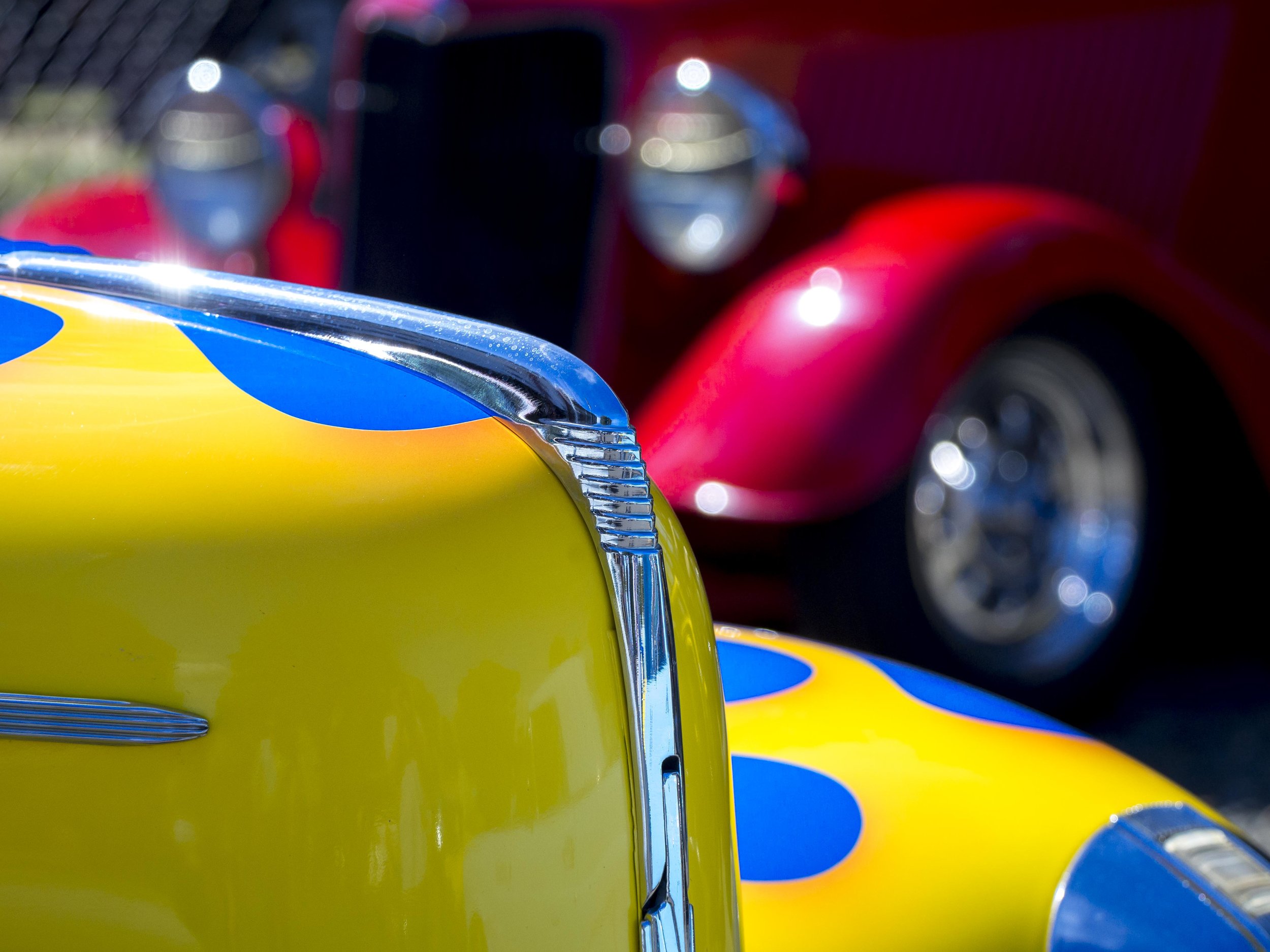
*Shadows and Blacks. Like above I tend to drop the Blacks down to increase depth and richness of both the dark regions and colours, compensating by increasing the Shadow control (+20-50), then the Exposure and Contrast is looked at to better balance any inconsistencies. the blacks slider is also a good control for "de hazing" a flat image, but now they have a specific de haze slider. the effects are slightly different however. I find that the combination of the Black and White sliders go a long way to the Canon look/colours I am used to.
The image below has deepened blacks, increased whites, with reduced highlights and a little blue added in camera calibrations (see below).
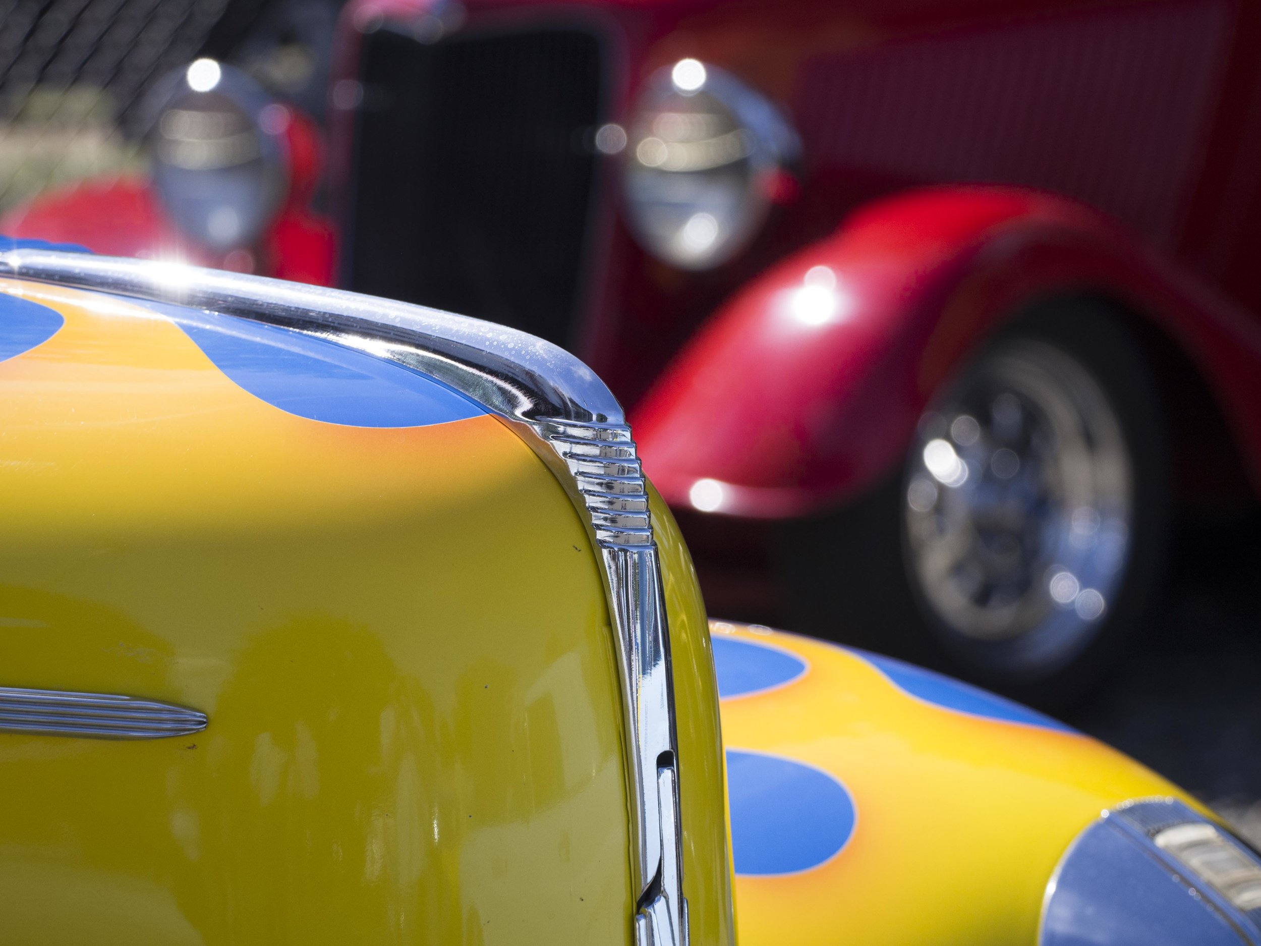
Clarity, Vibrance and Saturation. These are usually left alone, with the occasional push or pull of the global Clarity control and maybe a +10-20 Saturation as needed. I used to use these more, but prefer to use the brush control or specific colour controls now.
*Split Toning Control. I did not use this much before unless I was doing a mono image, but recently I was shown the benefits of a gentle shadow or highlight tone control to change the density and feel of the image's base colours. warming or cooling down shadows and highlights is one of the more powerful tools when changing the fundamental look of the image, adding depth to the colours. I find Olympus images can sometimes look a bit thin and clean, where Canon often adds depth in highlights. The Canon look benefits from cooler shadows and warmer highlights.
The Precision Controls. These controls are more precise, cleaner and less file intrusive (I.E. better), but more time consuming and harder to use properly.
Tonal Curve. For more precise tonal controls, the tone curve tool can be used, but I find often that the extra effort is not warranted. It is said by Lightroom experts that the Tone curve tool is cleaner and more precise, so if you are wanting the very best, use this and not the global fixes above.
Colo(u)r Sliders. Anything is possible here! Want Canon Reds or Purples, Fuji Skin tones or Olympus Blues, they are all found here. Other side of the same sword though is too much choice. I use a lot of pre sets here, starting with them if I am after a certain look, otherwise adjusting a bit (+/-10-20) is plenty, using both Saturation and Luminance controls in tandem. be aware of the difference though between the camera calibration colour sliders and these. The calibration settings will fundamentally change the base colours, often enough to make the image look like it is from a different camera brand, where the colour sliders allow you to tweak specifics better. Olympus files need little in the way of colour if the above controls are used as the Whites/Blacks/Contrast sliders tend to control colour "pop", but changing one Colour slider can make a huge difference and does not effect other colours. if you want to guarantee the colour you are adjusting is correct, use the little bullseye spot (top left of the colour box) and actually pick the colour out on the image, using the mouse to increase/decrease the setting.
The Brush tool. About now or sometimes earlier I will use the brush tool to increase the "snap" of the image. The brush tool is your ultimate control for very specific, localised manipulation. Noise, clarity and sharpness, saturation and many other features allow very powerful, repeatable and controllable changes. The big advantage of the brush is that it allows editing on an area without forcing the same editing on the rest of the image. Starting with a gentle +05-20 in contrast, clarity, sharpness and a little vibrance (occasionally - exposure also), I will brush over the eye catching parts of an image. It is like a veil has been lifted. I then might do the reverse to less important parts of the image that I want to drop away. This controls the look of DOF (Bokeh), the focal point and increases micro contrast, making small sensor cameras look like full frame ones.
*Lens Corrections and Transform. Rarely used, you know when you need to. The CA control used to be better (easier), but is good enough to get rid of any and all CA that my lenses occasionally cough up. I have started to use the de fringe setting on the brush tool here also as it looks to be stronger and faster.
Sharpening. This is low on the list because it is not often needed with Olympus or Fuji images, is capable of being destructive if over used, is not as good looking as the brush tool and is often not that important to image quality when other manipulations are completed. The sharpening tool is powerful, but easy to get wrong. Less is more. The radius and masking sliders are less well understood, but are the key to natural looking sharpening. Use the Option/Alt key when applying sharpening to help gauge the effect (the screen turns negative grey and highlights just the effected areas).
Effects. I usually use a touch of vignetting to constrain the edges, but again less is more. if the image is a portrait this is a good emphasising tool.
Camera Calibration. This one is a bit of a revelation to me. When hunting for the secret mixture to get my Olympus files to look like other brands files, I discovered two things. The camera calibration settings, especially the blue saturation slider and split toning colour images controls. these are very powerful on a deeper level than normal manipulations. Increasing the regular red colour slider compared to the red calibration slider is like garnish on a meal as opposed to changing the base recipe. The calibration controls will change the fundamental colour palette of your camera.
The blue slider will add pop to portrait images, by intensifying the contrast between cooler and warmer tones, making the warmer tones look stronger.
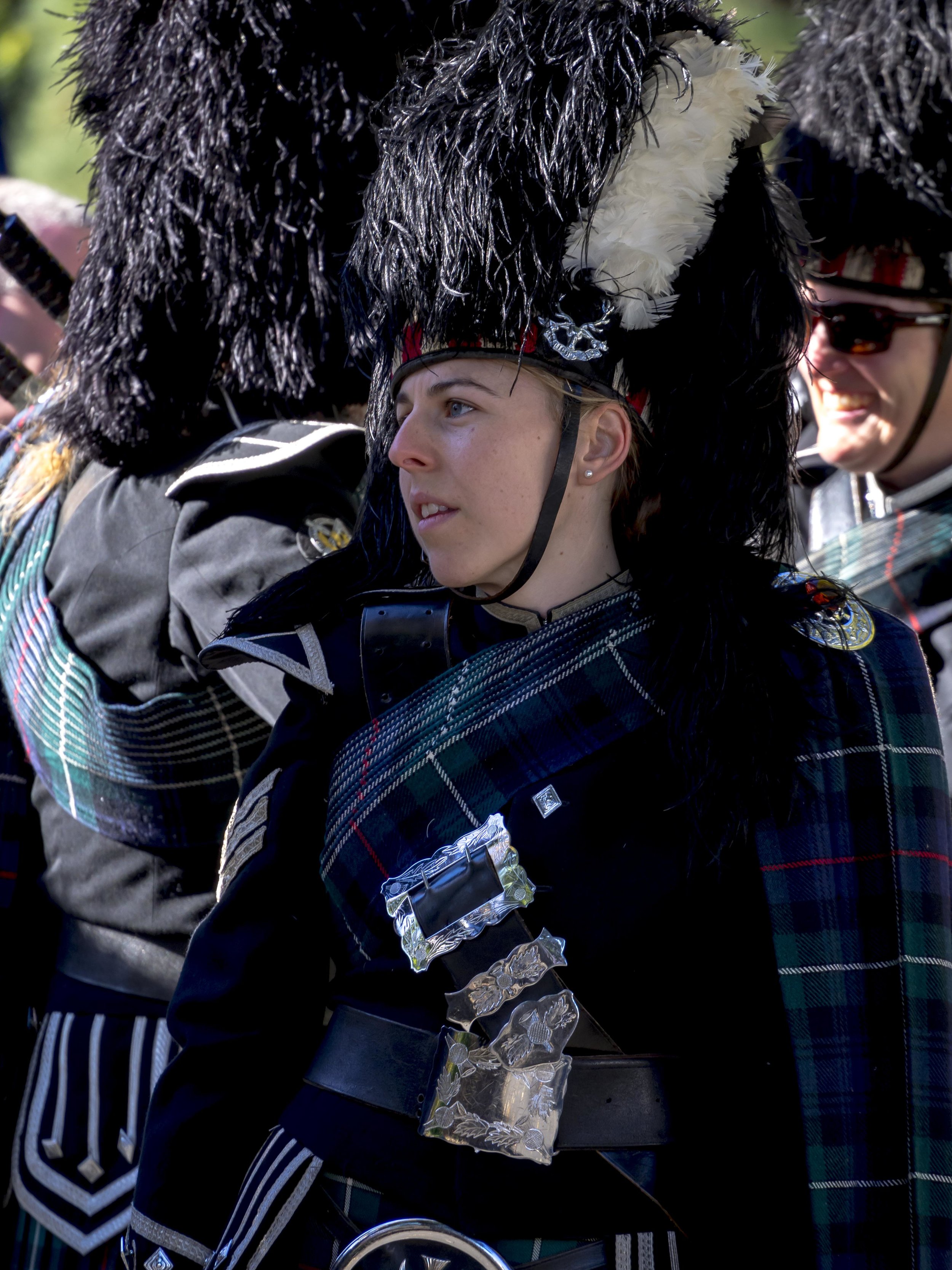
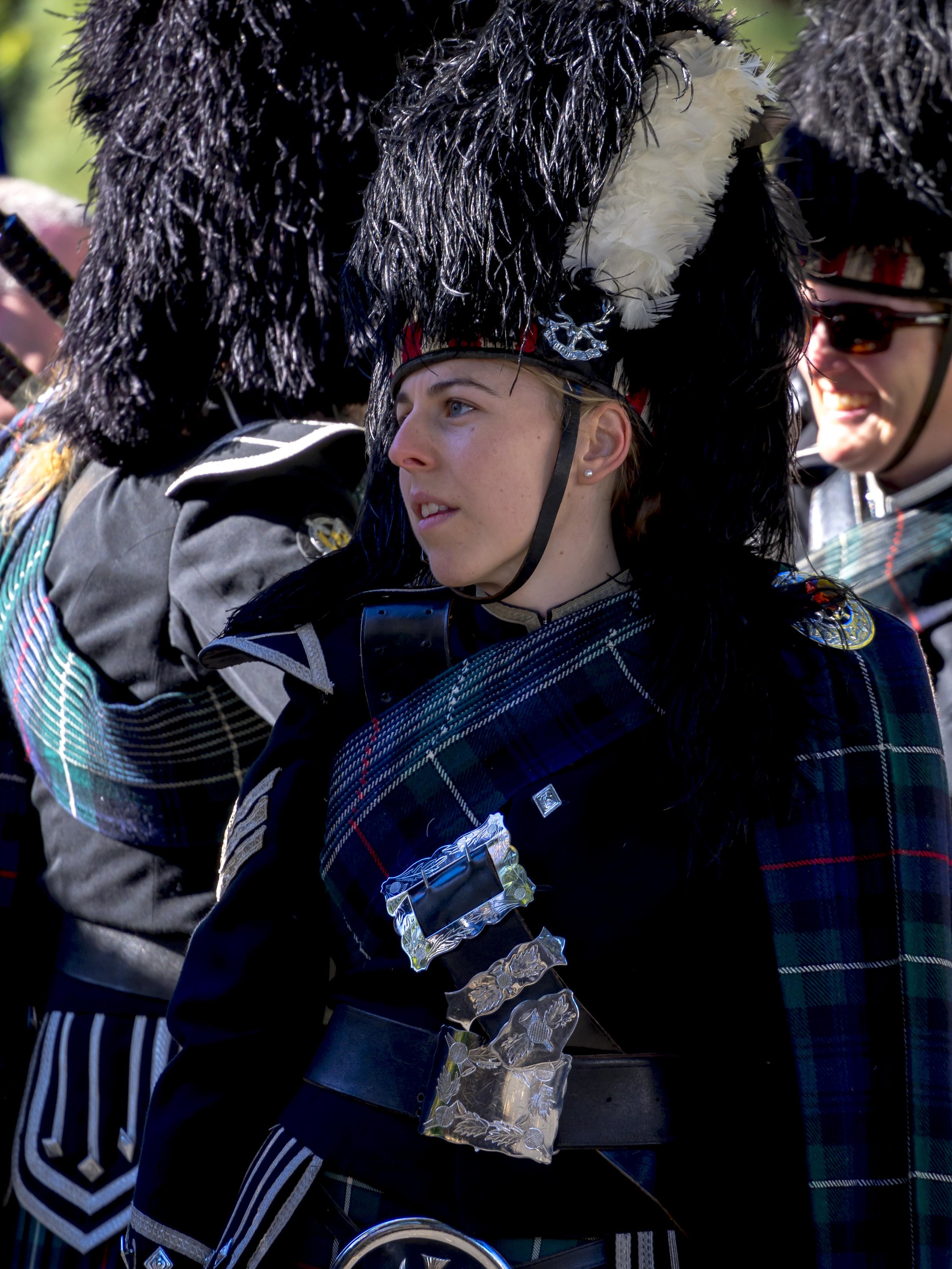
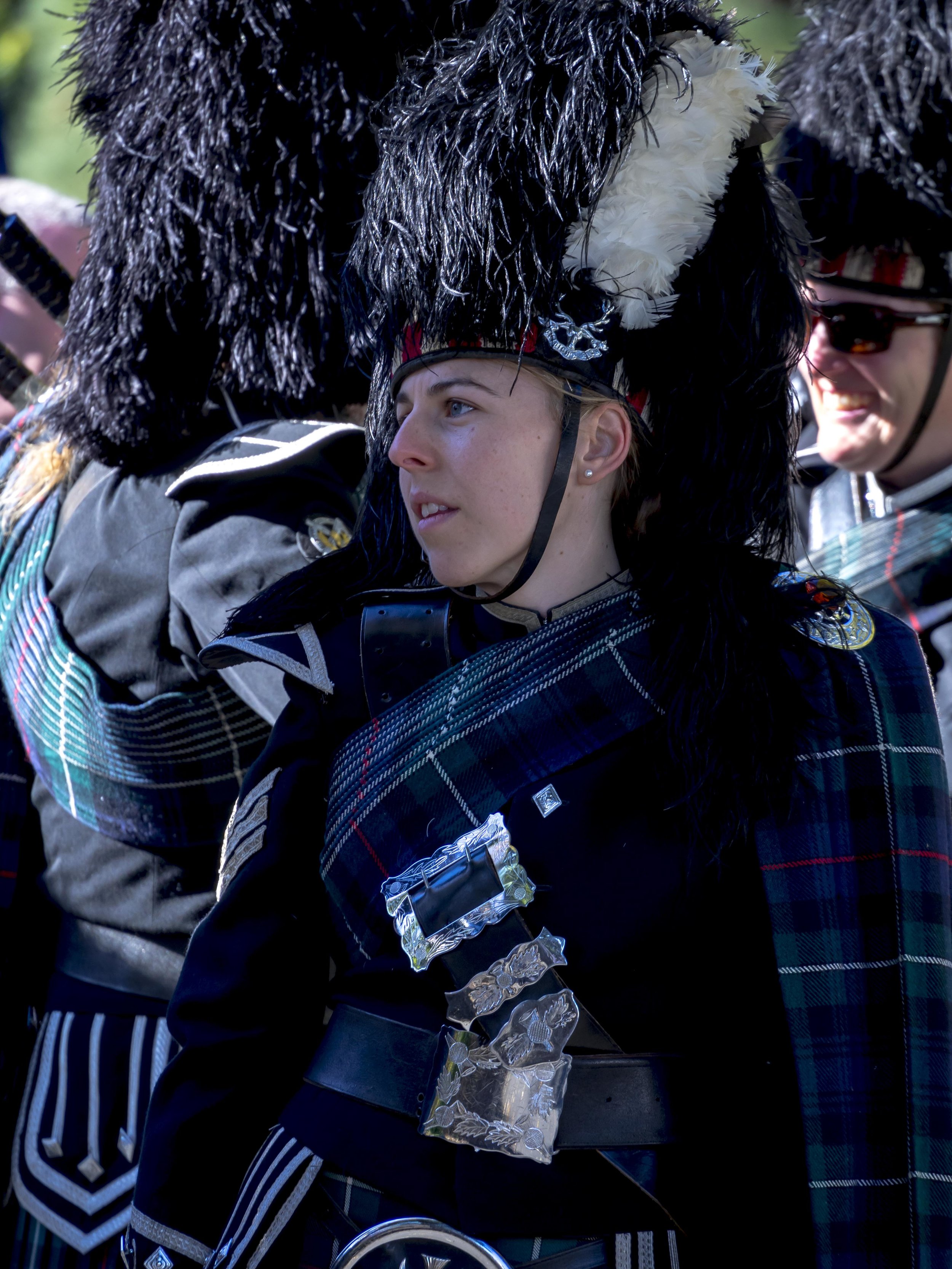
The above images are firstly the base image with a preset called "gentle" with only basic noise and sharpening settings, the second image has added blue through the camera calibration slider, notice the added warmth in the skin and finally the blue adjusted only in white balance giving the image an overall cold look.
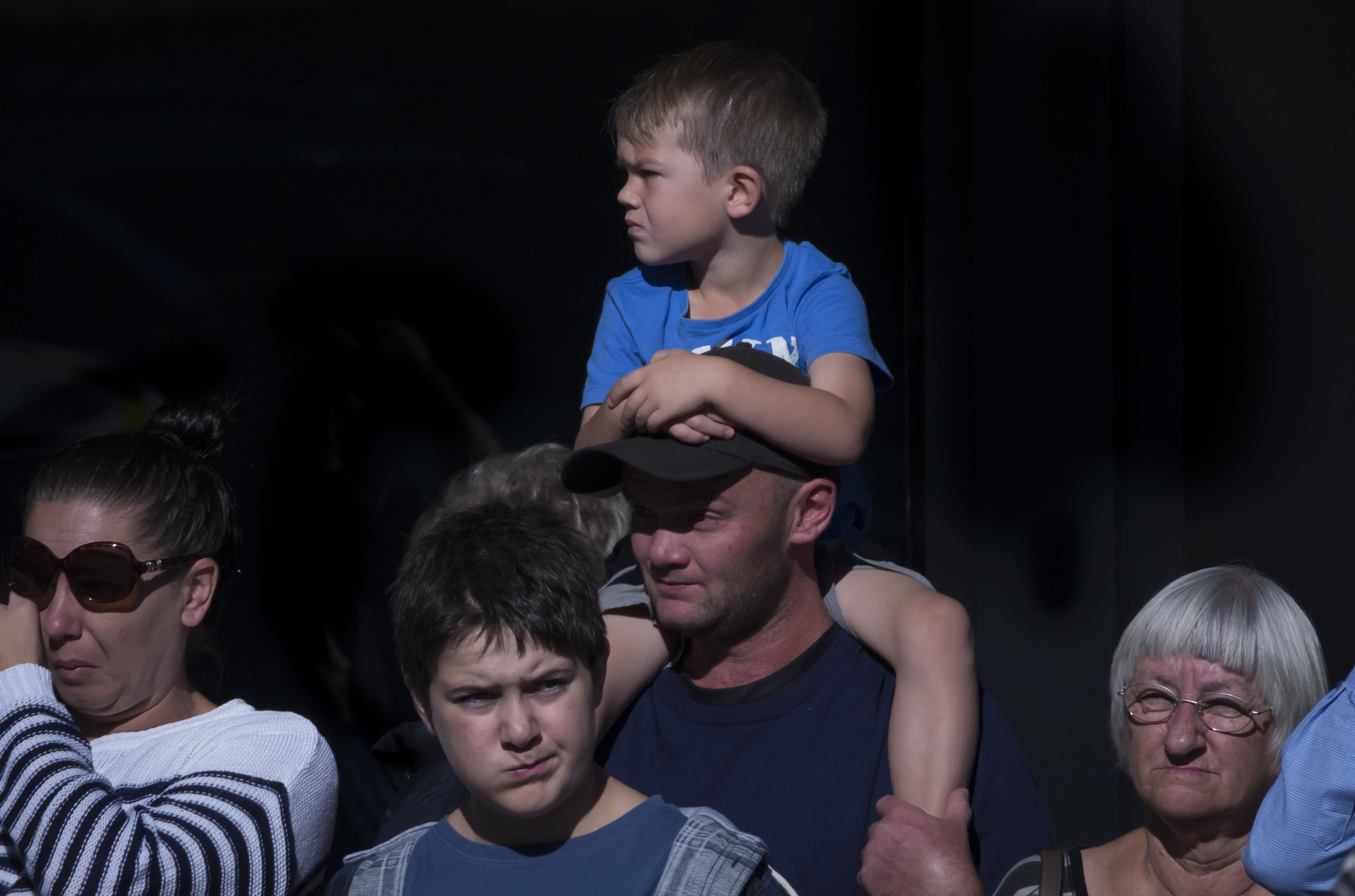
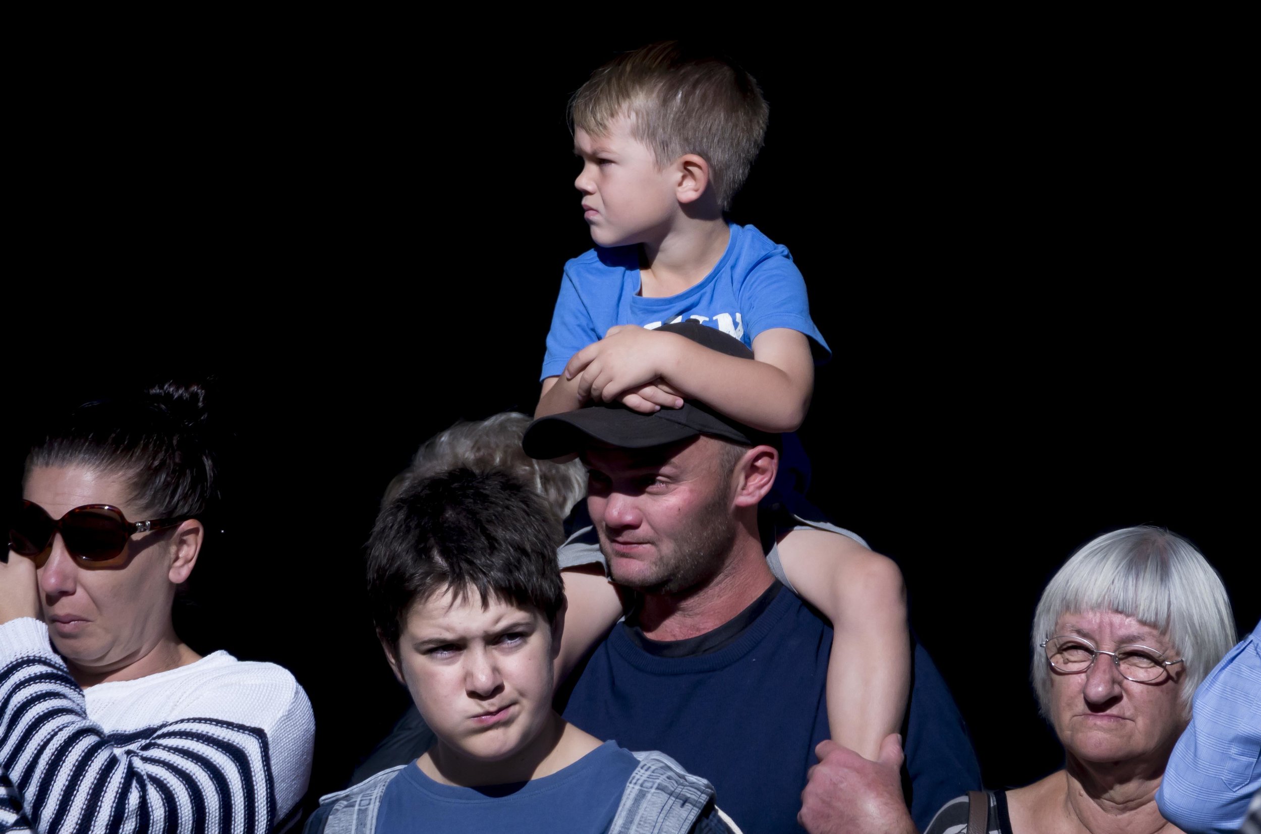
The above image shows a basic work flow. A preset called "Olympus Bright" was first applied, that generally lightened and brightened the image using more exposure, whiter whites and deeper blacks and adding camera calibration blue with a little sharpening. The brush tool was then used to first, remove some unwanted detail in the shadows that the preset exposed and then it was applied to for extra clarity and contrast to faces. The boy in front looks slightly sharpened by the application of clarity.
Don't be afraid, or ashamed of post processing. It is as much a tool as any camera setting and allows you to show your vision as you want it seen. Where you stop is entirely up to you, but don't think that the path of the purist does anything but sell you and your images short. Even Ansel Adams spent hours in the dark room to perfect his images. Nothing came out of the camera magically perfect.