Field testing The new thinking

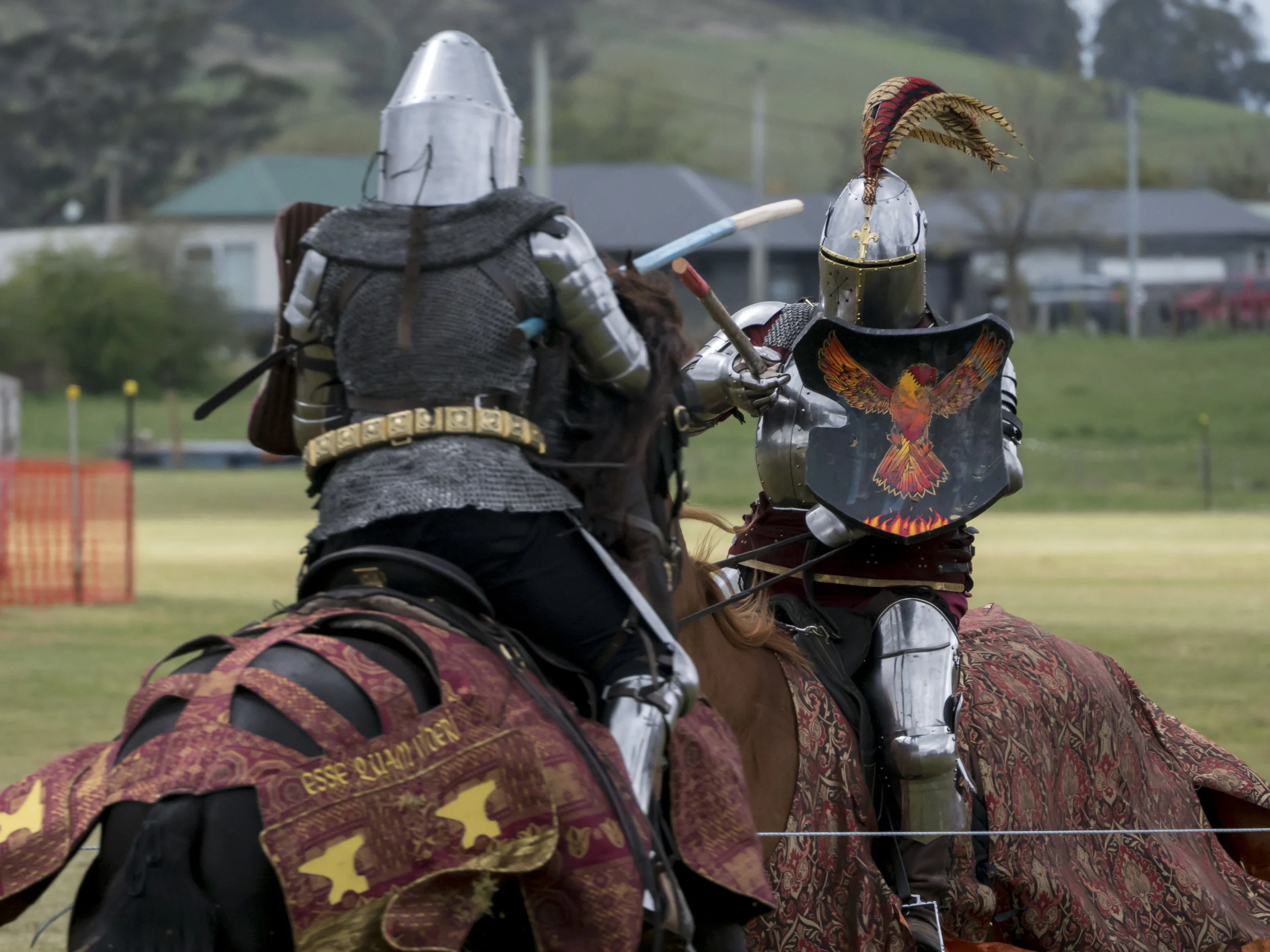
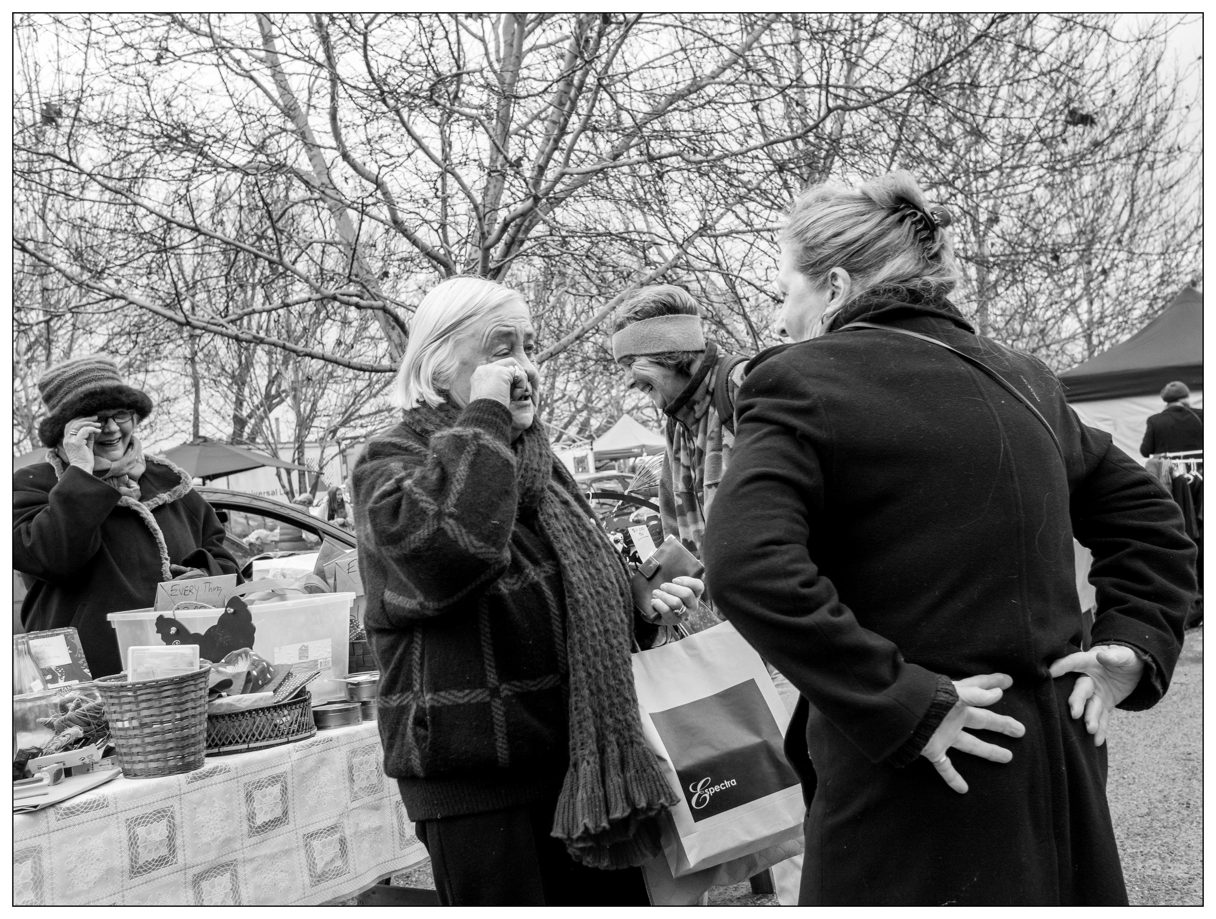
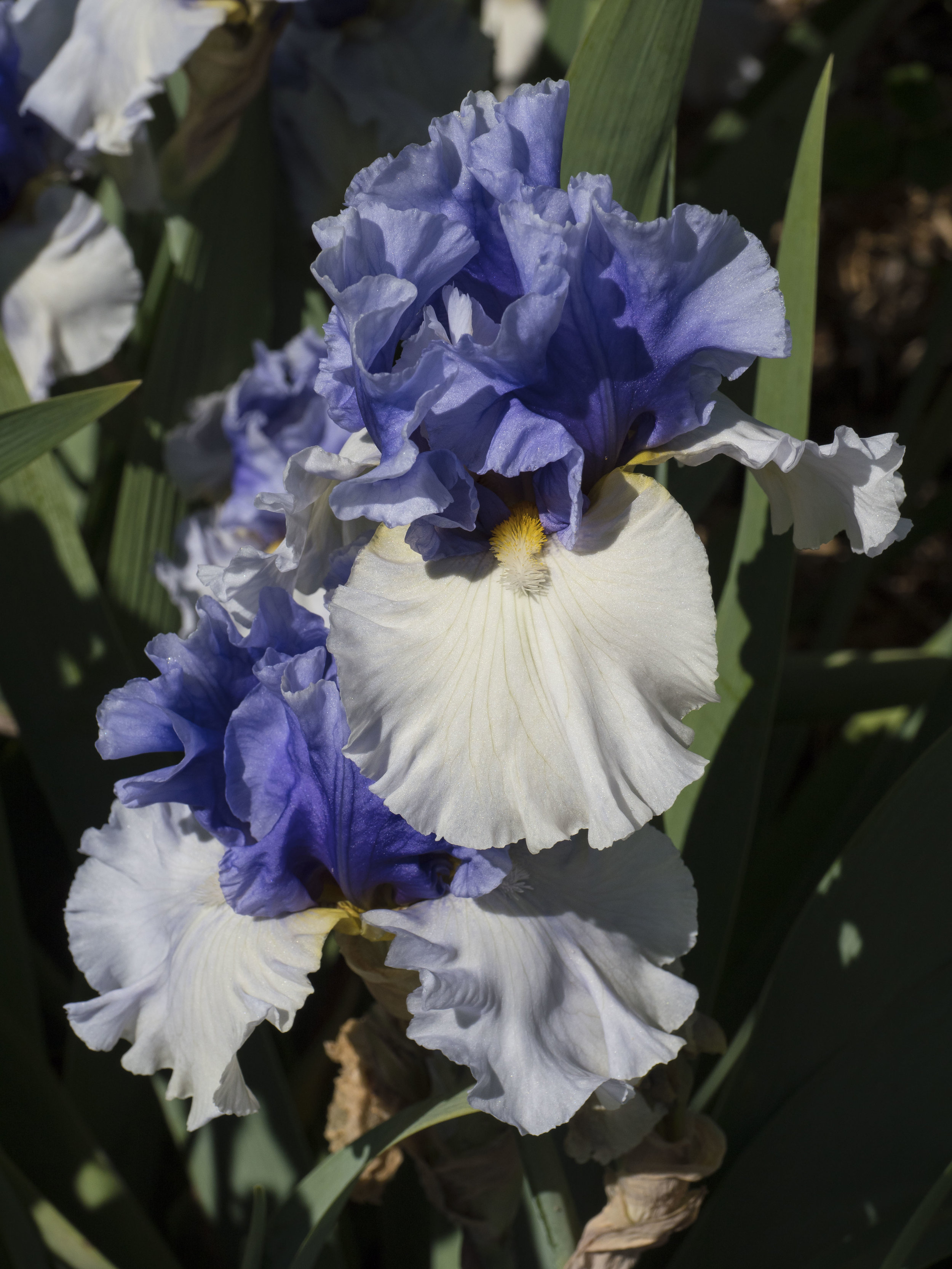
I will (I have promised myself) test the new zoom against my older lenses, but today offered a chance to try out the (re)mated Pen F and 12-100 in the field. The venue was a magnificent day mush against the trend of this spring, at a local spring flower show. All images are standard res, hand held.

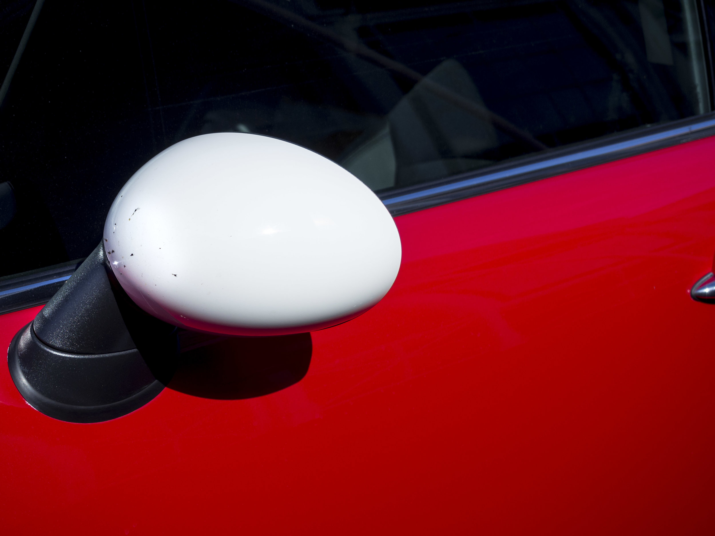
First up, I found another reason to use the Pen F as my tripod camera. It’s accessory grip slides into the Arca Swiss style Pro Master ball head I recently purchased. Brilliant. This means it does not matter if I loose the plate and also I can fit the plate to my backup camera.

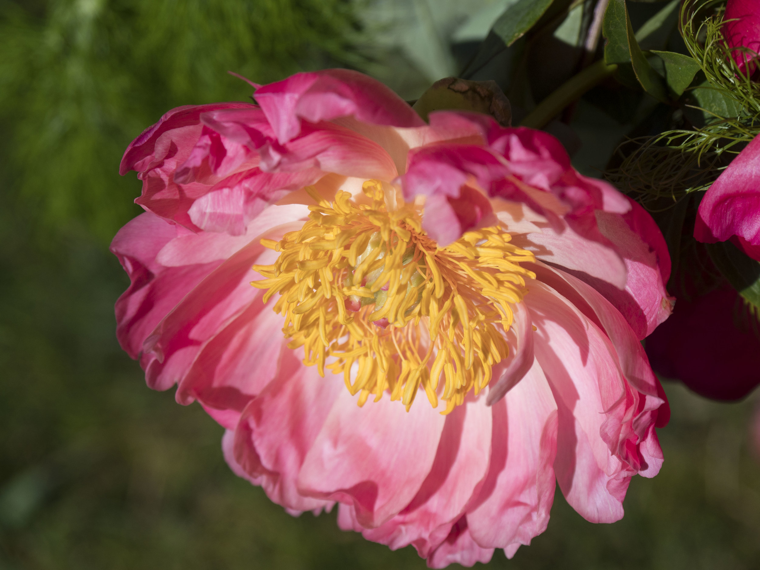
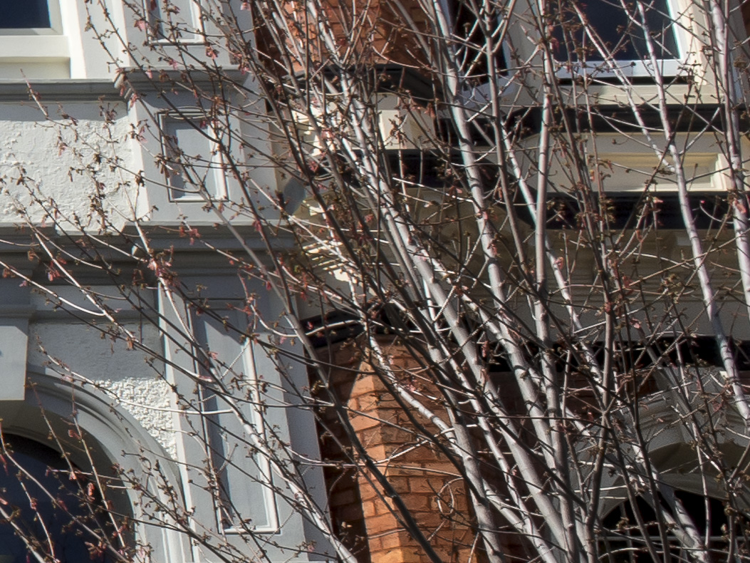
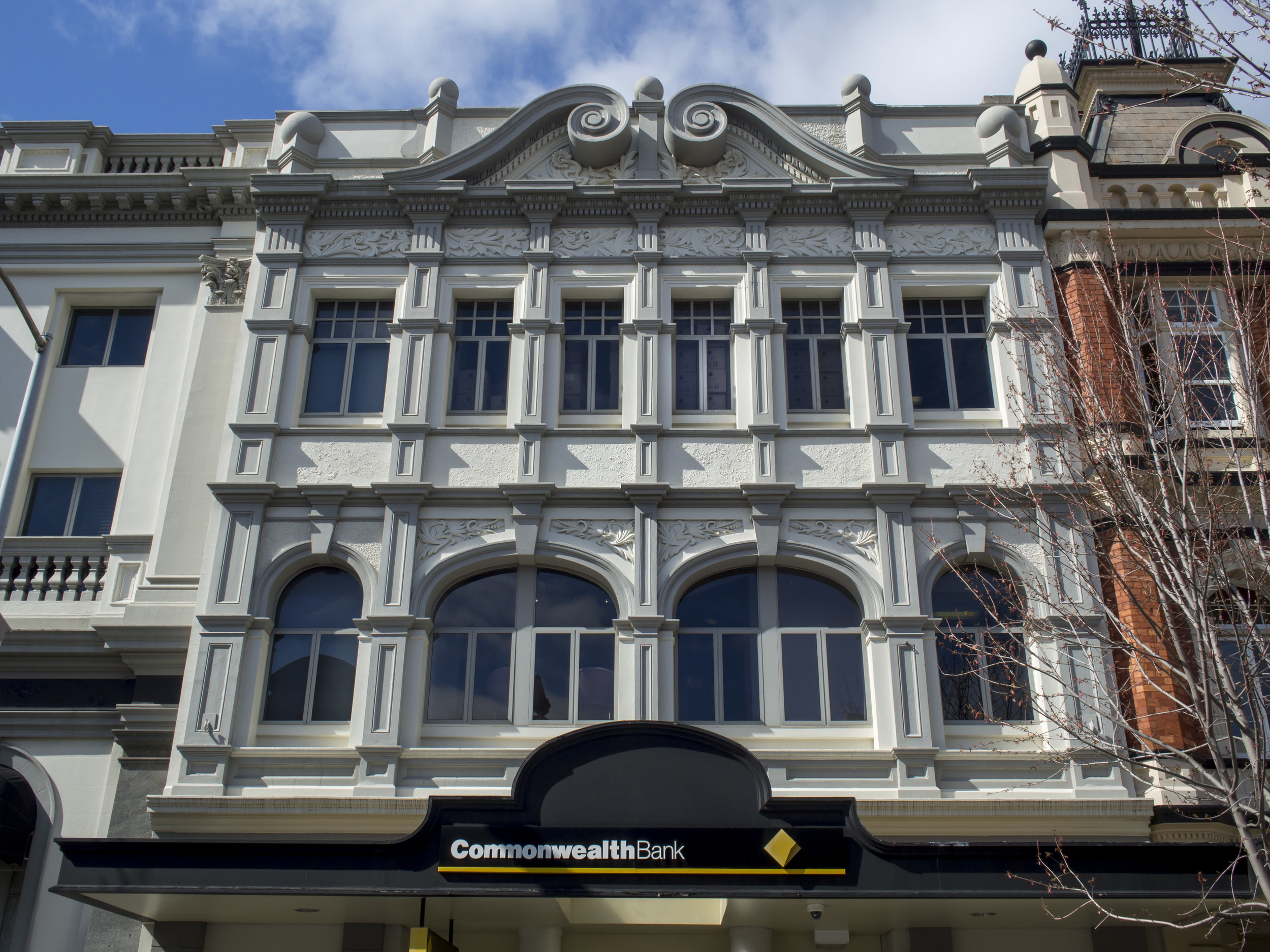
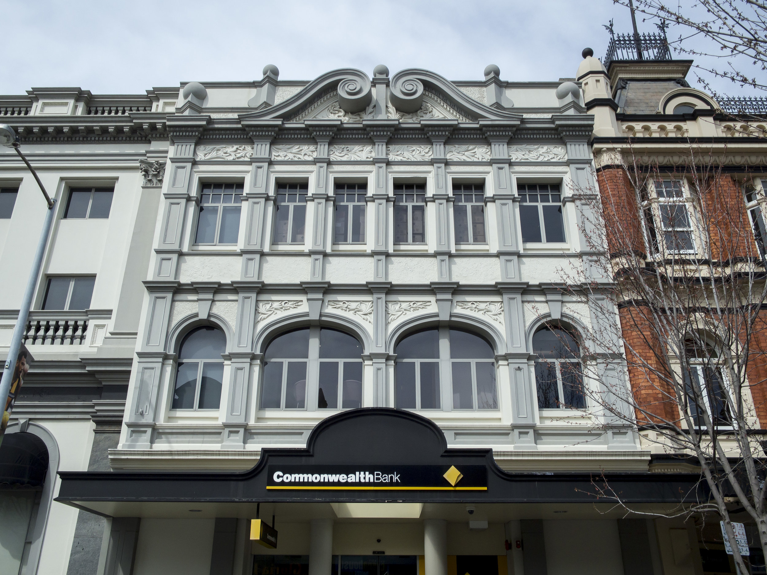
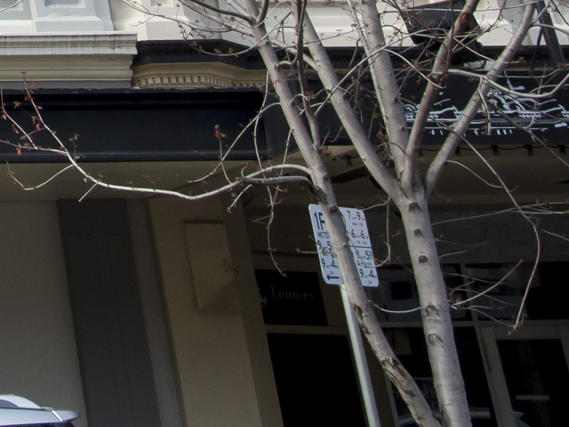
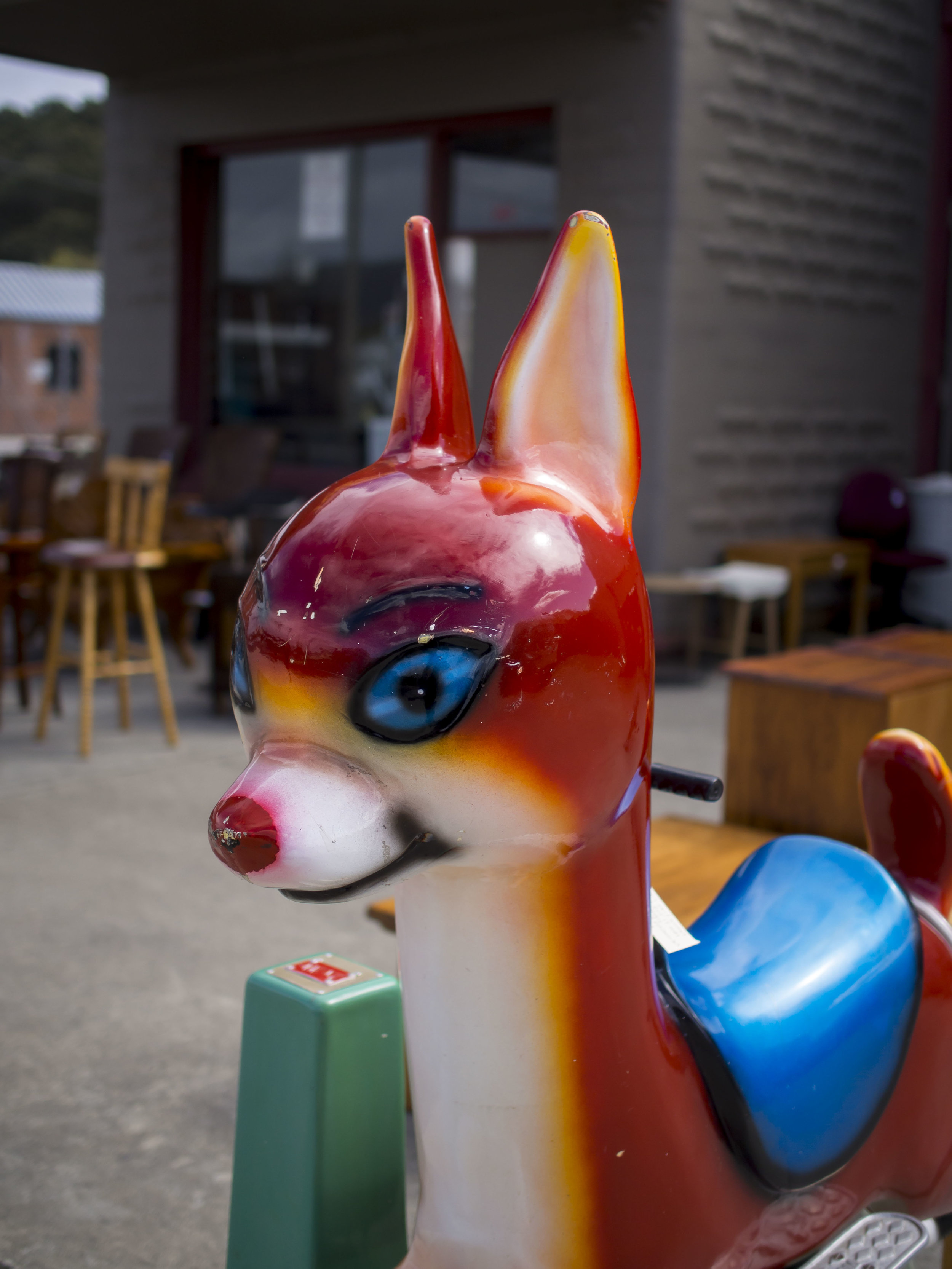
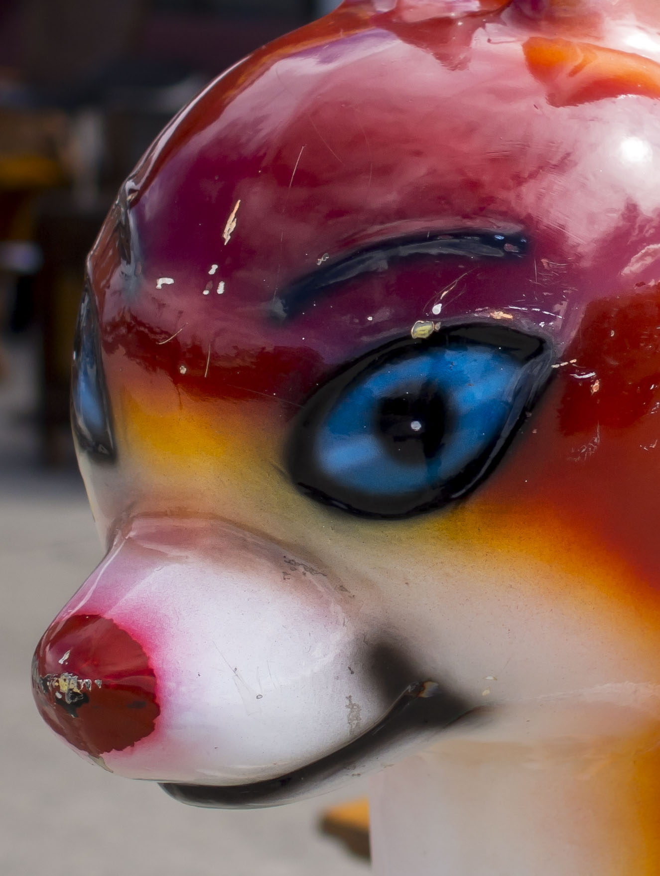
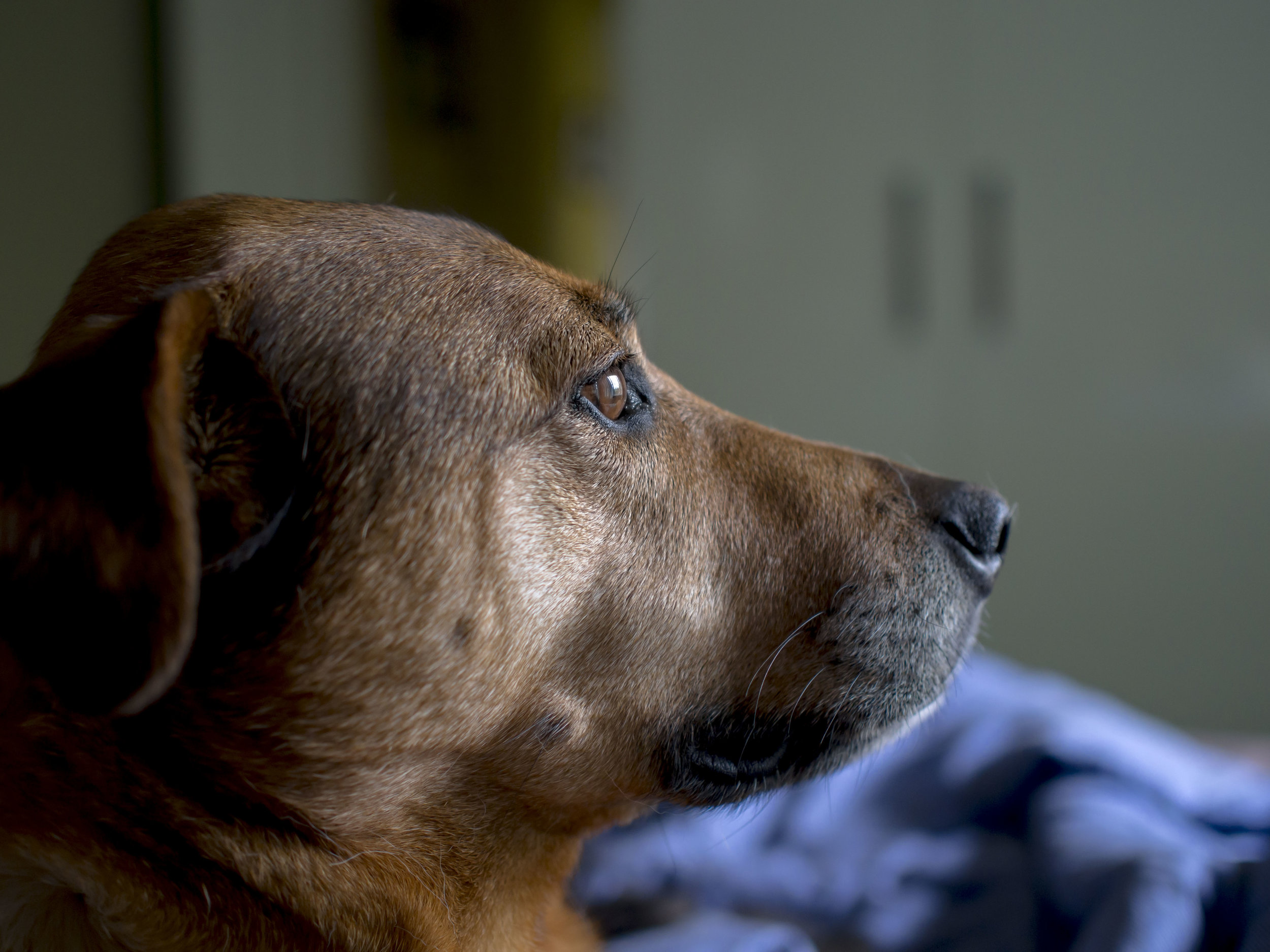
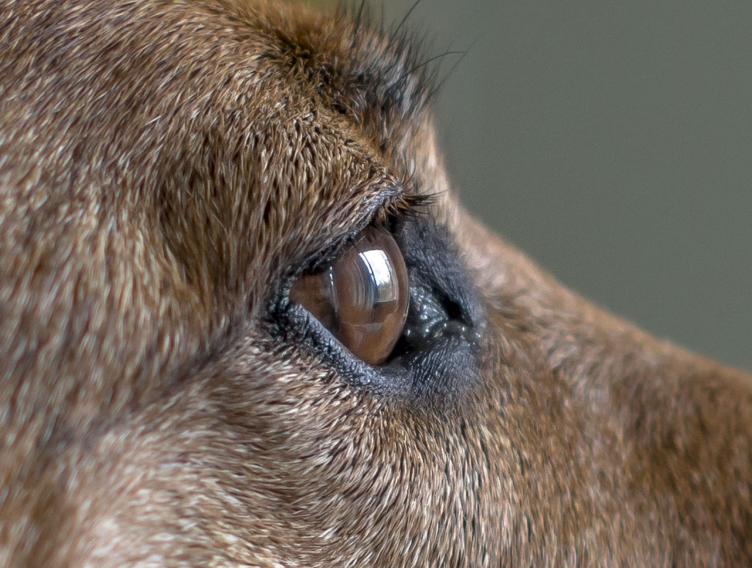
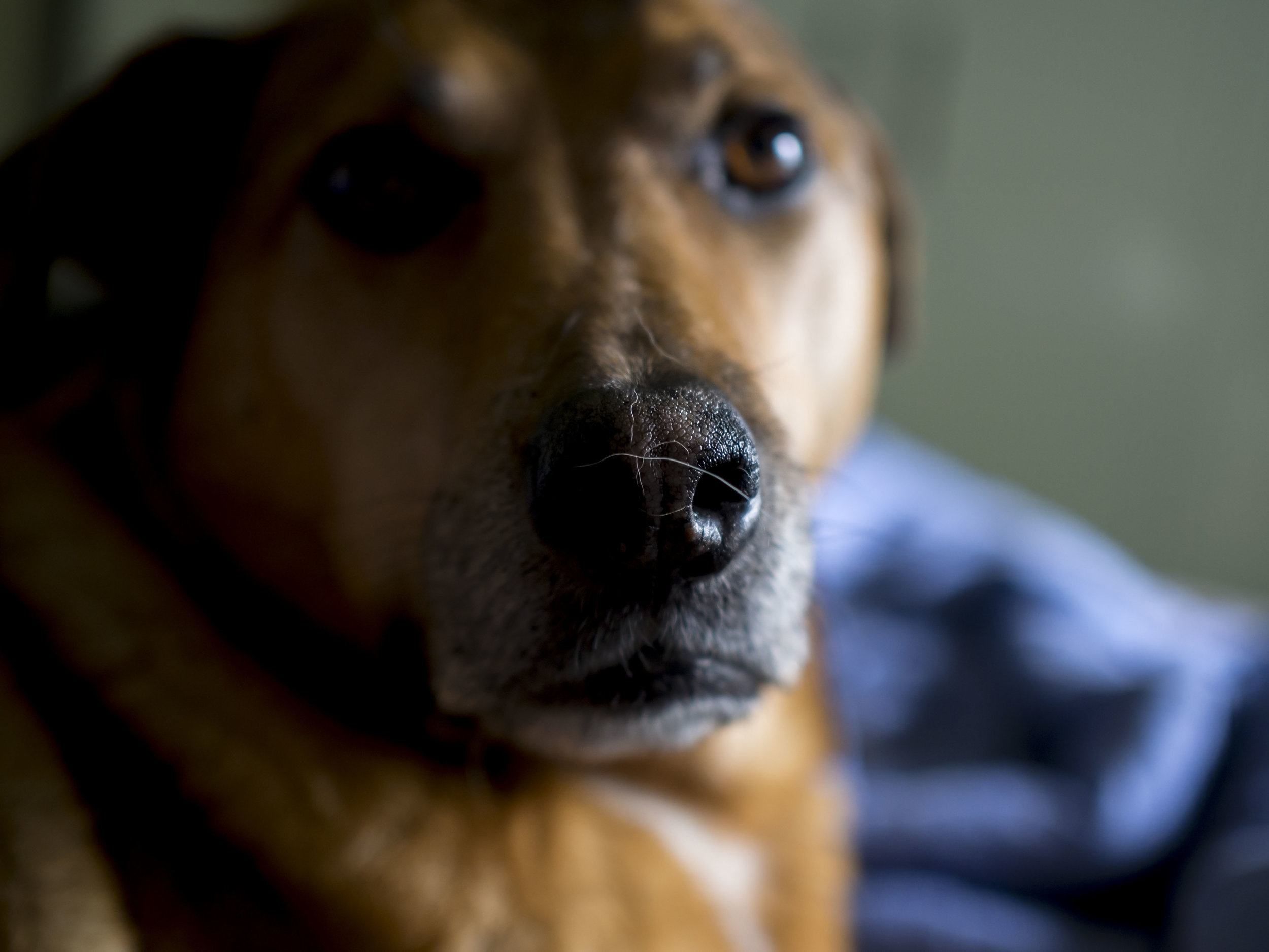
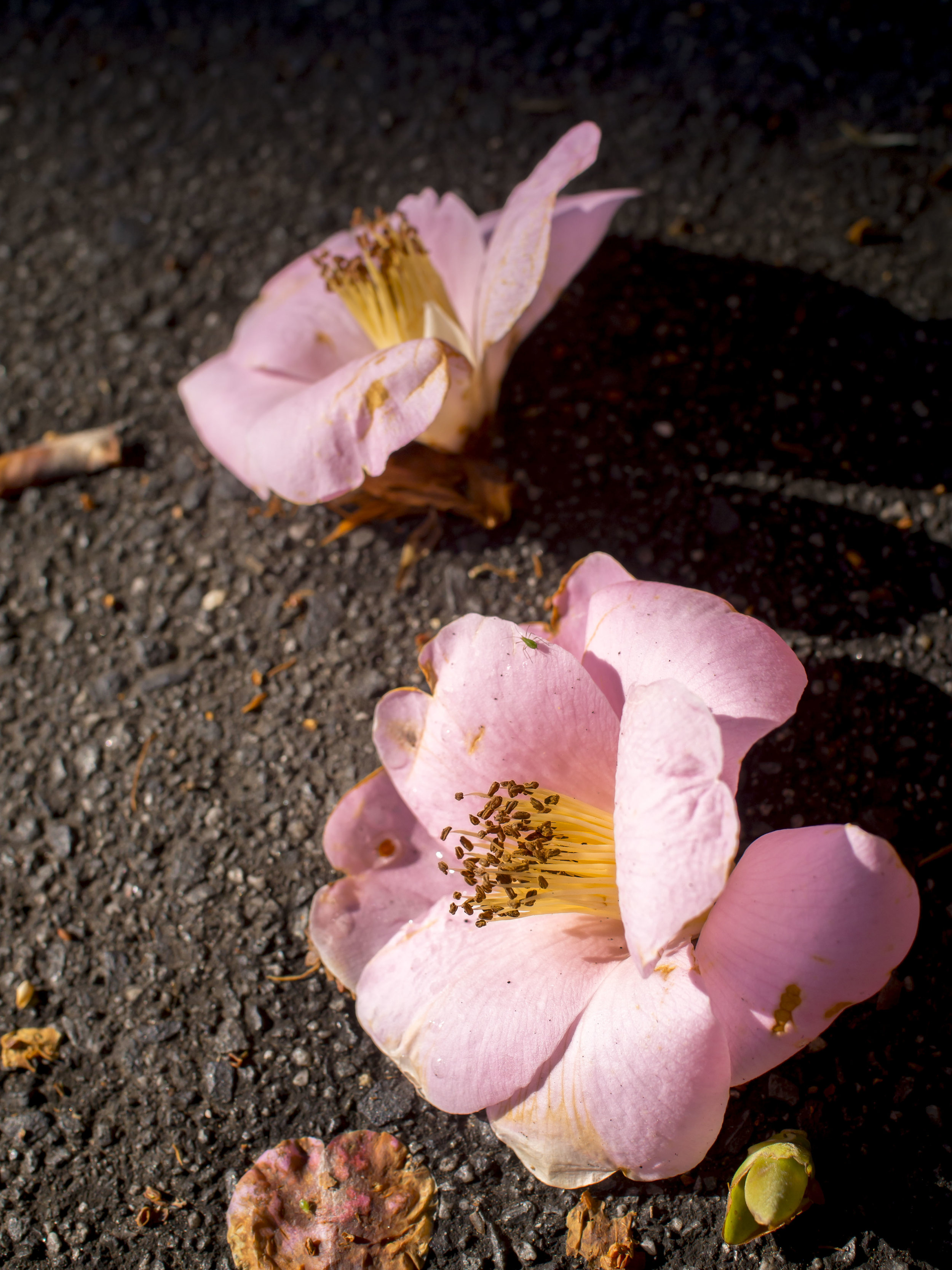
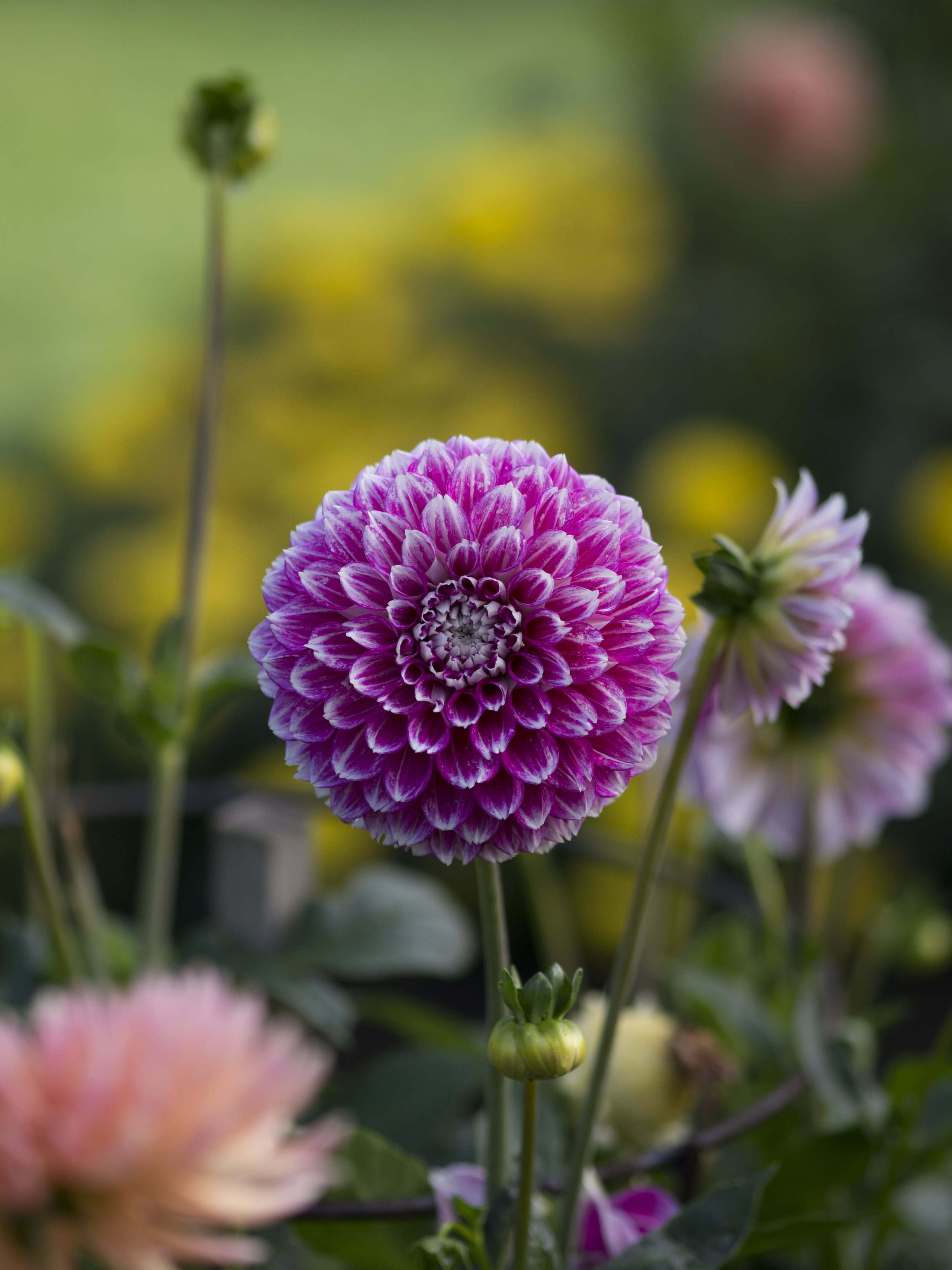
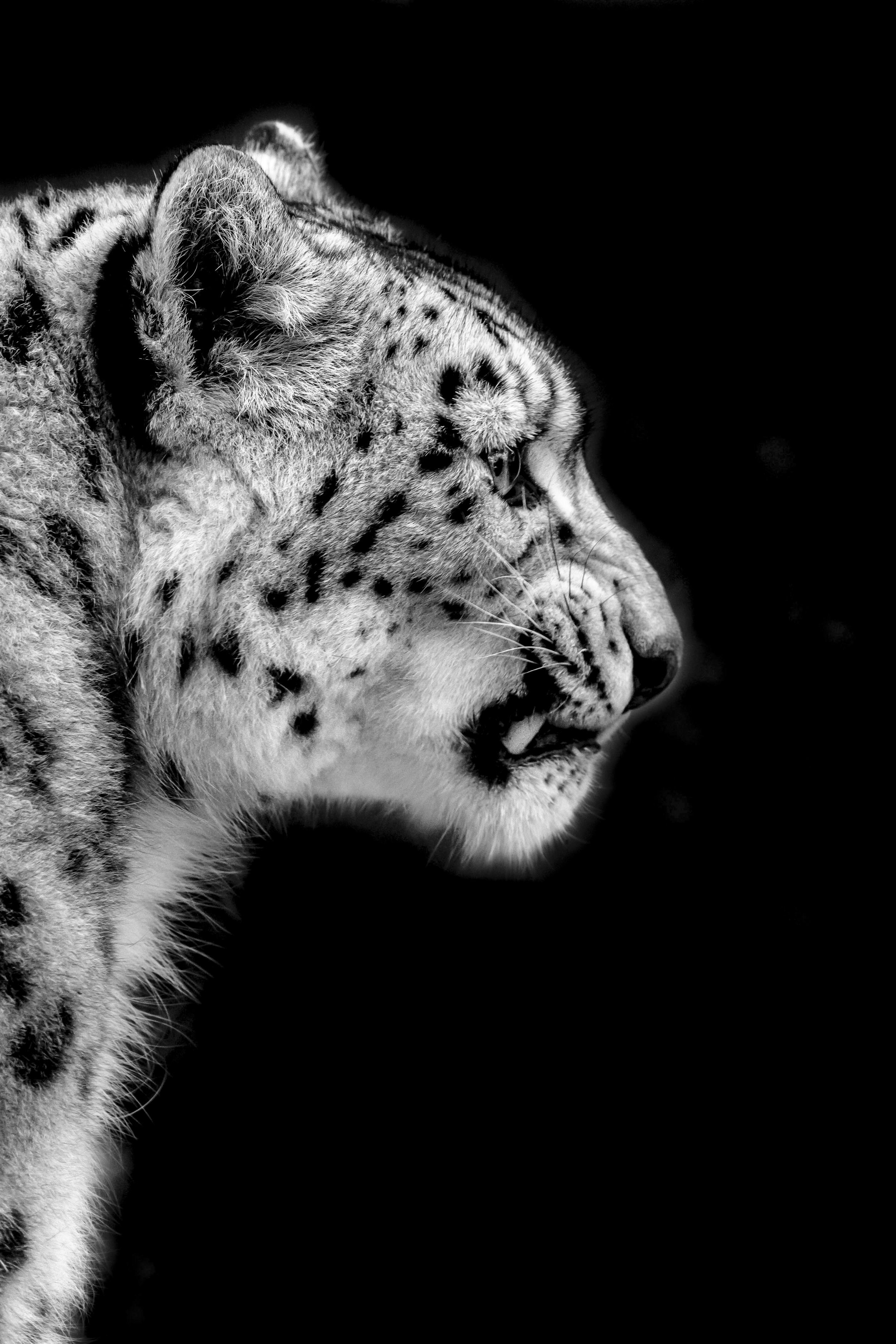
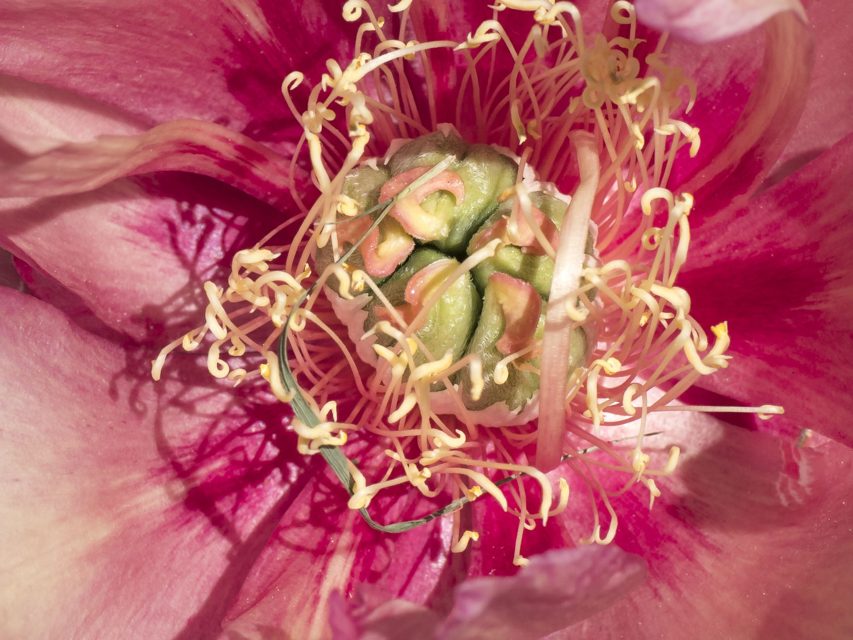
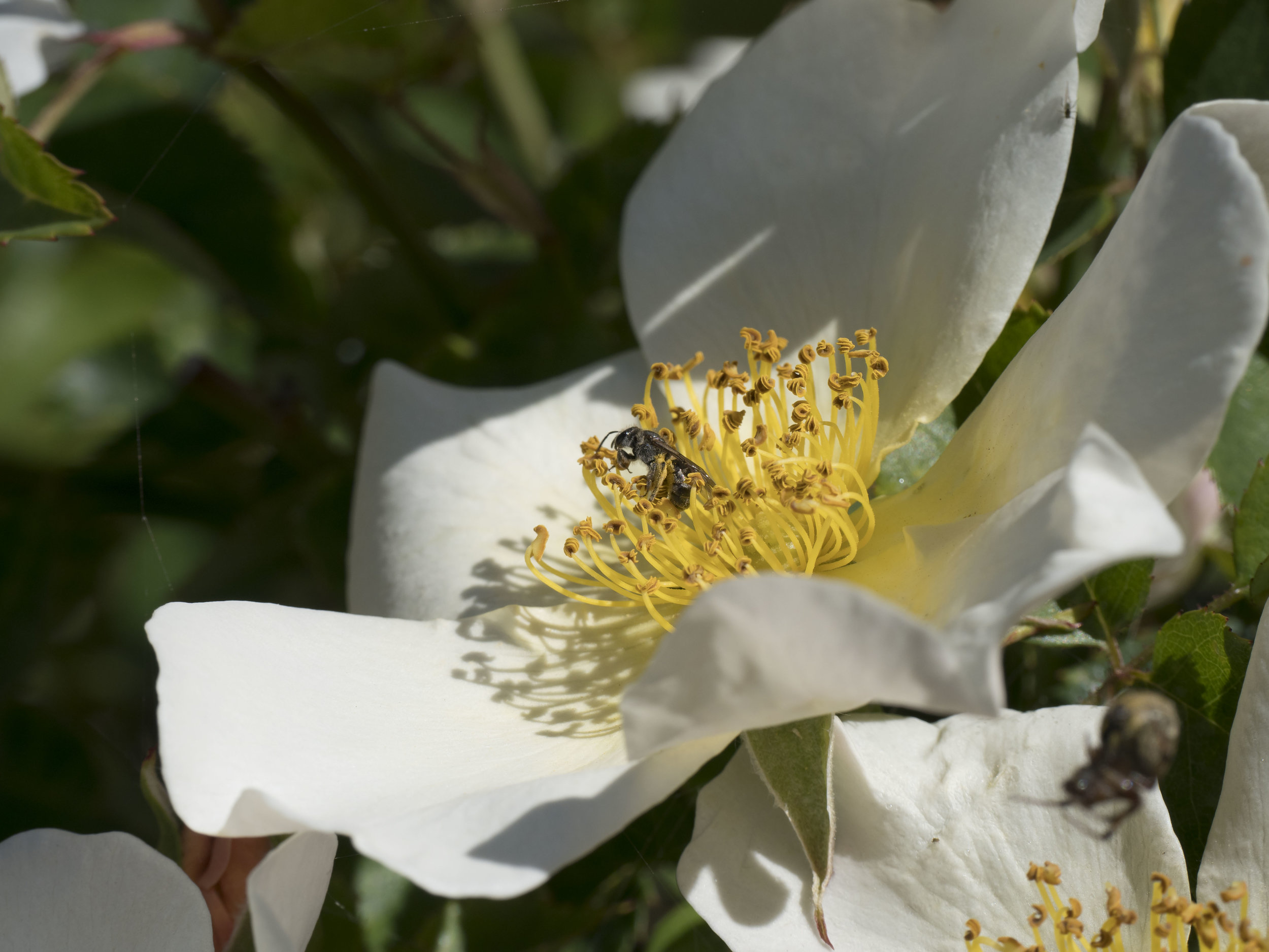
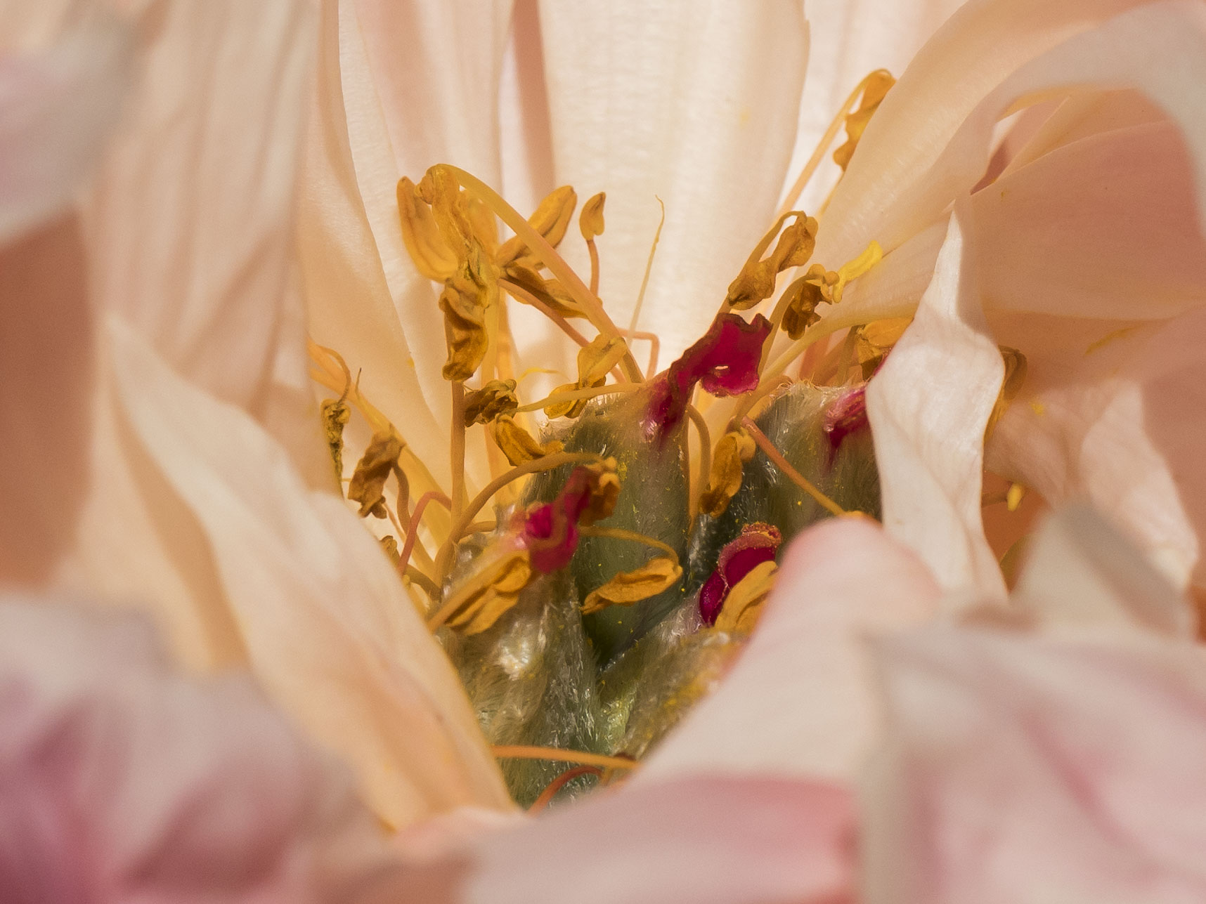
Ok. Lets look at what appears all by itself when reviewing the images. This file shows two things. Firstly, really accurate focussing. Secondly some odd, nervous or even borderline ugly background Bokeh. Bokeh is not a big issue, because the lens was purchased for landscapes and macro images, where DOF is either maximised or is so shallow, blurring is strong enough to make it overwhelming.

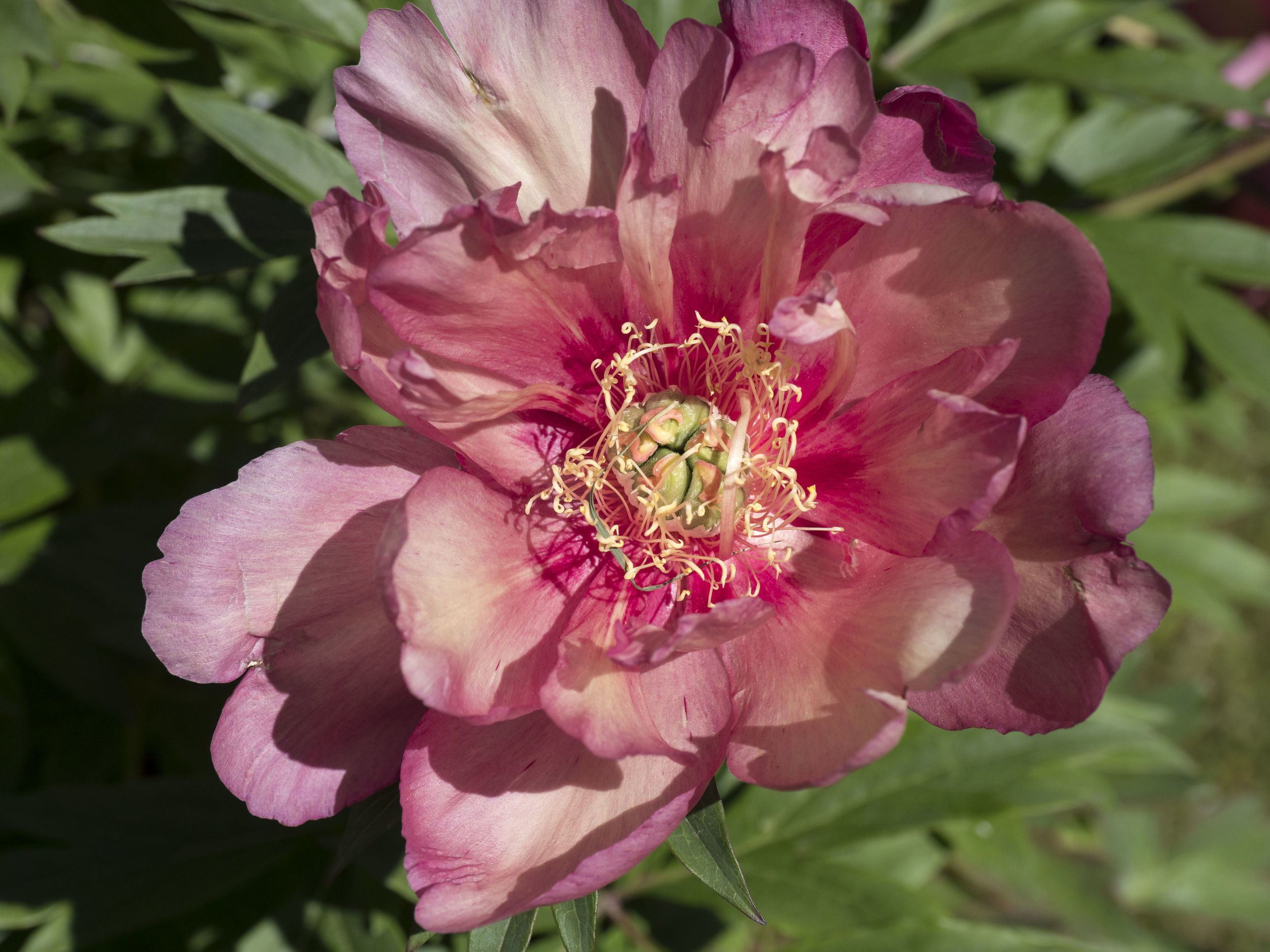
The lens really is sharp. Post process sharpening is mild in Lightroom (from +20 to +40 maximum), but attention should be paid to radius which seems to be better a little lower than the Lightroom base. A little brush work makes all the difference, but again should really be limited to mild (+10-15) contrast, clarity and sharpening or it becomes too visible.

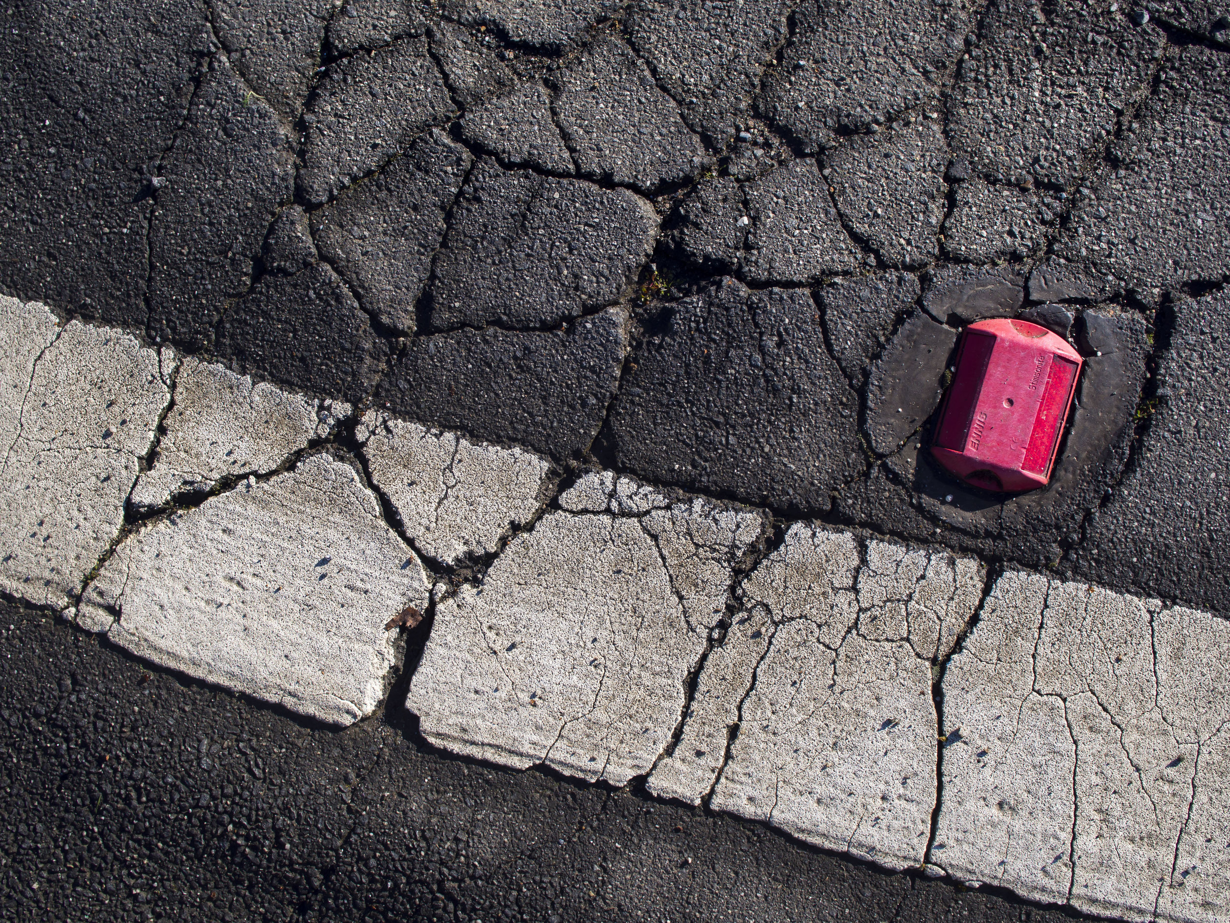
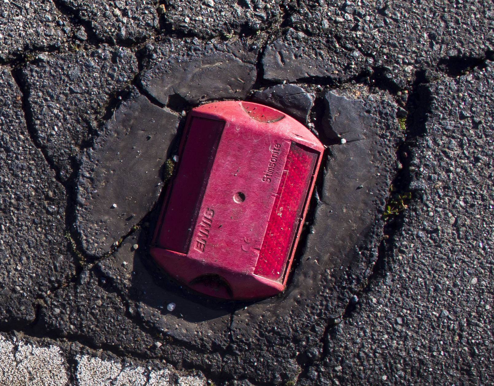
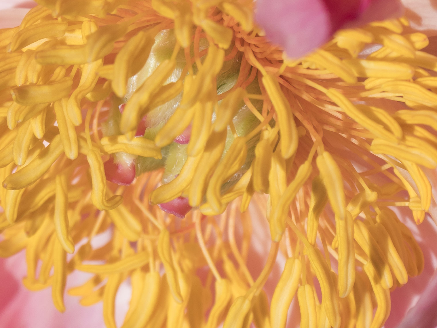
Macro really is good enough for an occasional user, but one should always look out for “Ninja Bokeh Spiders”.

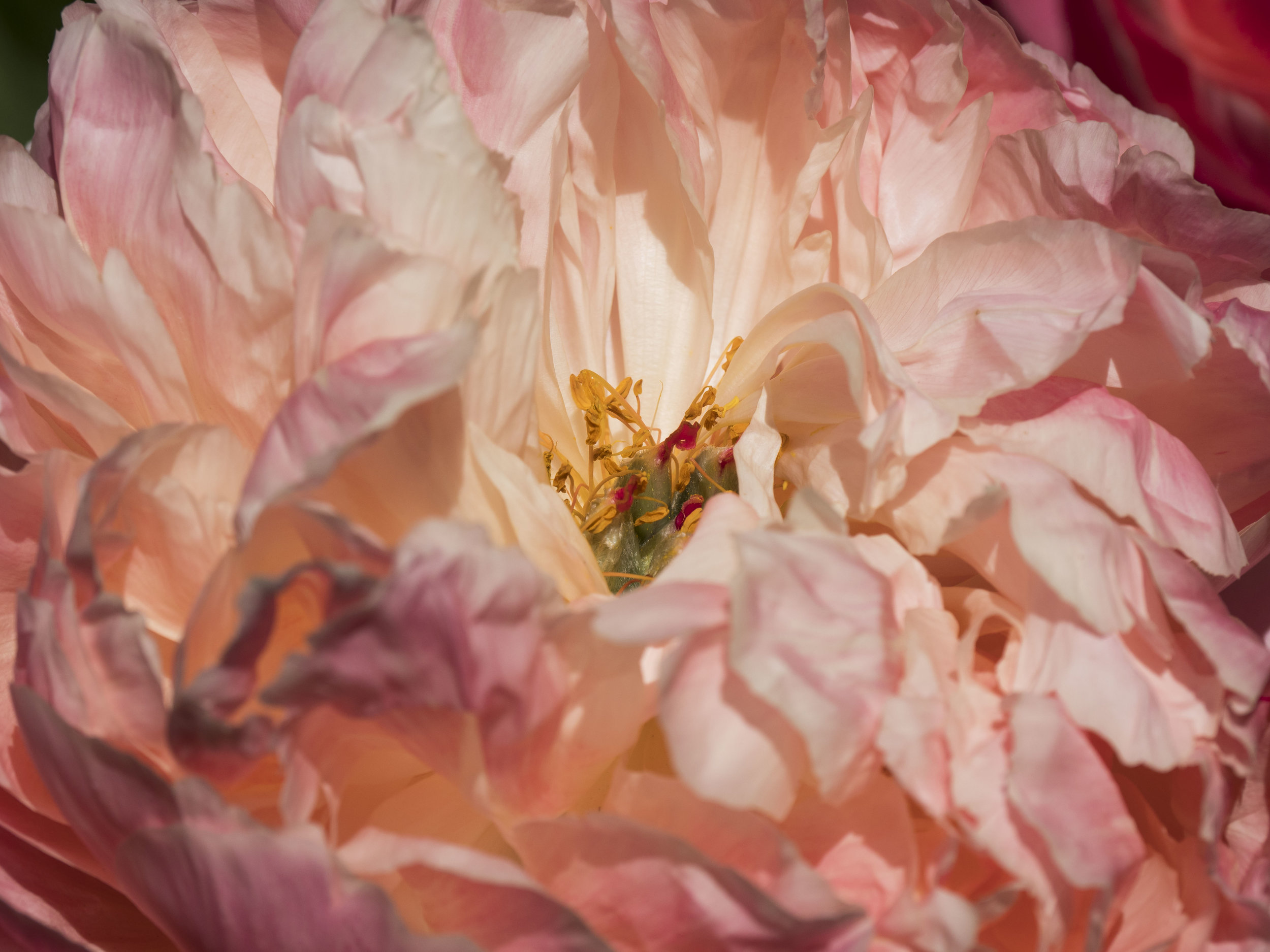
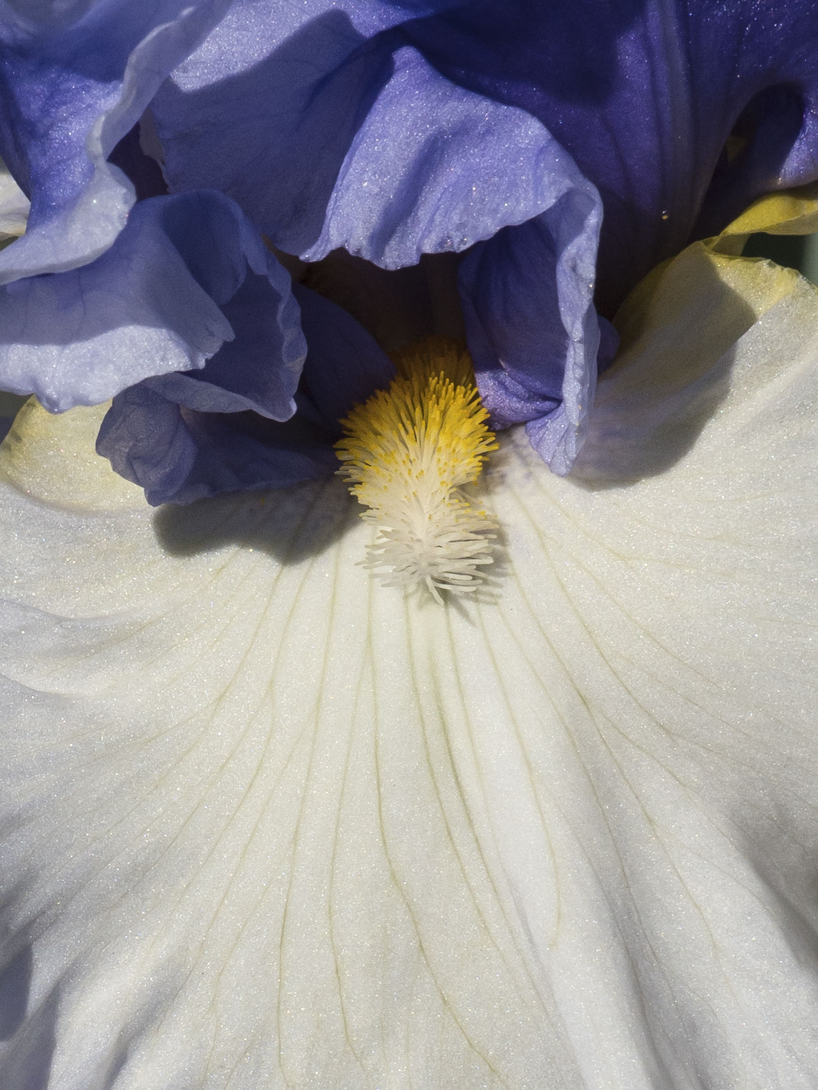
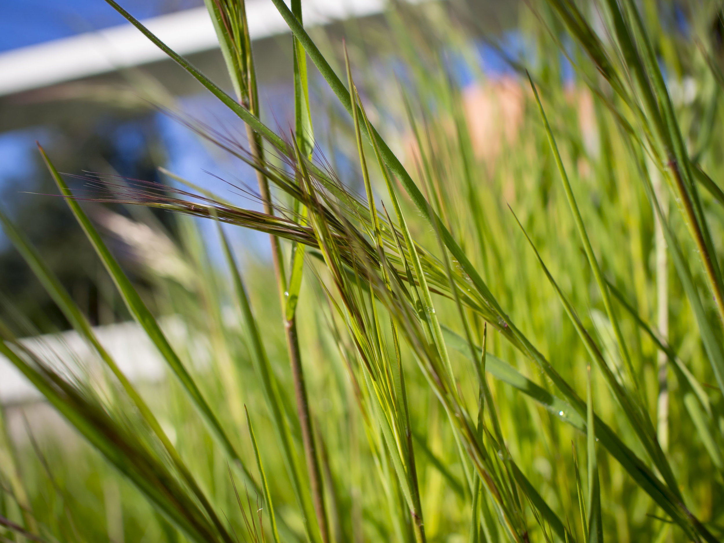
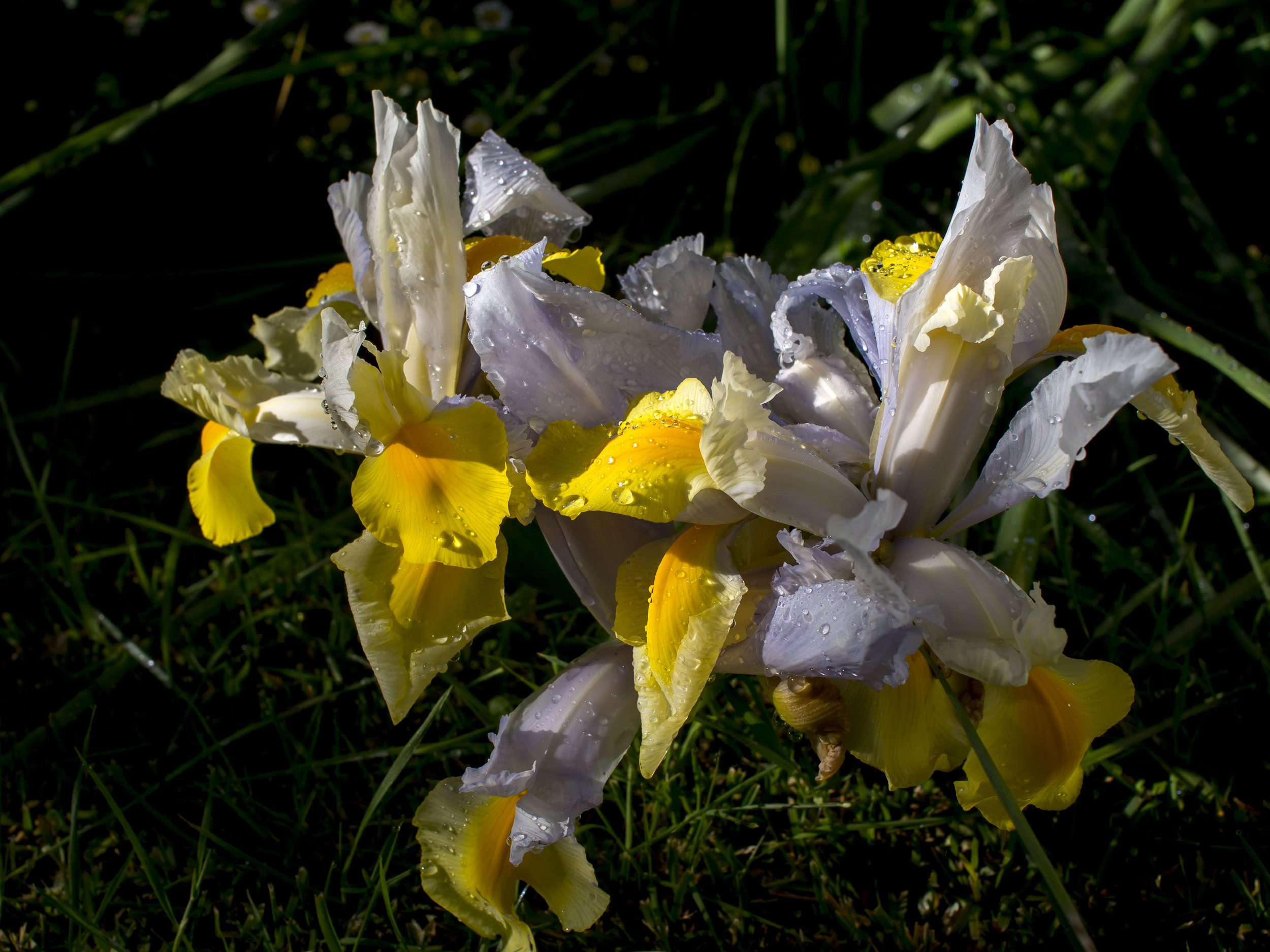
Detail really is good enough to do the job without resorting to High Res images, meaning hand held and windy day shooting is not a compromise of basic expectations.

All I need to do now is make sure the lens and camera combo performs as well at all focussing distances and all will be good.

Thoughts after the days shoot.

The pairing is cumbersome in the hand, almost clumsy, which is kind of ideal as it is not how I intend to use either. It makes the camera more of an old school work horse rather than a slick street shooter (I know that was what it was designed for, but retro cuteness aside, I just don’t feel it). Changing cards and batteries on the fly is a pain with the little door on the bottom locked by a thumbnail tab opening latch and the camera is generally less intuitive in the hand, but works well for more considered shooting. The image quality is also a little sharper or finer rendering, which suits considered, fine art work. I have also never liked the “flappy” sounding shutter which I can totally avoid using the electronic one.

The EM1 shows all of it’s best qualities when used in hand. Matched with fast primes, long tele’s and with it’s better high ISO performance it is simply more powerful than the older cameras. The responsive “soft touch” shutter button and smooth quiet shutter, less fiddly layout (such as an exposure compensation dial that does not need two fingers to change!), a latch style battery door and much bigger battery and twin card slots eliminating the need to change in a days shooting (as do both batteries with the grip). It also just feels great in the hand, with or without the grip.

This “all things in their place” dynamic is all I need for balance to be restored.

Horses for Courses (or a first world problem set)

Balance is important in all things.

For me, unhappiness in my camera kit (and my other endeavours) comes from two sources.

The first is lack of use. Often a dead of winter or height of summer issue, this allows too much time for thought and speculation, leading often to retrograde, sometimes even plain stupid gear movements. One case of this was the 40-150 Pro. Loved it, relied on it, but felt it was a symbol of pressure to work professionally even when I was not. So what if I had 3 good lenses covering the 75mm focal length? They all had their job to do, were not going anywhere and had all paid their way. When I am happily just taking photos, these thoughts magically go away.

The second is a clear lack of balance or relevance for gear. Canon, with it’s two formats and lack of ideal crop sensor lenses (ones that I liked anyway) gave me a lot of headaches here.

For a long time I had a working balance, but I have managed to get a little out of balance again.

The 3 EM5’s have done me proud. They still produce and my comfort zone when using them them is broad and deep.

The Pen F was purchased with three specific benefits in mind. Firstly a sensor/processor upgrade. Secondly the potential benefits of the high-res mode. Finally and most importantly the electronic shutter. It did as desired, although the e/shutter proved to be more beneficial than the high res mode. The 12-100 was then purchased to complete the landscape picture.

Lately the Em1 has mysteriously turned up, thanks to a great deal, but what is it’s role?

What it does well;

It is fast. Really fast. In every way measurable.

It is clever, adding many new features that I may not ever use, but now have the option of.

It is tough. Tougher than anything previously offered by Olympus. Not a feature set I will need in the foreseeable future, but who would turn down more peace of mind.

It is more powerful. Better battery, two cards, faster functioning, longer lasting.

So again, what is it’s role in the kit of an occasional professional photographer and avid amateur street shooter?

Originally I attached it to the 12-100, mating my most powerful/versatile combination of lens and camera. A lot of this was due to the grip supplied with the camera. It was the only combo that felt right together. Smaller lenses on the EM1 felt under done, the big lens on other cameras felt more or less unbalanced.

This gave me a clutch of proven small and fast primes that are attached to EM5’s or a Pen, but were often ignored because I would gravitate to the Em1 and zoom. Suddenly I am toting a huge, heavy camera and lens, lacking my faster apertures, the cleaner thinking of primes and the smaller bag options I prefer. Added to this, I struggled with the EM1 for landscapes, because I found the camera over laden with options (I could not even find electronic timer release until further exploring at home) and the grip made the whole thing too big for tripod balance. I like my tripods small these days, like my bags and my cameras and my lenses….

Then a interesting thing happened. The grip developed a small but annoying fault (the camera’s shutter button occasionally faulted with the grip on and activated, but worked fine with the grip in the locked position). Olympus has it now and I will get it back in the next two weeks most likely, but the “perfect” dynamic of camera and lens was broken.

This got me thinking differently about the camera.

It was suddenly smaller, lighter, more nimble.

So to recap.

I believe that the Pen F produces the best IQ of all 5 cameras especially at lower ISO’s (the sensor is different to the EM1, probably from not needing to support better AF operation). It has the gentlest and cleanest operation on a tripod, including a threaded cable release socket. It does not offer greatly improved operation over the EM5’s for how I shoot street and travel and no advantage at all for action/event work when compared to the Em1. I actually find it the least comfortable of the 5 to use in hand. It is precious and beautiful, but not weather sealed or something I would be happy “knocking around” in use. The battery life is not as good as the EM1, but it has 6 batteries, exceeding in total the performance of the two for the EM1 and it shares these with it’s backup EM5.

= Landscape camera.

The weather proofing is not a big deal as I can cover it up and have an EM5 as backup, the high res benefits on the eM1 are irrelevant as I do not see that feature being of much practical value and speed of course is irrelevant.

A strong crop of a non high res image. The RAW 20mp performance nearly matches the high res 50mp jpegs and is more natural and way easier to use.

A strong crop of a non high res image. The RAW 20mp performance nearly matches the high res 50mp jpegs and is more natural and way easier to use.

The Em1 on the other hand IS the camera that adds functionality and speed to hand held work. It has the best stabiliser, AF, ISO performance and in-hand feel as well as a beautifully smooth and responsive shutter release. Without the grip it feels perfect with the smaller lenses, with the grip it adds portrait functionality (totally wasted on a tripod). Two batteries can do me for a long day. The dual I.S. with the 12-100 is lost, but to be honest, I would rarely use it, preferring a tripod or added lens/shutter speed. It also upgrades the AF performance of my primes and the travel/event 75-300.

= Street/travel/event/portrait camera.

Image after image after image perfectly in focus with a budget 75-300.

Image after image after image perfectly in focus with a budget 75-300.

Technically the EM1 is the better camera all-round, but not in this specific case. The nifty little street camera (Pen F) turns out to be a great tripod camera, the high res, high speed beast is just better out in the world pulling off the near impossible. The older cameras are reserved for travel, back up and around the house hack work.

If I only had 1 camera? The EM1 would be logical, but I am glad that in this world, right now I have options.

Something from nothing

I draw the line at Lightroom for my processing. It is not that I am fundamentally opposed to the more “graphic design” processing of Photoshop, I just have never needed what it offers for my own images and much prefer the more intuitive style of Lightroom. This artificial boundary has allowed me to explore digital image making with the perspective of a film era shooter, but is powerful enough to take me places film processing would have struggled with. This is especially true of colour. Film probably held as much if not more colour in each exposure, but it has only been since using digital that I have been able to extract it easily enough to make discovery, as well as nurture a part of the process.

The final screen edit. After a basic import preset, there has been a little cropping, then the more aggressive processes outlined below. For printing the image would be reworked to put the punch back in that printing on a fine art matt paper will mu…

The final screen edit. After a basic import preset, there has been a little cropping, then the more aggressive processes outlined below. For printing the image would be reworked to put the punch back in that printing on a fine art matt paper will mute slightly. The printed end result though will likely hold more subtlety and depth. The effect is strong, maybe too strong for some, but all of the colour is enhanced from what was naturally there, nothing has been faked.

The unprocessed, cropped original. Pretty drab, due to cloud cover and the time of day. My first impulse on reviewing was to ditch it. My second thought, after some success with other files in the set was a mono conversion (see below). Browsing through the files recently, looking for a good mono/colour comparison, it occurred to me to push a couple of sliders and see what came easily. I intended to show the added strength of the mono image, but ended up with one of my favourite colour images from the day.

In this file, only colour saturation has been added to a basic import pre-set which is a mild version of below. (+50 vibrance and saturation and a little more specific orange/yellow/blue saturation). You can see the latent colour in the image coming…

In this file, only colour saturation has been added to a basic import pre-set which is a mild version of below. (+50 vibrance and saturation and a little more specific orange/yellow/blue saturation). You can see the latent colour in the image coming out a little, but it is subtle.

It always amazes me how much hidden colour an image can have. Night/evening and shaded area shots often have much more colour in them than we see at first sight.

This shows the effect of the basics panel contrast and exposure controls, but without any colour settings being applied. The contrast is +40, highlights reduced by -50 and blacks to -90. Shadows and whites are increased to +40 ad exposure by +20. Th…

This shows the effect of the basics panel contrast and exposure controls, but without any colour settings being applied. The contrast is +40, highlights reduced by -50 and blacks to -90. Shadows and whites are increased to +40 ad exposure by +20. This shape is pretty standard for EM5 mk1 files as it adds brilliance and crispness without loosing highlight detail.

The blacks slider can be one of the strongest acting and most useful in Lightroom. Deepening the blacks can add the effect of sharpness, crispness and a cleaner, more contrasty image (this is what we used before the de-haze slider was added) and is often where I start with a flat looking image. If the image does not respond to the blacks slider, I will often pass it over as too far gone. Pushing whites adds brilliance to EM5 mk1 images, but often needs reduced highlights to hold the image together. The highlights and shadows sliders are less aggressive than the blacks and whites ones, so they are often the limiting factors.

Combining the two above combinations resulted in the majority of the finished file, then some added brush work (+20 clarity and contrast mainly) added to the dune detail, the foreground and background. I much prefer to use the brush with mild sharpness, clarity and contrast settings, even multiple times, than using the clumsier global settings.

I have since revisited the image, changing the cropping to a more rectangular shape.

The mono conversion. This was the end product of the pre-conceived path and is perfectly serviceable treatment of tones and textures, but as often happens (with me anyway), the colour of the image called.

The mono conversion. This was the end product of the pre-conceived path and is perfectly serviceable treatment of tones and textures, but as often happens (with me anyway), the colour of the image called.

Lens selection (more headaches)

So I started working in a camera shop again, teaching classes and generally getting back into the groove.

Inevitably I suppose, I have become re-inspired and unsettled in equal measure. I am not the type (these days) to be the slave of other peoples expectations, but I am certainly becoming more of a slave to my own.

The unsettled feeling I have comes from the same source it has done for awhile.

I do not have a good wide angle lens. This is something I do not feel I need for my general every day photography, but here is the rub. I cannot stretch, change or explore all forms of photography if I stay limited to a small clutch of “normal” range lenses (all shot with an EM5 mk1). For myself, the route to constant output seems to be directly linked to the ability to adapt to subject, opportunity and mood. It has not gone un noticed that my commitment has become more focussed on travel and occasional street work, but little else.

This came home to me recently on a landscape photography workshop we held recently. I have no landscape kit to speak of and I felt like a bit of an imposter. Sure the advice I gave was sound, but it was a case of do as I say, not as I do. Of course, if pushed I could get the job done, but I do not have either of the two things I feel are realistically necessary (for me) for serious landscape work;

  1. A superior and consistent (at f5.6-11 at least) zoom lens or lenses, to cut down on framing dilemmas (why rob yourself of maximum possible quality by being forced to mis-frame images with a limited choice of primes, when an all-in-one zoom now can offer 100% usable image space without it’s own compromises. I would also love to have a “no fiddle” kit using as few moving parts as possible. This is to address a known laziness issue I have, but one that I could see as a test of commitment?

  2. A wide angle (as part of the above). Nothing outlandish, but at least something wider than my 17mm, capable of a little grandeur of perspective. Nothing crazy wide is in the mix. I do like filters and do not like super wide lenses. Simple as that. If I want extended coverage I would prefer two less perspective expanded (14mm or longer) files as a stitched panorama.

The benefit of working in a shop of course is access to gear.

Last shift, I grabbed a little time and a clutch of lenses and, very unscientifically, shot a series of shots at the apertures and relevant focal lengths I wanted to use. I was trying to find a clear winner, but also to compare the lenses I have to the ones I would like. These images were then manipulated at home to a standard I would accept.

The subject at 12mm (surprised I was not arrested for staking out the bank). Great as a CA challenge with lots of contrasty edges. I particularly paid attention to the sign in the bottom right hand corner, the trees right centre edge and the boxes i…

The subject at 12mm (surprised I was not arrested for staking out the bank). Great as a CA challenge with lots of contrasty edges. I particularly paid attention to the sign in the bottom right hand corner, the trees right centre edge and the boxes in the frame centre window on which I could read “made in china” with the 45mm lens. Focus was on the middle column just above the filigree work.

untitled-9220046.jpg

Keep in mind I am not after the best theoretically perfect lens, but the one that “puts the rubber on the road” post fixes if necessary, so I fixed CA, sharpened a little and addressed fall off etc., you know, the way we all do with all of our serious images. Why would I reject a lens that delivers what I am after, just because of an easily fixable minor issue. This is not a homage to the lens makers craft. It is an attempt to get to the end point of a process with the best realistic results.

The conclusion.

Tie for first consideration

Olympus 12-100 f4 Pro. What a winner! This lens was consistent across the frame and through the range It had mild and easily fixable CA and sharpened nicely (usually a good sign of micro contrast). Unfortunately the light varied a lot over the 5 minutes it took to complete the shots (Tassie in spring, what ya gonna do) and the images with this one were fairly low contrast, but never the less it’s quality showed through (in many ways, the less than ideal light actually helped show it’s strengths). Great close focus, great range, weather sealed and pro build. The only small issue is filter size, but with only 2-3 needed and no changing I can deal with that. At f8 it was slightly less sharp than f4 (did not test f5.6), but that would likely be slight diffraction. Diffraction softness sharpens well enough. It renders a cool and neutral image, which I feel would add contrast to landscapes and is in welcome contrast to the warmer 17mm and some of the other primes. The amazing stabiliser performance is a bonus.

The left hand frame is a crop at 15mm from the Olympus at f8 and the second is the Panasonic 15mm. The colour is from the light changing partly, but the Oly does look to render cooler, although a feature that the 15mm images showed was more controlled contrast (notice the more natural, smoother rendering of the branches even though the wall behind has more shadowing). The third file is a crop from the 17mm showing the slightly cruder, but not unusable file edges after a bit of work.

Panasonic 15mm f1.7. This one is a known quantity to me. After testing it against the other lenses here and knowing how the two 17mm Olympus lenses compare, I would put it on par with the Olympus 17 f1.2 for across the frame clarity (where the f1.8 falls short). It has always tempted with it’s slightly wider angle of view to the 17mm Oly and early on it was a genuine contender to replace the 17mm, but for street and travel, the Oly won out due to it’s warmth, excellent micro contrast and elegant, street friendly Bokeh. As expected the 15mm out-shone the 17mm in the edges and corners (but not by as much as I expected, credit to the 17) and offered a “brighter” look with slightly more open, less organic colours (a better rendering possibly for landscapes). It does not fix the zoom issue and barely adds anything to my coverage, but would add a scenic specialist, moderate wide to compliment my street specialist one. It had effectively no CA and offered a smooth, realistically sharp, mature image, much like the 45mm. The light may be to blame for the slightly warm rendering, but it had more snap than the 12-35 in the same light and held more highlight detail than the 12-100. All primes with varying filter threads goes against the ideal, but how serious am I? Not buying this will hurt as any lens this good that is affordable is worth grabbing. If I am true to my own ideals and can function with a compressed range, this little prime gives me the needed alter ego to my much loved 17mm.

The angle of view from the Olympus 17mm on the left and 15mm Leica is negligible, but not totally irrelevant. It is the better edge to edge performance that is more appealing for landscapes (only). These were taken less than a minute apart, showing the fickle nature of the light, so it was hard to get a handle on the true, natural tint of each lens.

The Oly zoom on the left at 12mm and the 12-60mm on the right. This is the corner that the 12-60 seemed to render better, although muddier than the others, but it fell away elsewhere.


Lenses that gave me pause

Panasonic 14-140 mk2. This is a little sleeper. It has the ideal 58mm filter size (have those), is small, well made and has a good range (12mm would have been nice). This was a case of more than adequate being trumped by better. If I had this, I would be settled, but at half the price of the 12-100 (the pro lens is on special at the moment), the temptation to go for better is too strong. It had a little CA that robbed it of some sharpness and the corners at 14mm wide open were the worst in it’s otherwise stable range.

Panasonic 12-60 f3.5-5.6. Much like the one above, but with a shorter range. Nothing to complain about, but a little expensive for the range/speed. I would have been tempted at a slightly lower price, pairing it with my 75-300. Compared to the lens below, this one looks to be very good value. Fixable but obvious green and purple CA with above average corners, especially in the aperture range I want, it gave the big Oly a run and matched or bettered the f2.8 zoom. The only issue, that I put down to the changing light was a lack of contrast, but after long comparison viewing with the others, it just looks to be a little flatter than the cooler rendering 12-100. It is also weather sealed and takes 58mm filters. Two other things I noticed. It was a tiny bit wider than the 12-100 at 12mm and it seemed to perform against reviews I later read. Possibly it suffers from some field flatness issues. These only effect testing flat targets not real life images.

Panasonic 12-35 f2.8 mk2. I must admit to being a little surprised by this one. I expected it to out shine the 12-100 if any would, but it was more at home in the lesser pack with the two above. The high speed and short range probably limited it an outsider and it would compete with my primes for general work. CA was well controlled mostly except for some troublesome purple/green at 35mm that I found hard to correct and it was consistently sharp across the frame. It is a strong lens in the vein of few faults rather than anything outstanding (much like the Oly 12-40). The 15mm became the reference lens and beat it at that focal length, but at 12mm it maybe pipped the 12-100 by a hair.

To put it simply, if I owned any of these above already, I would probably not bother to get anything else.

Not in the Mix

Olympus 14-150 Mk2. I really wanted this to be the winner as it fit the bulk of criteria and a big part of me hoped it would be a real sleeper like the 75-300, but alas it just fell behind the pack, especially on the outer half of the frame (similar performance to the 17mm). Maybe a good choice for general travel work and non critical landscapes, but it cannot in my opinion be elevated to the fine art level.


My reference lenses at the start of this test performed as expected.

The 45mm f1.8 Olympus is exceptional. It was the best at the edges, although only by a small margin to some of the other lenses at their best apertures and the 17mm performed above expectations on comparison. Those that were better in the corner of the frame than the 17 were clearly better (15mm, 12-100). I would put it’s corner performance in the middle of the pack and the centre circle was wide and forgiving, but the frame centre often beat the best lenses here (snappier micro contrast?).

The missing lens is the 12-40 Pro, a lens I grudgingly rate highly after using it for a while, but it has the same issues as the 12-35 Panasonic (short range) with added weight and filter thread needs. Owning this basically felt like owning a big and heavy 12-18, with the prime 25/45’s as good or better.

*

I will probably be getting (the tested) 12-100. It came through in the top two in every area. No mean feat considering the range. If I can noticeably better it’s performance at the focal lengths it offers, the lenses required would I feel, need to be the far less useful and no less expensive primes or paired f2.8 zooms and some of these I already have or have had and sold.

The 15mm is hard to let slip by, but I may revisit that later. Unfortunately for it, the stronger area for the 12-100 is in the 12-25mm range. They were really hard to split, with the 15 winning little fights, mainly in gentler, slightly smoother rendering (again micro contrast?), but the zoom looking crisper/more contrasty over all and again that huge advantage of being able to micro manage framing (and good macro) in camera, giving it the edge most often in resolution simply by avoiding wasted pixels later.

It is funny how the mind works. On one hand I would love to be that purist, who finds the rare piece of compositional perfection and draws from their understated bag one of a small, hand selected choice of (range limited) “ideal” lenses, then painstakingly composing the perfect image, accepting that sometimes the best framing option is not possible (adding the validation of good fortune to the good shots when captured). On the other hand, the realist in me just wants to get 100% return in any circumstances regardless without the false promise of better through hardship. Lets face it, good image making is hard enough, but which corners are worth cutting in the name of efficiency and which ones just promote laziness.

Fundamentally I am opposed to zoom lenses for my street and portrait photography due to their limited aperture range (especially in M43 where all apertures are practical to use). When thinking of landscape shooting, with it’s forced contemplation and effort, field craft limitations, unforgiving nature and other external considerations my thinking is different. Even issues such as handling/size/weight become irrelevant when methodical tripod use is the norm.

If the Panasonic 12-60 was cheaper, I would possibly look that way allowing this whole thing to be less expensive, but at twice the price you get nearly twice the range and slightly better performance across the board from the Oly.

An old favourite the 12-35 f2.8 failed to excite, being the perfect balance of not a useful enough range, and not outstanding (enough) performance to be compelling.

For a trip planned for next year requiring a lot of hiking, the Panasonic 14-140 is tempting, the Oly is not that big and heavy on balance.

On Light Part 1

I have wanted to do for a while, a series of essays on light.

Light is obviously photography. The two are intertwined and it is fair to say light defines an image. I would like to look at light in images, both good and bad as to dwell on only the good robs us of creative options and opportunities. 

When photographing in Japan, the light can often be muted and gentle, but a little lacking in drama. Towards the middle of the day, the sky is often a colourless haze, especially from the perspective of a Tasmanian photographer used to strong and more angled light. Early and later, depending on the time of year will usually add more contrast and for a short while, that contrast and deepened colour becomes a revelation.

Walking In Light.

"Walking in" light is that magical last or first half an hour of sunlight, filtered by atmospheric conditions that often adds a golden yellow or orange glow. It is sometimes called the "golden hour", but this is probably even more specific as it pertains to a strength of light, combined with a direction of movement, away from the lightand against the flow of traffic, specifically applicable to street photography.

Kyoto's main shopping drag is ideally aligned to the sunset version of this light (and sunrise I guess, but I have not been going in the right direction at that time in the morning).

There is plenty of movement at this time of the day, especially on work days.

untitled-4220210-3.jpg

Metering can be tricky, but I find that more drama comes from metering for the sunlit areas, even if that risks loosing the shadows. The OMD sensor and meter combination seems ideally suited to a little under exposure in aperture priority with precious few lost files. Because the primary light is quite strong, the exposures are well within do-able range for quality, depth and capturing subject motion (ISO 400, f4 to 5.6, 1/250th or there about). Autofocus is also assisted by the added contrast, but these images were captured using zone focus.

Still strong in black and white

Still strong in black and white

The portico's and bus shelters also add to the complication and interest of the light.

Even mundane compositions take on a level of brilliance.

Even mundane compositions take on a level of brilliance.

Colours just "pop".

Colours just "pop".

Others appreciate the last of the light as well.

Others appreciate the last of the light as well.

Subjects are framed by shafts of light, surrounded by deep shadow. Notice the shadow selfie? I am on the left.

Subjects are framed by shafts of light, surrounded by deep shadow. Notice the shadow selfie? I am on the left.

Every image, and many more (some spoiled by my own shadow!), were taken over a 10 to 15 minute period with an OMD and 17mm. 

On Perspective and naturalness

Photography offers a lot of tools and ideas to help you express your vision. The process of applying these seems to follow a pattern;

We start out with a simple kit, using probably just the standard lens for a while, later trying the second zoom that came in the kit and as we grow in confidence more and more good images are produced.

Next we explore the other lenses that are often recommended by a salesman, discovered on a blog or in a book or maybe at a course. These are usually a wide angle (zoom), something for close ups (macro), a fast lens (50mm) and possibly a longer lens. Careful shopping may even net a lens that does 2 of those jobs in one. 

Exploring the merits of a new macro lens.

Exploring the merits of a new macro lens.

This is the period where extreme, often signature looks become dominant. I have seen many budding photographers (I am sure I was one of them) who adopt with glee the super shallow depth of field, super wide, extremely close or very long and compressed looks as their own. 

Gear, technique and knowledge are suitably honed, often to the detriment of all other styles. The birder or sports fan carries a long tele and maybe a standard zoom just in case. The landscape specialist often tends towards the wide or super wide and again something middle of the road for back up, while the portraitist may settle on a single prime lens for the bulk of their work. Which ever direction they take, the style they are cultivating can be equally defining and restricting.  

Possibly the last stage for many is to specialise in one or two areas, but also rekindle some semblance of their "jack of all trades" or everyday kit, often in the form of another camera format or style. Changing work process can free up thinking allowing more creativity and an occasional holiday from well trod routine.

This photographer will have seen enough to state truthfully what their preferred focal length range is and why. They know that the only way to come to this conclusion is to do the work. Hundreds of hours of composing thousands of images and some times pressure to perform are the best ways to "find your voice" artistically. Any serious and successful artist will tell you, talent gets you started, but only hard work counts in the long run. 

So, what happens if one day you discover that the only style you like is "Natural".

I am not there, but I think this is where I am headed. At some point in the transition from film to crop frame digital I grew averse to the exaggerated wide angle perspective. I only found this out when wide angle lenses were nearly impossible to find for crop frame cameras and I realised I did not miss them. It felt like something must be missing, broken even. When I went full frame, I actually disliked the regained width, although my 35L was far too big to be a 50mm, I still preferred it that way. I tried to get back on board with wides, but each time I tried, my images felt flat. Same old wide angle look, that only a few years before was a staple technique.

Recently I have started to notice again in a negative way, telephoto compression. Am I just sick of looking at far too many images over the years? Is familiarity and the loss of mystery stealing the wonder, or am I simply looking for premium composition and subject matter presented in it's purest form? Maybe I am paying the price for not having a specialty. 

Taken with a 50mm lens.

Taken with a 50mm lens.

What ever the reason, I am finding it harder and harder to justify the use of any lens wider than a 17mm (35mm equiv.) or longer than a 45mm (90mm equiv.). The gentle and comfortable angle of our vision produced by a 35mm (not our full peripheral vision, that is an optical marvel, something like two fisheye portrait lenses that is beyond us) or the equally harmonious slight compression of a short telephoto 70-90mm, that mimics our eyes magnification are where I feel most comfortable. I am sure the odd, slightly longer lens will slip in, but I have nothing wider, so no straying there. Maybe a normal lens panoramic? Still not sure what my issue is with the Olympus 25mm?

Olympus 45mm. Natural compression, plenty of (practical) blurring and good close focus (6" tall model).

Olympus 45mm. Natural compression, plenty of (practical) blurring and good close focus (6" tall model).

I may yet get a 20mm panasonic, simply for the angle of view and the Pana colour (different to the Olympus and missed for it's added variety), but nothing wider entices and the 75-300, although I love it, is starting to loose it's appeal. 

What is your focal range of comfort?

On Yellow pages and lost data

For the last couple of days my site has been playing up. I would start a post and all looked normal, but if I tried to upload external files or save the post, a message would come up saying "error, you are not logged in". On contacting the service provider they very promptly told me it was a fault at their end and the next day all was well.

It got me thinking on a subject that came up recently directly related to and at the same time completely opposed to this. 

On inspecting some of my collection of photographic books, I discovered slight yellowing around the edges of the pages in some of the older books. Furious internet searching informed me that it is in some part inevitable, although still unfortunate that some of my older and most precious books have suffered poor storage at some time in their fairly long lives.

Too hot, Too cool, Too moist, wood de-gassing, bad luck, there are many ways books can be effected by their surroundings, so short of sealing then away in acid proof plastic, I will just have to live with the reality that they will age, but probably better than I will.

I purchased a lot of my favourites over 30 years ago* when I was just getting the photography bug. Many have been in a dozen or so different rooms in five different houses over their lives and I know some of those environments were less than ideal (nothing too irresponsible, but my wife and I had a thing for old houses and all that they entail).

So, they were bought in my 20's, are a little battle weary in my 50's and I will probably still find them fulfilling in my 70's.  basically I am ok. Even the prints I did 6 years ago on my great little Pixma 9000 mk2 Canon printer are holding up well, though they are not printed in the more "archival" print process of pigment inks. Most of these have been superseded by better prints or better images anyway, so the extra effort and expense of archival printing would have been wasted. 

Now the ironic bit.

As much as the condition of my books stressed me at the time, the reality set in the other day that everything committed to digital is far more fragile than anything printed. Sounds obvious really, but two things are always on the mind of anyone who deals with data stored in the cloud or on hardware, They are longevity and security (just ask the American electoral authorities).

This website could vaporise tomorrow if the service provider folds. The images on my hard drives all rely on devices with moving parts and format support for life. No device we buy today has a realistic life span of more than 5 years and that is if they cannot entice you before that. Nothing is free of batteries, updates or without built in obsolescence pending and do we really but that all those airport and bank glitches are not man made! No wonder kids of today are drawn to "retro" things, nothing in their world is certain for more than a year or two.

Dads old Kodachrome slides or lab prints in the box under the bed will out last any domestic and most industrial digital devices operational now!

My books look as solid as mountains in comparison.

Something to ponder.

A nice pic full of symbolism of sticks fighting relentless water and stuff. You get the idea.

A nice pic full of symbolism of sticks fighting relentless water and stuff. You get the idea.


*Sam Abel, Adams, Weston, Kenna, Wolfe, Rowell, Haas etc.

On 50 being the new 40. A quick review of the Olympus 25mm f1.8

Not my age (well yes, my age), but looking at the Olympus 25mm as the true replacement for the still missed 20 f1.7 Panasonic and moving on. The real need is to partner the 17mm that I am very pleased with in the semi wide street environment role.

So the role of a partner lens to the 17mm? More snap or "modern" smooth bokeh, more compression, more glow. 

I just love the 40mm focal length. Been there and done that several times in various formats, but either the camera system did not fit or the lens proved problematic. In the case of the Panasonic, it fell through the cracks when the more practical 17mm Olympus proved time and again that it delivered, especially in focussing options. 

Yes, the stellar 20mm has only one relatively minor flaw. Slow autofocus and relatively stiff and un-marked manual focus operation, two things the 17mm does better.

Now to be clear; there is no room in my bag, nor any need for a 40mm focal length between a 35 and a 50. My feeling is the 40mm is the ideal lens to have instead of the other two*, but not as well as. Why clutter the thinking process up with too many choices that are really only a matter of perspective change by degrees?

Buying the 25mm F1.8 (50mm equivalent) seemed a no brainer at the time. Reviewers were giving it a big tick even when compared to the Panasonic 25 f1.4 (I had two of these over a couple of years, but they did not stick), and with a better price/size/functionality, I just grabbed it when it came out. 

The problem is, the 20mm's sharpness, angle of view (a less distorting 35mm really) combined with a highly portable pancake design. It is not really a better lens optically than the 25mm Olympus, but it renders differently and is poor in application compared to the 17mm. 

So the question is can I forget the 20mm and use the 25mm I have had now for 3 years, but used little in that time.

The 25mm has become a filler lens. You know, the one you feel better having, but have to find an excuse to use. I struggle with it, but cannot work out why. In truth there is nothing to complain about. It handles well and has always delivered, but what is wrong? 

In the spirit of finding a reason to use it, in probably it's best application as the "one lens, lens", I grabbed it, and only it, for a road trip today, intending to decide the issue.

First, is it sharp?

As you can see from the first two images above, crops included, even wide open it is professionally sharp and the background is perfectly smooth. The last image stopped down to f5.6 is effortlessly sharp hard into the corners. All images are with my standard work flow from RAW EM5 images.

Is it problem free?

No, not totally, but easily fixed. The above image, also wide open has some expected situational CA that took only a little fixing (see crops). Not much else to complain about. Unlike the 17mm, which tends to loose contrast wide open, this one keeps it's punch.  

How about Bokeh?

The first two images are at f1.8 (that is her own hair on her nose, shedding for summer), showing front/back Bokeh and good focus accuracy. Perspective aside, there is a longer lens look to these shots. The third image is at f4, showing nice gentle transition, the fourth is at f2.8 harmoniously taming chaos and the last at f5.6 showing how forgiving it is when DOF is limited by circumstance or physics. The 17mm is better at holding out of focus information, but this lens offers the opposite look, snappy and defined.

Conclusion; Nice on the eye overall, with that same 20mm "snappy" look. It also has better close focus with a more natural perspective than the semi wide. This is the opposite look to the 17mm, ideal.

And finally colour and contrast.

Looking at the images above, the colour is rich (less like the 17mm, more like the 75mm) and contrast is on the strong end. The colour from the 20mm is more like the 17mm, so less reason to add it next to that lens.

Problem solved?

Not sure.

The real issue I think is the 25mm (50mm e.) lens is to me is a short portrait lens, where the 20mm is an environment lens.  Relaxed and inclusive, without the slight distortion the 17mm, the 20 (40) is the ideal "everywhere" focal length. The 50mm is not and traditionally never was the perfect compromise lens** (approximately 42mm is technically the standard on a full frame camera). The 50mm is actually the first of the natural rendering portrait focal lengths, so it is probably the correct foil for the wider than standard 17mm.

If this is really the case and I suppose it really is, it means that all of my wide work, such as I do, will be handled by a capable enough little 17mm.  

* Olympus and Panasonic obviously agree as neither does a cluttered range of focal lengths in their offerings, the clutter comes when you combine the two. Panasonic goes 14 replaced by 15, 20, 25 while Olympus is 12, 17 replaced by 17, 25.

**I assume it became the standard lens because it has a more natural perspective and being a gentle-short portrait lens, with the main subject often more important to many hobbyists, that still offers the user a good enough general purpose option. Minolta used to offer a 58mm as their standard lens. Most medium format makers still sold a closer to 40mm equivalent as their standard lens through the film era.

Perfect Pair

It is not often that you find a combination of two items that offer far more together than they do individually. This is called, I think super-additivity, a phenomenon where the combining of two or more ingredients creates a whole, greater than the sum of it's parts.

The Olympus Pen F and 17mm are, to me, a good example of this.

untitled-9300082.jpg

The 17mm has become my go to standard (and wide angle) lens. I have little use for anything wider and tend to think of the 25mm as a short telephoto, so the 17mm, mixed reviews withstanding, is my "everything else" lens, from a portraitist's perspective.

It's main task is what I personally define as traditional street photography, natural (emphasis here) candids of people in sometimes complicated, multi faceted street scenes. Not street portraiture, that holds no appeal for me.

untitled-010416-2.jpg

Why it does this so well is a combination of the format's forgiving depth of field and the lens's even more forgiving bokeh. The lens transitions from in to out of focus areas very naturally and gently. The ability to shoot at wider apertures, without the more modern styled and severe sharp/soft fall off that so many newer lenses tend to deliver is a great benefit. I am not afraid to use this lens at f2.8 or even wider for images that require a feeling of depth and layering. Indeed, the bokeh, when at it's most obvious, is attractive and natural. With full frame format or even another lens* in M43 format, I would seldom use an aperture wider than f5.6 and even then lean heavily towards f8-11.

Although not the sharpest or least aberration prone lens wide open in the corners, it still nailed focus wide open in the corner. Notice how the curtains in the back ground still show coherent form, almost as much as Miss Daisy's front paws.

Although not the sharpest or least aberration prone lens wide open in the corners, it still nailed focus wide open in the corner. Notice how the curtains in the back ground still show coherent form, almost as much as Miss Daisy's front paws.

Bokeh is, to me important, but it is not the only benefit the combination offers.

The manual focus/auto focus operation is also brilliant. The Pen F's bright and clear viewfinder, mated to the 17mm lens's forgiving nature allow me to manually focus, often without any peeking needed. I have not before been able to mimic the laser matt focus screen look from my film days which allowed me to manually focus subjects off centre, even in the corners. Being able to view the whole frame evenly, no distractions, with the left eye watching "outside the frame", effectively making the camera invisible, is ideal. 

Split prisms and centred viewfinders annoyed as they tend to "focus" (eh!) my attention on the focussing process, not the scene in front of me, much the same as AF. 

AF when used is super fast and accurate.

I tend to use the focus by wire option for MF, leaving the clutch manual focus on it's pre set of 5' so I can instantly shoot near without thinking and I find the focus ring in it's normal position with MF override applied to be smoother and lighter to the touch (I can focus with my little finger!). This is one if the nicest and most relevant manual focus experiences I have had in a long time*.

The button on the front of the body activates peeking if needed (white and mild). This does two things. The button is suited to this job as the finger needed to activate it is usually not doing anything else and the button tends to get pushed occasionally by accident, especially with the grip fitted and peeking activation does no harm.

Other things that I like;

The feel is identical from both lens and camera. Cool metal, tight operation and seamless fit. It feels great in the hand, although I still prefer the OMD bodies with longer lenses (mainly the centred viewfinder placement).

The screen can be folded away creating a truly retro, immersive experience. If your desire is viewing with the eye or shooting from the hip using zone focus or "guestimation" then both of these styles will be practiced, used and improved. If there is a screen option also, then there is one more complication, another choice and another convenient excuse to avoid developing superior skills. I actually like the flip out screen because it is a pain in the ass and I don't feel the need to use it!

Utter silence if needed.

Very nice mono. Similar tonal crunch to the Sony NEX7 and very responsive to processing.

A ten second conversion of above.

A ten second conversion of above.

Good metering and better highlight recovery. I tend to shoot the OMD EM5 mk1's a little under exposed because their shadows are robust and quite clean, while their highlights (although better than my Canon's when I switched) can get a little lost. The Pen F gets exposure spot on more often and the highlights have about one more stop of detail. This seriously reduces fiddling before capture.

The only things I do not like are the over tight exposure comp dial, but I have also found it (see above) less needed and the lack of a comfortable button under the thumb for AF to give the instant option of AF NOT connected to the shutter button (I liked the idea of AF on the front function button, but it does not seem to offer the option).

There are many refinements in menu and button placement compared to the comparatively geriatric OMD's, but most are lost on me as I have adapted to the older cameras, so I will leave these thoughts to others. Apparently the jpeg files are very good also, but I don't like being locked into limited options by compressed files, so again, look to others for an opinion here.

Could the lens be better? I am sure it could. Most things can be improved, but I would not like any improvements that reduce the existing powers of the lens. 

How about the camera? Little things, already worked around. Maybe weather proofing (for both), but Oly cameras and lenses have always shown superior weather sealing even with the non proofed gear (that is to say, they like getting wet about as much as I do).

*The Panasonic 20mm, although looking sharper is guilty of being the polar opposite to the 17mm in both handling (slow AF and tight and "blind" MF) and unforgiving bokeh. It made a nice snap shot lens, producing very sharp looking shots, but was useless for my street work method.

on the types of sharpness

We often (too often?) use terms like sharpness or resolution when describing the qualities of an image. I suppose then a discussion on the types of sharpness is warranted.

This is tough to explain well, but is based on my own perceptions over the last few years, especially when trying to define the differences between Fuji, Canon, Sony and M43 sensors and lenses for my own needs.

What do I mean by the types of sharpness?

Many years ago I had a discussion with an experienced dark room technician about the best choices in enlarger lenses available (35mm format).

He felt the Schneider 50mm f2.8, was too "brittle" sharp. He said it was harsh and unforgiving.

The Nikkor 50mm was "simple sharp". It provided a clear and defined image, that lacked a delicateness he preferred for detailed landscape prints, it was better suited to portraits.

The Rodenstock was just right (said Goldie Locks). It was delicate, but forgiving. Perfect for high quality enlargements that stretched to the limit 35mm negs.

These comments stayed with me. 

I think that now, more than in the past, the character of sensor and lens combinations can be explained using similar terms. In the film era, a lot of things were fixed and consistent, but in the digital era, many things can add variation and as sensor technology reaches a point of sufficiency, this character is what separates them.

For example, my poison of choice is Olympus. I would characterise their sensors as providing "simple sharpness".

EM5 and 17mm from a Fuji/Olympus show down. The camera and lens are good examples of "simple" sharp. There is actually more detail in the flower centre than in the Fuji image below.

EM5 and 17mm from a Fuji/Olympus show down. The camera and lens are good examples of "simple" sharp. There is actually more detail in the flower centre than in the Fuji image below.

Part of the simple character of the Olympus images comes from the natural colour warmth of their sensor (their character), part from depth of field rendering and part from the lenses. The Pen F is less like this, but still has this character. It reminds me of a really clean and sharp 35mm slide image.

This is the Fuji XE-1 and 23mm comparison image. This is what I would call "delicate" or "glassy" sharp. Some of this comes from tonal separation and white balance, but it is hard to prise out what comes grudgingly.

This is the Fuji XE-1 and 23mm comparison image. This is what I would call "delicate" or "glassy" sharp. Some of this comes from tonal separation and white balance, but it is hard to prise out what comes grudgingly.

Fuji in contrast provides glassy or delicate sharpness. The viewer tends to become less aware of sharpness as a component of the image, it just is. This is closer to a medium format film image, not in real enlargeable quality, but feel. The actual fine rendering is often smoothed away, but the perceived clarity is extraordinary, almost defying or transcending terms of quality. I found out after taking the above image that the whole morning the camera had been set to small jpeg. This looks to have added to the delicateness of the file.

There is smooth sharpness. Both of the above brands can achieve this, but the best I have used is Canon.

A Canon image crop from last year. This is a "smooth" sharp image. The impression of detail is strong but looking closely, edge acutance (contrast) is not strongly defined. One of my main drivers for switching to Olympus a few years ago was a strong…

A Canon image crop from last year. This is a "smooth" sharp image. The impression of detail is strong but looking closely, edge acutance (contrast) is not strongly defined. One of my main drivers for switching to Olympus a few years ago was a strong (maybe too strong) reaction to the clearer sharpness I was seeing. Something I over estimated was it's importance. One of Canon's qualities is image smoothness. I later came to miss and spent a long time trying to extract from the EM5 files, not difficult technically, but I resisted on principal.

Finally is busy or detailed over edge-acutance sharpness. The Sony NEX 7 and the little clutch of primes I had with it was great at this. This is simply the result of lots of pixels, supported or not by lenses of equal capability.

Busy sharpness is the type I like the least, but cannot really fault it. This type of rendering is the result of high resolution sensors, often supported by lenses that cannot keep up or strong filtering that tends to soften the very detail the sensor is capable of rendering. Already old fashioned, the brands that offered this recently are now moving to a harder sharpness as a result of reducing or removing filtering from their sensors to address customer demand. High pixel count cameras with basic zoom lenses provide this in spades.

NEX 7 and the under rated Sony 35 f1.8 wide open. 

NEX 7 and the under rated Sony 35 f1.8 wide open. 

Plenty of smooth and natural detail, after a little work, but not bitingly sharp (does it need to be?).

Plenty of smooth and natural detail, after a little work, but not bitingly sharp (does it need to be?).

This rendering seems to really suit mono images as the busy details show up naturally as great mid range or "micro" contrast.

This rendering seems to really suit mono images as the busy details show up naturally as great mid range or "micro" contrast.

Brittle or Hard (also delicate and glassy) sharpness is reliant on cleanness of image, high edge contrast (acutance), often at the expense of finer details. Manufacturers aim for this in their jpeg images, using contrast and sometimes over sharpening to add obvious punch. These images are often near noiseless, but can push reality a little and can easily go too far. I love this type of sharpness if it comes off. It reminds me of medium format "effortless" film sharpness and it prints well., when done badly, it just looks "digital". Fuji jpegs show their true quality here. 

A similar crop of the same eye as above taken with a Fuji in jpeg mode and the 60mm macro wide open (different light though).

A similar crop of the same eye as above taken with a Fuji in jpeg mode and the 60mm macro wide open (different light though).

A heavy crop of another eye image from a Fuji XE-1 and 60mm macro (jpeg). Smooth, clean and glassy. This was also my ideal when shooting Canon. The differing light and therefore different processing show how hard it is to get consistent results.

A heavy crop of another eye image from a Fuji XE-1 and 60mm macro (jpeg). Smooth, clean and glassy. This was also my ideal when shooting Canon. The differing light and therefore different processing show how hard it is to get consistent results.

Simple sharpness is usually the result of low or no low pass filtering on the sensor and an image shot in RAW mode. Often lower contrast, especially in controlling highlights, thus reducing brilliance but increasing naturalness. These images can show good micro contrast and are good for strong contrast subjects such as metallic surfaces. I often think of this as "American" sharpness as it reminds me of the Kodak film images from the 80's and 90's that I grew up with. This type of sharpness shows us that perceived sharpness is not reliant on lots of pixels. EM5's with 17, 45, 12-40, 20mm Panasonic and 75-300 are all strong here as well as older sensors like the one in my 10D Canon.

Another tight crop (different age, same subject) from An Olympus with 45mm f1.8. Simpler, but detailed, less forgiving of blemishes etc. (the colour is due to very different lighting). High levels of noise reduction can create a smoothness, without …

Another tight crop (different age, same subject) from An Olympus with 45mm f1.8. Simpler, but detailed, less forgiving of blemishes etc. (the colour is due to very different lighting). High levels of noise reduction can create a smoothness, without reducing detail too much, but the delicateness of other sensors is missing unless a very hard sharp lens is used like the 75mm.

As tight a crop from a full body RAW original image, using the 75mm and in the past the Pana-Leica 25mm. This is half way between Olympus hard (lens) and simple (sensor) soft. On later examination, maybe this one was pushed a little hard.

As tight a crop from a full body RAW original image, using the 75mm and in the past the Pana-Leica 25mm. This is half way between Olympus hard (lens) and simple (sensor) soft. On later examination, maybe this one was pushed a little hard.

Other factors obviously have an effect here. Processing is capable of mimicking some looks from one brand to another, but this is often fighting the natural rendering, trying to substitute one for another rather than playing to the natural strengths the system offers. The sharpening radius tool for example is useful for creating finer or bolder edge sharpness. Often jpeg sharpening is heavy handed, using wider/harsher radii as this forms a stronger impression of sharpness, but is unnatural looking on close inspection. Fuji and later model Olympus cameras manage delicate sharpening in jpegs, much closer to a well processed RAW image.

The pair of images above (roughly 200% crops) show the difference in sharpening between a jpeg on the left (EM5 -1 sharpening and NR off) and RAW (basic pre set and a little brush work over the hair). the impression of most jpegs is they are sharper, but the fine detail is often lost to illusion and can feel forced. Notice how the RAW just looks more natural and could tolerate a lot more sharpening.

The full jpeg (EM5, 75mm f2), showing the impression of snappy detail. This would print up well to fairly large sizes, with the print medium helping to smooth perceived harshness. No doubt the designers want their jpegs to deliver high satisfaction …

The full jpeg (EM5, 75mm f2), showing the impression of snappy detail. This would print up well to fairly large sizes, with the print medium helping to smooth perceived harshness. No doubt the designers want their jpegs to deliver high satisfaction to casual viewers, leaving RAW mode for pickier types. 

The closest I can get with my kit to "delicate/hard" sharp is with my 75 or 40-150mm on the Pen F. The best "simple" sharp I get is from my EM5 and 12-40, 17mm* and the Panasonic 20mm combinations. That is not to say one combination is measurably sharper than the other, but rather, one has finer visual resolution at 100%, on screen, while the other offers a clear and more straight forward image without (literally) fine, hair splitting detail. Ask a model which they would prefer at a shoot?

Printing tends to blur the differences and I find, larger screen viewing exaggerates differences. 

Sharpness is a measurable and often measured thing. Anything that can be measured often has to be measured for us to accept a difference, but maybe we should look at our less mathematical, more visceral response rather than take the test charts word for it.

*I really struggled to accept the 17mm lens in it's role as my primary wider lens, due mostly to poor reviewers comments, especially when compared on the test bench to any of the longer primes in the Olympus stable. I now consider it to be one of my most stable lenses, delivering over and over. Using it has allowed it's strengths to show through. They are different strengths to the 75mm, the 45mm and the 25mm, but are no less relevant.

It looks to me that in wider lenses, Olympus has concentrated on the qualities an image will show over the full frame (focus transition, micro contrast and smoothness) and as the lenses get longer, they concentrated on snappier rendering to better suit the likely subject matter. Both my 17/75 and 12-40/40-150 pairings show these characteristics.

My thanks to Meg and Tom for the use of their eyes and ears.


On Friends, travels and a natural eye

This post is a review of a photographers work. The photographer in question would not consider herself a "true" photographer, but I do. In a time when titles and labels often mean more than they should, she is a prime example of the true meaning of a gifted amateur.

I have known Peta Frost for a long time. She was a work colleague and friend of my wife's on and off for more than 20 years, and has always kept in touch.

Now semi retired allowing her to succumb fully to the effects of her travel bug, Peta is showing a natural photographers eye, curiosity fuelled and sensitivity moulded. A natural eye is a great gift. My wife also has a great eye, possibly tainted by too much exposure to me, but strong none the less.

My first contact with Peta's image making came in the form of a little Canon compact camera, purchased from the shop I was working at several years ago. This went to Morocco, a favourite destination and came back laden with great images. She stretched that little camera as far as it would go and then some. It was clear to me, she had more potential than the camera could service, an ideal situation really (I have sold plenty of cameras over the years that are never going to be fully stretched or even fully understood by their owners). 

This is often a tipping point for active photographers. Many a time, a customer or friend would upgrade from the camera that gave them so much satisfaction, only to be disappointed that their flash new camera not only fails to make their images noticeably better, but that added complication has stolen their comfort zone away**.

Very National Geographic 1960's, this image has been processed to bring out the mood and depth it showed, using the cameras short comings to full advantage. A great example to me of what emotion and character can do more powerfully than sterile perf…

Very National Geographic 1960's, this image has been processed to bring out the mood and depth it showed, using the cameras short comings to full advantage. A great example to me of what emotion and character can do more powerfully than sterile perfection.

The next trip would be to Norway in the winter, pretty much semi darkness at best. This would be beyond any normal compact. Peta was in luck though, as I was just starting to come to terms with a one brand kit, choosing Olympus, primarily because of the size of my investment in their gear and the work flow I had developed. The best Fuji I owned was actually the cheapest (XA-1), so we made a mutually beneficial deal. I found a good home for the camera and Peta got the ideal upgrade.

The Xa1 is the little camera that could. It does not have the unusual and problematic (at the time of production especially) Fuji sensor and processor combination, but rather the normal Bayer type. The Fuji colour was intact, along with the sharpness, but no strangeness in processing. It was also ridiculously good in low light. I still wonder why Fuji pushed their more exotic sensor so hard, when this more conventional one delivered everything the other could, without the quirks?

Peta now had a camera that would allow her to express herself with fewer limitations*, so after a couple of brief lessons on how to get the most out of it (mostly the use of exposure compensation for best utilising the "what you see is what you get" benefit of mirrorless cameras) she was away.

I have to admit to being surprised at the quality of images coming back. The compositions were mature and those of a photographer, not a tourist. Peta's photographic interests tend to follow story telling images, often devoid of clutter (people) or with people included if that is the compositional element that is intended. 

The little camera came up trumps also, getting out of the way and providing clean and colourful images in some challenging light.

I think this one was taken from a moving vehicle!

I think this one was taken from a moving vehicle!

We processed some of the top images together in Lightroom, but they did not need much work. The Fuji jpeg files really are spot on. 

Then off to Morocco again, but this time with the Fuji.

The thing that stands out to me about Peta, when she talks about her images is the emotional connection she shares with her subjects. Refreshing after all of the tech talk.

The thing that stands out to me about Peta, when she talks about her images is the emotional connection she shares with her subjects. Refreshing after all of the tech talk.

_DSF5178.jpg

The above images were mined from her impressive library. Some have been gently processed in Lightroom, some by Peta in a different, more generic programme and some are as shot.

Peta has taught (re taught?) me, to appreciate the results and the story, not to obsess about what took the image, but more the why and who of the image. Part of me wishes I could unlearn a lot of what I know, releasing some pressure of expectation and the restrictions often inherent in accumulated knowledge (sometimes called analysis paralysis), expanding my ability to see freely, with an open and generous eye.

I am grateful to have shared Peta's journey a little bit and helped in some small way to contribute to it. David Vestal, one of my favourite photo philosophers once said something along the lines of "You can't teach someone to be a good photographer, you can only guide them on their own path". Pretty sure that is not word for word, but you get the idea.

                                                                       *

* The more I talk about and use cameras, the more I come to realise that a camera does not have the capacity to expand a photographers ability to see images, only to hold it back through technical limitations. Camera limitations have always been the hard ceiling that photographers have had to combat, so much so they often determining fashions in image making and viewing (National Geographic and Kodachrome for years were the assumed way to look at colour images). The current crop of cameras are lifting that ceiling, freeing us all to express ourselves without having to learn the "secret sauce" just to get the job done.

**Rant, un related to To above photographers work; I remember once having a customer in tears after stuffing up a wedding with a brand new 5D mk3, set in the wrong AF setting for the whole day (continuous servo with the left hand focus points only activated, fiddled with because they had read how fast the AF was, but could not work out how to undo their settings), sporting a new, fast zoom, left wide open for more bokeh (grrrr), shot in RAW without any upgraded software loaded or any understanding it was even needed (frightening when your wedding images won't open and you don't know why).

The perfect back up (old faithful crop frame body, a 500D if I remember with a simple AF system and slower lens-providing lots more depth of field) had already been sold off to a friend, leaving the customer with the new monster to fight and no plan B. The traps of upgrading had been fully explained before purchase, but like a dear in the headlights the new camera promised the customer improvements unmeasured. Well done that marketing dept.!

On the influence of other photographers part 1.

We are all influenced by our surroundings. The choices we make and the paths we follow almost always have a precedent in our memories, otherwise the very idea of taking an image with a camera would probably not occur to us. 

On a superficial level, deciding who your "hero's" are (hate that over used and often in appropriate term), can help you decode the why of your own technique. It is never helpful to simply copy others, but it is nearly impossible to be inspired by someone else's work and then completely remove those memories from your mental library when working your self.

I am going to, as a mental exercise for myself, look at those image makers that I like and try to de-cypher their influence on me. 

Sam Abel

The work of less well known, quietly spoken National Geographic photographer and editor Sam Abel came at a formative time for me. He arrived fully in book form, mentioned I think in a magazine article (popular photography some time in the '80's?), way back before the internet anyway. The article talked about his method of composing from "back to front", making sure that all of the elements of an image work toward the whole (see my book review also). At the time, the term bokeh was not (invented) in our photographic consciousness, but the back-front thing started me looking at the frame as a whole, reaching it's logical fulfilment when I became bokeh aware (or, maybe like most image makers, I was already, I just didn't know what I was responding to).

Maybe a bit Abelish? No real attention to the back ground except to make sure it was in focus enough to contribute and an awareness that depth of field was compositionally required or desired.  Definitely not as deliberate, but the "filmy"…

Maybe a bit Abelish? No real attention to the back ground except to make sure it was in focus enough to contribute and an awareness that depth of field was compositionally required or desired.  Definitely not as deliberate, but the "filmy" colour and location remind me of his work a bit.

Lots of depth, but no real strength in subject. Not really Abel?

Lots of depth, but no real strength in subject. Not really Abel?

His quote "I believe in the staying power of the quieter image" became a sort of mantra and a confirmation of my own philosophy, that quiet observation and minimum intrusion is the path I am most comfortable with and that it gets the images I like the most.

What have I learned from him; His use of light and depth to make simple looking, but deeply complicated compositions definitely influenced how I see and how I think between shoots, but I cannot confess being a master of his technique. I am aware, more than ever after writing this, that I need to re visit his philosophy as my own style has drifted towards the shallow depth of field portrait style to my own detriment. Backgrounds are key and often forgotten.

Michael Kenna

Michael Kenna came to me later in my early years, towards the end of the film era and after the influence of the classic American greats (Adams etc) and the National Geo "big book" photographers (Art Wolfe and Jim Brandenburg). What he shows us is that anything can be photogenic, even the ugly and mundane. A bit of stone path, the stacks from a power station, a swing set, a lone tree in the snow or a wooden fence, taken sometimes after dark or in strong mist with long exposure technique, using what ever grain and character is provided by film. He only works in black and white 35mm or medium format film with mechanical cameras, but can make a work of art out of nothing really. Ugly and boring are no excuse, look harder with an open mind.

His style has been copied a lot in the film and digital eras, especially in the last few years due to advances in digital cameras, so his work can look to some like just another in a crowd of many, but consider this; I bought his 20 year retrospective book over 20 years ago. When he emerged, there was nothing like his work except much older images taken with view cameras on glacially slow film stock through necessity. The most notable of his contemporaries is Michael Levitt, who uses a similar style shot on large format film. 

Not in the same league and technically flawed (see my previous post about sharpness), but taken with lessons learned from his work.

Not in the same league and technically flawed (see my previous post about sharpness), but taken with lessons learned from his work.

What I take from his work is; simplicity (emphasis on minimalism in composition and tones), clarity of vision, not accepting technical limitations, but embarrassing them and then doing the work required to hone these can make a great image out of almost anything. he stresses the value of post production in the darkroom, so in a way he is the natural grandfather to the photoshop era. Many (not all) of the colour photographers of his day shot slide film stock and very few processed their work, leaving it to lab technicians and printers, but the black and white masters were the ones who followed the process all the way through, like we do today.

Probably a bit more along the lines of creative manipulation. Taken as a bright and sunny day image.

Probably a bit more along the lines of creative manipulation. Taken as a bright and sunny day image.

So endeth part 1.

On sharpness and reality

I am as guilty as any blogger of using the words sharpness, resolution and detail too many times in a week. Part of the obsession some of us have with quality, that is perceived, numerically or visually measurable quality, comes from the it's elusiveness in our early years.

Photography went from "weird science" to controllable hobby in a relatively short time (if you call a human generation short), but it went off like a bomb when it did take. All were in agreement; the technical side of photography was as much a part of the whole as any other part, allowing gear nerds, working pros, experimental or classical artists and enthusiasts to share the same journey, if taking different paths.

The second great wave of quality obsession came with the digital emergence. Starting from scratch, but with a  pre determined quality bar to aim for and tools readily available for determining value, we jumped in with both feet, measuring micro differences between lens X and sensor Y, until the differences needed better equipment than our own eyes to even see those differences.

So, what is sharpness and is it that important?

Photographically, sharpness is the ability of the end product to convey a perception of clarity and definition using true edge and/or micro contrast (Canon's Lens Work publication explains this best, showing the differences between contrast and resolving power).

All sharpness is an illusion. The flat surfaces used to view images have no actual sharp edges, you cannot cut yourself on them (ok, a smashed screen or a nasty paper cut can disprove that point). The impression of sharpness comes from the clarity and strength of contrast used to show transition from one tone or colour end point to a neighbouring one. 

In a dark room, this was called acutance and was often a chemically created phenomenon, so I guess it had actual substance, but even if digitally created the effect is the same. The sharpening tool in your processing suite is simply exaggerating the strength of the transition point between two areas, which is why over sharpening looks so bad as it is creating a clearly false (oversized) edge rather than a better defined edge.

How do we see sharpness?

Simply put, we are tricked into seeing it. Viewing distance is important, display media and viewer expectations also, but trickery is the name of the game. If you decide that "perfect' sharpness is your goal, that is sharpness so pure and definable, you cannot perceive the point where it is no longer sharp, them you have to stop looking before you exceed your point of maximum acceptable perception. That is, you must decide when you no longer want to look any further (closer), because eventually, if you get close enough, you will see the point of un sharpness.

Very big prints from 50mp full frame cameras will have a realistic resolution limit, that is not far past 16mp m43 sensors in real terms. Neither is perfect, but either is capable of producing fine art work to reasonable sizes. The reality is, M43 is not a revolutionary "catch up" leap to bigger sensor size quality through some exclusive, advanced technology. There is no magic juice. What has happened is a new wave of very sharp* sensors and supporting lenses has coincided with "already enough" quality and is acting more like a reality call than a real quality shift.

*Anti aliasing filters removed or reduced from the sensor path, increasing perceived sharpness.

Ming Thein did an exercise a couple of years ago where it tried to get unrealistic and impractical "loupe viewable" sharpness on a print. The process needed 36mp's, perfect technique and multiple passes of very fine ink droplets from a pro printing press onto carefully chosen paper to render that much detail and even then paper size was limited to small gallery sizes only. In his own observations he basically said no one will care except other photographers interested/obsessed by quality. It is all about viewing distance, expectations and delivery.

Example; look at your TV. look at it from across the room. Decide there how sharp the picture looks. Then get closer and closer, until the actual pixels making up the picture are more obvious than the picture itself. Some time in the middle, you will feel the image has become possibly sharper, but gradually unsharp. Next the actual pixels start to look sharp, but as you get even closer, those pixels loose their sharpness also. A couple of times on the journey you are happy with your perception of clarity and a couple of times not.

Another example, closer in relevance to the subject at hand.

The image below was taken with care a few years ago with a crop frame SLR, sporting plenty of pixels, a solid wood tripod and a better than average lens. 

Eos 550D 15-85mm at 85 f8, at about 30 seconds. Important to remember here that in print, this looks sharper as the paper texture and physical ink work together. 

Eos 550D 15-85mm at 85 f8, at about 30 seconds. Important to remember here that in print, this looks sharper as the paper texture and physical ink work together. 

Up to reasonable sizes (11x14 inch) and equally reasonable viewing distances the image looks sharp and contrasty in print, especially on more precious, heavy matt-fibre paper. Viewers have responded well to this series of colour and mono images, but the dirty secret is, none of the images were very sharp.

Their response was to the colours and tones, the location and the composition. If I had managed better technical quality would it have really mattered to the average viewer or would that simply have made me happier with the image?

I have narrowed the culprits down to vibration from the quite heavy sea crashing on the beach at the feet of the tripod (amazing what a long exposure can hide), possibly combined with the tripod very slowly sinking into the soft sand and maybe a less than brilliant lens (some obvious CA issues), but either way, the whole evening was less satisfying than desired. At first I thought I had left the stabiliser on. Never a good idea when using a tripod, but that would have been too easy.

A crop of the above.

A crop of the above.

Technique was tried and tested, gear should have been ok, but the images lacked any real "bite" at 100% on a screen, so most of the perceived sharpness came from added contrast, print stock selection and by limiting size.

Another example of perceived sharpness compared to actual sharpness below.

Taken with an ancient Pen 25mm from the 1960's, shot wide open, where it's not at it's best, the image looks soft and muddy.

The second image has had contrast added to it globally (clarity and darkened blacks) and specifically to the camera body (the brush tool with slightly increase clarity, de hazing and contrast). All of the clarity you see comes from applied contrast. Reasonable sharpness was there, just hidden. The lens actually showed a little more 3D pop than the newer lens it was compared to and slightly unusual (old school) bokeh.

The lesson learned here is; actual sharpness is only part of the story.

Olympus and Panasonic M43 cameras are very satisfying in the sharpness department. What I used to think was pretty good is now base line and exceptional has become the norm. So what? The elusive smoothness I loved from my Canon cameras and the glassiness of the Fuji's, turned out to be less fine detail resolution with contrast increasing perceived sharpness.

The newer raft of sensors are very clear, but Fuji and Canon in particular are aiming for a more holistic quality. What the Olympus cameras can supply is a choice between ridiculous sharpness for it's own sake or a deliberate scaling back, allowing other factors to come forward. The choice is great, it just took me a while to get over the "sharpness at all costs" thinking and use it.

An example of lush smoothness, brilliance and biting sharpness from with an EM5 and 75mm. Yes, you can have it all if you are careful.  

An example of lush smoothness, brilliance and biting sharpness from with an EM5 and 75mm. Yes, you can have it all if you are careful.  

M43 users have a tendency to be a bit defensive of their little sensor, revelling in the many comparisons done, often between full frame and M43 cameras. They usually show little practical difference between the formats in real terms, but we need to stop obsessing and concentrate on the whole process more. It is true, that the gap has been bridged, to the point that M43 users need to look over their shoulder at the surprising 1" sensor pack nipping at their heels, so move on and create with what ever camera is your chosen poison, it does not matter.

What does it mean to me?

When image quality was a far less controllable thing, image makers used all of the short comings of the medium to their advantage. A little movement blur, well crafted grain patterns, controlled colour failure, deliberate cross processing or processing errors and many other stretched technical realities were embraced (I remember first looking at Robert Capa's processing ruined images of the D-Day landings, thinking how he really got emotion and chaos across. I wonder if more perfect images would have had the same impact?).  

EPM2 45mm f1.8 1/20th f8

EPM2 45mm f1.8 1/20th f8

It is a shame that I feel I am running the risk of losing my feel for image imperfectness. The image above was a mistake (a street grab using city landscape settings). It is also my favourite of hundreds taken on my last trip to Melbourne. Ironically, if I had managed to capture it as I intended, it most likely would have become another of my many so-so street images.

On one level, I am grateful for the wonderful quality available now to all of us for relatively little cost, but I am personally at a cross roads. Do I want to loose what is left of my experimental, curious photographer brain, concentration on perfection always or do I need to stop upgrading, settling for my almost perfect cameras, but allowing some small hint of the wonder of miss-takes in. Maybe a compact pushed too hard, a film camera (oh the expense!), use the old manual focus Pen 25mm lens moreor even use a down graded model sometimes, just to keep up the hunger and awareness of how lucky we are.  

I  just sold my EPM2 and kit lens. They are excess to needs and produce much the same images as my other gear. They were basically too good and did not add anything different to my kit. Even cheaper alternatives can lack a point of difference. Maybe I should ?

Sharp images are a thing no doubt.

Sharp images are not the only thing.


On Colour and preferences

I have stated before, many times, that I like Canon colour. My early years were spent with Fuji Velvia slide film and then Canon in digital. The transition seemed natural to me. Strong, clean and vibrant colours make my heart sing. Can they go too far? Yes, easily as it turns out, but given the choice between cool and dull or bright and brilliant I will go as for to the latter as is realistic.

Olympus cameras (EM5's in particular) produce strong colours no doubt, but they lacked the depth and mystery I was used to in Canon camera's files and could look a bit dark and dull. Sometimes the very discovery of how the Canon's interpreted colour was a revelation. Deep purples in shadows, cold blues contrasting with warm and "happy" reds, yellows and oranges, lush greens and blues sharing the image almost aggressively. 

Sometimes hard to control, but never dull (let me say though, the RAW files are as flat as flat, but the colours that come out when pushed are what we are talking about).

I experimented with the files from the OMD's over a couple of years, but never really felt that the under layer of colour was there. Sure, if the image started warm and had strong and contrasty colours it could look fantastic, but was it as fathomless as the Canons?

The break through!

The bottom of Lightroom's development panel has a section I had never really looked at. It is the Camera Calibration section. I suppose in hind sight, the hint was in the name.

Camera calibration allows you to fine tune the colour palette of your camera's files to best suit your preferences, by adjusting not the saturation or vibrancy of the surface colours, but the base layer of the colour. It is in effect the ability to but a "tint base" into paint, rather than a "white base".

How do you use the sliders? Well I cannot explain technically (too lazy to find out, I am sure someone can break it down) , but here is what happens. If you push the Blues slider up to about +20-40 saturation, the file gets warmer (highlighting yellows). Not warmer like white balance warm, but it adds contrast and enhances the perception of the yellow/blue difference. If you do the same for the Greens slider, orange and green hues do the same.

The images below are identically processed except the one on the right has +20 green and +40 blue added. The feeling I get is one of more exciting colour, without over saturation or white balance shifts. Contrast and definition seem to be enhanced also.


Testing this again with an image I posted the other day (the left one), I only added +15 green and +25 blue to the right image, deepening the skin colour warmth, making the blue jacket stand out and putting some warmth in the dress. The red light in the back ground is also richer and the white/green ones have more colour in them. basically, the shot is snappier, warmer and more pleasant to view. 

The beauty of this control setting is it has the same dramatic, but subtle and natural effect as using the brush tool to sharpen, not the heavy handed global slider.

I have not had much luck with the Red control, but Olympus files are strong their and I also have not played with the hue controls, but with just a little touch in the green and blue channels, the "Canoniness" has come out.

I should say though, that the Pen F is not needing the same treatment. The jpeg's it produces are pretty close to the same, even a bit over the top without care taken. It is the EM5 and the early 12mp sensors in the Pen cameras that need the above work.

On getting off the hamster wheel

Reviews. I have been reading camera and lens reviews for over 30 years. Before digital it was a three pronged attack, camera/film/lens, now it is a different fork, just as pointy,  sensor/lens/ programme, but the rhetoric is still the same;

You will be able take better photos than you do now with camera "X".

You will be able to take (by inference) the same images as photographer "Y" with afore mentioned camera 'cos he uses one.

All previous images are sub par, because they were not taken with super camera "X" (by however small the improvement).

How do they make their case, proving beyond doubt that their conclusions are indisputable? Numbers. Lots of numbers. On graphs, charts and sometimes just floating out there on their own, unqualified. How many of us actually do the following when looking at these numbers; know what they mean technically, know what they mean in relation to other numbers representing other cameras etc. or know what they mean in real terms, in the field and off the printer?

The problem is the language never changes. 

I have been around cameras for a long time. I have seen AF take over from MF, Fuji slowly dominate Kodak (in film) and digital take over from film. Has everything that has come before been for nothing? Is everything from here on only good until the next great thing? Obviously not as the only images that can excite us, the only images that can teach us, are the ones taken on "old" cameras and formats. I would even go far as to say that images taken before the turn of the century, almost all on film, are the most influential available. In fact, I am constantly surprised at how many new books are about old photographs, processes and photographers.

I have purchased 3 or 4 books in the last few months on the photographer's work that inspires me and they are all retrospectives dating back to as long ago as the 1950's. Even new works by the best, most influential and current fine art photographers were more often than not shot on film (example tome Thames and Hudson's Image Makers Image Takers, full of the greats of contemporary fine art photography, very few working exclusively or even at all in digital). 

I will confess my hypocrisy. I have been taken in by the image quality of the Pen F, but not from a numerically quantitive way, but simply "by eye". It has a quality that comes easily to it that I find similar to some older digital cameras and some film images I have used, not something I have never seen before (The EM5's remind me of 35mm and the Pen F of medium format film). It can take an image easily that is in a style I like, but it will not do it better than Canon Full frame cameras or medium format film cameras I have owned or even (likely) good compact cameras of the near future. It simply takes an image I like for reasons different to the ones I also like from the EM5's, Fuji "X" series or various Canons.

Pen F 45mm. The Pen has a "quality is not an issue" look like medium format film had.

Pen F 45mm. The Pen has a "quality is not an issue" look like medium format film had.

EM5 mk1 17mm. An example of the more "organic" look of OMD files. Almost old fashioned film looking, but with added digital smoothness (if you want).

EM5 mk1 17mm. An example of the more "organic" look of OMD files. Almost old fashioned film looking, but with added digital smoothness (if you want).

I am glad I have the pen as it has added another arrow to my quiver, easing some of the limitations my "one look" forced on me, but it has also strengthened my appreciation of the older cameras and their role in the future.

I must admit, I still sometimes childishly bristle at uneducated and often biased statements claiming that bigger sensors and only bigger sensors are capable of high quality results (the same statements were made when they only sported 12mp sensors which was apparently tons of quality when it was all that was available). Even top end compacts can now match pro cameras from only 5-6 years ago in image quality and direct comparison of the much loved Nikon D700 to even an early M43 camera is very revealing. I am not going to defend my weapon of choice, but simply say it is more that enough for me and my image needs and the needs of most others (if not, how did we function in the past?).

We must stop this bland and sterile "quality" hunt, because we are loosing sight of real quality. It is not in the technology. That just lets the ideas out in a form that is close to what we visualise, which in turn is based on our expectations of what any device can realistically produce. Sure there was a time when good quality was not assured (sub 1mp cameras with poor/slow handling and features), but that time is long past and if you stuck with film, your "bar" never changed. The measurable differences between cameras "X" and "Y" are now so slight, that it would be nearly impossible to show them (after judicious processing) on something as simple and as relevant as a large piece of quality printing paper. 

To be able to tell, we must be equipped with better internal measuring devices, perfect memories and blessed with perfect judgement. We are not, so even experts have to compare huge prints, or 200% screen grabs of test charts, just to see the fine differences. Ask yourself which images move you the most, then look at them critically. Are they perfect in every way?

Ironically, one of the articles that caught my eye recently was published by a printing expert why compared prints measured in feet, not inches taken by M43 and full frame cameras. His conclusion was; you can (always) tell the difference if you look hard enough, but that in itself is often self defeating. There will always be a better camera, but often enough camera is close to hand. Keep chasing better and you will never be satisfied, because it will always be coming tomorrow.

The same qualifications, measurements and conclusions are repeated, time after time since the latter part of the last century. Newer is always better and you must have it. Nothing from the past can be considered. Here is an eye opener for you. Grab a copy of American Photo mag or similar from the 1990's. Look at the adds and compare the language, the images and tone to a current add. Rubber stamp copy most likely except in the specific technical terms.

Reason for rant?

A couple of articles on some blogs I follow, who are still falling into the review trap got me un settled. Not gear unsettled, but industry. Fine, talk about cameras, but not in dry, better or worse numerical values. Maybe in more or less suitable to a particular task or what the user liked/disliked. My fault for looking. There are plenty who do review without test values etc, but the reality is, the most visited sites are the number crunching ones.

I ask, when will it stop? Camera makers want to sell cameras, but the industry has reduced itself to comparison of numbers to help qualify more abstract ideas and with anything, when short cuts are taken, they become habits of convenience. I don't think the manufacturers are overly happy about it, but they are dancing to tune of reviewers (The Nikon D5500 is an example of a perfectly good camera with nothing new to offer forced into a world of new is better). 

Why have mobile phones taken over 90% (or more) of photography for the common man? Because they are fun, they show a strong quality increase each generation (like DSLR's a few years ago), they are often enough and they are always with you. 

Camera makers need to give us a reason to buy a better camera. Added complication is not that reason. One thing I passively hate about the Olympus cameras, that I find otherwise so affirming, is their ridiculously over loaded menus. Massive and largely useless feature sets with their need (like all of the others) to offer that "one unique thing" each model. How is it a camera can offer lots of new, but never really get on to of the noted problems of previous models? Problems with button placement and feature depth can often be solved with....less.

I often wonder how much easier teaching photography would be if the camera sold stuck to the basics. Training often requires as much advice about what to turn off/ignore as what to use and how.

Many years ago I sold top end Hi Fi gear. It came in two types. Very simple and beautifully crafted Euro style, sometimes with only 2-3 dials and buttons or the super complicated, all the bells and whistles Japanese monsters with far too many things that can go wrong with them. The Japanese often mimicked the European models in asperations, but could never leave out the swathe of extras that lost the point of the exercise..listening to the music. Guess which type I preferred? Oh for a simple and pure NAD style camera (mobile phone/TV/etc.)! I think it was called the Pentax K1000.

Are there better cameras out there than mine? Technically yes, there always will be, but in proportion to camera history, very few as it turns out.

Are there good images made by less advanced cameras? The majority were.

Are there better photographers out there than me? Oh yeah, lots and lots.

Is there anyone better at being me, where I am am, with my camera than me? No, never.

On being real

I look at a lot of street photography. It is the thing I am most interested in, generally speaking, when I go looking for inspiration.

I am exhausted. Exhausted by clever framing of people in front of well placed signage, oddly composed angels, tricky geometrics, stern third world or homeless people's, portraits, subjects looking down the lens, a little off centre with a crusty wall behind and I am tired of rainy windows, shadows, silhouettes and reflections. I loved these looks when I first saw them*, but that was a while ago and all those that came after just fall flat with me. 

Street photography is a broad and hard to quantify art form, but it must not fall into a sameness that will tarnish it's value.

In my last post, I stated that my "style" was often based on interactions of people. I will go a bit further and say, that my style is actually just humble reality. It is an image that transcends trickery, ignores fads. It is timeless, but of time. I want to see real interactions, not cold abstractions of people glancing off the composition. I want life in it's true form or the beauty of simple things seen honestly, quietly. I want happiness, not despair and I want to see the genuine humour shared by two people, not the observers ironic humour stolen from their actions. I don't think it is necessary to interact personally with my subject, in fact I prefer not to, but I need to see their humanity.

Pen F 17mm

Pen F 17mm

One of the reasons a lot of the huge crop of current street photographers were not included as examples when I posted "On (pre) visualising foundations", is because they do not inspire me to match or better them (once, but not any more!). I don't think I am better than these guys, I just do not see any point in doing what they do as it does not satisfy me. The better exponents of the end of last century and some contemporary artists who quietly observe, understand and treasure their subjects are the ones I respond to, but please, no more copy-cat juxtapositions. 

What am I going to do about it? Try my hardest to ignore these image making habits and see higher than the base grab or the "set and wait" shots, so hungrily hunted by others. I want to see first and foremost the people I am photographing doing real things, not their abstract impression inserted into an environment as tools for humour and/or coincidence. Heaven forbid I do it just to show how clever I am.

This look will not last. It is a style of it's time and destined to be tagged as such. Just like the aged Polaroid look or cartoony HDR it will fade. Apart from that, the simple act of clever, reflex image making is going to take a huge hit soon. When technology nullifies skill**, only subject relevance and respect for that subject will matter. 

There are no cliche's in honesty.

Had enough? Fair cop, me to.

Travel well.

*Saul Leiter, David H Wells, Jan Meisner, Sam Abel etc.

** There are already 6K (18mp) cameras shooting at 30fps and "reversing to the previous # of seconds", buffer capture cameras already available and this only going to become more common. Editing will be the future push.

On finding your voice

I have little to say specifically on how you should (or not), find a style or a look that is identified as you. It is not that I do not believe in a personal style, but i do not believe in forcing or faking it.

Whenever I have touched on the subject, it has always been with the caveat of natural evolution and inspiration as the key.

Basically, you will develop a style or a look, by doing, not by intending to do.

If I look at my own work and try to find something that is mine, not mine only, just mine at the exclusion of other things for me, then I guess it is human interaction, often positive, but not always, in my street images.

I like and am often amused by the coincidental images of wall art framing a foreground person cleverly, or lines ending on one plane and continuing on another, or colours forming strong collisions of shape and the knowing portraits of third world people against a ragged wall but I cannot confess to wanting to emulate them. The thing that constantly draws me and this shows in my image library, is human interaction.

Japan is a great source of inspiration. On our first trip, I must admit to having made many assumptions based on stereo types that were on the whole wrong. As expected the people of Japan are private, polite and respectful, but they are also generous and very demonstrative around friends and family. Even quirky.

Not sure. Flirting? Maybe a bleeding nose (or maybe one on the way)? A failure in many ways due to terrible framing, but a good example.

Not sure. Flirting? Maybe a bleeding nose (or maybe one on the way)? A failure in many ways due to terrible framing, but a good example.

Recurring themes from the first trip to Japan were umbrellas and laughter. On subsequent trips, light hearted and playful images became the norm. The people are affectionate and genuine and this hits a chord with me every time.

Possibly not Japanese, but the theme is the same. The compositional imperative for me was the emotional content. The girls, shoulder craving head came first, then the stronger friends support and later I noticed the contradictory happy face in the b…

Possibly not Japanese, but the theme is the same. The compositional imperative for me was the emotional content. The girls, shoulder craving head came first, then the stronger friends support and later I noticed the contradictory happy face in the back ground to add some irony.

Even this image, with no overt interaction, hints at other emotional connections, through a positive phone conversation, worry, possibly due to being lost or unsure and a contemplative, controlled and serious face for work. Without these emotions, t…

Even this image, with no overt interaction, hints at other emotional connections, through a positive phone conversation, worry, possibly due to being lost or unsure and a contemplative, controlled and serious face for work. Without these emotions, they are just three (slightly misplaced) visual pillars.

Is this limited to Japan? No, of course not, but I have found that different environments force a different dynamic. In Melbourne for example, my images are often based on light and geometry, less about people and I find that irony, even negativity become visual tools. there are exceptions, but the emotion often comes from assumptions and hints rather than being laid bare.

The ease of shooting locally nets a few interactive images. We are more aware of cameras, but are also gentler moving at home. The markets at Evandale and Salamanca in Hobart often give me similar images to Japan, full of "small town" familiarity.

Plenty to laugh about here apparently.

Plenty to laugh about here apparently.

There is interaction at home, even with clothing.

There is interaction at home, even with clothing.

Being a stranger in Japan gives me a naive ability to "steal" away shots without having to understand them. At home I tend to shy away from overt emotional displays as I often find it too intrusive to watch/photograph or, due to my over familiarity, I do not see in the same way the connections the Japanese show.

What ever the reason, happy or sad, loving or not, emotion and connection fuels my eye when shooting street images.

That is my style.

On kit upgrades.

I promised myself I would not be thinking about gear this year. Maybe if I get stuck in, it will go away quickly.

My problem (as I see it), is that my best "work" camera is simply not the camera I want to waste on work, and my work horse cameras are better suited to the street photography I do for myself.

The Pen F is beautiful and clearly designed for street and cultural photography. It's looks must be weighed against the lack of weather proofing and the manufacturing detail is also at odds with the lack of knock around robustness (like a top end SUV, you bought it to use, but really don't want to scratch it). The camera offers smoother low ISO results and about one stop of real improvement over the EM5 in the high ISO range. The electronic shutter also provides a real benefit for landscape work. The biggest improvement for me though is in the jpegs. They are very good and offer the colour palette my main client likes, making work flow and consistency better.

Simply put, it provides the upgrade I would like in file quality for a work camera, but it is a shame to waste it on work. It's like driving my hobby, retro car project to work.

The EM5's on the other hand are the ideal workhorse cameras as there are three of them and they are built to take (and have taken) a knock or two without ruining their average beauty. The silver one probably looks a little cooler with it's scars.

What they are best at photographically for me, is street and travel. The slight file quality increase is mostly irrelevant to this style and the handling/size/speed is fine (the on/off switch under the shooting thumb is better than the left hand dial on the Pen). I also like the old school "film contrast" look they can give and there is the not insignificant factor of street photography damage. The fast and loose style can lead to drops, things banging together and even other peoples aggression. I also connect better with them, probably through familiarity, but I really do find the shutter and feel, more to my liking.

Do I get an EM1 mk2 to add focus tracking and the ruggedness a work camera needs (with the possible benefit of working exclusively in jpegs also) or just use the Pen in the work role and use the OMD's as street shooters?

Can I really justify using the Pen for Portraits and landscape only, EM5's for street/travel and a Mk2 just for "other" work?

Can my work flow incorporate the OMD's more into work without loosing the convenience and quality the Pen offers?

Do I really want to have a surplus Pen and/or 3 redundant OMD's in my kit when the EM1 Mk2 takes over all of their roles?

After a couple of days using the kit extensively, the answer came easily. The Pen is my portrait and landscape camera (as purchased). The look and operation, combined with the primes is perfect. All other duties can be handled by the newer OMD EM5 and the older two for street.

Pen F 45mm at f2.2

Pen F 45mm at f2.2

On (pre) visualising foundations

What do we think of when we photograph? I don't mean the process, but what are the base, the foundations of our expectations when we point a camera at a subject.

Nobody alive became a photographer without some awareness of other images. Every image in our visual history either fades, becoming part of their "culture noise" or they stick and become the louder voices, the voices that drive and inspire them.

Do I know and can I express my "base" to my satisfaction? Not sure. 

The guiding thing(s), that is the first things that come to mind, even before the "composition*" stage of image making and I guess it is probably the root of recognising "connection*", must be the goal of "completion*" and be there before even "concept*", the little flash of base inspiration (that often abandons me when I am nervous) that makes you photograph in the first place is;

Memories of organised, clean perfection of a subject done beautifully.

Here are some of the examples that will come to mind in different circumstances, giving me clear constraints, expectations and I suppose limits. 

Example 1;

The National Geographic, documentary style "real life scene" with perfect light and balanced composition. Always showing real people doing real things, highlighting a time and a place with interaction and perfection in compositional timing, these images are to me the pinnacle of real and relevant photography (as long as their reproduction does not become fanciful). They are what it was always about, capturing history, but with compassion, relevance in place and time and style, avoiding fashions and falsehoods. I tend to prefer colour, often with strong contrast, but there are exceptions. There are many, many examples in my physical and mental library (fewer now that some have come clean about their habit of setting their images up!). Bill Allard's "Benedetta Buccellato", Sam Abell's "Riders from Cornwell Ranch" and Fred Herzog's "Man with Bandage" as well the works of Nathan Benn, Ernst Haas, Peter Turnley, Kate Kirkwood, Ken Tanaka, Saul Leiter and Jan Meisner (etc. etc.). Technical perfection is relevant, but not all important, as the subject should transcend the process, indeed most of my favourites were taken on early colour film.

Only used in comparison because of the colours and feel. Not in the calibre of those mentioned.

Only used in comparison because of the colours and feel. Not in the calibre of those mentioned.


Example 2;

The perfect natural, rural or urban, semi abstract, landscape detail. Tightly framed and often black and white and sometimes produced in square format to further constrain cleanly, even rigidly. All of these measures are helping to define harmony in chaos. An example of this would be the works of Adams (especially in colour!), Michael Kenna, Michael Levin, John Sexton or Cole Thompson. Technical competency is important here as every tiny detail will be noticed and it should be.  

Again showing only my weakness in this demanding area. I do not pay anywhere near enough attention to this form, but the images that swim in to my head as I go to compose are surely there to do more than just frustrate!?

Again showing only my weakness in this demanding area. I do not pay anywhere near enough attention to this form, but the images that swim in to my head as I go to compose are surely there to do more than just frustrate!?

Example 3;

Strong, clean, (smooth) sharp images of small, unimportant items that are shown as they are rarely seen. This is anything from simple still life images of real things, to events and some landscapes. They all have one thing in common, they must be real, not studio set ups as these leave me cold, falling into the realm of advertising. These are the considered or "quiet" images, in contrast to the busy, people fuelled images from example 1. Sam Abell's "Straw Hat", "Hagi Japan" and Okefenokee Swamp", Eggleston's "Untitled, Glass in Aeroplane" are some that come to mind when the process starts. Technique is important here, but not extreme technical perfection, as they retain some of the "found" subject feel of the images in example 1, allowing the viewer to pay into the story.

Well, something like this.

Well, something like this.

Nobody's story is the same. This posting has helped me to recognise the real and specific images that come to mind, often automatically (habitually?) and usually unbidden when I choose to take an image. I have found that often the act of taking an image for a client can undo this process as pre conceptions are destined to disappoint, but I think what happens is your image catalogue grows and includes both images from your "love" collection and your "required" collection, allowing a good working compromise. At least I hope this is what happens.

Do these images restrict my growth as a photographer, stereo typing my style or are they all individual stairs in a journey, each supporting the next as I rise? 

*The 4 "C's" highlighted in a previous post.

On my thought processes when choosing lenses for the day

This is going to be an odd post. It is not a lens test, nor advice for choosing the right lens for the job, but rather my own thoughts about a lens when I pick it up and use it. 

These are honest thoughts. As honest as I can be with myself about a crucial part of the creative process. I will rate them from 1 to 5 for results/confidence.

Starting from the wide end.

12-40 f2.8 Pro. This lens leaves me in two minds.                                                                            

If I am using it for landscape work, I have no issues with it what so ever. I know it is a good performer into the corners and across the range and can produce "A" grade images with care. Stopping down is good for depth of field, but not overly necessary for sharpness. The lens post processes well, supplying a feeling of an un moulded image, waiting for finessing. 4.5/4            

Old school sharp and clear, like medium format film.

Old school sharp and clear, like medium format film.

As a work or general lens, I like it at the long end, but have little practical use for the wider end. I have a problem with wide angle lenses, use them sparingly and always feel they add too much clutter to a composition. 17mm (35mm) is my usual wide limit, but you never know when your client will ask for a group shot at close quarters. This lens still gives me the jitters a bit. I feel focus issues are more common with it (feel, don't know for sure), especially on the non firmware updated OMD bodies (yeah, I know..) and the bokeh it displays, pleasant enough for portraiture, exaggerates these misses. It looks to wash out some images when shot into the light, but I may be being harsh. I also feel it is sharper at close distances, but that tends to go for many lenses due to atmospheric conditions etc.  3.5/3.5

Edit. It turns out that the images I have liked most from this lens have been jpegs taken on the Pen F. The built in corrections for the lens look to my eye to be near perfect and I will be using jpeg/RAW files together until I am sure Lightroom can do as good a job as the Olympus engineers.

Sharp, smooth, colourful and good blurring. Nothing to complain about, so why no connection?

Sharp, smooth, colourful and good blurring. Nothing to complain about, so why no connection?

17mm. Great for the job it is designed for.                                                                                        

For street photography, where composition, timing and subject relevance outweigh sheer quality, this lens is ideal. I would like it to be a little better performing across the frame for landscapes, but I am sure I would manage (it's a lot better than my Canon 17-40L). The lens "feels" sharp in it's rendering, especially in the way it's bokeh transitions, a lovely mix of micro contrast snap with good coherence. It's accurate and super fast in focus and smooth in operation and the MF markings are a must for zone focussing. It took a while, but I am more than comfortable with it, indeed it is one of the three lenses (all primes) that I rely on. Part of my need for the above zoom comes from this and the 12mm lens's supposed weaknesses in the corners.   4/4.5

Harmonious and consistent depth of field rendering, even wide open. Notice how the case stands out sharply when you look at it directly, but the out of focus areas still hold their own in harmony with it. This is very old fashioned and competent bok…

Harmonious and consistent depth of field rendering, even wide open. Notice how the case stands out sharply when you look at it directly, but the out of focus areas still hold their own in harmony with it. This is very old fashioned and competent bokeh rendering, much like many Leica lenses have.

25mm. The must have?                                                                                                                      

This one is a confusing lens. I feel like it should be more than just the stable "nifty fifty". The focal length is just not used much unless I make myself. I often go out with it alone, deliberately trying to become comfortable, even reliant on it, and it tends to be my "one lens" option. I must confess, if I lost it I may not replace it or I may go back to a Leica 25mm that I feel has more character (flaws) and perceived snap (micro contrast), but then I would most likely get the Pana 20mm (but I have the 17mm..oh crap, too confusing). It is very sharp at all apertures (with a little CA wide open), contrasty, has some genuine sparkle and a good close focus, so I should not complain and I even feel the slight regret at selling the Leica is wholly unfounded as the lens has less erratic behaviour. It is most often used as a faster backup for the 12-40 for work or as the fourth and least used lens in my all prime street kit (i.e. not used enough). My wish is to use this lens instead of the 17mm as I feel the 50mm equivalent is more dramatic for street, but the 17mm is so good at getting the image. I do however always use it for night shooting, because of it's contrast and brilliance. I think it is good enough that I would not bother with the 25 f1.2 super lens for 5x as much. 4.5/3.75

A sparkle filled, "glowacious" lens, versatile, capable and....not used as much at it should be.

A sparkle filled, "glowacious" lens, versatile, capable and....not used as much at it should be.

45mm. This is my warm-fuzzy.                                                                                                            

I love this lens. I cannot even say I use the focal length that much, but I love this lens. A bit like the 25mm, the focal length tends to one that I make myself use, but I never regret when I do and it is a no brainer when used with the 17mm on another body for street shooting. If I could only have one portrait lens, this would be it. It shares both the warmth, lush colour and contrast of the 75-300 zoom and the genuine and very grown up sharpness of the better Olympus lenses. I also find the focal length more versatile and cleaner (more decisive) to use than the 25mm, which often leaves me neither close or far enough away. My only wish would be for better close focus like the Panasonic. 4.5/5

Bright, brilliant and lush.

Bright, brilliant and lush.

40-150 Pro. My reliable work horse.                                                                                      

From a rocky start (re boxed and siting at the door for return), this lens has recovered to become my work horse lens. It was originally purchased for landscapes and will regularly do this work, but as a low light tele for sport and stage work it has really come into it's own. The shock of strong CA at the wider end and a strange "fuzzy" softness that shows up in strong light (possibly focus-Bokeh related) are being accepted in light of it's lightning fast AF, overall sharpness and versatility. I do not like the slight "ringlet" bokeh in all circumstances, but that gives me a reason to use my primes. 4/4  

A bit of old school micro contrast at ISO 3200!

A bit of old school micro contrast at ISO 3200!

75mm f1.8 This is my "hot" spot.                                                                                                          

I never regret using this lens. Some say it is a little long to be useful. My wish would be for it to have been slightly longer (100mm f2?), allowing me to get away without the big pro zoom. There is nothing to criticise, except it's habit of making me unsettled with other lenses (like Hi Fi gear, the whole tends to be judged by the possible performance of the strongest, but is limited to the actual performance of the weakest part). The 17mm is supposedly far below it in objective performance, but I think they make a good pair, the 45mm renders quite differently giving me options in look and the 25mm is technically close, often accompanying it as the fast support to my zooms when working. When I tested sharpness against the big zoom at 75mm, it was too close to pick, but the bokeh, speed and size of the 75mm makes it my preferred option. 5/5

Luxury shot with luxury, at f2.

Luxury shot with luxury, at f2.

75-300. The slow poke with some real punch.                                                                                                  

How is it, my cheapest zoom, and nearly my cheapest lens, with such extreme specifications for it's pricing is one of my favourites? it is so cheap that I have sold and re bought it without feeling gutted (a similar story to my 70-200 F4L Canons, I had 3!). It has terrific perceived sharpness and is in real terms very sharp at the short end through to 200mm and pretty good at the long end. It is really long, pulling of shots, I have never been able to do without a monster lens and even though it is slow in aperture, it has good bokeh rendering and beautiful colour. There is not really a weak area in the package except average grade build quality.  4/4.5

Seriously? From a cheap zoom.

Seriously? From a cheap zoom.

14-42 kit (manual zoom type). Not rubbish.

I like this lens. I like that it promises nothing, but delivers plenty. If I am travelling really light, it gives me a decent wide angle to go with the 45mm as the fast long option.

Wide open at the long end, no crop.

Wide open at the long end, no crop.

Lenses are funny things. You buy them intellectually and/or lustfully, but only after using them for a while can you really tell if you like them. I am generally happy with the balance of my kit for the first time in a long time. It is not perfect, but it is probably as close as I can expect from one brand alone (something that I could not do with Canon in 2013, but could do now) and is more than I need really. Unlike my Canon days though, I feel no guilt about my excess as nothing cost more than it should (except maybe the 25mm?), it can all be carried and all lenses deliver.

So, how do I rate them in my head as I go out the door?

Will only leave behind if there is really no use for it (landscape); 75mm.

Will only leave behind if using pro zooms for work/landscape; 17mm and 45mm.

Always taken for work/landscape otherwise left behind; 12-40 and 40-150.

Will leave behind unless needed specifically; 2575-300, 14-42.


What could I survive on, if it was just for me?

The 75, 17 and 45 would get me through (and maybe the 25). This is the 1 camera mated to 1 lens kit (Pen F + 17mm, OMDn + 75mm, OMD + 25mm, OMD + 45mm each set up for best use of their respective lens).


And what would I buy if money was really no object?

The primo kit would be 12mm Leica, 42.5 Leica, 75 and 300 primes.