I often go on about the Canon (or Fuji) look and how I have needed on some level to mimmic to some extent that look in my images. Digital Canon followed Fuji Velvia (shot with Canon), forming in me a taste for rich colours, strong contrast, a cool base palette with strong but cooler warm tones. Olympus cameras take beautiful images, but they are more like Kodachrome than Velvia. The neutral base and emphasis on skin tones and warmer colours matched with (in the EM5's especially) strong and deep blacks, looks very Kodachrome to me.

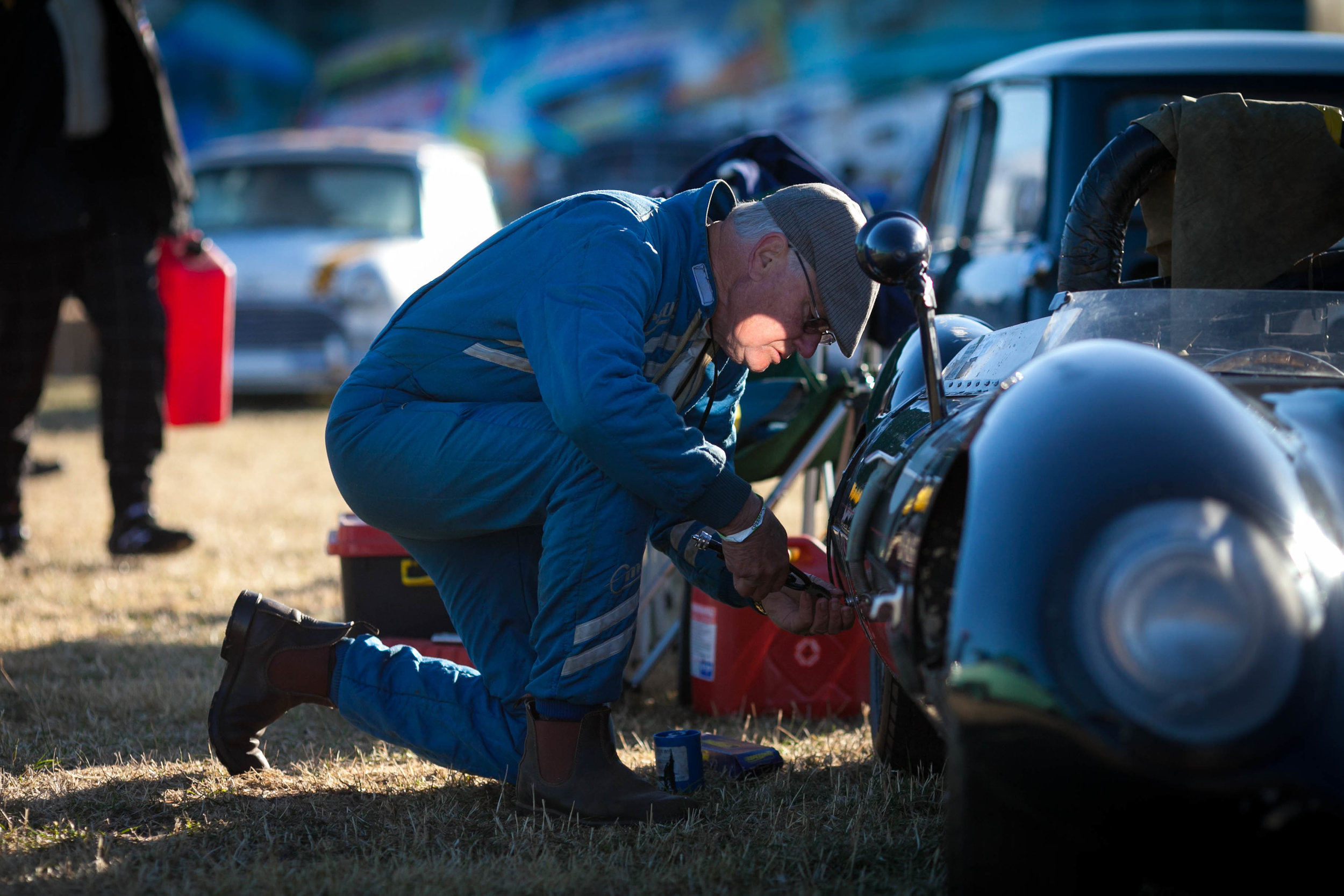
Olympus OMD and 75-300 lens at 75mm.
Why do I need the look of one brand in another camera brand?
Because I love the size and lens consistency of the Olympus cameras, I do like their images, but I miss the Canon/Fuji look sometimes, especially when the light is poor and (in my mind) I feel another brand would handle dull and uninspiring light better. This is a Fuji jpeg strength. The Sony made, Olympus sensors are better performing than the current Canon crop frame cameras at the moment in a lot of areas as well, like dynamic range (highlight recovery) and noise (Olympus black speck noise is sharp noise, not mushy noise).

An Olympus image (OMD 25mm), with reduced sharpness, clarity and increased contrast.

A Canon full frame image (5D mk2 35L), with increased sharpness and clarity, and no change to contrast.
This is one of the "haunting" images. There is nothing here Olympus cannot provide and it turns out that the original Canon file did not look this way anyway.
The good news for me, is I think I can now easily and consistently get Canon colours out of my Olympus cameras when I need. The "Hollywood" glow is actually a result of noise reduction, un sharpening and/or reducing clarity. The black and white sliders in Lightroom give an image a more contrasty and brilliant look, toning the shadows and highlights to give more colour depth and the blue slider in camera calibrations cools shadows while giving warm tones more "pop". I also need to correct my own colour memory, because on investigation, the Canon files that make me so unsettled often required a lot of work. There was a reason I switched and I have to remember that.