Generations

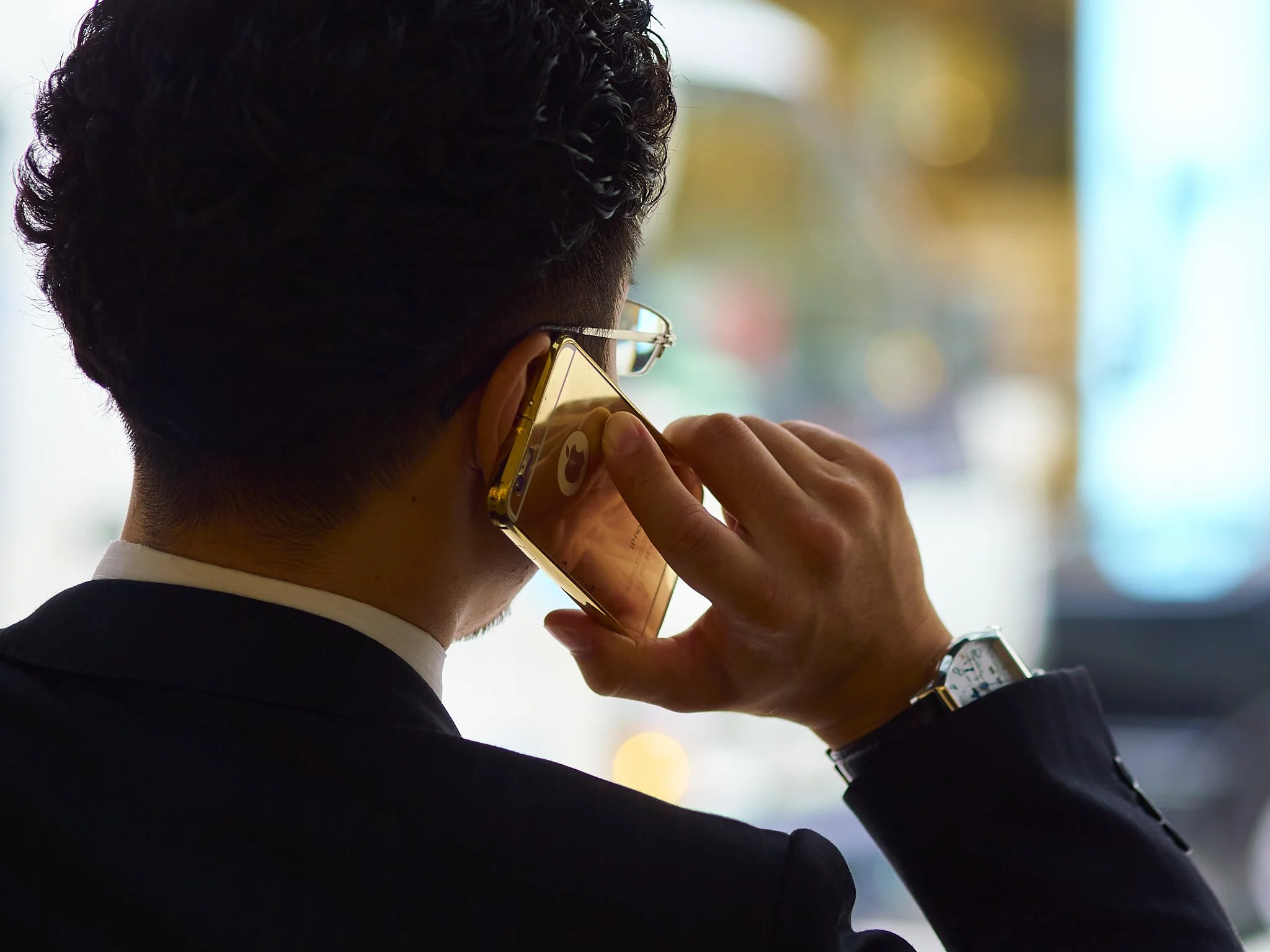
The problem with the youth of today is they spend too much time on their phones…….

…when they could spend it looking anywhere else it seems.

Then And Now

Re-processing some old favourites, I am really becoming aware of the way I respond to a file when using different software.

The image below has been used before for depth of field and Bokeh posts and I have been quite used to it, but still had some ability to look at it fresh with C1 and process to taste, assuming the Lightroom version would be similar.

A quick couple of slider moves and the C1 version was done. The warmth was natural to the file I saw and the background colour came out with a little saturation and highlight recovery. I also noticed the chin hair for the first time in this version.

The Lightroom version is darker than the original (as C1 produced it), cooler and less delicate. I suspected the files were different, but I thought there was only one. Turns out these are different files, taken seconds apart, which explains the watch and glasses being slightly out.

The C1 files done to my eye and quickly.

The LR file, after a lot of work from memory. These were the sorts of files that bought out the shadow sharpness/noise balancing act, something that is a thing of the past for me now.

I guess the lesson here is to be aware we all evolve, so be aware of you in your past in comparison with your current self. You now can learn much from you before.

Understanding Bokeh And It's Various Uses

This is not a post based on the twitchy, defensive nature many M43 shooters are assumed to have regarding Bokeh.

I was there at the beginning, I got it and I embraced it, but what I did not do is let the obsessive shallow depth at all costs movement change my way of seeing the world or my understanding of what the term Bokeh actually means.

Wide open works for some subjects, no arguement.

Photo Techniques editor Mike Johnson and contributor John Kennerdell bought to light a very real Japanese perspective on a technical reality of photography, art and human vision. The Japanese have given the nearly unavoidable effect of a sharpest plane of best focus and the transition to the out of focus parts of the same image and it’s characteristics.

That term was Bo_ke, anglicised to Bokeh (Bo as in bone, ke as in kettle with the h added for pronunciation, which clearly failed as Bow-kerr seems the common mongreliseation). If you don’t believe me ask a Japanese, it is their word after all.

A sharp and clear deliniation of the main subject always looks good and is often seen as “professional”, but look at what is not sharp that could have been. It is an image of two carts, nothing more, using a pleasant technique to hold the image together. Another way would be to include some context. The reality is our eyes do the same thing as you scan across the frame and adjust, but the photo cannot adapt. You need to choose up front. Remember your images have lost forever what you do not include.

Bokeh is a term used to describe the quality (subjective) of out of focus transitions, but not the quantity of it, nor does it provide a ranking system from good to bad. It just is.

Within the Bokeh umbrella, there are many sub-terms of blurring like Ni-Sen (cross-eyed), something my 300 f4 exhibits. Having Bokeh is a statement of reality, not a measure.

Shallow depth can tell a story, the qualities of the out of focus areas and their transition becoming important elements of the overall effect, because sharp or not, they are still a part of the image.

Funny thing is, the 17mm is often cited as having poor Bokeh, which is not only fundamentally incorrect as a statement like saying weather is bad without qualifying what weather it is, but also misleading, because it ignores the various applications of different forms of Bokeh.

The above taken with a pre-focussed 17mm wide open, has no clear point of in-out sharpness transition, which is why it works on some level (I hope). It is a natural transition, invisible. I think the demonstrative man, an unlikely top left main subject may be it? The inability of the viewer to see that plane of sharp focus clearly allows the effect to be ignored completely. You just follow the lines from the soft foreground hand up to the man. Another point of interest is the 17mm is not rated highly for it’s corner sharpness wide open, so what happened?

Looking back through my earlier Japan files, I have noticed I am responding to both deep depth of field images as well as shallow ones. The interesting thing is, I linger longer over the deeper ones.

The shallow depth of field images are like a catch phrase or a one-liner. The deeper depth files are more of a sentence, even a paragraph. What they are doing is to allow the eye to wander without being blocked from exploration by obvious technical elements.

I think that if you feel you can sum up an image in a single glance, it has power, but a shallow effect. If you need to explore, even change your mind about what it contains, it has more staying power.

Looking at powerful and influential older images, their power often comes from inclusion, not exclusion. Excessively shallow depth of field makes a single subject the hero of the image as it makes all supporting elements an often pretty blur.

I guess this is a plea of sorts.

the habit of over using Bokeh is a little addictive. I get it and have suffered from it. It came from the availablility of both smaller formats, which had natively more depth of field than older, larger formats, removing one of the biggest bains of early photographers, and wide aperture lenses that actually worked as the paint on the barrel promised.

Extra depth in transition is useful when you need to render near and far subjects, with little light and no tripod.

All that was added, was another arrow to the creative quiver, not an excuse to ignore the other techniques that may be harder (including more means more effort is needed to do it well), possibly more relevant, but most likely will stand the test of time better.

Does Bokeh rendering matter in real life?

It does because it is real, but it can also be subtle.

The most useful aspect of the 17mm for me is I can set the lens manually at about 5ft (marked on the handy distance scale), use f2.8 and get most things in focus. The one thing better than fast AF, which it has, is fixed focus with a deep and forgiving sharpness range. If I shoot wide open I use AF, because often even the misses are useable.

I have, as I have written here recently, two work horse lenses that define my kit on a givern day. The Leica 15mm f1.7 and Olympus 17mm f1.8 semi wide standard lenses. Between them they do the lions share of my personal and travel images. I even travelled to Melbourne recently for a long weekend with only the 17mm, a very freeing experience.

If I had to choose, the Olympus would be the keeper hands down, because it offers a more useful practical application, which for its main use, street and travel, is what I want. This is not the current trend, is possibly even considered old fashioned.

I sometimes actually have trouble telling if the lens is set tof1.8, 2.8 or 5.6 when reviewing.

The Leica can seem sharper and to have more “modern” rendering, but that is part of the illusion of fast transition Bokeh. This wide angle lens has similar properties to many longer lenses, which is to say, it creates a strong sharp/soft effect, all together less useful for street photography. I use it in my work bag, because making the subject “pop” is a cheap and easy trick for eye catching news print images.

The thing is, I want different effects from different lenses, not the same look from all. If you compare the Olympus 75 and 17mm lenses, the former is technically perfect and a very strong proponent of a modern Bokeh rendering lens. It is long and fast enough to effortlessly render shallow depth and the quality of the Bokeh is very pleasant.

Sharp front to back, but not using a particularly small aperture.

Arguably the 75 is a one trick pony, except that when stopped down it is also razor sharp and well corrected, offering a sharp-compression lens.

Lovely “Bokeh balls” and creamy rendering of the 75mm. Easy to use, great for effect, easy to over use and at the other end of the story telling stick.

The 17mm on paper looks much weaker, lacks “Bokeh” by common understanding and seems all together less “snappy”. This is actually ideal, because it is the other way of looking at the world.

For me, someone who bought it semi reluctantly, it was seen at the time possibly a necessary compromise*, but now it is the perfect companion and I think of it as being of equal quality to the other primes, just different.

I have a hero maker lens and a story teller.

The sharpness is gentle, natural and forgiving. The actual aperture is almost irrelevant as the transition sits well regardless.

Why have two lenses with the same look, when each can be a specialist in its chosen role?

The more I use the two lenses, the more I am appreciating the 17mm’s old fashioned and more natural rendering. It also has a unique ability to tame strong light, but that is another story.

Thanks Olympus for listening to your own little voice and ignoring the trend of the time.

The other thing that may be a long term boon, is the video application of the lens. This long transition Bokeh is not only useful, but also may add up to a less digital look of the footage. I think this may need some further investigtion.

*When released, technical reviews were mixed, many testing areas irrelevant for most uses like wide aperture corners or fixable CA, but over time it became so well liked by actual users, it tops several must buy lists for this format and has very few detractors. When the new super lens, the Olympus 17mm f1.2 came out, it still stood up favourably, but again showed its role as being different to the new Bokeh master.

Hiroshima Revisited

In 2016, we returned to Hiroshima and had a very different experience.

The cold, rainy Spring of the year before made way for a gentle late Summer, early Autumn feel.

On the first trip, Hiroshima seemed small, emotive and introverted. Thar seemed to fit our pre conceptions. Next time around we discoverred a warm, bright and alive town, full of happy and content people.

A city literally risen from the ashes, tall and proud.

All these images were taken with the 17 or 45, so I guess I was travelling light.

The 17mm showing that ability to blend the foreground and background naturally at f2.8. I believ f2.8 is the sweet spot for most M43 prime lenses. The 15mm leica in this same situation would have made the foreground woman “pop” a little more, made the colour a little lighter and brighter and blurred the background out, none of which are inherently bad, just different. The 17mm is my preferred lens for this type of shooting.

This was the trip I started to fall deeply for both lenses. Lightroom and nasty light on the first trip left me feeling confident with my gear, but not overly taken with the overall results. They seemed cold, hard and if pushed tended towards gritty and rough.

Remembering I had only committed to Olympus completely a year or so before, the whole thing had an element of discovery to it.

This trip let the quality of the gear and my deeper understanding of it start to blossom.

Reprocessing with Capture 1 from .dng files is awakening a new and even deeper appreciation.

Kyoto Habits

Although every visit to Kyoto and surrounds brings forward new sights and sounds, the same places tend to get swept up while we are busy doing other things.

Alien towers from the train station roof.

Our favourite cemetary/temple

Arashiama traffic

Fushimi Inari shrine

Osaka Heat

Please indulge me here, lots of images of just regular people being themselves.

I am really responding happily to the many files that C1 is delivering to me in a more pleasant way than previous incarnations. Many of these images were previously done in black and white as I felt it handled the files better.

All of these were shot on a walk through then back again along the Osaka food trail on a stinking hot day.

All files taken with the Pen F and 17mm Olympus in manual “zone” focus, usually at f5.6, but some were f1.8, or 2.8, ‘cos I’m a twit.

The Olympus 17mm. Features, Benefits And Overall Personality.

This is well trod ground with me so if it sounds familiar, it is. The reality is though, as I go back through old files, theories solidify into fact and that is something worth sharing.

Features and benefits were drummed into me in my early retail days.

Features are what they seem, an actual thing that stands out in a product, place or situation.

A lens has a fast aperture; feature.

It is auto focus; feature.

It is small; feature.

Benefits are the actual positive or beneficial effects of those features, which a salesman will use as the selling point. Just saying it has something means little, explaining how that helps you is the key.

The lens allows you to exploit low light situations or use shallow depth of field; benefit.

The lens focusses fast and accurately; benefit

The lens can be put in a pocket; benefit.

The next level though is the hidden benefit, something you need a deeper understanding of the item to know, becasue it is not on the packet.

A lens has the feature of a fast aperture with the benefits mentioned above. Great, all lenses on that format will have that feature and its benefits, but are they all the same?

The Olympus 17mm, a lens I believe the designers made specifically for fly-by street shooting, has a hidden benefit. It has what I will call “long draw” or slow transition Bokeh. This means that the benefit has a second benefit, one that mitigates the negatives of the feature when its benefit is not a benefit…….. if that makes sense.

You can exploit the low light gather benefit of the f1.8 aperture, but you do not have to be overly concerned that the shallow depth of field benefit is a problem, has teeth even.

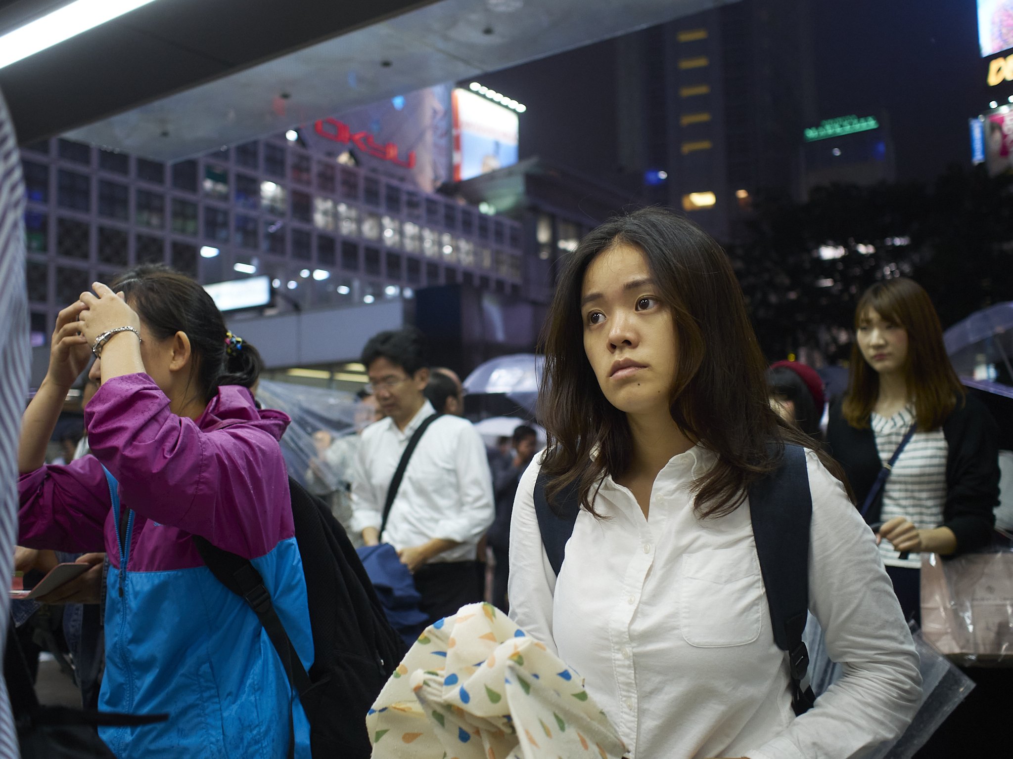
This image was shot at f2.8, with manual focus set to about 1m. The woman in front is the best point of focus (I assume), but the man on the left and woman on the right are also workable elelements. The woman in particular is not in focus fully, but she is still a part of the story and the point where the plane of best focus transitions, is very organically applied. In other words, all elements work in harmony, nothing jangles and the technical “process” is well hidden. Even the girl in the immediate background is coherent, but natural looking. I feel that even at f1.8, this would still have worked.

The image below is one of my favourite examples of the Panasonic Leica 15mm’s ability to do exactly the opposite. The Leica is a little wider, so logic would dictate that its background transition would be less dramatic, but it is actually a better lens for “snapping” the main plane of focus out from the background.

The tree children look like they have been literally cut out and layered onto a background image. The background is not totally out of focus, but it is clearly not on the same plane as the front. This makes the Leica an ideal wide portrait lens, so it havs become part of my editorial day kit, but for wide open street shooting, it is too twitchy. When I look at image made by this lens, i first see the sharp, then the soft, then come back to the sharp again often startled by its rendering. This does not happen with the 17mm.

Many modern lenses are designed for fast transition “creamy” Bokeh as a benefit. This is a benefit most of the time, but sometimes, especially when you are trying to tell a story, add context or include layers, it tends to be finicky and unforgiving.

This image, one of the best I have to illustrate this effect (benefit), was taken wide open in dark dreary light. The woman in the middle is pleasantly renderred and seems the central point of the image. The actual point of focus is the back of the mans Kimono (see how sharp his shoulder is), which wide open should render the woman quite out of focus.

All lenses have a personality, which is by definition neither a feature or benefit, just an accent towards things done beter or worse. Getting to know your gear allows you to use these personailty traits to your advantage.

Another immediately before. The lens was set at 1m f1.8, putting the man in perfect focus, the woman about a metre out. The people in the background are still easily identifiable. The thing I often see with this lens, is how delicate fine details are even if they are a little out.

Want a natural, organic, smooth street image without twitchy Bokeh?

The 17mm Olympus is as good as you will find. Use zone focussing (which its old school depth scale can help with) and a wide-ish aperture and you are good to go. The combination of long transition Bokeh and warm natural, slightly dense colours give the image a gentle, old fashioned look.

This image was taken at f2,

as was this,

but intriguingly, so was this.

Want a semi wide angle lens with the ability to hero the central subject(s) against a messy background with that modern look?

Grab the Leica 15mm which gives you that “poppy” 3d look, bright colours and a lightness of tone, all adding to the illusion of being sharper than the Oly, which it is not.

Other differences? I would grab the Leica with flat light, where it adds an almost Fuji like ability to handle dullness with aplomb, the Oly on the other hand loves to tame strong light.

The 17mm at f1.8 (God only nows why I shot a whole series at f1.8 in mid day sun, but I did). I dabbed a little sharpness on the clock, but otherwise as shot.

And later at f8 when I got on top of it. Both work as urban landscapes, which should not be possible.

Postcards From Kamakura 3

The loop around Kamakura brings you back to the more substantial temple area.

One of my favourite street corners. Corners in Japan are like the corner shots of old. Each one has a private business, Familymart, Seven Eleven or similar.

It seems we only glanced off the bigger temple this trip, which is not surprising as the place was a bit of a Tardis of a town.

Postcards From Kamakura 2

Kamakura as an odd place.

The oddest bit is the beach front.

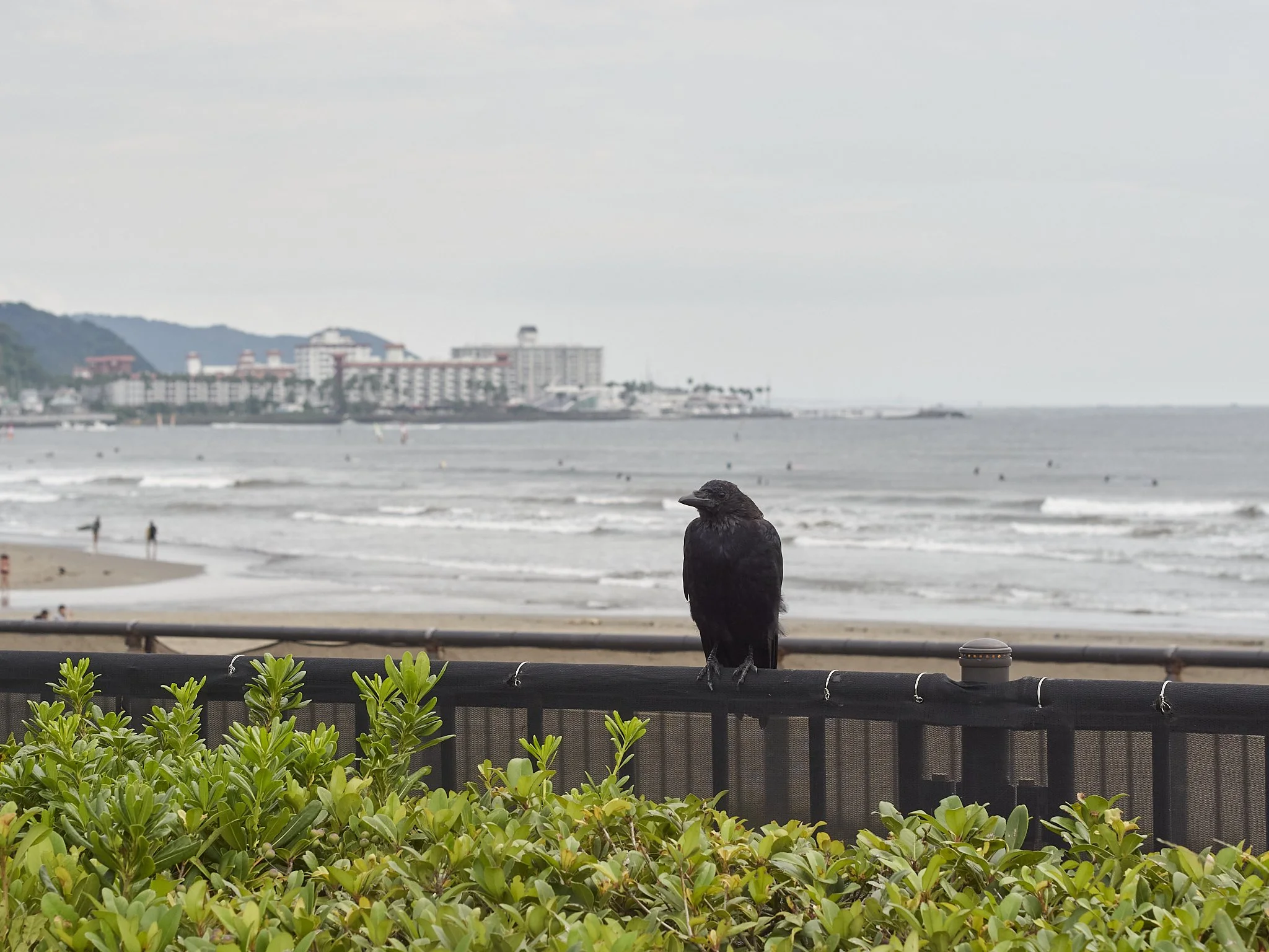
Starting with the signage warning of eagles taking your small dog if you are not watchful (looking skyward revealed several sizeable predators “play” fighting), to pushbikes and mopeds toting long boards in custom side brackets. The strip is channelling Hawaii, the Riviera and in patches, even Tasmania.

This one is is on the short list. The irony, contradiction and purely Japanese feel of the image combined with near perfect figure placement are working for me. Interestingly, I remember taking it eight years ago and being excited at the time, but it failed to catch my eye after.

The strip is channelling Hawaii, the Riviera and in patches, even southern Victoria or Tasmania.

Tsunami shelter, life guard station or toilet block?

From the beach, you then head back into town.

Shadow Game

The combination of .dng EM5.1 files and Capture 1 is offering up some surprises.

Shadows are a mystery waiting to be investigated.

Underexposed (a habit I had from shooting Canon, where you tender to under bake to protect fragile highlights), this file might strike fear into the early M43 shooter at ISO 800.

Clean as a whistle and highlights are reasonable well protected (for an essentially white sky).

More?

ISO 800 and f2.5. Not sure why. Even early days I knew ISO’s above 800 and wide open were both options, but maybe just forgetting to change settings after being inside.

Again clean and sharp. The shadows are effectively ISO 6400 or higher.

The .dng files seem to change the curve on the EM5 files to more of a Canon palette, which is to say, little is to be feared in deep shadows, but highlights seem to have a limit.

Postcards From Kamakura 1

I have moved reluctantly into 2016 Japan files. Reluctantly becasue I have enjoyed the rediscovery of the older files, so moving on is a little like leaving a place and also becasue I am reminded that for some reason, I culled the 2016 files quite heavily. This in retrospect was a huge error as I am constantly finding old files that are coming to life with Capture 1.

Moving on.

One of our favourite places in Japan is the little seaside town of Kamakura, about an hour by local train from Tokyo.

Part beach culture, religious mecca and wildlife odyssey, Kamakura tends to be a mish-mash of disjointed memory packets, that need to be deliberately re-connected afterwards.

After our first trip there in 2016, I actually had remembered it as two places.

From the train staion you head parallel to the sea, along the hillside to the big Buddha statue and temple. This is I think the biggest metal Buddha in Japan.

from here, you head down the hill through a quaint shopping strip, past a couple more temples (always more temples), towards the beach.

The .dng Reality?

Back when I started the Japan trips, I made a choice to do .dng copies of my files to future proof them*, then on some dark day, I culled the non .dng files from my system. This logic prevailed for the first three trips (2015-16).

The files from the first trips are nice. They seem to be a little over sharpened, but I can reduce that, but they respond well to any processing needed.

The magenta cast early EM5.1 files could have seems gone (could be C1) and the shadows come back from near blackness.

Highlights respond slowly, but do recover.

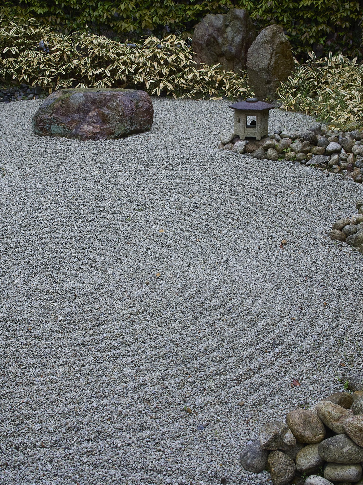
The images I seem to be responding most to are garden and landscape shots. They just seem to be more “fine art” than I previously perceived them to be.

This is a heavy crop and can go right down to fine detail. I remember the spot was dark even for a gloomy day.

All these images were shot hand held, using EM5 Mk1’s, with 17, 25, 45, 75 or 75-300 lenses with no filtering.

This not my usual landscape routine, if I pretend for a moment I still have one.

Ed. I have just started processing RAW files from these cameras, and it looks like C1 treats them close to the same, so ignore this :).

Channelling Film

The new look Japan files have been haunting me a little.

Their new found found brilliance and clarity is embraced whole heartedly, but there is another look that has been jumping out at me.

Another of the “three” set.

Sometimes, with the smallest push, they look a little film like.

Kodachrome to be precise.

This one has a strong early film look.

They are cleaner and sharper than Kodachrome (fixable), but the colour palette leans that way and with a little added contrast and maybe some reduced saturation, they are really taking me there.

Darker files in particular are responding like film and are screaming to be handled gently.

I know that the memory can play tricks, but I am willing to trust my instincts and visual memory here and I do have a secret weapon.

I have access to a sizeable library of books printed in the pre-digital era or later, but with a pre-digital mind set, that were taken more often than not with Kodachrome.

My concern is, these are EM5 mk1 files, which are literally a dying breed. The only camera I have that seems to have a similar look is the Pen F and I have heard that the sensor in the EM10 mk4 is similar, but the processors are newer.

Going Backwards, But With Intent.

Did something dumb today.

Asked by the sports editor to get some images of the state Junior Track Team, I proposed a not totally original, but also not thoroughly planned idea of sitting backwards on the trial bike, with my 9mm, going for some dramatic images.

To add to the variables, lighting was intermittent with only about 20% of the overheads on and the odd natural sky light, so the subjects tended to go bright/dark quite quickly (30km an hour quickly).

With the 9mm, able to focus down to 3cms, I actually had to be careful how close I got.

The sweet spot was 1/250th at ISO 1600, roughly f1.8 to 2.8.

Professionals all, the distances did not bother the riders especially at these relatively sedate (for them) speeds, but holding on, staying balanced, changing settings and getting the shot all came down to nerves and muscle memory for this newbie (me that is).

Keep in mind, the oldest rider is 16 and the youngest 14.

Being more sensible and using the 75mm wide open also worked.

Back to the 15 and 9mm’s for some statics.

Then long again.

My “ride”.

AFL Action (Or The Vertically Challenged)

AFL football at the highest level is a joy to photograph. Unfortunately for full enjoyment I would need to have a personal interest in it, because identifying the players, who are only numbered on the back, often tend to look similar and move really quickly can be tough.

many times you get the shot you want, then have to chase the numbers on the back of players running in three or four different directions.

All of the above are passable images, but they all failed the submission folder, because at least one players name was an uncertainty on the night (many have been confirmed since).

The curse for me is, the sports I like to shoot are not the ones I have an interest in.

The other little niggle, and this is one as old as news papers, is that in print, horizontal rules. You may be lucky to get one or two long verticals a page and the problem is, AFL is a “tall” sport.

Players pushing 2m on average, leaping regularly and high means a lot of wasted real estate to the sides if shot horizontally.

Most of the ones above have been cropped to vertical, so over half the frame is wasted. Shame only one or two may get used so only a few get supplied.

So, all this will go away when we go fully digital?* Unfrotunately for us, no. The powers that be, likely not photographers, decided that a uniform 16:9 ratio is the best for web. This effectively means no more marking images.

*Currently we make content first for print, then flesh it out for digital, but the looming cloud is doing only digital at our end with a separate print editorial team making a paper from that.

The Wonderful 75-300

The first trip images are still being explored. To be honest, I am finding (re-finding?) so many, that I am wondering how I am going to cull effectively.

I seem to have taken my best primes (17, 25, 45, 75 and the 75-300 as long work horse). This is not surprising and apart from the 12-40, may have been the bulk of my options at the time. A very workable kit, but now I think I would go with less (17, 45, 40-150 kit).

Of the lenses listed above, the cheapest was the biggest and longest, the 75-300. I have had two of theses, selling one, missing it and grabbing another and paid roughly $400au each time. Bargain.

The files are EM5 mk1 .dng files. They are responding to Capture 1 better in some ways than newer files, with massive shadow recovery, but strangely reduced highlight recovery. The highlights come back, but they are about as responsive as large super fine jpegs (an Olympus thing).

This has always been a favourite, but never like this. The 75-300 is a killer lens, especially in the shorter half of the range, but even I am surprised at the brilliance and clarity of some re-worked files.

I am also surprised how often I used it, especially considering the cool, dark, wet trip we had.

I had fast primes aplenty, but the slow super zoom stayed on even in tricky light.

This lens has very stable and pleasant image making properties, including nice Bokeh.

Too long really for this type of street grab, it never the less took plenty.

It seems I even chanced it in the dark arcades.

In its natural state, compressing a whole street into one plane.

More compression.

Some thoughts.

I seem to be drawn to yellow.

The 75-300 used to fill a lot of roles.

The .dng files may behave differently to straight RAW files from the EM5 mk1’s (in C1 anyway), but are a nice starting point.

I feel I missed a chance with the EM5 mk1’s and C1. What a combination they may have made.

The Video Rigs Complete

I missed an obvious video rig accessory when I bought the chest and shoulder rigs. I forgot quick release plates.

I grabbed a pair of Neewer ones, something they do well and cheaply and I know they will be compatible with my mechanical Gimbal and Tripod head plates (both Neewer). They do not line up perfectly with the Smallrig base plates, but are near enough and sit tightly.

I now have four head plates that are fully interchangeable with four accessories.

The big rig, probably only going to be used occasionally, but the handles might come in handy.

The matching Neewer quick release plates have joined the dots. They are a good size and cosmetic match, but the screws do not align perfectly. On the shoulder rig I managed to get two to align (just), but with the chest rig there is only one. Seems firm enough.

The Shoulder rig has some added weights from the Neewer Gimbal as I do not need the two heaviest ones. It just felt a little “floaty”, so the added heft anchors it better.

Possibly the LCD mount, but there are other options. The G9 has a top handle and a screen mount on the front of that.

The chest rig is simpler and most likely more often used as it is basically configured to aid how I actually shoot (hand held). I added the optional Ronin handle I bought a while back. This and the cameras own handle make a good balanced pair. Seems everything Smallrig ends up being useful.

There seems to be a red theme running through these accessories that matches the details on the Pana cameras. Irrelevant but nice.

All three video rigs have a plate, from the S5 in its cage, G9 in its and the universal Camvate one for the EM1x. There is a fourth plate for maybe the OSMO or the second G9.

More Format Thoughts

Running two formats again has been less vexing than I suspected it would be.

I bought the S5 not because it was the better format, but because it was the better value video choice at the time, in the context of my existing kit and needs. The 3:2 format, something I am not a huge fan of for stills even though I have used it since the 1980’s, is closer to the 16:8 ideal.

High ISO performance is exceptional and all the other little niggles I had like limited recording time and formats, dynamic range etc were all effortlessly sorted. The other option would have been the GH5mk2 and another couple of fast primes or the Pana f1.7 zoom, but the S5 kit was cheaper even than that.

These were video issues fixed by a video-centric camera.

I feared that full frame fever would catch hold again across the board, but it really hasn’t. I tend to forget I have it for stills.

For video, the S5 forms the nucleus of my more pro-end kit. It is the best supported and my first stop for serious projects, but the other cameras I have available* are still fully capable in their own spaces.

For stills though, and this is the curious bit, I still actually prefer M43. This is not a specific camera thing, because the S5 feels like a G9 in many respects, but in use, I find M43 a more practical format, capable of doing any job I need.

Quality.

This old pearl, likely the number one reason people avoid the format, was ironically the thing that attracted me in the first place.

Sick of soft/sharp Canon files from 5D mk2’s, I was attracted to the bright and clear M43 files and that was out of their earlier generation EM5’s. I also tried Fuji and Sony, but both were behind in key areas at that point. In its early days m43 was giant killing. I still remember the Steve Huff comparison of the D3s to a lowly M43 EP-2 with equivalent lens in his 20mm Panasonic review. Daylight to the little tacker.

I laboured and stressed over this for a year or so, but time and time again, the little EM5 mk1, with my clutch of 14, 20, 45 and 75mm lenses were sharper, more accurate and brighter looking to this jaded Canon user when compared to some heavy and expensive old favourites (i.e. the Canon equivalents 24EF, 35L, 85 USM and 135L).

Granted high ISO is behind when compared to the modern bigger sensors (although other factors help mitigate this) and new mirrorless cameras from the big guns are bridging some of the other factors like mirrorless accuracy and speed, but I am more than happy to shoot for fine art with this format. It generally out resolves fine art paper.

An ISO 6400 image at f2.8, which if printed would be good to quite large sizes.

3D pop.

I can get it and surprisingly easily. Some of my M43 lenses are very good at this, even the semi wide ones. They tend to fall into two camps, both equally useful.

The fast transition lenses (the Leica’s, Oly 12-40, 25 and 75 as well as the f1.2’s) are ideal for highlighting a single subject plane, while the others tend to be longer transition (the 17 is a paragon here), which is perfect when you want a more forgiving and organic file.

This clean snappiness is from the wide angle 15mm at too long a distance to be likely, but still it is there.

This shot is another example of the clean separation the little Leica 15mm provides. I first saw this from early Leica, Zeiss-Contax and Zenza-Bronica glass with film, the ability to draw the eye to the sharp plane of focus, then let you drift back to the soft supporting elements, then back again.

Depth of field.

M43 offers the same tools for shallow depth, they are just applied at magnifications twice as long as their full frame equivalents. The advantage of this is that shallow depth is not as twitchy. I can and do use f1.8 lenses wide open all the time, just like a full frame shooter uses f2.8 which was not even a habit I had when shooting full frame/35mm for twenty five plus years.

About 100mm at f4 using the proper principals of shallow depth rendering.

This gives me effectively a two stop advantage in light gathering, without forcing a strong creative imperative on my images.

Even at f2.5, it has decent subject cut out. Now apply the math. The full frame equivalent would have to be twice as close, or be cropped by half again or be a much bigger and more expensive lens. It would also have to use f2.8 at ISO 6400 rather than 1600 at f1.8, to provide the same DOF if needed. If a higher pixel count camera was used like a 45mp Z9, thus evening out the pixel count when cropped, pixel density would be much the same as the un-cropped 20mp M43 file and if done regularly the bigger sensors extra unused real estate would be wasted.

M43 gives you slightly over two stops more depth of field with the same effective focal length at the same focussing distance. So, a 15mm lens is still a 15mm lens, but it magnifies like a full frame 30mm.

The 45mm wide open, showing the benefits of story telling depth of field. Blurring the background out completely would look nice on one level, but then becomes a portrait of a single figure only with no context other than blur. You can always add more blur, but not reduce it. Notice also how the blurring is in layers.

This is ideal for landscapes.

Easily achieved at a relatively moderate aperture, hand held, no tripod, in fact little technical effort made. I cannot remember a time when I felt I actually needed more than F8 (about f18 in full frame) for front to back sharpness. The laws of lens refraction being what they are, there is actually a slight advantage to M43 here.

Shape.

Yep, the actual shape of the file. M43 is a good fit for print, with plenty of quality to go 3:2 or even wider if desired. Full frame 3:2 ratio on the other hand tends to need cropping more often than not. Of the 30 odd templates we use at the paper, only a handful of inserts actually accept the 35mm format natively (yesterday I did a “Behind The Lens” article with eleven shots from a Tokyo garden. Only a two needed any cropping on our templates. The reality is a single image or matched pair stretching from side to side are a better fit in 4:3 ratio.

Square is well served and wider is much the same, as the extra included height in 4:3 is as relevant as it is in 3:2. It is just included, not excluded. I especially like 4:3 in verticals, finding 3:2 too skinny.

Flash.

This is a mixed bag.

On one hand the depth of field advantage effectively makes flash units 2 stops more powerful, turning speed-lites into heavy duty models, then these into mono blocks. My YN560’s act like AD 200 Godox units.

On the flip side, wide aperture shooting in daylight using high speed sync can be more taxing on the units, generally needing wider apertures, then higher shutter speeds to achieve. I fix this with a ND filter.

*

There are a couple of patterns forming here.

More blur can be added, but not taken away, meaning deeper depth of field can be reduced in processing, but not increased and a squarer shape can be cropped, but a thinner one cannot be expanded. This means in a nutshell, more flexibility.

My take away.

M43 can offer a more flexible, forgiving and logical format for stills photography and empower you at much reduced cost. Do not discount it based on perceived short comings or prejudices until you have tried it and if you do try it, make sure you use it properly.

The key is in the lenses, but they do not have to be ridiculously big or expensive super optics. Part of the magic is the quality of the glass, even at the cheaper end. The 9, 15, 25, 45 and 75 are all top tier, can fit into a small bag and go anywhere (covering 18-150 equiv).

The 10-25 and 25-50 f1.7 zooms are near perfection optically, similar in size and cost to f2.8 full frame zoom, cover more range and are hybrid stills/video specialists. My 300 f4 can match it with any equivalent super tele out there at a third the cost and size. The list goes on.

It is important when looking at the systems in comparison to full frame to think more like motor bikes compared to cars rather than small cars vs bigger ones.

When comparing to APSC crop sensor cameras, the same math applies, just in half increments.

*2x G9’s (10 bit 4:2:2, 4k/60), EM1x (C4K), OSMO Pocket (4K/60), most of which are in video configuration as we speak.

The Triple

My street photography lacks a formula. It is purely an instinctive thing and I am fine with that. I see a form or the idea of one, then shoot.

Looking back though, I do see some patterns emerging.

Seems “The Triple” is a thing.

Three elements of interest in one frame.

They can be three people all acting differently.

Sometimes all doing the same thing.

Sometimes the people are not all people.

The dynamic seems to go something like this;

The point of interest.

This is the obvious eye catcher, often the person nearest the camera or most central (but not always). At the time this may have been what triggered the shot, or the element that completed the idea and provided the pivot point. I am often moving when I take these, so the “shape” is fluid.

The distraction. This is the element that either supports or contrasts with the primary elements.

The discovery.

This is the bit what brings the rule of three into play. This is the person or interaction that surprises or sneaks up on you. The third element is what makes it all work.

Usually the individual elements are mundane, only working because of the full story.

So, how often does this happen?

All of the images above were taken on one day in Harajuku on our first trip to Japan, so yes, I think it is a “thing”.

I love a street image with layers. One hit wonders are strong at first, but almost instantly dismissed. The layers do not have to be deep and meaningful messages, because the subjects all deserve some consideration as they are.