Olympus and Lightroom sampler #4

This is a simple one and they should all be (I wish). The image is not much on it's own, but it ia part of a series. The problem is, the top of the bolt. After importing with pre set "P1 Pen F base", (not as aggressive as the OMD pre sets as I find the newer camera does not need as much work) the bolt head looks soft. In this case, the bolt head is acting like the eye in a portrait. For better or worse it is attracting all of the attention.

A little brush work, just on the head adding +50 clarity, +30 sharpness and +20 contrast has supplied a bit of a sharpness illusion, balancing out the image.

Subtle in this size, but in editing the effect is quite strong.

Kamakura Yellow

I love the sleepy little coastal town of Kamakura. Where else can you see long boards on vespas, temples in rain forests, warning signs about the giant hawks common in the area (taking your dog!) all within 10 minutes walk? 

The train stations are terrific. The main station has gorgeous light and the smaller station in the middle of town is quaint and interesting looking. The yellow attracts me. 

Pen F and 45mm at f8 

Pen F and 45mm at f8 

Pen F 45mm f5.6

Pen F 45mm f5.6

Pen F 45mm f3.5

Pen F 45mm f3.5

Colour, mono showdown #6

In Japan, the people are the exception. They are very patient and well mannered on the surface (and deeper), but occasionally someone (that's me folks) over steps the invisible line of too much. This is one of the few occasions I have witnessed from my own actions or those of others where a Japanese person showed their ire, if briefly. The thing that pushed it was my overt framing of the image, the main problem of using longer lenses in confined spaces. I am not that person. A photo can rarely do harm, but the clumsy taking of one can. I fall squarely in the camp of "do no harm" and would never publish an intimate image like this in a well trod forum or against someones wishes. The not for profit street genre allows me to share an image of an unknown person with other unknown people as long as the audience is reasonable and aware, as street photographers have done for years. It's a reality that many of the most famous people in street photo images are not even be aware their photo was taken.

Now I have confessed my rudeness, I will move onto the image as it is one of my guilty favourites.

Pen F 75mm f2

Pen F 75mm f2

The colour image works for me. The colours are balanced and avoid the multi dimensional look that colour can introduce by having the strongest (and harmonious) colour on the same plane as the main subject. The warm skin tones, separated by the neutral olive sweater create a pleasant and balanced shape and the overall warmth of the image makes it look relaxed and gentle.

The mono image is deeper. The girls face dominates, forcing a more emotional response. The colder feel introduced by the untoned, grey tones and the dropping off of the background due to the bulk of the colours turning light grey, I feel, gives the image a sadder, more contemplative feel than the warmer colour image. Another phenomenon of converting to mono is the image looks sharper. This often happens when colours are turned to tones and textures. Even thought the black and white image is stronger-more direct, I feel drawn to the harmonious colours of the other image, or maybe that's the guilt talking.

observations of a kit lens.

Kit lenses. Not much I can add to the huge inventory of opinion and test data. The important question is can they produce images that are not "reduced" by flaws in the lens or produce too many misses through poor mechanical application (much the same as any lens, but add a barrel full of "crappy kit lens" doubt). Yesterday I went wild with a 4 year old Pen camera and the kit lens. Part of the experiment was curiosity and part practical.

Ctein once wrote in his "very unscientific lens evaluation" (The Online Photographer blog), that even though he could see (pixel peep) a difference between the various lenses tested**, he saw no reason to take his (1st gen) 14-42 or Panasonic 45-200 kit lenses off the camera in most normal photographic situations for a better lens. Ctein is a seriously top end fine art printer, with a long history of impeccable images, from medium format film and M43 cameras. 

Ok, the pre amble out of the way, lets look at some quickly taken snaps using the above kit. The camera was set to AF with the middle 9 AF boxes activated. The camera was attached to a 30" Gordy shoulder strap and many of the images shot from the hip*.

Note; see also the images in the previous three posts.

EPM 35mm f5.6 This one is really sharp, but the subject matter tends to be sharp. There is little or no CA present and the flare from the chrome work is well controlled allowing some glow to show through. The nearer bokeh "snap" renders well, but th…

EPM 35mm f5.6 This one is really sharp, but the subject matter tends to be sharp. There is little or no CA present and the flare from the chrome work is well controlled allowing some glow to show through. The nearer bokeh "snap" renders well, but the far bokeh is a little busy.

Crop from above. This reminds me of the best quality I could extract from a 50D and "L" Canon lens a few years ago. There was a tiny bit of purple in the highlight near the off sign, but it went away very cleanly. 18x24" print any body?

Crop from above. This reminds me of the best quality I could extract from a 50D and "L" Canon lens a few years ago. There was a tiny bit of purple in the highlight near the off sign, but it went away very cleanly. 18x24" print any body?

30mm f5.6. This image needed a little post to bring out the head of the statue from the back ground, partly because the middle distance bokeh is quite coherent and pleasant. Again this image shows the slightly busy bokeh in the distance.

30mm f5.6. This image needed a little post to bring out the head of the statue from the back ground, partly because the middle distance bokeh is quite coherent and pleasant. Again this image shows the slightly busy bokeh in the distance.

42mm f5.6. This image was quite flat, needing quite a bit of work. The bokeh rendering of this one created a couple of cool optical illusions. Of the three that I got*, two had a bad Photoshop "paste on" look with the Fair(mont) badge, as if it is u…

42mm f5.6. This image was quite flat, needing quite a bit of work. The bokeh rendering of this one created a couple of cool optical illusions. Of the three that I got*, two had a bad Photoshop "paste on" look with the Fair(mont) badge, as if it is unnaturally floating there (have a look for a second or two, it's kind of cool) and the third image had it quite out of focus, but the Premier badge is never sharp on the left side?. At first I thought the lens was a bit de-centred, but I think maybe I was, following the angle of the nearest badge*.

42mm f5.6. Perfectly pleasant rendering and lovely colour.

42mm f5.6. Perfectly pleasant rendering and lovely colour.

40mm f5.6. Taken at ISO 800 indoors. The lens's slightly lower micro contrast tends to give a pleasingly smooth look, but can be a little flat looking in poor light or at higher ISO's. The focus fall off in this image is nearly perfect.

40mm f5.6. Taken at ISO 800 indoors. The lens's slightly lower micro contrast tends to give a pleasingly smooth look, but can be a little flat looking in poor light or at higher ISO's. The focus fall off in this image is nearly perfect.

40mm f5.6. This one also looked a little flat at first, but came up quickly. The colour is lovely, both warm and cool where it should be. A possible use for the lens would be in poor contrast situations, as it looks to process up well.

40mm f5.6. This one also looked a little flat at first, but came up quickly. The colour is lovely, both warm and cool where it should be. A possible use for the lens would be in poor contrast situations, as it looks to process up well.

15mm f5.6. The only shot at wide angle in this set, showing how little I use wide angles. This guy needs to be a little more convincing is he is going to pull that T-shirt off.

15mm f5.6. The only shot at wide angle in this set, showing how little I use wide angles. This guy needs to be a little more convincing is he is going to pull that T-shirt off.

My feelings after using the lens for the morning;

It is lightning fast and accurate enough in focus. It is sharp enough through the range (at f5.6 anyway) and could certainly produce pro grade work with some care and respect. It feels crappy, but that never got in the way. It went under the radar, giving zoom convenience without bulk (or lens speed). It has nice colour, but mixed bokeh on the occasions it showed up.

The future for this lens? I will carry it as a back up for my street and travel kit as it slightly expands the range and offers me an alternative to primes or using more precious lenses in some circumstances. If it bites the dust I will see that as a sacrifice made to save a better lens, a bit like a protective filter.

I can honestly say that it can do the job, as the last 4 posts were fed by the 80 or so images I shot that morning. The cross frame quality in particular was a pleasant surprise. I am not really surprised. I have had experiences like this before with the brilliant Fuji 16-50 and 18-55 lenses and the old kit Panasonic 14-45 has a great reputation.

*I found it hard to use a fixed screen camera in this lighting, so many images were simply missed from poor technique, including not shooting straight.

** Top tier Olympus 4/3 lenses, Leica and other M43 glass mixed in with his own patchwork quilt of lenses.

Olympus and Lightroom sampler #3

This is a simple little fix to an image to show how often less is more and how familiarity with Lightroom can reduce your work load and also reduce the processing harm done to an image.

The image is one of my 14-42 kit lens test shots. A characteristic of the lens is easy processing from low contrast files.

The top image is the import with no processing.

The middle image has my "gentle" pre set applied.This pre set is designed simply to lean the Olympus images towards a cooler, smoother and slightly brighter image, that is towards my Canon colour tastes. Nothing is stronger than +/- 20  except -50 reduced highlights. Reduced blacks and contrast increased whites, a little general sharpening and noise reduction-smoothing. 

The bottom image is tweaked with a simple brush pre set "gentle push", adding again only about +15-20 clarity, sharpness and contrast. Designed to add "pop" to selected areas of the image. The big front root stem is slightly out of focus, but the added clarity and contrast hide this well. If this is not strong enough I re apply the brush with the same settings, rather than make the single pass stronger.

Either of the second two work I guess, but the bottom image has more perceived sharpness and colour depth.

The more you manipulate and image, the more pixels get "dumped", harming the original file. Try to work as directly and gently as possible, finding what works best for a particular problem. As a general rule, I find that is I have spent too long on an image and I have applied too many different fixes (especially if some are undoing others!), I re-set and start again.

Colour and mono showdown #5

This image, taken a few minutes after the one in showdown #4, is a tough one. The processing in both of these is a pre set, with nothing else added. The first is my "gentle" pre set and the second my Mono #2 "softer" pre set. The mono looks to be near enough to spot on, but the colour one is lacking, but it has not sent me a hint yet as to what it wants. Maybe the clues are in the mono image.

Pen EPM-1 14-42 kit lens at 35mm f5.6

Pen EPM-1 14-42 kit lens at 35mm f5.6

The mono image suits, and draws you to the expression on the girls face. I also exaggerates the glow from the bag and the play of shadows on the wall. Again, as with the last showdown image, the less distracting back ground also makes this image stronger. it has two clear layers, but only two and the girl in front is the dominant one. The colour could be processed to match and I am in a colour mood, but I will give this one to the mono conversion as it was effortless, natural.

The lens is a mixed bag. It exhibits good contrast and colour, reasonable bokeh (where possible) and reasonable sharpness. It suffers from flare and my jury rigged hood, made from two stepping rings is not good enough (nor is it good at keeping finger prints off the lens as it turns out). Sometimes on the middle left side of the frame there looks to be some softness, but it is hard to be sure and I am usually shooting pretty loosely.

Colour and mono showdown #4

A little walk this morning around the local market to look around and use the Pen mini with the 14-42 kit, just because. Autumn is showing it's first signs. 

The image at the top is warm, but a little unbalanced and busy due to the blue on the left and the face in the back ground on the right. The only post that has been used is my "gentle" pre set, that emphasises the whites at the expense of highlights, darkens the blacks, sharpens and smooths a little and then a mild brushing of the man to add local clarity and contrast.

EPM-2 14-42 widish at f5.6

EPM-2 14-42 widish at f5.6

The lower image is stronger on the man and his face, simply due to removing the colour from the peripheral subjects. The woman's face still fights for notice, but in the mono image I do not find this as annoying.

It is rare that a colour image sends a simpler message than a mono one, but I think, with a little work, this one could and is my favourite. Cropping looks to be the obvious thing to do, but it does not work in this case. The image needs the space to breath.

We had a spud straight after this also. Cameras cannot convey the smell!

Olympus and Lightroom sampler #2

What already? Yup, the second in the series, hot on the heels of the first.

This a much simpler image to work on, having no actual faults, just needing some help. I love this image for it's mid 20th century look, both in style and subject matter.

The first image is poorly composed, flat and lifeless.

The second image has had cropping applied and the intensity of the image was boosted with +40 contrast, -60 highlights, +35 whites and -60 blacks. The whites slider adds brilliance and the blacks adds intensity. Clarity is also boosted to +35 and there was a little sharpening and noise reduction. The noise reduction is a good way of adding smoothness to an image as long as you have not applied too much sharpening, that will create a "painterly" look. The Lightroom technicians seem to have been working on retaining sharpness when NR is applied. The smoothing element is a bonus and tends to add to the medium format film* look of sharpness without effort. 

When sharpening, the radius control is important here as it can be used to smooth or exaggerate the effect of texture in the concrete building. I chose 0.8 to smooth it.

The final image has had the standard brush sweep of +10-15 clarity, sharpness and contrast applied to bring out the detail in the left side of the building. The crop has also been slightly adjusted to make the angle of the building more majestic.

*Recently, Ctein, a premier colour printer and photographer of many years, stated that Pentax 6x7 film and M43 files from an EM5 are about equal in quality. He has used both extensively and interchangeably for his portfolio prints. He is also a bridge image fan (among other things), which has strong similarities to my love of older buildings.

Olympus and Lightroom sampler #1 simple recovery

I am going to do a series of Lightroom samplers. Things I am doing for myself as I do them. Each will show either the capabilities of the M43 sensor and/or the power of the programme.

Here is an example of the powerful recovery tools available in Lightroom, from the perspective of Olympus files.

The original image on the left was badly captured. I had left the Aperture priority setting to a wide aperture while capturing details in the dark of the alley, with the result of blowing out the sky badly in the next composition. OMD (Sony) sensors are renown for their ability to recover highlights (one of the reasons I switched from Canon), but full -100 recovery made little difference. I find the highlight recovery tool to be fairly weak in Lightroom, so I have started to look for other ways. 

The second image has had it's overall exposure reduced to -1, and -100 highlight recovery, then the shadow recovery tool is pushed back up to +60.

The shadow recovery tool is much stronger especially if used to get back deliberately reduced exposure, but with a trade off of revealing noise in the shadows if the image is naturally under exposed in that area. Some mild luminance noise reduction is added. I have found the shadow noise from the Olympus sensors to be fine black dots with little loss of detail, pretty much how I like my film grain to look. When working on some Canon crop frame files recently, I was abruptly reminded of the ugliness of digital "colour blotch" noise associated with most sensors.

A tight crop showing the shadows from the second image. 

A tight crop showing the shadows from the second image. 

As you can see, the grain at ISO 200, heavily recovered from reduced exposure, even in a natural shadow area is none the worse for ware.

The final image has had a little brush work in the wall and a global reduction in the black slider to add contrast. Contrast, sharpening and clarity are all about +10-15, bringing out the brilliance of the lit wall section and making the pattern in the shadow area more defined.

Golden

I love Spring and Autumn for their light. I thought this would make a nice addition to the blue and red ones posted recently.

OMD 75mm

OMD 75mm

Old and new

The other day I wrote a post about the excellent 400mm L lens and EOS 1Ds Mk2 combo. The image I used to demonstrate the quality the pair could produce has always been a marvel to me, showing the capability of an older, non stabilised lens and an "obsolete" 16mp camera.

Different images (the new one I stumbled on while cleaning out my library), taken three years apart, in different light and a female, rather than male monkey. Cropping roughly the same, from a slightly out dated OMD M43 camera and budget 75-300mm lens. Just goes to show. Granted the 400mm was used with a tele converter, but the Olympus lens is a slow, cheap zoom. The eye and chin hair detail look to be the same, with both having the appropriate level of processing and I can't help feeling the Olympus colour is more accurate in it's lighting circumstances.

The odd thing is, the current second hand value for the Canon setup is about $2000 au and the Olympus $800. 

70D test shots

I stumbled on these the other day. The 70D that I tested toward the end of 2015 with the 40mm acting as a 65mm on that body. The body did not have the date set so it came up as Jan. 2000 in Lightroom and got lost.

The exposure has been tweaked a little (reduced contrast, highlights, blacks and lightened whites, all about +/- 20 value), but not the colour. 

And another, not an MG.

Lovely colour and smooth bokeh from the lens. A pleasant focal length also. I have toyed with the idea of a Canon body and the 24/40mm pancakes, but I don't think I can go back to an SLR.

On first seeing the images, my first thoughts were I had over done the colour and contrast compared to my usual settings. I thought the images had a glassy and clear look and the perception of sharpness at normal size was excellent, but they were I assumed taken on a kit zoom (if on my Olympus) as the high level of detail I am used to was missing. The Olympus and Panasonic M43 cameras provide a very sharp image, with a lot of fine detail that contributes to their non glassy look. One way to bring back the glassy look is to un sharpen, apply noise reduction or use a less sharp lens. Canon files to me look like Olympus files with noise reduction, saturation, some blue channel and contrast added.

This is not "camera bashing", but a good opportunity for me to evaluate a camera without any pre conceptions. My response to the colour was positive and also to the perceived sharpness. Fuji and Canon, both give a high level of subjective quality without the bitingly detailed sharpness and micro detail of Olympus. Even the best full frame Canon's I have used and their sharpest lenses render differently to the M43 cameras. Neither is better, but it was funny that I assumed the Canon images were Olympus with a (still pleasing looking) sub premium lens.

The difference a camera can make

Two images, both similar of the same subject in the same location.

Panasonic 20mm at f1.7 OMD RAW image with basic processing for exposure.

Panasonic 20mm at f1.7 OMD RAW image with basic processing for exposure.

XE-1 Fuji 27mm at f2.8 jpeg image set to Velvia.

XE-1 Fuji 27mm at f2.8 jpeg image set to Velvia.

The Fuji cameras can produce some lovely images, but if using jpeg, you must remember to set the right film simulation. My father in law was never that pink!

Preparing for the season

It is almost crunch time. My investment in the PenF and two pro zooms is about to be put to the test in the high season of landscape in Tasmania, autumn.

Last year, I effectively missed autumn, worrying about other things. The above images were taken while testing my hopeful landscape kit the XA-1 and two basic zooms. The results were good, but the jpeg only idea did not sit well with me and RAW landscape with Fuji, even the XA with the traditional sensor (avoiding the issues with the water colour sharpening effect in processing), produced nice, but slightly fake colours. I have nothing but praise for a kit, made up of a base model camera and lenses. Especially stopped down, these lenses were a match for the dearer Fuji glass and superior in my opinion to any other "kit" lenses. All of the images were taken at Hollybank reserve in the states north. It was once a Tennis racket factory, hence the slightly plantation look to the landscape. It all felt a bit rushed on the day and the images support this. I really hate breaking in new gear or techniques. It distracts from the process.

making do...ok

So. Lots of claims by me of sports being photographed with a combination of single shot AF without AF tracking and manual focus. How did I go when the rubber met the road?

Some basketball yesterday. The usual poor light and fast pace. The actual assignment was to document one of the referees involved, but in his down time, when the other referee was officiating, I grabbed some quick action shots.

All of the images were captured with an EM5 at ISO 1600-3200 and the 40-150 f2.8. All of the longer shots, including two dozen of the main subject (the referee) running down the court* were captured sharply with single shot AF on centre point only with timing and minimal hesitation (a second shot of a converging or receding will always be out of focus due to the lack of tracking), For the close action under the net, I used S-AF with a wider capture area of the middle nine points and the camera at waist level. Manual trap focus would have been better, but the lens was a little long (40=80mm) and the F2.8 aperture too shallow for zone focussing. Except for my miss cues, there were no AF fails. A wider lens like a 25mm would have been better, but I was not at the event for these shots. I missed the ball in the action a lot, but that was me out of practice, not the camera.

The mono conversion is my standard pre set, Mono 1 (I have 6 mono ones, all designed to create a remembered contrast look from my film era memory). The look is much like my memory of pushed TriX in Rodinal 1:50, but without the excessive grain. Not much noise reduction is used to allow a slight "grainy" look to come out and it is tight looking grain, as Rodinal would render it, but not at the expense of clarity.

*I can't show these as they belong to the client.

learning from sharing

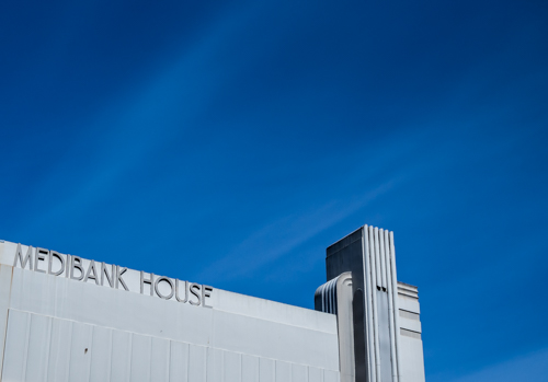
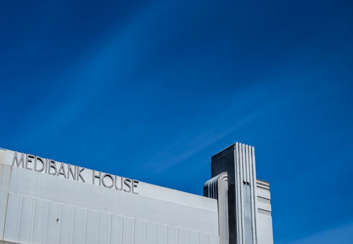
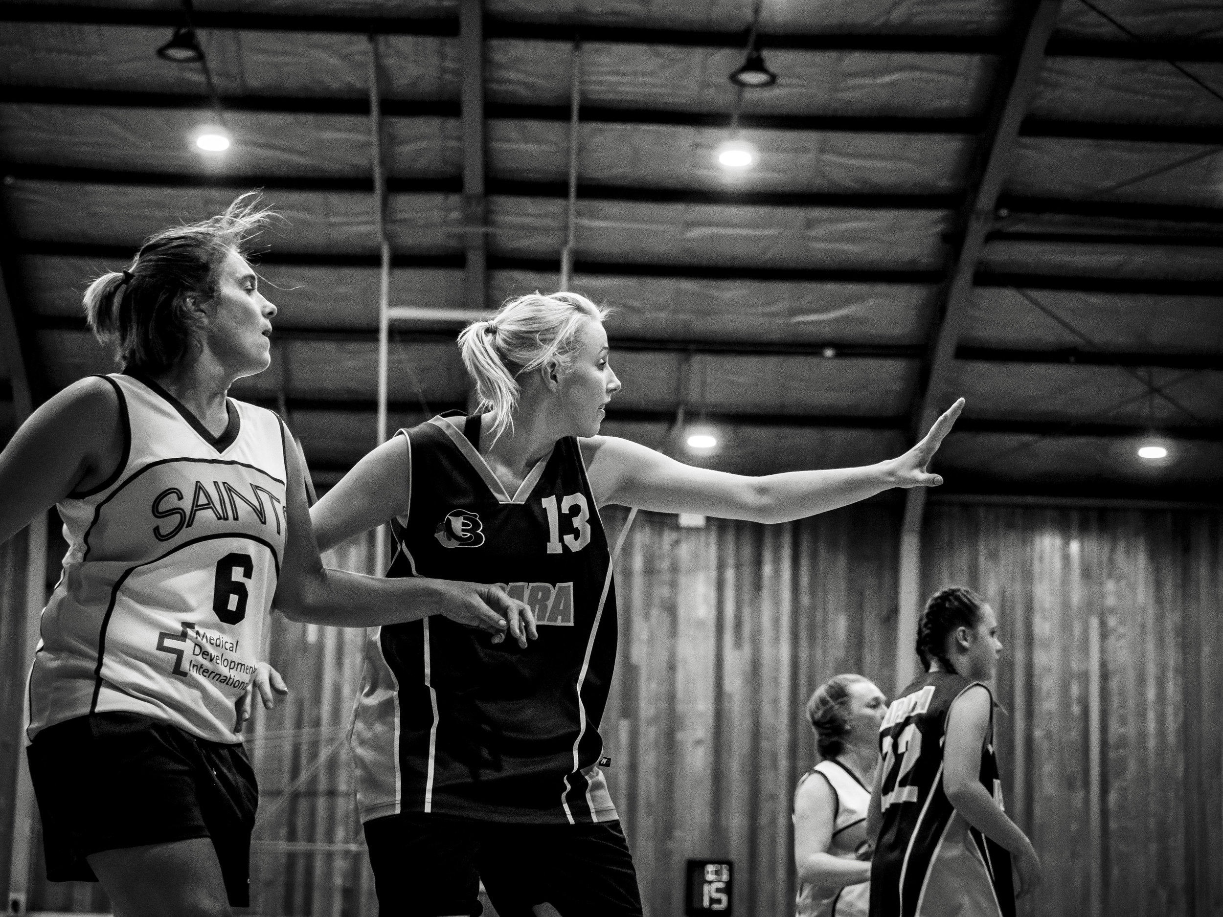
The other day I posted under "thoughts", a little bit of the enormous capabilities of Adobe Lightroom as I understand them at this point. In the post I commented that I am "not an expert" and "I am always learning", but hoping that someone would gain something from my own habits and understanding. Little did I know that my own learning curve would take a spike. It goes to show, talking to other people with the same interests is always a benefit as long as you have a "growth mind set". A kind and knowledgeable readers comment (you should read the comment to as it makes some very good points) would not only teach me a trick, pointing out that some of the brush work I had done was visible (ouch) and also remind me of something I had forgotten.

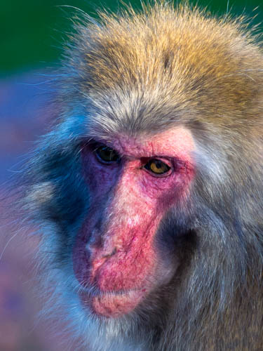
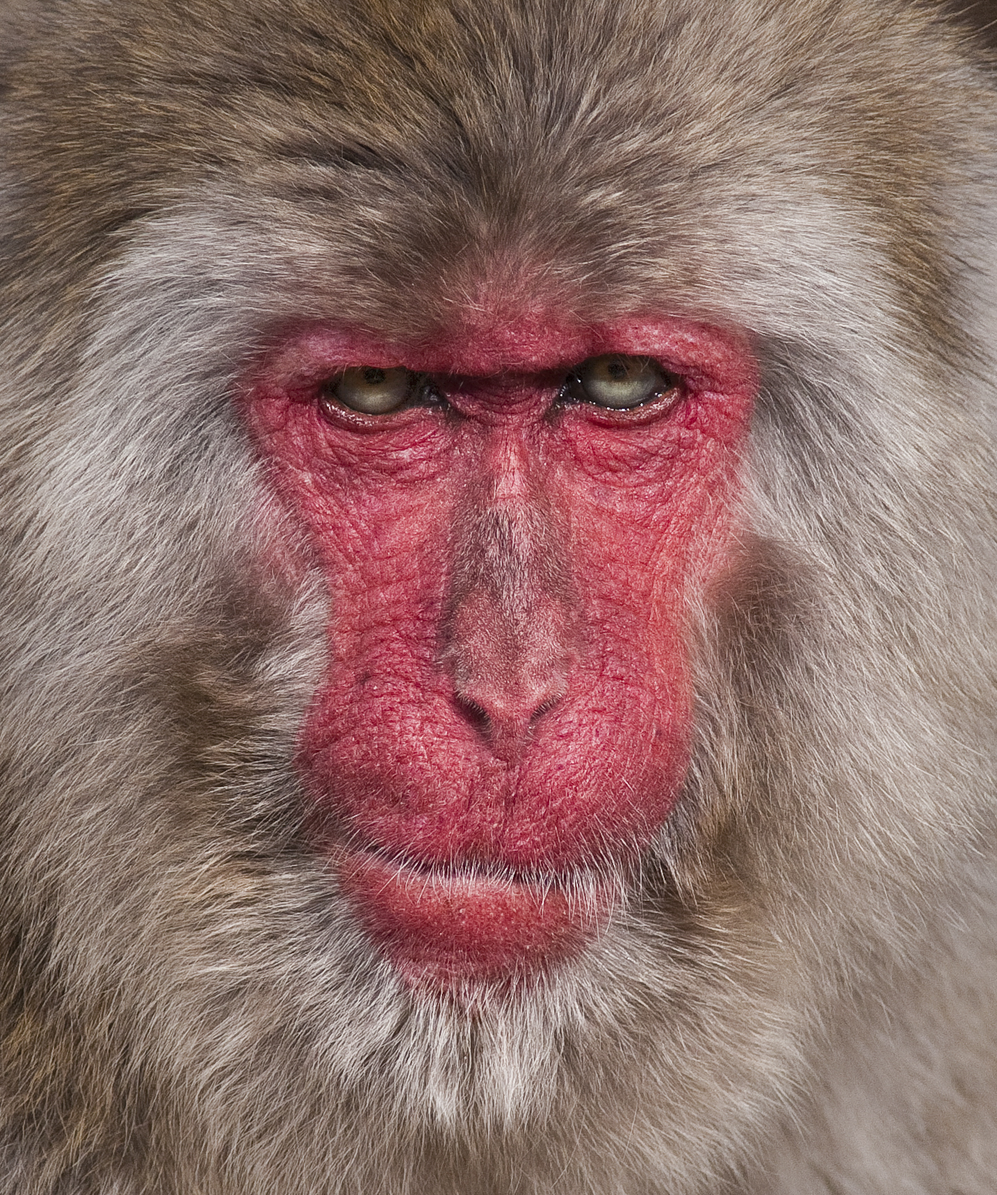
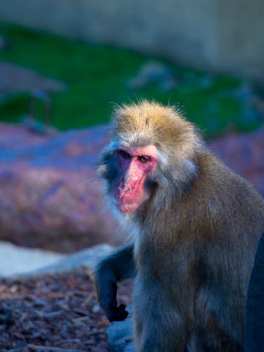
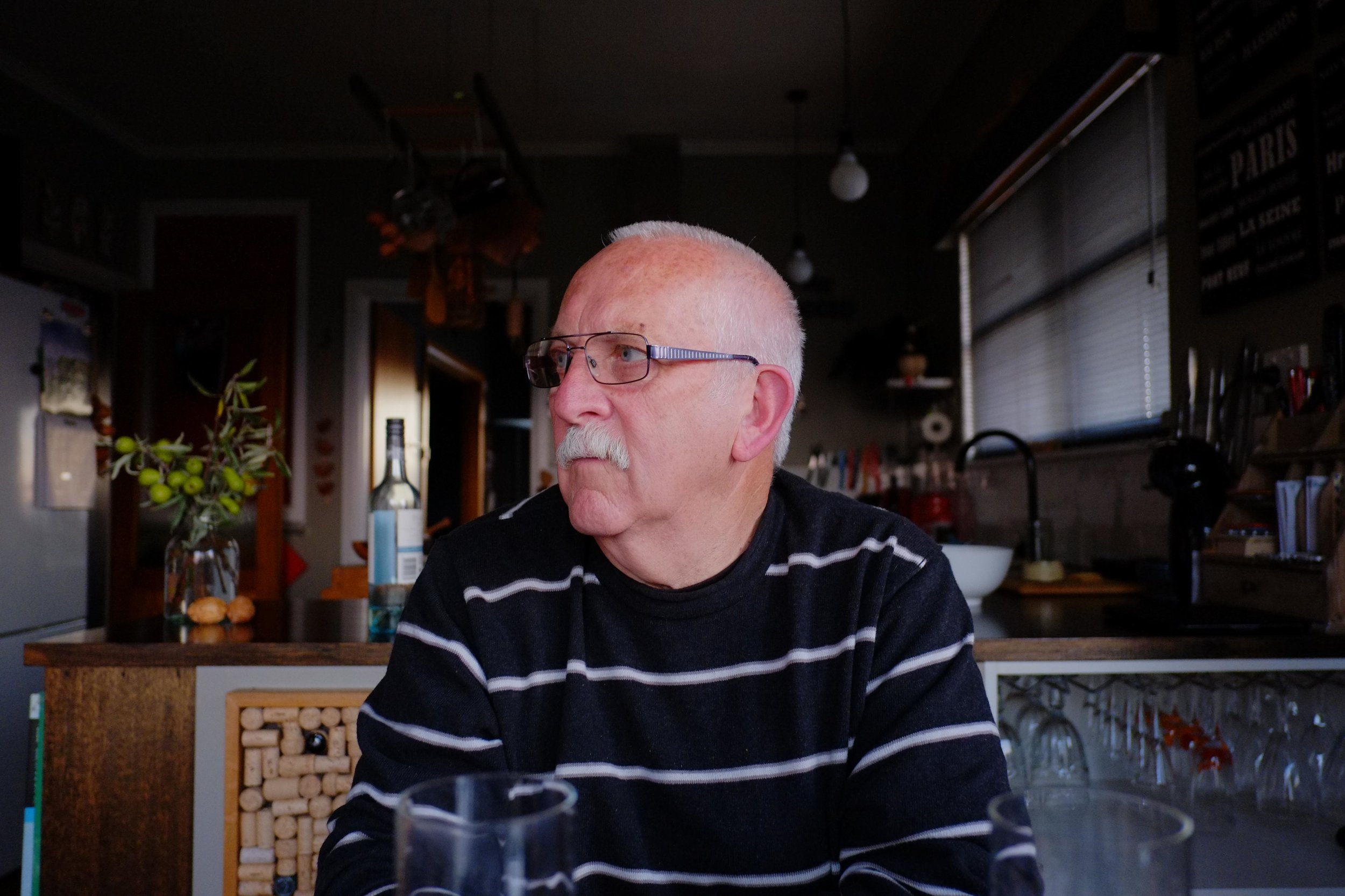
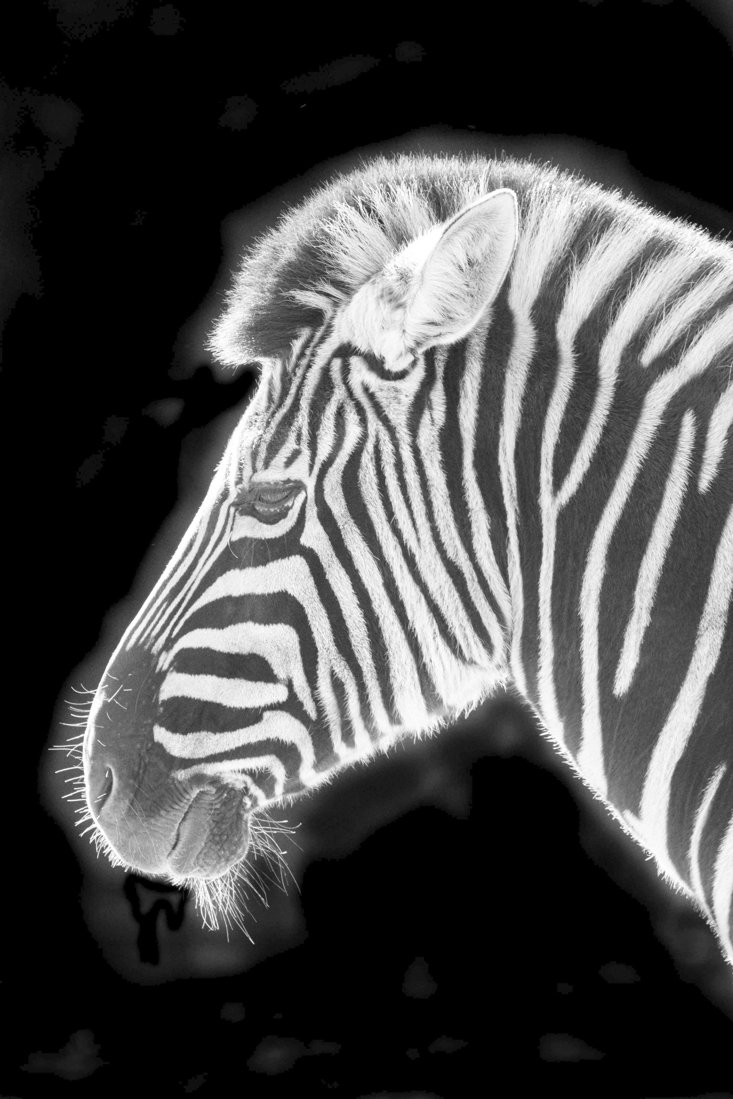
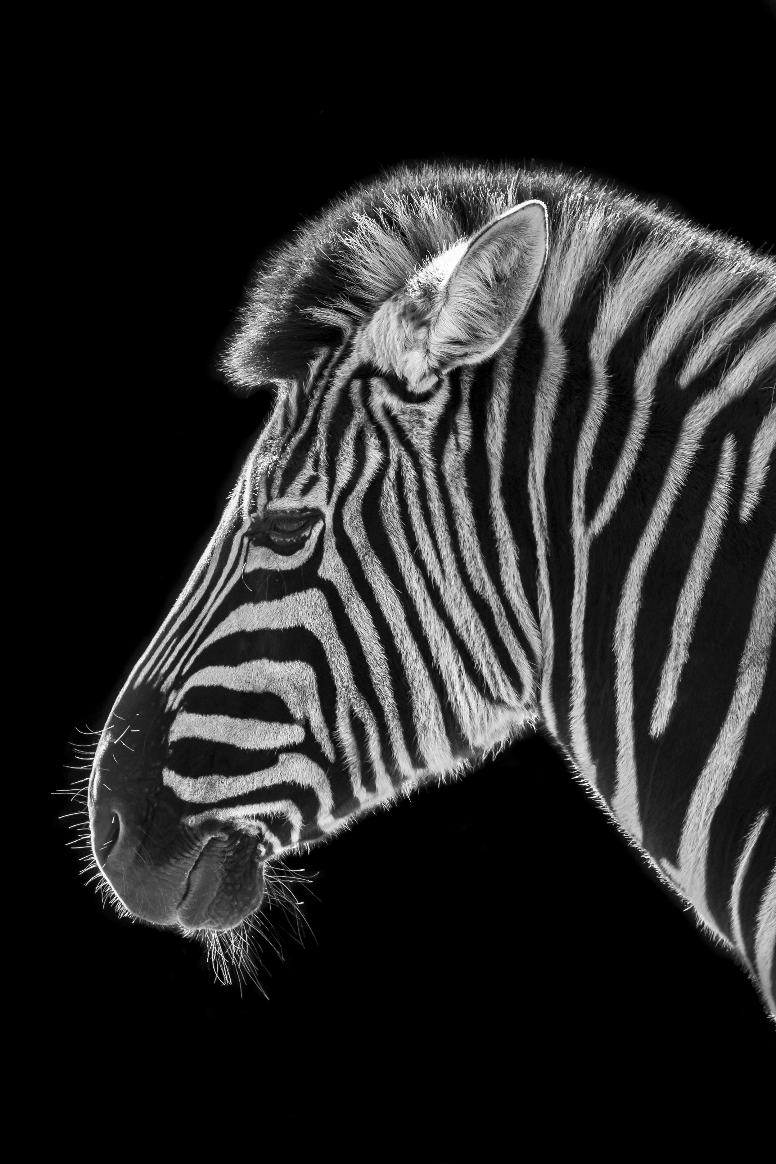
I will admit, I pushed the processing of the image chosen for the example beyond my comfort zone. Doing that much brush work is probably beyond my skill at this point and I was caught out fair and square. In the past, when this much work was needed, I would either take more time, working on each area with a magnified view or re evaluate the value of the image.

Basically, when using the brush, graduated filter or any other manipulative feature in Lightroom, always make sure the playing field is in your favour. The two errors I did in my posted image were editing from the original view and NOT CLEANING MY SCREEN. If (assuming the screen is clean) you lighten the image or in some cases deliberately over do the brush work to make it more visible in relation to the rest of the image, you can always push it back later. 

One of the beauties of Lightroom is that it is non destructive editing. You can push, pull, reset and start again. Nothing is actually real and final until it is exported. For example, of you are sharpening an edge or adding noise reduction selectively, you could reduce exposure to see the area darken as you work, making sure you have not missed anywhere, then double click on the exposure slider when done to reset the exposure to normal. If you click on one of the brush starting point dots, even months after your edit, the area previously worked on will show up as a red cloud. To re do the image, I (after I cleaned my screen) lightened the whole image to see it better, then re applied the brushing). 

The above image on the left is an already edited mono conversion, taken at Perth Zoo a couple of years ago. As is, it is ok, but showing the clumsiness of my early brush use. The second image has been lightened (thank you Olympus Hopeful), showing the areas that have not been fully removed and areas that have heavier brush work applied. Mostly invisible, but not great. The last image has the poor areas touched up by applying -30 exposure and then a new brush edit applied around the edges and the main body of the Zebra with +35 contrast, +30 clarity, +20 sharpness and +10 dehaze. Remember, that these settings will not darken light areas, only dark areas, so they intensify the edge.

Notice the glow on the main body. There is no extra exposure added, this is all from contrast, clarity and dehaze control. Another point of note is these manipulations were done to a re imported jpeg, as the original eludes me (I will not be doing a post on organising and filing for a while!).

The trick I was reminded of, that I read once before in an interview with one of the official UN photographers, John Isaac is to use the brush on weaker settings, but with more passes. He felt that multiple passes on a gentle setting is less destructive than hitting it hard in one go. 


Canon colour from Olympus

I often go on about the Canon (or Fuji) look and how I have needed on some level to mimmic to some extent that look in my images. Digital Canon followed Fuji Velvia (shot with Canon), forming in me a taste for rich colours, strong contrast, a cool base palette with strong but cooler warm tones. Olympus cameras take beautiful images, but they are more like Kodachrome than Velvia. The neutral base and emphasis on skin tones and warmer colours matched with (in the EM5's especially) strong and deep blacks, looks very Kodachrome to me.

Olympus OMD and 75-300 lens at 75mm. 

Olympus OMD and 75-300 lens at 75mm. 

Why do I need the look of one brand in another camera brand? 

Because I love the size and lens consistency of the Olympus cameras, I do like their images, but I miss the Canon/Fuji look sometimes, especially when the light is poor and (in my mind) I feel another brand would handle dull and uninspiring light better. This is a Fuji jpeg strength. The Sony made, Olympus sensors are better performing than the current Canon crop frame cameras at the moment in a lot of areas as well, like dynamic range (highlight recovery) and noise (Olympus black speck noise is sharp noise, not mushy noise).

An Olympus image (OMD 25mm), with reduced sharpness, clarity and increased contrast.

An Olympus image (OMD 25mm), with reduced sharpness, clarity and increased contrast.

A Canon full frame image (5D mk2 35L), with increased sharpness and clarity, and no change to contrast.

A Canon full frame image (5D mk2 35L), with increased sharpness and clarity, and no change to contrast.

This is one of the "haunting" images. There is nothing here Olympus cannot provide and it turns out that the original Canon file did not look this way anyway.

This is one of the "haunting" images. There is nothing here Olympus cannot provide and it turns out that the original Canon file did not look this way anyway.

The good news for me, is I think I can now easily and consistently get Canon colours out of my Olympus cameras when I need. The "Hollywood" glow is actually a result of noise reduction, un sharpening and/or reducing clarity. The black and white sliders in Lightroom give an image a more contrasty and brilliant look, toning the shadows and highlights to give more colour depth and the blue slider in camera calibrations cools shadows while giving warm tones more "pop". I also need to correct my own colour memory, because on investigation, the Canon files that make me so unsettled often required a lot of work. There was a reason I switched and I have to remember that.

GAS release

I followed my own advice and re read out some old reviews on the EM5 mk1 (Ctein and others), then wrote a bit about things that have been on my mind lately. Itch scratched (a bit easier than this guy).

Shooting sport without tracking AF

While looking at my future needs for possible sports photography, I analysed the actual needs of each type of sport and the techniques required.

Field sports.

Longer lenses allow for better focus as the subject moves less in relation to you. If shooting length ways down the ground, with decent depth of field, the single shot or continuous AF of even the EM5 mk1 will get the job done. If trying to follow action from the side, manual zone focus and timing will get good results.

Swimming and distant athletics.

This is the one I did recently that started the madness. Manual zone focus will get diving in, the lanes guarantee the same plane of focus from the side and focussing on the "bow wave" of the subject will work for single or continuous AF for converging targets.

OMD 40-150 pro at about 100mm f2.8

OMD 40-150 pro at about 100mm f2.8

Short distance sprinting.

This is the tough one. How I used to do it was to focus on the runner about to leave the blocks (from the finishing end), shift focus once or twice down the track getting the subject with a short burst as they pass through the focus point and then settle focus on the finish line, usually zoomed right back (this can be achieved by memorising finger placement at each of the focus points). Using the most depth of field possible and with a bit of practice, a set of 10 or so good images out of 15-20 is the norm, including zooming. If shooting from the side, practice panning with good depth and a slowish shutter speed, the longer the lens, the longer the focus sweet spot holds. The long lens trick I learned photographing dragonflies in flight (remember to keep one eye on the action and the other on the eye piece).

IDs mk2 and 400 f5.6L. With the long lens, the 2-3 meter "hops" the dragonfly made were relatively small adjustments. Closer would have meant greater shifts.

IDs mk2 and 400 f5.6L. With the long lens, the 2-3 meter "hops" the dragonfly made were relatively small adjustments. Closer would have meant greater shifts.

Tennis and Netball.

I used to shoot a lot of Netball and found that the field sport techniques worked (shooting long down the length or zone focus from the side), but you also have the opportunity to do some high or low wide angle and short lens work around the goals or base line in tennis.

The trick is to be smooth and gentle with focus, no jerky movements and trust to depth of field if available. Single shot AF is ok as long as the total process of focus and fire is not slower than the subjects movement. Practice on moving cars is good to. Shoot wider than needed as 16-20mp has plenty of cropping power for web work.


This an example of a 2-3mp crop of a failed "trap focus" composition. One of the reasons good corner sharpness is handy.

This an example of a 2-3mp crop of a failed "trap focus" composition. One of the reasons good corner sharpness is handy.

Fighting G.A.S.

I have a slight case of GAS (gear acquisition syndrome).

I decided I should look at the merits of tracking autofocus in the M43 world as I shot some sport and may have some more on the horizon. 

Even though I have rationalised the benefits away for the level I will be working at (high school), the lure of the new will not go. Even old new, the EM1 mk1 is calling to me. I am fighting false promises, shunning the reliable and well known for the new and exciting. I need to count my blessings, take stock of what is good, what is working and move on.

One of the best things to do is get my gear out, clean and check it as I find the intangible tends to over shadow the real when my imagination takes hold. I learned this trick with Canon gear. I had more of a problem settling on it, even stressing over the physical look of some of my lenses.

Yep, take a breath.

Yep, take a breath.